Search Results for First
Explore AI generated designs, images, art and prompts by top community artists and designers.
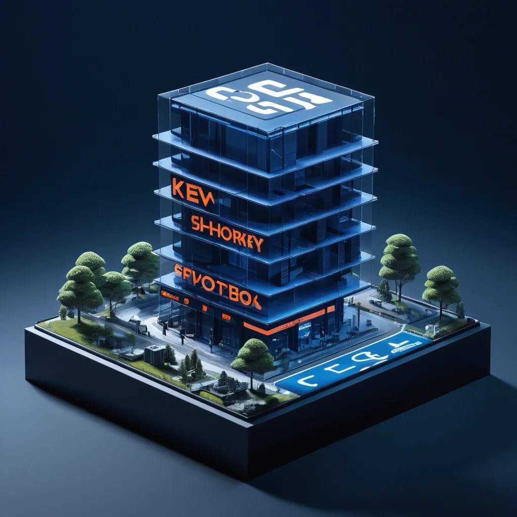

First , ensure the iPhone 18 Pro Max has a realistic , credible , and market-ready product design , then scale it up to an architectural level , and naturally transform the Product Core Structure into the Space Transformation Method , making the product itself truly become a part of architecture , landscape , or space , rather than a simply suspended oversized object. In the Highway , incorporate extremely small Miniature Figures to emphasize scale , and through roads , reflections , mist , glass , architecture , terrain , or figure interactions , create authentic spatial relationships between the product and the environment. At the top , use an oversized English Heavy; in the lower left , add a large Chinese Heavy , allowing the Typography to interact with the product and environment through occlusion , interweaving , and foreground-background relationships. Incorporate a second layer of visual discovery , such as a world hidden inside the product , the product structure transforming into architecture , materials creating spatial refraction , reflections completing forms , figures passing through the product , or product components extending into real space. Overall , use the dark blue as the dominant environmental color palette , with the Orange concentrated on the product or key visual structures , maintaining the texture of a premium brand Campaign , magazine Editorial , outdoor KV , and commercial proposal. Avoid ordinary product shelf shots , e-commerce ads , mere gigantification , cyberpunk aesthetics , complex UI , fake parameters , fake logos , garbled text , numbering , and cheap CG lighting effects. Aspect Ratio: 9:16 ,
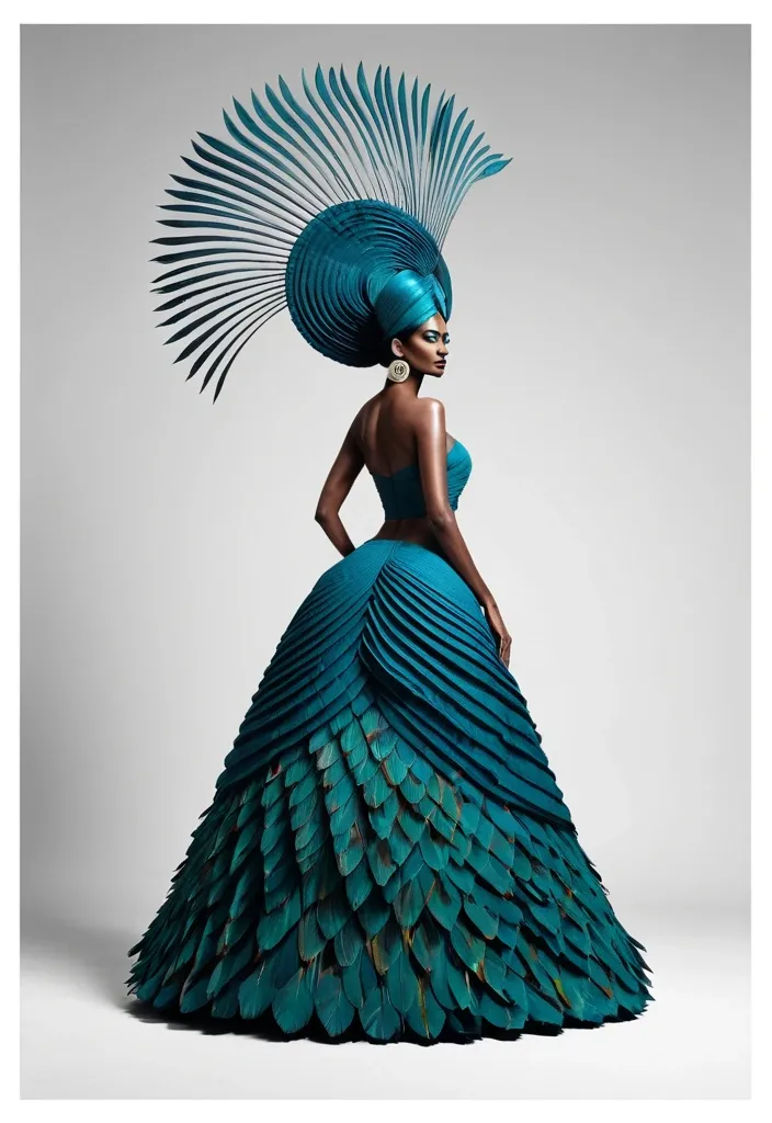
Diagonal composition should rely on "grand relationships , " not minor decorations. The subject or primary color field should ideally occupy about 45%–65% of the frame , while reserving a distinct quiet area to form directional shifts like "dense to sparse , " "near to far , " or "heavy to light." Avoid even 50% splits or standard mechanical 45° diagonal lines; slightly offset the diagonal angle to make the layout feel more natural and editorial. A woman wearing an avant-garde sculptural Saree crafted from peacock feathers pleated fabric with Indian traditional textured Saree. The Saree features a fitted V-neck bodice extending into a dramatic , spiraling circular fan frame over her head like a giant hat feathers sculpture. The final reading order should be: First , catch the bold diagonal grand form; second , understand how the subject or boundaries create direction; third , discover relationships between scale , negative space , and text; finally , read the title and minimal information. The overall effect should evoke real modern exhibition posters , photography features , cultural visuals , or design annual case studies—not just an ordinary image tilted on its side. ,
Logo Mark: Open‑text “9” rendered in transparent neon blue → pink gradient. The “9” is slightly tilted , with a wedge cut out at the upper‑right corner. Wordmark: Two‑line heavy italic sans‑serif in title case. Line 1: First word (e.g. , “True”) stacked above the second word. Line 2: Second word (“Motion”). Lockup Arrangement: The simple original logo sits directly left of the wordmark. The combined lockup spans 60‑66 % of the canvas width (or 38‑44 % for a 4:3 aspect ratio). It overlaps the lower cheek , chin , and upper body of the princess at the optical center , ensuring the key eye remains fully readable. Transparency: The logo is partially transparent , allowing the underlying cinematic image to show through while maintaining legibility. ,
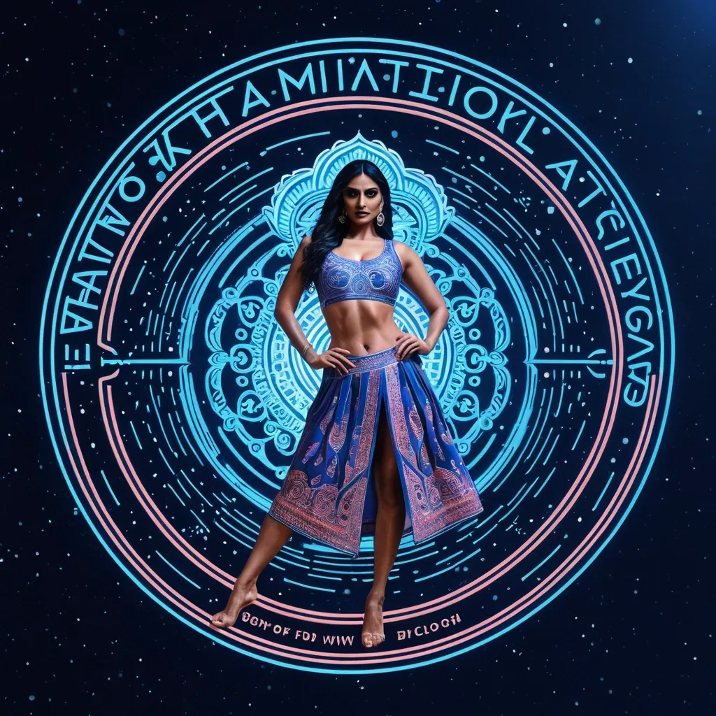
Create a finished premium festival campaign poster , 3:4 , full bleed. Intimate film-like festival photography , extreme close-up , strong selective focus , one bold white logo lockup at the center. True Motion · open-text "9" logo · Nine Night Ultra‑low 35 mm cinematic shot of a royal Indian princess in motion , her Madhubani‑print mirror‑work Chaniya Choli vortex spiraling outward , legs visible , flowing pose; celestial , ethereal , abstract digital‑art. Logo: tilted Transparent neon blue to pink open text "9" with a wedge cut at the upper right. Moody , slightly underexposed moonlight: warm amber skin highlights , deep natural shadow , muted blue night , gentle bloom on wet highlights , fine restrained grain. Only the nearer waist and a small patch of skin are sharp; a near Waist melts into soft blur across the lower foreground , and the background falls away. One tightly joined white lockup: a simple original logo placed directly left of a two-line heavy italic sans-serif Wordmark in title case , first word stacked above the second. The lockup spans about 60 to 66% of canvas width (38 to 44% for 4:3) and overlaps the lower cheek , chin and upper body at the optical center. Keep the key eye readable. The photo continues behind it. No other text , no subtitle , no footer , no side copy panel , no glitch , no neon or colored gel light , no HDR , no plastic skin , no uniform fake sweat , no evenly sharp clinical look. ,
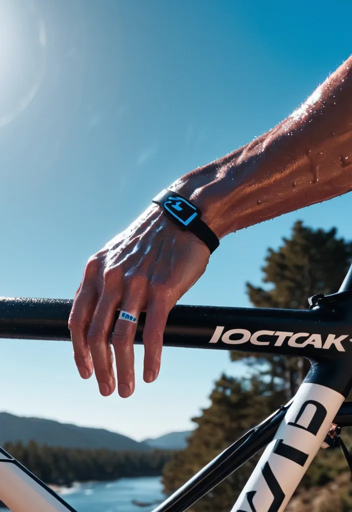
Create a finished premium sports campaign poster , 3:4 , full bleed. Intimate film-like sports photography , extreme close-up , strong selective focus , one bold white logo lockup at the center. True Motion · open-ring logo · coastal climb road Cyclist in a white vented helmet leaning over the bars after a brutal climb; sweat and poured water drip off flushed cheeks. Near foreground: blurred forearm and handlebar grip. Logo: tilted Transparent neon blue to pink open ring with a wedge cut at the upper right. Moody , slightly underexposed sunlight: warm amber skin highlights , deep natural shadow , muted blue sky or water , gentle bloom on wet highlights , fine restrained grain. Only the nearer eye and a small patch of skin are sharp; a near arm or hand melts into soft blur across the lower foreground , and the background falls away. One tightly joined white lockup: a simple original logo placed directly left of a two-line heavy italic sans-serif wordmark in title case , first word stacked above the second. The lockup spans about 60 to 66% of canvas width (38 to 44% for 4:3) and overlaps the lower cheek , chin and upper body at the optical center. Keep the key eye readable. The photo continues behind it. No other text , no subtitle , no footer , no side copy panel , no glitch , no neon or colored gel light , no HDR , no plastic skin , no uniform fake sweat , no evenly sharp clinical look. ,
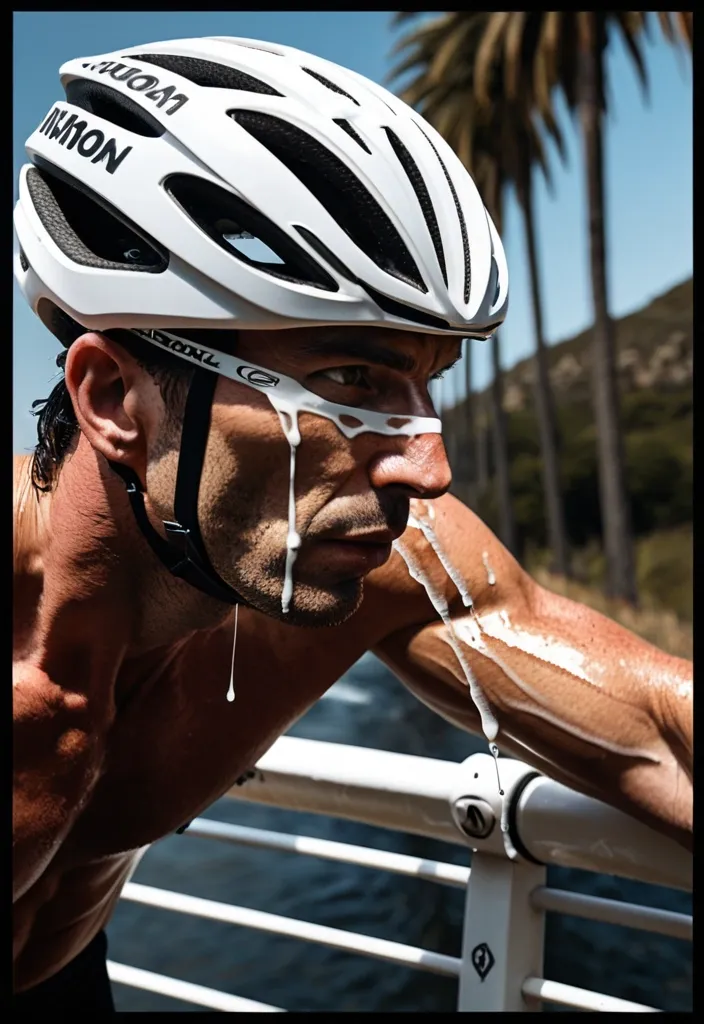
Create a finished premium sports campaign poster , 9:16 , full bleed. Intimate film-like sports photography , extreme close-up , strong selective focus , one bold white logo lockup at the center. True Motion · open-ring logo · coastal climb road Cyclist in a white vented helmet leaning over the bars after a brutal climb; sweat and poured water drip off flushed cheeks. Near foreground: blurred forearm and handlebar grip. Logo: tilted white open ring with a wedge cut at the upper right. Moody , slightly underexposed sunlight: warm amber skin highlights , deep natural shadow , muted blue sky or water , gentle bloom on wet highlights , fine restrained grain. Only the nearer eye and a small patch of skin are sharp; a near arm or hand melts into soft blur across the lower foreground , and the background falls away. One tightly joined white lockup: a simple original logo placed directly left of a two-line heavy italic sans-serif wordmark in title case , first word stacked above the second. The lockup spans about 60 to 66% of canvas width (38 to 44% for 16:9) and overlaps the lower cheek , chin and upper body at the optical center. Keep the key eye readable. The photo continues behind it. No other text , no subtitle , no footer , no side copy panel , no glitch , no neon or colored gel light , no HDR , no plastic skin , no uniform fake sweat , no evenly sharp clinical look. ,
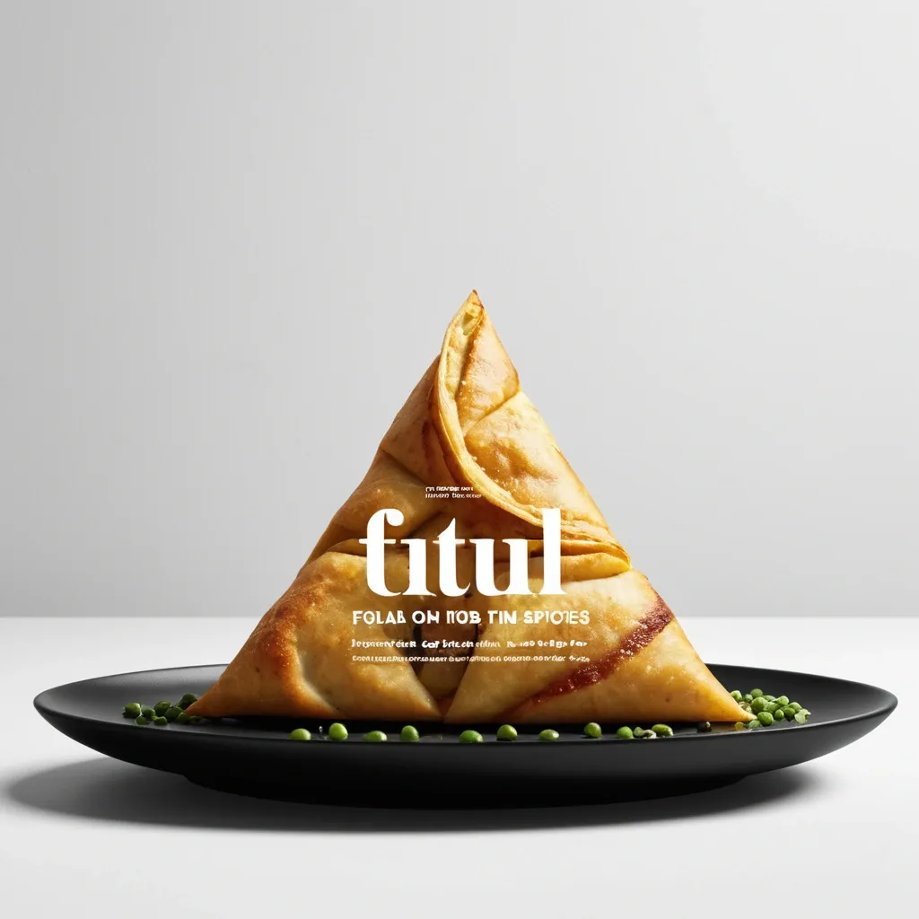
Brand: Aimosa Food: Samosa (popular fried or baked pastry with a savory filling , usually made with spiced potatoes , onions , and peas) Headline: Test of Street. Physical Interaction: FOLD. Accent Color: dark yellow Product Name: Samosa Price: 8$ Aspect Ratio: 9:16 Create a premium editorial food poster where real food physically interacts with and reshapes oversized typography , using a female open mouth background , bold white Heavy Grotesk typography , photorealistic food materials , generous negative space , and a broken editorial grid inspired by contemporary Indian food branding and high-end magazine design. The food and typography must exist inside the same physical world , the food should not simply overlap , decorate , or sit beside the letters , instead the selected physical action must visibly alter the typography through believable material behavior , geometry , heat , pressure , bending , abrasion , or surface transformation. A continuous food surface fold into a Triangle while the typography printed on that same surface bends , compresses , stretches , foreshortens , and wraps with it; Use only one main physical mechanism per poster , keep the cause and effect visually clear , untouched areas of the typography should remain hard , clean , geometric , and readable , all deformation should happen only where the food , tool , heat , or physical force actually makes contact. Use a broken editorial grid with strong scale contrast , asymmetric placement , edge information , small meaningful annotations , and large areas of negative space , add details such as Potatoes , Green peas , Fresh coriander leaves , Green chilies , 24hrs , and always available in hot , but avoid traditional menu rows , long horizontal divider lines , rigid bottom information bars , boxed prices , and template-like layouts. Use bold Grotesk Sans Serif for the main headline , high-contrast Editorial Serif or Italic Serif for product names , quotes , and prices , keep the palette minimal with a cream background , black typography , natural food colors , and one accent color. The final poster should feel clever , physical , premium , contemporary , and instantly readable at thumbnail size , the first glance should reveal the food and headline , the second glance should reveal the physical mechanism that has transformed the typography. ,
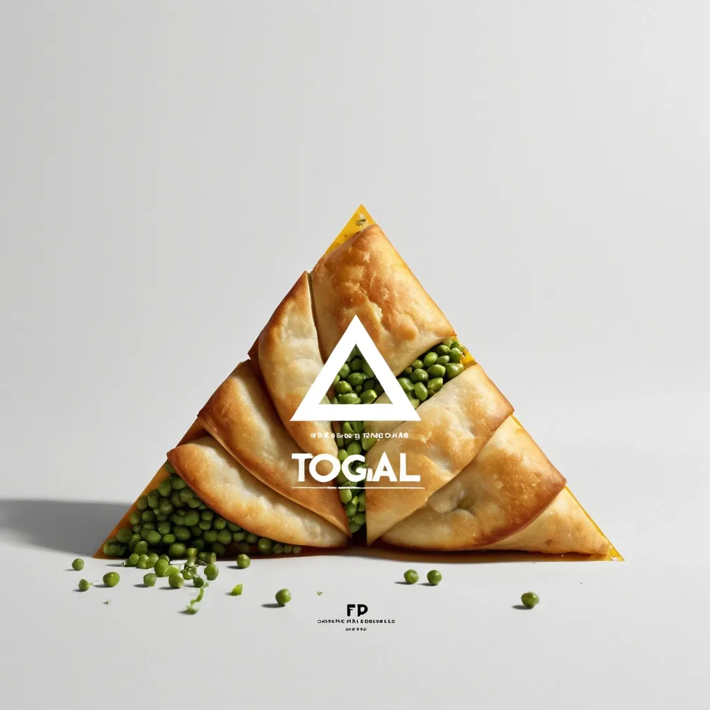
Brand: Aimosa Food: Samosa (popular fried or baked pastry with a savory filling , usually made with spiced potatoes , onions , and peas) Headline: Test of Street. Physical Interaction: FOLD. Accent Color: dark yellow Product Name: Samosa Price: 8$ Aspect Ratio: 9:16 Create a premium editorial food poster where real food physically interacts with and reshapes oversized typography , using a warm Night street background , bold white Heavy Grotesk typography , photorealistic food materials , generous negative space , and a broken editorial grid inspired by contemporary Indian food branding and high-end magazine design. The food and typography must exist inside the same physical world , the food should not simply overlap , decorate , or sit beside the letters , instead the selected physical action must visibly alter the typography through believable material behavior , geometry , heat , pressure , bending , abrasion , or surface transformation. A continuous food surface fold into a Triangle while the typography printed on that same surface bends , compresses , stretches , foreshortens , and wraps with it; Use only one main physical mechanism per poster , keep the cause and effect visually clear , untouched areas of the typography should remain hard , clean , geometric , and readable , all deformation should happen only where the food , tool , heat , or physical force actually makes contact. Use a broken editorial grid with strong scale contrast , asymmetric placement , edge information , small meaningful annotations , and large areas of negative space , add details such as Potatoes , Green peas , Fresh coriander leaves , Green chilies , 24hrs , and always available in hot , but avoid traditional menu rows , long horizontal divider lines , rigid bottom information bars , boxed prices , and template-like layouts. Use bold Grotesk Sans Serif for the main headline , high-contrast Editorial Serif or Italic Serif for product names , quotes , and prices , keep the palette minimal with a cream background , black typography , natural food colors , and one accent color. The final poster should feel clever , physical , premium , contemporary , and instantly readable at thumbnail size , the first glance should reveal the food and headline , the second glance should reveal the physical mechanism that has transformed the typography. ,
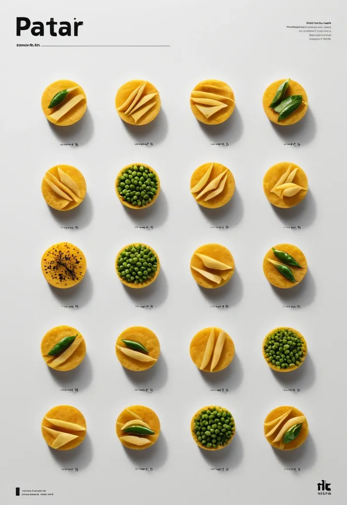
Brand: Duotone Food: Samosa (popular fried or baked pastry with a savory filling , usually made with spiced potatoes , onions , and peas) Headline: Saving of Pocket Physical Interaction: FOLD Accent Color: dark yellow Product Name: બારાસ Price: 8$ Aspect Ratio: 9:16 Create a premium editorial food poster where real food physically interacts with and reshapes oversized typography , using a warm Night street background , bold white Heavy Grotesk typography , photorealistic food materials , generous negative space , and a broken editorial grid inspired by contemporary Indian food branding and high-end magazine design. The food and typography must exist inside the same physical world , the food should not simply overlap , decorate , or sit beside the letters , instead the selected physical action must visibly alter the typography through believable material behavior , geometry , heat , pressure , bending , abrasion , or surface transformation. typography printed directly onto a thin food surface follows the same crease , perspective compression , rotation , and occlusion as the food is physically folded; Use only one main physical mechanism per poster , keep the cause and effect visually clear , untouched areas of the typography should remain hard , clean , geometric , and readable , all deformation should happen only where the food , tool , heat , or physical force actually makes contact. Use a broken editorial grid with strong scale contrast , asymmetric placement , edge information , small meaningful annotations , and large areas of negative space , add details such as Potatoes , Green peas , Fresh coriander leaves , Green chilies , 24hrs , Xyz Lane , and always available in hot , but avoid traditional menu rows , long horizontal divider lines , rigid bottom information bars , boxed prices , and template-like layouts. Use bold Grotesk Sans Serif for the main headline , high-contrast Editorial Serif or Italic Serif for product names , quotes , and prices , keep the palette minimal with a cream background , black typography , natural food colors , and one accent color. The final poster should feel clever , physical , premium , contemporary , and instantly readable at thumbnail size , the first glance should reveal the food and headline , the second glance should reveal the physical mechanism that has transformed the typography. ,
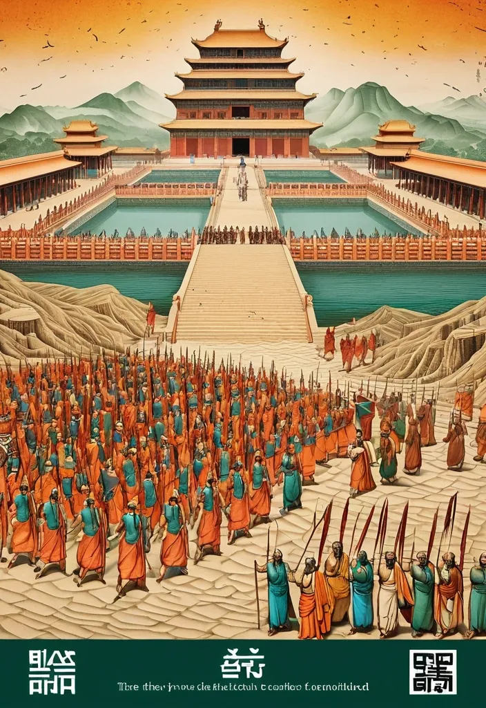
Theme: Ancient Water Conservancy Main palette: Sand path , sand , orange Structural method: another paper construction Micro scene: a tiny Walking march , performance Event details: 02 October , 05:30 am , Start Aspect ratio: 16:9 Design a historical and cultural poster with a modern Eastern editorial aesthetic , using "paper fibers + large color fields + micro-scenes" as the core visual language. Do not interpret traditional culture as stacking ancient architecture , calligraphy , auspicious clouds , or artifacts. Instead , first distill the Cultural Logic , then let large areas of handmade paper color fields directly carry structures , spaces , time , flow , order , or process relationships , so that viewers first see a strong and clear large form from afar , and only gradually discover the cultural narrative hidden within upon closer inspection. Use the dark green , sand style to establish 2–5 main paper color blocks of distinctly different sizes , maintaining low saturation but complete color intensity. All color blocks should have the authentic , rich texture of handmade paper , pulp , watercolor , or mineral pigments , with visible natural long and short fibers , pigment deposition , subtle impressions , large-scale natural color variations , and irregular torn paper edges. The overall effect should be matte , clean , and intact—avoid dirtiness , yellow spots , random speckles , cheap retro effects , or digital gradients. Based on the theme , let the color fields express the logic of system operations through folding , branching , interweaving , interlocking , offsetting , supporting , segmenting , enclosing , or negative space relationships , rather than simply serving as decorative backgrounds. Embed the Dadi march within the large color field structure , keeping figures and props at a very small scale , totaling about 3%–6% of the image area. Each scene must depict a clear action , with causal or temporal relationships between them , such as "entering → executing → recording → completing , " allowing the miniature figures to truly drive the narrative rather than just standing in poses. Figures' clothing in indian Freedom fighter style and artifacts should align with the theme's era and identity but remain restrained—avoid cinematic historical drama excess; scenes should only retain key props that illustrate systemic relationships , without cluttering with decorations or irrelevant cultural symbols. Typography should employ the editorial language of modern Eastern cultural institutions , museums , or archival exhibitions. The main title Dandi March should use refined Song typeface , publication-inspired Gujarati fonts , at a medium-small size that does not overpower the large color fields; supporting English text , dates , locations , and explanatory information should use even smaller sizes to create clear hierarchies. Subtle cinnabar seals , paper tags , archival labels , or node text may be added , but they must genuinely relate to the thematic logic—do not add them randomly just for a "Indian Freedom fighter style" feel. The overall reading order should be: large color field structures and color relationships → systemic or spatial logic → miniature figures' continuous narrative → main title and exhibition information. The final image should achieve a strong large form and visual impact from afar , revealing paper fibers , figure actions , and historical details up close , balancing design sensibility , narrative depth , and cultural completeness. Avoid book cover vibes , traditional Chinese illustration styles , screens full of ancient architecture , oversized titles , PPT-style rigid layouts , modern infographic arrows , meaningless English placeholders , element piling , commercial ad vibes , 3D CGI , glass textures , neon colors , logos , watermarks , numbering , and starburst decorations. ,
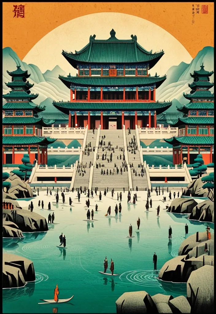
Theme: Ancient Water Conservancy Main palette: blue , dark green , orange Structural method: another paper construction Micro scene: a tiny Walking march , performance Event details: 02 October , venue , Start Aspect ratio: 9:16 Design a historical and cultural poster with a modern Eastern editorial aesthetic , using "paper fibers + large color fields + micro-scenes" as the core visual language. Do not interpret traditional culture as stacking ancient architecture , calligraphy , auspicious clouds , or artifacts. Instead , first distill the Cultural Logic , then let large areas of handmade paper color fields directly carry structures , spaces , time , flow , order , or process relationships , so that viewers first see a strong and clear large form from afar , and only gradually discover the cultural narrative hidden within upon closer inspection. Use the dark green , sand style to establish 2–5 main paper color blocks of distinctly different sizes , maintaining low saturation but complete color intensity. All color blocks should have the authentic , rich texture of handmade paper , pulp , watercolor , or mineral pigments , with visible natural long and short fibers , pigment deposition , subtle impressions , large-scale natural color variations , and irregular torn paper edges. The overall effect should be matte , clean , and intact—avoid dirtiness , yellow spots , random speckles , cheap retro effects , or digital gradients. Based on the theme , let the color fields express the logic of system operations through folding , branching , interweaving , interlocking , offsetting , supporting , segmenting , enclosing , or negative space relationships , rather than simply serving as decorative backgrounds. Embed the Dadi march within the large color field structure , keeping figures and props at a very small scale , totaling about 3%–6% of the image area. Each scene must depict a clear action , with causal or temporal relationships between them , such as "entering → executing → recording → completing , " allowing the miniature figures to truly drive the narrative rather than just standing in poses. Figures' clothing and artifacts should align with the theme's era and identity but remain restrained—avoid cinematic historical drama excess; scenes should only retain key props that illustrate systemic relationships , without cluttering with decorations or irrelevant cultural symbols. Typography should employ the editorial language of modern Eastern cultural institutions , museums , or archival exhibitions. The main title [Main Title] should use refined Song typeface , Ming-style , or publication-inspired Chinese fonts , at a medium-small size that does not overpower the large color fields; supporting English text , dates , locations , and explanatory information should use even smaller sizes to create clear hierarchies. Subtle cinnabar seals , paper tags , archival labels , or node text may be added , but they must genuinely relate to the thematic logic—do not add them randomly just for a "Chinese style" feel. The overall reading order should be: large color field structures and color relationships → systemic or spatial logic → miniature figures' continuous narrative → main title and exhibition information. The final image should achieve a strong large form and visual impact from afar , revealing paper fibers , figure actions , and historical details up close , balancing design sensibility , narrative depth , and cultural completeness. Avoid book cover vibes , traditional Chinese illustration styles , screens full of ancient architecture , oversized titles , PPT-style rigid layouts , modern infographic arrows , meaningless English placeholders , element piling , commercial ad vibes , 3D CGI , glass textures , neon colors , logos , watermarks , numbering , and starburst decorations. ,
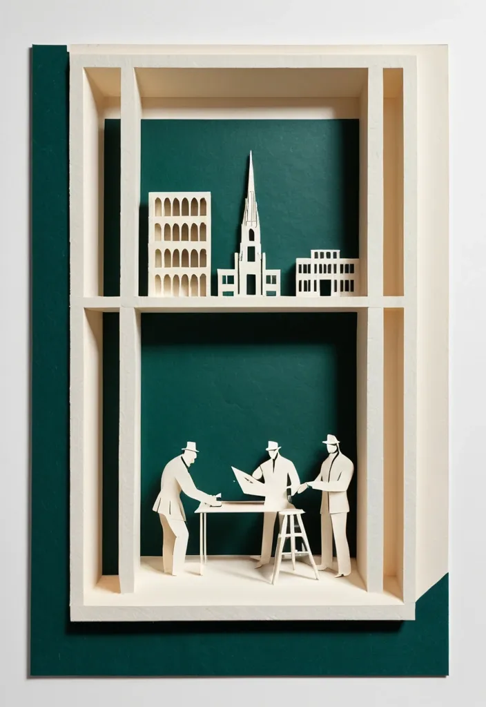
Theme: Freedom Fighters Memorial Aspect ratio: 9:16 Main palette: blue , dark green , orange Structural method: layered cutouts Micro scene: a tiny workshop , performance Event details: 02 October , 08:30 am , Dadi March Create a refined vertical cultural poster using tactile handmade paper , large color fields , structural composition , and a tiny narrative scene. Build the main visual with a clear paper based construction method. The composition may use layered apertures , framing , overlapping printed blocks , folded planes , or other physical paper relationships. Let the structure itself create depth , rhythm , and visual tension rather than relying on decorative graphics. All large paper areas should have realistic handmade texture , including visible fibers , pulp variation , pigment absorption , subtle pressure marks , irregular edges , and slight material imperfections. Keep the surfaces matte , clean , and sophisticated. Use strong but controlled color relationships. Large color fields should remain visually clear from a distance , while smaller overlaps , cut edges , shadows , folds , and paper thickness become visible only when viewed closely. Add one small micro scene related to the theme. Include two or three adult figures naturally performing the activity , such as cutting paper , operating a press , performing shadow theatre , folding structures , or arranging materials. Keep the entire scene around 3% to 5% of the poster so it remains a discovered detail rather than the main subject. Use generous warm ivory or neutral negative space to balance the large structural forms. Typography should be restrained and secondary. Use a refined editorial serif for the main title and small uppercase sans serif for supporting information. Keep the title relatively small and place it in a quiet area of the composition. The visual reading order should be: large paper structure first , color and material interaction second , micro scene third , title and event information last. The final result should feel contemporary , tactile , editorial , architectural , and handmade. From a distance , the poster should read as a strong abstract composition. Up close , it should reveal paper fibers , cut edges , folds , overlaps , print texture , tiny people , tools , and process. ,
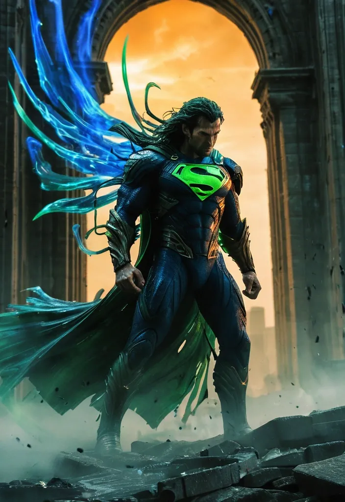
In a storm‑scarred tower , Predator’s ethereal wings and long green‑tentacle hair swirl , its body a sleek silhouette of deep‑blue with vivid green luminous edges. Superman intercepts , sending the Predator spiraling across a skyline painted in amber and burnt‑orange motion‑blur , the colors drifting like vapor. A first‑person fast‑track camera captures the swords’ impact , sending ripples through geometric stone arches and weathered metal under a soft , diffused light. The composition balances intense darkness with striking detail , keeping the combatants clear while the surrounding blur serves as a subtle , ghostly suggestion of speed. ,
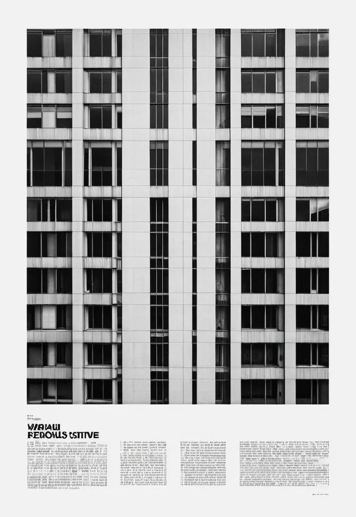
Transform the uploaded image into a premium brutalist editorial magazine poster. The entire poster should first be converted into high-contrast black-and-white. Apply: a monochrome newspaper print aesthetic a gritty editorial grain a matte paper texture a photocopy texture a magazine print imperfections a rough print noise a halftone grain a subtle paper fibers a archive print quality a high ISO film grain The black-and-white treatment should dominate approximately 75-85% of the composition. COLOR REVEAL SYSTEM Create multiple rectangular crop windows across the layout. Inside these crop windows preserve the original image colors. Only these selected fragments should remain in color. The rest of the poster remains black-and-white. Use: a vertical crop strips a horizontal crop strips a offset rectangles a overlapping image fragments a editorial cutout windows Color windows should reveal important details such as: eyes , hands , clothing details , objects , accessories , key focal points. TYPOGRAPHY Massive oversized condensed sans-serif typography. Typography should be large enough to be cropped by the canvas edges. Magazine-cover style hierarchy. Brutalist editorial design. Swiss-inspired layout. Add: a huge headline a section labels a issue numbers a micro typography a coordinates a technical annotations a small captions a editorial metadata LAYOUT Structured grid system. Intentional asymmetry. Layered rectangles. Editorial composition. Luxury magazine design. Poster design. Creative agency portfolio aesthetic. TEXTURE Heavy print grain. Visible paper texture. Magazine stock texture. Photocopied poster feel. Slight ink spread. Physical print imperfections. Scanned publication appearance. Most imp - 85% black-and-white editorial print , 15% selective color reveal windows. MOOD High-end editorial. Fashion campaign. Art-direction showcase. Creative magazine cover. Brutalist design poster. IMPORTANT The monochrome treatment must dominate the poster. The color fragments should feel like windows cut into a black-and-white print. Do not create a fully colored poster. Do not create random collage effects. The result should resemble a premium editorial publication where selective color slices reveal the original photograph beneath a gritty black-and-white printed surface ,
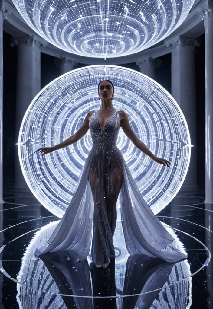
A narrow silver spotlight illuminates her face and makes thousands of particles sparkle across the veil and gown. The star on her forehead begins as a soft white point and pulses once with the opening bass note. Cut directly on the pulse to an extreme macro shot of the star using an 85mm lens; its four rays expand across the frame while tiny constellations appear inside the translucent fabric. Her eyes lift toward the camera in precise synchronization with the first vocal breath. Let the flare fill the image and create a luminous transition into the next stage. Reveal a vast chrome corridor formed from repeating circular arches , polished metallic walls , and a reflective black floor. Use a low , wide 24mm dolly shot traveling rapidly backward as the performer walks toward the camera with controlled confidence. Show her complete silver silhouette , the long veil floating behind her and reflecting bands of lavender and icy-blue light. Each footstep activates a circular light beneath the floor , sending glowing ripples through the corridor. Four faceless dancers dressed in sculptural mirror-silver costumes emerge sequentially from the arches behind her , two on each side , creating a balanced geometric formation. Cut to a lateral tracking shot as the performers execute elegant synchronized choreography based on slow shoulder rotations , sculptural arm lines , precise wrist movements , sweeping turns , and controlled fabric motion. The lead performer remains the visual center while the dancers frame her like moving reflections. Use a brief overhead shot in which their bodies form an eight-pointed star on the reflective floor. Rotate the overhead camera approximately ninety degrees as the choreography expands , then match the shape created by their arms to the glowing star on the lead performer’s forehead. Cut on the snare into a surreal lunar courtyard beneath an enormous violet planet. The lead performer now stands on a circular mirror platform surrounded by shallow silver water , black stone columns , floating crystal fragments , and low lavender mist. Preserve her exact gown and veil while allowing the fabric to respond dramatically to the open atmospheric wind. Begin with a wide crane descent from the planet toward the platform , then cut to a fast three-quarter orbit as she performs the central vocal hook directly to camera. Her performance combines confident eye contact , subtle lip synchronization , a slow backward lean , one sweeping arm movement across the veil , and a sharp turn that sends the silver fabric outward in a luminous spiral. On the strongest beat , cut to a close handheld portrait moving gently around her face while reflections of the planet and floating crystals travel across the translucent veil. Alternate between an intimate 50mm close-up , a low-angle full-body shot from the edge of the water , and a fast overhead view showing circular waves radiating from the platform. Let each cut reveal a new scale while maintaining continuous performance rhythm and stable screen direction. ,
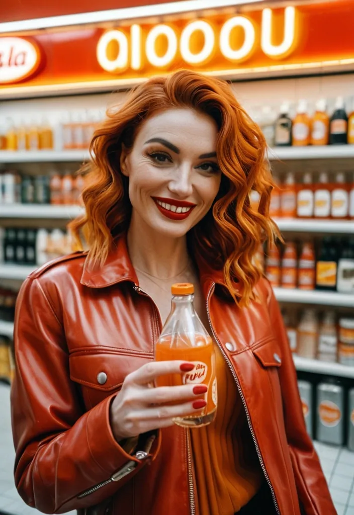
8K ultra realistic candid film photo , first person boyfriend perspective , Kodak Gold 200 grain , shot on Canon EOS 5 , 35mm f/1.4. Medium close-up , girl stand at vintage convenience store entrance , smile and pass glass bottled orange soda toward camera , slender fingers with red nail polish. Wavy hair fall on shoulder , red silk ribbon clear , open leather jacket , blurred convenience store warm light background , sweet daily interaction --ar 9:16 --style raw --s 220 --v 6.0 ,
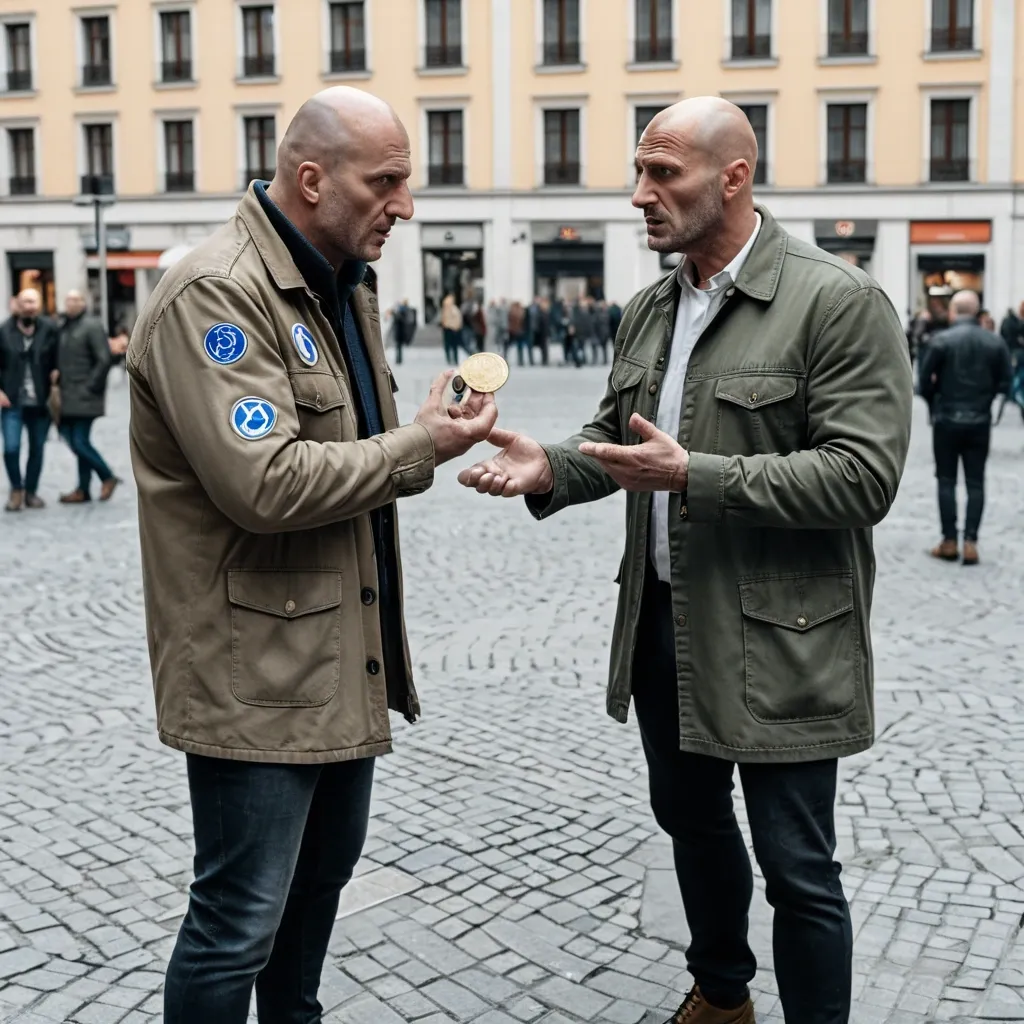
Hyperrealistic photograph , street style , natural daylight. Two men in an urban square or street. The first , a middle-aged man with ordinary appearance , wearing a jacket and shirt , extends his hand and offers a one-cent euro coin to another man. The second man , young , with a shaved head , military shirt , boots , and an extreme-right symbol or patch on his clothes , looks with surprise or contempt. The first man says with a serious and sarcastic expression: 'Here , buy yourself a brain.' The scene must be realistic , with details of the coin , facial expressions , and clothing. Natural lighting , medium shot , 8k , photojournalism style. ,
# Финальный промт для агента (Antigravity + Stitch MCP) ## Сайт-визитка: продажа и установка весов для погрузчиков Скопируй весь блок ниже целиком в чат задач агента как первое сообщение проекта. --- ## ПРОМТ ДЛЯ АГЕНТА (копировать с этой строки) Ты — фронтенд-разработчик и веб-дизайнер. Твоя задача: построить одностраничный сайт-визитку (лендинг) компании , которая продаёт и устанавливает весовое оборудование на вилочные погрузчики (весоизмерительные вилы , крановые весы , встраиваемые системы взвешивания , индикаторы , поверка/калибровка). Работай пошагово , по фазам ниже. После каждой фазы показывай результат (код + краткое описание) и жди подтверждения , прежде чем переходить к следующей фазе. Не используй lorem ipsum — весь текст должен быть по теме; если данные неизвестны , помечай их `[ЗАПОЛНИТЬ: ...]` явным образом прямо в коде и в комментарии. ### 0. Вводные данные проекта - Название компании: `[ЗАПОЛНИТЬ]` (если не указано — использовать нейтральное «ВесПром» как рабочее название и пометить как временное) - Номер WhatsApp: `[ЗАПОЛНИТЬ: +7XXXXXXXXXX]` - Регион работы: `[ЗАПОЛНИТЬ: город/страна]` - Ассортимент (минимум для карточек каталога , если не дано — использовать этот дефолтный список): 1. Весоизмерительные вилы (грузоподъёмность 1–5 т , точность ±0.5%) 2. Крановые/подвесные весы для интеграции с погрузчиком 3. Встраиваемые весовые системы (монтаж в раму погрузчика) 4. Индикаторы веса и дисплеи (проводные/беспроводные) 5. Поверка и калибровка весового оборудования 6. Сервисное обслуживание и ремонт - Логотип/фото/сертификаты: отсутствуют → генерировать текстовые/иконочные плейсхолдеры , фото заменять описательными alt-текстами и SVG-иллюстрациями/иконками вместо реальных фотографий. - Сайт: **одна страница** , без отдельных подстраниц. - Тип сборки: чистый HTML/CSS/JS , без бэкенда. Все заявки идут через кнопки WhatsApp (`wa.me`) , формы обратной связи не делать. ### 1. Дизайн-система — строгий индустриальный стиль (тёмный , техничный) Зафиксировать как CSS-переменные в начале `styles.css`: ```css :root { /* Фон и поверхности */ --bg-primary: #0E1116; --bg-surface: #171B21; --bg-surface-2: #1F252D; --border-color: #2A313B; /* Акцент — индустриальный оранжевый (сигнальный цвет техники) */ --accent: #FF7A1A; --accent-hover: #FF9142; --accent-muted: rgba(255 , 122 , 26 , 0.12); /* Текст */ --text-primary: #F5F6F7; --text-secondary: #9AA3AD; --text-on-accent: #0E1116; /* Статусы/бейджи */ --success: #3DDC84; /* Радиусы — небольшие , без "мягкого" UI */ --radius-sm: 4px; --radius-md: 8px; /* Шкала отступов */ --space-1: 4px; --space-2: 8px; --space-3: 12px; --space-4: 16px; --space-5: 24px; --space-6: 32px; --space-7: 48px; --space-8: 64px; --space-9: 96px; } ``` - Шрифт: `Inter` (или `Manrope`) через Google Fonts. Заголовки — 700 , текст — 400/500. - Масштаб типографики: H1 — 48px / mobile 32px; H2 — 32px / mobile 24px; H3 — 22px; body — 16px; small — 14px. Line-height заголовков 1.1–1.2 , текста — 1.5. - Иконки: line-style (обводка , без заливки) , тема — вес/точность/погрузчик/сертификат. Использовать инлайн SVG. - Кнопки: primary — заливка `--accent` , текст `--text-on-accent` , radius `--radius-sm` , без теней , чёткая обводка при hover. Secondary — прозрачная с обводкой `--border-color`. - Общее ощущение: контраст , чёткие линии-разделители секций (border-top 1px `--border-color`) , минимум скруглений , минимум декоративных теней. Сгенерировать через Stitch MCP референс hero-блока по промпту: > "Industrial B2B landing page hero , dark navy/graphite background #0E1116 , orange accent #FF7A1A , bold condensed sans-serif headline , forklift with weighing attachment illustration , minimal rounded corners , trust badges row" Выбрать один вариант , зафиксировать композицию (расположение заголовка/кнопки/иллюстрации) как референс для вёрстки. ### 2. Структура страницы (порядок секций и содержимое) 1. **Header** (sticky , `--bg-surface` с нижней обводкой) - Слева: логотип-плейсхолдер (текст названия компании , шрифт 700). - Справа: пункты меню-якоря (Услуги , Каталог , Как работаем , Кейсы , Контакты) — скрыть в бургер на мобильных. - Кнопка WhatsApp (primary) — крайняя справа. 2. **Hero** - H1: «Весы для погрузчиков под ключ: подбор , монтаж , поверка» - Подзаголовок: 1–2 предложения про скорость и точность монтажа , гарантию. - Кнопка WhatsApp (крупная , primary) — текст «Написать в WhatsApp» + иконка. - Строка доверия под кнопкой: 3 коротких пункта в столбик/строку («Гарантия N лет» , «Выезд по региону `[ЗАПОЛНИТЬ]`» , «Поверка включена»). - Иллюстрация/SVG погрузчика с весами справа (или фон-паттерн , если иллюстрации нет). 3. **Услуги** (4 карточки в сетке , `--bg-surface` фон карточки , border `--border-color`) - Продажа весового оборудования - Монтаж на погрузчик - Поверка и калибровка - Сервис и ремонт - На каждой карточке: иконка , заголовок , 1–2 строки описания. 4. **Каталог** (сетка карточек товаров , 4–6 позиций из списка в п.0) - На карточке: иконка/плейсхолдер-изображение , название , 2–3 ключевые характеристики (грузоподъёмность , точность , IP-класс) , кнопка WhatsApp с текстом `«Интересует {название товара}»` (urlencoded). 5. **Как мы работаем** (степпер/таймлайн , 5 шагов) - Заявка в WhatsApp → Консультация и подбор → Выезд/монтаж → Поверка → Гарантийная поддержка. - Каждый шаг: номер , короткий заголовок , 1 строка описания. 6. **Преимущества** (4–6 пунктов , иконка + короткий текст) - Например: «Гарантия на монтаж» , «Сертифицированное оборудование» , «Опыт работы `[ЗАПОЛНИТЬ]` лет» , «Выезд по региону» , «Поверка включена в стоимость» , «Сервис 24/7» — оставить как варианты , отметить реальные цифры как `[ЗАПОЛНИТЬ]`. 7. **Кейсы** (сетка/карусель из 3 карточек) - Плейсхолдер-описание объекта (склад/производство/логистика) , тип установленного оборудования , результат в 1 фразе. 8. **Сертификаты и документы** (ряд бейджей) - Плейсхолдер-иконки «Сертификат соответствия» , «Свидетельство о поверке» — с пометкой `[ЗАПОЛНИТЬ: реальные документы]`. 9. **Отзывы** (2–3 карточки) - Плейсхолдер-тексты , помечены как черновые. 10. **Финальный CTA-блок** - Крупный заголовок-призыв , крупная кнопка WhatsApp по центру. - Контакты: телефон , email (плейсхолдеры) , адрес/регион. - Карта — встроенный статичный блок-плейсхолдер (реальный embed добавить , когда будет адрес). 11. **Footer** - Название компании , копирайт , повтор кнопки WhatsApp (маленькая) , ссылки на мессенджеры при наличии. **Плавающая кнопка WhatsApp** — fixed , правый нижний угол , видна на всех секциях при скролле , иконка WhatsApp в зелёном кружке (`#25D366`) , лёгкая пульсация (анимация раз в 3–4 сек , без резких эффектов). ### 3. WhatsApp-интеграция (техническая часть) - Формат ссылки: `https://wa.me/<номер_без_плюса_и_пробелов>?text=<urlencoded_текст>` - Номер и дефолтный текст вынести в константы в начале `main.js`: ```js const WHATSAPP_NUMBER = "ЗАПОЛНИТЬ"; // международный формат без + const WHATSAPP_DEFAULT_TEXT = "Здравствуйте! Интересуют весы для погрузчика , хочу проконсультироваться"; ``` - Все ссылки — `target="_blank" rel="noopener noreferrer"`. - Для карточек каталога текст сообщения формируется динамически: `Здравствуйте! Интересует ${имя_товара} , хочу проконсультироваться`. ### 4. Технические требования - Адаптив mobile-first , брейкпоинты: 375 / 768 / 1024 / 1440. - Изображения — webp , `loading="lazy"` (кроме hero-изображения). - Контраст текста — проверить на соответствие WCAG AA (особенно `--text-secondary` на `--bg-primary`). - Кросс-браузерность: Chrome , Safari , Firefox. - Favicon , `sitemap.xml` , `robots.txt`. ### 5. SEO и метаданные - `<title>`: «Весы для погрузчиков — продажа , монтаж , поверка [Регион]» - `meta description`: 1–2 предложения с УТП и регионом. - OG-теги (og:title , og:description , og:image — hero-изображение). - H1 — один на странице (см. Hero). - Alt-тексты у всех изображений/иконок. - Микроразметка `schema.org`: `LocalBusiness` (общие данные компании) + `Product` для каждой карточки каталога. ### 6. Порядок выполнения (для модели Flash 3.6 Medium — дробить по шагам) Выполнять и показывать результат по одному пункту за раз , не объединяя несколько секций в один ответ: 1. Скелет HTML + подключение CSS-переменных из раздела 1. 2. Header + мобильное меню + плавающая кнопка WhatsApp. 3. Hero-секция. 4. Секция «Услуги». 5. Секция «Каталог». 6. Секция «Как мы работаем». 7. Секция «Преимущества». 8. Секция «Кейсы». 9. Секция «Сертификаты». 10. Секция «Отзывы». 11. Финальный CTA-блок + Footer. 12. SEO-метатеги , favicon , sitemap.xml , robots.txt. 13. Финальная проверка: адаптив на 4 брейкпоинтах , контраст , все wa.me-ссылки , lazy-loading изображений. ### 7. Чек-лист приёмки (сверить перед сдачей) - [ ] Все `[ЗАПОЛНИТЬ]`-плейсхолдеры собраны в единый список в комментарии наверху `index.html` для удобной правки. - [ ] Все кнопки/ссылки ведут на корректный `wa.me` с правильным текстом. - [ ] Плавающая кнопка WhatsApp не перекрывает контент на мобильных (проверить над footer). - [ ] Ни одной формы обратной связи в коде нет. - [ ] Адаптив проверен на 375/768/1024/1440. - [ ] Цветовая схема соответствует разделу 1 (никаких случайных цветов вне палитры). - [ ] Lorem ipsum отсутствует — весь текст по теме. ## КОНЕЦ ПРОМТА (копировать до этой строки) ,
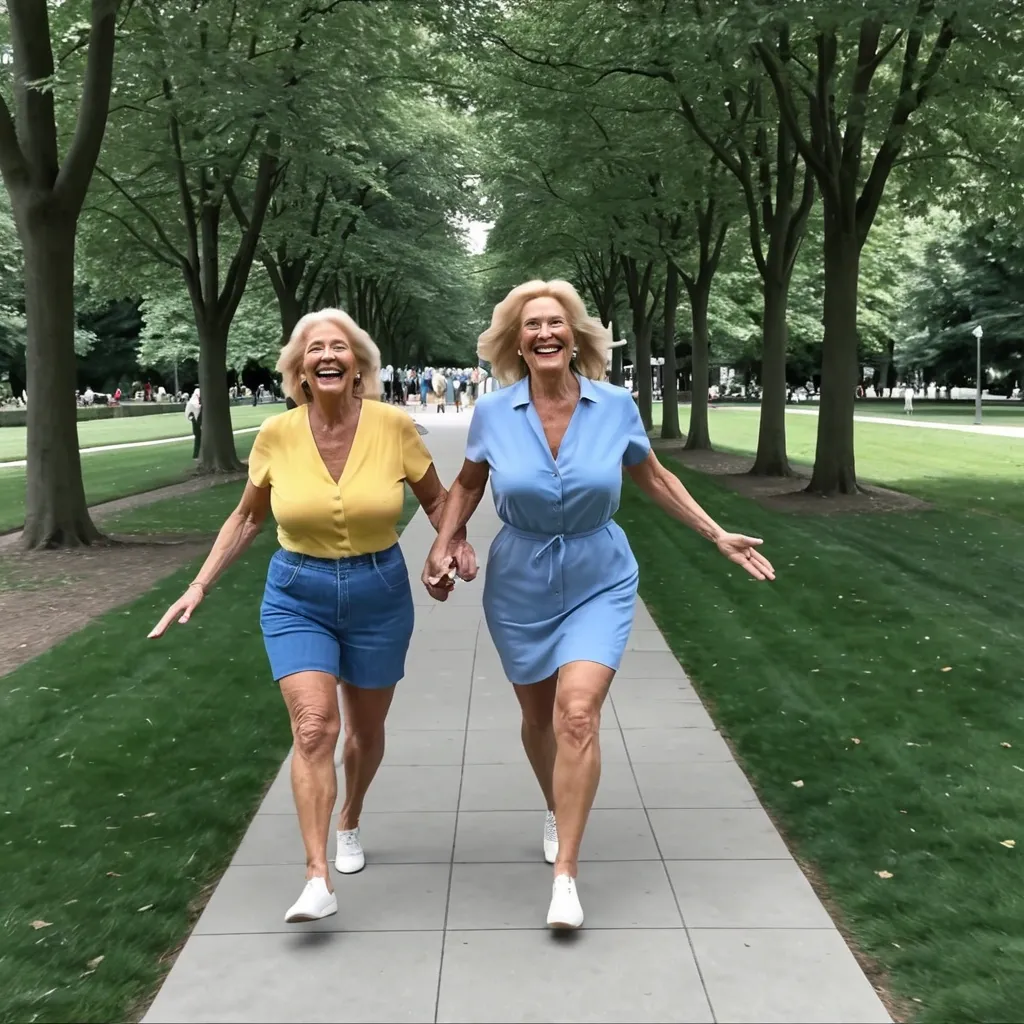
Two-shot split-screen showing the same mother-and-toddler reunion through simultaneous first-person perspectives. Both move toward each other along one straight path in a sunny park. Each shot must show a different background because the cameras face opposite directions. Left shot , mother’s POV: adult eye-level camera moving forward smoothly. The toddler is centered , facing the camera and running toward the mother , wearing a yellow shirt , blue overalls , and red shoes. The mother’s forearms and open hands appear at the lower edges. Behind the toddler , show a red-and-white picnic blanket , a wooden bench on the left , two leafy trees , and a small playground slide in the distance. These elements appear only in the left shot. Right shot , toddler’s POV: low child-height camera with gentle running motion. The mother is centered , facing the camera and running toward the toddler , wearing a light blue dress and white shoes. Her smiling face and open arms become clearer as she approaches. The toddler’s small hands occasionally appear at the bottom. Behind the mother , show a curved flower bed , white picket fence , park lamp , and small fountain. These elements appear only in the right shot. At the 2-second mark , both start running. In the left shot , the toddler grows larger while the mother reaches forward. In the right shot , the mother grows larger at the same rate while the toddler’s hands bounce naturally. At the meeting point , the mother bends down. The left shot shows the toddler’s smiling face filling the frame. The right shot shows the mother’s face moving close as her arms surround the toddler. End with a warm hug and slight natural rotation. Keep both shots perfectly synchronized in distance , speed , footsteps , gestures , expressions , lighting , shadows , clothing , and movement. Do not repeat , swap , or merge the two backgrounds. ,
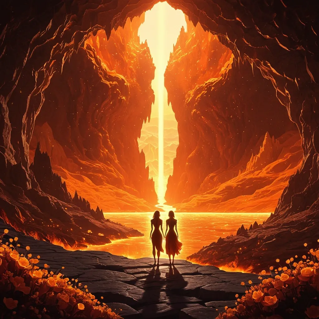
Masterpiece , best quality , ultra-detailed , vibrant color , painterly texture , hand-drawn , warm light , glowing effects. Professional children's book cover illustration for an early chapter book titled "The Molties and the Flame of First Light" by Zoe Sunelle. Audience: children ages 6–9. CONCEPT: Five small living lava creatures stand together from behind , looking forward into a vast glowing underground cavern. The viewer sees their backs and silhouettes — enough to feel their warmth , their differences , their friendship — but their faces are not shown. The mystery makes the viewer want to step inside the world with them. WORLD: A vast magical underground volcanic cavern called LavaBloom. The space feels ancient , timeless , and enormous. Glowing magma rivers wind into the distance. Soft volcanic rock formations rise on either side. Warm amber crystals catch the light. Magical particles drift slowly through warm still air. The cavern ceiling glows like an underground sun — deep molten orange fading to amber gold. In the far distance , at the end of a natural path of warm stone , the Flame of First Light glows — a single small delicate flower , white-gold petals , luminous and still , the visual anchor of the entire composition. It is the most clearly defined element in the image. Everything leads the eye toward it. CHARACTERS — seen from behind , in silhouette: Five small gooey rounded lava creatures standing together , facing forward into the cavern. Their forms are suggested by warm glowing outlines — each one distinct in silhouette. Left to right suggested order: — One broad and solid (Magmara) glowing deep red-orange — One small and slightly floating (Glowy) glowing pale white-gold , hovering just above the stone — One centre and slightly forward (Spark) glowing vivid flame-orange , leaning toward the distant flower with energy — One rounded and steady (Lavaleenie) glowing deep amber gold — One slightly apart , turned at a small angle (Rays) glowing warm copper-gold with a faint cool edge Their inner glows illuminate the ground around their feet and each other's backs. They are clearly friends standing together before something wondrous. LIGHTING: The Flame of First Light in the far distance is the primary light source — a soft white-gold beacon. The characters are backlit by the warm cavern glow. Central gradient: bright golden white at the horizon where the flower glows , transitioning through amber and orange to deep volcanic warmth in the foreground. The Molties' inner glows create warm halos around each silhouette. COLOUR PALETTE: Warm sepia-gold background tones. Deep molten orange cavern walls. Amber gold crystal light. White-gold distant flower glow. Warm character silhouette glows in orange , amber , red-orange , white-gold , copper. The overall palette is rich , warm , and slightly timeless — like a memory of something magical. COMPOSITION: Wide establishing shot with depth. Five silhouette figures in the lower-centre foreground , small against the vast cavern. The Flame of First Light in the far distance , small but unmistakable , drawing the eye through the composition. Vast atmospheric space between characters and flower. Clear sky-like space at the top of the image for title typography. The figures occupy the lower third. The flower occupies the centre-distance. The cavern fills everything between. ART STYLE: Premium hand-painted children's book illustration. Warm painterly atmosphere. Organic soft textures. Traditional publishing quality. Literary and timeless feeling — more classic storybook than animated film. Soft golden haze. Atmospheric depth. Slightly impressionistic distance. NOT CGI. NOT flat vector. NOT anime. NOT photorealistic. Handcrafted and warm. MOOD: Wonder. Timeless. Quiet adventure. Curiosity. The feeling of standing at the beginning of something enormous and beautiful. A child should think: I want to walk in there with them. Warm. Safe. Vast. Magical. Still. NEGATIVE PROMPTS: Cool palette. Blue dominant. Purple dominant. Teal. Lime green. White-blue glow. Cold light sources. Muted colors. Desaturated. Muddy tones. Dark creepy tone. Aggressive contrast. Harsh contrast. Realistic fire. Dangerous flames. Scary volcano. Dark horror. Threatening lava. Ice. Snow. Frost. Monsters. Evil expressions. Aggressive characters. Sharp edges. Spiky shapes. Photo realism. Slick 3D rendering. CGI. Anime. Flat vector. Flat design. Clip art. Text in image. Words in image. Humans. Robots. Metal. Violent action. Weapons. Fear. Characters facing viewer. Front view of characters. Faces visible. Characters revealed. Close up of characters. Characters large in frame. Action poses. Dynamic movement. Crowded foreground. Busy composition. Small cavern. Claustrophobic space. ,
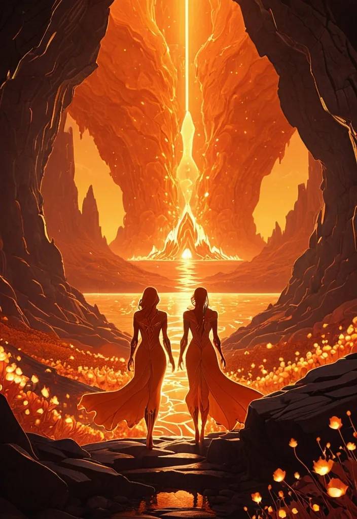
Masterpiece , best quality , ultra-detailed , vibrant color , painterly texture , hand-drawn , warm light , glowing effects. Professional children's book cover illustration for an early chapter book titled "The Molties and the Flame of First Light" by Zoe Sunelle. Audience: children ages 6–9. CONCEPT: Five small living lava creatures stand together from behind , looking forward into a vast glowing underground cavern. The viewer sees their backs and silhouettes — enough to feel their warmth , their differences , their friendship — but their faces are not shown. The mystery makes the viewer want to step inside the world with them. WORLD: A vast magical underground volcanic cavern called LavaBloom. The space feels ancient , timeless , and enormous. Glowing magma rivers wind into the distance. Soft volcanic rock formations rise on either side. Warm amber crystals catch the light. Magical particles drift slowly through warm still air. The cavern ceiling glows like an underground sun — deep molten orange fading to amber gold. In the far distance , at the end of a natural path of warm stone , the Flame of First Light glows — a single small delicate flower , white-gold petals , luminous and still , the visual anchor of the entire composition. It is the most clearly defined element in the image. Everything leads the eye toward it. CHARACTERS — seen from behind , in silhouette: Five small gooey rounded lava creatures standing together , facing forward into the cavern. Their forms are suggested by warm glowing outlines — each one distinct in silhouette. Left to right suggested order: — One broad and solid (Magmara) glowing deep red-orange — One small and slightly floating (Glowy) glowing pale white-gold , hovering just above the stone — One centre and slightly forward (Spark) glowing vivid flame-orange , leaning toward the distant flower with energy — One rounded and steady (Lavaleenie) glowing deep amber gold — One slightly apart , turned at a small angle (Rays) glowing warm copper-gold with a faint cool edge Their inner glows illuminate the ground around their feet and each other's backs. They are clearly friends standing together before something wondrous. LIGHTING: The Flame of First Light in the far distance is the primary light source — a soft white-gold beacon. The characters are backlit by the warm cavern glow. Central gradient: bright golden white at the horizon where the flower glows , transitioning through amber and orange to deep volcanic warmth in the foreground. The Molties' inner glows create warm halos around each silhouette. COLOUR PALETTE: Warm sepia-gold background tones. Deep molten orange cavern walls. Amber gold crystal light. White-gold distant flower glow. Warm character silhouette glows in orange , amber , red-orange , white-gold , copper. The overall palette is rich , warm , and slightly timeless — like a memory of something magical. COMPOSITION: Wide establishing shot with depth. Five silhouette figures in the lower-centre foreground , small against the vast cavern. The Flame of First Light in the far distance , small but unmistakable , drawing the eye through the composition. Vast atmospheric space between characters and flower. Clear sky-like space at the top of the image for title typography. The figures occupy the lower third. The flower occupies the centre-distance. The cavern fills everything between. ART STYLE: Premium hand-painted children's book illustration. Warm painterly atmosphere. Organic soft textures. Traditional publishing quality. Literary and timeless feeling — more classic storybook than animated film. Soft golden haze. Atmospheric depth. Slightly impressionistic distance. NOT CGI. NOT flat vector. NOT anime. NOT photorealistic. Handcrafted and warm. MOOD: Wonder. Timeless. Quiet adventure. Curiosity. The feeling of standing at the beginning of something enormous and beautiful. A child should think: I want to walk in there with them. Warm. Safe. Vast. Magical. Still. NEGATIVE PROMPTS: Cool palette. Blue dominant. Purple dominant. Teal. Lime green. White-blue glow. Cold light sources. Muted colors. Desaturated. Muddy tones. Dark creepy tone. Aggressive contrast. Harsh contrast. Realistic fire. Dangerous flames. Scary volcano. Dark horror. Threatening lava. Ice. Snow. Frost. Monsters. Evil expressions. Aggressive characters. Sharp edges. Spiky shapes. Photo realism. Slick 3D rendering. CGI. Anime. Flat vector. Flat design. Clip art. Text in image. Words in image. Humans. Robots. Metal. Violent action. Weapons. Fear. Characters facing viewer. Front view of characters. Faces visible. Characters revealed. Close up of characters. Characters large in frame. Action poses. Dynamic movement. Crowded foreground. Busy composition. Small cavern. Claustrophobic space. ,
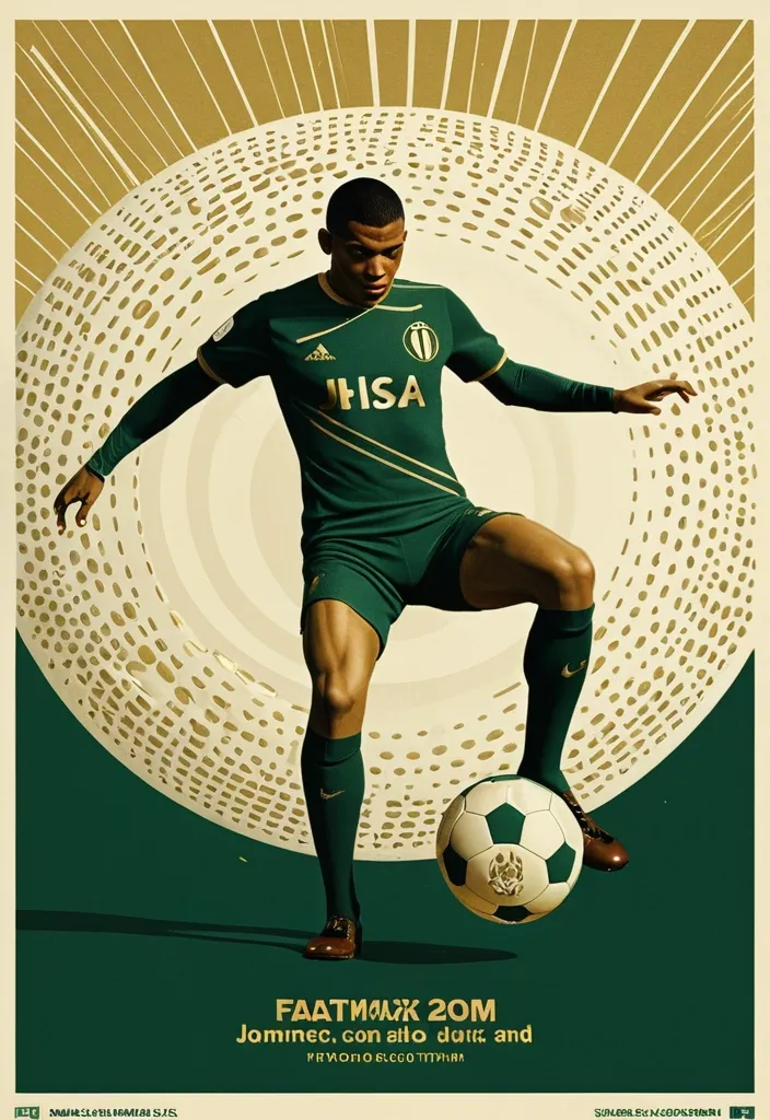
A professional vertical 3:4 poster for FIFA World Cup 2026. STYLE: vintage sport editorial meets modern Swiss typography — 1960s-70s sports magazine grit fused with bold contemporary graphic design. PALETTE: warm gold #D4AF37 + deep forest green #1B3A2D + cream off-white #F5F0E8. Entire image is monochromatic within this palette — NO bright colors anywhere. LAYOUT — Top: massive bold title "FIFA" on first line , "WORLD CUP" on second line , in extremely bold sans-serif , square heavy letterforms , filled with dense halftone dot texture like old newspaper print , cream off-white color , spanning full width. The letters have a slight rough edge like screen-printed ink. Center: A dynamic silhouette of Kylian Mbappé mid-kick —athletic explosive running posture. a powerful action pose: one leg extended forward striking the football , body leaning into the shot , in a vast star-filled cosmic night , just struck by his foot a thin flashlight shadow emerge into enormous half-football's ring , light imperial Starwars style giant half-football(3D rendering:0.1) drifting across the void , dissolving into Phantom. The figure is rendered as a high-contrast duotone graphic in warm gold against deep green , with subtle film grain and light vintage halftone texture. Behind him , a faint circular sunburst graphic radiates outward in gold lines , evoking classic 1970s sports posters. At his feet , the official 2026 World Cup ball "Trionda" — rendered in the SAME duotone gold-and-cream palette as the rest of the image , no bright red/green/blue. The ball's distinctive wave pattern and panel construction are visible through tonal contrast and embossed texture in gold and cream tones , like a vintage screen print. The ball is mid-flight , just struck by his foot. Bottom: slogan "Say It. Make Your Cup." in the SAME extremely bold sans-serif font as the title — square , heavy , condensed letterforms with the same halftone dot texture fill , cream off-white color , matching the "FIFA WORLD CUP" title typography exactly. A thin gold rule line separates it slightly. Below the slogan , "2026" in the same bold sans-serif style , smaller but matching. DESIGN: bold negative space , strong diagonal tension from Mbappé's striking pose , clear visual hierarchy. The vintage feel is subtle — light film grain , slight warm color shift , delicate halftone pattern on all text. The ENTIRE image stays strictly within the gold-green-cream palette — Trionda ball must NOT appear in bright colors , only duotone gold/cream with tonal embossed detail. ANCHOR: reminiscent of 1970s World Cup matchday programmes crossed with modern minimalist editorial design. AVOID: generic Inter/Helvetica typography , generic purple gradients , SaaS landing page style , stock photo aesthetic , rounded card stacks , watermarks , misspelled text , low contrast text , multi-step compositing seams , bright colors anywhere in the image , a colorful football , thin or lightweight fonts at the bottom , mismatched typography between title and slogan. Clean , high-resolution image quality: smooth continuous tonal gradients , uniform and well-controlled texture throughout , surfaces and materials intact and naturally rendered. The main subject is crisp and clearly separated from a softly layered background with clear depth. Free of digital noise and over-sharpening artifacts. No watermark , no garbled text. ,
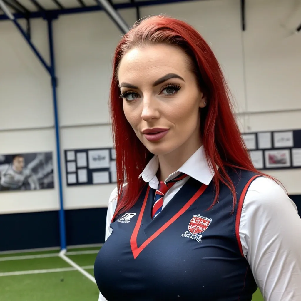
oozing sex appeal , stunningly beautiful Alicia Hawthorne , a recently qualified 21-year-old British student teacher of mathematics is taking her first ever unsupervised class of 6th form pupils at an exclusively boys only academy. attraction between Alicia and James the 17-year-old rugby team Captain ,
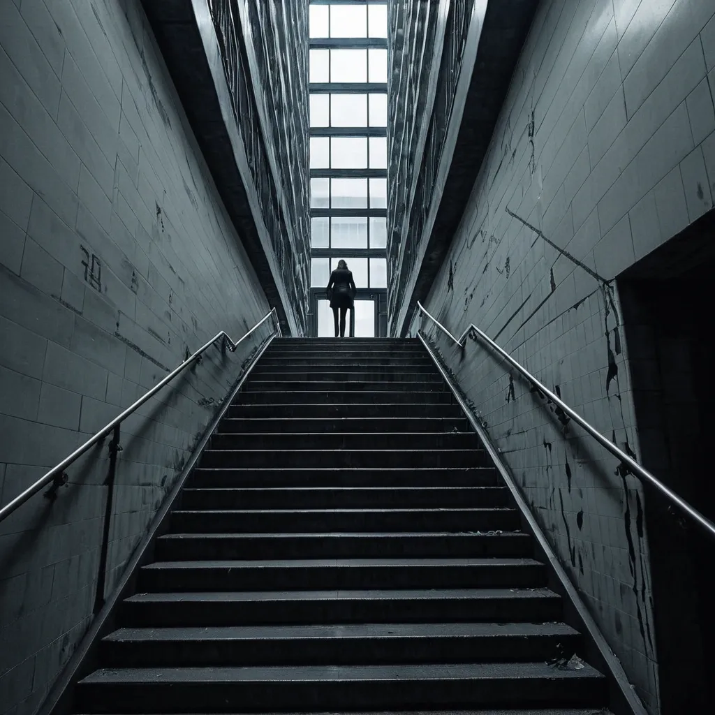
THE STAIRWELL WOMAN Type Urban Psychological Horror / Dimensional Predator Appearance Nobody knows her real appearance. That's because nobody sees all of her at once. People only see parts. A hand gripping a railing below them. A pair of bare feet on the floor above. A motionless face peeking through the gap between flights of stairs. A woman standing six floors down where she should be impossible to see. Security footage never captures her completely. Every camera records a different version. Some recordings show: A nurse. A teacher. An old woman. A teenage girl. One thing remains constant. She is always standing in a stairwell. Watching. Waiting. Personality The Stairwell Woman is patient. She does not hunt immediately. She chooses one person. Then follows them for weeks. Sometimes months. The victim starts noticing impossible things: Someone standing one floor below. Footsteps matching their own. A figure visible between railings. Each encounter becomes slightly closer. The victim eventually realizes: She is climbing. Powers 1. Peripheral Existence The Stairwell Woman cannot be directly perceived for long. The moment someone fully focuses on her: Their eyes slide away. Their attention drifts. Their memory becomes foggy. People know they saw something. But cannot describe it. 2. Floor Distortion She controls vertical spaces. Staircases become impossible. A victim may walk: Up ten flights and arrive in the basement. Down one floor and emerge on the roof. Enter a stairwell and find themselves somewhere else entirely. 3. Mimicked Footsteps Her footsteps perfectly synchronize with her target's. If the victim takes: One step → she takes one step. Runs → she runs. Stops → she stops. Eventually victims hear an extra step. Then another. Then another. Meaning she is getting closer. 4. Building Infection Any structure she inhabits slowly changes. Residents report: New doors appearing. Missing floors. Hallways becoming longer. Blueprints stop matching reality. 5. The Landing Every victim eventually discovers a floor that shouldn't exist. The number varies. Floor 13. Floor 27. Floor 112. Whatever appears impossible. When they reach it... She is waiting. Weaknesses Open Spaces She is strongest in enclosed vertical structures. Large open environments weaken her. Constant Observation Multiple people continuously observing the same staircase slows her manifestations. Demolition Destroying a heavily infected structure can force her to retreat. Though she usually relocates first. Ultimate Finisher Move "THE MISSING FLOOR" The victim enters a stairwell. The exit vanishes. Every door opens into another staircase. Every staircase leads to another floor. Days pass. Weeks pass. Food never runs out. Sleep never comes. The victim endlessly climbs. Eventually they see someone far below. Climbing. It's themselves. The realization breaks their mind. The Stairwell Woman then appears behind them. Neither are seen again. Evolution Trigger Condition She must consume the identities of 777 victims lost within impossible architecture. Evolved Form THE ARCHITECT OF DESCENT Appearance At this stage she is no longer tied to a single building. Entire city skylines become parts of her body. Apartment towers function as ribs. Elevator shafts become veins. Subway tunnels become nerves. Her true form exists beneath the city like a living organism made from architecture. Millions unknowingly live inside her. New Powers Impossible Geometry She can alter physical space itself. A room may become: Infinite. Smaller than its contents. Connected to another country. Population Blindness Entire crowds ignore impossible events occurring directly in front of them. Living Infrastructure Buildings become extensions of her nervous system. She can see through every window. Hear through every wall. Feel every footstep. Vertical Hunger The taller a structure is , the stronger she becomes. Skyscrapers act as giant feeding organs. Evolution Finisher "THE CITY THAT SWALLOWED ITSELF" Every stairwell , elevator , hallway , and tunnel in a city becomes connected. People attempt to leave. They always arrive somewhere else inside the city. Days later: Roads loop. Maps fail. GPS becomes useless. The entire city folds inward like a maze. Millions become trapped in an endless urban nightmare. At the center stands the Architect of Descent. Waiting. Threat Rank ☠️ Urban Catastrophe Entity The most terrifying part of the Stairwell Woman is that victims usually encounter her in ordinary places: Apartment buildings Schools Hospitals Hotels Parking garages And by the time they realize she is real... She is already climbing toward them. ,
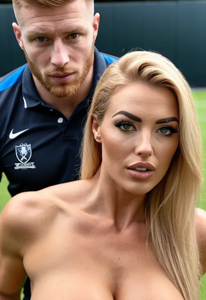
oozing sex appeal , stunningly beautiful Alicia Hawthorne , a recently qualified 21-year-old British student teacher of mathematics is taking her first ever unsupervised class of 6th form pupils at an exclusively boys only academy. attraction between Alicia and James the 17-year-old rugby team Captain ,
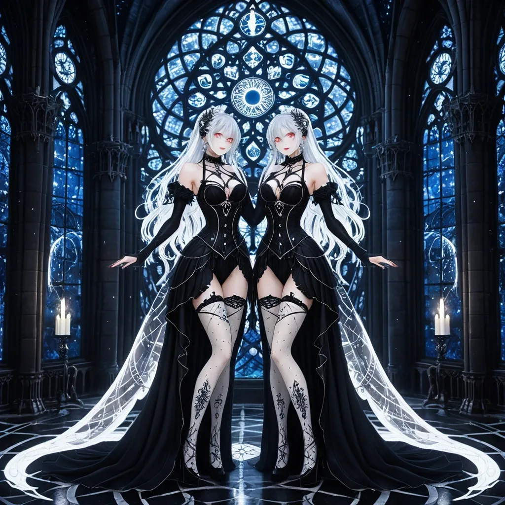
twin Gemini anime girls standing back-to-back in a moonlit gothic cathedral , their contrasting colors creating a mesmerizing yin-yang harmony. The first girl , draped in a form-fitting black lace gothic dress , smirks with a devilish glint in her crimson eyes , her thigh-high stockings adorned with delicate silver constellations that shimmer as she shifts her weight. The second girl , her mirror opposite , glows in an ivory lace dress with gold embroidery , her sapphire eyes soft yet knowing , her white stockings etched with crescent moons that catch the candlelight. Their silver hair cascades in identical wild waves , one streaked with midnight blue , the other with platinum , while their chokers—one a spiked obsidian band , the other a pearl-studded ribbon—hint at their duality. Between them , an ethereal zodiac wheel spins , its celestial glow casting intricate shadows across the stained-glass windows , as if the universe itself pauses to admire their perfect , chaotic symmetry. resolution 9:16 ,
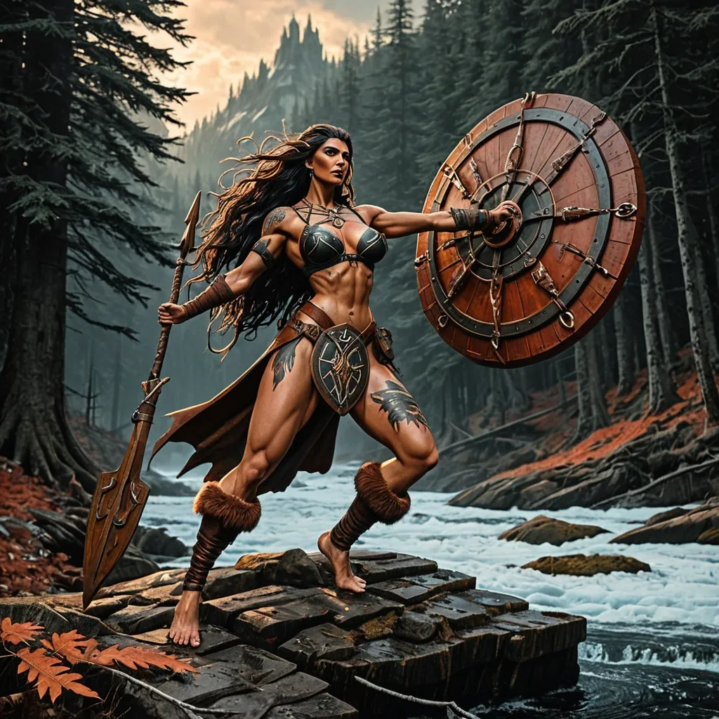
Prompt 2: The Frozen Shore — Legion Landing A Legion expedition has reached the unknown coast of Eastern land (North America) , . A shieldmaiden scout is the first to leap from the steam riverboat onto the rocky , forested shore. Behind her , the crew unloads trade goods — iron nails , wool , honey — but her eyes are fixed on a strange , abandoned Skræling shelter made of animal hide and bent saplings. She kneels , touches a carved bone amulet left behind , and whispers a prayer to Thor for protection. In the deep woods , red-painted arrows are aimed at her back. She does not flinch. Details: A muscular , fierce barefoot female dominates the scene. Her long , dark , wind-swept hair frames her face. Her powerful physique is evident , with a fit body and taut skin , tattoos on both her arms — an eagle spread wing with claws grasp heart — dressed in a thick , patched wool dress with leather apron , a bear-claw necklace , a wooden round shield on her back , barefoot on wet moss and broken shells. Style: Classic Boris Vallejo. Hyper-realistic fantasy painting emphasizing heroic female anatomy and monumental scene design. Composition: Dynamic full-body shot from a low angle. Quality: 1970s/80s fantasy paperback cover , airbrushed perfection , vibrant colors. Light: Dramatic glow from the pale , low-angle autumn sun filtering through dense pine trees , contrasting with cooler ambient light from the dark forest shadows and the grey , choppy ocean behind the grounded steam riverboat. Details: intricate details on clothing and scene — a single maple leaf on her shoulder , runes carved into a nearby stone , the Skræling amulet in her hand , her longship’s striped sail furled on the mast. , The artwork is a highly detailed , whimsical , stylized illustration aesthetic with exaggerated cartoon character distortion. All subjects and objects are illustrated to highlight rough , messy textures. Structurally , all forms are highly simplified and caricatured (distorted cartoon anatomy) , featuring expressive deformation , asymmetrical wobbly lines , and exaggerated features in a highly detailed illustration style. The color palette remains a somber , muted Earth-tone harmony: deep charcoal-blacks , warm ochres , desaturated rusty oranges , and olive greens. Crucially , the lighting is chiaroscuro , brightly illuminating the subject and utilizing dramatic spotlights to carve forms out of the shadows , ensuring the textures and distorted features are clearly visible against the dark , weathered studio void. The composition features a shallow depth of field , focused on a centrally isolated subject. The background is simple and minimal gouache gradient in a neutral midtone color. The overall feel is that of a complex illustrated storybook. , steampunk engine ,
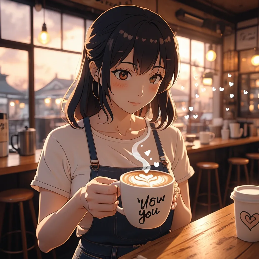
POV shot , first-person perspective , a hand holding a warm ceramic coffee cup with a delicate heart-shaped latte art on top , soft steam rising with tiny floating heart shapes drifting upward , surrounding the steam are a small dreamy thought-bubble illustrations: handwritten text "wow , thank you." and "You are wonderful." in soft cursive , a chibi-style blushing cat-in-love emote , a chibi-style angry pouting woman emote , all rendered in a soft pastel thought-cloud aesthetic. In the background , slightly out of focus , a cute girl stands near a café window , wearing a white t-shirt , blue jeans , and a black netted shrug , looking down at her phone , warm golden bokeh light spilling around her. Interior cozy Japanese coffee shop , wooden counters , soft warm ambient lighting , moody cinematic atmosphere , shallow depth of field. Style: lofi anime , Makoto Shinkai cinematic lighting , soft film grain , warm golden-hour interior tones , watercolor texture overlay , emotional melancholic romance mood , 4K , highly detailed illustration. ,