Search Results for Fresh coriander leaves
Explore AI generated designs, images, art and prompts by top community artists and designers.
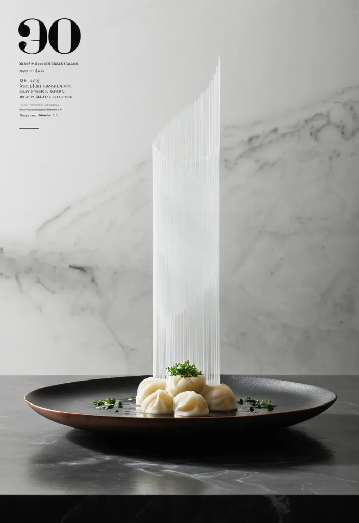

Vertical 4:5 editorial food poster featuring a single plate of handmade steamed Sev Usal arranged on a dark hammered ceramic dish over a charcoal stone countertop. The composition is centered and highly architectural. A tall column of hot vapor rises directly above the Sev Usal and becomes the dominant graphic element. Instead of soft , fluffy steam , shape the vapor into layered translucent sheets , geometric folds , vertical planes , and overlapping glass-like structures , creating the feeling of an architectural monument built from heat. Only the chef’s hands and forearms are visible. One arm enters naturally from the upper left in a clean ivory chef sleeve , delicately dropping Fresh coriander leaves onto the Sev Usal. suggesting the dish has just been served. No face or full human figure. The background is a flattened matte charcoal kitchen wall with minimal detail. Include only one functional object in the distance: a warm brushed-copper saucepan , softly out of focus. Use a restrained palette of charcoal black , warm ivory , stone gray , muted copper , soft bamboo brown , and fresh herbal green. Dramatic directional restaurant lighting creates sculptural highlights on the dumplings , realistic moisture , gentle shadows , and visible heat. Place an enormous translucent numeral “01” behind the rising vapor , partially obscured by the steam architecture and integrated into the composition rather than floating over it. At the bottom , set the word “SEV USAL” in tall , narrow condensed editorial typography with generous letter spacing. Add very small secondary type around the edges for a refined culinary-magazine feel. Minimal , premium , tactile , quiet luxury , food photography blended with Swiss editorial design and architectural poster composition. Heat , precision , ritual , stillness. No clutter , no cartoon styling , no excessive props. ,
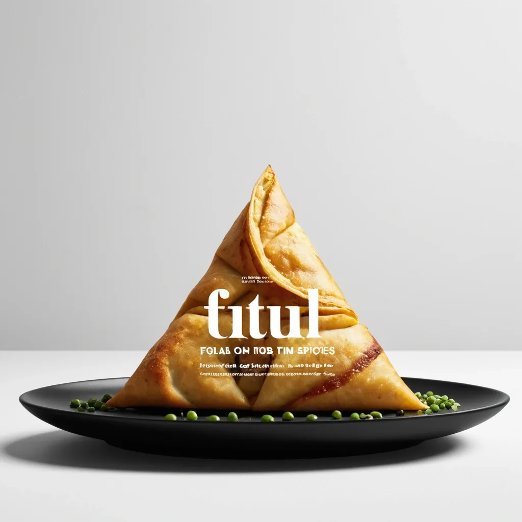
Brand: Aimosa Food: Samosa (popular fried or baked pastry with a savory filling , usually made with spiced potatoes , onions , and peas) Headline: Test of Street. Physical Interaction: FOLD. Accent Color: dark yellow Product Name: Samosa Price: 8$ Aspect Ratio: 9:16 Create a premium editorial food poster where real food physically interacts with and reshapes oversized typography , using a female open mouth background , bold white Heavy Grotesk typography , photorealistic food materials , generous negative space , and a broken editorial grid inspired by contemporary Indian food branding and high-end magazine design. The food and typography must exist inside the same physical world , the food should not simply overlap , decorate , or sit beside the letters , instead the selected physical action must visibly alter the typography through believable material behavior , geometry , heat , pressure , bending , abrasion , or surface transformation. A continuous food surface fold into a Triangle while the typography printed on that same surface bends , compresses , stretches , foreshortens , and wraps with it; Use only one main physical mechanism per poster , keep the cause and effect visually clear , untouched areas of the typography should remain hard , clean , geometric , and readable , all deformation should happen only where the food , tool , heat , or physical force actually makes contact. Use a broken editorial grid with strong scale contrast , asymmetric placement , edge information , small meaningful annotations , and large areas of negative space , add details such as Potatoes , Green peas , Fresh coriander leaves , Green chilies , 24hrs , and always available in hot , but avoid traditional menu rows , long horizontal divider lines , rigid bottom information bars , boxed prices , and template-like layouts. Use bold Grotesk Sans Serif for the main headline , high-contrast Editorial Serif or Italic Serif for product names , quotes , and prices , keep the palette minimal with a cream background , black typography , natural food colors , and one accent color. The final poster should feel clever , physical , premium , contemporary , and instantly readable at thumbnail size , the first glance should reveal the food and headline , the second glance should reveal the physical mechanism that has transformed the typography. ,
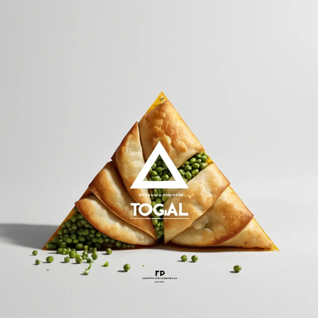
Brand: Aimosa Food: Samosa (popular fried or baked pastry with a savory filling , usually made with spiced potatoes , onions , and peas) Headline: Test of Street. Physical Interaction: FOLD. Accent Color: dark yellow Product Name: Samosa Price: 8$ Aspect Ratio: 9:16 Create a premium editorial food poster where real food physically interacts with and reshapes oversized typography , using a warm Night street background , bold white Heavy Grotesk typography , photorealistic food materials , generous negative space , and a broken editorial grid inspired by contemporary Indian food branding and high-end magazine design. The food and typography must exist inside the same physical world , the food should not simply overlap , decorate , or sit beside the letters , instead the selected physical action must visibly alter the typography through believable material behavior , geometry , heat , pressure , bending , abrasion , or surface transformation. A continuous food surface fold into a Triangle while the typography printed on that same surface bends , compresses , stretches , foreshortens , and wraps with it; Use only one main physical mechanism per poster , keep the cause and effect visually clear , untouched areas of the typography should remain hard , clean , geometric , and readable , all deformation should happen only where the food , tool , heat , or physical force actually makes contact. Use a broken editorial grid with strong scale contrast , asymmetric placement , edge information , small meaningful annotations , and large areas of negative space , add details such as Potatoes , Green peas , Fresh coriander leaves , Green chilies , 24hrs , and always available in hot , but avoid traditional menu rows , long horizontal divider lines , rigid bottom information bars , boxed prices , and template-like layouts. Use bold Grotesk Sans Serif for the main headline , high-contrast Editorial Serif or Italic Serif for product names , quotes , and prices , keep the palette minimal with a cream background , black typography , natural food colors , and one accent color. The final poster should feel clever , physical , premium , contemporary , and instantly readable at thumbnail size , the first glance should reveal the food and headline , the second glance should reveal the physical mechanism that has transformed the typography. ,
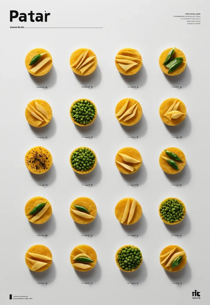
Brand: Duotone Food: Samosa (popular fried or baked pastry with a savory filling , usually made with spiced potatoes , onions , and peas) Headline: Saving of Pocket Physical Interaction: FOLD Accent Color: dark yellow Product Name: બારાસ Price: 8$ Aspect Ratio: 9:16 Create a premium editorial food poster where real food physically interacts with and reshapes oversized typography , using a warm Night street background , bold white Heavy Grotesk typography , photorealistic food materials , generous negative space , and a broken editorial grid inspired by contemporary Indian food branding and high-end magazine design. The food and typography must exist inside the same physical world , the food should not simply overlap , decorate , or sit beside the letters , instead the selected physical action must visibly alter the typography through believable material behavior , geometry , heat , pressure , bending , abrasion , or surface transformation. typography printed directly onto a thin food surface follows the same crease , perspective compression , rotation , and occlusion as the food is physically folded; Use only one main physical mechanism per poster , keep the cause and effect visually clear , untouched areas of the typography should remain hard , clean , geometric , and readable , all deformation should happen only where the food , tool , heat , or physical force actually makes contact. Use a broken editorial grid with strong scale contrast , asymmetric placement , edge information , small meaningful annotations , and large areas of negative space , add details such as Potatoes , Green peas , Fresh coriander leaves , Green chilies , 24hrs , Xyz Lane , and always available in hot , but avoid traditional menu rows , long horizontal divider lines , rigid bottom information bars , boxed prices , and template-like layouts. Use bold Grotesk Sans Serif for the main headline , high-contrast Editorial Serif or Italic Serif for product names , quotes , and prices , keep the palette minimal with a cream background , black typography , natural food colors , and one accent color. The final poster should feel clever , physical , premium , contemporary , and instantly readable at thumbnail size , the first glance should reveal the food and headline , the second glance should reveal the physical mechanism that has transformed the typography. ,