Search Results for and readable
Explore AI generated designs, images, art and prompts by top community artists and designers.
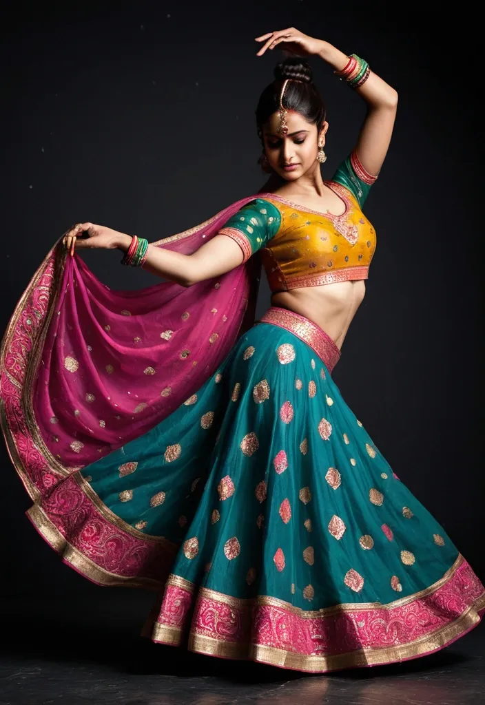

Photograph of a beautiful female ballet dancer posing on a dark floor against a dark gray background. she wears a vibrant Chaniya Choli brings together a striking reddish pink flared silhouette with shimmering golden borders , a beautifully detailed multicolour blouse , and a rich green Bandhani dupatta. the Chaniya Choli transitions from orange at the waist to yellow , bursting into dynamic , swirling strands that curve upward behind her in a wave like form. her hair is styled in a bun , her arms are elegantly extended , and her head is turned to the side in a graceful profile. the lighting highlights the texture of her dress and the glossy , hair like quality of the Chaniya Choli strands , shot on flash-drag — a sharp flash pop lands on her and the shutter is then held open while everything keeps moving , so every highlight in the frame drags into a smooth dupatta arc and all the arcs curve the same way around her. The near shoulder and the ear above it stays semi-solid and readable through it while the rest of her goes unreadable. The empty area of the frame is one deep flat inky teal that owns it , and the ribbons run across it in warm rose and electric blue , long and smooth and dupatta. a mirrored visor , caught mid-swing and dragging arcs of its own. Fine 35mm grain throughout with the highlights blooming , the pure saturation running higher than anywhere else in the lane. Euphoric and chaotic , loud and mid-motion and caught badly on purpose — the feeling of being in the room rather than looking at a picture. ar 9:16. ,
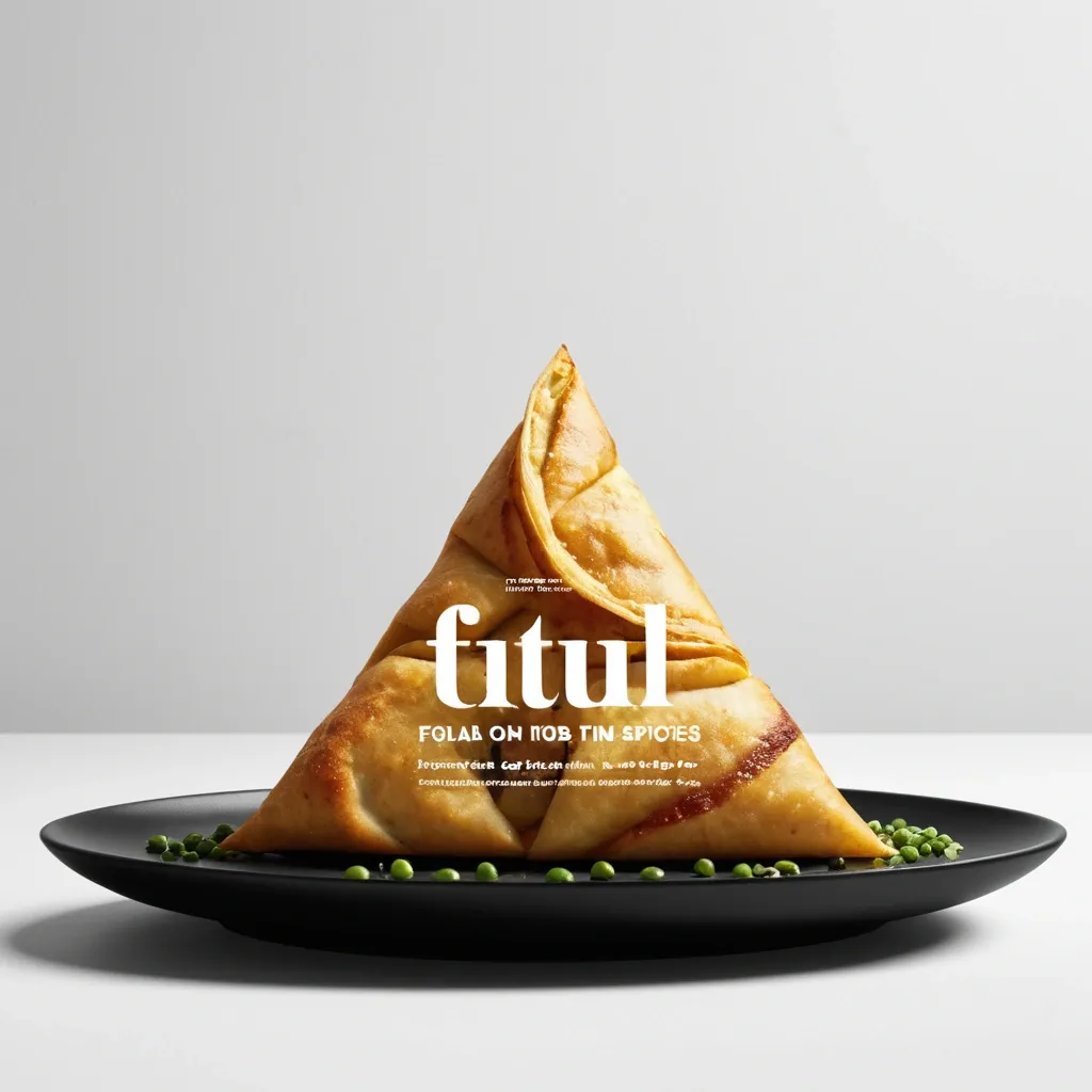
Brand: Aimosa Food: Samosa (popular fried or baked pastry with a savory filling , usually made with spiced potatoes , onions , and peas) Headline: Test of Street. Physical Interaction: FOLD. Accent Color: dark yellow Product Name: Samosa Price: 8$ Aspect Ratio: 9:16 Create a premium editorial food poster where real food physically interacts with and reshapes oversized typography , using a female open mouth background , bold white Heavy Grotesk typography , photorealistic food materials , generous negative space , and a broken editorial grid inspired by contemporary Indian food branding and high-end magazine design. The food and typography must exist inside the same physical world , the food should not simply overlap , decorate , or sit beside the letters , instead the selected physical action must visibly alter the typography through believable material behavior , geometry , heat , pressure , bending , abrasion , or surface transformation. A continuous food surface fold into a Triangle while the typography printed on that same surface bends , compresses , stretches , foreshortens , and wraps with it; Use only one main physical mechanism per poster , keep the cause and effect visually clear , untouched areas of the typography should remain hard , clean , geometric , and readable , all deformation should happen only where the food , tool , heat , or physical force actually makes contact. Use a broken editorial grid with strong scale contrast , asymmetric placement , edge information , small meaningful annotations , and large areas of negative space , add details such as Potatoes , Green peas , Fresh coriander leaves , Green chilies , 24hrs , and always available in hot , but avoid traditional menu rows , long horizontal divider lines , rigid bottom information bars , boxed prices , and template-like layouts. Use bold Grotesk Sans Serif for the main headline , high-contrast Editorial Serif or Italic Serif for product names , quotes , and prices , keep the palette minimal with a cream background , black typography , natural food colors , and one accent color. The final poster should feel clever , physical , premium , contemporary , and instantly readable at thumbnail size , the first glance should reveal the food and headline , the second glance should reveal the physical mechanism that has transformed the typography. ,
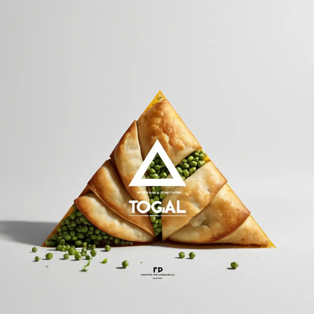
Brand: Aimosa Food: Samosa (popular fried or baked pastry with a savory filling , usually made with spiced potatoes , onions , and peas) Headline: Test of Street. Physical Interaction: FOLD. Accent Color: dark yellow Product Name: Samosa Price: 8$ Aspect Ratio: 9:16 Create a premium editorial food poster where real food physically interacts with and reshapes oversized typography , using a warm Night street background , bold white Heavy Grotesk typography , photorealistic food materials , generous negative space , and a broken editorial grid inspired by contemporary Indian food branding and high-end magazine design. The food and typography must exist inside the same physical world , the food should not simply overlap , decorate , or sit beside the letters , instead the selected physical action must visibly alter the typography through believable material behavior , geometry , heat , pressure , bending , abrasion , or surface transformation. A continuous food surface fold into a Triangle while the typography printed on that same surface bends , compresses , stretches , foreshortens , and wraps with it; Use only one main physical mechanism per poster , keep the cause and effect visually clear , untouched areas of the typography should remain hard , clean , geometric , and readable , all deformation should happen only where the food , tool , heat , or physical force actually makes contact. Use a broken editorial grid with strong scale contrast , asymmetric placement , edge information , small meaningful annotations , and large areas of negative space , add details such as Potatoes , Green peas , Fresh coriander leaves , Green chilies , 24hrs , and always available in hot , but avoid traditional menu rows , long horizontal divider lines , rigid bottom information bars , boxed prices , and template-like layouts. Use bold Grotesk Sans Serif for the main headline , high-contrast Editorial Serif or Italic Serif for product names , quotes , and prices , keep the palette minimal with a cream background , black typography , natural food colors , and one accent color. The final poster should feel clever , physical , premium , contemporary , and instantly readable at thumbnail size , the first glance should reveal the food and headline , the second glance should reveal the physical mechanism that has transformed the typography. ,
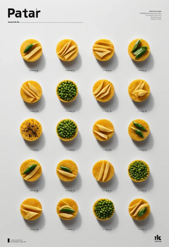
Brand: Duotone Food: Samosa (popular fried or baked pastry with a savory filling , usually made with spiced potatoes , onions , and peas) Headline: Saving of Pocket Physical Interaction: FOLD Accent Color: dark yellow Product Name: બારાસ Price: 8$ Aspect Ratio: 9:16 Create a premium editorial food poster where real food physically interacts with and reshapes oversized typography , using a warm Night street background , bold white Heavy Grotesk typography , photorealistic food materials , generous negative space , and a broken editorial grid inspired by contemporary Indian food branding and high-end magazine design. The food and typography must exist inside the same physical world , the food should not simply overlap , decorate , or sit beside the letters , instead the selected physical action must visibly alter the typography through believable material behavior , geometry , heat , pressure , bending , abrasion , or surface transformation. typography printed directly onto a thin food surface follows the same crease , perspective compression , rotation , and occlusion as the food is physically folded; Use only one main physical mechanism per poster , keep the cause and effect visually clear , untouched areas of the typography should remain hard , clean , geometric , and readable , all deformation should happen only where the food , tool , heat , or physical force actually makes contact. Use a broken editorial grid with strong scale contrast , asymmetric placement , edge information , small meaningful annotations , and large areas of negative space , add details such as Potatoes , Green peas , Fresh coriander leaves , Green chilies , 24hrs , Xyz Lane , and always available in hot , but avoid traditional menu rows , long horizontal divider lines , rigid bottom information bars , boxed prices , and template-like layouts. Use bold Grotesk Sans Serif for the main headline , high-contrast Editorial Serif or Italic Serif for product names , quotes , and prices , keep the palette minimal with a cream background , black typography , natural food colors , and one accent color. The final poster should feel clever , physical , premium , contemporary , and instantly readable at thumbnail size , the first glance should reveal the food and headline , the second glance should reveal the physical mechanism that has transformed the typography. ,
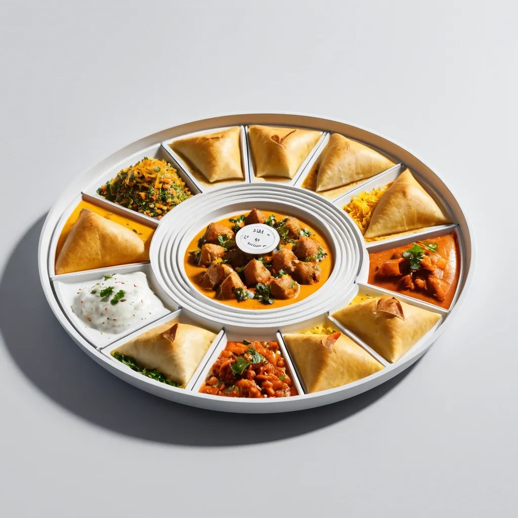
Ultra-clean modern recipe infographic. Showcase Samosa (Indian street food) in a visually appealing finished form—sliced , plated , or portioned—floating slightly in perspective or angled view. Arrange ingredients , steps , and tips around the dish in a dynamic editorial layout , not restricted to top-down. Ingredients Section: Include icons or mini illustrations for each ingredient with quantities. Arrange them in clusters , lists , or circular flows connected visually to the dish. Steps Section: Show preparation steps with numbered panels , arrows , or lines , forming a logical flow around the main dish. Include small cooking icons (knife , pan , oven , timer) where helpful. Additional Info (optional): Total calories , prep/cook time , servings , spice level—displayed as clean bubbles or badges near the dish. Visual Style: Editorial infographic meets lifestyle food photography. Vibrant , natural food colors , subtle drop shadows , clean vector icons , modern typography , soft gradients or glassmorphism for step panels. Accent colors can highlight key info (calories , prep time). Composition Guidelines: Finished meal as hero visual (perspective or angled). Ingredients and steps flow dynamically around the dish. Clear visual hierarchy: dish > steps > ingredients > optional stats. Enough negative space to keep design airy and readable. Lighting & Background: Soft , natural studio lighting. Minimal textured or gradient background for premium editorial feel. ,
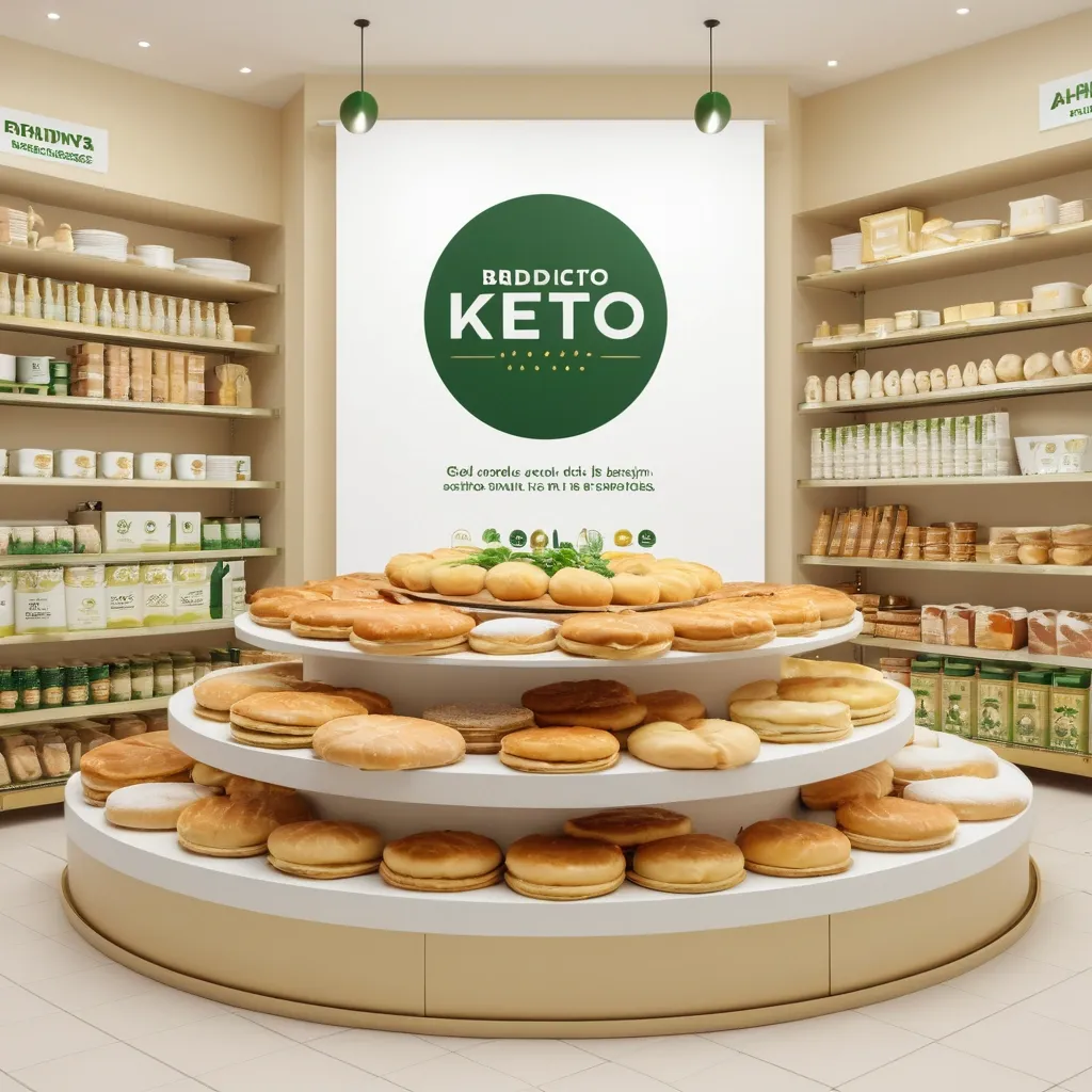
Vertical banner for large-format printing , dimensions 1 meter tall x 0.50 meters wide , for a store selling keto products. At the top , a minimalist circular logo in green and gold. Below , a very large and centered main text in one single line: PRODUCTOS KETO. Below that , a list of products in ALL CAPS , clear and readable typography: SORRENTINOS , TALLARINES , TAPAS DE EMPANADAS Y PASCUALINA , BUDINES , TORTAS DULCES INDIVIDUALES , ALFAJORES , PANES KETO. Include realistic , appetizing photos of the mentioned products arranged neatly around the text , with warm lighting. Background in light tones (white or soft beige) with fresh green accents. Modern , clean style in high resolution , suitable for printing. ,
Create a Vectorized Logo for the Company "IMPRIMASSUR" Design a vectorized logo for "IMPRIMASSUR" , a printing company and seller of extra-white paper. The logo should incorporate the stylized name "IMPRIMASSUR" with colorful geometric shapes arranged in a pixel art pattern or high-resolution abstract geometric forms. The upper part of "IMPRIMASSUR" should evoke pixels or dots flying away , symbolizing printing precision , technology , movement , growth , and innovation. Style: Modern , creative , and eye-catching. Colors: Bright and vibrant (cyan , magenta , yellow , black , and white). Typography: An elegant and readable font (to be specified). The text "IMPRIMASSUR" will appear below the logo , followed by a thin line and the slogan: "Le renouveau pour l'excellence" (The renewal for excellence). Adaptability: The logo must be suitable for all formats , including web , social media , and marketing materials. Variations: Provide multiple versions with different color and shape combinations (triangles , circles , rectangles , dots) in high resolution , along with a suggested font for "IMPRIMASSUR". ,
Imagine a cover image that captures the essence of the real estate world and conveys confidence and success. You can use a combination of visual elements related to the real estate business and elements that represent success and growth. 1. Background: Use a background that reflects the nature of the housing market , such as an image of a city with skyscrapers or modern houses. This helps establish the context and theme of the book. 2. Title: Highlight the title "Real Estate Business Secrets: How to Succeed in the Real Estate Market" in an eye-catching and readable style. You can use a sleek and professional font to convey credibility and expertise. 3. Real Estate Elements: Add visual elements related to the real estate business , such as a house , a building or a key. These symbols represent ownership and success in the real estate market. 4. Symbols of Triumph: Add elements that suggest success and achievement , such as a gold ribbon , medal , or rising graph. These elements reinforce the central message of the book and call attention to the possibility of success in the real estate market. 5. Color palette: Use a color scheme that reflects professionalism and confidence , such as shades of blue or dark gray. You can add pops of bold color to highlight key elements. , Pencil Sketch ,
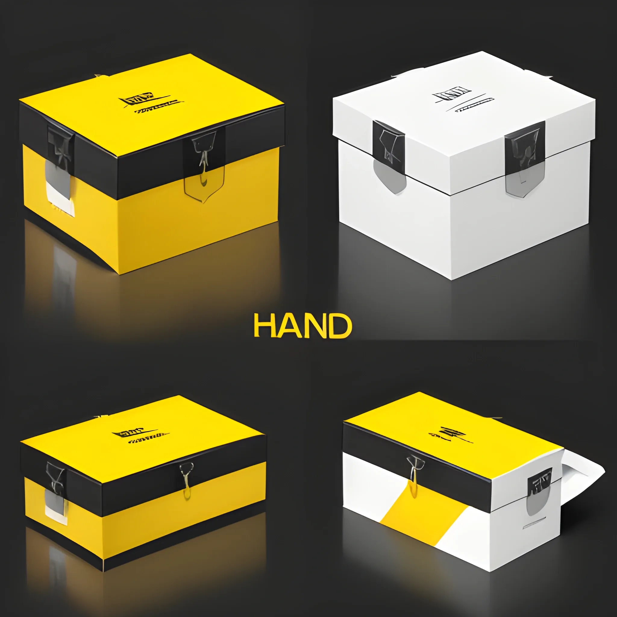
A refined and stylish packaging box design for 'HBK BAND' self-adhesive aluminum repair tape. The design should maintain the original logo with the red and black segmented layout , ensuring the yellow color in the logo is bright and not gold. The box should have a sleek black background. Place the 'HBK BAND' logo prominently at the top , preserving its exact form and colors. Use brand colors: bright yellow , red , black , and white throughout the design. Include clear , sharp text to highlight product features such as 'Flexible Aluminum of Latest Generation' , 'Cold Application' , and 'High Adhesion'. Display technical details like thickness , adhesion strength , and application temperature on the back of the box in a neat and readable format. The design should also feature an image of the aluminum tape roll , emphasizing its metallic texture. Ensure the overall design is elegant , modern , and suitable for retail shelves , with no blurriness in the text or graphics ,
Generate an image for an insurance brand called "EP". Imagine a logo that conveys safety , security and trust , all key elements in the insurance industry. Choose black and silver , colors that evoke a sense of calm and reliability. Choose a shield shape to reinforce the idea of stability and confidence. Choose a modern and readable font or alternatively a sans-serif typeface to present a modern and accessible image. Remember that it is essential to work with a professional graphic designer to translate these concepts into a visually appealing and functional design for your "EP" life insurance brand. ,
1. Background: Use a background that reflects the nature of the housing market , such as an image of a city with skyscrapers or modern houses. This helps establish the context and theme of the book. 2. Title: Highlight the title "Real Estate Business Secrets: How to Succeed in the Real Estate Market" in an eye-catching and readable style. You can use a sleek and professional font to convey credibility and expertise. 3. Real Estate Elements: Add visual elements related to the real estate business , such as a house , a building or a key. These symbols represent ownership and success in the real estate market. 4. Symbols of Triumph: Add elements that suggest success and achievement , such as a gold ribbon , medal , or rising graph. These elements reinforce the central message of the book and call attention to the possibility of success in the real estate market. 5. Color palette: Use a color scheme that reflects professionalism and confidence , such as shades of blue or dark gray. You can add pops of bold color to highlight key elements. ,