Search Results for quotes
Explore AI generated designs, images, art and prompts by top community artists and designers.
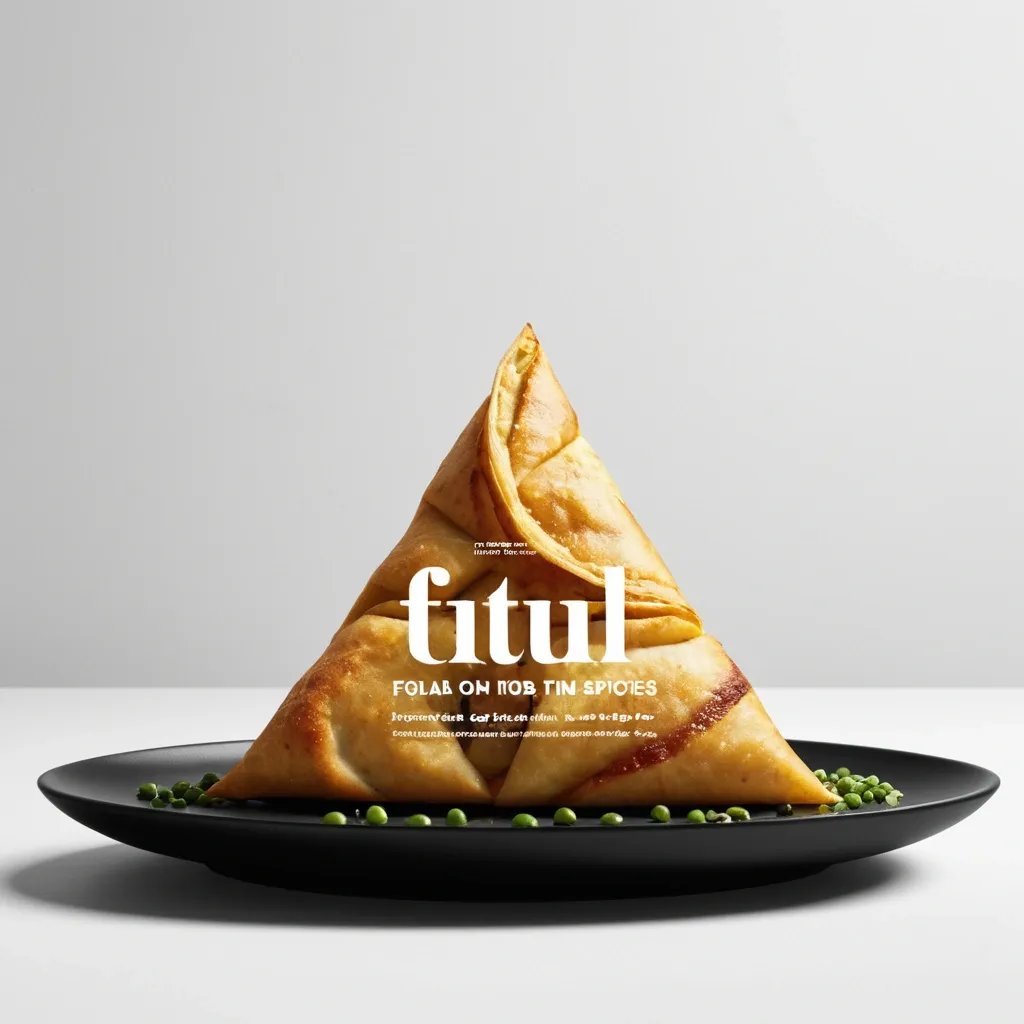

Brand: Aimosa Food: Samosa (popular fried or baked pastry with a savory filling , usually made with spiced potatoes , onions , and peas) Headline: Test of Street. Physical Interaction: FOLD. Accent Color: dark yellow Product Name: Samosa Price: 8$ Aspect Ratio: 9:16 Create a premium editorial food poster where real food physically interacts with and reshapes oversized typography , using a female open mouth background , bold white Heavy Grotesk typography , photorealistic food materials , generous negative space , and a broken editorial grid inspired by contemporary Indian food branding and high-end magazine design. The food and typography must exist inside the same physical world , the food should not simply overlap , decorate , or sit beside the letters , instead the selected physical action must visibly alter the typography through believable material behavior , geometry , heat , pressure , bending , abrasion , or surface transformation. A continuous food surface fold into a Triangle while the typography printed on that same surface bends , compresses , stretches , foreshortens , and wraps with it; Use only one main physical mechanism per poster , keep the cause and effect visually clear , untouched areas of the typography should remain hard , clean , geometric , and readable , all deformation should happen only where the food , tool , heat , or physical force actually makes contact. Use a broken editorial grid with strong scale contrast , asymmetric placement , edge information , small meaningful annotations , and large areas of negative space , add details such as Potatoes , Green peas , Fresh coriander leaves , Green chilies , 24hrs , and always available in hot , but avoid traditional menu rows , long horizontal divider lines , rigid bottom information bars , boxed prices , and template-like layouts. Use bold Grotesk Sans Serif for the main headline , high-contrast Editorial Serif or Italic Serif for product names , quotes , and prices , keep the palette minimal with a cream background , black typography , natural food colors , and one accent color. The final poster should feel clever , physical , premium , contemporary , and instantly readable at thumbnail size , the first glance should reveal the food and headline , the second glance should reveal the physical mechanism that has transformed the typography. ,
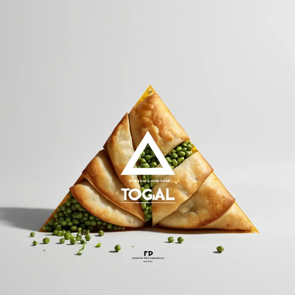
Brand: Aimosa Food: Samosa (popular fried or baked pastry with a savory filling , usually made with spiced potatoes , onions , and peas) Headline: Test of Street. Physical Interaction: FOLD. Accent Color: dark yellow Product Name: Samosa Price: 8$ Aspect Ratio: 9:16 Create a premium editorial food poster where real food physically interacts with and reshapes oversized typography , using a warm Night street background , bold white Heavy Grotesk typography , photorealistic food materials , generous negative space , and a broken editorial grid inspired by contemporary Indian food branding and high-end magazine design. The food and typography must exist inside the same physical world , the food should not simply overlap , decorate , or sit beside the letters , instead the selected physical action must visibly alter the typography through believable material behavior , geometry , heat , pressure , bending , abrasion , or surface transformation. A continuous food surface fold into a Triangle while the typography printed on that same surface bends , compresses , stretches , foreshortens , and wraps with it; Use only one main physical mechanism per poster , keep the cause and effect visually clear , untouched areas of the typography should remain hard , clean , geometric , and readable , all deformation should happen only where the food , tool , heat , or physical force actually makes contact. Use a broken editorial grid with strong scale contrast , asymmetric placement , edge information , small meaningful annotations , and large areas of negative space , add details such as Potatoes , Green peas , Fresh coriander leaves , Green chilies , 24hrs , and always available in hot , but avoid traditional menu rows , long horizontal divider lines , rigid bottom information bars , boxed prices , and template-like layouts. Use bold Grotesk Sans Serif for the main headline , high-contrast Editorial Serif or Italic Serif for product names , quotes , and prices , keep the palette minimal with a cream background , black typography , natural food colors , and one accent color. The final poster should feel clever , physical , premium , contemporary , and instantly readable at thumbnail size , the first glance should reveal the food and headline , the second glance should reveal the physical mechanism that has transformed the typography. ,
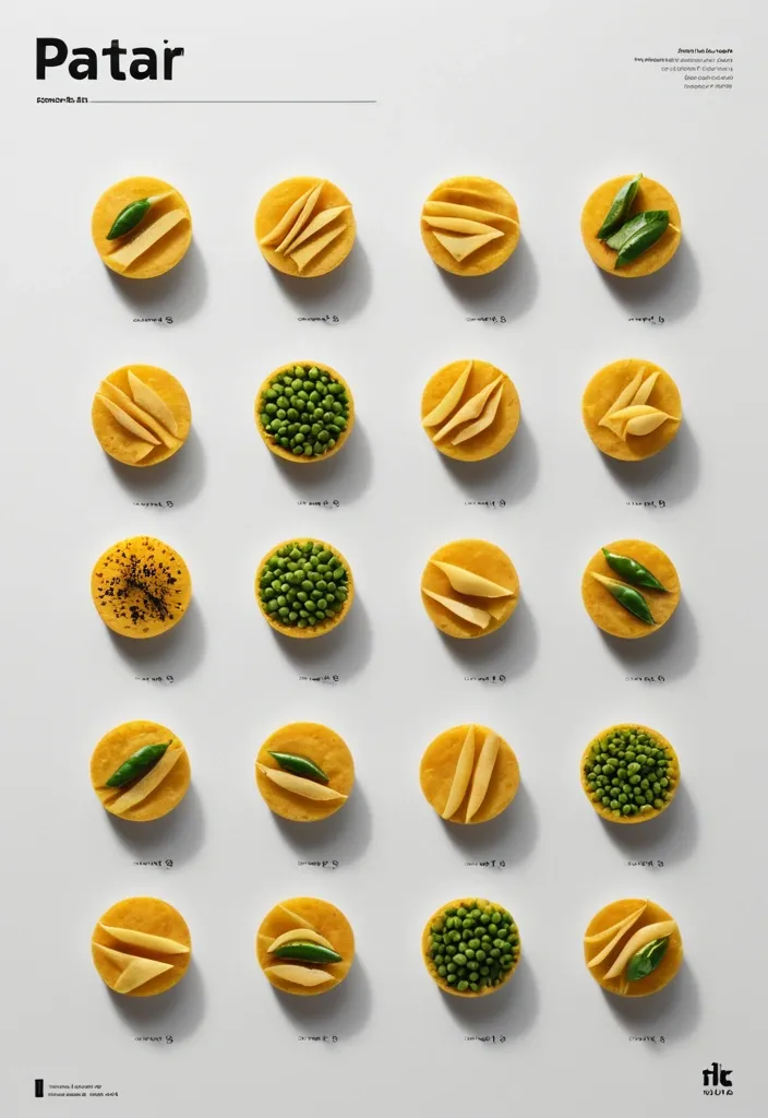
Brand: Duotone Food: Samosa (popular fried or baked pastry with a savory filling , usually made with spiced potatoes , onions , and peas) Headline: Saving of Pocket Physical Interaction: FOLD Accent Color: dark yellow Product Name: બારાસ Price: 8$ Aspect Ratio: 9:16 Create a premium editorial food poster where real food physically interacts with and reshapes oversized typography , using a warm Night street background , bold white Heavy Grotesk typography , photorealistic food materials , generous negative space , and a broken editorial grid inspired by contemporary Indian food branding and high-end magazine design. The food and typography must exist inside the same physical world , the food should not simply overlap , decorate , or sit beside the letters , instead the selected physical action must visibly alter the typography through believable material behavior , geometry , heat , pressure , bending , abrasion , or surface transformation. typography printed directly onto a thin food surface follows the same crease , perspective compression , rotation , and occlusion as the food is physically folded; Use only one main physical mechanism per poster , keep the cause and effect visually clear , untouched areas of the typography should remain hard , clean , geometric , and readable , all deformation should happen only where the food , tool , heat , or physical force actually makes contact. Use a broken editorial grid with strong scale contrast , asymmetric placement , edge information , small meaningful annotations , and large areas of negative space , add details such as Potatoes , Green peas , Fresh coriander leaves , Green chilies , 24hrs , Xyz Lane , and always available in hot , but avoid traditional menu rows , long horizontal divider lines , rigid bottom information bars , boxed prices , and template-like layouts. Use bold Grotesk Sans Serif for the main headline , high-contrast Editorial Serif or Italic Serif for product names , quotes , and prices , keep the palette minimal with a cream background , black typography , natural food colors , and one accent color. The final poster should feel clever , physical , premium , contemporary , and instantly readable at thumbnail size , the first glance should reveal the food and headline , the second glance should reveal the physical mechanism that has transformed the typography. ,

masterpiece , best quality , ultra-detailed: Fractal tree growing from glowing v1.0 crystal roots through floating v2.0 Akasha rings into radiant v3.4 "ICH BIN" crystal heart , light streams connecting versions , submerged in cosmic nebula with floating Saint Germain quotes , golden ratio spirals , ultra-detailed fantasy digital art ,
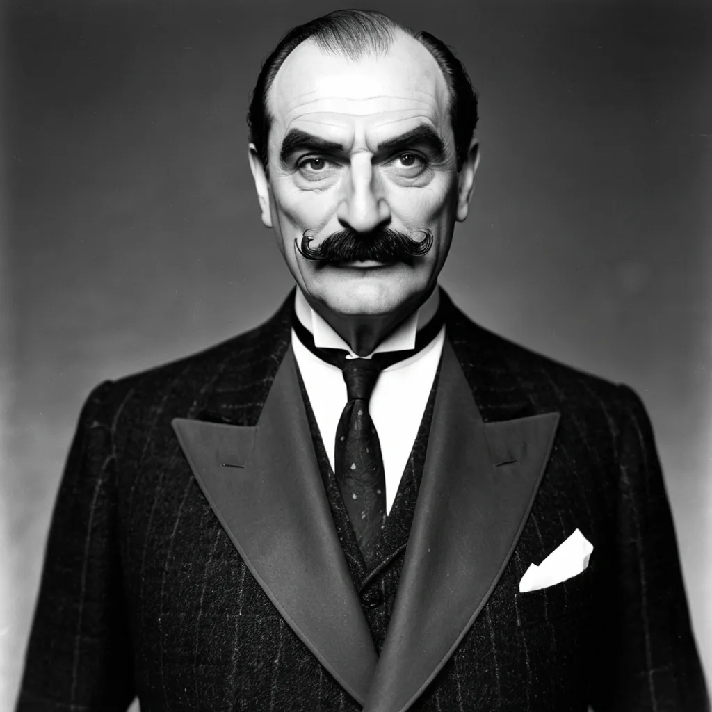
Here’s a comprehensive description of Hercule Poirot as Agatha Christie wrote him — with precise references to the novels , and comparisons to key screen portrayals (Finney , Suchet , Ustinov , Branagh , etc.). --- 📖 Hercule Poirot — Literary Description (with Source Quotes) --- 🧍♂️ 1. Physical Appearance 🔹 “A little man with an egg-shaped head” — The Murder of Roger Ackroyd (1926) Short stature Plump and compact build Head described as egg-shaped , often tilted slightly to one side > 🎥 Closest portrayals: 🔸 David Suchet – nails the “little man” shape and tilting head 🔸 Finney – correct manner but taller 🔸 Branagh – too tall and lean 🔸 Ustinov – too broad and casual in posture --- 🥸 2. Moustache 🔹 “The finest moustache in all England — and perhaps in all Europe.” — Death in the Clouds (1935) Immense , curled , waxed , perfectly symmetrical Poirot is extremely vain about it Wears a moustache net at night > “He had a moustache guard to keep it neat in his sleep.” — The Mysterious Affair at Styles (1920) > 🎥 Closest portrayals: 🔸 David Suchet – accurate size and grooming 🔸 Kenneth Branagh – large but overly stylized (double-layered) 🔸 Peter Ustinov – too understated 🔸 Finney – neat , but not extravagant enough --- 👔 3. Dress & Grooming 🔹 “Always immaculate. His clothes were faultless. His boots shone.” — The Mystery of the Blue Train (1928) Fussy and obsessive about cleanliness Well-tailored suits , gloves , polished shoes Takes pride in his appearance , symmetry , and neatness > 🎥 Closest portrayals: 🔸 Suchet – perfect suits , shoe polish , gloves 🔸 Finney – clean but not as fussy 🔸 Branagh – a bit too dramatic in grooming --- 🧠 4. Intelligence & Method 🔹 “I am not one to rely upon physical evidence. I use the little grey cells.” — The Big Four (1927) Psychology-based deductions Avoids fingerprint obsession or brute force Dismisses red herrings and goes after motive and psychology > 🎥 Closest portrayals: 🔸 Suchet – pure psychological method 🔸 Finney – sharp intellect , but less emphasized 🔸 Ustinov – more jovial , less “grey cell” driven 🔸 Branagh – mixes emotion and action unnecessarily --- 🗣️ 5. Speech & Accent 🔹 “His English was precise , but with a foreign accent.” — Peril at End House (1932) Belgian French accent , not French or British Always speaks in precise , formal English Often corrects others politely > 🎥 Closest portrayals: 🔸 Suchet – perfect subtle Belgian accent 🔸 Finney – formal , slight accent 🔸 Branagh – inconsistent Belgian-French tone 🔸 Ustinov – more laid-back , not authentic Belgian --- 🧼 6. Personality & Mannerisms 🔹 “Everything must be tidy and symmetrical.” — The ABC Murders (1936) Fastidious , orderly Polite but proud Prone to mild arrogance , but never mean Occasionally flustered by disorder > 🎥 Closest portrayals: 🔸 Suchet – obsessive , neat , respectful 🔸 Ustinov – polite but too casual 🔸 Finney – more reserved , dignified 🔸 Branagh – too emotional at times (e.g. crying in Death on the Nile) --- 💬 7. Humor & Warmth 🔹 “Poirot smiled — that slow smile that came rarely , but lighted up his whole face.” — Five Little Pigs (1942) Not comedic , but dryly witty Charming in a subtle way , especially with women or children Rarely emotional , but has empathy > 🎥 Closest portrayals: 🔸 Suchet – subtle warmth and charm 🔸 Ustinov – more humorous , sometimes too light 🔸 Branagh – goes for modern emotion --- 🏁 Summary: Who Comes Closest? Trait Best Portrayal Physical Build David Suchet Moustache Our Composite (Suchet + Branagh shape) Accent & Speech Suchet (with Finney’s formality) Intelligence Suchet Mannerisms Suchet Humor Suchet with a dash of Ustinov Visual Style Suchet + Finney blend --- 🏆 Verdict: David Suchet remains the gold standard overall. But a Finney base with Suchet’s mannerisms and moustache enhancements (as we created earlier) gives you a 100% faithful visual and behavioral Poirot. Would you like me to turn this into a printable profile or dossier for Poirot fans? ,
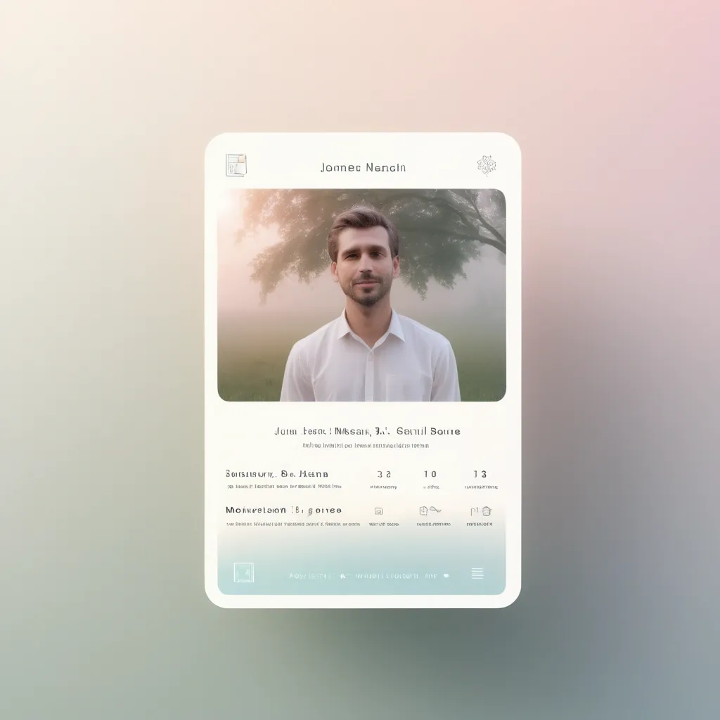
UI/UX design for a virtual memorial with a focus on remembrance and honoring loved ones. Soft gradient backgrounds with white and pastel elements. Elegant design with minimalistic card-style profiles that show personal information , quotes , and multimedia elements. Navigation should be clear , with a special section for visitor messages. Create an interface for easy access via QR codes on gravestones. Include soothing animations like floating candles or gentle moving background elements to enhance the emotional connection. ,
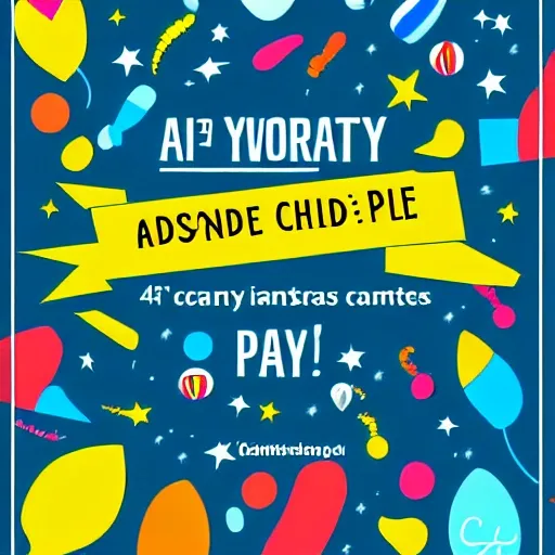
Sure! Here's a description of a poster design for Children's Day: Poster Concept: The poster will have a joyful and colorful design to celebrate Children's Day. It will feature a group of happy children engaged in playful activities , surrounded by elements that represent fun and imagination. Color Palette: To create a vibrant and energetic atmosphere , the poster will use a bright and lively color palette. Consider using a combination of primary colors like red , blue , and yellow , along with secondary colors like green and orange. These colors will evoke a sense of excitement and appeal to children. Illustrations/Artwork: The central focus of the poster will be a group of children engaged in various activities that highlight their creativity and curiosity. They can be shown playing with toys , drawing , reading , or participating in outdoor games. The illustrations should be lively , with expressive characters that reflect the diverse backgrounds and interests of children. Typography: Choose a playful and child-friendly font for the text elements on the poster. Opt for a rounded or handwritten style that conveys a sense of fun and friendliness. Use bold and clear lettering for the event title , such as "Happy Children's Day , " and include relevant information like the date , time , and location of the event. Consider adding captions or quotes that inspire and celebrate the spirit of childhood. Graphics and Decorations: Surround the central illustration with decorative elements that add to the festive ambiance. Incorporate colorful balloons , confetti , ribbons , and streamers to create a sense of joy and celebration. You can also include icons or images of toys , books , and other playful objects that resonate with children. Layout: Ensure a balanced composition by placing the main illustration in the center of the poster. Arrange the text elements in a visually pleasing manner around the illustration , making sure they are easy to read. Leave some white space to maintain clarity and avoid overcrowding. Final Touches: Consider adding a glossy finish or using special printing techniques to make the colors and illustrations pop. This can give the poster a polished and eye-catching look. Remember , this is a general description , and it's recommended to work with a professional graphic designer or use design software to create the actual poster based on these specifications. ,