Search Results for generous negative space
Explore AI generated designs, images, art and prompts by top community artists and designers.
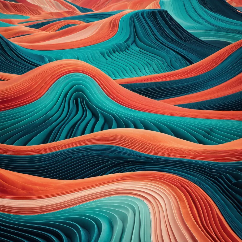

MINERAL CURRENT: Colorful mineral flows. Create a premium art poster that transforms an imaginary landscape into a vibrant , abstract world of continuous topographic contour lines , combining Eastern landscape aesthetics with modern editorial design. Construct the terrain from hundreds of long , smooth , elegant flowing lines that naturally follow its shape , elevation , and movement. The contour lines should become the actual structure of the landscape , forming soft hills , sweeping folds , flowing rifts , or interconnected mineral formations rather than simply decorating a realistic surface. Use large , recognizable landforms with strong silhouettes , layered depth , and clear visual hierarchy. Vary line density naturally , with tighter contours around curves and folds and wider spacing across calmer surfaces. Keep every line flowing in harmony with the overall composition. Apply a bold but controlled palette with strong warm and cool contrast. Combine colors such as deep indigo , cobalt blue , turquoise , coral pink , vermilion , peach orange , emerald green , and warm cream according to the chosen palette. Let colors transition smoothly along the contour lines , creating substantial color fields and harmonious gradients without random rainbow effects. Keep the landscape monumental , abstract , and highly graphic. If a scale element is specified , make it extremely small , occupying less than 1% of the image. Balance intricate linework with generous negative space to maintain strong thumbnail readability. Reserve a calm upper area for refined editorial typography. Include the main title , Chinese subtitle , and poetic tagline using elegant serif lettering , generous spacing , and a contemporary exhibition-poster aesthetic. The final artwork should feel colorful , poetic , sophisticated , and strongly line-driven , with visual impact created through continuous contours , bold color relationships , flowing terrain forms , and clean graphic composition. Avoid realistic landscape photography , rocky textures , chaotic patterns , broken strokes , excessive detail , cinematic CGI , plastic 3D surfaces , watermarks , logos , copyright text , and unnecessary decorative elements. ,
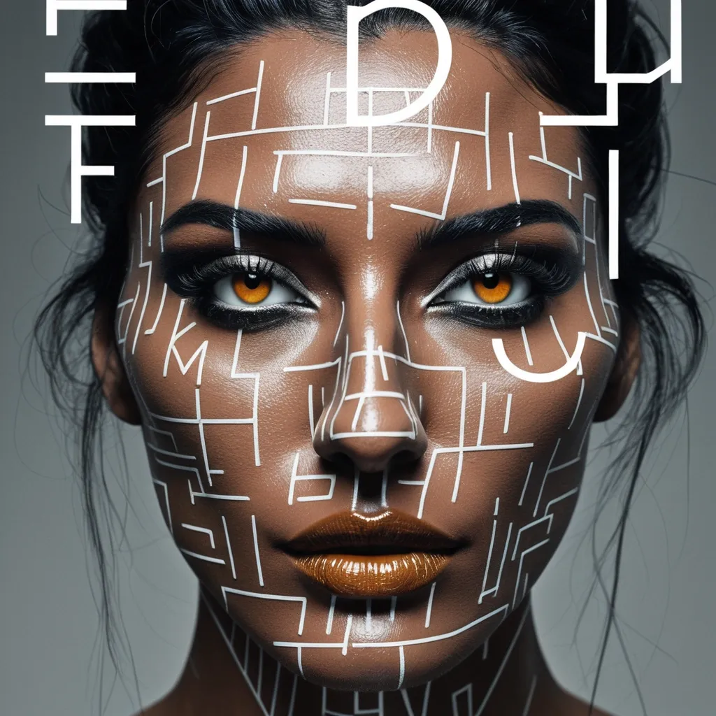
Create a sophisticated editorial portrait poster built around selective focus. Use a realistic photographic portrait with natural skin texture , pores , subtle imperfections , believable hair , and authentic facial structure. Avoid plastic skin , CGI smoothness , heavy beauty retouching , or generic commercial-model styling. Aspect Ratio: 9:16. Keep most of the portrait softly blurred , slightly motion-softened , desaturated , or reduced in detail. Only the selected horizontal sharp slice should return to sharp detail , natural skin tone , and clear texture. The sharp and blurred areas must remain perfectly aligned as the same person and the same photographic moment , with no duplicated eyes , second face , or pasted-photo effect. Choose one focus structure: a horizontal sharp band across the eyes , a small floating window isolating part of the face , a narrow offset focus frame through motion blur , or a larger offset frame that deliberately shifts attention away from the facial center. Use a restrained neutral palette of charcoal , gray , warm beige , off-white , and natural skin tones. Use rust orange as the only strong accent for the focus lines , main title , and a few key details. Keep the visual rule: Neutral Field + One Accent Color. Use mature magazine-style typography: a high-contrast editorial serif for MOTION , a condensed bold sans serif for RAJU , and a small neutral sans serif for secondary information. Include harp through motion as meaningful copy connected to the subject and concept , not random filler text. Keep the composition asymmetric with generous negative space. Let the portrait , typography , and focus geometry interact naturally. Add subtle film grain , light scan texture , and restrained print texture so the whole poster feels like one finished editorial piece. The final result should feel like a polished independent fashion , photography , music , or culture magazine poster , with blur and sharpness deliberately controlling where the viewer looks. Avoid cyberpunk HUDs , excessive UI graphics , neon gradients , gibberish text , logos , watermarks , numbering , sparkle symbols , harsh Gaussian blur , melted facial features , duplicated features , plastic skin , and over-retouching. ,
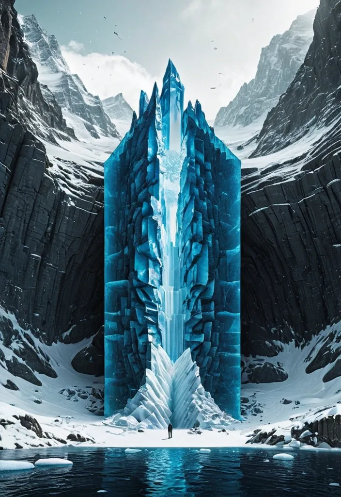
Theme: Ice Surface world: Ice-fort appears above the surface Hidden world: Cave gate is revealed underneath Key natural structure: Ice mass Main palette: Deep blue Title: Navro Subtitle: lishotta Create a premium 9:16 editorial poster from the WORLD SLICE series. Show a realistic natural landscape as if a section of the world has been physically cut open , revealing a much larger hidden structure beneath the visible surface. Keep the surface relatively simple and easy to read , while the hidden section becomes the main visual surprise. Use strong scale contrast , clear geological or ecological layers , realistic materials , believable depth , atmospheric perspective and cinematic natural light. The cutaway should not look like a glass box or aquarium. Treat it as a real piece of land , ocean , forest or ice physically sliced from the planet. Let parts of nature break beyond the geometric cutaway boundary: roots , rock formations , ice , water or terrain may extend outside the original shape to create stronger visual impact. Keep the central object around 55–70% of the poster width and preserve generous negative space. Avoid making the 3D cutaway too large. Integrate typography into the composition instead of adding many tiny labels. Use one bold main title , one short supporting line and only a few minimal editorial details. Allow natural elements to overlap , pass behind or partially cover the typography. Use a refined mix of modern serif and condensed sans-serif typography. The poster should feel like premium nature editorial design , contemporary art direction and photorealistic environmental visualization. Prioritize: strong thumbnail readability , one clear visual surprise , large recognizable forms , realistic natural textures , clean hierarchy , high-end editorial composition , and a strong contrast between the visible world and the hidden world. No logo , no watermark , no numbering , no excessive micro text , no HUD interface , no four-point sparkle symbols , no cheap CGI , no glass-container look. Make the final image feel like a complete finished poster , not a template. ,
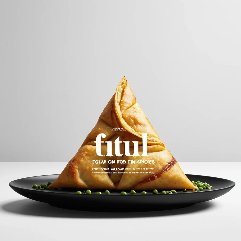
Brand: Aimosa Food: Samosa (popular fried or baked pastry with a savory filling , usually made with spiced potatoes , onions , and peas) Headline: Test of Street. Physical Interaction: FOLD. Accent Color: dark yellow Product Name: Samosa Price: 8$ Aspect Ratio: 9:16 Create a premium editorial food poster where real food physically interacts with and reshapes oversized typography , using a female open mouth background , bold white Heavy Grotesk typography , photorealistic food materials , generous negative space , and a broken editorial grid inspired by contemporary Indian food branding and high-end magazine design. The food and typography must exist inside the same physical world , the food should not simply overlap , decorate , or sit beside the letters , instead the selected physical action must visibly alter the typography through believable material behavior , geometry , heat , pressure , bending , abrasion , or surface transformation. A continuous food surface fold into a Triangle while the typography printed on that same surface bends , compresses , stretches , foreshortens , and wraps with it; Use only one main physical mechanism per poster , keep the cause and effect visually clear , untouched areas of the typography should remain hard , clean , geometric , and readable , all deformation should happen only where the food , tool , heat , or physical force actually makes contact. Use a broken editorial grid with strong scale contrast , asymmetric placement , edge information , small meaningful annotations , and large areas of negative space , add details such as Potatoes , Green peas , Fresh coriander leaves , Green chilies , 24hrs , and always available in hot , but avoid traditional menu rows , long horizontal divider lines , rigid bottom information bars , boxed prices , and template-like layouts. Use bold Grotesk Sans Serif for the main headline , high-contrast Editorial Serif or Italic Serif for product names , quotes , and prices , keep the palette minimal with a cream background , black typography , natural food colors , and one accent color. The final poster should feel clever , physical , premium , contemporary , and instantly readable at thumbnail size , the first glance should reveal the food and headline , the second glance should reveal the physical mechanism that has transformed the typography. ,
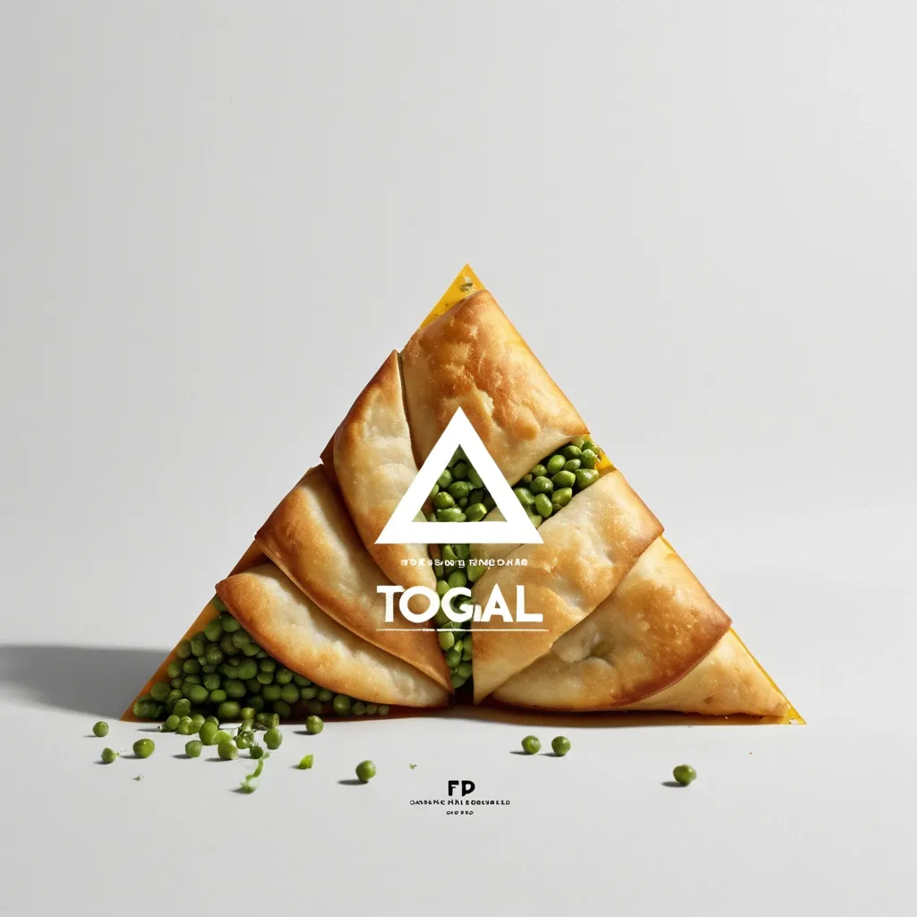
Brand: Aimosa Food: Samosa (popular fried or baked pastry with a savory filling , usually made with spiced potatoes , onions , and peas) Headline: Test of Street. Physical Interaction: FOLD. Accent Color: dark yellow Product Name: Samosa Price: 8$ Aspect Ratio: 9:16 Create a premium editorial food poster where real food physically interacts with and reshapes oversized typography , using a warm Night street background , bold white Heavy Grotesk typography , photorealistic food materials , generous negative space , and a broken editorial grid inspired by contemporary Indian food branding and high-end magazine design. The food and typography must exist inside the same physical world , the food should not simply overlap , decorate , or sit beside the letters , instead the selected physical action must visibly alter the typography through believable material behavior , geometry , heat , pressure , bending , abrasion , or surface transformation. A continuous food surface fold into a Triangle while the typography printed on that same surface bends , compresses , stretches , foreshortens , and wraps with it; Use only one main physical mechanism per poster , keep the cause and effect visually clear , untouched areas of the typography should remain hard , clean , geometric , and readable , all deformation should happen only where the food , tool , heat , or physical force actually makes contact. Use a broken editorial grid with strong scale contrast , asymmetric placement , edge information , small meaningful annotations , and large areas of negative space , add details such as Potatoes , Green peas , Fresh coriander leaves , Green chilies , 24hrs , and always available in hot , but avoid traditional menu rows , long horizontal divider lines , rigid bottom information bars , boxed prices , and template-like layouts. Use bold Grotesk Sans Serif for the main headline , high-contrast Editorial Serif or Italic Serif for product names , quotes , and prices , keep the palette minimal with a cream background , black typography , natural food colors , and one accent color. The final poster should feel clever , physical , premium , contemporary , and instantly readable at thumbnail size , the first glance should reveal the food and headline , the second glance should reveal the physical mechanism that has transformed the typography. ,
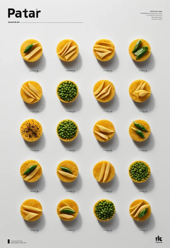
Brand: Duotone Food: Samosa (popular fried or baked pastry with a savory filling , usually made with spiced potatoes , onions , and peas) Headline: Saving of Pocket Physical Interaction: FOLD Accent Color: dark yellow Product Name: બારાસ Price: 8$ Aspect Ratio: 9:16 Create a premium editorial food poster where real food physically interacts with and reshapes oversized typography , using a warm Night street background , bold white Heavy Grotesk typography , photorealistic food materials , generous negative space , and a broken editorial grid inspired by contemporary Indian food branding and high-end magazine design. The food and typography must exist inside the same physical world , the food should not simply overlap , decorate , or sit beside the letters , instead the selected physical action must visibly alter the typography through believable material behavior , geometry , heat , pressure , bending , abrasion , or surface transformation. typography printed directly onto a thin food surface follows the same crease , perspective compression , rotation , and occlusion as the food is physically folded; Use only one main physical mechanism per poster , keep the cause and effect visually clear , untouched areas of the typography should remain hard , clean , geometric , and readable , all deformation should happen only where the food , tool , heat , or physical force actually makes contact. Use a broken editorial grid with strong scale contrast , asymmetric placement , edge information , small meaningful annotations , and large areas of negative space , add details such as Potatoes , Green peas , Fresh coriander leaves , Green chilies , 24hrs , Xyz Lane , and always available in hot , but avoid traditional menu rows , long horizontal divider lines , rigid bottom information bars , boxed prices , and template-like layouts. Use bold Grotesk Sans Serif for the main headline , high-contrast Editorial Serif or Italic Serif for product names , quotes , and prices , keep the palette minimal with a cream background , black typography , natural food colors , and one accent color. The final poster should feel clever , physical , premium , contemporary , and instantly readable at thumbnail size , the first glance should reveal the food and headline , the second glance should reveal the physical mechanism that has transformed the typography. ,
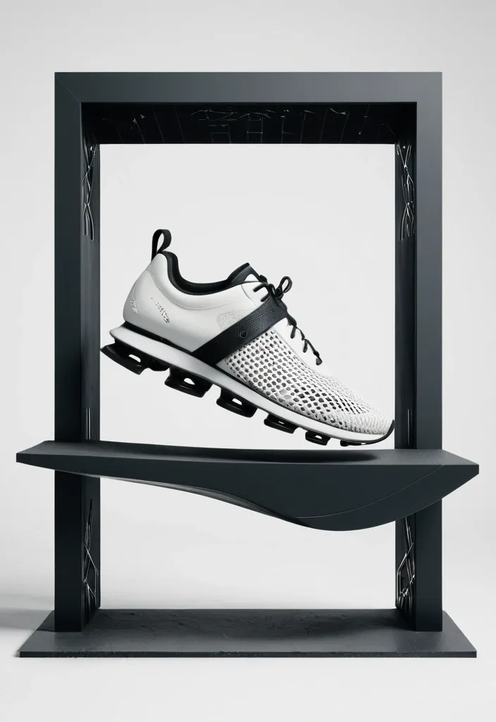
Create a premium future-sport editorial footwear concept board , 9:16 , full bleed. Modular panel atelier layout , sculptural unbranded footwear , human movement. A disciplined high-contrast editorial board composed of 2 to 4 crisp modular image panels with clean gutters and generous negative space. Obsidian , warm bone , and brushed titanium palette with a single restrained glacial-cyan accent line or marker. Hero footwear features an original unbranded sculptural architecture: pearl-bone knit upper , open heel cage , floating brushed-titanium arch bridge , and a continuous smoked-ceramic rocker with three long carved channels. Smooth integrated forefoot , no separate round pods , no red sole. Panels combine: one dynamic human athletic gesture or quiet moment in natural scale , one hero shoe profile catching metallic highlights , and one tactile macro detailing the open arch bridge and rocker grooves. floating leap · obsidian-to-bone cyclorama Athlete suspended in a vertical leap in profile with folded leg. Opposite panels isolate a floating smoked-ceramic shoe macro and the open titanium arch void. Layout: tall motion panel left , stacked footwear macros right. Title: WEIGHTLESS. Render one clean editorial title in refined condensed grotesk. Keep typography grid-aligned with minimal micro-labels. No Nike , no Reebok , no swoosh , no logos , no fake brand marks , no cluttered HUD , no duplicate limbs. ,
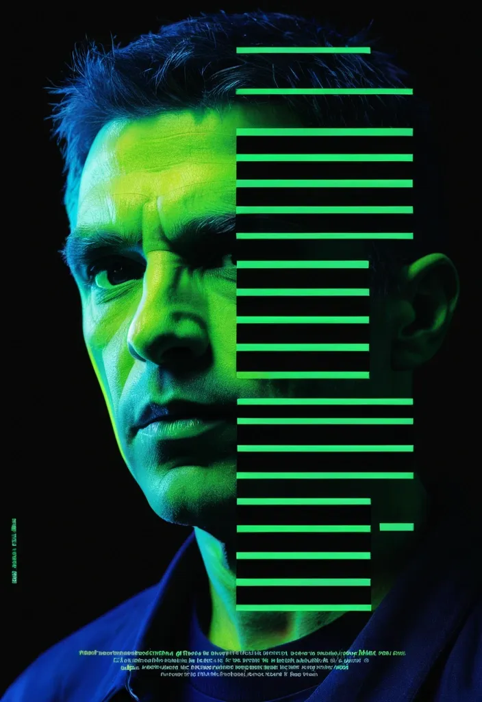
TITLE: EXCESS TEXT COLOR: fluorescent green SUBJECT: Mature man , front view DISTORTION: mosaic PALETTE: neutral base , one accent BACKGROUND: Black to dark blue FORMAT: 9:16 Create a premium fashion editorial portrait using controlled horizontal slit-echo distortion. Begin with a strong realistic portrait and keep at least one clear identity anchor such as the eyes , profile or facial outline. Break selected areas into vertical slices with varied widths , compression and horizontal displacement , creating a gradual transition from clear photography to optical fragmentation. Keep some areas completely sharp rather than distorting the whole image. Preserve realistic skin , hair and fabric texture inside every slice. Use a restrained palette , strong silhouette and generous negative space. Keep typography clean and editorial: one title , one short phrase and minimal supporting copy. The result should feel like an optical photography experiment and high-fashion magazine poster , not a digital glitch effect. Avoid RGB splitting , VHS noise , horizontal scanlines , uniform slices , neon cyberpunk graphics , excessive text , plastic skin , logos , numbering and watermarks. ,
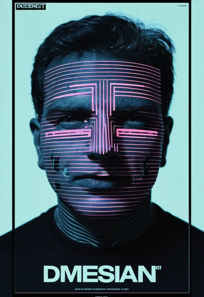
TITLE: Mastram Masti me SUBJECT: Mature man , front view DISTORTION: echo PALETTE: Electronic circuit FORMAT: 9:16 Create a premium fashion editorial portrait using controlled vertical slit-scan distortion. Begin with a strong realistic portrait and keep at least one clear identity anchor such as the eyes , profile or facial outline. Break selected areas into vertical slices with varied widths , compression and horizontal displacement , creating a gradual transition from clear photography to optical fragmentation. Keep some areas completely sharp rather than distorting the whole image. Preserve realistic skin , hair and fabric texture inside every slice. Use a restrained palette , strong silhouette and generous negative space. Keep typography clean and editorial: one title , one short phrase and minimal supporting copy. The result should feel like an optical photography experiment and high-fashion magazine poster , not a digital glitch effect. Avoid RGB splitting , VHS noise , horizontal scanlines , uniform slices , neon cyberpunk graphics , excessive text , plastic skin , logos , numbering and watermarks. ,
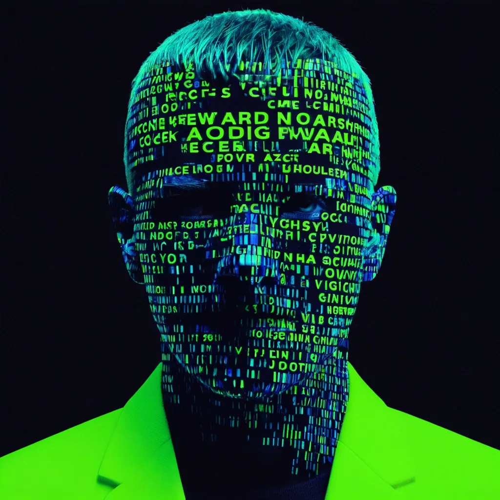
TITLE: EXCESS TEXT COLOR: fluorescent green SUBJECT: Mature man , front view DISTORTION: mosaic PALETTE: neutral base , one accent BACKGROUND: Black to dark blue FORMAT: 9:16 Create a premium fashion editorial portrait using controlled horizontal slit-echo distortion. Begin with a strong realistic portrait and keep at least one clear identity anchor such as the eyes , profile or facial outline. Break selected areas into vertical slices with varied widths , compression and horizontal displacement , creating a gradual transition from clear photography to optical fragmentation. Keep some areas completely sharp rather than distorting the whole image. Preserve realistic skin , hair and fabric texture inside every slice. Use a restrained palette , strong silhouette and generous negative space. Keep typography clean and editorial: one title , one short phrase and minimal supporting copy. The result should feel like an optical photography experiment and high-fashion magazine poster , not a digital glitch effect. Avoid RGB splitting , VHS noise , horizontal scanlines , uniform slices , neon cyberpunk graphics , excessive text , plastic skin , logos , numbering and watermarks. ,
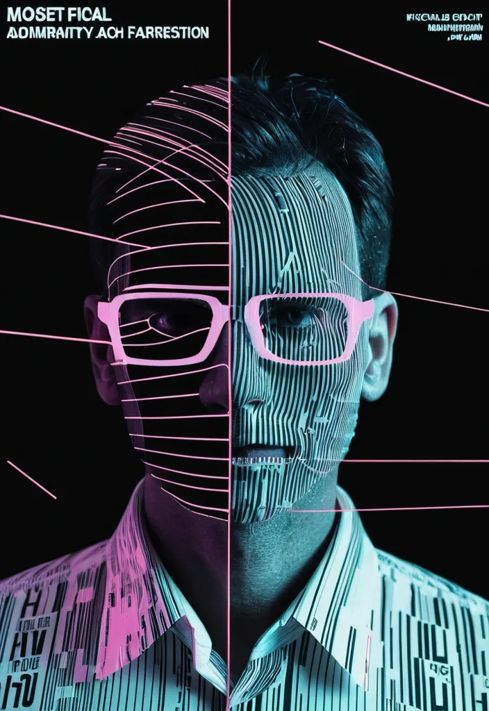
TITLE: Mastram Masti me SUBJECT: Mature man , front view DISTORTION: echo PALETTE: neutral base FORMAT: 9:16 Create a premium fashion editorial portrait using controlled vertical slit-scan distortion. Begin with a strong realistic portrait and keep at least one clear identity anchor such as the eyes , profile or facial outline. Break selected areas into vertical slices with varied widths , compression and horizontal displacement , creating a gradual transition from clear photography to optical fragmentation. Keep some areas completely sharp rather than distorting the whole image. Preserve realistic skin , hair and fabric texture inside every slice. Use a restrained palette , strong silhouette and generous negative space. Keep typography clean and editorial: one title , one short phrase and minimal supporting copy. The result should feel like an optical photography experiment and high-fashion magazine poster , not a digital glitch effect. Avoid RGB splitting , VHS noise , horizontal scanlines , uniform slices , neon cyberpunk graphics , excessive text , plastic skin , logos , numbering and watermarks. ,
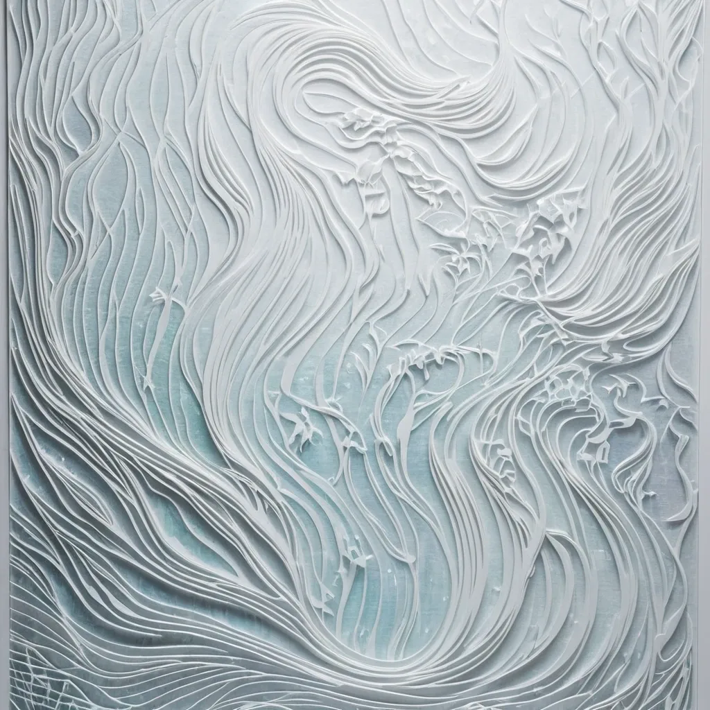
Generate a 9:16 poster featuring an Eastern poetic aesthetic , characterized by flowing light and generous negative space. Distill a two-character theme and a core emotion from the original poetic verse. Avoid replicating a complete traditional scene; instead , achieve a visual translation using a small , singular subject and a specific form of light movement (e.g. , fragmented , continuous , scattered , converging , flowing , veiled , or translucent). Use a background of premium , pure-white handmade art paper with 65%–75% negative space , while the subject occupies only 8%–20% of the composition. Incorporate meaningful white bas-relief elements—such as rain streaks , water ripples , mountain ridges , wind lines , old paths , or floral shadows—that appear minimalist from a distance but reveal themselves upon closer inspection. Subtly introduce iridescent accents—pearl white , ice blue , pale violet , celadon green , champagne gold , or amber gold—allowing light to emerge naturally from elements like water , porcelain , jade , paper , or spatial paths to create a shimmering , ethereal glow. Keep the use of color restrained; avoid neon effects or full-screen gradients. Human figures may appear minuscule or be omitted entirely , with "human presence" suggested only through objects such as a teacup , bamboo staff , empty chair , letter , or illuminated window. Feature the two-character theme as the main title , accompanied by a concise poetic line , location , date , and an English subtitle. ,
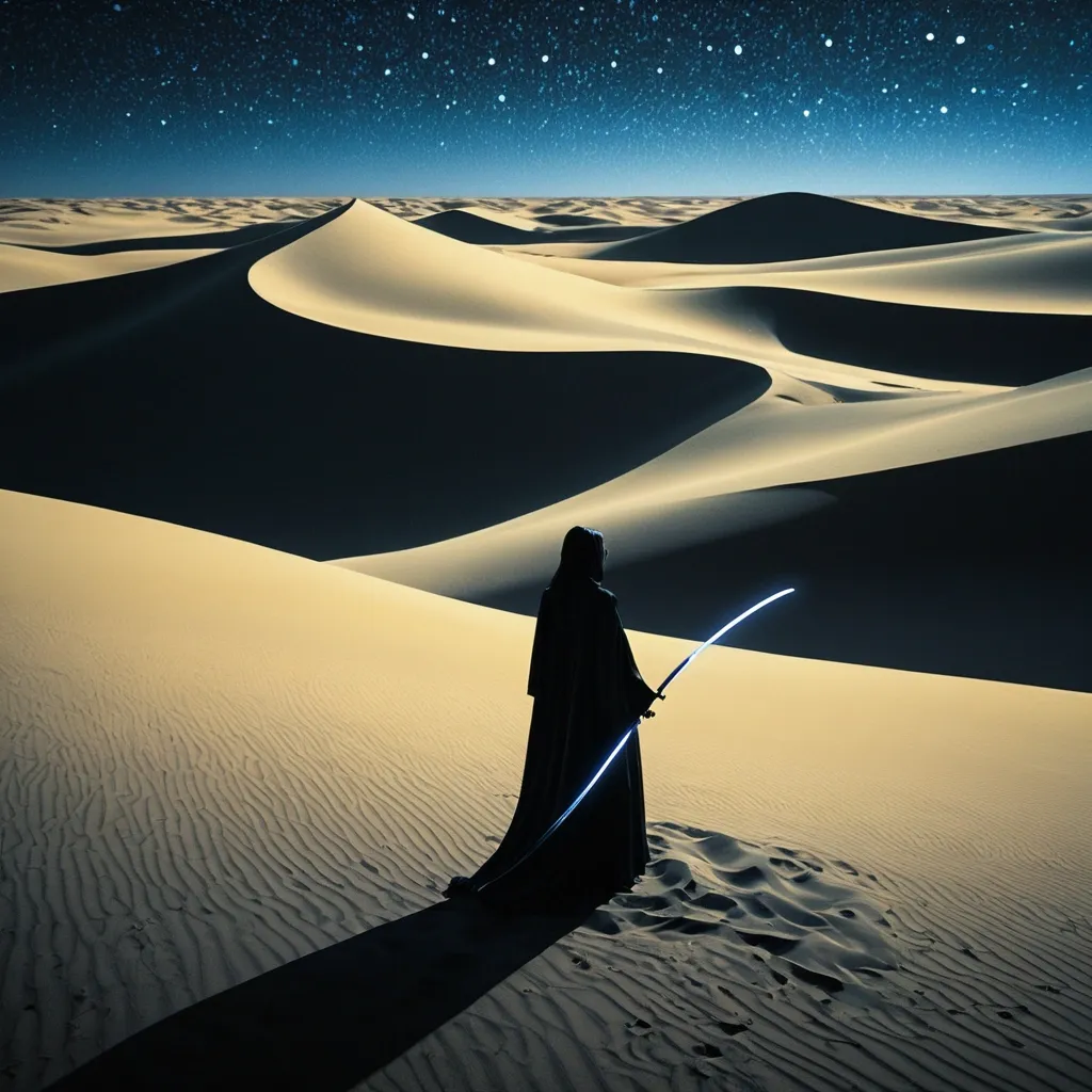
Generate a 9:16 poster featuring an Eastern poetic aesthetic , characterized by flowing light and generous negative space. A vast desert of black sand where the dunes form perfect negative shapes of inverted peak , a solitary woman in a long dark robe holds a katana at her side. An enormous translucent fabric train billows dramatically behind her across a reflective surface , standing among tall yellow reeds at the edge of a quiet land. As it progresses , the blue vortex dots towards sky , by Matisse to the right and then to the left , becoming progressively narrower to create a strong sense of perspective and depth , inversion surreal dreamlike strong contrast between dark sand and luminous figure impossible landscape cinematic presence highly detailed striking composition. ,
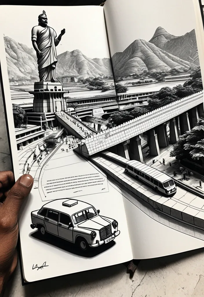
A highly detailed , premium travel-art illustration. In the foreground , a hand holds an open passport , its right-hand page acting as a portal into Kevadia , Gujarat. A photorealistic miniature city scene grows out of the open page , as if the paper itself were a window into the streets. A signature E-Rickshaw breaks out of the passport edge in dramatic 3D perspective , tilting toward the viewer and casting a soft shadow across the hand. Behind the passport , one iconic landmark , Statue of Unity , rises tall and photorealistic as the single architectural focal point. Around the scene , exactly 3 clean black-ink hand-drawn doodles label the city's identity (Ekta Nagar in the Narmada district of Gujarat) , placed loosely in the negative space. Tiny realistic figures interact with the miniature world: a commuter , a street vendor , a tourist taking a photo , all scaled to sell the miniature effect. Style: photorealistic travel photography fused with elegant black-ink sketchbook doodles. Soft warm directional light from the upper left , shallow depth of field , sharp focus on the emerging vehicle , realistic paper and skin textures , subtle contact shadows. Clean editorial composition with generous negative space. Instagram-worthy. Composition hierarchy (most to least prominent): 1. Jungle Safari , 2. Valley of Flowers , 3. Sardar Sarovar Dam , 4. Statue of Unity Ticket in hand , 5. Butterfly Garden. Avoid: crowded layouts , more than one landmark , duplicated symbols , excessive text , arrows , stickers , decorative icons , busy backgrounds , more than 3 doodles. Make the aspect ratio 3:4 ,