Search Results for main title
Explore AI generated designs, images, art and prompts by top community artists and designers.
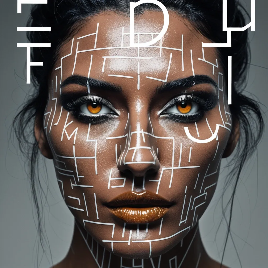

Create a sophisticated editorial portrait poster built around selective focus. Use a realistic photographic portrait with natural skin texture , pores , subtle imperfections , believable hair , and authentic facial structure. Avoid plastic skin , CGI smoothness , heavy beauty retouching , or generic commercial-model styling. Aspect Ratio: 9:16. Keep most of the portrait softly blurred , slightly motion-softened , desaturated , or reduced in detail. Only the selected horizontal sharp slice should return to sharp detail , natural skin tone , and clear texture. The sharp and blurred areas must remain perfectly aligned as the same person and the same photographic moment , with no duplicated eyes , second face , or pasted-photo effect. Choose one focus structure: a horizontal sharp band across the eyes , a small floating window isolating part of the face , a narrow offset focus frame through motion blur , or a larger offset frame that deliberately shifts attention away from the facial center. Use a restrained neutral palette of charcoal , gray , warm beige , off-white , and natural skin tones. Use rust orange as the only strong accent for the focus lines , main title , and a few key details. Keep the visual rule: Neutral Field + One Accent Color. Use mature magazine-style typography: a high-contrast editorial serif for MOTION , a condensed bold sans serif for RAJU , and a small neutral sans serif for secondary information. Include harp through motion as meaningful copy connected to the subject and concept , not random filler text. Keep the composition asymmetric with generous negative space. Let the portrait , typography , and focus geometry interact naturally. Add subtle film grain , light scan texture , and restrained print texture so the whole poster feels like one finished editorial piece. The final result should feel like a polished independent fashion , photography , music , or culture magazine poster , with blur and sharpness deliberately controlling where the viewer looks. Avoid cyberpunk HUDs , excessive UI graphics , neon gradients , gibberish text , logos , watermarks , numbering , sparkle symbols , harsh Gaussian blur , melted facial features , duplicated features , plastic skin , and over-retouching. ,
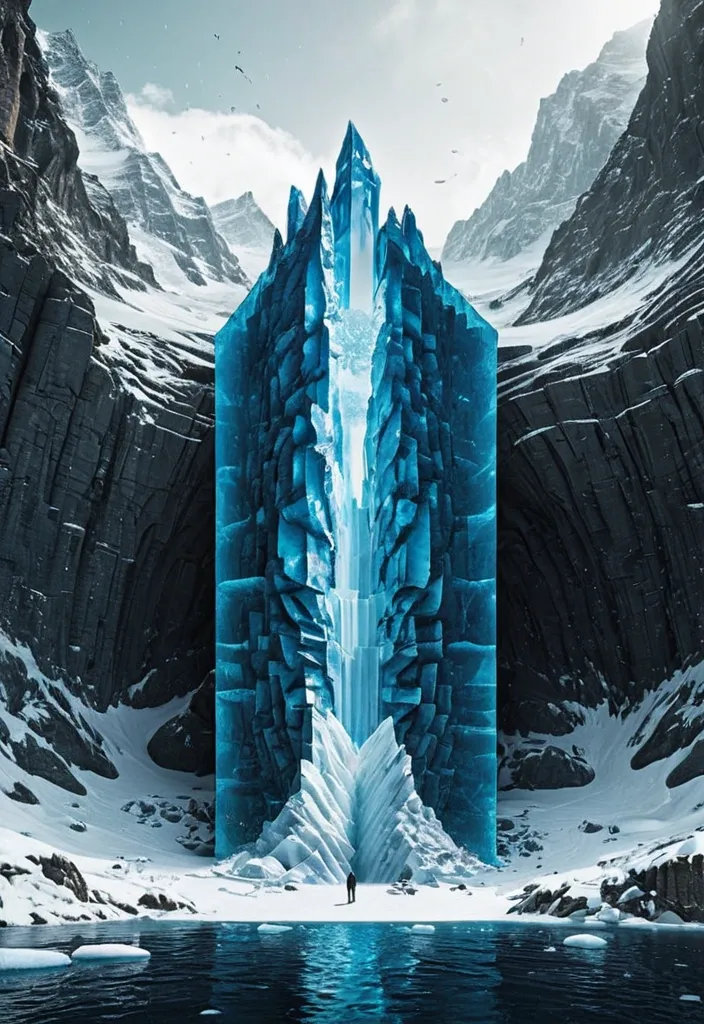
Theme: Ice Surface world: Ice-fort appears above the surface Hidden world: Cave gate is revealed underneath Key natural structure: Ice mass Main palette: Deep blue Title: Navro Subtitle: lishotta Create a premium 9:16 editorial poster from the WORLD SLICE series. Show a realistic natural landscape as if a section of the world has been physically cut open , revealing a much larger hidden structure beneath the visible surface. Keep the surface relatively simple and easy to read , while the hidden section becomes the main visual surprise. Use strong scale contrast , clear geological or ecological layers , realistic materials , believable depth , atmospheric perspective and cinematic natural light. The cutaway should not look like a glass box or aquarium. Treat it as a real piece of land , ocean , forest or ice physically sliced from the planet. Let parts of nature break beyond the geometric cutaway boundary: roots , rock formations , ice , water or terrain may extend outside the original shape to create stronger visual impact. Keep the central object around 55–70% of the poster width and preserve generous negative space. Avoid making the 3D cutaway too large. Integrate typography into the composition instead of adding many tiny labels. Use one bold main title , one short supporting line and only a few minimal editorial details. Allow natural elements to overlap , pass behind or partially cover the typography. Use a refined mix of modern serif and condensed sans-serif typography. The poster should feel like premium nature editorial design , contemporary art direction and photorealistic environmental visualization. Prioritize: strong thumbnail readability , one clear visual surprise , large recognizable forms , realistic natural textures , clean hierarchy , high-end editorial composition , and a strong contrast between the visible world and the hidden world. No logo , no watermark , no numbering , no excessive micro text , no HUD interface , no four-point sparkle symbols , no cheap CGI , no glass-container look. Make the final image feel like a complete finished poster , not a template. ,
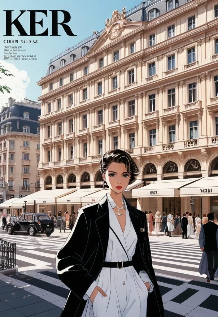
Cover of a high-end luxury fashion magazine featuring a 1990s editorial style. A high-quality digital illustration blending refined anime art with editorial realism. The model is positioned in the center. Surrounding her , the scene depicts a street in an elegant European city , featuring classic architecture , café terraces , and people dressed in formal attire of the era. Typographic magazine headlines are distributed across the layout , including the large main title *"HER19845"* at the top and the date *"SUMMER 1996"*. Natural daylight , a sophisticated and luxurious atmosphere , 8K high definition. ,
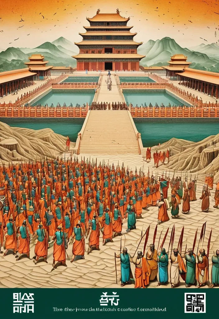
Theme: Ancient Water Conservancy Main palette: Sand path , sand , orange Structural method: another paper construction Micro scene: a tiny Walking march , performance Event details: 02 October , 05:30 am , Start Aspect ratio: 16:9 Design a historical and cultural poster with a modern Eastern editorial aesthetic , using "paper fibers + large color fields + micro-scenes" as the core visual language. Do not interpret traditional culture as stacking ancient architecture , calligraphy , auspicious clouds , or artifacts. Instead , first distill the Cultural Logic , then let large areas of handmade paper color fields directly carry structures , spaces , time , flow , order , or process relationships , so that viewers first see a strong and clear large form from afar , and only gradually discover the cultural narrative hidden within upon closer inspection. Use the dark green , sand style to establish 2–5 main paper color blocks of distinctly different sizes , maintaining low saturation but complete color intensity. All color blocks should have the authentic , rich texture of handmade paper , pulp , watercolor , or mineral pigments , with visible natural long and short fibers , pigment deposition , subtle impressions , large-scale natural color variations , and irregular torn paper edges. The overall effect should be matte , clean , and intact—avoid dirtiness , yellow spots , random speckles , cheap retro effects , or digital gradients. Based on the theme , let the color fields express the logic of system operations through folding , branching , interweaving , interlocking , offsetting , supporting , segmenting , enclosing , or negative space relationships , rather than simply serving as decorative backgrounds. Embed the Dadi march within the large color field structure , keeping figures and props at a very small scale , totaling about 3%–6% of the image area. Each scene must depict a clear action , with causal or temporal relationships between them , such as "entering → executing → recording → completing , " allowing the miniature figures to truly drive the narrative rather than just standing in poses. Figures' clothing in indian Freedom fighter style and artifacts should align with the theme's era and identity but remain restrained—avoid cinematic historical drama excess; scenes should only retain key props that illustrate systemic relationships , without cluttering with decorations or irrelevant cultural symbols. Typography should employ the editorial language of modern Eastern cultural institutions , museums , or archival exhibitions. The main title Dandi March should use refined Song typeface , publication-inspired Gujarati fonts , at a medium-small size that does not overpower the large color fields; supporting English text , dates , locations , and explanatory information should use even smaller sizes to create clear hierarchies. Subtle cinnabar seals , paper tags , archival labels , or node text may be added , but they must genuinely relate to the thematic logic—do not add them randomly just for a "Indian Freedom fighter style" feel. The overall reading order should be: large color field structures and color relationships → systemic or spatial logic → miniature figures' continuous narrative → main title and exhibition information. The final image should achieve a strong large form and visual impact from afar , revealing paper fibers , figure actions , and historical details up close , balancing design sensibility , narrative depth , and cultural completeness. Avoid book cover vibes , traditional Chinese illustration styles , screens full of ancient architecture , oversized titles , PPT-style rigid layouts , modern infographic arrows , meaningless English placeholders , element piling , commercial ad vibes , 3D CGI , glass textures , neon colors , logos , watermarks , numbering , and starburst decorations. ,
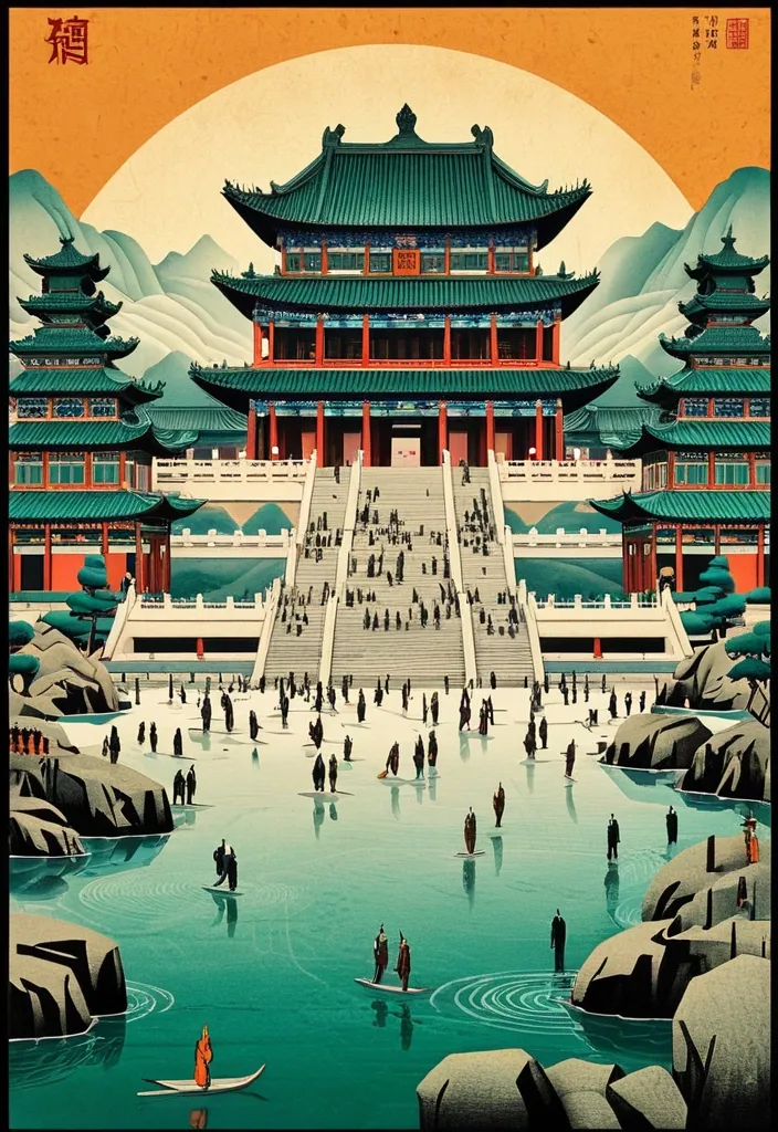
Theme: Ancient Water Conservancy Main palette: blue , dark green , orange Structural method: another paper construction Micro scene: a tiny Walking march , performance Event details: 02 October , venue , Start Aspect ratio: 9:16 Design a historical and cultural poster with a modern Eastern editorial aesthetic , using "paper fibers + large color fields + micro-scenes" as the core visual language. Do not interpret traditional culture as stacking ancient architecture , calligraphy , auspicious clouds , or artifacts. Instead , first distill the Cultural Logic , then let large areas of handmade paper color fields directly carry structures , spaces , time , flow , order , or process relationships , so that viewers first see a strong and clear large form from afar , and only gradually discover the cultural narrative hidden within upon closer inspection. Use the dark green , sand style to establish 2–5 main paper color blocks of distinctly different sizes , maintaining low saturation but complete color intensity. All color blocks should have the authentic , rich texture of handmade paper , pulp , watercolor , or mineral pigments , with visible natural long and short fibers , pigment deposition , subtle impressions , large-scale natural color variations , and irregular torn paper edges. The overall effect should be matte , clean , and intact—avoid dirtiness , yellow spots , random speckles , cheap retro effects , or digital gradients. Based on the theme , let the color fields express the logic of system operations through folding , branching , interweaving , interlocking , offsetting , supporting , segmenting , enclosing , or negative space relationships , rather than simply serving as decorative backgrounds. Embed the Dadi march within the large color field structure , keeping figures and props at a very small scale , totaling about 3%–6% of the image area. Each scene must depict a clear action , with causal or temporal relationships between them , such as "entering → executing → recording → completing , " allowing the miniature figures to truly drive the narrative rather than just standing in poses. Figures' clothing and artifacts should align with the theme's era and identity but remain restrained—avoid cinematic historical drama excess; scenes should only retain key props that illustrate systemic relationships , without cluttering with decorations or irrelevant cultural symbols. Typography should employ the editorial language of modern Eastern cultural institutions , museums , or archival exhibitions. The main title [Main Title] should use refined Song typeface , Ming-style , or publication-inspired Chinese fonts , at a medium-small size that does not overpower the large color fields; supporting English text , dates , locations , and explanatory information should use even smaller sizes to create clear hierarchies. Subtle cinnabar seals , paper tags , archival labels , or node text may be added , but they must genuinely relate to the thematic logic—do not add them randomly just for a "Chinese style" feel. The overall reading order should be: large color field structures and color relationships → systemic or spatial logic → miniature figures' continuous narrative → main title and exhibition information. The final image should achieve a strong large form and visual impact from afar , revealing paper fibers , figure actions , and historical details up close , balancing design sensibility , narrative depth , and cultural completeness. Avoid book cover vibes , traditional Chinese illustration styles , screens full of ancient architecture , oversized titles , PPT-style rigid layouts , modern infographic arrows , meaningless English placeholders , element piling , commercial ad vibes , 3D CGI , glass textures , neon colors , logos , watermarks , numbering , and starburst decorations. ,
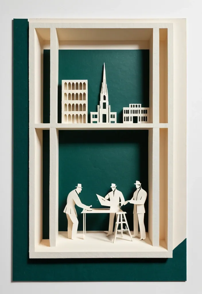
Theme: Freedom Fighters Memorial Aspect ratio: 9:16 Main palette: blue , dark green , orange Structural method: layered cutouts Micro scene: a tiny workshop , performance Event details: 02 October , 08:30 am , Dadi March Create a refined vertical cultural poster using tactile handmade paper , large color fields , structural composition , and a tiny narrative scene. Build the main visual with a clear paper based construction method. The composition may use layered apertures , framing , overlapping printed blocks , folded planes , or other physical paper relationships. Let the structure itself create depth , rhythm , and visual tension rather than relying on decorative graphics. All large paper areas should have realistic handmade texture , including visible fibers , pulp variation , pigment absorption , subtle pressure marks , irregular edges , and slight material imperfections. Keep the surfaces matte , clean , and sophisticated. Use strong but controlled color relationships. Large color fields should remain visually clear from a distance , while smaller overlaps , cut edges , shadows , folds , and paper thickness become visible only when viewed closely. Add one small micro scene related to the theme. Include two or three adult figures naturally performing the activity , such as cutting paper , operating a press , performing shadow theatre , folding structures , or arranging materials. Keep the entire scene around 3% to 5% of the poster so it remains a discovered detail rather than the main subject. Use generous warm ivory or neutral negative space to balance the large structural forms. Typography should be restrained and secondary. Use a refined editorial serif for the main title and small uppercase sans serif for supporting information. Keep the title relatively small and place it in a quiet area of the composition. The visual reading order should be: large paper structure first , color and material interaction second , micro scene third , title and event information last. The final result should feel contemporary , tactile , editorial , architectural , and handmade. From a distance , the poster should read as a strong abstract composition. Up close , it should reveal paper fibers , cut edges , folds , overlaps , print texture , tiny people , tools , and process. ,
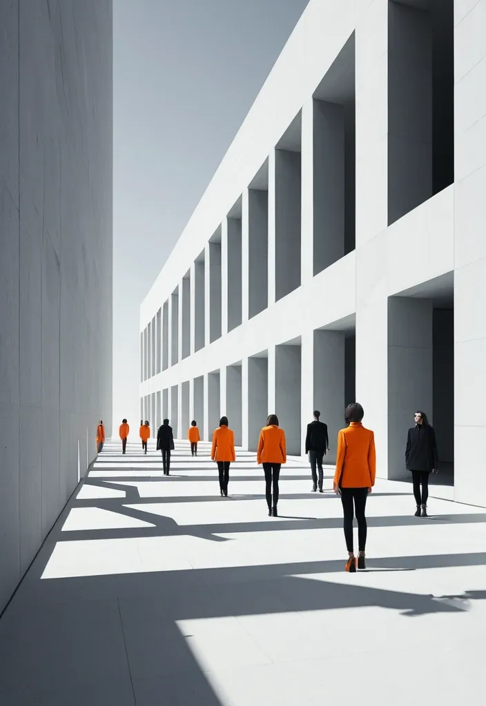
BRAND NAME: AKOTA SERIES: Max0.5 MAIN TITLE: Mastram DEPTH SYSTEM: layered slabs PRIMARY COLOR: Orange ACCENT COLOR: Gray ASPECT RATIO: 9:16 Create a high-end multi-person editorial campaign poster where depth and perspective become the main design system. Build the scene around one strong spatial structure , such as nested architectural frames , lines converging toward a vanishing point , irregular stacked platforms , or large horizontal layers. The architecture should immediately create a clear foreground , middle ground , and background. Place multiple adult figures at different distances and heights within the same coherent perspective field. Their scale must change naturally with depth. Use one or two strong foreground figures , several smaller midground figures , and a few distant figures. Avoid evenly spaced people , grids , lineups , or team-photo compositions. Make people and architecture physically overlap. Some figures should pass through frames , disappear behind walls , be partially hidden by platforms , appear between layers , or emerge from deeper spaces. The result should feel like one real photographed environment , not separate people pasted onto a layout. Integrate the main title into the architecture whenever possible. Let typography follow the perspective of a frame , wall , platform , or structural edge. It may change scale , become partially occluded , or stretch across several depth planes , but it should remain readable. Keep the environment minimal and sculptural. Use large geometric forms , controlled negative space , one dominant color system , realistic directional daylight , and consistent architectural shadows. The spatial idea should still read clearly at thumbnail size. Use realistic fashion photography for the cast: natural skin texture , believable anatomy , real hair , accurate hands and feet , natural fabric folds , varied poses , and subtle movement. Avoid duplicated figures , plastic skin , floating bodies , or overly staged model poses. Supporting typography should stay minimal and secondary. The final image should feel like a real contemporary fashion , cultural , or brand campaign where people , architecture , type , and perspective are all part of the same composition. ,
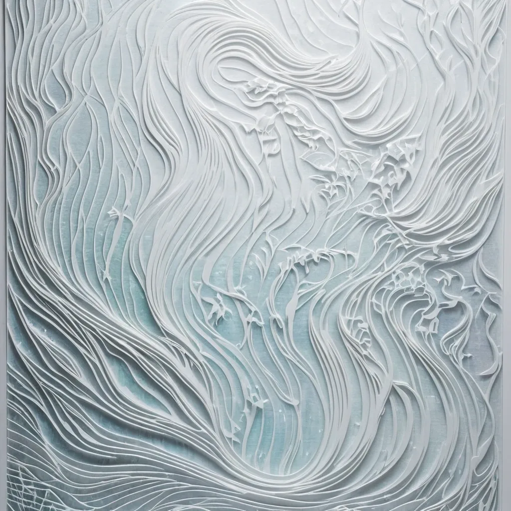
Generate a 9:16 poster featuring an Eastern poetic aesthetic , characterized by flowing light and generous negative space. Distill a two-character theme and a core emotion from the original poetic verse. Avoid replicating a complete traditional scene; instead , achieve a visual translation using a small , singular subject and a specific form of light movement (e.g. , fragmented , continuous , scattered , converging , flowing , veiled , or translucent). Use a background of premium , pure-white handmade art paper with 65%–75% negative space , while the subject occupies only 8%–20% of the composition. Incorporate meaningful white bas-relief elements—such as rain streaks , water ripples , mountain ridges , wind lines , old paths , or floral shadows—that appear minimalist from a distance but reveal themselves upon closer inspection. Subtly introduce iridescent accents—pearl white , ice blue , pale violet , celadon green , champagne gold , or amber gold—allowing light to emerge naturally from elements like water , porcelain , jade , paper , or spatial paths to create a shimmering , ethereal glow. Keep the use of color restrained; avoid neon effects or full-screen gradients. Human figures may appear minuscule or be omitted entirely , with "human presence" suggested only through objects such as a teacup , bamboo staff , empty chair , letter , or illuminated window. Feature the two-character theme as the main title , accompanied by a concise poetic line , location , date , and an English subtitle. ,
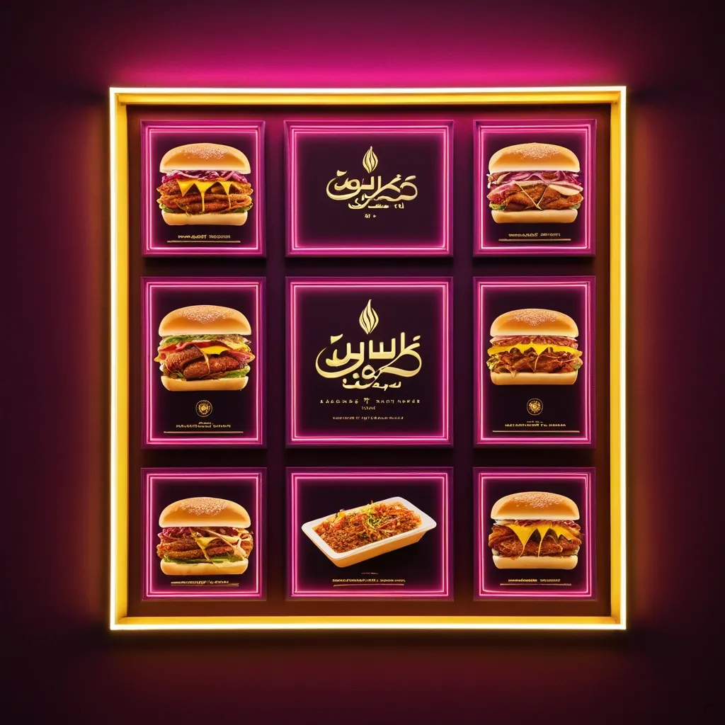
**Subject:** A horizontal commercial signboard for an sudanes restaurant specializing in fast food **Composition & Layout:** * **Format:** A wide , horizontal rectangular banner set within a thin , glowing warm-yellow frame. * **Central Focus:** Large , prominent Arabic text dominates the center. * **Top Left:** A logo place leave it empty * **Bottom Section:** Smaller lines of informative text and four square photographic panels showing food. * **Lighting Effects:** The overall aesthetic is a high-contrast , glowing "light-box" style. Pinkish-magenta light streaks radiate upward from the bottom corners toward the center. **Color Palette:** * **Background:** Deep royal red ff2325 with subtle textures and faint , light-white decorative flourishes (filigree patterns). * **Main Typography:** Bright orange letters with a thick , 3D-effect gold/yellow outline and a dark drop shadow for depth. * **Secondary Typography:** Pure white for the address and bright yellow for the contact numbers. * **Accents:** Magenta/pink light flares and a warm yellow glow from the outer frame. **Specific Elements:** * **Main Title (Arabic):** Bold , stylized Arabic calligraphy reading "كوبا للفطائر". * **Logo:** The logo for Cuba pies Restaurant will be sent with the promo. * **Address Line (Middle):** A single line of white Arabic text: "الاسكان 96-شارع السوق-الفاصل 96_95" * **Contact Line (Bottom):** Yellow text containing two phone numbers "0923931452/ 0928737341" preceded by the Arabic word for "Contact:". * **Food Imagery:** Four small square panels at the bottom (two on the left , two on the right). They feature realistic photos of Shawarma sandwich on plates with garnishes and one panel showing a whole , golden-brown roasted chicken. **Style:** Modern Egyptian commercial design , vibrant , professional , and designed to look like an illuminated neon or LED sign at night. ,
**Subject:** A horizontal commercial signboard for an sudanes restaurant specializing in fast food **Composition & Layout:** * **Format:** A wide , horizontal rectangular banner set within a thin , glowing warm-yellow frame. * **Central Focus:** Large , prominent Arabic text dominates the center. * **Top Left:** A logo place leave it empty * **Bottom Section:** Smaller lines of informative text and four square photographic panels showing food. * **Lighting Effects:** The overall aesthetic is a high-contrast , glowing "light-box" style. Pinkish-magenta light streaks radiate upward from the bottom corners toward the center. **Color Palette:** * **Background:** Deep royal red ff2325 with subtle textures and faint , light-white decorative flourishes (filigree patterns). * **Main Typography:** Bright orange letters with a thick , 3D-effect gold/yellow outline and a dark drop shadow for depth. * **Secondary Typography:** Pure white for the address and bright yellow for the contact numbers. * **Accents:** Magenta/pink light flares and a warm yellow glow from the outer frame. **Specific Elements:** * **Main Title (Arabic):** Bold , stylized Arabic calligraphy reading "كوبا للفطائر". * **Logo:** The logo for Cuba pies Restaurant will be sent with the promo. * **Address Line (Middle):** A single line of white Arabic text: "الاسكان 96-شارع السوق-الفاصل 96_95" * **Contact Line (Bottom):** Yellow text containing two phone numbers "0923931452/ 0928737341" preceded by the Arabic word for "Contact:". * **Food Imagery:** Four small square panels at the bottom (two on the left , two on the right). They feature realistic photos of Shawarma sandwich on plates with garnishes and one panel showing a whole , golden-brown roasted chicken. **Style:** Modern Egyptian commercial design , vibrant , professional , and designed to look like an illuminated neon or LED sign at night. ,
**Subject:** A horizontal commercial signboard for an sudanes restaurant specializing in fast food **Composition & Layout:** * **Format:** A wide , horizontal rectangular banner set within a thin , glowing warm-yellow frame. * **Central Focus:** Large , prominent Arabic text dominates the center. * **Top Left:** A logo place leave it empty * **Bottom Section:** Smaller lines of informative text and four square photographic panels showing food. * **Lighting Effects:** The overall aesthetic is a high-contrast , glowing "light-box" style. Pinkish-magenta light streaks radiate upward from the bottom corners toward the center. **Color Palette:** * **Background:** Deep royal red ff2325 with subtle textures and faint , light-white decorative flourishes (filigree patterns). * **Main Typography:** Bright orange letters with a thick , 3D-effect gold/yellow outline and a dark drop shadow for depth. * **Secondary Typography:** Pure white for the address and bright yellow for the contact numbers. * **Accents:** Magenta/pink light flares and a warm yellow glow from the outer frame. **Specific Elements:** * **Main Title (Arabic):** Bold , stylized Arabic calligraphy reading "كوبا للفطائر". * **Logo:** The logo for Cuba pies Restaurant will be sent with the promo. * **Address Line (Middle):** A single line of white Arabic text: "الاسكان 96-شارع السوق-الفاصل 96_95" * **Contact Line (Bottom):** Yellow text containing two phone numbers "0923931452/ 0928737341" preceded by the Arabic word for "Contact:". * **Food Imagery:** Four small square panels at the bottom (two on the left , two on the right). They feature realistic photos of Shawarma sandwich on plates with garnishes and one panel showing a whole , golden-brown roasted chicken. **Style:** Modern Egyptian commercial design , vibrant , professional , and designed to look like an illuminated neon or LED sign at night. ,
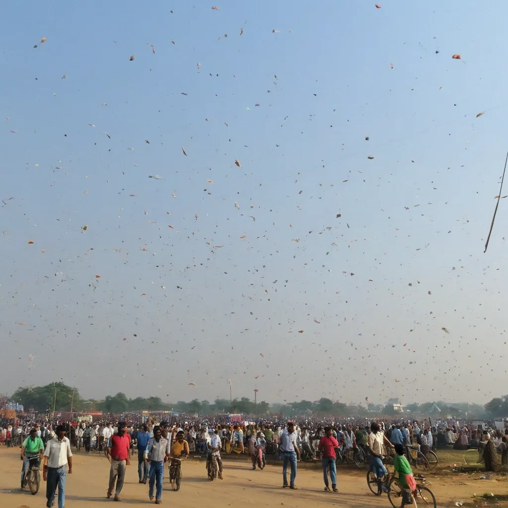
For the cover of the **Indian festival for the "Happy Uttarayan" cycle** , it is important to visually convey the values of **Festival Uttarayan** , **Flying kites** , and **people enjoying**. The visual proposal should be modern , welcoming , and symbolic , reflecting the essence of the content that will be explored in the manual. Below is a detailed description of the cover: ### **Visual Composition:** 1. **Central Image:** * A **stylized woman with wings** emerging from an abstract composition of shapes and colors. The wings can be represented in a **fluid and elegant** way , symbolizing growth and the freedom gained through knowledge. * **Diversity of Kites**: The central figure should be representative of **diverse ethnicities** , with the woman's face and body presented in an inclusive manner. The idea is to communicate that all women , regardless of their origin or background , are part of this transformation movement. * **Cultural Elements**: Cultural details can be incorporated into the wings or the background , such as **line art style kites** (Indian style kites) and other symbols that refer to the ancestry and cultural richness of women. 2. **Typography:** * **Main Title (Women with kites)**: Use a **modern and imposing typography** , such as **Montserrat** or **Bebas Neue** , in **bold** , with a large size (minimum 32px) and adjusted letter spacing. The font should be simple but powerful , to reflect the strength of the concept. * **Subtitle**: "Gender Literacy as an Instrument of Equality and Transformation". Use a lighter typography , such as **Roboto** or **Lora** , with a size of 16px-18px to ensure good readability. The font can be more fluid and rounded to balance with the stronger title. * **Typography Color**: Use **deep purple (#4A148C)** or **vibrant orange (#FF5722)** for the title , creating contrast with the background and giving it prominence. The subtitle can be in **white** or **yellow (#FFEB3B)** , creating harmony and visibility. 3. **Color Palette:** * **Background**: The background can have a mix of warm and vibrant tones , such as **orange** , **purple** , and **yellow**. The use of these colors should symbolize energy , transformation , and the celebration of femininity. A **soft gradient** or a texture that evokes gujarati cultural and artistic elements can be used. * **Details and Graphic Elements**: Use graphic elements such as **thin lines** or **geometric shapes** to frame the cover , such as circles or flowers , giving a modern and dynamic touch to the composition. * **Color Contrasts**: To ensure the title stands out , the cover background can be a **dark or neutral** tone , while the title and subtitle stand out in **vibrant** colors. 4. **Additional Elements:** * **Symbolic Iconography**: Small icons , such as **kites** , **bugal** , **hat** , **lineart style kites** , can be subtly distributed throughout the cover to add cultural and symbolic elements without cluttering the main image. * **Text Positioning**: The title can occupy the upper central part , with the subtitle immediately below , to create a clear reading hierarchy. 5. **Environment and Graphic Style:** * The cover should be **minimalist** , with enough space between the elements to ensure readability and an uncluttered look. * The **artistic details** and **fluid shapes** should symbolize the concept of **freedom** , **transformation** , and **growth**. The use of **organic elements** (such as flowers or leaves) can bring softness to the composition , balancing the strength of the concept with a welcoming tone. ### **Visual Message:** * The cover needs to convey the idea of **emancipation** and **movement** , representing women who seek **personal and collective growth** in the educational and social fields. * The use of vibrant colors and symbolic images such as kites allude to **female power** , **struggle** , and **social transformation** , which are essential to the content of the workshop series. This cover design not only aligns with the themes of the *Happy Uttarayan* (Women with kites) series , but also promotes an aesthetic that captivates the target audience and reinforces the importance of **Kites festival** in the context of Professional and Technological Education. ,
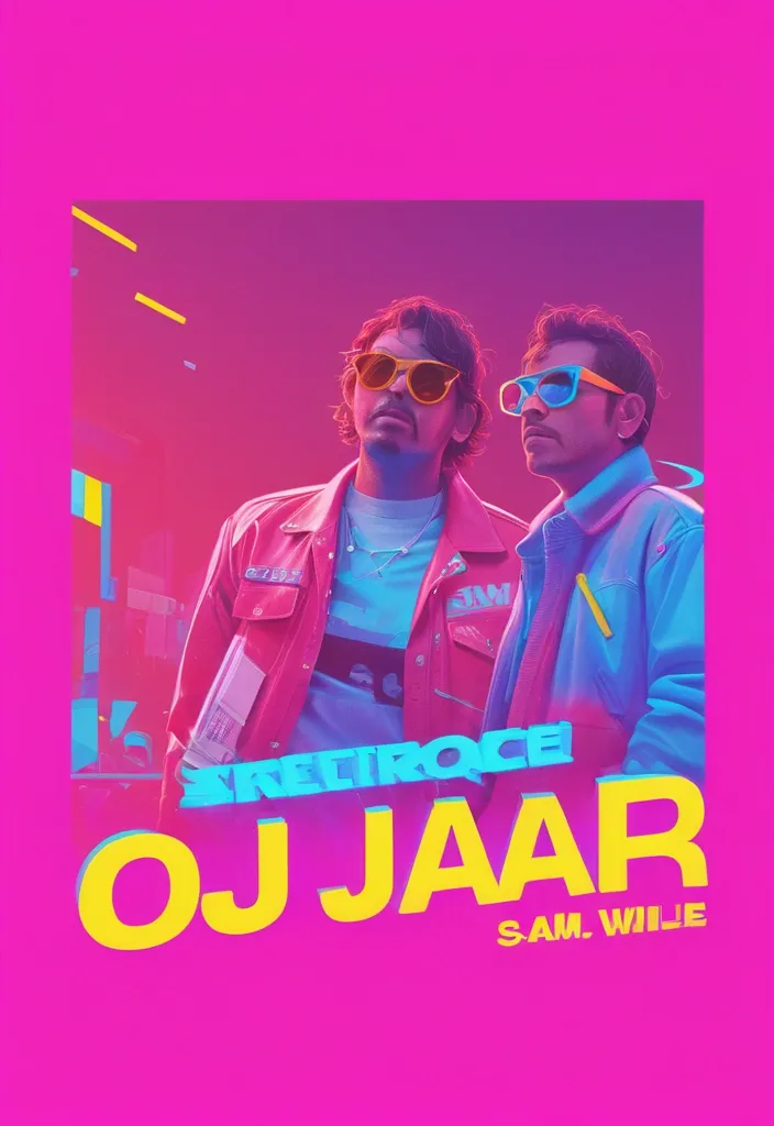
Create a vibrant , horizontal banner (aspect ratio 4:1) for a party event titled 'Guerra de Promotores' with a neon , 80s-inspired aesthetic. The background should feature a dynamic mix of purple , blue , and pink gradients with abstract light effects and confetti. Include the following text in bold , playful fonts: Main title: 'GUERRA DE PROMOTORES' in large , neon pink and blue letters with a slight 3D effect. Subtitle: 'JUEGA DE FIN DE VACACIONES EN "NOISE"' in white with a yellow outline , slightly smaller. Date and time: 'VIE 07 MAR DESDE LAS 12PM' in white , modern font. Location: 'CALLE VILLALBA 325 C - CERCAO' in smaller white text at the bottom. Event details: 'LINE UP DJs' with names 'SHAYELL' , 'TEMPA' , 'MARIO GALLEGOS' , 'ANIMAN' , 'ALEXANDER CHAVEZ' , 'PELUQUITA' in colorful , stylized logos or badges. Add two male characters in the center , one wearing a pink hoodie and sunglasses holding a bottle , the other in a red jacket with sunglasses holding a ruler , both posing confidently. Incorporate logos or branding in the top corners , such as 'AQP Fest' , 'Confesiones' , 'Universitaria' , 'Farrar' , and 'Noise' in neon styles. Use bright , contrasting colors (pink , blue , yellow , red) and a festive , energetic vibe. Avoid copyright elements and ensure the design is original. ,
**Title**: "The Hub - Merging Technology and Community" **Size**: 8 feet in height and 12 feet in length. **Style**: AI-Generated Art , modern and futuristic style **Color Palette**: Predominantly Black and Yellow. With additional pops of white , gray , and shades of blue to represent the technological aspect. **Imagery/Artwork Elements**: 1. **Community**: Illustrate people connecting and interacting to emphasize the community-building aspect of The Hub. Include representations of different community members - students , IT professionals , and gamers. 2. **Technology**: Incorporate technological symbols - AI elements , circuits , computer screens , or coding symbols - blending with the representation of community , depicting the tech-utility nature of The Hub. 3. **Games**: Showcase gaming elements - consoles , game graphics , headsets - to reflect the facility for professional gamers. 4. **Study and Work**: Include elements of study and work - laptops , books , coffee cups , work desks - indicating the utilities for students and IT professionals. **Typography**: 1. **Main Title**: The poster should feature the words "The Hub" in bold , large , and futuristic font. The letters should be sleek and modern , fitting in with the tech theme. Position this title at the center or upper part of the poster. 2. **Tagline**: Below the main title , include the tagline: "Tech , Learn , Play , and Connect". Use a simpler , smaller but still noticeable font for this. 3. **Brief Description**: Include a brief description of The Hub. Something like: "A dynamic tech-utility space for students , IT professionals , and gamers. Join our thriving community today!" 4. Call to Action: At the bottom of the poster , include contact information for The Hub and a call-to-action , "Explore more at our website infinite-variable.com". **Overall feel**: The poster should convey a sense of excitement , connectivity , and futuristic advancement , engaging passersby and inviting them to learn more about The Hub. ,