Search Results for sparkle symbols
Explore AI generated designs, images, art and prompts by top community artists and designers.
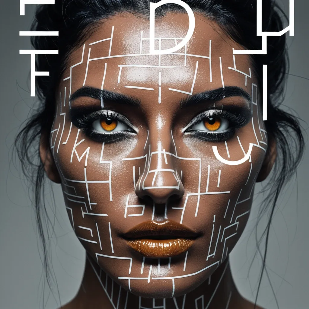

Create a sophisticated editorial portrait poster built around selective focus. Use a realistic photographic portrait with natural skin texture , pores , subtle imperfections , believable hair , and authentic facial structure. Avoid plastic skin , CGI smoothness , heavy beauty retouching , or generic commercial-model styling. Aspect Ratio: 9:16. Keep most of the portrait softly blurred , slightly motion-softened , desaturated , or reduced in detail. Only the selected horizontal sharp slice should return to sharp detail , natural skin tone , and clear texture. The sharp and blurred areas must remain perfectly aligned as the same person and the same photographic moment , with no duplicated eyes , second face , or pasted-photo effect. Choose one focus structure: a horizontal sharp band across the eyes , a small floating window isolating part of the face , a narrow offset focus frame through motion blur , or a larger offset frame that deliberately shifts attention away from the facial center. Use a restrained neutral palette of charcoal , gray , warm beige , off-white , and natural skin tones. Use rust orange as the only strong accent for the focus lines , main title , and a few key details. Keep the visual rule: Neutral Field + One Accent Color. Use mature magazine-style typography: a high-contrast editorial serif for MOTION , a condensed bold sans serif for RAJU , and a small neutral sans serif for secondary information. Include harp through motion as meaningful copy connected to the subject and concept , not random filler text. Keep the composition asymmetric with generous negative space. Let the portrait , typography , and focus geometry interact naturally. Add subtle film grain , light scan texture , and restrained print texture so the whole poster feels like one finished editorial piece. The final result should feel like a polished independent fashion , photography , music , or culture magazine poster , with blur and sharpness deliberately controlling where the viewer looks. Avoid cyberpunk HUDs , excessive UI graphics , neon gradients , gibberish text , logos , watermarks , numbering , sparkle symbols , harsh Gaussian blur , melted facial features , duplicated features , plastic skin , and over-retouching. ,
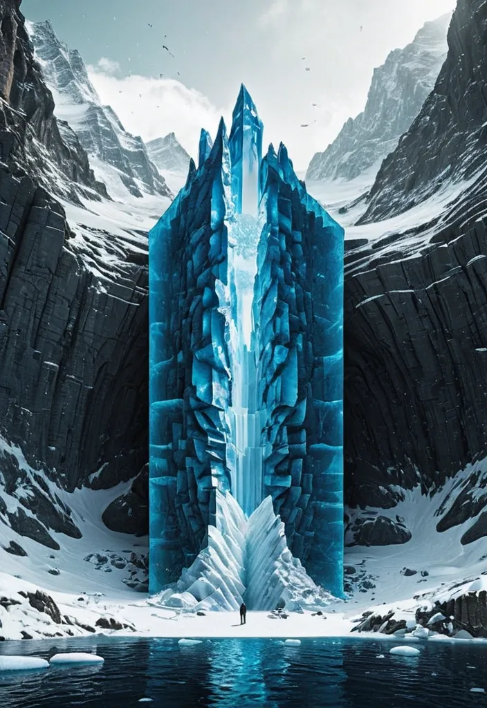
Theme: Ice Surface world: Ice-fort appears above the surface Hidden world: Cave gate is revealed underneath Key natural structure: Ice mass Main palette: Deep blue Title: Navro Subtitle: lishotta Create a premium 9:16 editorial poster from the WORLD SLICE series. Show a realistic natural landscape as if a section of the world has been physically cut open , revealing a much larger hidden structure beneath the visible surface. Keep the surface relatively simple and easy to read , while the hidden section becomes the main visual surprise. Use strong scale contrast , clear geological or ecological layers , realistic materials , believable depth , atmospheric perspective and cinematic natural light. The cutaway should not look like a glass box or aquarium. Treat it as a real piece of land , ocean , forest or ice physically sliced from the planet. Let parts of nature break beyond the geometric cutaway boundary: roots , rock formations , ice , water or terrain may extend outside the original shape to create stronger visual impact. Keep the central object around 55–70% of the poster width and preserve generous negative space. Avoid making the 3D cutaway too large. Integrate typography into the composition instead of adding many tiny labels. Use one bold main title , one short supporting line and only a few minimal editorial details. Allow natural elements to overlap , pass behind or partially cover the typography. Use a refined mix of modern serif and condensed sans-serif typography. The poster should feel like premium nature editorial design , contemporary art direction and photorealistic environmental visualization. Prioritize: strong thumbnail readability , one clear visual surprise , large recognizable forms , realistic natural textures , clean hierarchy , high-end editorial composition , and a strong contrast between the visible world and the hidden world. No logo , no watermark , no numbering , no excessive micro text , no HUD interface , no four-point sparkle symbols , no cheap CGI , no glass-container look. Make the final image feel like a complete finished poster , not a template. ,
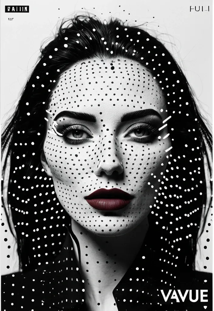
Create a 9:16 experimental character poster using a close or waist-up portrait with expressive body language. Keep most of the portrait in high-contrast black and white , then add a clear halftone screen-print effect. Use finer dots on the face and denser dots in the hair , clothing and shadows , so it feels like a printed zine rather than simple photo grain. Add one color scan window through an important part of the portrait. It can run vertically across the eye , face and hand , horizontally through the eyes and gesture , or extend from the face down into the collar and body. Inside this window , return to clean high-resolution photography with realistic cool-neutral skin , blue-grey shadows and natural lip tones. Keep it crisp and free of halftone texture so the contrast between “printed portrait” and “real detail” feels obvious. Use oversized condensed typography as part of the composition rather than placing a title in empty space. Let the letters crop off the canvas , overlap the body , pass behind the subject or cut across the scan window. Keep the palette restrained: black , white and cool grey as the base , then one cool blue and one muted red / burgundy as accents. Only add a few small identity-style labels such as “IDENTITY TRACE” , “SUBJECT ACTIVE” , “GESTURE READ” or “FEATURE ACTIVE”. A few thin lines , circles and open corner marks are enough. The final image should feel like a mix of youth-culture poster , printed zine , character dossier and experimental magazine editorial. Avoid warm yellow grading , multiple random scan windows , floating facial features , heavy glitch effects , dense UI graphics , long paragraphs , numbering , Vol./Issue labels , sparkle symbols , logos or watermarks. ,