Explore AI generated designs, images, art and prompts by top community artists and designers.
Main palette: Sand , dark green , orange Structural method: layered cutouts Micro scene: a tiny workshop , performance Create a 9:16 vertical experimental editorial architecture poster that transforms the selected abstract concept into a monumental surreal spatial environment. Do not simply design a building and place typography over it. The architecture itself must be generated from the logic of the concept. Translate the theme into one clear spatial metaphor. Transit can become disconnected suspended platforms and passages. Time can become arcs , sunlight , long shadows and observation structures. Sound can become acoustic ribs , suspended panels and reverberation spaces. Memory can become fragmented rooms , doors , corridors and traces of human presence. For other themes , invent an equally direct architectural metaphor rather than reusing these examples mechanically. Choose one dominant architectural gesture and build the entire composition around it. Avoid combining too many structural ideas. The image should have one immediately recognizable spatial identity even at small thumbnail size. Integrate the main typography physically into the architecture. Large words , numbers or data should exist on different walls , platforms , curved surfaces , rooms or structural elements , following real perspective , scale , cropping , depth and occlusion. Typography may stretch across multiple spatial planes or only become readable from the chosen camera viewpoint. Never treat the main text as a flat graphic overlay. Use the main typography as the visual hook. It should be simple enough to read quickly but surprising enough to make the viewer notice how it interacts with the space. Add only a limited amount of secondary editorial information related to the theme , such as functional labels , measurements , timestamps , room information , observation data or short conceptual phrases. Keep many large surfaces completely blank so the design does not become a wall of text. Populate the architecture with approximately 7 to 12 tiny adult human figures. Their poses should be natural and connected to the theme: waiting , walking , observing , listening , sitting , arriving or leaving. Keep people visually small so they establish scale , distance and emotional atmosphere rather than becoming portrait subjects. Use large differences in architectural scale. Combine one or two monumental foreground structures with medium depth elements and several extremely small distant forms. Preserve clear foreground , middle ground and background separation. Create strong but believable light and shadow. Let light participate in the concept whenever relevant: long shadows for time , isolated warm rooms for memory , controlled pools of light for sound , or directional daylight for transit. Avoid decorative cinematic effects that do not serve the spatial idea. Use a restrained palette of ivory white , pale concrete gray , graphite black and soft desaturated atmospheric tones. Introduce only one muted accent color on a small percentage of the architecture so each variation develops its own identity while remaining part of the same series. Use matte concrete , stone , glass or paper like architectural surfaces with subtle grain , graphite texture and delicate scan noise. Keep the final image closer to a sophisticated architecture publication , cultural poster or experimental editorial print than a glossy CGI render. Maintain strong asymmetry , deliberate negative space and controlled information density. Avoid conventional presentation boards , regular grids and perfectly balanced layouts. The composition should feel carefully designed but never mechanically templated. The final result should feel monumental , intelligent , surreal , quiet and slightly melancholic , with typography , architecture , tiny humans , light and spatial depth operating as one coherent visual system. ,

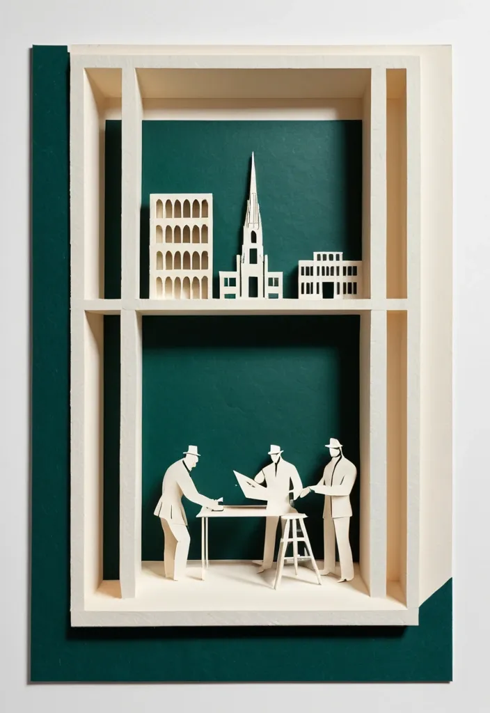
Theme: Freedom Fighters Memorial Aspect ratio: 9:16 Main palette: blue , dark green , orange Structural method: layered cutouts Micro scene: a tiny workshop , performance Event details: 02 October , 08:30 am , Dadi March Create a refined vertical cultural poster using tactile handmade paper , large color fields , structural composition , and a tiny narrative scene. Build the main visual with a clear paper based construction method. The composition may use layered apertures , framing , overlapping printed blocks , folded planes , or other physical paper relationships. Let the structure itself create depth , rhythm , and visual tension rather than relying on decorative graphics. All large paper areas should have realistic handmade texture , including visible fibers , pulp variation , pigment absorption , subtle pressure marks , irregular edges , and slight material imperfections. Keep the surfaces matte , clean , and sophisticated. Use strong but controlled color relationships. Large color fields should remain visually clear from a distance , while smaller overlaps , cut edges , shadows , folds , and paper thickness become visible only when viewed closely. Add one small micro scene related to the theme. Include two or three adult figures naturally performing the activity , such as cutting paper , operating a press , performing shadow theatre , folding structures , or arranging materials. Keep the entire scene around 3% to 5% of the poster so it remains a discovered detail rather than the main subject. Use generous warm ivory or neutral negative space to balance the large structural forms. Typography should be restrained and secondary. Use a refined editorial serif for the main title and small uppercase sans serif for supporting information. Keep the title relatively small and place it in a quiet area of the composition. The visual reading order should be: large paper structure first , color and material interaction second , micro scene third , title and event information last. The final result should feel contemporary , tactile , editorial , architectural , and handmade. From a distance , the poster should read as a strong abstract composition. Up close , it should reveal paper fibers , cut edges , folds , overlaps , print texture , tiny people , tools , and process. ,