Search Results for performance Event details: 02 October
Explore AI generated designs, images, art and prompts by top community artists and designers.
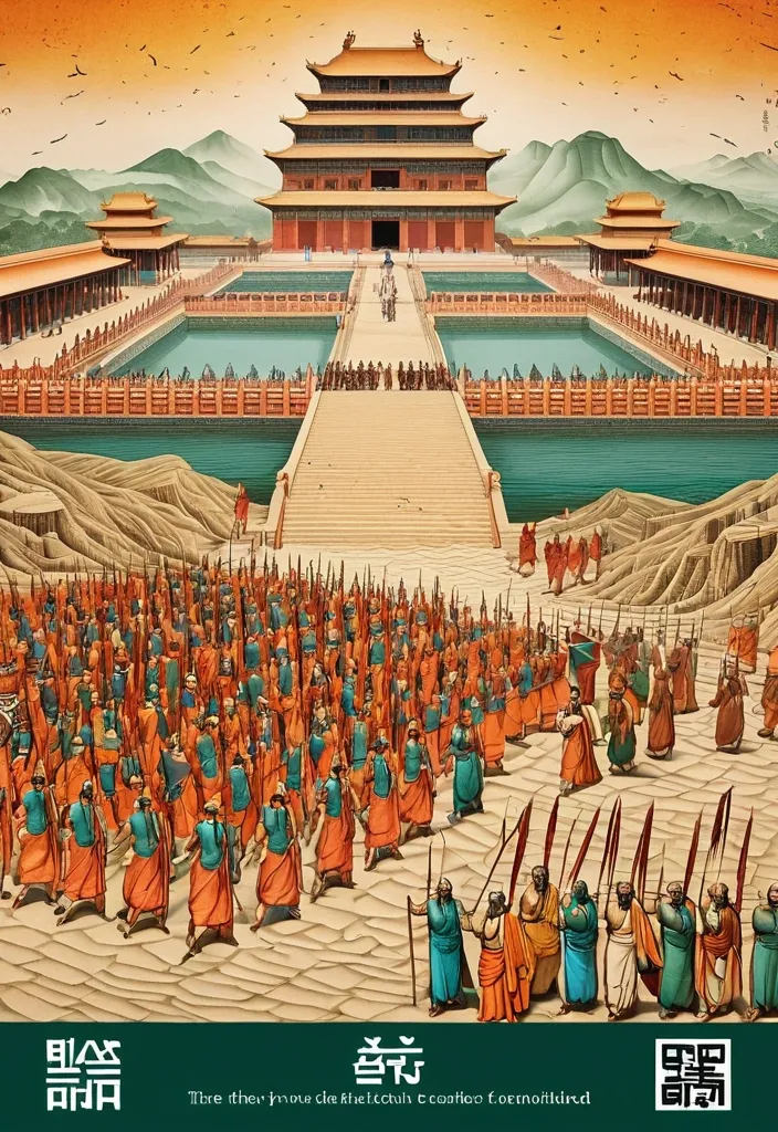

Theme: Ancient Water Conservancy Main palette: Sand path , sand , orange Structural method: another paper construction Micro scene: a tiny Walking march , performance Event details: 02 October , 05:30 am , Start Aspect ratio: 16:9 Design a historical and cultural poster with a modern Eastern editorial aesthetic , using "paper fibers + large color fields + micro-scenes" as the core visual language. Do not interpret traditional culture as stacking ancient architecture , calligraphy , auspicious clouds , or artifacts. Instead , first distill the Cultural Logic , then let large areas of handmade paper color fields directly carry structures , spaces , time , flow , order , or process relationships , so that viewers first see a strong and clear large form from afar , and only gradually discover the cultural narrative hidden within upon closer inspection. Use the dark green , sand style to establish 2–5 main paper color blocks of distinctly different sizes , maintaining low saturation but complete color intensity. All color blocks should have the authentic , rich texture of handmade paper , pulp , watercolor , or mineral pigments , with visible natural long and short fibers , pigment deposition , subtle impressions , large-scale natural color variations , and irregular torn paper edges. The overall effect should be matte , clean , and intact—avoid dirtiness , yellow spots , random speckles , cheap retro effects , or digital gradients. Based on the theme , let the color fields express the logic of system operations through folding , branching , interweaving , interlocking , offsetting , supporting , segmenting , enclosing , or negative space relationships , rather than simply serving as decorative backgrounds. Embed the Dadi march within the large color field structure , keeping figures and props at a very small scale , totaling about 3%–6% of the image area. Each scene must depict a clear action , with causal or temporal relationships between them , such as "entering → executing → recording → completing , " allowing the miniature figures to truly drive the narrative rather than just standing in poses. Figures' clothing in indian Freedom fighter style and artifacts should align with the theme's era and identity but remain restrained—avoid cinematic historical drama excess; scenes should only retain key props that illustrate systemic relationships , without cluttering with decorations or irrelevant cultural symbols. Typography should employ the editorial language of modern Eastern cultural institutions , museums , or archival exhibitions. The main title Dandi March should use refined Song typeface , publication-inspired Gujarati fonts , at a medium-small size that does not overpower the large color fields; supporting English text , dates , locations , and explanatory information should use even smaller sizes to create clear hierarchies. Subtle cinnabar seals , paper tags , archival labels , or node text may be added , but they must genuinely relate to the thematic logic—do not add them randomly just for a "Indian Freedom fighter style" feel. The overall reading order should be: large color field structures and color relationships → systemic or spatial logic → miniature figures' continuous narrative → main title and exhibition information. The final image should achieve a strong large form and visual impact from afar , revealing paper fibers , figure actions , and historical details up close , balancing design sensibility , narrative depth , and cultural completeness. Avoid book cover vibes , traditional Chinese illustration styles , screens full of ancient architecture , oversized titles , PPT-style rigid layouts , modern infographic arrows , meaningless English placeholders , element piling , commercial ad vibes , 3D CGI , glass textures , neon colors , logos , watermarks , numbering , and starburst decorations. ,
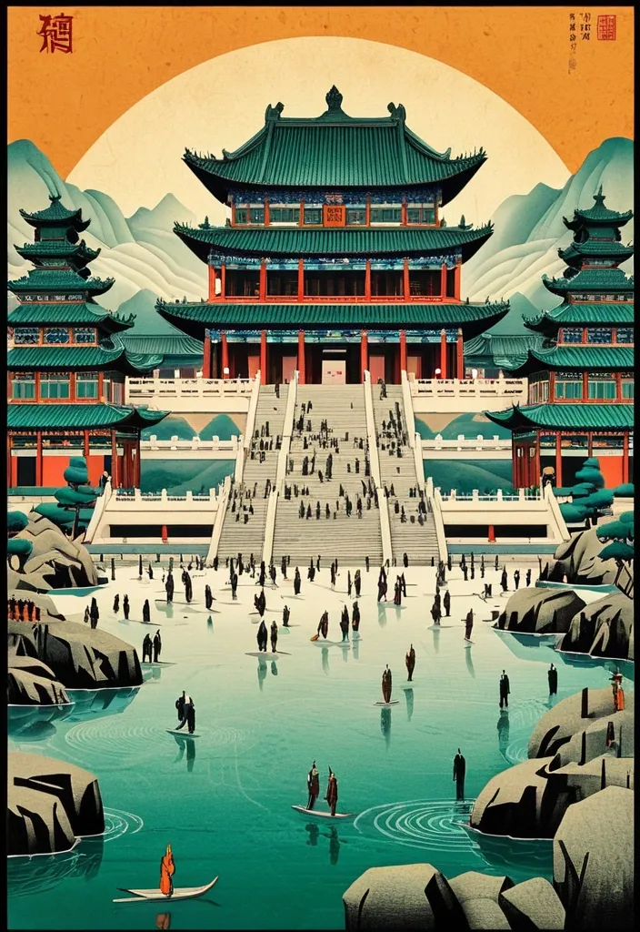
Theme: Ancient Water Conservancy Main palette: blue , dark green , orange Structural method: another paper construction Micro scene: a tiny Walking march , performance Event details: 02 October , venue , Start Aspect ratio: 9:16 Design a historical and cultural poster with a modern Eastern editorial aesthetic , using "paper fibers + large color fields + micro-scenes" as the core visual language. Do not interpret traditional culture as stacking ancient architecture , calligraphy , auspicious clouds , or artifacts. Instead , first distill the Cultural Logic , then let large areas of handmade paper color fields directly carry structures , spaces , time , flow , order , or process relationships , so that viewers first see a strong and clear large form from afar , and only gradually discover the cultural narrative hidden within upon closer inspection. Use the dark green , sand style to establish 2–5 main paper color blocks of distinctly different sizes , maintaining low saturation but complete color intensity. All color blocks should have the authentic , rich texture of handmade paper , pulp , watercolor , or mineral pigments , with visible natural long and short fibers , pigment deposition , subtle impressions , large-scale natural color variations , and irregular torn paper edges. The overall effect should be matte , clean , and intact—avoid dirtiness , yellow spots , random speckles , cheap retro effects , or digital gradients. Based on the theme , let the color fields express the logic of system operations through folding , branching , interweaving , interlocking , offsetting , supporting , segmenting , enclosing , or negative space relationships , rather than simply serving as decorative backgrounds. Embed the Dadi march within the large color field structure , keeping figures and props at a very small scale , totaling about 3%–6% of the image area. Each scene must depict a clear action , with causal or temporal relationships between them , such as "entering → executing → recording → completing , " allowing the miniature figures to truly drive the narrative rather than just standing in poses. Figures' clothing and artifacts should align with the theme's era and identity but remain restrained—avoid cinematic historical drama excess; scenes should only retain key props that illustrate systemic relationships , without cluttering with decorations or irrelevant cultural symbols. Typography should employ the editorial language of modern Eastern cultural institutions , museums , or archival exhibitions. The main title [Main Title] should use refined Song typeface , Ming-style , or publication-inspired Chinese fonts , at a medium-small size that does not overpower the large color fields; supporting English text , dates , locations , and explanatory information should use even smaller sizes to create clear hierarchies. Subtle cinnabar seals , paper tags , archival labels , or node text may be added , but they must genuinely relate to the thematic logic—do not add them randomly just for a "Chinese style" feel. The overall reading order should be: large color field structures and color relationships → systemic or spatial logic → miniature figures' continuous narrative → main title and exhibition information. The final image should achieve a strong large form and visual impact from afar , revealing paper fibers , figure actions , and historical details up close , balancing design sensibility , narrative depth , and cultural completeness. Avoid book cover vibes , traditional Chinese illustration styles , screens full of ancient architecture , oversized titles , PPT-style rigid layouts , modern infographic arrows , meaningless English placeholders , element piling , commercial ad vibes , 3D CGI , glass textures , neon colors , logos , watermarks , numbering , and starburst decorations. ,
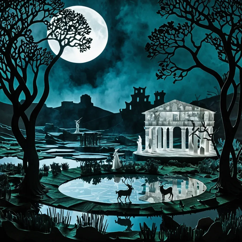
Theme: craft workshop Main palette: blue , dark green , orange Structural method: another paper construction Micro scene: a tiny workshop , performance Event details: 02 October , venue , Prayer Aspect ratio: 9:16 A pastoral landscape featuring a faun with horns and goat legs dancing and playing two flutes . A Roman ruin. Under a massive , lush , gnarled tree rests a nymph dressed in thin , transparent , white veils adorned with flowers in her hair. A pond. Mist. Dark night. Full moon. Dramatic backlit clouds. The final result should feel contemporary , tactile , editorial , architectural , and handmade. From a distance , the poster should read as a strong abstract composition. Up close , it should reveal paper fibers , cut edges , folds , overlaps , print texture , tiny people , tools , and process. ,
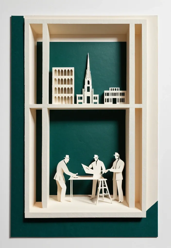
Theme: Freedom Fighters Memorial Aspect ratio: 9:16 Main palette: blue , dark green , orange Structural method: layered cutouts Micro scene: a tiny workshop , performance Event details: 02 October , 08:30 am , Dadi March Create a refined vertical cultural poster using tactile handmade paper , large color fields , structural composition , and a tiny narrative scene. Build the main visual with a clear paper based construction method. The composition may use layered apertures , framing , overlapping printed blocks , folded planes , or other physical paper relationships. Let the structure itself create depth , rhythm , and visual tension rather than relying on decorative graphics. All large paper areas should have realistic handmade texture , including visible fibers , pulp variation , pigment absorption , subtle pressure marks , irregular edges , and slight material imperfections. Keep the surfaces matte , clean , and sophisticated. Use strong but controlled color relationships. Large color fields should remain visually clear from a distance , while smaller overlaps , cut edges , shadows , folds , and paper thickness become visible only when viewed closely. Add one small micro scene related to the theme. Include two or three adult figures naturally performing the activity , such as cutting paper , operating a press , performing shadow theatre , folding structures , or arranging materials. Keep the entire scene around 3% to 5% of the poster so it remains a discovered detail rather than the main subject. Use generous warm ivory or neutral negative space to balance the large structural forms. Typography should be restrained and secondary. Use a refined editorial serif for the main title and small uppercase sans serif for supporting information. Keep the title relatively small and place it in a quiet area of the composition. The visual reading order should be: large paper structure first , color and material interaction second , micro scene third , title and event information last. The final result should feel contemporary , tactile , editorial , architectural , and handmade. From a distance , the poster should read as a strong abstract composition. Up close , it should reveal paper fibers , cut edges , folds , overlaps , print texture , tiny people , tools , and process. ,