Search Results for Mary
Explore AI generated designs, images, art and prompts by top community artists and designers.


Diagonal composition should rely on "grand relationships , " not minor decorations. The subject or primary color field should ideally occupy about 45%–65% of the frame , while reserving a distinct quiet area to form directional shifts like "dense to sparse , " "near to far , " or "heavy to light." Avoid even 50% splits or standard mechanical 45° diagonal lines; slightly offset the diagonal angle to make the layout feel more natural and editorial. A woman wearing an avant-garde sculptural Saree crafted from peacock feathers pleated fabric with Indian traditional textured Saree. The Saree features a fitted V-neck bodice extending into a dramatic , spiraling circular fan frame over her head like a giant hat feathers sculpture. The final reading order should be: First , catch the bold diagonal grand form; second , understand how the subject or boundaries create direction; third , discover relationships between scale , negative space , and text; finally , read the title and minimal information. The overall effect should evoke real modern exhibition posters , photography features , cultural visuals , or design annual case studies—not just an ordinary image tilted on its side. ,
# GitHub Terms of Service <!-- markdownlint-disable search-replace --> Thank you for using GitHub! We're happy you're here. Please read this Terms of Service agreement carefully before accessing or using GitHub. Because it is such an important contract between us and our users , we have tried to make it as clear as possible. For your convenience , we have presented these terms in a short non-binding summary followed by the full legal terms. ## Summary | Section | What can you find there? | | -------------------------------------------------------------------------------- | ------------------------------------------------------------------------------------------------------------------------------------------------------------------------------------------------------------------------------------------ | | [A. Definitions](#a-definitions) | Some basic terms , defined in a way that will help you understand this agreement. Refer back up to this section for clarification. | | [B. Account Terms](#b-account-terms) | These are the basic requirements of having an Account on GitHub. | | [C. Acceptable Use](#c-acceptable-use) | These are the basic rules you must follow when using your GitHub Account. | | [D. User-Generated Content](#d-user-generated-content) | You own the content you post on GitHub. However , you have some responsibilities regarding it , and we ask you to grant us some rights so we can provide services to you. | | [E. Private Repositories](#e-private-repositories) | This section talks about how GitHub will treat content you post in private repositories. | | [F. Copyright & DMCA Policy](#f-copyright-infringement-and-dmca-policy) | This section talks about how GitHub will respond if you believe someone is infringing your copyrights on GitHub. | | [G. Intellectual Property Notice](#g-intellectual-property-notice) | This describes GitHub's rights in the website and service. | | [H. API Terms](#h-api-terms) | These are the rules for using GitHub's APIs , whether you are using the API for development or data collection. | | [I. Additional Product Terms](#i-github-additional-product-terms) | We have a few specific rules for GitHub's features and products. | | [J. AI Features , Training , and Your Data](#j-ai-features-training-and-your-data) | These are the terms that apply to GitHub Copilot and other AI features , including how your data may be used for development and improvement of the artificial intelligence and machine learning models , and the controls available to you. | | [K. Beta Previews](#k-beta-previews) | These are some of the additional terms that apply to GitHub's features that are still in development. | | [L. Payment](#l-payment) | You are responsible for payment. We are responsible for billing you accurately. | | [M. Cancellation and Termination](#m-cancellation-and-termination) | You may cancel this agreement and close your Account at any time. | | [N. Communications with GitHub](#n-communications-with-github) | We only use email and other electronic means to stay in touch with our users. We do not provide phone support. | | [O. Disclaimer of Warranties](#o-disclaimer-of-warranties) | We provide our service as is , and we make no promises or guarantees about this service. **Please read this section carefully; you should understand what to expect.** | | [P. Limitation of Liability](#p-limitation-of-liability) | We will not be liable for damages or losses arising from your use or inability to use the service or otherwise arising under this agreement. **Please read this section carefully; it limits our obligations to you.** | | [Q. Release and Indemnification](#q-release-and-indemnification) | You are fully responsible for your use of the service. | | [R. Changes to these Terms of Service](#r-changes-to-these-terms) | We may modify this agreement , but we will give you 30 days' notice of material changes. | | [S. Miscellaneous](#s-miscellaneous) | Please see this section for legal details including our choice of law. | ## The GitHub Terms of Service Effective date: April 27 , 2026 ## A. Definitions **Short version:** *We use these basic terms throughout the agreement , and they have specific meanings. You should know what we mean when we use each of the terms. There's not going to be a test on it , but it's still useful information.* 1. An "Account" represents your legal relationship with GitHub. A “Personal Account” represents an individual User’s authorization to log in to and use the Service and serves as a User’s identity on GitHub. “Organizations” are shared workspaces that may be associated with a single entity or with one or more Users where multiple Users can collaborate across many projects at once. A Personal Account can be a member of any number of Organizations. 2. The “Agreement” refers , collectively , to all the terms , conditions , notices contained or referenced in this document (the “Terms of Service” or the "Terms") and all other operating rules , policies (including the GitHub Privacy Statement , available at [github.com/site/privacy](https://github.com/site/privacy)) and procedures that we may publish from time to time on the Website. Most of our site policies are available at [docs.github.com/categories/site-policy](/en/site-policy). 3. "AI Feature" means any feature of GitHub or our Affiliates that uses machine learning or artificial intelligence to generate Output , including GitHub Copilot , Copilot Autofix , and any other feature identified as using machine learning or artificial intelligence in our documentation. 4. “Affiliate” means any entity that directly or indirectly controls , is controlled by , or is under common control with a party , where "control" means having more than fifty percent (50%) ownership or the right to direct the management of the entity. For the avoidance of doubt , Microsoft is an Affiliate of GitHub. 5. "Beta Previews" mean software , services , or features identified as alpha , beta , preview , early access , or evaluation , or words or phrases with similar meanings. 6. "Content" means code , text , data , documentation , images , graphics , software , packages , and other materials made available through the Service. 7. “GitHub , ” “We , ” and “Us” refer to GitHub , Inc. , as well as our directors , subsidiaries , contractors , licensors , officers , agents , and employees. 8. “Input” means any content or context provided to an AI Feature , including prompts , attachments , code in your workspace , and conversation history. 9. "Output" means responses and suggestions , including code or other material , generated by an AI Feature. 10. The “Service” refers to the applications , software , products , and services provided by GitHub , including through the Website and any Beta Previews. 11. “User , ” “You , ” and “Your” refer to the individual person , company , or organization that has visited or is using the Website or Service; that accesses or uses any part of the Account; or that directs the use of the Account in the performance of its functions. A User must be at least 13 years of age. Special terms may apply for business or government Accounts (See [Section B(5): Additional Terms](#5-additional-terms)). 12. "User-Generated Content" means Content that you or other users upload , submit , or create through the Service. 13. The “Website” refers to GitHub’s website located at [github.com](https://github.com/) , and all content , services , and products provided by GitHub at or through the Website. It also refers to GitHub-owned subdomains of github.com , such as [education.github.com](https://education.github.com/) and [pages.github.com](https://pages.github.com/). These Terms also govern GitHub’s conference websites , such as [githubuniverse.com](https://githubuniverse.com/) , and product websites , such as [electronjs.org](https://www.electronjs.org/). Occasionally , websites owned by GitHub may provide different or additional terms of service. If those additional terms conflict with this Agreement , the more specific terms apply to the relevant page or service. 14. "Your Content" means User-Generated Content that you upload , submit , or create , including your modifications to Content you have forked or cloned. It does not include the underlying Content created by others. ## B. Account Terms **Short version:** *Personal Accounts and Organizations have different administrative controls; a human must create your Account; you must be 13 or over; you must provide a valid email address; and you may not have more than one free Account. You alone are responsible for your Account and anything that happens while you are signed in to or using your Account. You are responsible for keeping your Account secure.* ### 1. Account Controls * Users. Subject to these Terms , you retain ultimate administrative control over your Personal Account and the Content within it. * Organizations. The "owner" of an Organization that was created under these Terms has ultimate administrative control over that Organization and the Content within it. Within the Service , an owner can manage User access to the Organization’s data and projects. An Organization may have multiple owners , but there must be at least one Personal Account designated as an owner of an Organization. If you are the owner of an Organization under these Terms , we consider you responsible for the actions that are performed on or through that Organization. ### 2. Required Information You must provide a valid email address in order to complete the signup process. Any other information requested , such as your real name , is optional , unless you are accepting these terms on behalf of a legal entity (in which case we need more information about the legal entity) or if you opt for a [paid Account](#l-payment) , in which case additional information will be necessary for billing purposes. ### 3. Account Requirements We have a few simple rules for Accounts on GitHub's Service. * You must be a human to create an Account. Accounts registered by "bots" or other automated methods are not permitted. We do permit machine accounts: * A machine account is an Account set up by an individual human who accepts the Terms on behalf of the Account , provides a valid email address , and is responsible for its actions. A machine account is used exclusively for performing automated tasks. Multiple users may direct the actions of a machine account , but the owner of the Account is ultimately responsible for the machine's actions. You may maintain no more than one free machine account in addition to your free Personal Account. * One person or legal entity may maintain no more than one free Account (if you choose to control a machine account as well , that's fine , but it can only be used for running a machine). * You must be age 13 or older. While we are thrilled to see brilliant young coders get excited by learning to program , we must comply with United States law. GitHub does not target our Service to children under 13 , and we do not permit any Users under 13 on our Service. If we learn of any User under the age of 13 , we will [terminate that User’s Account immediately](#m-cancellation-and-termination). If you are a resident of a country outside the United States , your country’s minimum age may be older; in such a case , you are responsible for complying with your country’s laws. * Your login may only be used by one person — i.e. , a single login may not be shared by multiple people. A paid Organization may only provide access to as many Personal Accounts as your subscription allows. * You may not use GitHub in violation of export control or sanctions laws of the United States or any other applicable jurisdiction. You may not use GitHub if you are or are working on behalf of a [Specially Designated National (SDN)](https://www.treasury.gov/resource-center/sanctions/SDN-List/Pages/default.aspx) or a person subject to similar blocking or denied party prohibitions administered by a U.S. government agency. GitHub may allow persons in certain sanctioned countries or territories to access certain GitHub services pursuant to U.S. government authorizations. For more information , please see our [Export Controls policy](/en/site-policy/other-site-policies/github-and-trade-controls). ### 4. Account Security You are responsible for keeping your Account secure while you use our Service. We offer tools such as two-factor authentication to help you maintain your Account's security , but the content of your Account and its security are up to you. * You are responsible for all content posted and activity that occurs under your Account (even when content is posted by others who have Accounts under your Account). * You are responsible for maintaining the security of your Account and password. GitHub cannot and will not be liable for any loss or damage from your failure to comply with this security obligation. * You will promptly notify GitHub by contacting us through the [GitHub Support portal](https://support.github.com/) if you become aware of any unauthorized use of , or access to , our Service through your Account , including any unauthorized use of your password or Account. ### 5. Additional Terms In some situations , third parties' terms may apply to your use of GitHub. For example , you may be a member of an organization on GitHub with its own terms or license agreements; you may download an application that integrates with GitHub; or you may use GitHub to authenticate to another service. Please be aware that while these Terms are our full agreement with you , other parties' terms govern their relationships with you. If you are a government User or otherwise accessing or using any GitHub Service in a government capacity , this [Government Amendment to GitHub Terms of Service](/en/site-policy/site-policy-deprecated/amendment-to-github-terms-of-service-applicable-to-us-federal-government-users) applies to you , and you agree to its provisions. If you have signed up for GitHub Enterprise Cloud , the [Enterprise Cloud Addendum](/en/site-policy/site-policy-deprecated/github-enterprise-service-level-agreement) applies to you , and you agree to its provisions. ## C. Acceptable Use **Short version:** *GitHub hosts a wide variety of collaborative projects from all over the world , and that collaboration only works when our users are able to work together in good faith. While using the service , you must follow the terms of this section , which include some restrictions on content you can post , conduct on the service , and other limitations. In short , be excellent to each other.* Your use of the Website and Service must not violate any applicable laws , including copyright or trademark laws , export control or sanctions laws , or other laws in your jurisdiction. You are responsible for making sure that your use of the Service is in compliance with laws and any applicable regulations. You agree that you will not under any circumstances violate our [Acceptable Use Policies](/en/site-policy/acceptable-use-policies/github-acceptable-use-policies) or [Community Guidelines](/en/site-policy/github-terms/github-community-guidelines). ## D. User-Generated Content **Short version:** *You own content you create , but you allow us certain rights to it , so that we can display and share the content you post. You still have control over your content , and responsibility for it , and the rights you grant us are limited to those we need to provide the service. We have the right to remove content or close Accounts if we need to.* ### 1. Responsibility for User-Generated Content You are responsible for Your Content and any harm resulting from it. This includes Content you post , upload , or make available through the Service. We are not responsible for any public display or misuse of Your Content. ### 2. GitHub May Remove Content We may refuse or remove User-Generated Content that violates applicable law or our terms and policies. We access private repositories only as described in Section E. Content displayed on GitHub Mobile may be subject to app store terms. ### 3. Ownership and License Grants You own Your Content. If you post Content you did not create , you are responsible for ensuring you have the right to post it and for complying with any applicable licenses. You grant us and other Users the licenses in Sections D.4–D.8. These licenses apply to Your Content. If Your Content already includes a license granting us the permissions we need , no additional license is required. You will not receive payment for these rights. These licenses end when you remove Your Content , unless other Users have forked it. ### 4. License Grant to Us You grant GitHub and our Affiliates the right to store , host , archive , parse , display , and make copies of Your Content as necessary to provide , develop , and improve the Service , including by training AI Features , and for the purpose of training , developing , and improving artificial intelligence and machine learning models and technologies of our Affiliates. This license includes the right to do things like copy it to our database and make backups; show it to you and other Users; parse it into a search index or otherwise analyze it on our servers; share it with other Users; and perform it , in case Your Content is something like music or video. For the avoidance of doubt , use of Your Content to develop , train , and improve artificial intelligence and machine learning models and technologies of GitHub and our Affiliates is within the scope of this license and does not constitute a sale or other restricted transfer of Your Content. ### 5. License Grant to Other Users Your Content that you post publicly , including issues , comments , and contributions to other Users' repositories , may be viewed by others. By setting your repositories to be viewed publicly , you agree to allow others to view and "fork" your repositories (this means that others may make their own copies within the Service in repositories they control). By making a repository public , you grant other Users a nonexclusive , worldwide license to use , display , perform and reproduce (by forking) Your Content through the Service as permitted by GitHub's functionality. You may grant additional rights by [adopting a license](/en/communities/setting-up-your-project-for-healthy-contributions/adding-a-license-to-a-repository#including-an-open-source-license-in-your-repository). If you post Content you did not create or own , you are responsible for ensuring it is licensed under terms that permit these uses. ### 6. Contributions Under Repository License Whenever you add Content to a repository containing notice of a license , you license that Content under the same terms , and you agree that you have the right to license that Content under those terms. If you have a separate agreement to license that Content under different terms , such as a contributor license agreement , that agreement will supersede. Isn't this just how it works already? Yep. This is widely accepted as the norm in the open-source community; it's commonly referred to by the shorthand "inbound=outbound". We're just making it explicit. ### 7. Moral Rights You retain all moral rights to Your Content that you upload , publish , or submit to any part of the Service , including the rights of integrity and attribution. However , you waive these rights and agree not to assert them against us or our Affiliates , to enable GitHub and our Affiliates to reasonably exercise the rights granted in Section D.4 , but not otherwise. To the extent this agreement is not enforceable by applicable law , you grant GitHub the rights we need to use Your Content without attribution and to make reasonable adaptations of Your Content as necessary to render the Website and provide the Service. ### 8. Public Repositories and Lawful Access By choosing to contribute Content to a public repository , you are choosing to and directing us to make such Content accessible to everyone on the internet. Unless specifically set forth herein , these Terms do not restrict lawful access to or use of the contents of public repositories by third parties , or by GitHub or its Affiliates. ### 9. Access Reciprocity By using automated means to access , collect , or otherwise use (“Access”) any publicly accessible Content from the Service for the purpose of developing or training any commercially available artificial intelligence model , machine learning system , or similar technology (a "Commercial AI System") , you hereby waive any and all policies , terms , conditions , or contractual provisions governing products , services , websites or datasets you own or operate that would otherwise prohibit , restrict , or place conditions upon GitHub's Access to any publicly accessible data , information or content associated with your products or services , including for the purpose of developing or training any Commercial AI System. You further agree not to impose technical or other targeted measures to restrict or retaliate against such Access. This Section D.9 does not apply to Access solely for the purpose of academic research or if , on the date you Access the Content , the number of monthly active users of the products or services made available by you is less than 700 million in the preceding calendar month. For the purposes of this Section , "you" shall refer to you and any entity that directly or indirectly controls , is controlled by , or is under common control with you (affiliates). ## E. Private Repositories **Short version:** *We treat the content of private repositories as confidential , and we only access it as described in Section E.3 below—for security purposes , to assist the repository owner with a support matter , to maintain the integrity of the Service , to comply with our legal obligations , if we have reason to believe the contents are in violation of the law , or with your consent.* ### 1. Control of Private Repositories Some Accounts may have private repositories , which allow the User to control access to Content. ### 2. Confidentiality of Private Repositories GitHub considers the contents of private repositories to be confidential to you. GitHub will protect the contents of private repositories from unauthorized use , access , or disclosure in the same manner that we would use to protect our own confidential information of a similar nature and in no event with less than a reasonable degree of care. ### 3. Access You control access to the content of your private repositories. GitHub considers the contents of private repositories to be confidential to you , as set forth in Section E.2 , and GitHub personnel will not access private repository content without your consent except in the following circumstances: * for security purposes; * for automated scanning or manual review for known vulnerabilities , active malware , or other content known to violate our Terms of Service; * to assist the repository owner with a support matter; * to maintain the integrity of the Service; or * to comply with our legal obligations if we have reason to believe the contents are in violation of the law. You may choose to enable additional access to your private repositories. For example: * You may enable various GitHub services or features that require additional rights to Your Content in private repositories. These rights may vary depending on the service or feature , but GitHub will continue to treat your private repository Content as confidential. If those services or features require rights in addition to those we need to provide the GitHub Service , we will provide an explanation of those rights. * If you provide your private repository content as Input to AI Features , we may use that Input to provide , develop , train , and improve the Service , including AI Features. Your ability to opt out under [Section J.3](#3-development-and-improvement-using-your-input-and-output) applies to this use of private repository content. We will not otherwise use your private repository contents to develop or improve the Service. Additionally , we may be [compelled by law](/en/site-policy/privacy-policies/github-general-privacy-statement#sharing-of-personal-data) to disclose the contents of your private repositories. GitHub will provide notice regarding our access to private repository content , unless [for legal disclosure](/en/site-policy/privacy-policies/github-general-privacy-statement) , to comply with our legal obligations , or where otherwise bound by requirements under law , for automated scanning , or if in response to a security threat or other risk to security. ## F. Copyright Infringement and DMCA Policy If you believe that content on our website violates your copyright , please contact us in accordance with our [Digital Millennium Copyright Act Policy](/en/site-policy/content-removal-policies/dmca-takedown-policy). If you are a copyright owner and you believe that content on GitHub violates your rights , please contact us via [our convenient DMCA form](https://github.com/contact/dmca) or by emailing <copyright@github.com>. There may be legal consequences for sending a false or frivolous takedown notice. Before sending a takedown request , you must consider legal uses such as fair use and licensed uses. We will terminate the Accounts of [repeat infringers](/en/site-policy/content-removal-policies/dmca-takedown-policy#f-repeated-infringement) of this policy. ## G. Intellectual Property Notice **Short version:** *We own the service and all of our content. In order for you to use our content , we give you certain rights to it , but you may only use our content in the way we have allowed.* ### 1. GitHub's Rights to Content GitHub and our licensors , vendors , agents , and/or our content providers retain ownership of all intellectual property rights of any kind related to the Website and Service. We reserve all rights that are not expressly granted to you under this Agreement or by law. The look and feel of the Website and Service is copyright © GitHub , Inc. All rights reserved. You may not duplicate , copy , or reuse any portion of the HTML/CSS , JavaScript , or visual design elements or concepts without express written permission from GitHub. ### 2. GitHub Trademarks and Logos If you’d like to use GitHub’s trademarks , you must follow all of our trademark guidelines , including those on our logos page: <https://github.com/logos>. ### 3. License to GitHub Policies This Agreement is licensed under this [Creative Commons Zero license](https://creativecommons.org/publicdomain/zero/1.0/). For details , see our [site-policy repository](https://github.com/github/site-policy#license). ## H. API Terms **Short version:** *You agree to these Terms of Service , plus this Section H , when using any of GitHub's APIs (Application Programming Interface) , including use of the API through a third party product that accesses GitHub.* Abuse or excessively frequent requests to GitHub via the API may result in the temporary or permanent suspension of your Account's access to the API. GitHub , in our sole discretion , will determine abuse or excessive usage of the API. We will make a reasonable attempt to warn you via email prior to suspension. You may not share API tokens to exceed GitHub's rate limitations. You may not use the API to download data or Content from GitHub for spamming purposes , including for the purposes of selling GitHub users' personal information , such as to recruiters , headhunters , and job boards. All use of the GitHub API is subject to these Terms of Service and the [GitHub Privacy Statement](https://github.com/site/privacy). GitHub may offer subscription-based access to our API for those Users who require high-throughput access or access that would result in resale of GitHub's Service. ## I. GitHub Additional Product Terms **Short version:** *You need to follow certain specific terms and conditions for GitHub's various features and products , and you agree to the Supplemental Terms and Conditions when you agree to this Agreement.* Some Service features may be subject to additional terms specific to that feature or product as set forth in the GitHub Additional Product Terms. By accessing or using the Services , you also agree to the [GitHub Additional Product Terms](/en/site-policy/github-terms/github-terms-for-additional-products-and-features). ## J. AI Features , Training , and Your Data ### 1. Applicability This section applies to all AI Features unless a specific feature has additional terms that expressly modify them. The training and data-use provisions in Section J.3 apply only to individual licenses. If your use of the Service is governed by a GitHub Customer Agreement or volume licensing agreement , those agreements govern the use of your data in connection with AI Features and Section J.3 does not apply to you. ### 2. Ownership GitHub does not claim ownership of your Input or Output. Output may contain material that resembles code or content in the model's training data or that is subject to third-party copyrights or open source license terms. You are responsible for determining whether your use of Output requires a third-party license and for complying with any such license. ### 3. Development and Improvement Using Your Input and Output We use your Inputs to generate Outputs and provide the AI Features. You also grant GitHub and its Affiliates a license to collect and use your Inputs and Outputs to develop , train and improve artificial intelligence and machine learning models and technologies including those that power AI Features , unless (a) you opt out through your account settings , or (b) your use of the Service is governed by a GitHub Customer Agreement or volume licensing agreement. If you opt out , GitHub will not collect or use your Inputs and Outputs for the purposes described in this paragraph from the effective date of your opt-out going forward. Unless you opt out , GitHub's Affiliates may use your Inputs and Outputs under this license in accordance with their applicable privacy and contractual obligations. This license does not , however , permit GitHub or its Affiliates to share your Inputs or Outputs with third-party AI model providers for their own independent model training purposes. The license in this Section J.3 is in addition to , and does not limit , the rights granted to GitHub and its Affiliates under Sections D.4 and D.8. This license does not extend to Your Content stored in repositories that are not provided as Input to an AI Feature. The opt-out right described in this section applies solely to the use of your Inputs and Outputs as described in this section , and does not apply to the license granted in Sections D.4-D.8 or to any Content that does not constitute Input or Output (including Content stored in public repositories). ### 4. Disclaimers Output is provided "as-is" and subject to the disclaimers in Section O. Without limiting Section O: Output may be inaccurate , incomplete , or non-functional. Output may resemble third-party code , including code under open source licenses. We do not guarantee that Output is free of errors , vulnerabilities , or intellectual property claims. You are responsible for reviewing , testing , and validating any Output before use. ### 5. Your Responsibility and Indemnity You are responsible for your use of Output , including ensuring it complies with applicable law and does not infringe third-party rights. Your indemnity obligations in Section Q apply to your use of AI Features and Output , including claims arising from Output you incorporate into your products or services. ## K. Beta Previews **Short version:** *Beta Previews may not be supported or may change at any time. You may receive confidential information through those programs that must remain confidential while the program is private. We'd love your feedback to make our Beta Previews better.* ### 1. Subject to Change Beta Previews may not be supported and may be changed at any time without notice. In addition , Beta Previews are not subject to the same security measures and auditing to which the Service has been and is subject. **By using a Beta Preview , you use it at your own risk.** ### 2. Confidentiality As a user of Beta Previews , you may get access to special information that isn’t available to the rest of the world. Due to the sensitive nature of this information , it’s important for us to make sure that you keep that information secret. **Confidentiality Obligations.** You agree that any non-public Beta Preview information we give you , such as information about a private Beta Preview , will be considered GitHub’s confidential information (collectively , “Confidential Information”) , regardless of whether it is marked or identified as such. You agree to only use such Confidential Information for the express purpose of testing and evaluating the Beta Preview (the “Purpose”) , and not for any other purpose. You should use the same degree of care as you would with your own confidential information , but no less than reasonable precautions to prevent any unauthorized use , disclosure , publication , or dissemination of our Confidential Information. You promise not to disclose , publish , or disseminate any Confidential Information to any third party , unless we don’t otherwise prohibit or restrict such disclosure (for example , you might be part of a GitHub-organized group discussion about a private Beta Preview feature). **Exceptions.** Confidential Information will not include information that is: (a) or becomes publicly available without breach of this Agreement through no act or inaction on your part (such as when a private Beta Preview becomes a public Beta Preview); (b) known to you before we disclose it to you; (c) independently developed by you without breach of any confidentiality obligation to us or any third party; or (d) disclosed with permission from GitHub. You will not violate the terms of this Agreement if you are required to disclose Confidential Information pursuant to operation of law , provided GitHub has been given reasonable advance written notice to object , unless prohibited by law. ### 3. Feedback We’re always trying to improve our products and services , and your feedback as a Beta Preview user will help us do that. If you choose to give us any ideas , know-how , algorithms , code contributions , suggestions , enhancement requests , recommendations or any other feedback for our products or services (collectively , “Feedback”) , you acknowledge and agree that GitHub will have a royalty-free , fully paid-up , worldwide , transferable , sub-licensable , irrevocable and perpetual license to implement , use , modify , commercially exploit and/or incorporate the Feedback into our products , services , and documentation. ## L. Payment **Short version:** *You are responsible for any fees associated with your use of GitHub. We are responsible for communicating those fees to you clearly and accurately , and letting you know well in advance if those prices change.* ### 1. Pricing Our pricing and payment terms are available at [github.com/pricing](https://github.com/pricing). If you agree to a subscription price , that will remain your price for the duration of the payment term; however , prices are subject to change at the end of a payment term. ### 2. Upgrades , Downgrades , and Changes * We will immediately bill you when you upgrade from the free plan to any paying plan. * If you change from a monthly billing plan to a yearly billing plan , GitHub will bill you for a full year at the next monthly billing date. * If you upgrade to a higher level of service , we will bill you for the upgraded plan immediately. * You may change your level of service at any time by [choosing a plan option](https://github.com/pricing) or going into your [Billing settings](https://github.com/settings/billing). If you choose to downgrade your Account , you may lose access to Content , features , or capacity of your Account. Please see our section on [Cancellation](#m-cancellation-and-termination) for information on getting a copy of that Content. ### 3. Billing Schedule; No Refunds **Payment Based on Plan** For monthly or yearly payment plans , the Service is billed in advance on a monthly or yearly basis respectively and is non-refundable. There will be no refunds or credits for partial months of service , downgrade refunds , or refunds for months unused with an open Account; however , the service will remain active for the length of the paid billing period. In order to treat everyone equally , no exceptions will be made. **Payment Based on Usage** Some Service features are billed based on your usage. A limited quantity of these Service features may be included in your plan for a limited term without additional charge. If you choose to use paid Service features beyond the quantity included in your plan , you pay for those Service features based on your actual usage in the preceding month. Monthly payment for these purchases will be charged on a periodic basis in arrears. See [GitHub Additional Product Terms for Details](/en/site-policy/github-terms/github-terms-for-additional-products-and-features). **Invoicing** For invoiced Users , User agrees to pay the fees in full , up front without deduction or setoff of any kind , in U.S. Dollars. User must pay the fees within thirty (30) days of the GitHub invoice date. Amounts payable under this Agreement are non-refundable , except as otherwise provided in this Agreement. If User fails to pay any fees on time , GitHub reserves the right , in addition to taking any other action at law or equity , to (i) charge interest on past due amounts at 1.0% per month or the highest interest rate allowed by law , whichever is less , and to charge all expenses of recovery , and (ii) terminate the applicable order form. User is solely responsible for all taxes , fees , duties and governmental assessments (except for taxes based on GitHub's net income) that are imposed or become due in connection with this Agreement. ### 4. Authorization By agreeing to these Terms , you are giving us permission to charge your on-file credit card , PayPal account , or other approved methods of payment for fees that you authorize for GitHub. ### 5. Responsibility for Payment You are responsible for all fees , including taxes , associated with your use of the Service. By using the Service , you agree to pay GitHub any charge incurred in connection with your use of the Service. If you dispute the matter , contact us through the [GitHub Support portal](https://support.github.com/). You are responsible for providing us with a valid means of payment for paid Accounts. Free Accounts are not required to provide payment information. ## M. Cancellation and Termination **Short version:** *You may close your Account at any time. If you do , we'll treat your information responsibly.* ### 1. Account Cancellation It is your responsibility to properly cancel your Account with GitHub. You can [cancel your Account at any time](/en/billing/how-tos/manage-plan-and-licenses/downgrade-plan) by going into your Settings in the global navigation bar at the top of the screen. The Account screen provides a simple , no questions asked cancellation link. We are not able to cancel Accounts in response to an email or phone request. ### 2. Upon Cancellation We will retain and use your information as necessary to comply with our legal obligations , resolve disputes , and enforce our agreements , but barring legal requirements , we will delete your full profile and the Content of your repositories within 90 days of cancellation or termination (though some information may remain in encrypted backups). This information cannot be recovered once your Account is canceled. We will not delete Content that you have contributed to other Users' repositories or that other Users have forked. Upon request , we will make a reasonable effort to provide an Account owner with a copy of your lawful , non-infringing Account contents after Account cancellation , termination , or downgrade. You must make this request within 90 days of cancellation , termination , or downgrade. ### 3. GitHub May Terminate GitHub has the right to suspend or terminate your access to all or any part of the Website at any time , with or without cause , with or without notice , effective immediately. GitHub reserves the right to refuse service to anyone for any reason at any time. ### 4. Survival All provisions of this Agreement which , by their nature , should survive termination *will* survive termination — including , without limitation: ownership provisions , warranty disclaimers , indemnity , and limitations of liability. ## N. Communications with GitHub **Short version:** *We use email and other electronic means to stay in touch with our users.* ### 1. Electronic Communication Required For contractual purposes , you (1) consent to receive communications from us in an electronic form via the email address you have submitted or via the Service; and (2) agree that all Terms of Service , agreements , notices , disclosures , and other communications that we provide to you electronically satisfy any legal requirement that those communications would satisfy if they were on paper. This section does not affect your non-waivable rights. ### 2. Legal Notice to GitHub Must Be in Writing Communications made through email or GitHub Support's messaging system will not constitute legal notice to GitHub or any of its officers , employees , agents or representatives in any situation where notice to GitHub is required by contract or any law or regulation. Legal notice to GitHub must be in writing and [served on GitHub's legal agent](/en/site-policy/other-site-policies/guidelines-for-legal-requests-of-user-data#submitting-requests). ### 3. No Phone Support GitHub only offers support via email , in-Service communications , and electronic messages. We do not offer telephone support. ## O. Disclaimer of Warranties **Short version:** *We provide our service as is , and we make no promises or guarantees about this service. Please read this section carefully; you should understand what to expect.* GitHub provides the Website and the Service “as is” and “as available , ” without warranty of any kind. Without limiting this , we expressly disclaim all warranties , whether express , implied or statutory , regarding the Website and the Service including without limitation any warranty of merchantability , fitness for a particular purpose , title , security , accuracy and non-infringement. GitHub does not warrant that the Service will meet your requirements; that the Service will be uninterrupted , timely , secure , or error-free; that the information provided through the Service is accurate , reliable or correct; that any defects or errors will be corrected; that the Service will be available at any particular time or location; or that the Service is free of viruses or other harmful components. You assume full responsibility and risk of loss resulting from your downloading and/or use of files , information , content or other material obtained from the Service. ## P. Limitation of Liability **Short version:** *We will not be liable for damages or losses arising from your use or inability to use the service or otherwise arising under this agreement. Please read this section carefully; it limits our obligations to you.* You understand and agree that we will not be liable to you or any third party for any loss of profits , use , goodwill , or data , or for any incidental , indirect , special , consequential or exemplary damages , however arising , that result from <!-- markdownlint-disable GHD034 --> * the use , disclosure , or display of your User-Generated Content; * your use or inability to use the Service; * any modification , price change , suspension or discontinuance of the Service; * the Service generally or the software or systems that make the Service available; * unauthorized access to or alterations of your transmissions or data; * statements or conduct of any third party on the Service; * any other user interactions that you input or receive through your use of the Service; or * any other matter relating to the Service. <!-- markdownlint-enable GHD034 --> Our liability is limited whether or not we have been informed of the possibility of such damages , and even if a remedy set forth in this Agreement is found to have failed of its essential purpose. We will have no liability for any failure or delay due to matters beyond our reasonable control. ## Q. Release and Indemnification **Short version:** *You are responsible for your use of the service. If you harm someone else or get into a dispute with someone else , we will not be involved.* If you have a dispute with one or more Users , you agree to release GitHub from any and all claims , demands and damages (actual and consequential) of every kind and nature , known and unknown , arising out of or in any way connected with such disputes. You agree to indemnify us , defend us , and hold us harmless from and against any and all claims , liabilities , and expenses , including attorneys’ fees , arising out of your use of the Website and the Service , including but not limited to your violation of this Agreement , provided that GitHub (1) promptly gives you written notice of the claim , demand , suit or proceeding; (2) gives you sole control of the defense and settlement of the claim , demand , suit or proceeding (provided that you may not settle any claim , demand , suit or proceeding unless the settlement unconditionally releases GitHub of all liability); and (3) provides to you all reasonable assistance , at your expense. ## R. Changes to These Terms **Short version:** *We want our users to be informed of important changes to our terms , but some changes aren't that important — we don't want to bother you every time we fix a typo. So while we may modify this agreement at any time , we will notify users of any material changes and give you time to adjust to them.* We reserve the right , at our sole discretion , to amend these Terms of Service at any time and will update these Terms of Service in the event of any such amendments. We will notify our Users of material changes to this Agreement , such as price increases , at least 30 days prior to the change taking effect by posting a notice on our Website or sending email to the primary email address specified in your GitHub account. Customer's continued use of the Service after those 30 days constitutes agreement to those revisions of this Agreement. For any other modifications , your continued use of the Website constitutes agreement to our revisions of these Terms of Service. You can view all changes to these Terms in our [Site Policy](https://github.com/github/site-policy) repository. We reserve the right at any time and from time to time to modify or discontinue , temporarily or permanently , the Website (or any part of it) with or without notice. ## S. Miscellaneous ### 1. Governing Law Except to the extent applicable law provides otherwise , this Agreement between you and GitHub and any access to or use of the Website or the Service are governed by the federal laws of the United States of America and the laws of the State of California , without regard to conflict of law provisions. You and GitHub agree to submit to the exclusive jurisdiction and venue of the courts located in the City and County of San Francisco , California. However , any claim for injunctive relief with respect to a violation of section D.9 may be brought in any jurisdiction. ### 2. Non-Assignability GitHub may assign or delegate these Terms of Service and/or the [GitHub Privacy Statement](https://github.com/site/privacy) , in whole or in part , to any person or entity at any time with or without your consent , including the license grant in Section D.4. You may not assign or delegate any rights or obligations under the Terms of Service or Privacy Statement without our prior written consent , and any unauthorized assignment and delegation by you is void. ### 3. Section Headings and Summaries Throughout this Agreement , each section includes titles and brief summaries of the following terms and conditions. These section titles and brief summaries are not legally binding. ### 4. Severability , No Waiver , and Survival If any part of this Agreement is held invalid or unenforceable , that portion of the Agreement will be construed to reflect the parties’ original intent. The remaining portions will remain in full force and effect. Any failure on the part of GitHub to enforce any provision of this Agreement will not be considered a waiver of our right to enforce such provision. Our rights under this Agreement will survive any termination of this Agreement. ### 5. Amendments; Complete Agreement This Agreement may only be modified by a written amendment signed by an authorized representative of GitHub , or by the posting by GitHub of a revised version in accordance with [Section R. Changes to These Terms](#r-changes-to-these-terms). These Terms of Service , together with the GitHub Privacy Statement , represent the complete and exclusive statement of the agreement between you and us. This Agreement supersedes any proposal or prior agreement oral or written , and any other communications between you and GitHub relating to the subject matter of these terms including any confidentiality or nondisclosure agreements. ### 6. Questions Questions about the Terms of Service? Contact us through the [GitHub Support portal](https://support.github.com/). ,
# GitHub Terms of Service <!-- markdownlint-disable search-replace --> Thank you for using GitHub! We're happy you're here. Please read this Terms of Service agreement carefully before accessing or using GitHub. Because it is such an important contract between us and our users , we have tried to make it as clear as possible. For your convenience , we have presented these terms in a short non-binding summary followed by the full legal terms. ## Summary | Section | What can you find there? | | -------------------------------------------------------------------------------- | ------------------------------------------------------------------------------------------------------------------------------------------------------------------------------------------------------------------------------------------ | | [A. Definitions](#a-definitions) | Some basic terms , defined in a way that will help you understand this agreement. Refer back up to this section for clarification. | | [B. Account Terms](#b-account-terms) | These are the basic requirements of having an Account on GitHub. | | [C. Acceptable Use](#c-acceptable-use) | These are the basic rules you must follow when using your GitHub Account. | | [D. User-Generated Content](#d-user-generated-content) | You own the content you post on GitHub. However , you have some responsibilities regarding it , and we ask you to grant us some rights so we can provide services to you. | | [E. Private Repositories](#e-private-repositories) | This section talks about how GitHub will treat content you post in private repositories. | | [F. Copyright & DMCA Policy](#f-copyright-infringement-and-dmca-policy) | This section talks about how GitHub will respond if you believe someone is infringing your copyrights on GitHub. | | [G. Intellectual Property Notice](#g-intellectual-property-notice) | This describes GitHub's rights in the website and service. | | [H. API Terms](#h-api-terms) | These are the rules for using GitHub's APIs , whether you are using the API for development or data collection. | | [I. Additional Product Terms](#i-github-additional-product-terms) | We have a few specific rules for GitHub's features and products. | | [J. AI Features , Training , and Your Data](#j-ai-features-training-and-your-data) | These are the terms that apply to GitHub Copilot and other AI features , including how your data may be used for development and improvement of the artificial intelligence and machine learning models , and the controls available to you. | | [K. Beta Previews](#k-beta-previews) | These are some of the additional terms that apply to GitHub's features that are still in development. | | [L. Payment](#l-payment) | You are responsible for payment. We are responsible for billing you accurately. | | [M. Cancellation and Termination](#m-cancellation-and-termination) | You may cancel this agreement and close your Account at any time. | | [N. Communications with GitHub](#n-communications-with-github) | We only use email and other electronic means to stay in touch with our users. We do not provide phone support. | | [O. Disclaimer of Warranties](#o-disclaimer-of-warranties) | We provide our service as is , and we make no promises or guarantees about this service. **Please read this section carefully; you should understand what to expect.** | | [P. Limitation of Liability](#p-limitation-of-liability) | We will not be liable for damages or losses arising from your use or inability to use the service or otherwise arising under this agreement. **Please read this section carefully; it limits our obligations to you.** | | [Q. Release and Indemnification](#q-release-and-indemnification) | You are fully responsible for your use of the service. | | [R. Changes to these Terms of Service](#r-changes-to-these-terms) | We may modify this agreement , but we will give you 30 days' notice of material changes. | | [S. Miscellaneous](#s-miscellaneous) | Please see this section for legal details including our choice of law. | ## The GitHub Terms of Service Effective date: April 27 , 2026 ## A. Definitions **Short version:** *We use these basic terms throughout the agreement , and they have specific meanings. You should know what we mean when we use each of the terms. There's not going to be a test on it , but it's still useful information.* 1. An "Account" represents your legal relationship with GitHub. A “Personal Account” represents an individual User’s authorization to log in to and use the Service and serves as a User’s identity on GitHub. “Organizations” are shared workspaces that may be associated with a single entity or with one or more Users where multiple Users can collaborate across many projects at once. A Personal Account can be a member of any number of Organizations. 2. The “Agreement” refers , collectively , to all the terms , conditions , notices contained or referenced in this document (the “Terms of Service” or the "Terms") and all other operating rules , policies (including the GitHub Privacy Statement , available at [github.com/site/privacy](https://github.com/site/privacy)) and procedures that we may publish from time to time on the Website. Most of our site policies are available at [docs.github.com/categories/site-policy](/en/site-policy). 3. "AI Feature" means any feature of GitHub or our Affiliates that uses machine learning or artificial intelligence to generate Output , including GitHub Copilot , Copilot Autofix , and any other feature identified as using machine learning or artificial intelligence in our documentation. 4. “Affiliate” means any entity that directly or indirectly controls , is controlled by , or is under common control with a party , where "control" means having more than fifty percent (50%) ownership or the right to direct the management of the entity. For the avoidance of doubt , Microsoft is an Affiliate of GitHub. 5. "Beta Previews" mean software , services , or features identified as alpha , beta , preview , early access , or evaluation , or words or phrases with similar meanings. 6. "Content" means code , text , data , documentation , images , graphics , software , packages , and other materials made available through the Service. 7. “GitHub , ” “We , ” and “Us” refer to GitHub , Inc. , as well as our directors , subsidiaries , contractors , licensors , officers , agents , and employees. 8. “Input” means any content or context provided to an AI Feature , including prompts , attachments , code in your workspace , and conversation history. 9. "Output" means responses and suggestions , including code or other material , generated by an AI Feature. 10. The “Service” refers to the applications , software , products , and services provided by GitHub , including through the Website and any Beta Previews. 11. “User , ” “You , ” and “Your” refer to the individual person , company , or organization that has visited or is using the Website or Service; that accesses or uses any part of the Account; or that directs the use of the Account in the performance of its functions. A User must be at least 13 years of age. Special terms may apply for business or government Accounts (See [Section B(5): Additional Terms](#5-additional-terms)). 12. "User-Generated Content" means Content that you or other users upload , submit , or create through the Service. 13. The “Website” refers to GitHub’s website located at [github.com](https://github.com/) , and all content , services , and products provided by GitHub at or through the Website. It also refers to GitHub-owned subdomains of github.com , such as [education.github.com](https://education.github.com/) and [pages.github.com](https://pages.github.com/). These Terms also govern GitHub’s conference websites , such as [githubuniverse.com](https://githubuniverse.com/) , and product websites , such as [electronjs.org](https://www.electronjs.org/). Occasionally , websites owned by GitHub may provide different or additional terms of service. If those additional terms conflict with this Agreement , the more specific terms apply to the relevant page or service. 14. "Your Content" means User-Generated Content that you upload , submit , or create , including your modifications to Content you have forked or cloned. It does not include the underlying Content created by others. ## B. Account Terms **Short version:** *Personal Accounts and Organizations have different administrative controls; a human must create your Account; you must be 13 or over; you must provide a valid email address; and you may not have more than one free Account. You alone are responsible for your Account and anything that happens while you are signed in to or using your Account. You are responsible for keeping your Account secure.* ### 1. Account Controls * Users. Subject to these Terms , you retain ultimate administrative control over your Personal Account and the Content within it. * Organizations. The "owner" of an Organization that was created under these Terms has ultimate administrative control over that Organization and the Content within it. Within the Service , an owner can manage User access to the Organization’s data and projects. An Organization may have multiple owners , but there must be at least one Personal Account designated as an owner of an Organization. If you are the owner of an Organization under these Terms , we consider you responsible for the actions that are performed on or through that Organization. ### 2. Required Information You must provide a valid email address in order to complete the signup process. Any other information requested , such as your real name , is optional , unless you are accepting these terms on behalf of a legal entity (in which case we need more information about the legal entity) or if you opt for a [paid Account](#l-payment) , in which case additional information will be necessary for billing purposes. ### 3. Account Requirements We have a few simple rules for Accounts on GitHub's Service. * You must be a human to create an Account. Accounts registered by "bots" or other automated methods are not permitted. We do permit machine accounts: * A machine account is an Account set up by an individual human who accepts the Terms on behalf of the Account , provides a valid email address , and is responsible for its actions. A machine account is used exclusively for performing automated tasks. Multiple users may direct the actions of a machine account , but the owner of the Account is ultimately responsible for the machine's actions. You may maintain no more than one free machine account in addition to your free Personal Account. * One person or legal entity may maintain no more than one free Account (if you choose to control a machine account as well , that's fine , but it can only be used for running a machine). * You must be age 13 or older. While we are thrilled to see brilliant young coders get excited by learning to program , we must comply with United States law. GitHub does not target our Service to children under 13 , and we do not permit any Users under 13 on our Service. If we learn of any User under the age of 13 , we will [terminate that User’s Account immediately](#m-cancellation-and-termination). If you are a resident of a country outside the United States , your country’s minimum age may be older; in such a case , you are responsible for complying with your country’s laws. * Your login may only be used by one person — i.e. , a single login may not be shared by multiple people. A paid Organization may only provide access to as many Personal Accounts as your subscription allows. * You may not use GitHub in violation of export control or sanctions laws of the United States or any other applicable jurisdiction. You may not use GitHub if you are or are working on behalf of a [Specially Designated National (SDN)](https://www.treasury.gov/resource-center/sanctions/SDN-List/Pages/default.aspx) or a person subject to similar blocking or denied party prohibitions administered by a U.S. government agency. GitHub may allow persons in certain sanctioned countries or territories to access certain GitHub services pursuant to U.S. government authorizations. For more information , please see our [Export Controls policy](/en/site-policy/other-site-policies/github-and-trade-controls). ### 4. Account Security You are responsible for keeping your Account secure while you use our Service. We offer tools such as two-factor authentication to help you maintain your Account's security , but the content of your Account and its security are up to you. * You are responsible for all content posted and activity that occurs under your Account (even when content is posted by others who have Accounts under your Account). * You are responsible for maintaining the security of your Account and password. GitHub cannot and will not be liable for any loss or damage from your failure to comply with this security obligation. * You will promptly notify GitHub by contacting us through the [GitHub Support portal](https://support.github.com/) if you become aware of any unauthorized use of , or access to , our Service through your Account , including any unauthorized use of your password or Account. ### 5. Additional Terms In some situations , third parties' terms may apply to your use of GitHub. For example , you may be a member of an organization on GitHub with its own terms or license agreements; you may download an application that integrates with GitHub; or you may use GitHub to authenticate to another service. Please be aware that while these Terms are our full agreement with you , other parties' terms govern their relationships with you. If you are a government User or otherwise accessing or using any GitHub Service in a government capacity , this [Government Amendment to GitHub Terms of Service](/en/site-policy/site-policy-deprecated/amendment-to-github-terms-of-service-applicable-to-us-federal-government-users) applies to you , and you agree to its provisions. If you have signed up for GitHub Enterprise Cloud , the [Enterprise Cloud Addendum](/en/site-policy/site-policy-deprecated/github-enterprise-service-level-agreement) applies to you , and you agree to its provisions. ## C. Acceptable Use **Short version:** *GitHub hosts a wide variety of collaborative projects from all over the world , and that collaboration only works when our users are able to work together in good faith. While using the service , you must follow the terms of this section , which include some restrictions on content you can post , conduct on the service , and other limitations. In short , be excellent to each other.* Your use of the Website and Service must not violate any applicable laws , including copyright or trademark laws , export control or sanctions laws , or other laws in your jurisdiction. You are responsible for making sure that your use of the Service is in compliance with laws and any applicable regulations. You agree that you will not under any circumstances violate our [Acceptable Use Policies](/en/site-policy/acceptable-use-policies/github-acceptable-use-policies) or [Community Guidelines](/en/site-policy/github-terms/github-community-guidelines). ## D. User-Generated Content **Short version:** *You own content you create , but you allow us certain rights to it , so that we can display and share the content you post. You still have control over your content , and responsibility for it , and the rights you grant us are limited to those we need to provide the service. We have the right to remove content or close Accounts if we need to.* ### 1. Responsibility for User-Generated Content You are responsible for Your Content and any harm resulting from it. This includes Content you post , upload , or make available through the Service. We are not responsible for any public display or misuse of Your Content. ### 2. GitHub May Remove Content We may refuse or remove User-Generated Content that violates applicable law or our terms and policies. We access private repositories only as described in Section E. Content displayed on GitHub Mobile may be subject to app store terms. ### 3. Ownership and License Grants You own Your Content. If you post Content you did not create , you are responsible for ensuring you have the right to post it and for complying with any applicable licenses. You grant us and other Users the licenses in Sections D.4–D.8. These licenses apply to Your Content. If Your Content already includes a license granting us the permissions we need , no additional license is required. You will not receive payment for these rights. These licenses end when you remove Your Content , unless other Users have forked it. ### 4. License Grant to Us You grant GitHub and our Affiliates the right to store , host , archive , parse , display , and make copies of Your Content as necessary to provide , develop , and improve the Service , including by training AI Features , and for the purpose of training , developing , and improving artificial intelligence and machine learning models and technologies of our Affiliates. This license includes the right to do things like copy it to our database and make backups; show it to you and other Users; parse it into a search index or otherwise analyze it on our servers; share it with other Users; and perform it , in case Your Content is something like music or video. For the avoidance of doubt , use of Your Content to develop , train , and improve artificial intelligence and machine learning models and technologies of GitHub and our Affiliates is within the scope of this license and does not constitute a sale or other restricted transfer of Your Content. ### 5. License Grant to Other Users Your Content that you post publicly , including issues , comments , and contributions to other Users' repositories , may be viewed by others. By setting your repositories to be viewed publicly , you agree to allow others to view and "fork" your repositories (this means that others may make their own copies within the Service in repositories they control). By making a repository public , you grant other Users a nonexclusive , worldwide license to use , display , perform and reproduce (by forking) Your Content through the Service as permitted by GitHub's functionality. You may grant additional rights by [adopting a license](/en/communities/setting-up-your-project-for-healthy-contributions/adding-a-license-to-a-repository#including-an-open-source-license-in-your-repository). If you post Content you did not create or own , you are responsible for ensuring it is licensed under terms that permit these uses. ### 6. Contributions Under Repository License Whenever you add Content to a repository containing notice of a license , you license that Content under the same terms , and you agree that you have the right to license that Content under those terms. If you have a separate agreement to license that Content under different terms , such as a contributor license agreement , that agreement will supersede. Isn't this just how it works already? Yep. This is widely accepted as the norm in the open-source community; it's commonly referred to by the shorthand "inbound=outbound". We're just making it explicit. ### 7. Moral Rights You retain all moral rights to Your Content that you upload , publish , or submit to any part of the Service , including the rights of integrity and attribution. However , you waive these rights and agree not to assert them against us or our Affiliates , to enable GitHub and our Affiliates to reasonably exercise the rights granted in Section D.4 , but not otherwise. To the extent this agreement is not enforceable by applicable law , you grant GitHub the rights we need to use Your Content without attribution and to make reasonable adaptations of Your Content as necessary to render the Website and provide the Service. ### 8. Public Repositories and Lawful Access By choosing to contribute Content to a public repository , you are choosing to and directing us to make such Content accessible to everyone on the internet. Unless specifically set forth herein , these Terms do not restrict lawful access to or use of the contents of public repositories by third parties , or by GitHub or its Affiliates. ### 9. Access Reciprocity By using automated means to access , collect , or otherwise use (“Access”) any publicly accessible Content from the Service for the purpose of developing or training any commercially available artificial intelligence model , machine learning system , or similar technology (a "Commercial AI System") , you hereby waive any and all policies , terms , conditions , or contractual provisions governing products , services , websites or datasets you own or operate that would otherwise prohibit , restrict , or place conditions upon GitHub's Access to any publicly accessible data , information or content associated with your products or services , including for the purpose of developing or training any Commercial AI System. You further agree not to impose technical or other targeted measures to restrict or retaliate against such Access. This Section D.9 does not apply to Access solely for the purpose of academic research or if , on the date you Access the Content , the number of monthly active users of the products or services made available by you is less than 700 million in the preceding calendar month. For the purposes of this Section , "you" shall refer to you and any entity that directly or indirectly controls , is controlled by , or is under common control with you (affiliates). ## E. Private Repositories **Short version:** *We treat the content of private repositories as confidential , and we only access it as described in Section E.3 below—for security purposes , to assist the repository owner with a support matter , to maintain the integrity of the Service , to comply with our legal obligations , if we have reason to believe the contents are in violation of the law , or with your consent.* ### 1. Control of Private Repositories Some Accounts may have private repositories , which allow the User to control access to Content. ### 2. Confidentiality of Private Repositories GitHub considers the contents of private repositories to be confidential to you. GitHub will protect the contents of private repositories from unauthorized use , access , or disclosure in the same manner that we would use to protect our own confidential information of a similar nature and in no event with less than a reasonable degree of care. ### 3. Access You control access to the content of your private repositories. GitHub considers the contents of private repositories to be confidential to you , as set forth in Section E.2 , and GitHub personnel will not access private repository content without your consent except in the following circumstances: * for security purposes; * for automated scanning or manual review for known vulnerabilities , active malware , or other content known to violate our Terms of Service; * to assist the repository owner with a support matter; * to maintain the integrity of the Service; or * to comply with our legal obligations if we have reason to believe the contents are in violation of the law. You may choose to enable additional access to your private repositories. For example: * You may enable various GitHub services or features that require additional rights to Your Content in private repositories. These rights may vary depending on the service or feature , but GitHub will continue to treat your private repository Content as confidential. If those services or features require rights in addition to those we need to provide the GitHub Service , we will provide an explanation of those rights. * If you provide your private repository content as Input to AI Features , we may use that Input to provide , develop , train , and improve the Service , including AI Features. Your ability to opt out under [Section J.3](#3-development-and-improvement-using-your-input-and-output) applies to this use of private repository content. We will not otherwise use your private repository contents to develop or improve the Service. Additionally , we may be [compelled by law](/en/site-policy/privacy-policies/github-general-privacy-statement#sharing-of-personal-data) to disclose the contents of your private repositories. GitHub will provide notice regarding our access to private repository content , unless [for legal disclosure](/en/site-policy/privacy-policies/github-general-privacy-statement) , to comply with our legal obligations , or where otherwise bound by requirements under law , for automated scanning , or if in response to a security threat or other risk to security. ## F. Copyright Infringement and DMCA Policy If you believe that content on our website violates your copyright , please contact us in accordance with our [Digital Millennium Copyright Act Policy](/en/site-policy/content-removal-policies/dmca-takedown-policy). If you are a copyright owner and you believe that content on GitHub violates your rights , please contact us via [our convenient DMCA form](https://github.com/contact/dmca) or by emailing <copyright@github.com>. There may be legal consequences for sending a false or frivolous takedown notice. Before sending a takedown request , you must consider legal uses such as fair use and licensed uses. We will terminate the Accounts of [repeat infringers](/en/site-policy/content-removal-policies/dmca-takedown-policy#f-repeated-infringement) of this policy. ## G. Intellectual Property Notice **Short version:** *We own the service and all of our content. In order for you to use our content , we give you certain rights to it , but you may only use our content in the way we have allowed.* ### 1. GitHub's Rights to Content GitHub and our licensors , vendors , agents , and/or our content providers retain ownership of all intellectual property rights of any kind related to the Website and Service. We reserve all rights that are not expressly granted to you under this Agreement or by law. The look and feel of the Website and Service is copyright © GitHub , Inc. All rights reserved. You may not duplicate , copy , or reuse any portion of the HTML/CSS , JavaScript , or visual design elements or concepts without express written permission from GitHub. ### 2. GitHub Trademarks and Logos If you’d like to use GitHub’s trademarks , you must follow all of our trademark guidelines , including those on our logos page: <https://github.com/logos>. ### 3. License to GitHub Policies This Agreement is licensed under this [Creative Commons Zero license](https://creativecommons.org/publicdomain/zero/1.0/). For details , see our [site-policy repository](https://github.com/github/site-policy#license). ## H. API Terms **Short version:** *You agree to these Terms of Service , plus this Section H , when using any of GitHub's APIs (Application Programming Interface) , including use of the API through a third party product that accesses GitHub.* Abuse or excessively frequent requests to GitHub via the API may result in the temporary or permanent suspension of your Account's access to the API. GitHub , in our sole discretion , will determine abuse or excessive usage of the API. We will make a reasonable attempt to warn you via email prior to suspension. You may not share API tokens to exceed GitHub's rate limitations. You may not use the API to download data or Content from GitHub for spamming purposes , including for the purposes of selling GitHub users' personal information , such as to recruiters , headhunters , and job boards. All use of the GitHub API is subject to these Terms of Service and the [GitHub Privacy Statement](https://github.com/site/privacy). GitHub may offer subscription-based access to our API for those Users who require high-throughput access or access that would result in resale of GitHub's Service. ## I. GitHub Additional Product Terms **Short version:** *You need to follow certain specific terms and conditions for GitHub's various features and products , and you agree to the Supplemental Terms and Conditions when you agree to this Agreement.* Some Service features may be subject to additional terms specific to that feature or product as set forth in the GitHub Additional Product Terms. By accessing or using the Services , you also agree to the [GitHub Additional Product Terms](/en/site-policy/github-terms/github-terms-for-additional-products-and-features). ## J. AI Features , Training , and Your Data ### 1. Applicability This section applies to all AI Features unless a specific feature has additional terms that expressly modify them. The training and data-use provisions in Section J.3 apply only to individual licenses. If your use of the Service is governed by a GitHub Customer Agreement or volume licensing agreement , those agreements govern the use of your data in connection with AI Features and Section J.3 does not apply to you. ### 2. Ownership GitHub does not claim ownership of your Input or Output. Output may contain material that resembles code or content in the model's training data or that is subject to third-party copyrights or open source license terms. You are responsible for determining whether your use of Output requires a third-party license and for complying with any such license. ### 3. Development and Improvement Using Your Input and Output We use your Inputs to generate Outputs and provide the AI Features. You also grant GitHub and its Affiliates a license to collect and use your Inputs and Outputs to develop , train and improve artificial intelligence and machine learning models and technologies including those that power AI Features , unless (a) you opt out through your account settings , or (b) your use of the Service is governed by a GitHub Customer Agreement or volume licensing agreement. If you opt out , GitHub will not collect or use your Inputs and Outputs for the purposes described in this paragraph from the effective date of your opt-out going forward. Unless you opt out , GitHub's Affiliates may use your Inputs and Outputs under this license in accordance with their applicable privacy and contractual obligations. This license does not , however , permit GitHub or its Affiliates to share your Inputs or Outputs with third-party AI model providers for their own independent model training purposes. The license in this Section J.3 is in addition to , and does not limit , the rights granted to GitHub and its Affiliates under Sections D.4 and D.8. This license does not extend to Your Content stored in repositories that are not provided as Input to an AI Feature. The opt-out right described in this section applies solely to the use of your Inputs and Outputs as described in this section , and does not apply to the license granted in Sections D.4-D.8 or to any Content that does not constitute Input or Output (including Content stored in public repositories). ### 4. Disclaimers Output is provided "as-is" and subject to the disclaimers in Section O. Without limiting Section O: Output may be inaccurate , incomplete , or non-functional. Output may resemble third-party code , including code under open source licenses. We do not guarantee that Output is free of errors , vulnerabilities , or intellectual property claims. You are responsible for reviewing , testing , and validating any Output before use. ### 5. Your Responsibility and Indemnity You are responsible for your use of Output , including ensuring it complies with applicable law and does not infringe third-party rights. Your indemnity obligations in Section Q apply to your use of AI Features and Output , including claims arising from Output you incorporate into your products or services. ## K. Beta Previews **Short version:** *Beta Previews may not be supported or may change at any time. You may receive confidential information through those programs that must remain confidential while the program is private. We'd love your feedback to make our Beta Previews better.* ### 1. Subject to Change Beta Previews may not be supported and may be changed at any time without notice. In addition , Beta Previews are not subject to the same security measures and auditing to which the Service has been and is subject. **By using a Beta Preview , you use it at your own risk.** ### 2. Confidentiality As a user of Beta Previews , you may get access to special information that isn’t available to the rest of the world. Due to the sensitive nature of this information , it’s important for us to make sure that you keep that information secret. **Confidentiality Obligations.** You agree that any non-public Beta Preview information we give you , such as information about a private Beta Preview , will be considered GitHub’s confidential information (collectively , “Confidential Information”) , regardless of whether it is marked or identified as such. You agree to only use such Confidential Information for the express purpose of testing and evaluating the Beta Preview (the “Purpose”) , and not for any other purpose. You should use the same degree of care as you would with your own confidential information , but no less than reasonable precautions to prevent any unauthorized use , disclosure , publication , or dissemination of our Confidential Information. You promise not to disclose , publish , or disseminate any Confidential Information to any third party , unless we don’t otherwise prohibit or restrict such disclosure (for example , you might be part of a GitHub-organized group discussion about a private Beta Preview feature). **Exceptions.** Confidential Information will not include information that is: (a) or becomes publicly available without breach of this Agreement through no act or inaction on your part (such as when a private Beta Preview becomes a public Beta Preview); (b) known to you before we disclose it to you; (c) independently developed by you without breach of any confidentiality obligation to us or any third party; or (d) disclosed with permission from GitHub. You will not violate the terms of this Agreement if you are required to disclose Confidential Information pursuant to operation of law , provided GitHub has been given reasonable advance written notice to object , unless prohibited by law. ### 3. Feedback We’re always trying to improve our products and services , and your feedback as a Beta Preview user will help us do that. If you choose to give us any ideas , know-how , algorithms , code contributions , suggestions , enhancement requests , recommendations or any other feedback for our products or services (collectively , “Feedback”) , you acknowledge and agree that GitHub will have a royalty-free , fully paid-up , worldwide , transferable , sub-licensable , irrevocable and perpetual license to implement , use , modify , commercially exploit and/or incorporate the Feedback into our products , services , and documentation. ## L. Payment **Short version:** *You are responsible for any fees associated with your use of GitHub. We are responsible for communicating those fees to you clearly and accurately , and letting you know well in advance if those prices change.* ### 1. Pricing Our pricing and payment terms are available at [github.com/pricing](https://github.com/pricing). If you agree to a subscription price , that will remain your price for the duration of the payment term; however , prices are subject to change at the end of a payment term. ### 2. Upgrades , Downgrades , and Changes * We will immediately bill you when you upgrade from the free plan to any paying plan. * If you change from a monthly billing plan to a yearly billing plan , GitHub will bill you for a full year at the next monthly billing date. * If you upgrade to a higher level of service , we will bill you for the upgraded plan immediately. * You may change your level of service at any time by [choosing a plan option](https://github.com/pricing) or going into your [Billing settings](https://github.com/settings/billing). If you choose to downgrade your Account , you may lose access to Content , features , or capacity of your Account. Please see our section on [Cancellation](#m-cancellation-and-termination) for information on getting a copy of that Content. ### 3. Billing Schedule; No Refunds **Payment Based on Plan** For monthly or yearly payment plans , the Service is billed in advance on a monthly or yearly basis respectively and is non-refundable. There will be no refunds or credits for partial months of service , downgrade refunds , or refunds for months unused with an open Account; however , the service will remain active for the length of the paid billing period. In order to treat everyone equally , no exceptions will be made. **Payment Based on Usage** Some Service features are billed based on your usage. A limited quantity of these Service features may be included in your plan for a limited term without additional charge. If you choose to use paid Service features beyond the quantity included in your plan , you pay for those Service features based on your actual usage in the preceding month. Monthly payment for these purchases will be charged on a periodic basis in arrears. See [GitHub Additional Product Terms for Details](/en/site-policy/github-terms/github-terms-for-additional-products-and-features). **Invoicing** For invoiced Users , User agrees to pay the fees in full , up front without deduction or setoff of any kind , in U.S. Dollars. User must pay the fees within thirty (30) days of the GitHub invoice date. Amounts payable under this Agreement are non-refundable , except as otherwise provided in this Agreement. If User fails to pay any fees on time , GitHub reserves the right , in addition to taking any other action at law or equity , to (i) charge interest on past due amounts at 1.0% per month or the highest interest rate allowed by law , whichever is less , and to charge all expenses of recovery , and (ii) terminate the applicable order form. User is solely responsible for all taxes , fees , duties and governmental assessments (except for taxes based on GitHub's net income) that are imposed or become due in connection with this Agreement. ### 4. Authorization By agreeing to these Terms , you are giving us permission to charge your on-file credit card , PayPal account , or other approved methods of payment for fees that you authorize for GitHub. ### 5. Responsibility for Payment You are responsible for all fees , including taxes , associated with your use of the Service. By using the Service , you agree to pay GitHub any charge incurred in connection with your use of the Service. If you dispute the matter , contact us through the [GitHub Support portal](https://support.github.com/). You are responsible for providing us with a valid means of payment for paid Accounts. Free Accounts are not required to provide payment information. ## M. Cancellation and Termination **Short version:** *You may close your Account at any time. If you do , we'll treat your information responsibly.* ### 1. Account Cancellation It is your responsibility to properly cancel your Account with GitHub. You can [cancel your Account at any time](/en/billing/how-tos/manage-plan-and-licenses/downgrade-plan) by going into your Settings in the global navigation bar at the top of the screen. The Account screen provides a simple , no questions asked cancellation link. We are not able to cancel Accounts in response to an email or phone request. ### 2. Upon Cancellation We will retain and use your information as necessary to comply with our legal obligations , resolve disputes , and enforce our agreements , but barring legal requirements , we will delete your full profile and the Content of your repositories within 90 days of cancellation or termination (though some information may remain in encrypted backups). This information cannot be recovered once your Account is canceled. We will not delete Content that you have contributed to other Users' repositories or that other Users have forked. Upon request , we will make a reasonable effort to provide an Account owner with a copy of your lawful , non-infringing Account contents after Account cancellation , termination , or downgrade. You must make this request within 90 days of cancellation , termination , or downgrade. ### 3. GitHub May Terminate GitHub has the right to suspend or terminate your access to all or any part of the Website at any time , with or without cause , with or without notice , effective immediately. GitHub reserves the right to refuse service to anyone for any reason at any time. ### 4. Survival All provisions of this Agreement which , by their nature , should survive termination *will* survive termination — including , without limitation: ownership provisions , warranty disclaimers , indemnity , and limitations of liability. ## N. Communications with GitHub **Short version:** *We use email and other electronic means to stay in touch with our users.* ### 1. Electronic Communication Required For contractual purposes , you (1) consent to receive communications from us in an electronic form via the email address you have submitted or via the Service; and (2) agree that all Terms of Service , agreements , notices , disclosures , and other communications that we provide to you electronically satisfy any legal requirement that those communications would satisfy if they were on paper. This section does not affect your non-waivable rights. ### 2. Legal Notice to GitHub Must Be in Writing Communications made through email or GitHub Support's messaging system will not constitute legal notice to GitHub or any of its officers , employees , agents or representatives in any situation where notice to GitHub is required by contract or any law or regulation. Legal notice to GitHub must be in writing and [served on GitHub's legal agent](/en/site-policy/other-site-policies/guidelines-for-legal-requests-of-user-data#submitting-requests). ### 3. No Phone Support GitHub only offers support via email , in-Service communications , and electronic messages. We do not offer telephone support. ## O. Disclaimer of Warranties **Short version:** *We provide our service as is , and we make no promises or guarantees about this service. Please read this section carefully; you should understand what to expect.* GitHub provides the Website and the Service “as is” and “as available , ” without warranty of any kind. Without limiting this , we expressly disclaim all warranties , whether express , implied or statutory , regarding the Website and the Service including without limitation any warranty of merchantability , fitness for a particular purpose , title , security , accuracy and non-infringement. GitHub does not warrant that the Service will meet your requirements; that the Service will be uninterrupted , timely , secure , or error-free; that the information provided through the Service is accurate , reliable or correct; that any defects or errors will be corrected; that the Service will be available at any particular time or location; or that the Service is free of viruses or other harmful components. You assume full responsibility and risk of loss resulting from your downloading and/or use of files , information , content or other material obtained from the Service. ## P. Limitation of Liability **Short version:** *We will not be liable for damages or losses arising from your use or inability to use the service or otherwise arising under this agreement. Please read this section carefully; it limits our obligations to you.* You understand and agree that we will not be liable to you or any third party for any loss of profits , use , goodwill , or data , or for any incidental , indirect , special , consequential or exemplary damages , however arising , that result from <!-- markdownlint-disable GHD034 --> * the use , disclosure , or display of your User-Generated Content; * your use or inability to use the Service; * any modification , price change , suspension or discontinuance of the Service; * the Service generally or the software or systems that make the Service available; * unauthorized access to or alterations of your transmissions or data; * statements or conduct of any third party on the Service; * any other user interactions that you input or receive through your use of the Service; or * any other matter relating to the Service. <!-- markdownlint-enable GHD034 --> Our liability is limited whether or not we have been informed of the possibility of such damages , and even if a remedy set forth in this Agreement is found to have failed of its essential purpose. We will have no liability for any failure or delay due to matters beyond our reasonable control. ## Q. Release and Indemnification **Short version:** *You are responsible for your use of the service. If you harm someone else or get into a dispute with someone else , we will not be involved.* If you have a dispute with one or more Users , you agree to release GitHub from any and all claims , demands and damages (actual and consequential) of every kind and nature , known and unknown , arising out of or in any way connected with such disputes. You agree to indemnify us , defend us , and hold us harmless from and against any and all claims , liabilities , and expenses , including attorneys’ fees , arising out of your use of the Website and the Service , including but not limited to your violation of this Agreement , provided that GitHub (1) promptly gives you written notice of the claim , demand , suit or proceeding; (2) gives you sole control of the defense and settlement of the claim , demand , suit or proceeding (provided that you may not settle any claim , demand , suit or proceeding unless the settlement unconditionally releases GitHub of all liability); and (3) provides to you all reasonable assistance , at your expense. ## R. Changes to These Terms **Short version:** *We want our users to be informed of important changes to our terms , but some changes aren't that important — we don't want to bother you every time we fix a typo. So while we may modify this agreement at any time , we will notify users of any material changes and give you time to adjust to them.* We reserve the right , at our sole discretion , to amend these Terms of Service at any time and will update these Terms of Service in the event of any such amendments. We will notify our Users of material changes to this Agreement , such as price increases , at least 30 days prior to the change taking effect by posting a notice on our Website or sending email to the primary email address specified in your GitHub account. Customer's continued use of the Service after those 30 days constitutes agreement to those revisions of this Agreement. For any other modifications , your continued use of the Website constitutes agreement to our revisions of these Terms of Service. You can view all changes to these Terms in our [Site Policy](https://github.com/github/site-policy) repository. We reserve the right at any time and from time to time to modify or discontinue , temporarily or permanently , the Website (or any part of it) with or without notice. ## S. Miscellaneous ### 1. Governing Law Except to the extent applicable law provides otherwise , this Agreement between you and GitHub and any access to or use of the Website or the Service are governed by the federal laws of the United States of America and the laws of the State of California , without regard to conflict of law provisions. You and GitHub agree to submit to the exclusive jurisdiction and venue of the courts located in the City and County of San Francisco , California. However , any claim for injunctive relief with respect to a violation of section D.9 may be brought in any jurisdiction. ### 2. Non-Assignability GitHub may assign or delegate these Terms of Service and/or the [GitHub Privacy Statement](https://github.com/site/privacy) , in whole or in part , to any person or entity at any time with or without your consent , including the license grant in Section D.4. You may not assign or delegate any rights or obligations under the Terms of Service or Privacy Statement without our prior written consent , and any unauthorized assignment and delegation by you is void. ### 3. Section Headings and Summaries Throughout this Agreement , each section includes titles and brief summaries of the following terms and conditions. These section titles and brief summaries are not legally binding. ### 4. Severability , No Waiver , and Survival If any part of this Agreement is held invalid or unenforceable , that portion of the Agreement will be construed to reflect the parties’ original intent. The remaining portions will remain in full force and effect. Any failure on the part of GitHub to enforce any provision of this Agreement will not be considered a waiver of our right to enforce such provision. Our rights under this Agreement will survive any termination of this Agreement. ### 5. Amendments; Complete Agreement This Agreement may only be modified by a written amendment signed by an authorized representative of GitHub , or by the posting by GitHub of a revised version in accordance with [Section R. Changes to These Terms](#r-changes-to-these-terms). These Terms of Service , together with the GitHub Privacy Statement , represent the complete and exclusive statement of the agreement between you and us. This Agreement supersedes any proposal or prior agreement oral or written , and any other communications between you and GitHub relating to the subject matter of these terms including any confidentiality or nondisclosure agreements. ### 6. Questions Questions about the Terms of Service? Contact us through the [GitHub Support portal](https://support.github.com/). ,
# GitHub Terms of Service <!-- markdownlint-disable search-replace --> Thank you for using GitHub! We're happy you're here. Please read this Terms of Service agreement carefully before accessing or using GitHub. Because it is such an important contract between us and our users , we have tried to make it as clear as possible. For your convenience , we have presented these terms in a short non-binding summary followed by the full legal terms. ## Summary | Section | What can you find there? | | -------------------------------------------------------------------------------- | ------------------------------------------------------------------------------------------------------------------------------------------------------------------------------------------------------------------------------------------ | | [A. Definitions](#a-definitions) | Some basic terms , defined in a way that will help you understand this agreement. Refer back up to this section for clarification. | | [B. Account Terms](#b-account-terms) | These are the basic requirements of having an Account on GitHub. | | [C. Acceptable Use](#c-acceptable-use) | These are the basic rules you must follow when using your GitHub Account. | | [D. User-Generated Content](#d-user-generated-content) | You own the content you post on GitHub. However , you have some responsibilities regarding it , and we ask you to grant us some rights so we can provide services to you. | | [E. Private Repositories](#e-private-repositories) | This section talks about how GitHub will treat content you post in private repositories. | | [F. Copyright & DMCA Policy](#f-copyright-infringement-and-dmca-policy) | This section talks about how GitHub will respond if you believe someone is infringing your copyrights on GitHub. | | [G. Intellectual Property Notice](#g-intellectual-property-notice) | This describes GitHub's rights in the website and service. | | [H. API Terms](#h-api-terms) | These are the rules for using GitHub's APIs , whether you are using the API for development or data collection. | | [I. Additional Product Terms](#i-github-additional-product-terms) | We have a few specific rules for GitHub's features and products. | | [J. AI Features , Training , and Your Data](#j-ai-features-training-and-your-data) | These are the terms that apply to GitHub Copilot and other AI features , including how your data may be used for development and improvement of the artificial intelligence and machine learning models , and the controls available to you. | | [K. Beta Previews](#k-beta-previews) | These are some of the additional terms that apply to GitHub's features that are still in development. | | [L. Payment](#l-payment) | You are responsible for payment. We are responsible for billing you accurately. | | [M. Cancellation and Termination](#m-cancellation-and-termination) | You may cancel this agreement and close your Account at any time. | | [N. Communications with GitHub](#n-communications-with-github) | We only use email and other electronic means to stay in touch with our users. We do not provide phone support. | | [O. Disclaimer of Warranties](#o-disclaimer-of-warranties) | We provide our service as is , and we make no promises or guarantees about this service. **Please read this section carefully; you should understand what to expect.** | | [P. Limitation of Liability](#p-limitation-of-liability) | We will not be liable for damages or losses arising from your use or inability to use the service or otherwise arising under this agreement. **Please read this section carefully; it limits our obligations to you.** | | [Q. Release and Indemnification](#q-release-and-indemnification) | You are fully responsible for your use of the service. | | [R. Changes to these Terms of Service](#r-changes-to-these-terms) | We may modify this agreement , but we will give you 30 days' notice of material changes. | | [S. Miscellaneous](#s-miscellaneous) | Please see this section for legal details including our choice of law. | ## The GitHub Terms of Service Effective date: April 27 , 2026 ## A. Definitions **Short version:** *We use these basic terms throughout the agreement , and they have specific meanings. You should know what we mean when we use each of the terms. There's not going to be a test on it , but it's still useful information.* 1. An "Account" represents your legal relationship with GitHub. A “Personal Account” represents an individual User’s authorization to log in to and use the Service and serves as a User’s identity on GitHub. “Organizations” are shared workspaces that may be associated with a single entity or with one or more Users where multiple Users can collaborate across many projects at once. A Personal Account can be a member of any number of Organizations. 2. The “Agreement” refers , collectively , to all the terms , conditions , notices contained or referenced in this document (the “Terms of Service” or the "Terms") and all other operating rules , policies (including the GitHub Privacy Statement , available at [github.com/site/privacy](https://github.com/site/privacy)) and procedures that we may publish from time to time on the Website. Most of our site policies are available at [docs.github.com/categories/site-policy](/en/site-policy). 3. "AI Feature" means any feature of GitHub or our Affiliates that uses machine learning or artificial intelligence to generate Output , including GitHub Copilot , Copilot Autofix , and any other feature identified as using machine learning or artificial intelligence in our documentation. 4. “Affiliate” means any entity that directly or indirectly controls , is controlled by , or is under common control with a party , where "control" means having more than fifty percent (50%) ownership or the right to direct the management of the entity. For the avoidance of doubt , Microsoft is an Affiliate of GitHub. 5. "Beta Previews" mean software , services , or features identified as alpha , beta , preview , early access , or evaluation , or words or phrases with similar meanings. 6. "Content" means code , text , data , documentation , images , graphics , software , packages , and other materials made available through the Service. 7. “GitHub , ” “We , ” and “Us” refer to GitHub , Inc. , as well as our directors , subsidiaries , contractors , licensors , officers , agents , and employees. 8. “Input” means any content or context provided to an AI Feature , including prompts , attachments , code in your workspace , and conversation history. 9. "Output" means responses and suggestions , including code or other material , generated by an AI Feature. 10. The “Service” refers to the applications , software , products , and services provided by GitHub , including through the Website and any Beta Previews. 11. “User , ” “You , ” and “Your” refer to the individual person , company , or organization that has visited or is using the Website or Service; that accesses or uses any part of the Account; or that directs the use of the Account in the performance of its functions. A User must be at least 13 years of age. Special terms may apply for business or government Accounts (See [Section B(5): Additional Terms](#5-additional-terms)). 12. "User-Generated Content" means Content that you or other users upload , submit , or create through the Service. 13. The “Website” refers to GitHub’s website located at [github.com](https://github.com/) , and all content , services , and products provided by GitHub at or through the Website. It also refers to GitHub-owned subdomains of github.com , such as [education.github.com](https://education.github.com/) and [pages.github.com](https://pages.github.com/). These Terms also govern GitHub’s conference websites , such as [githubuniverse.com](https://githubuniverse.com/) , and product websites , such as [electronjs.org](https://www.electronjs.org/). Occasionally , websites owned by GitHub may provide different or additional terms of service. If those additional terms conflict with this Agreement , the more specific terms apply to the relevant page or service. 14. "Your Content" means User-Generated Content that you upload , submit , or create , including your modifications to Content you have forked or cloned. It does not include the underlying Content created by others. ## B. Account Terms **Short version:** *Personal Accounts and Organizations have different administrative controls; a human must create your Account; you must be 13 or over; you must provide a valid email address; and you may not have more than one free Account. You alone are responsible for your Account and anything that happens while you are signed in to or using your Account. You are responsible for keeping your Account secure.* ### 1. Account Controls * Users. Subject to these Terms , you retain ultimate administrative control over your Personal Account and the Content within it. * Organizations. The "owner" of an Organization that was created under these Terms has ultimate administrative control over that Organization and the Content within it. Within the Service , an owner can manage User access to the Organization’s data and projects. An Organization may have multiple owners , but there must be at least one Personal Account designated as an owner of an Organization. If you are the owner of an Organization under these Terms , we consider you responsible for the actions that are performed on or through that Organization. ### 2. Required Information You must provide a valid email address in order to complete the signup process. Any other information requested , such as your real name , is optional , unless you are accepting these terms on behalf of a legal entity (in which case we need more information about the legal entity) or if you opt for a [paid Account](#l-payment) , in which case additional information will be necessary for billing purposes. ### 3. Account Requirements We have a few simple rules for Accounts on GitHub's Service. * You must be a human to create an Account. Accounts registered by "bots" or other automated methods are not permitted. We do permit machine accounts: * A machine account is an Account set up by an individual human who accepts the Terms on behalf of the Account , provides a valid email address , and is responsible for its actions. A machine account is used exclusively for performing automated tasks. Multiple users may direct the actions of a machine account , but the owner of the Account is ultimately responsible for the machine's actions. You may maintain no more than one free machine account in addition to your free Personal Account. * One person or legal entity may maintain no more than one free Account (if you choose to control a machine account as well , that's fine , but it can only be used for running a machine). * You must be age 13 or older. While we are thrilled to see brilliant young coders get excited by learning to program , we must comply with United States law. GitHub does not target our Service to children under 13 , and we do not permit any Users under 13 on our Service. If we learn of any User under the age of 13 , we will [terminate that User’s Account immediately](#m-cancellation-and-termination). If you are a resident of a country outside the United States , your country’s minimum age may be older; in such a case , you are responsible for complying with your country’s laws. * Your login may only be used by one person — i.e. , a single login may not be shared by multiple people. A paid Organization may only provide access to as many Personal Accounts as your subscription allows. * You may not use GitHub in violation of export control or sanctions laws of the United States or any other applicable jurisdiction. You may not use GitHub if you are or are working on behalf of a [Specially Designated National (SDN)](https://www.treasury.gov/resource-center/sanctions/SDN-List/Pages/default.aspx) or a person subject to similar blocking or denied party prohibitions administered by a U.S. government agency. GitHub may allow persons in certain sanctioned countries or territories to access certain GitHub services pursuant to U.S. government authorizations. For more information , please see our [Export Controls policy](/en/site-policy/other-site-policies/github-and-trade-controls). ### 4. Account Security You are responsible for keeping your Account secure while you use our Service. We offer tools such as two-factor authentication to help you maintain your Account's security , but the content of your Account and its security are up to you. * You are responsible for all content posted and activity that occurs under your Account (even when content is posted by others who have Accounts under your Account). * You are responsible for maintaining the security of your Account and password. GitHub cannot and will not be liable for any loss or damage from your failure to comply with this security obligation. * You will promptly notify GitHub by contacting us through the [GitHub Support portal](https://support.github.com/) if you become aware of any unauthorized use of , or access to , our Service through your Account , including any unauthorized use of your password or Account. ### 5. Additional Terms In some situations , third parties' terms may apply to your use of GitHub. For example , you may be a member of an organization on GitHub with its own terms or license agreements; you may download an application that integrates with GitHub; or you may use GitHub to authenticate to another service. Please be aware that while these Terms are our full agreement with you , other parties' terms govern their relationships with you. If you are a government User or otherwise accessing or using any GitHub Service in a government capacity , this [Government Amendment to GitHub Terms of Service](/en/site-policy/site-policy-deprecated/amendment-to-github-terms-of-service-applicable-to-us-federal-government-users) applies to you , and you agree to its provisions. If you have signed up for GitHub Enterprise Cloud , the [Enterprise Cloud Addendum](/en/site-policy/site-policy-deprecated/github-enterprise-service-level-agreement) applies to you , and you agree to its provisions. ## C. Acceptable Use **Short version:** *GitHub hosts a wide variety of collaborative projects from all over the world , and that collaboration only works when our users are able to work together in good faith. While using the service , you must follow the terms of this section , which include some restrictions on content you can post , conduct on the service , and other limitations. In short , be excellent to each other.* Your use of the Website and Service must not violate any applicable laws , including copyright or trademark laws , export control or sanctions laws , or other laws in your jurisdiction. You are responsible for making sure that your use of the Service is in compliance with laws and any applicable regulations. You agree that you will not under any circumstances violate our [Acceptable Use Policies](/en/site-policy/acceptable-use-policies/github-acceptable-use-policies) or [Community Guidelines](/en/site-policy/github-terms/github-community-guidelines). ## D. User-Generated Content **Short version:** *You own content you create , but you allow us certain rights to it , so that we can display and share the content you post. You still have control over your content , and responsibility for it , and the rights you grant us are limited to those we need to provide the service. We have the right to remove content or close Accounts if we need to.* ### 1. Responsibility for User-Generated Content You are responsible for Your Content and any harm resulting from it. This includes Content you post , upload , or make available through the Service. We are not responsible for any public display or misuse of Your Content. ### 2. GitHub May Remove Content We may refuse or remove User-Generated Content that violates applicable law or our terms and policies. We access private repositories only as described in Section E. Content displayed on GitHub Mobile may be subject to app store terms. ### 3. Ownership and License Grants You own Your Content. If you post Content you did not create , you are responsible for ensuring you have the right to post it and for complying with any applicable licenses. You grant us and other Users the licenses in Sections D.4–D.8. These licenses apply to Your Content. If Your Content already includes a license granting us the permissions we need , no additional license is required. You will not receive payment for these rights. These licenses end when you remove Your Content , unless other Users have forked it. ### 4. License Grant to Us You grant GitHub and our Affiliates the right to store , host , archive , parse , display , and make copies of Your Content as necessary to provide , develop , and improve the Service , including by training AI Features , and for the purpose of training , developing , and improving artificial intelligence and machine learning models and technologies of our Affiliates. This license includes the right to do things like copy it to our database and make backups; show it to you and other Users; parse it into a search index or otherwise analyze it on our servers; share it with other Users; and perform it , in case Your Content is something like music or video. For the avoidance of doubt , use of Your Content to develop , train , and improve artificial intelligence and machine learning models and technologies of GitHub and our Affiliates is within the scope of this license and does not constitute a sale or other restricted transfer of Your Content. ### 5. License Grant to Other Users Your Content that you post publicly , including issues , comments , and contributions to other Users' repositories , may be viewed by others. By setting your repositories to be viewed publicly , you agree to allow others to view and "fork" your repositories (this means that others may make their own copies within the Service in repositories they control). By making a repository public , you grant other Users a nonexclusive , worldwide license to use , display , perform and reproduce (by forking) Your Content through the Service as permitted by GitHub's functionality. You may grant additional rights by [adopting a license](/en/communities/setting-up-your-project-for-healthy-contributions/adding-a-license-to-a-repository#including-an-open-source-license-in-your-repository). If you post Content you did not create or own , you are responsible for ensuring it is licensed under terms that permit these uses. ### 6. Contributions Under Repository License Whenever you add Content to a repository containing notice of a license , you license that Content under the same terms , and you agree that you have the right to license that Content under those terms. If you have a separate agreement to license that Content under different terms , such as a contributor license agreement , that agreement will supersede. Isn't this just how it works already? Yep. This is widely accepted as the norm in the open-source community; it's commonly referred to by the shorthand "inbound=outbound". We're just making it explicit. ### 7. Moral Rights You retain all moral rights to Your Content that you upload , publish , or submit to any part of the Service , including the rights of integrity and attribution. However , you waive these rights and agree not to assert them against us or our Affiliates , to enable GitHub and our Affiliates to reasonably exercise the rights granted in Section D.4 , but not otherwise. To the extent this agreement is not enforceable by applicable law , you grant GitHub the rights we need to use Your Content without attribution and to make reasonable adaptations of Your Content as necessary to render the Website and provide the Service. ### 8. Public Repositories and Lawful Access By choosing to contribute Content to a public repository , you are choosing to and directing us to make such Content accessible to everyone on the internet. Unless specifically set forth herein , these Terms do not restrict lawful access to or use of the contents of public repositories by third parties , or by GitHub or its Affiliates. ### 9. Access Reciprocity By using automated means to access , collect , or otherwise use (“Access”) any publicly accessible Content from the Service for the purpose of developing or training any commercially available artificial intelligence model , machine learning system , or similar technology (a "Commercial AI System") , you hereby waive any and all policies , terms , conditions , or contractual provisions governing products , services , websites or datasets you own or operate that would otherwise prohibit , restrict , or place conditions upon GitHub's Access to any publicly accessible data , information or content associated with your products or services , including for the purpose of developing or training any Commercial AI System. You further agree not to impose technical or other targeted measures to restrict or retaliate against such Access. This Section D.9 does not apply to Access solely for the purpose of academic research or if , on the date you Access the Content , the number of monthly active users of the products or services made available by you is less than 700 million in the preceding calendar month. For the purposes of this Section , "you" shall refer to you and any entity that directly or indirectly controls , is controlled by , or is under common control with you (affiliates). ## E. Private Repositories **Short version:** *We treat the content of private repositories as confidential , and we only access it as described in Section E.3 below—for security purposes , to assist the repository owner with a support matter , to maintain the integrity of the Service , to comply with our legal obligations , if we have reason to believe the contents are in violation of the law , or with your consent.* ### 1. Control of Private Repositories Some Accounts may have private repositories , which allow the User to control access to Content. ### 2. Confidentiality of Private Repositories GitHub considers the contents of private repositories to be confidential to you. GitHub will protect the contents of private repositories from unauthorized use , access , or disclosure in the same manner that we would use to protect our own confidential information of a similar nature and in no event with less than a reasonable degree of care. ### 3. Access You control access to the content of your private repositories. GitHub considers the contents of private repositories to be confidential to you , as set forth in Section E.2 , and GitHub personnel will not access private repository content without your consent except in the following circumstances: * for security purposes; * for automated scanning or manual review for known vulnerabilities , active malware , or other content known to violate our Terms of Service; * to assist the repository owner with a support matter; * to maintain the integrity of the Service; or * to comply with our legal obligations if we have reason to believe the contents are in violation of the law. You may choose to enable additional access to your private repositories. For example: * You may enable various GitHub services or features that require additional rights to Your Content in private repositories. These rights may vary depending on the service or feature , but GitHub will continue to treat your private repository Content as confidential. If those services or features require rights in addition to those we need to provide the GitHub Service , we will provide an explanation of those rights. * If you provide your private repository content as Input to AI Features , we may use that Input to provide , develop , train , and improve the Service , including AI Features. Your ability to opt out under [Section J.3](#3-development-and-improvement-using-your-input-and-output) applies to this use of private repository content. We will not otherwise use your private repository contents to develop or improve the Service. Additionally , we may be [compelled by law](/en/site-policy/privacy-policies/github-general-privacy-statement#sharing-of-personal-data) to disclose the contents of your private repositories. GitHub will provide notice regarding our access to private repository content , unless [for legal disclosure](/en/site-policy/privacy-policies/github-general-privacy-statement) , to comply with our legal obligations , or where otherwise bound by requirements under law , for automated scanning , or if in response to a security threat or other risk to security. ## F. Copyright Infringement and DMCA Policy If you believe that content on our website violates your copyright , please contact us in accordance with our [Digital Millennium Copyright Act Policy](/en/site-policy/content-removal-policies/dmca-takedown-policy). If you are a copyright owner and you believe that content on GitHub violates your rights , please contact us via [our convenient DMCA form](https://github.com/contact/dmca) or by emailing <copyright@github.com>. There may be legal consequences for sending a false or frivolous takedown notice. Before sending a takedown request , you must consider legal uses such as fair use and licensed uses. We will terminate the Accounts of [repeat infringers](/en/site-policy/content-removal-policies/dmca-takedown-policy#f-repeated-infringement) of this policy. ## G. Intellectual Property Notice **Short version:** *We own the service and all of our content. In order for you to use our content , we give you certain rights to it , but you may only use our content in the way we have allowed.* ### 1. GitHub's Rights to Content GitHub and our licensors , vendors , agents , and/or our content providers retain ownership of all intellectual property rights of any kind related to the Website and Service. We reserve all rights that are not expressly granted to you under this Agreement or by law. The look and feel of the Website and Service is copyright © GitHub , Inc. All rights reserved. You may not duplicate , copy , or reuse any portion of the HTML/CSS , JavaScript , or visual design elements or concepts without express written permission from GitHub. ### 2. GitHub Trademarks and Logos If you’d like to use GitHub’s trademarks , you must follow all of our trademark guidelines , including those on our logos page: <https://github.com/logos>. ### 3. License to GitHub Policies This Agreement is licensed under this [Creative Commons Zero license](https://creativecommons.org/publicdomain/zero/1.0/). For details , see our [site-policy repository](https://github.com/github/site-policy#license). ## H. API Terms **Short version:** *You agree to these Terms of Service , plus this Section H , when using any of GitHub's APIs (Application Programming Interface) , including use of the API through a third party product that accesses GitHub.* Abuse or excessively frequent requests to GitHub via the API may result in the temporary or permanent suspension of your Account's access to the API. GitHub , in our sole discretion , will determine abuse or excessive usage of the API. We will make a reasonable attempt to warn you via email prior to suspension. You may not share API tokens to exceed GitHub's rate limitations. You may not use the API to download data or Content from GitHub for spamming purposes , including for the purposes of selling GitHub users' personal information , such as to recruiters , headhunters , and job boards. All use of the GitHub API is subject to these Terms of Service and the [GitHub Privacy Statement](https://github.com/site/privacy). GitHub may offer subscription-based access to our API for those Users who require high-throughput access or access that would result in resale of GitHub's Service. ## I. GitHub Additional Product Terms **Short version:** *You need to follow certain specific terms and conditions for GitHub's various features and products , and you agree to the Supplemental Terms and Conditions when you agree to this Agreement.* Some Service features may be subject to additional terms specific to that feature or product as set forth in the GitHub Additional Product Terms. By accessing or using the Services , you also agree to the [GitHub Additional Product Terms](/en/site-policy/github-terms/github-terms-for-additional-products-and-features). ## J. AI Features , Training , and Your Data ### 1. Applicability This section applies to all AI Features unless a specific feature has additional terms that expressly modify them. The training and data-use provisions in Section J.3 apply only to individual licenses. If your use of the Service is governed by a GitHub Customer Agreement or volume licensing agreement , those agreements govern the use of your data in connection with AI Features and Section J.3 does not apply to you. ### 2. Ownership GitHub does not claim ownership of your Input or Output. Output may contain material that resembles code or content in the model's training data or that is subject to third-party copyrights or open source license terms. You are responsible for determining whether your use of Output requires a third-party license and for complying with any such license. ### 3. Development and Improvement Using Your Input and Output We use your Inputs to generate Outputs and provide the AI Features. You also grant GitHub and its Affiliates a license to collect and use your Inputs and Outputs to develop , train and improve artificial intelligence and machine learning models and technologies including those that power AI Features , unless (a) you opt out through your account settings , or (b) your use of the Service is governed by a GitHub Customer Agreement or volume licensing agreement. If you opt out , GitHub will not collect or use your Inputs and Outputs for the purposes described in this paragraph from the effective date of your opt-out going forward. Unless you opt out , GitHub's Affiliates may use your Inputs and Outputs under this license in accordance with their applicable privacy and contractual obligations. This license does not , however , permit GitHub or its Affiliates to share your Inputs or Outputs with third-party AI model providers for their own independent model training purposes. The license in this Section J.3 is in addition to , and does not limit , the rights granted to GitHub and its Affiliates under Sections D.4 and D.8. This license does not extend to Your Content stored in repositories that are not provided as Input to an AI Feature. The opt-out right described in this section applies solely to the use of your Inputs and Outputs as described in this section , and does not apply to the license granted in Sections D.4-D.8 or to any Content that does not constitute Input or Output (including Content stored in public repositories). ### 4. Disclaimers Output is provided "as-is" and subject to the disclaimers in Section O. Without limiting Section O: Output may be inaccurate , incomplete , or non-functional. Output may resemble third-party code , including code under open source licenses. We do not guarantee that Output is free of errors , vulnerabilities , or intellectual property claims. You are responsible for reviewing , testing , and validating any Output before use. ### 5. Your Responsibility and Indemnity You are responsible for your use of Output , including ensuring it complies with applicable law and does not infringe third-party rights. Your indemnity obligations in Section Q apply to your use of AI Features and Output , including claims arising from Output you incorporate into your products or services. ## K. Beta Previews **Short version:** *Beta Previews may not be supported or may change at any time. You may receive confidential information through those programs that must remain confidential while the program is private. We'd love your feedback to make our Beta Previews better.* ### 1. Subject to Change Beta Previews may not be supported and may be changed at any time without notice. In addition , Beta Previews are not subject to the same security measures and auditing to which the Service has been and is subject. **By using a Beta Preview , you use it at your own risk.** ### 2. Confidentiality As a user of Beta Previews , you may get access to special information that isn’t available to the rest of the world. Due to the sensitive nature of this information , it’s important for us to make sure that you keep that information secret. **Confidentiality Obligations.** You agree that any non-public Beta Preview information we give you , such as information about a private Beta Preview , will be considered GitHub’s confidential information (collectively , “Confidential Information”) , regardless of whether it is marked or identified as such. You agree to only use such Confidential Information for the express purpose of testing and evaluating the Beta Preview (the “Purpose”) , and not for any other purpose. You should use the same degree of care as you would with your own confidential information , but no less than reasonable precautions to prevent any unauthorized use , disclosure , publication , or dissemination of our Confidential Information. You promise not to disclose , publish , or disseminate any Confidential Information to any third party , unless we don’t otherwise prohibit or restrict such disclosure (for example , you might be part of a GitHub-organized group discussion about a private Beta Preview feature). **Exceptions.** Confidential Information will not include information that is: (a) or becomes publicly available without breach of this Agreement through no act or inaction on your part (such as when a private Beta Preview becomes a public Beta Preview); (b) known to you before we disclose it to you; (c) independently developed by you without breach of any confidentiality obligation to us or any third party; or (d) disclosed with permission from GitHub. You will not violate the terms of this Agreement if you are required to disclose Confidential Information pursuant to operation of law , provided GitHub has been given reasonable advance written notice to object , unless prohibited by law. ### 3. Feedback We’re always trying to improve our products and services , and your feedback as a Beta Preview user will help us do that. If you choose to give us any ideas , know-how , algorithms , code contributions , suggestions , enhancement requests , recommendations or any other feedback for our products or services (collectively , “Feedback”) , you acknowledge and agree that GitHub will have a royalty-free , fully paid-up , worldwide , transferable , sub-licensable , irrevocable and perpetual license to implement , use , modify , commercially exploit and/or incorporate the Feedback into our products , services , and documentation. ## L. Payment **Short version:** *You are responsible for any fees associated with your use of GitHub. We are responsible for communicating those fees to you clearly and accurately , and letting you know well in advance if those prices change.* ### 1. Pricing Our pricing and payment terms are available at [github.com/pricing](https://github.com/pricing). If you agree to a subscription price , that will remain your price for the duration of the payment term; however , prices are subject to change at the end of a payment term. ### 2. Upgrades , Downgrades , and Changes * We will immediately bill you when you upgrade from the free plan to any paying plan. * If you change from a monthly billing plan to a yearly billing plan , GitHub will bill you for a full year at the next monthly billing date. * If you upgrade to a higher level of service , we will bill you for the upgraded plan immediately. * You may change your level of service at any time by [choosing a plan option](https://github.com/pricing) or going into your [Billing settings](https://github.com/settings/billing). If you choose to downgrade your Account , you may lose access to Content , features , or capacity of your Account. Please see our section on [Cancellation](#m-cancellation-and-termination) for information on getting a copy of that Content. ### 3. Billing Schedule; No Refunds **Payment Based on Plan** For monthly or yearly payment plans , the Service is billed in advance on a monthly or yearly basis respectively and is non-refundable. There will be no refunds or credits for partial months of service , downgrade refunds , or refunds for months unused with an open Account; however , the service will remain active for the length of the paid billing period. In order to treat everyone equally , no exceptions will be made. **Payment Based on Usage** Some Service features are billed based on your usage. A limited quantity of these Service features may be included in your plan for a limited term without additional charge. If you choose to use paid Service features beyond the quantity included in your plan , you pay for those Service features based on your actual usage in the preceding month. Monthly payment for these purchases will be charged on a periodic basis in arrears. See [GitHub Additional Product Terms for Details](/en/site-policy/github-terms/github-terms-for-additional-products-and-features). **Invoicing** For invoiced Users , User agrees to pay the fees in full , up front without deduction or setoff of any kind , in U.S. Dollars. User must pay the fees within thirty (30) days of the GitHub invoice date. Amounts payable under this Agreement are non-refundable , except as otherwise provided in this Agreement. If User fails to pay any fees on time , GitHub reserves the right , in addition to taking any other action at law or equity , to (i) charge interest on past due amounts at 1.0% per month or the highest interest rate allowed by law , whichever is less , and to charge all expenses of recovery , and (ii) terminate the applicable order form. User is solely responsible for all taxes , fees , duties and governmental assessments (except for taxes based on GitHub's net income) that are imposed or become due in connection with this Agreement. ### 4. Authorization By agreeing to these Terms , you are giving us permission to charge your on-file credit card , PayPal account , or other approved methods of payment for fees that you authorize for GitHub. ### 5. Responsibility for Payment You are responsible for all fees , including taxes , associated with your use of the Service. By using the Service , you agree to pay GitHub any charge incurred in connection with your use of the Service. If you dispute the matter , contact us through the [GitHub Support portal](https://support.github.com/). You are responsible for providing us with a valid means of payment for paid Accounts. Free Accounts are not required to provide payment information. ## M. Cancellation and Termination **Short version:** *You may close your Account at any time. If you do , we'll treat your information responsibly.* ### 1. Account Cancellation It is your responsibility to properly cancel your Account with GitHub. You can [cancel your Account at any time](/en/billing/how-tos/manage-plan-and-licenses/downgrade-plan) by going into your Settings in the global navigation bar at the top of the screen. The Account screen provides a simple , no questions asked cancellation link. We are not able to cancel Accounts in response to an email or phone request. ### 2. Upon Cancellation We will retain and use your information as necessary to comply with our legal obligations , resolve disputes , and enforce our agreements , but barring legal requirements , we will delete your full profile and the Content of your repositories within 90 days of cancellation or termination (though some information may remain in encrypted backups). This information cannot be recovered once your Account is canceled. We will not delete Content that you have contributed to other Users' repositories or that other Users have forked. Upon request , we will make a reasonable effort to provide an Account owner with a copy of your lawful , non-infringing Account contents after Account cancellation , termination , or downgrade. You must make this request within 90 days of cancellation , termination , or downgrade. ### 3. GitHub May Terminate GitHub has the right to suspend or terminate your access to all or any part of the Website at any time , with or without cause , with or without notice , effective immediately. GitHub reserves the right to refuse service to anyone for any reason at any time. ### 4. Survival All provisions of this Agreement which , by their nature , should survive termination *will* survive termination — including , without limitation: ownership provisions , warranty disclaimers , indemnity , and limitations of liability. ## N. Communications with GitHub **Short version:** *We use email and other electronic means to stay in touch with our users.* ### 1. Electronic Communication Required For contractual purposes , you (1) consent to receive communications from us in an electronic form via the email address you have submitted or via the Service; and (2) agree that all Terms of Service , agreements , notices , disclosures , and other communications that we provide to you electronically satisfy any legal requirement that those communications would satisfy if they were on paper. This section does not affect your non-waivable rights. ### 2. Legal Notice to GitHub Must Be in Writing Communications made through email or GitHub Support's messaging system will not constitute legal notice to GitHub or any of its officers , employees , agents or representatives in any situation where notice to GitHub is required by contract or any law or regulation. Legal notice to GitHub must be in writing and [served on GitHub's legal agent](/en/site-policy/other-site-policies/guidelines-for-legal-requests-of-user-data#submitting-requests). ### 3. No Phone Support GitHub only offers support via email , in-Service communications , and electronic messages. We do not offer telephone support. ## O. Disclaimer of Warranties **Short version:** *We provide our service as is , and we make no promises or guarantees about this service. Please read this section carefully; you should understand what to expect.* GitHub provides the Website and the Service “as is” and “as available , ” without warranty of any kind. Without limiting this , we expressly disclaim all warranties , whether express , implied or statutory , regarding the Website and the Service including without limitation any warranty of merchantability , fitness for a particular purpose , title , security , accuracy and non-infringement. GitHub does not warrant that the Service will meet your requirements; that the Service will be uninterrupted , timely , secure , or error-free; that the information provided through the Service is accurate , reliable or correct; that any defects or errors will be corrected; that the Service will be available at any particular time or location; or that the Service is free of viruses or other harmful components. You assume full responsibility and risk of loss resulting from your downloading and/or use of files , information , content or other material obtained from the Service. ## P. Limitation of Liability **Short version:** *We will not be liable for damages or losses arising from your use or inability to use the service or otherwise arising under this agreement. Please read this section carefully; it limits our obligations to you.* You understand and agree that we will not be liable to you or any third party for any loss of profits , use , goodwill , or data , or for any incidental , indirect , special , consequential or exemplary damages , however arising , that result from <!-- markdownlint-disable GHD034 --> * the use , disclosure , or display of your User-Generated Content; * your use or inability to use the Service; * any modification , price change , suspension or discontinuance of the Service; * the Service generally or the software or systems that make the Service available; * unauthorized access to or alterations of your transmissions or data; * statements or conduct of any third party on the Service; * any other user interactions that you input or receive through your use of the Service; or * any other matter relating to the Service. <!-- markdownlint-enable GHD034 --> Our liability is limited whether or not we have been informed of the possibility of such damages , and even if a remedy set forth in this Agreement is found to have failed of its essential purpose. We will have no liability for any failure or delay due to matters beyond our reasonable control. ## Q. Release and Indemnification **Short version:** *You are responsible for your use of the service. If you harm someone else or get into a dispute with someone else , we will not be involved.* If you have a dispute with one or more Users , you agree to release GitHub from any and all claims , demands and damages (actual and consequential) of every kind and nature , known and unknown , arising out of or in any way connected with such disputes. You agree to indemnify us , defend us , and hold us harmless from and against any and all claims , liabilities , and expenses , including attorneys’ fees , arising out of your use of the Website and the Service , including but not limited to your violation of this Agreement , provided that GitHub (1) promptly gives you written notice of the claim , demand , suit or proceeding; (2) gives you sole control of the defense and settlement of the claim , demand , suit or proceeding (provided that you may not settle any claim , demand , suit or proceeding unless the settlement unconditionally releases GitHub of all liability); and (3) provides to you all reasonable assistance , at your expense. ## R. Changes to These Terms **Short version:** *We want our users to be informed of important changes to our terms , but some changes aren't that important — we don't want to bother you every time we fix a typo. So while we may modify this agreement at any time , we will notify users of any material changes and give you time to adjust to them.* We reserve the right , at our sole discretion , to amend these Terms of Service at any time and will update these Terms of Service in the event of any such amendments. We will notify our Users of material changes to this Agreement , such as price increases , at least 30 days prior to the change taking effect by posting a notice on our Website or sending email to the primary email address specified in your GitHub account. Customer's continued use of the Service after those 30 days constitutes agreement to those revisions of this Agreement. For any other modifications , your continued use of the Website constitutes agreement to our revisions of these Terms of Service. You can view all changes to these Terms in our [Site Policy](https://github.com/github/site-policy) repository. We reserve the right at any time and from time to time to modify or discontinue , temporarily or permanently , the Website (or any part of it) with or without notice. ## S. Miscellaneous ### 1. Governing Law Except to the extent applicable law provides otherwise , this Agreement between you and GitHub and any access to or use of the Website or the Service are governed by the federal laws of the United States of America and the laws of the State of California , without regard to conflict of law provisions. You and GitHub agree to submit to the exclusive jurisdiction and venue of the courts located in the City and County of San Francisco , California. However , any claim for injunctive relief with respect to a violation of section D.9 may be brought in any jurisdiction. ### 2. Non-Assignability GitHub may assign or delegate these Terms of Service and/or the [GitHub Privacy Statement](https://github.com/site/privacy) , in whole or in part , to any person or entity at any time with or without your consent , including the license grant in Section D.4. You may not assign or delegate any rights or obligations under the Terms of Service or Privacy Statement without our prior written consent , and any unauthorized assignment and delegation by you is void. ### 3. Section Headings and Summaries Throughout this Agreement , each section includes titles and brief summaries of the following terms and conditions. These section titles and brief summaries are not legally binding. ### 4. Severability , No Waiver , and Survival If any part of this Agreement is held invalid or unenforceable , that portion of the Agreement will be construed to reflect the parties’ original intent. The remaining portions will remain in full force and effect. Any failure on the part of GitHub to enforce any provision of this Agreement will not be considered a waiver of our right to enforce such provision. Our rights under this Agreement will survive any termination of this Agreement. ### 5. Amendments; Complete Agreement This Agreement may only be modified by a written amendment signed by an authorized representative of GitHub , or by the posting by GitHub of a revised version in accordance with [Section R. Changes to These Terms](#r-changes-to-these-terms). These Terms of Service , together with the GitHub Privacy Statement , represent the complete and exclusive statement of the agreement between you and us. This Agreement supersedes any proposal or prior agreement oral or written , and any other communications between you and GitHub relating to the subject matter of these terms including any confidentiality or nondisclosure agreements. ### 6. Questions Questions about the Terms of Service? Contact us through the [GitHub Support portal](https://support.github.com/). ,
# GitHub Terms of Service <!-- markdownlint-disable search-replace --> Thank you for using GitHub! We're happy you're here. Please read this Terms of Service agreement carefully before accessing or using GitHub. Because it is such an important contract between us and our users , we have tried to make it as clear as possible. For your convenience , we have presented these terms in a short non-binding summary followed by the full legal terms. ## Summary | Section | What can you find there? | | -------------------------------------------------------------------------------- | ------------------------------------------------------------------------------------------------------------------------------------------------------------------------------------------------------------------------------------------ | | [A. Definitions](#a-definitions) | Some basic terms , defined in a way that will help you understand this agreement. Refer back up to this section for clarification. | | [B. Account Terms](#b-account-terms) | These are the basic requirements of having an Account on GitHub. | | [C. Acceptable Use](#c-acceptable-use) | These are the basic rules you must follow when using your GitHub Account. | | [D. User-Generated Content](#d-user-generated-content) | You own the content you post on GitHub. However , you have some responsibilities regarding it , and we ask you to grant us some rights so we can provide services to you. | | [E. Private Repositories](#e-private-repositories) | This section talks about how GitHub will treat content you post in private repositories. | | [F. Copyright & DMCA Policy](#f-copyright-infringement-and-dmca-policy) | This section talks about how GitHub will respond if you believe someone is infringing your copyrights on GitHub. | | [G. Intellectual Property Notice](#g-intellectual-property-notice) | This describes GitHub's rights in the website and service. | | [H. API Terms](#h-api-terms) | These are the rules for using GitHub's APIs , whether you are using the API for development or data collection. | | [I. Additional Product Terms](#i-github-additional-product-terms) | We have a few specific rules for GitHub's features and products. | | [J. AI Features , Training , and Your Data](#j-ai-features-training-and-your-data) | These are the terms that apply to GitHub Copilot and other AI features , including how your data may be used for development and improvement of the artificial intelligence and machine learning models , and the controls available to you. | | [K. Beta Previews](#k-beta-previews) | These are some of the additional terms that apply to GitHub's features that are still in development. | | [L. Payment](#l-payment) | You are responsible for payment. We are responsible for billing you accurately. | | [M. Cancellation and Termination](#m-cancellation-and-termination) | You may cancel this agreement and close your Account at any time. | | [N. Communications with GitHub](#n-communications-with-github) | We only use email and other electronic means to stay in touch with our users. We do not provide phone support. | | [O. Disclaimer of Warranties](#o-disclaimer-of-warranties) | We provide our service as is , and we make no promises or guarantees about this service. **Please read this section carefully; you should understand what to expect.** | | [P. Limitation of Liability](#p-limitation-of-liability) | We will not be liable for damages or losses arising from your use or inability to use the service or otherwise arising under this agreement. **Please read this section carefully; it limits our obligations to you.** | | [Q. Release and Indemnification](#q-release-and-indemnification) | You are fully responsible for your use of the service. | | [R. Changes to these Terms of Service](#r-changes-to-these-terms) | We may modify this agreement , but we will give you 30 days' notice of material changes. | | [S. Miscellaneous](#s-miscellaneous) | Please see this section for legal details including our choice of law. | ## The GitHub Terms of Service Effective date: April 27 , 2026 ## A. Definitions **Short version:** *We use these basic terms throughout the agreement , and they have specific meanings. You should know what we mean when we use each of the terms. There's not going to be a test on it , but it's still useful information.* 1. An "Account" represents your legal relationship with GitHub. A “Personal Account” represents an individual User’s authorization to log in to and use the Service and serves as a User’s identity on GitHub. “Organizations” are shared workspaces that may be associated with a single entity or with one or more Users where multiple Users can collaborate across many projects at once. A Personal Account can be a member of any number of Organizations. 2. The “Agreement” refers , collectively , to all the terms , conditions , notices contained or referenced in this document (the “Terms of Service” or the "Terms") and all other operating rules , policies (including the GitHub Privacy Statement , available at [github.com/site/privacy](https://github.com/site/privacy)) and procedures that we may publish from time to time on the Website. Most of our site policies are available at [docs.github.com/categories/site-policy](/en/site-policy). 3. "AI Feature" means any feature of GitHub or our Affiliates that uses machine learning or artificial intelligence to generate Output , including GitHub Copilot , Copilot Autofix , and any other feature identified as using machine learning or artificial intelligence in our documentation. 4. “Affiliate” means any entity that directly or indirectly controls , is controlled by , or is under common control with a party , where "control" means having more than fifty percent (50%) ownership or the right to direct the management of the entity. For the avoidance of doubt , Microsoft is an Affiliate of GitHub. 5. "Beta Previews" mean software , services , or features identified as alpha , beta , preview , early access , or evaluation , or words or phrases with similar meanings. 6. "Content" means code , text , data , documentation , images , graphics , software , packages , and other materials made available through the Service. 7. “GitHub , ” “We , ” and “Us” refer to GitHub , Inc. , as well as our directors , subsidiaries , contractors , licensors , officers , agents , and employees. 8. “Input” means any content or context provided to an AI Feature , including prompts , attachments , code in your workspace , and conversation history. 9. "Output" means responses and suggestions , including code or other material , generated by an AI Feature. 10. The “Service” refers to the applications , software , products , and services provided by GitHub , including through the Website and any Beta Previews. 11. “User , ” “You , ” and “Your” refer to the individual person , company , or organization that has visited or is using the Website or Service; that accesses or uses any part of the Account; or that directs the use of the Account in the performance of its functions. A User must be at least 13 years of age. Special terms may apply for business or government Accounts (See [Section B(5): Additional Terms](#5-additional-terms)). 12. "User-Generated Content" means Content that you or other users upload , submit , or create through the Service. 13. The “Website” refers to GitHub’s website located at [github.com](https://github.com/) , and all content , services , and products provided by GitHub at or through the Website. It also refers to GitHub-owned subdomains of github.com , such as [education.github.com](https://education.github.com/) and [pages.github.com](https://pages.github.com/). These Terms also govern GitHub’s conference websites , such as [githubuniverse.com](https://githubuniverse.com/) , and product websites , such as [electronjs.org](https://www.electronjs.org/). Occasionally , websites owned by GitHub may provide different or additional terms of service. If those additional terms conflict with this Agreement , the more specific terms apply to the relevant page or service. 14. "Your Content" means User-Generated Content that you upload , submit , or create , including your modifications to Content you have forked or cloned. It does not include the underlying Content created by others. ## B. Account Terms **Short version:** *Personal Accounts and Organizations have different administrative controls; a human must create your Account; you must be 13 or over; you must provide a valid email address; and you may not have more than one free Account. You alone are responsible for your Account and anything that happens while you are signed in to or using your Account. You are responsible for keeping your Account secure.* ### 1. Account Controls * Users. Subject to these Terms , you retain ultimate administrative control over your Personal Account and the Content within it. * Organizations. The "owner" of an Organization that was created under these Terms has ultimate administrative control over that Organization and the Content within it. Within the Service , an owner can manage User access to the Organization’s data and projects. An Organization may have multiple owners , but there must be at least one Personal Account designated as an owner of an Organization. If you are the owner of an Organization under these Terms , we consider you responsible for the actions that are performed on or through that Organization. ### 2. Required Information You must provide a valid email address in order to complete the signup process. Any other information requested , such as your real name , is optional , unless you are accepting these terms on behalf of a legal entity (in which case we need more information about the legal entity) or if you opt for a [paid Account](#l-payment) , in which case additional information will be necessary for billing purposes. ### 3. Account Requirements We have a few simple rules for Accounts on GitHub's Service. * You must be a human to create an Account. Accounts registered by "bots" or other automated methods are not permitted. We do permit machine accounts: * A machine account is an Account set up by an individual human who accepts the Terms on behalf of the Account , provides a valid email address , and is responsible for its actions. A machine account is used exclusively for performing automated tasks. Multiple users may direct the actions of a machine account , but the owner of the Account is ultimately responsible for the machine's actions. You may maintain no more than one free machine account in addition to your free Personal Account. * One person or legal entity may maintain no more than one free Account (if you choose to control a machine account as well , that's fine , but it can only be used for running a machine). * You must be age 13 or older. While we are thrilled to see brilliant young coders get excited by learning to program , we must comply with United States law. GitHub does not target our Service to children under 13 , and we do not permit any Users under 13 on our Service. If we learn of any User under the age of 13 , we will [terminate that User’s Account immediately](#m-cancellation-and-termination). If you are a resident of a country outside the United States , your country’s minimum age may be older; in such a case , you are responsible for complying with your country’s laws. * Your login may only be used by one person — i.e. , a single login may not be shared by multiple people. A paid Organization may only provide access to as many Personal Accounts as your subscription allows. * You may not use GitHub in violation of export control or sanctions laws of the United States or any other applicable jurisdiction. You may not use GitHub if you are or are working on behalf of a [Specially Designated National (SDN)](https://www.treasury.gov/resource-center/sanctions/SDN-List/Pages/default.aspx) or a person subject to similar blocking or denied party prohibitions administered by a U.S. government agency. GitHub may allow persons in certain sanctioned countries or territories to access certain GitHub services pursuant to U.S. government authorizations. For more information , please see our [Export Controls policy](/en/site-policy/other-site-policies/github-and-trade-controls). ### 4. Account Security You are responsible for keeping your Account secure while you use our Service. We offer tools such as two-factor authentication to help you maintain your Account's security , but the content of your Account and its security are up to you. * You are responsible for all content posted and activity that occurs under your Account (even when content is posted by others who have Accounts under your Account). * You are responsible for maintaining the security of your Account and password. GitHub cannot and will not be liable for any loss or damage from your failure to comply with this security obligation. * You will promptly notify GitHub by contacting us through the [GitHub Support portal](https://support.github.com/) if you become aware of any unauthorized use of , or access to , our Service through your Account , including any unauthorized use of your password or Account. ### 5. Additional Terms In some situations , third parties' terms may apply to your use of GitHub. For example , you may be a member of an organization on GitHub with its own terms or license agreements; you may download an application that integrates with GitHub; or you may use GitHub to authenticate to another service. Please be aware that while these Terms are our full agreement with you , other parties' terms govern their relationships with you. If you are a government User or otherwise accessing or using any GitHub Service in a government capacity , this [Government Amendment to GitHub Terms of Service](/en/site-policy/site-policy-deprecated/amendment-to-github-terms-of-service-applicable-to-us-federal-government-users) applies to you , and you agree to its provisions. If you have signed up for GitHub Enterprise Cloud , the [Enterprise Cloud Addendum](/en/site-policy/site-policy-deprecated/github-enterprise-service-level-agreement) applies to you , and you agree to its provisions. ## C. Acceptable Use **Short version:** *GitHub hosts a wide variety of collaborative projects from all over the world , and that collaboration only works when our users are able to work together in good faith. While using the service , you must follow the terms of this section , which include some restrictions on content you can post , conduct on the service , and other limitations. In short , be excellent to each other.* Your use of the Website and Service must not violate any applicable laws , including copyright or trademark laws , export control or sanctions laws , or other laws in your jurisdiction. You are responsible for making sure that your use of the Service is in compliance with laws and any applicable regulations. You agree that you will not under any circumstances violate our [Acceptable Use Policies](/en/site-policy/acceptable-use-policies/github-acceptable-use-policies) or [Community Guidelines](/en/site-policy/github-terms/github-community-guidelines). ## D. User-Generated Content **Short version:** *You own content you create , but you allow us certain rights to it , so that we can display and share the content you post. You still have control over your content , and responsibility for it , and the rights you grant us are limited to those we need to provide the service. We have the right to remove content or close Accounts if we need to.* ### 1. Responsibility for User-Generated Content You are responsible for Your Content and any harm resulting from it. This includes Content you post , upload , or make available through the Service. We are not responsible for any public display or misuse of Your Content. ### 2. GitHub May Remove Content We may refuse or remove User-Generated Content that violates applicable law or our terms and policies. We access private repositories only as described in Section E. Content displayed on GitHub Mobile may be subject to app store terms. ### 3. Ownership and License Grants You own Your Content. If you post Content you did not create , you are responsible for ensuring you have the right to post it and for complying with any applicable licenses. You grant us and other Users the licenses in Sections D.4–D.8. These licenses apply to Your Content. If Your Content already includes a license granting us the permissions we need , no additional license is required. You will not receive payment for these rights. These licenses end when you remove Your Content , unless other Users have forked it. ### 4. License Grant to Us You grant GitHub and our Affiliates the right to store , host , archive , parse , display , and make copies of Your Content as necessary to provide , develop , and improve the Service , including by training AI Features , and for the purpose of training , developing , and improving artificial intelligence and machine learning models and technologies of our Affiliates. This license includes the right to do things like copy it to our database and make backups; show it to you and other Users; parse it into a search index or otherwise analyze it on our servers; share it with other Users; and perform it , in case Your Content is something like music or video. For the avoidance of doubt , use of Your Content to develop , train , and improve artificial intelligence and machine learning models and technologies of GitHub and our Affiliates is within the scope of this license and does not constitute a sale or other restricted transfer of Your Content. ### 5. License Grant to Other Users Your Content that you post publicly , including issues , comments , and contributions to other Users' repositories , may be viewed by others. By setting your repositories to be viewed publicly , you agree to allow others to view and "fork" your repositories (this means that others may make their own copies within the Service in repositories they control). By making a repository public , you grant other Users a nonexclusive , worldwide license to use , display , perform and reproduce (by forking) Your Content through the Service as permitted by GitHub's functionality. You may grant additional rights by [adopting a license](/en/communities/setting-up-your-project-for-healthy-contributions/adding-a-license-to-a-repository#including-an-open-source-license-in-your-repository). If you post Content you did not create or own , you are responsible for ensuring it is licensed under terms that permit these uses. ### 6. Contributions Under Repository License Whenever you add Content to a repository containing notice of a license , you license that Content under the same terms , and you agree that you have the right to license that Content under those terms. If you have a separate agreement to license that Content under different terms , such as a contributor license agreement , that agreement will supersede. Isn't this just how it works already? Yep. This is widely accepted as the norm in the open-source community; it's commonly referred to by the shorthand "inbound=outbound". We're just making it explicit. ### 7. Moral Rights You retain all moral rights to Your Content that you upload , publish , or submit to any part of the Service , including the rights of integrity and attribution. However , you waive these rights and agree not to assert them against us or our Affiliates , to enable GitHub and our Affiliates to reasonably exercise the rights granted in Section D.4 , but not otherwise. To the extent this agreement is not enforceable by applicable law , you grant GitHub the rights we need to use Your Content without attribution and to make reasonable adaptations of Your Content as necessary to render the Website and provide the Service. ### 8. Public Repositories and Lawful Access By choosing to contribute Content to a public repository , you are choosing to and directing us to make such Content accessible to everyone on the internet. Unless specifically set forth herein , these Terms do not restrict lawful access to or use of the contents of public repositories by third parties , or by GitHub or its Affiliates. ### 9. Access Reciprocity By using automated means to access , collect , or otherwise use (“Access”) any publicly accessible Content from the Service for the purpose of developing or training any commercially available artificial intelligence model , machine learning system , or similar technology (a "Commercial AI System") , you hereby waive any and all policies , terms , conditions , or contractual provisions governing products , services , websites or datasets you own or operate that would otherwise prohibit , restrict , or place conditions upon GitHub's Access to any publicly accessible data , information or content associated with your products or services , including for the purpose of developing or training any Commercial AI System. You further agree not to impose technical or other targeted measures to restrict or retaliate against such Access. This Section D.9 does not apply to Access solely for the purpose of academic research or if , on the date you Access the Content , the number of monthly active users of the products or services made available by you is less than 700 million in the preceding calendar month. For the purposes of this Section , "you" shall refer to you and any entity that directly or indirectly controls , is controlled by , or is under common control with you (affiliates). ## E. Private Repositories **Short version:** *We treat the content of private repositories as confidential , and we only access it as described in Section E.3 below—for security purposes , to assist the repository owner with a support matter , to maintain the integrity of the Service , to comply with our legal obligations , if we have reason to believe the contents are in violation of the law , or with your consent.* ### 1. Control of Private Repositories Some Accounts may have private repositories , which allow the User to control access to Content. ### 2. Confidentiality of Private Repositories GitHub considers the contents of private repositories to be confidential to you. GitHub will protect the contents of private repositories from unauthorized use , access , or disclosure in the same manner that we would use to protect our own confidential information of a similar nature and in no event with less than a reasonable degree of care. ### 3. Access You control access to the content of your private repositories. GitHub considers the contents of private repositories to be confidential to you , as set forth in Section E.2 , and GitHub personnel will not access private repository content without your consent except in the following circumstances: * for security purposes; * for automated scanning or manual review for known vulnerabilities , active malware , or other content known to violate our Terms of Service; * to assist the repository owner with a support matter; * to maintain the integrity of the Service; or * to comply with our legal obligations if we have reason to believe the contents are in violation of the law. You may choose to enable additional access to your private repositories. For example: * You may enable various GitHub services or features that require additional rights to Your Content in private repositories. These rights may vary depending on the service or feature , but GitHub will continue to treat your private repository Content as confidential. If those services or features require rights in addition to those we need to provide the GitHub Service , we will provide an explanation of those rights. * If you provide your private repository content as Input to AI Features , we may use that Input to provide , develop , train , and improve the Service , including AI Features. Your ability to opt out under [Section J.3](#3-development-and-improvement-using-your-input-and-output) applies to this use of private repository content. We will not otherwise use your private repository contents to develop or improve the Service. Additionally , we may be [compelled by law](/en/site-policy/privacy-policies/github-general-privacy-statement#sharing-of-personal-data) to disclose the contents of your private repositories. GitHub will provide notice regarding our access to private repository content , unless [for legal disclosure](/en/site-policy/privacy-policies/github-general-privacy-statement) , to comply with our legal obligations , or where otherwise bound by requirements under law , for automated scanning , or if in response to a security threat or other risk to security. ## F. Copyright Infringement and DMCA Policy If you believe that content on our website violates your copyright , please contact us in accordance with our [Digital Millennium Copyright Act Policy](/en/site-policy/content-removal-policies/dmca-takedown-policy). If you are a copyright owner and you believe that content on GitHub violates your rights , please contact us via [our convenient DMCA form](https://github.com/contact/dmca) or by emailing <copyright@github.com>. There may be legal consequences for sending a false or frivolous takedown notice. Before sending a takedown request , you must consider legal uses such as fair use and licensed uses. We will terminate the Accounts of [repeat infringers](/en/site-policy/content-removal-policies/dmca-takedown-policy#f-repeated-infringement) of this policy. ## G. Intellectual Property Notice **Short version:** *We own the service and all of our content. In order for you to use our content , we give you certain rights to it , but you may only use our content in the way we have allowed.* ### 1. GitHub's Rights to Content GitHub and our licensors , vendors , agents , and/or our content providers retain ownership of all intellectual property rights of any kind related to the Website and Service. We reserve all rights that are not expressly granted to you under this Agreement or by law. The look and feel of the Website and Service is copyright © GitHub , Inc. All rights reserved. You may not duplicate , copy , or reuse any portion of the HTML/CSS , JavaScript , or visual design elements or concepts without express written permission from GitHub. ### 2. GitHub Trademarks and Logos If you’d like to use GitHub’s trademarks , you must follow all of our trademark guidelines , including those on our logos page: <https://github.com/logos>. ### 3. License to GitHub Policies This Agreement is licensed under this [Creative Commons Zero license](https://creativecommons.org/publicdomain/zero/1.0/). For details , see our [site-policy repository](https://github.com/github/site-policy#license). ## H. API Terms **Short version:** *You agree to these Terms of Service , plus this Section H , when using any of GitHub's APIs (Application Programming Interface) , including use of the API through a third party product that accesses GitHub.* Abuse or excessively frequent requests to GitHub via the API may result in the temporary or permanent suspension of your Account's access to the API. GitHub , in our sole discretion , will determine abuse or excessive usage of the API. We will make a reasonable attempt to warn you via email prior to suspension. You may not share API tokens to exceed GitHub's rate limitations. You may not use the API to download data or Content from GitHub for spamming purposes , including for the purposes of selling GitHub users' personal information , such as to recruiters , headhunters , and job boards. All use of the GitHub API is subject to these Terms of Service and the [GitHub Privacy Statement](https://github.com/site/privacy). GitHub may offer subscription-based access to our API for those Users who require high-throughput access or access that would result in resale of GitHub's Service. ## I. GitHub Additional Product Terms **Short version:** *You need to follow certain specific terms and conditions for GitHub's various features and products , and you agree to the Supplemental Terms and Conditions when you agree to this Agreement.* Some Service features may be subject to additional terms specific to that feature or product as set forth in the GitHub Additional Product Terms. By accessing or using the Services , you also agree to the [GitHub Additional Product Terms](/en/site-policy/github-terms/github-terms-for-additional-products-and-features). ## J. AI Features , Training , and Your Data ### 1. Applicability This section applies to all AI Features unless a specific feature has additional terms that expressly modify them. The training and data-use provisions in Section J.3 apply only to individual licenses. If your use of the Service is governed by a GitHub Customer Agreement or volume licensing agreement , those agreements govern the use of your data in connection with AI Features and Section J.3 does not apply to you. ### 2. Ownership GitHub does not claim ownership of your Input or Output. Output may contain material that resembles code or content in the model's training data or that is subject to third-party copyrights or open source license terms. You are responsible for determining whether your use of Output requires a third-party license and for complying with any such license. ### 3. Development and Improvement Using Your Input and Output We use your Inputs to generate Outputs and provide the AI Features. You also grant GitHub and its Affiliates a license to collect and use your Inputs and Outputs to develop , train and improve artificial intelligence and machine learning models and technologies including those that power AI Features , unless (a) you opt out through your account settings , or (b) your use of the Service is governed by a GitHub Customer Agreement or volume licensing agreement. If you opt out , GitHub will not collect or use your Inputs and Outputs for the purposes described in this paragraph from the effective date of your opt-out going forward. Unless you opt out , GitHub's Affiliates may use your Inputs and Outputs under this license in accordance with their applicable privacy and contractual obligations. This license does not , however , permit GitHub or its Affiliates to share your Inputs or Outputs with third-party AI model providers for their own independent model training purposes. The license in this Section J.3 is in addition to , and does not limit , the rights granted to GitHub and its Affiliates under Sections D.4 and D.8. This license does not extend to Your Content stored in repositories that are not provided as Input to an AI Feature. The opt-out right described in this section applies solely to the use of your Inputs and Outputs as described in this section , and does not apply to the license granted in Sections D.4-D.8 or to any Content that does not constitute Input or Output (including Content stored in public repositories). ### 4. Disclaimers Output is provided "as-is" and subject to the disclaimers in Section O. Without limiting Section O: Output may be inaccurate , incomplete , or non-functional. Output may resemble third-party code , including code under open source licenses. We do not guarantee that Output is free of errors , vulnerabilities , or intellectual property claims. You are responsible for reviewing , testing , and validating any Output before use. ### 5. Your Responsibility and Indemnity You are responsible for your use of Output , including ensuring it complies with applicable law and does not infringe third-party rights. Your indemnity obligations in Section Q apply to your use of AI Features and Output , including claims arising from Output you incorporate into your products or services. ## K. Beta Previews **Short version:** *Beta Previews may not be supported or may change at any time. You may receive confidential information through those programs that must remain confidential while the program is private. We'd love your feedback to make our Beta Previews better.* ### 1. Subject to Change Beta Previews may not be supported and may be changed at any time without notice. In addition , Beta Previews are not subject to the same security measures and auditing to which the Service has been and is subject. **By using a Beta Preview , you use it at your own risk.** ### 2. Confidentiality As a user of Beta Previews , you may get access to special information that isn’t available to the rest of the world. Due to the sensitive nature of this information , it’s important for us to make sure that you keep that information secret. **Confidentiality Obligations.** You agree that any non-public Beta Preview information we give you , such as information about a private Beta Preview , will be considered GitHub’s confidential information (collectively , “Confidential Information”) , regardless of whether it is marked or identified as such. You agree to only use such Confidential Information for the express purpose of testing and evaluating the Beta Preview (the “Purpose”) , and not for any other purpose. You should use the same degree of care as you would with your own confidential information , but no less than reasonable precautions to prevent any unauthorized use , disclosure , publication , or dissemination of our Confidential Information. You promise not to disclose , publish , or disseminate any Confidential Information to any third party , unless we don’t otherwise prohibit or restrict such disclosure (for example , you might be part of a GitHub-organized group discussion about a private Beta Preview feature). **Exceptions.** Confidential Information will not include information that is: (a) or becomes publicly available without breach of this Agreement through no act or inaction on your part (such as when a private Beta Preview becomes a public Beta Preview); (b) known to you before we disclose it to you; (c) independently developed by you without breach of any confidentiality obligation to us or any third party; or (d) disclosed with permission from GitHub. You will not violate the terms of this Agreement if you are required to disclose Confidential Information pursuant to operation of law , provided GitHub has been given reasonable advance written notice to object , unless prohibited by law. ### 3. Feedback We’re always trying to improve our products and services , and your feedback as a Beta Preview user will help us do that. If you choose to give us any ideas , know-how , algorithms , code contributions , suggestions , enhancement requests , recommendations or any other feedback for our products or services (collectively , “Feedback”) , you acknowledge and agree that GitHub will have a royalty-free , fully paid-up , worldwide , transferable , sub-licensable , irrevocable and perpetual license to implement , use , modify , commercially exploit and/or incorporate the Feedback into our products , services , and documentation. ## L. Payment **Short version:** *You are responsible for any fees associated with your use of GitHub. We are responsible for communicating those fees to you clearly and accurately , and letting you know well in advance if those prices change.* ### 1. Pricing Our pricing and payment terms are available at [github.com/pricing](https://github.com/pricing). If you agree to a subscription price , that will remain your price for the duration of the payment term; however , prices are subject to change at the end of a payment term. ### 2. Upgrades , Downgrades , and Changes * We will immediately bill you when you upgrade from the free plan to any paying plan. * If you change from a monthly billing plan to a yearly billing plan , GitHub will bill you for a full year at the next monthly billing date. * If you upgrade to a higher level of service , we will bill you for the upgraded plan immediately. * You may change your level of service at any time by [choosing a plan option](https://github.com/pricing) or going into your [Billing settings](https://github.com/settings/billing). If you choose to downgrade your Account , you may lose access to Content , features , or capacity of your Account. Please see our section on [Cancellation](#m-cancellation-and-termination) for information on getting a copy of that Content. ### 3. Billing Schedule; No Refunds **Payment Based on Plan** For monthly or yearly payment plans , the Service is billed in advance on a monthly or yearly basis respectively and is non-refundable. There will be no refunds or credits for partial months of service , downgrade refunds , or refunds for months unused with an open Account; however , the service will remain active for the length of the paid billing period. In order to treat everyone equally , no exceptions will be made. **Payment Based on Usage** Some Service features are billed based on your usage. A limited quantity of these Service features may be included in your plan for a limited term without additional charge. If you choose to use paid Service features beyond the quantity included in your plan , you pay for those Service features based on your actual usage in the preceding month. Monthly payment for these purchases will be charged on a periodic basis in arrears. See [GitHub Additional Product Terms for Details](/en/site-policy/github-terms/github-terms-for-additional-products-and-features). **Invoicing** For invoiced Users , User agrees to pay the fees in full , up front without deduction or setoff of any kind , in U.S. Dollars. User must pay the fees within thirty (30) days of the GitHub invoice date. Amounts payable under this Agreement are non-refundable , except as otherwise provided in this Agreement. If User fails to pay any fees on time , GitHub reserves the right , in addition to taking any other action at law or equity , to (i) charge interest on past due amounts at 1.0% per month or the highest interest rate allowed by law , whichever is less , and to charge all expenses of recovery , and (ii) terminate the applicable order form. User is solely responsible for all taxes , fees , duties and governmental assessments (except for taxes based on GitHub's net income) that are imposed or become due in connection with this Agreement. ### 4. Authorization By agreeing to these Terms , you are giving us permission to charge your on-file credit card , PayPal account , or other approved methods of payment for fees that you authorize for GitHub. ### 5. Responsibility for Payment You are responsible for all fees , including taxes , associated with your use of the Service. By using the Service , you agree to pay GitHub any charge incurred in connection with your use of the Service. If you dispute the matter , contact us through the [GitHub Support portal](https://support.github.com/). You are responsible for providing us with a valid means of payment for paid Accounts. Free Accounts are not required to provide payment information. ## M. Cancellation and Termination **Short version:** *You may close your Account at any time. If you do , we'll treat your information responsibly.* ### 1. Account Cancellation It is your responsibility to properly cancel your Account with GitHub. You can [cancel your Account at any time](/en/billing/how-tos/manage-plan-and-licenses/downgrade-plan) by going into your Settings in the global navigation bar at the top of the screen. The Account screen provides a simple , no questions asked cancellation link. We are not able to cancel Accounts in response to an email or phone request. ### 2. Upon Cancellation We will retain and use your information as necessary to comply with our legal obligations , resolve disputes , and enforce our agreements , but barring legal requirements , we will delete your full profile and the Content of your repositories within 90 days of cancellation or termination (though some information may remain in encrypted backups). This information cannot be recovered once your Account is canceled. We will not delete Content that you have contributed to other Users' repositories or that other Users have forked. Upon request , we will make a reasonable effort to provide an Account owner with a copy of your lawful , non-infringing Account contents after Account cancellation , termination , or downgrade. You must make this request within 90 days of cancellation , termination , or downgrade. ### 3. GitHub May Terminate GitHub has the right to suspend or terminate your access to all or any part of the Website at any time , with or without cause , with or without notice , effective immediately. GitHub reserves the right to refuse service to anyone for any reason at any time. ### 4. Survival All provisions of this Agreement which , by their nature , should survive termination *will* survive termination — including , without limitation: ownership provisions , warranty disclaimers , indemnity , and limitations of liability. ## N. Communications with GitHub **Short version:** *We use email and other electronic means to stay in touch with our users.* ### 1. Electronic Communication Required For contractual purposes , you (1) consent to receive communications from us in an electronic form via the email address you have submitted or via the Service; and (2) agree that all Terms of Service , agreements , notices , disclosures , and other communications that we provide to you electronically satisfy any legal requirement that those communications would satisfy if they were on paper. This section does not affect your non-waivable rights. ### 2. Legal Notice to GitHub Must Be in Writing Communications made through email or GitHub Support's messaging system will not constitute legal notice to GitHub or any of its officers , employees , agents or representatives in any situation where notice to GitHub is required by contract or any law or regulation. Legal notice to GitHub must be in writing and [served on GitHub's legal agent](/en/site-policy/other-site-policies/guidelines-for-legal-requests-of-user-data#submitting-requests). ### 3. No Phone Support GitHub only offers support via email , in-Service communications , and electronic messages. We do not offer telephone support. ## O. Disclaimer of Warranties **Short version:** *We provide our service as is , and we make no promises or guarantees about this service. Please read this section carefully; you should understand what to expect.* GitHub provides the Website and the Service “as is” and “as available , ” without warranty of any kind. Without limiting this , we expressly disclaim all warranties , whether express , implied or statutory , regarding the Website and the Service including without limitation any warranty of merchantability , fitness for a particular purpose , title , security , accuracy and non-infringement. GitHub does not warrant that the Service will meet your requirements; that the Service will be uninterrupted , timely , secure , or error-free; that the information provided through the Service is accurate , reliable or correct; that any defects or errors will be corrected; that the Service will be available at any particular time or location; or that the Service is free of viruses or other harmful components. You assume full responsibility and risk of loss resulting from your downloading and/or use of files , information , content or other material obtained from the Service. ## P. Limitation of Liability **Short version:** *We will not be liable for damages or losses arising from your use or inability to use the service or otherwise arising under this agreement. Please read this section carefully; it limits our obligations to you.* You understand and agree that we will not be liable to you or any third party for any loss of profits , use , goodwill , or data , or for any incidental , indirect , special , consequential or exemplary damages , however arising , that result from <!-- markdownlint-disable GHD034 --> * the use , disclosure , or display of your User-Generated Content; * your use or inability to use the Service; * any modification , price change , suspension or discontinuance of the Service; * the Service generally or the software or systems that make the Service available; * unauthorized access to or alterations of your transmissions or data; * statements or conduct of any third party on the Service; * any other user interactions that you input or receive through your use of the Service; or * any other matter relating to the Service. <!-- markdownlint-enable GHD034 --> Our liability is limited whether or not we have been informed of the possibility of such damages , and even if a remedy set forth in this Agreement is found to have failed of its essential purpose. We will have no liability for any failure or delay due to matters beyond our reasonable control. ## Q. Release and Indemnification **Short version:** *You are responsible for your use of the service. If you harm someone else or get into a dispute with someone else , we will not be involved.* If you have a dispute with one or more Users , you agree to release GitHub from any and all claims , demands and damages (actual and consequential) of every kind and nature , known and unknown , arising out of or in any way connected with such disputes. You agree to indemnify us , defend us , and hold us harmless from and against any and all claims , liabilities , and expenses , including attorneys’ fees , arising out of your use of the Website and the Service , including but not limited to your violation of this Agreement , provided that GitHub (1) promptly gives you written notice of the claim , demand , suit or proceeding; (2) gives you sole control of the defense and settlement of the claim , demand , suit or proceeding (provided that you may not settle any claim , demand , suit or proceeding unless the settlement unconditionally releases GitHub of all liability); and (3) provides to you all reasonable assistance , at your expense. ## R. Changes to These Terms **Short version:** *We want our users to be informed of important changes to our terms , but some changes aren't that important — we don't want to bother you every time we fix a typo. So while we may modify this agreement at any time , we will notify users of any material changes and give you time to adjust to them.* We reserve the right , at our sole discretion , to amend these Terms of Service at any time and will update these Terms of Service in the event of any such amendments. We will notify our Users of material changes to this Agreement , such as price increases , at least 30 days prior to the change taking effect by posting a notice on our Website or sending email to the primary email address specified in your GitHub account. Customer's continued use of the Service after those 30 days constitutes agreement to those revisions of this Agreement. For any other modifications , your continued use of the Website constitutes agreement to our revisions of these Terms of Service. You can view all changes to these Terms in our [Site Policy](https://github.com/github/site-policy) repository. We reserve the right at any time and from time to time to modify or discontinue , temporarily or permanently , the Website (or any part of it) with or without notice. ## S. Miscellaneous ### 1. Governing Law Except to the extent applicable law provides otherwise , this Agreement between you and GitHub and any access to or use of the Website or the Service are governed by the federal laws of the United States of America and the laws of the State of California , without regard to conflict of law provisions. You and GitHub agree to submit to the exclusive jurisdiction and venue of the courts located in the City and County of San Francisco , California. However , any claim for injunctive relief with respect to a violation of section D.9 may be brought in any jurisdiction. ### 2. Non-Assignability GitHub may assign or delegate these Terms of Service and/or the [GitHub Privacy Statement](https://github.com/site/privacy) , in whole or in part , to any person or entity at any time with or without your consent , including the license grant in Section D.4. You may not assign or delegate any rights or obligations under the Terms of Service or Privacy Statement without our prior written consent , and any unauthorized assignment and delegation by you is void. ### 3. Section Headings and Summaries Throughout this Agreement , each section includes titles and brief summaries of the following terms and conditions. These section titles and brief summaries are not legally binding. ### 4. Severability , No Waiver , and Survival If any part of this Agreement is held invalid or unenforceable , that portion of the Agreement will be construed to reflect the parties’ original intent. The remaining portions will remain in full force and effect. Any failure on the part of GitHub to enforce any provision of this Agreement will not be considered a waiver of our right to enforce such provision. Our rights under this Agreement will survive any termination of this Agreement. ### 5. Amendments; Complete Agreement This Agreement may only be modified by a written amendment signed by an authorized representative of GitHub , or by the posting by GitHub of a revised version in accordance with [Section R. Changes to These Terms](#r-changes-to-these-terms). These Terms of Service , together with the GitHub Privacy Statement , represent the complete and exclusive statement of the agreement between you and us. This Agreement supersedes any proposal or prior agreement oral or written , and any other communications between you and GitHub relating to the subject matter of these terms including any confidentiality or nondisclosure agreements. ### 6. Questions Questions about the Terms of Service? Contact us through the [GitHub Support portal](https://support.github.com/). ,

Create an ultra-realistic vertical cinematic close-up portrait of an elegant Indian mature man photographed in a dark , moody nighttime setting. The image should feel like an authentic high-fashion editorial photograph captured on a professional camera , with dramatic low-key lighting , deep shadows , subtle film grain , realistic skin texture , and a luxurious mysterious atmosphere. The composition is an extremely tight facial close-up , framed vertically from slightly below eye level. Only one side of her face is strongly illuminated while the rest gradually disappears into deep shadow. His head is turned slightly toward the camera , creating a sensual three-quarter perspective. The lighting should sculpt her cheekbone , nose , lips , and jawline with strong contrast. Angular Fringe hair style , wearing a deep wrinkles , embroidery traditional Light Salmon Handwoven Organic Cotton Kurta , white dhoti , dark brown leather Jutti , accessorized with delicate framed glasses , , glossy textured outfit that is barely visible at the bottom and right side of the frame. The lighting is the defining element: a narrow warm beam of light cuts horizontally across her face , illuminating the eye , upper cheek , nose , and lips while leaving her forehead , hair , and surrounding areas in deep black shadow. Add subtle warm amber highlights along the skin and a faint red glow in the distant background. The illuminated skin should have realistic specular highlights , especially across the cheekbone , nose tip , and lips. The background should remain almost completely black and abstract , with soft out-of-focus highlights and subtle reflections suggesting a nighttime city or luxury interior without revealing any recognizable environment. Include a small diffused red-orange light source in the upper-right background and faint warm horizontal light streaks near the top. Use a cinematic color palette of deep blacks , warm amber , muted brown , rich crimson red , and subtle cool blue-gray in the eye. Maintain strong contrast between light and shadow while preserving detail in the illuminated areas. Photography style: luxury fashion editorial , cinematic low-key portrait , dramatic chiaroscuro lighting , 35mm/50mm professional lens , shallow depth of field , realistic optical falloff , subtle film grain , natural skin texture , authentic photographic imperfections , high dynamic range , refined color grading , sophisticated and mysterious mood. Composition: vertical 9:16 , extreme close-up , face dominating the frame , one visible eye as the primary focal point , dramatic negative space , dark background , asymmetrical framing , realistic proportions , no text , no watermark , no border. ,

Use the uploaded portrait photo as the primary identity reference. Preserve the person’s recognizable facial identity as accurately as possible , including their face shape , apparent age , receding hairline or hairstyle , eyebrows , eye shape , nose , mouth , jawline , salt and pepper beard pattern , skin tone , expression , and overall individual character. Create a cinematic , photorealistic 4:3 portrait scene in a quiet , charming corner of Montmartre , Hawa Mahel. Show the same person from the uploaded photograph sitting or standing outside a classic Parisian café on a peaceful tourist street. The setting should feel authentically Montmartre , with a Jaipur , Rajasthan cobblestone street , old cream-colored buildings , café chairs , a red café awning , soft daylight , an artistic street atmosphere , and the Sacré-Cœur softly visible in the background. The person should be clearly visible within the frame and photographed realistically , wearing a a deep wrinkles , wrinkles , wearing a Rajasthani embroidery traditional light-pink kurta , white dhoti , dark brown leather Jutti and long curly white mustache , accessorized with delicate framed glasses. He holds a large white drawing pad beside him , facing the camera. The paper features an exaggerated Rajasthan street caricature of the same person , drawn in the classic old-school style of a Montmartre tourist artist. The caricature should appear hand-drawn using black ink or pen lines on white paper. It should be dramatically exaggerated and humorous while remaining clearly recognizable as the same person. Push the facial features theatrically: an oversized or unusually shaped nose , an exaggerated jawline , enlarged ears , expressive eyebrows , distorted facial proportions , a broad mischievous smile , a strongly emphasized beard shape , and a playful , over-the-top expression. Keep the caricature charming , funny , and artistic rather than grotesque. Important: clearly show both versions within a single image: The real , photorealistic person The caricature drawing of the same person on the paper Use realistic lighting , a clean composition , high detail , natural skin texture , believable hands holding the paper , a calm background , and a playful vintage Rajasthani tourist-souvenir atmosphere. Aspect ratio: 4:3. ,

A highly cinematic , ultra-realistic fine-art fashion portrait of a beautiful young adult woman enveloped in flowing turquoise-blue silk fabric , captured in a vertical 2:3 composition. The image has a dreamy , ethereal , sensual yet elegant editorial atmosphere , with dramatic movement , luxurious textures , and a sophisticated high-fashion aesthetic. The woman is positioned slightly right of center , shown from approximately the waist upward. Her body is turned subtly toward the camera while her head tilts gently downward and slightly to the side. Her eyes are softly closed , creating a peaceful , introspective expression. She has naturally beautiful feminine features , a refined jawline , delicate cheekbones , a softly defined nose , naturally full lips with muted rose-red lipstick , and realistic skin with visible pores and subtle natural imperfections. Avoid plastic-looking skin or excessive retouching. Her long , voluminous dark-brown hair is dramatically lifted and swept around her head as if caught in a strong gentle breeze. Individual strands and fine flyaway hairs are clearly visible , creating a dynamic halo-like effect around her face. A few strands cross naturally over her forehead , cheeks , and neck. She wears a Off White and Red Silk Heavy Embroidered Navratri Chaniya Choli With Dupatta , holding a wood Sticks , Sticks Made from lightweight wood , often wrapped in colorful Bandhani fabric , velvet , or metallic foil , and sometimes fitted with ghungroos. Her head is tilted upward , with a confident , rebellious expression. Her hair flows naturally in the wind. The bodice features delicate gathered layers , subtle lace-like detailing , soft pleats , and luxurious semi-transparent textures. Her shoulders and upper chest remain naturally visible , adding an elegant classical fashion-portrait quality. Huge lengths of flowing Dupatta surround her entire body and sweep dramatically across the foreground , curling through the air in multiple graceful waves. The fabric should feel weightless and fluid , with realistic folds , ripples , translucency , soft highlights , and deep shadows. Some sections pass behind her head while others wrap around her shoulders and cascade across the lower frame , creating strong visual depth and a sense of motion. Use cinematic studio lighting with a soft warm key light illuminating her face and shoulders , combined with cool cyan rim lighting reflecting from the surrounding fabric. Subtle highlights should reveal individual strands of hair and delicate fabric fibers. Composition should emphasize her face as the primary focal point while the sweeping fabric creates leading lines toward her. Shallow depth of field , realistic optical falloff , subtle background blur , cinematic bokeh , high dynamic range , natural shadows , volumetric atmosphere , detailed fabric physics , realistic hair movement. Style: luxury fashion editorial photography , fine-art portraiture , cinematic fantasy realism , ethereal couture , sophisticated studio photography , photorealistic textures , elegant and timeless mood. Camera: full-frame professional camera , 85mm portrait lens , f/2.0 , shallow depth of field , sharp focus on eyes/lips/facial features , natural perspective , high-resolution detail , subtle film grain. Quality: ultra-detailed , photorealistic , realistic skin texture , individual hair strands , highly detailed silk fabric , physically accurate folds , cinematic lighting , HDR , refined color grading , premium fashion-magazine aesthetic , 8K detail. ,

A highly cinematic , ultra-realistic fine-art fashion portrait of a beautiful young adult woman enveloped in flowing turquoise-blue silk fabric , captured in a vertical 2:3 composition. The image has a dreamy , ethereal , sensual yet elegant editorial atmosphere , with dramatic movement , luxurious textures , and a sophisticated high-fashion aesthetic. The woman is positioned slightly right of center , shown from approximately the waist upward. Her body is turned subtly toward the camera while her head tilts gently downward and slightly to the side. Her eyes are softly closed , creating a peaceful , introspective expression. She has naturally beautiful feminine features , a refined jawline , delicate cheekbones , a softly defined nose , naturally full lips with muted rose-red lipstick , and realistic skin with visible pores and subtle natural imperfections. Avoid plastic-looking skin or excessive retouching. Her long , voluminous dark-brown hair is dramatically lifted and swept around her head as if caught in a strong gentle breeze. Individual strands and fine flyaway hairs are clearly visible , creating a dynamic halo-like effect around her face. A few strands cross naturally over her forehead , cheeks , and neck. She wears a Off White and Red Silk Heavy Embroidered Navratri Chaniya Choli With Dupatta. The bodice features delicate gathered layers , subtle lace-like detailing , soft pleats , and luxurious semi-transparent textures. Her shoulders and upper chest remain naturally visible , adding an elegant classical fashion-portrait quality. Huge lengths of flowing turquoise silk surround her entire body and sweep dramatically across the foreground , curling through the air in multiple graceful waves. The fabric should feel weightless and fluid , with realistic folds , ripples , translucency , soft highlights , and deep shadows. Some sections pass behind her head while others wrap around her shoulders and cascade across the lower frame , creating strong visual depth and a sense of motion. The background is deep charcoal-black with subtle abstract turquoise fabric shapes emerging from the darkness. Strong contrast separates the luminous woman and cyan fabric from the dark environment. Use cinematic studio lighting with a soft warm key light illuminating her face and shoulders , combined with cool cyan rim lighting reflecting from the surrounding fabric. Subtle highlights should reveal individual strands of hair and delicate fabric fibers. Color palette: luminous turquoise , aqua , teal , muted cyan , deep charcoal , subtle warm beige skin tones , and soft rose-red lips. Rich tonal contrast , sophisticated color grading , atmospheric shadows , elegant highlights. Composition should emphasize her face as the primary focal point while the sweeping fabric creates leading lines toward her. Shallow depth of field , realistic optical falloff , subtle background blur , cinematic bokeh , high dynamic range , natural shadows , volumetric atmosphere , detailed fabric physics , realistic hair movement. Style: luxury fashion editorial photography , fine-art portraiture , cinematic fantasy realism , ethereal couture , sophisticated studio photography , photorealistic textures , elegant and timeless mood. Camera: full-frame professional camera , 85mm portrait lens , f/2.0 , shallow depth of field , sharp focus on eyes/lips/facial features , natural perspective , high-resolution detail , subtle film grain. Quality: ultra-detailed , photorealistic , realistic skin texture , individual hair strands , highly detailed silk fabric , physically accurate folds , cinematic lighting , HDR , refined color grading , premium fashion-magazine aesthetic , 8K detail. ,

THEME: Glacier city SERIES: Max0.5 DEPTH SYSTEM: nested frames PRIMARY COLOR: Orange ACCENT COLOR: gray A city of clear crystal built on a steep glacier face streets and towers locked in ice that is slowly moving downhill midday light hitting the glacier so every wall becomes a prism figures standing still inside colored beams residents with ice-hooks a surveyor marking the day’s shift children on the long stairs prism-ice noon sun-through realistic crystal ice glacier and figure texture cinematic lighting strong prism-beam versus white-ice contrast highly detailed striking composition coherent fantasy atmosphere. Place multiple human figures at different distances and heights within the same coherent perspective field. Their scale must change naturally with depth. Use one or two strong foreground figures , several smaller midground figures , and a few distant figures. Avoid evenly spaced people , grids , lineups , or team-photo compositions. ,

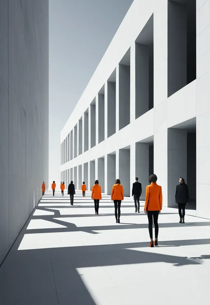
BRAND NAME: AKOTA SERIES: Max0.5 MAIN TITLE: Mastram DEPTH SYSTEM: layered slabs PRIMARY COLOR: Orange ACCENT COLOR: Gray ASPECT RATIO: 9:16 Create a high-end multi-person editorial campaign poster where depth and perspective become the main design system. Build the scene around one strong spatial structure , such as nested architectural frames , lines converging toward a vanishing point , irregular stacked platforms , or large horizontal layers. The architecture should immediately create a clear foreground , middle ground , and background. Place multiple adult figures at different distances and heights within the same coherent perspective field. Their scale must change naturally with depth. Use one or two strong foreground figures , several smaller midground figures , and a few distant figures. Avoid evenly spaced people , grids , lineups , or team-photo compositions. Make people and architecture physically overlap. Some figures should pass through frames , disappear behind walls , be partially hidden by platforms , appear between layers , or emerge from deeper spaces. The result should feel like one real photographed environment , not separate people pasted onto a layout. Integrate the main title into the architecture whenever possible. Let typography follow the perspective of a frame , wall , platform , or structural edge. It may change scale , become partially occluded , or stretch across several depth planes , but it should remain readable. Keep the environment minimal and sculptural. Use large geometric forms , controlled negative space , one dominant color system , realistic directional daylight , and consistent architectural shadows. The spatial idea should still read clearly at thumbnail size. Use realistic fashion photography for the cast: natural skin texture , believable anatomy , real hair , accurate hands and feet , natural fabric folds , varied poses , and subtle movement. Avoid duplicated figures , plastic skin , floating bodies , or overly staged model poses. Supporting typography should stay minimal and secondary. The final image should feel like a real contemporary fashion , cultural , or brand campaign where people , architecture , type , and perspective are all part of the same composition. ,
Create a double-sided , horizontal promotional business card design for a brand called Mege Pilot Vadodara. The business offers digital solutions for delivery pilots in the Asia , specifically bots , support , account guidance , setup , and ongoing assistance. Design Objective The card must look modern , professional , trustworthy , tech-oriented , and visually appealing , with a promotional aesthetic that sparks curiosity and encourages people to learn more about Mege Soluciones Digitales. It should convey support for Latino pilots working with delivery apps in the Vadodara. Visual Style Clean , premium , and commercial design Modern , tech-forward look Primary colors: navy blue , bright blue , white , and small red accents Visual feel: trust , clarity , approachability , and opportunity Use a modern Aircraft as a visual element Include a subtle reference to the United States or Miami Avoid visual clutter Do not use large official logos from the platforms Must not look like an official company representing Amazon , Walmart , DoorDash , or similar Card Front Must include: Main name: Mege Pilot Vadodara Subtitle: Digital solutions for drivers Featured services: Bots • Support • Guidance Instagram: @megevadodara A button or visual call-to-action , e.g. , "Learn more via WhatsApp" Image of a modern aircraft Elegant design with clear visual hierarchy The front should generate curiosity and have a promotional feel , rather than just a corporate one Card Back Must include: Catchy headline: Do you work with delivery apps in the Vadodara? Brief text: We help you with bots , support , and solutions to make the most of your time List of services: Delivery bots Account support and guidance Setup and ongoing assistance Mention platforms in text , without giving them excessive prominence: Amazon Flex • Spark • Veho • Instacart • DoorDash • Shipt A prominent space for a QR code CTA text: Scan and message us "MIAMI" on WhatsApp Contact number: WhatsApp: +57 318 082 4559 Small legal text: Independent service. We are not official representatives of the mentioned platforms. Design requirements Horizontal layout , business card format Balanced and attractive composition Legible text Print-ready appearance Consistent front and back designs Conveys a professional , well-presented brand image Expected outcome Generate a visual proposal for a double-sided business card—including front and back mockups—ready to serve as a professional design reference in Canva. ,

Use the uploaded reference images as the primary visual reference for the character , facial features , Gujarati village style Saree , outfit , proportions , pose , and overall composition. Create a masterpiece-quality artistic double exposure portrait of a beautiful mature Indian woman wearing a soft Gujarati style Saree , elegant natural lookup , gentle smile , warm expressive eyes , realistic facial proportions , smooth natural skin texture , and sophisticated feminine appearance. She wears Gujarati village style green to blue Saree , and a holding small sickle. Main composition: a large , elegant upper-body portrait of the mature woman occupies the upper half of the image with corn farm background. Her expression is calm , graceful , warm , and confident. Her face is highly detailed and photorealistic , with beautiful natural lighting. Double exposure element: seamlessly blend a breathtaking lush green Corn plantation into the lower portion of her portrait and around her silhouette. Rolling Corn-covered hills , rows of perfectly shaped Corn plants , soft morning mist , distant Corn farm. Within the lower landscape , show a smaller full-body version of the same mature woman standing naturally on a rustic wooden pedestrian bridge surrounded by the expansive Corn plantation. Maintain exact character consistency between the large portrait and the smaller full-body figure. Create an artistic transition between portrait and landscape using soft watercolor-like edges , atmospheric mist , subtle paint splashes , floating leaves , clouds , and organic fading boundaries , while keeping the woman's face sharply defined and realistic. Visual style: premium cinematic photography combined with sophisticated fine-art double exposure , elegant editorial travel poster aesthetic , dreamy Indonesian highland atmosphere , photorealistic character , natural skin texture , realistic fabric details , volumetric morning light , subtle film grain , rich but natural green tones , creamy beige highlights , atmospheric depth , exquisite composition. Composition: vertical poster , centered subject , large portrait on top with corn farm background , corn plantation integrated through the torso , smaller full-body character on the bridge at the bottom center , balanced negative space , harmonious visual flow , highly polished professional artwork. Quality: ultra-detailed , 8K , photorealistic , HDR , cinematic lighting , realistic anatomy , realistic hands , realistic village style clothing folds , sharp facial details , sophisticated color grading , premium magazine-quality photography , breathtaking masterpiece. Do not change the character's identity or facial structure. Preserve the reference character's appearance consistently throughout the image. Negative Prompt distorted face , different person , inconsistent character , duplicate face , deformed body , bad anatomy , extra fingers , missing fingers , malformed hands , extra limbs , unnatural eyes , asymmetrical face , plastic skin , excessive makeup , blurry face , low resolution , oversaturated colors , cartoon , anime , 3D render , artificial skin , warped clothing , floating objects , messy composition , text , typography , logo , watermark , cropped head , cut-off feet , duplicate body , unrealistic landscape , harsh shadows. ,

This photo captures a scene inside a dimly lit Hindu temple during a religious ceremony. The mood is solemn and devotional , with a warm color palette dominated by gold , red , and yellow tones. Soft , hazy light filters through the space , and thick plumes of white smoke from incense rise in the center. In the foreground , an elderly South Asian woman with grey hair tied in a bun sits on the floor , facing image-right. She wears a red blouse and a cream-colored saree with a red and gold border. Her expression is focused as she leans forward , her right hand reaching toward a large silver plate filled with yellow and red flowers. To her right , a young South Asian girl , approximately seven years old , sits beside her. Girl has long dark hair adorned with white jasmine flowers and wears a yellow and red traditional outfit. She is looking down at the plate , her hands occupied with the flowers. To the right of the people , a large statue of the goddess Durga is seated. The statue has yellow skin , large almond-shaped eyes , and long black hair. It is adorned with an elaborate golden crown , heavy gold jewelry , and several garlands of yellow , orange , and red flowers. The statue has multiple arms , some of which are raised. It is draped in a red and gold patterned cloth. The base of the statue is surrounded by a dense arrangement of yellow and pink flowers. In the mid-ground on the image-left , a South Asian man in a maroon shirt sits on the floor , playing a traditional drum (dholak). Behind him , another man 2 in a white shirt is partially visible. Further back , a crowd of people is softly blurred in the background , their forms obscured by the shadows and the rising smoke. The temple interior features ornate , dark stone pillars and arches that are partially visible in the background. Small oil lamps (diyas) are placed on the floor in the foreground , their small flames casting a warm glow. The floor is covered with a red patterned carpet. The overall lighting is low , with the primary light sources being the lamps and an unseen overhead light that illuminates the smoke and the statue. ,

A creative 3D isometric miniature in which the character (uploaded image as the primary facial identity reference) , Wearing blue checks on white shirt with a blue jeans , and smartwatch , on a social media profile picture on a smartphone screen. Icons and symbolic objects float around the character , which define his personality. [OpenAI , Google's Gemini , Claude (Anthropic) , Llama (Meta) , Kimi (Moonshot AI) , Seedream5.0] Hyper-realistic 3D rendering , Pixar-style octane rendering , smooth studio lighting , sharp and bright colors , defocus effects (object depth). Overall , the color and feel of the soft sunlight. --ar 9:16 --v 6.0 ,

Deity Identity: Emperor Zhenwu Mythical Beast Type: Divine Rhino Weapon: Divine Sword Color Palette: Azurite Blue , Silver , & Gray Overall Aura: Exorcising Evil Composition Direction: Frontal Subjugation Generate an illustration of an Eastern deity and their mythical beast mount , blending visual languages from traditional deity paintings , *Gongbi* (meticulous brushwork) with rich colors , *Baimiao* (fine-line drawing) , folk woodblock prints , and ancient illustrated scrolls. The image features the "Deity + Mythical Beast" as dual subjects. The deity serves as the core visual focus , while the beast possesses significant scale and presence; they engage in a clear , dynamic interaction—such as mounting , guarding , charging side-by-side , or circling in protection—rather than a simple collage. The deity's face exudes majesty , divinity , and an imposing aura , avoiding both modern "idol-like" features and excessive demon-like distortion. Attire consists of highly detailed traditional divine armor or ritual robes , incorporating intricate patterns such as cloud motifs , thunder patterns , beast-face masks , scale armor textures , and scrolling vines. While details are rich , the figure's overall silhouette must remain distinct. The mythical beast embodies the spirit of a divine creature , spirit beast , or evil-warding mount , possessing a robust physique and a powerful stance. Fur , scales , and tortoise shells are rendered using numerous fine , directional lines to emphasize the texture of traditional *Gongbi* painting (defining form through line); avoid photorealistic fur or 3D CG textures. Weapons or artifacts are integrated into the composition to create distinct diagonal lines , vertical lines , or a primary axis of action. Avoid stiff , static poses for the figures; instead , incorporate actions such as twisting the torso , lowering a shoulder , leaning forward , wielding a weapon , forming a ritual hand seal , patrolling , or launching an attack to imbue the image with a distinct sense of dynamic momentum (*shi*). Integrate elements such as flowing sashes , fluttering sleeves , headdress ribbons , wisps of hair or beard , and swirls of cloud , smoke , or mist. These should harmonize with the figure's movement to create S-shaped , C-shaped , or swirling fluid lines. Ensure these flowing elements serve the overall theme rather than cluttering the composition merely for the sake of detail. Maintain the aesthetic of traditional *xuan* paper by preserving negative space. Use an off-white , ivory , or aged-paper tone as the base , adding only minimal elements—such as inscriptions , vermilion seals , cloud patterns , or wisps of smoke—to evoke the feel of an ancient illustrated scroll or sacred icon. Avoid complex backgrounds depicting palaces , battlefields , or full-scale landscapes. Employ a palette of low-saturation mineral pigments centered around a dominant hue. Complement this with colors such as ink black , deep blue-black , azurite blue , malachite green , antique gold , cinnabar , ochre red , and grayish-white. The overall tone should be elegant and restrained , using small accents of high-saturation color to add vibrancy. The final image must simultaneously convey the solemnity of an Eastern deity , the imposing presence of a mythical beast , the intricate detail of fine-line brushwork (*gongbi*) , the serene atmosphere of ancient *xuan* paper , and a clear , powerful compositional dynamism. Avoid: modern "Guochao" neon aesthetics , cyberpunk styles , the look of 3D game concept art , "plastic" CG textures , cluttered backgrounds , stiff figures , generic-looking mythical beasts , loose or sloppy linework , and excessive or garbled text. ,
Prompt: [Replaceable Content] Deity Identity: Emperor Zhenwu Mythical Beast Type: Divine Hound Weapon: Divine Sword Color Palette: Azurite Blue , Silver , & Gray Overall Aura: Exorcising Evil Composition Direction: Frontal Subjugation Generate an illustration of an Eastern deity and their mythical beast mount , blending visual languages from traditional deity paintings , *Gongbi* (meticulous brushwork) with rich colors , *Baimiao* (fine-line drawing) , folk woodblock prints , and ancient illustrated scrolls. The image features the "Deity + Mythical Beast" as dual subjects. The deity serves as the core visual focus , while the beast possesses significant scale and presence; they engage in a clear , dynamic interaction—such as mounting , guarding , charging side-by-side , or circling in protection—rather than a simple collage. The deity's face exudes majesty , divinity , and an imposing aura , avoiding both modern "idol-like" features and excessive demon-like distortion. Attire consists of highly detailed traditional divine armor or ritual robes , incorporating intricate patterns such as cloud motifs , thunder patterns , beast-face masks , scale armor textures , and scrolling vines. While details are rich , the figure's overall silhouette must remain distinct. The mythical beast embodies the spirit of a divine creature , spirit beast , or evil-warding mount , possessing a robust physique and a powerful stance. Fur , scales , and tortoise shells are rendered using numerous fine , directional lines to emphasize the texture of traditional *Gongbi* painting (defining form through line); avoid photorealistic fur or 3D CG textures. Weapons or artifacts are integrated into the composition to create distinct diagonal lines , vertical lines , or a primary axis of action. Avoid stiff , static poses for the figures; instead , incorporate actions such as twisting the torso , lowering a shoulder , leaning forward , wielding a weapon , forming a ritual hand seal , patrolling , or launching an attack to imbue the image with a distinct sense of dynamic momentum (*shi*). Integrate elements such as flowing sashes , fluttering sleeves , headdress ribbons , wisps of hair or beard , and swirls of cloud , smoke , or mist. These should harmonize with the figure's movement to create S-shaped , C-shaped , or swirling fluid lines. Ensure these flowing elements serve the overall theme rather than cluttering the composition merely for the sake of detail. Maintain the aesthetic of traditional *xuan* paper by preserving negative space. Use an off-white , ivory , or aged-paper tone as the base , adding only minimal elements—such as inscriptions , vermilion seals , cloud patterns , or wisps of smoke—to evoke the feel of an ancient illustrated scroll or sacred icon. Avoid complex backgrounds depicting palaces , battlefields , or full-scale landscapes. Employ a palette of low-saturation mineral pigments centered around a dominant hue. Complement this with colors such as ink black , deep blue-black , azurite blue , malachite green , antique gold , cinnabar , ochre red , and grayish-white. The overall tone should be elegant and restrained , using small accents of high-saturation color to add vibrancy. The final image must simultaneously convey the solemnity of an Eastern deity , the imposing presence of a mythical beast , the intricate detail of fine-line brushwork (*gongbi*) , the serene atmosphere of ancient *xuan* paper , and a clear , powerful compositional dynamism. Avoid: modern "Guochao" neon aesthetics , cyberpunk styles , the look of 3D game concept art , "plastic" CG textures , cluttered backgrounds , stiff figures , generic-looking mythical beasts , loose or sloppy linework , and excessive or garbled text. ,

# Финальный промт для агента (Antigravity + Stitch MCP) ## Сайт-визитка: продажа и установка весов для погрузчиков Скопируй весь блок ниже целиком в чат задач агента как первое сообщение проекта. --- ## ПРОМТ ДЛЯ АГЕНТА (копировать с этой строки) Ты — фронтенд-разработчик и веб-дизайнер. Твоя задача: построить одностраничный сайт-визитку (лендинг) компании , которая продаёт и устанавливает весовое оборудование на вилочные погрузчики (весоизмерительные вилы , крановые весы , встраиваемые системы взвешивания , индикаторы , поверка/калибровка). Работай пошагово , по фазам ниже. После каждой фазы показывай результат (код + краткое описание) и жди подтверждения , прежде чем переходить к следующей фазе. Не используй lorem ipsum — весь текст должен быть по теме; если данные неизвестны , помечай их `[ЗАПОЛНИТЬ: ...]` явным образом прямо в коде и в комментарии. ### 0. Вводные данные проекта - Название компании: `[ЗАПОЛНИТЬ]` (если не указано — использовать нейтральное «ВесПром» как рабочее название и пометить как временное) - Номер WhatsApp: `[ЗАПОЛНИТЬ: +7XXXXXXXXXX]` - Регион работы: `[ЗАПОЛНИТЬ: город/страна]` - Ассортимент (минимум для карточек каталога , если не дано — использовать этот дефолтный список): 1. Весоизмерительные вилы (грузоподъёмность 1–5 т , точность ±0.5%) 2. Крановые/подвесные весы для интеграции с погрузчиком 3. Встраиваемые весовые системы (монтаж в раму погрузчика) 4. Индикаторы веса и дисплеи (проводные/беспроводные) 5. Поверка и калибровка весового оборудования 6. Сервисное обслуживание и ремонт - Логотип/фото/сертификаты: отсутствуют → генерировать текстовые/иконочные плейсхолдеры , фото заменять описательными alt-текстами и SVG-иллюстрациями/иконками вместо реальных фотографий. - Сайт: **одна страница** , без отдельных подстраниц. - Тип сборки: чистый HTML/CSS/JS , без бэкенда. Все заявки идут через кнопки WhatsApp (`wa.me`) , формы обратной связи не делать. ### 1. Дизайн-система — строгий индустриальный стиль (тёмный , техничный) Зафиксировать как CSS-переменные в начале `styles.css`: ```css :root { /* Фон и поверхности */ --bg-primary: #0E1116; --bg-surface: #171B21; --bg-surface-2: #1F252D; --border-color: #2A313B; /* Акцент — индустриальный оранжевый (сигнальный цвет техники) */ --accent: #FF7A1A; --accent-hover: #FF9142; --accent-muted: rgba(255 , 122 , 26 , 0.12); /* Текст */ --text-primary: #F5F6F7; --text-secondary: #9AA3AD; --text-on-accent: #0E1116; /* Статусы/бейджи */ --success: #3DDC84; /* Радиусы — небольшие , без "мягкого" UI */ --radius-sm: 4px; --radius-md: 8px; /* Шкала отступов */ --space-1: 4px; --space-2: 8px; --space-3: 12px; --space-4: 16px; --space-5: 24px; --space-6: 32px; --space-7: 48px; --space-8: 64px; --space-9: 96px; } ``` - Шрифт: `Inter` (или `Manrope`) через Google Fonts. Заголовки — 700 , текст — 400/500. - Масштаб типографики: H1 — 48px / mobile 32px; H2 — 32px / mobile 24px; H3 — 22px; body — 16px; small — 14px. Line-height заголовков 1.1–1.2 , текста — 1.5. - Иконки: line-style (обводка , без заливки) , тема — вес/точность/погрузчик/сертификат. Использовать инлайн SVG. - Кнопки: primary — заливка `--accent` , текст `--text-on-accent` , radius `--radius-sm` , без теней , чёткая обводка при hover. Secondary — прозрачная с обводкой `--border-color`. - Общее ощущение: контраст , чёткие линии-разделители секций (border-top 1px `--border-color`) , минимум скруглений , минимум декоративных теней. Сгенерировать через Stitch MCP референс hero-блока по промпту: > "Industrial B2B landing page hero , dark navy/graphite background #0E1116 , orange accent #FF7A1A , bold condensed sans-serif headline , forklift with weighing attachment illustration , minimal rounded corners , trust badges row" Выбрать один вариант , зафиксировать композицию (расположение заголовка/кнопки/иллюстрации) как референс для вёрстки. ### 2. Структура страницы (порядок секций и содержимое) 1. **Header** (sticky , `--bg-surface` с нижней обводкой) - Слева: логотип-плейсхолдер (текст названия компании , шрифт 700). - Справа: пункты меню-якоря (Услуги , Каталог , Как работаем , Кейсы , Контакты) — скрыть в бургер на мобильных. - Кнопка WhatsApp (primary) — крайняя справа. 2. **Hero** - H1: «Весы для погрузчиков под ключ: подбор , монтаж , поверка» - Подзаголовок: 1–2 предложения про скорость и точность монтажа , гарантию. - Кнопка WhatsApp (крупная , primary) — текст «Написать в WhatsApp» + иконка. - Строка доверия под кнопкой: 3 коротких пункта в столбик/строку («Гарантия N лет» , «Выезд по региону `[ЗАПОЛНИТЬ]`» , «Поверка включена»). - Иллюстрация/SVG погрузчика с весами справа (или фон-паттерн , если иллюстрации нет). 3. **Услуги** (4 карточки в сетке , `--bg-surface` фон карточки , border `--border-color`) - Продажа весового оборудования - Монтаж на погрузчик - Поверка и калибровка - Сервис и ремонт - На каждой карточке: иконка , заголовок , 1–2 строки описания. 4. **Каталог** (сетка карточек товаров , 4–6 позиций из списка в п.0) - На карточке: иконка/плейсхолдер-изображение , название , 2–3 ключевые характеристики (грузоподъёмность , точность , IP-класс) , кнопка WhatsApp с текстом `«Интересует {название товара}»` (urlencoded). 5. **Как мы работаем** (степпер/таймлайн , 5 шагов) - Заявка в WhatsApp → Консультация и подбор → Выезд/монтаж → Поверка → Гарантийная поддержка. - Каждый шаг: номер , короткий заголовок , 1 строка описания. 6. **Преимущества** (4–6 пунктов , иконка + короткий текст) - Например: «Гарантия на монтаж» , «Сертифицированное оборудование» , «Опыт работы `[ЗАПОЛНИТЬ]` лет» , «Выезд по региону» , «Поверка включена в стоимость» , «Сервис 24/7» — оставить как варианты , отметить реальные цифры как `[ЗАПОЛНИТЬ]`. 7. **Кейсы** (сетка/карусель из 3 карточек) - Плейсхолдер-описание объекта (склад/производство/логистика) , тип установленного оборудования , результат в 1 фразе. 8. **Сертификаты и документы** (ряд бейджей) - Плейсхолдер-иконки «Сертификат соответствия» , «Свидетельство о поверке» — с пометкой `[ЗАПОЛНИТЬ: реальные документы]`. 9. **Отзывы** (2–3 карточки) - Плейсхолдер-тексты , помечены как черновые. 10. **Финальный CTA-блок** - Крупный заголовок-призыв , крупная кнопка WhatsApp по центру. - Контакты: телефон , email (плейсхолдеры) , адрес/регион. - Карта — встроенный статичный блок-плейсхолдер (реальный embed добавить , когда будет адрес). 11. **Footer** - Название компании , копирайт , повтор кнопки WhatsApp (маленькая) , ссылки на мессенджеры при наличии. **Плавающая кнопка WhatsApp** — fixed , правый нижний угол , видна на всех секциях при скролле , иконка WhatsApp в зелёном кружке (`#25D366`) , лёгкая пульсация (анимация раз в 3–4 сек , без резких эффектов). ### 3. WhatsApp-интеграция (техническая часть) - Формат ссылки: `https://wa.me/<номер_без_плюса_и_пробелов>?text=<urlencoded_текст>` - Номер и дефолтный текст вынести в константы в начале `main.js`: ```js const WHATSAPP_NUMBER = "ЗАПОЛНИТЬ"; // международный формат без + const WHATSAPP_DEFAULT_TEXT = "Здравствуйте! Интересуют весы для погрузчика , хочу проконсультироваться"; ``` - Все ссылки — `target="_blank" rel="noopener noreferrer"`. - Для карточек каталога текст сообщения формируется динамически: `Здравствуйте! Интересует ${имя_товара} , хочу проконсультироваться`. ### 4. Технические требования - Адаптив mobile-first , брейкпоинты: 375 / 768 / 1024 / 1440. - Изображения — webp , `loading="lazy"` (кроме hero-изображения). - Контраст текста — проверить на соответствие WCAG AA (особенно `--text-secondary` на `--bg-primary`). - Кросс-браузерность: Chrome , Safari , Firefox. - Favicon , `sitemap.xml` , `robots.txt`. ### 5. SEO и метаданные - `<title>`: «Весы для погрузчиков — продажа , монтаж , поверка [Регион]» - `meta description`: 1–2 предложения с УТП и регионом. - OG-теги (og:title , og:description , og:image — hero-изображение). - H1 — один на странице (см. Hero). - Alt-тексты у всех изображений/иконок. - Микроразметка `schema.org`: `LocalBusiness` (общие данные компании) + `Product` для каждой карточки каталога. ### 6. Порядок выполнения (для модели Flash 3.6 Medium — дробить по шагам) Выполнять и показывать результат по одному пункту за раз , не объединяя несколько секций в один ответ: 1. Скелет HTML + подключение CSS-переменных из раздела 1. 2. Header + мобильное меню + плавающая кнопка WhatsApp. 3. Hero-секция. 4. Секция «Услуги». 5. Секция «Каталог». 6. Секция «Как мы работаем». 7. Секция «Преимущества». 8. Секция «Кейсы». 9. Секция «Сертификаты». 10. Секция «Отзывы». 11. Финальный CTA-блок + Footer. 12. SEO-метатеги , favicon , sitemap.xml , robots.txt. 13. Финальная проверка: адаптив на 4 брейкпоинтах , контраст , все wa.me-ссылки , lazy-loading изображений. ### 7. Чек-лист приёмки (сверить перед сдачей) - [ ] Все `[ЗАПОЛНИТЬ]`-плейсхолдеры собраны в единый список в комментарии наверху `index.html` для удобной правки. - [ ] Все кнопки/ссылки ведут на корректный `wa.me` с правильным текстом. - [ ] Плавающая кнопка WhatsApp не перекрывает контент на мобильных (проверить над footer). - [ ] Ни одной формы обратной связи в коде нет. - [ ] Адаптив проверен на 375/768/1024/1440. - [ ] Цветовая схема соответствует разделу 1 (никаких случайных цветов вне палитры). - [ ] Lorem ipsum отсутствует — весь текст по теме. ## КОНЕЦ ПРОМТА (копировать до этой строки) ,

Masterpiece , best quality , ultra-detailed , vibrant color , painterly texture , hand-drawn , warm light , glowing effects. Professional children's book cover illustration for an early chapter book titled "The Molties and the Flame of First Light" by Zoe Sunelle. Audience: children ages 6–9. CONCEPT: Five small living lava creatures stand together from behind , looking forward into a vast glowing underground cavern. The viewer sees their backs and silhouettes — enough to feel their warmth , their differences , their friendship — but their faces are not shown. The mystery makes the viewer want to step inside the world with them. WORLD: A vast magical underground volcanic cavern called LavaBloom. The space feels ancient , timeless , and enormous. Glowing magma rivers wind into the distance. Soft volcanic rock formations rise on either side. Warm amber crystals catch the light. Magical particles drift slowly through warm still air. The cavern ceiling glows like an underground sun — deep molten orange fading to amber gold. In the far distance , at the end of a natural path of warm stone , the Flame of First Light glows — a single small delicate flower , white-gold petals , luminous and still , the visual anchor of the entire composition. It is the most clearly defined element in the image. Everything leads the eye toward it. CHARACTERS — seen from behind , in silhouette: Five small gooey rounded lava creatures standing together , facing forward into the cavern. Their forms are suggested by warm glowing outlines — each one distinct in silhouette. Left to right suggested order: — One broad and solid (Magmara) glowing deep red-orange — One small and slightly floating (Glowy) glowing pale white-gold , hovering just above the stone — One centre and slightly forward (Spark) glowing vivid flame-orange , leaning toward the distant flower with energy — One rounded and steady (Lavaleenie) glowing deep amber gold — One slightly apart , turned at a small angle (Rays) glowing warm copper-gold with a faint cool edge Their inner glows illuminate the ground around their feet and each other's backs. They are clearly friends standing together before something wondrous. LIGHTING: The Flame of First Light in the far distance is the primary light source — a soft white-gold beacon. The characters are backlit by the warm cavern glow. Central gradient: bright golden white at the horizon where the flower glows , transitioning through amber and orange to deep volcanic warmth in the foreground. The Molties' inner glows create warm halos around each silhouette. COLOUR PALETTE: Warm sepia-gold background tones. Deep molten orange cavern walls. Amber gold crystal light. White-gold distant flower glow. Warm character silhouette glows in orange , amber , red-orange , white-gold , copper. The overall palette is rich , warm , and slightly timeless — like a memory of something magical. COMPOSITION: Wide establishing shot with depth. Five silhouette figures in the lower-centre foreground , small against the vast cavern. The Flame of First Light in the far distance , small but unmistakable , drawing the eye through the composition. Vast atmospheric space between characters and flower. Clear sky-like space at the top of the image for title typography. The figures occupy the lower third. The flower occupies the centre-distance. The cavern fills everything between. ART STYLE: Premium hand-painted children's book illustration. Warm painterly atmosphere. Organic soft textures. Traditional publishing quality. Literary and timeless feeling — more classic storybook than animated film. Soft golden haze. Atmospheric depth. Slightly impressionistic distance. NOT CGI. NOT flat vector. NOT anime. NOT photorealistic. Handcrafted and warm. MOOD: Wonder. Timeless. Quiet adventure. Curiosity. The feeling of standing at the beginning of something enormous and beautiful. A child should think: I want to walk in there with them. Warm. Safe. Vast. Magical. Still. NEGATIVE PROMPTS: Cool palette. Blue dominant. Purple dominant. Teal. Lime green. White-blue glow. Cold light sources. Muted colors. Desaturated. Muddy tones. Dark creepy tone. Aggressive contrast. Harsh contrast. Realistic fire. Dangerous flames. Scary volcano. Dark horror. Threatening lava. Ice. Snow. Frost. Monsters. Evil expressions. Aggressive characters. Sharp edges. Spiky shapes. Photo realism. Slick 3D rendering. CGI. Anime. Flat vector. Flat design. Clip art. Text in image. Words in image. Humans. Robots. Metal. Violent action. Weapons. Fear. Characters facing viewer. Front view of characters. Faces visible. Characters revealed. Close up of characters. Characters large in frame. Action poses. Dynamic movement. Crowded foreground. Busy composition. Small cavern. Claustrophobic space. ,

Masterpiece , best quality , ultra-detailed , vibrant color , painterly texture , hand-drawn , warm light , glowing effects. Professional children's book cover illustration for an early chapter book titled "The Molties and the Flame of First Light" by Zoe Sunelle. Audience: children ages 6–9. CONCEPT: Five small living lava creatures stand together from behind , looking forward into a vast glowing underground cavern. The viewer sees their backs and silhouettes — enough to feel their warmth , their differences , their friendship — but their faces are not shown. The mystery makes the viewer want to step inside the world with them. WORLD: A vast magical underground volcanic cavern called LavaBloom. The space feels ancient , timeless , and enormous. Glowing magma rivers wind into the distance. Soft volcanic rock formations rise on either side. Warm amber crystals catch the light. Magical particles drift slowly through warm still air. The cavern ceiling glows like an underground sun — deep molten orange fading to amber gold. In the far distance , at the end of a natural path of warm stone , the Flame of First Light glows — a single small delicate flower , white-gold petals , luminous and still , the visual anchor of the entire composition. It is the most clearly defined element in the image. Everything leads the eye toward it. CHARACTERS — seen from behind , in silhouette: Five small gooey rounded lava creatures standing together , facing forward into the cavern. Their forms are suggested by warm glowing outlines — each one distinct in silhouette. Left to right suggested order: — One broad and solid (Magmara) glowing deep red-orange — One small and slightly floating (Glowy) glowing pale white-gold , hovering just above the stone — One centre and slightly forward (Spark) glowing vivid flame-orange , leaning toward the distant flower with energy — One rounded and steady (Lavaleenie) glowing deep amber gold — One slightly apart , turned at a small angle (Rays) glowing warm copper-gold with a faint cool edge Their inner glows illuminate the ground around their feet and each other's backs. They are clearly friends standing together before something wondrous. LIGHTING: The Flame of First Light in the far distance is the primary light source — a soft white-gold beacon. The characters are backlit by the warm cavern glow. Central gradient: bright golden white at the horizon where the flower glows , transitioning through amber and orange to deep volcanic warmth in the foreground. The Molties' inner glows create warm halos around each silhouette. COLOUR PALETTE: Warm sepia-gold background tones. Deep molten orange cavern walls. Amber gold crystal light. White-gold distant flower glow. Warm character silhouette glows in orange , amber , red-orange , white-gold , copper. The overall palette is rich , warm , and slightly timeless — like a memory of something magical. COMPOSITION: Wide establishing shot with depth. Five silhouette figures in the lower-centre foreground , small against the vast cavern. The Flame of First Light in the far distance , small but unmistakable , drawing the eye through the composition. Vast atmospheric space between characters and flower. Clear sky-like space at the top of the image for title typography. The figures occupy the lower third. The flower occupies the centre-distance. The cavern fills everything between. ART STYLE: Premium hand-painted children's book illustration. Warm painterly atmosphere. Organic soft textures. Traditional publishing quality. Literary and timeless feeling — more classic storybook than animated film. Soft golden haze. Atmospheric depth. Slightly impressionistic distance. NOT CGI. NOT flat vector. NOT anime. NOT photorealistic. Handcrafted and warm. MOOD: Wonder. Timeless. Quiet adventure. Curiosity. The feeling of standing at the beginning of something enormous and beautiful. A child should think: I want to walk in there with them. Warm. Safe. Vast. Magical. Still. NEGATIVE PROMPTS: Cool palette. Blue dominant. Purple dominant. Teal. Lime green. White-blue glow. Cold light sources. Muted colors. Desaturated. Muddy tones. Dark creepy tone. Aggressive contrast. Harsh contrast. Realistic fire. Dangerous flames. Scary volcano. Dark horror. Threatening lava. Ice. Snow. Frost. Monsters. Evil expressions. Aggressive characters. Sharp edges. Spiky shapes. Photo realism. Slick 3D rendering. CGI. Anime. Flat vector. Flat design. Clip art. Text in image. Words in image. Humans. Robots. Metal. Violent action. Weapons. Fear. Characters facing viewer. Front view of characters. Faces visible. Characters revealed. Close up of characters. Characters large in frame. Action poses. Dynamic movement. Crowded foreground. Busy composition. Small cavern. Claustrophobic space. ,

Act as a world-class brand identity designer with 20+ years of experience specializing in luxury minimalist logos. Design a premium , timeless , award-winning logo for an industrial eco-friendly brand named: ورقة وجذع Warqah & Jitha About the Brand: Warqah & Jitha is a Yemeni industrial company manufacturing sustainable , locally produced rattan sticks as an eco-friendly alternative to imported natural rattan. The brand represents sustainability , local craftsmanship , environmental responsibility , premium quality , and modern Yemeni heritage. The logo must communicate: • Sustainability • Nature • Local manufacturing • Innovation • Premium craftsmanship • Eco-friendly materials • Trust • Elegance • Authentic Yemeni identity • Luxury simplicity Icon Design: Create a memorable geometric symbol by combining: • A natural leaf • A tree trunk or wooden branch • Several subtle rattan sticks integrated into the icon The integration should be clever using negative space. Avoid obvious clipart. The icon should be unique , scalable , iconic , and recognizable even without text. Design Style: Luxury Minimalism Modern Organic Scandinavian Simplicity Flat Vector Geometric Precision Negative Space Premium Branding Timeless Identity Clean Lines Swiss Design Monoline Balanced Composition Typography: Arabic: ورقة وجذع English: Warqah & Jitha Use elegant modern Arabic typography paired with a sophisticated sans-serif English font. Color Palette: Primary: Olive Green (#556B2F) Secondary: Natural Wood Brown (#7A5230) Accent: Warm Sand Beige (#D8C3A5) Optional Luxury Accent: Soft Matte Gold (#C7A55B) Background: Pure White Deliverables: • Full-color logo • Black version • White version • Icon only • Horizontal layout • Vertical layout • Luxury brand presentation • Packaging mockup • Wooden engraving mockup • Business card mockup • Stamp version • Social media profile icon The logo must look perfect on: Luxury packaging Wood engraving Product labels Gift boxes Shopping bags Website Mobile App Instagram Business cards Signage Requirements: No gradients No shadows No mockup effects inside the logo itself Vector style Simple but highly memorable Balanced proportions Professional branding Behance Featured quality Dribbble Top Shot quality Minimal but emotionally powerful The logo should be iconic enough to become a globally recognizable symbol similar to Apple , Nike , Airbnb , or Starbucks , using extremely simple geometry and intelligent negative space. ,

Act as a world-class brand identity designer with 20+ years of experience specializing in luxury minimalist logos. Design a premium , timeless , award-winning logo for an industrial eco-friendly brand named: ورقة وجذع Warqah & Jitha About the Brand: Warqah & Jitha is a Yemeni industrial company manufacturing sustainable , locally produced rattan sticks as an eco-friendly alternative to imported natural rattan. The brand represents sustainability , local craftsmanship , environmental responsibility , premium quality , and modern Yemeni heritage. The logo must communicate: • Sustainability • Nature • Local manufacturing • Innovation • Premium craftsmanship • Eco-friendly materials • Trust • Elegance • Authentic Yemeni identity • Luxury simplicity Icon Design: Create a memorable geometric symbol by combining: • A natural leaf • A tree trunk or wooden branch • Several subtle rattan sticks integrated into the icon The integration should be clever using negative space. Avoid obvious clipart. The icon should be unique , scalable , iconic , and recognizable even without text. Design Style: Luxury Minimalism Modern Organic Scandinavian Simplicity Flat Vector Geometric Precision Negative Space Premium Branding Timeless Identity Clean Lines Swiss Design Monoline Balanced Composition Typography: Arabic: ورقة وجذع English: Warqah & Jitha Use elegant modern Arabic typography paired with a sophisticated sans-serif English font. Color Palette: Primary: Olive Green (#556B2F) Secondary: Natural Wood Brown (#7A5230) Accent: Warm Sand Beige (#D8C3A5) Optional Luxury Accent: Soft Matte Gold (#C7A55B) Background: Pure White Deliverables: • Full-color logo • Black version • White version • Icon only • Horizontal layout • Vertical layout • Luxury brand presentation • Packaging mockup • Wooden engraving mockup • Business card mockup • Stamp version • Social media profile icon The logo must look perfect on: Luxury packaging Wood engraving Product labels Gift boxes Shopping bags Website Mobile App Instagram Business cards Signage Requirements: No gradients No shadows No mockup effects inside the logo itself Vector style Simple but highly memorable Balanced proportions Professional branding Behance Featured quality Dribbble Top Shot quality Minimal but emotionally powerful The logo should be iconic enough to become a globally recognizable symbol similar to Apple , Nike , Airbnb , or Starbucks , using extremely simple geometry and intelligent negative space. ,
The image is an artistic composition that combines elements of nature with human features. It depicts a profile view where part of a F1-Driver face with helmet rendered as a circuit tornado has been replaced by a dripping rainbow liquid , showing the f1 cars speeding forward with Matrix code flowing like motion blur light trails. A lone ((F1-wheels)) fly prominently within this natural track flowing through it. In addition to these primary subjects , there's also a steering wheel-like element integrated into one side of the body silhouette , adding another layer of texture and depth to the overall design. The background showcases range of F1 pavilion partially obscured by fire blast under a partly black cloudy sky , contributing to the serene atmosphere of the artwork. This blend creates a harmonious fusion between humanity and wildlife set against a picturesque backdrop. ,

A whimsical illustration of a colossal , ancient ruin that appears to be dissolving into a swarm of iridescent butterflies , creating a magical sense of transformation and movement. Soft , pastel colors dominate the scene , with a gentle , dreamlike quality. Masterpiece Monday encourages us to explore wonder; this piece embodies that with a whimsical illustration style , reminiscent of fairy tale art and the gentle fantasy art of Mary Blair. ,
Professional vector logo for educational center "ПРОГРЕСС" , minimalist geometric Cyrillic letter П combined with a subtle guiding star , symbol of achievement , confidence and educational success , modern academic identity , Swiss minimalism , premium branding , forest green primary color , muted terracotta accent , spacious layout , flat vector , white background ,
Generate a single complete image of Illustration Profile Long Scroll , one full image , no tiling , no multi-grid , no columns , horizontal 3:1 format. Theme: Port Logistics System. Title: Deendayal Port. Core Content: Dry Cargo Berths , Liquid Terminals , Container Terminals. Supply Chain & Hinterland Connectivity: Railway lines connect , Seamless connectivity to National Highways , Backed by Container Freight Stations. Information Modules: [Limit to 6–8] Style: Illustrated Knowledge Visualization with Text and Images. Color Scheme: yellow , blue , gray-white. The visual focus is to clearly explain the surface , internal structure , functional zoning , and operational process of complex systems all at once. Images primary , text secondary. Use only short labels , module names , function words , and one extremely brief description—no long paragraphs , no dense text blocks. Optionally add a small number of labels , arrows , flow lines , thin annotation lines , and a legend bar to help viewers understand how the system operates. Overall , like a museum science long scroll , city system infographic , or advanced profile diagram from a PPT proposal. Avoid text overload , cluttered information , tiled feel , multi-grid , ordinary landscape images , low resolution. ,

A legendary armored knight riding a colossal fire-breathing dragon in full flight , both locked in absolute unity of purpose and power. The knight: clad in magnificent battle-worn plate armor of dark steel and blackened gold — every surface engraved with ancient runes and battle marks , extreme textural detail on every dent , scratch and polished surface , visor raised revealing a face of iron determination and fierce exhilaration , long cloak of deep crimson billowing violently behind. The dragon: absolutely colossal , scales of obsidian black and molten dark copper with extreme individual scale detail , enormous wings fully spread at maximum span catching superheated air , neck stretched forward and downward , powerful jaw wide open unleashing a catastrophic torrent of pure white-gold fire that illuminates everything within half a mile. The fire stream is breathtakingly detailed — a churning column of white core transitioning to gold , amber and deep orange at the edges , with burning embers and superheated air distortion spiraling outward. Environment: flying at high altitude at dead of night over a vast dark mountain range far below , jagged peaks barely visible through clouds and fire glow. The sky above is pure black void with razor-sharp stars. Anamorphic 2.39:1 frame. Composition: extreme dynamic low-angle shot — dragon and rider fill the upper frame diagonally from left to right , the fire torrent erupting forward and downward toward the lower right , mountain landscape far below. Grandiose composition , both subjects dominant and dramatically visible against the deep black sky. Lighting: the dragon's own fire as the primary key light — catastrophic white-gold illumination lighting the entire underside of the dragon and rider from below with brutal intensity , creating extreme chiaroscuro on every armor plate and scale , deep cool blue-black shadows above , distant fire glow reflecting off cloud banks. Divine dramatic golden volumetric light rays piercing through the fire smoke upward. Ultra-realistic details on armor engravings , dragon scales , fire physics , fabric textures. Gustave Doré revisited in modern key — visible painterly brushstrokes , volumetric light , high contrast , cinematic depth , 8K resolution , masterpiece quality. No text , no letters , no words inside the image. ,

An opulent ballroom scene , bathed in the golden light of countless chandeliers , where ethereal , translucent jellyfish serve as the primary dancers. Their tendrils weave intricate patterns in the air as they float gracefully amongst elegantly dressed figures in Baroque attire. The overall aesthetic is a fusion of hyperrealism and surrealism , with a focus on rich textures , dramatic chiaroscuro lighting , and a dreamlike , otherworldly atmosphere. ,
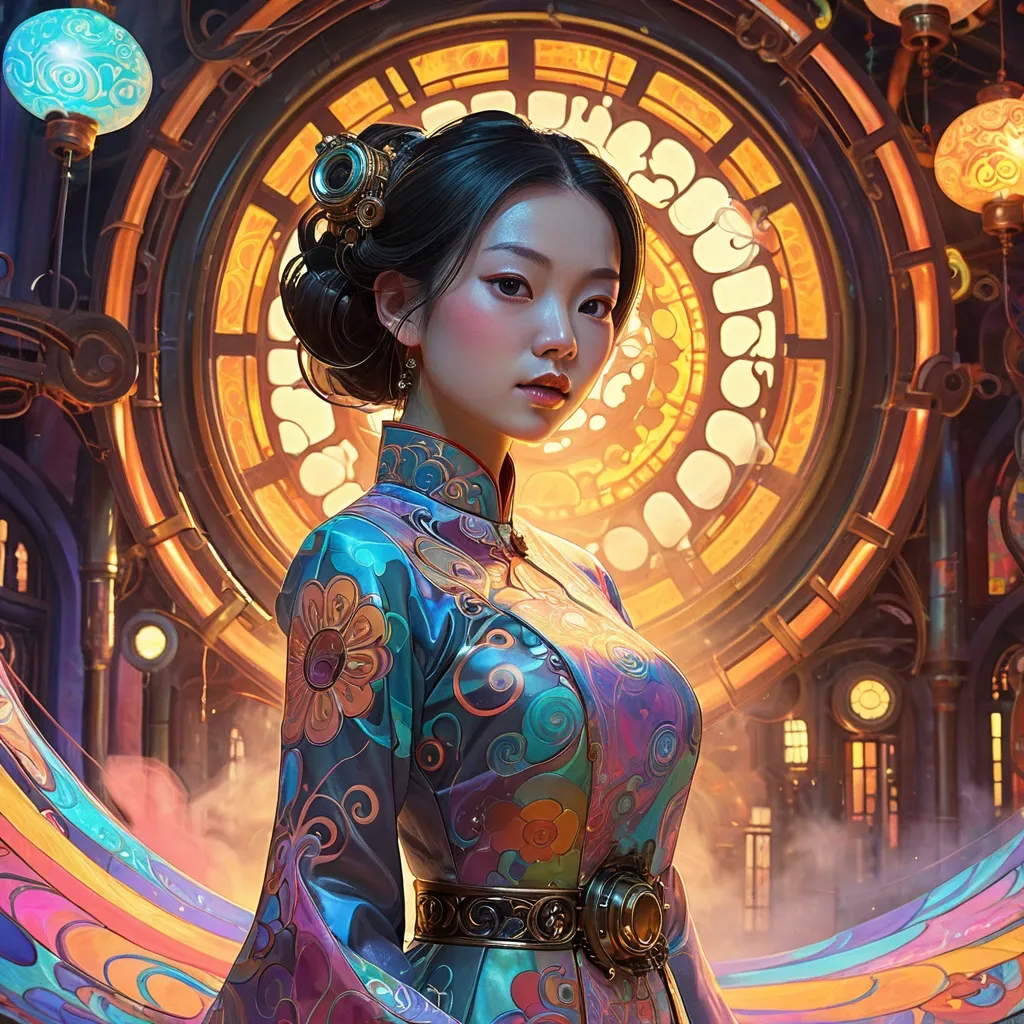
A beautiful Vietnamese woman in elegant Ao Dai stands within a vibrant , dreamlike environment filled with swirling psychedelic patterns and vivid , mesmerizing colors. Extreme close up portrait with interesting side-lighting. Her form is rendered with bold , expressive brushstrokes , evoking the playful , surreal aesthetic of Takashi Murakami , the dynamic , graphic qualities of Ash Thorp , and the charming character designs of Lois van Baarle. The scene glows with an inner light , casting diffused , ethereal shadows. The color palette is modern , light primary tones with holographic pastels , steampunk world , intricate brass and copper machinery , Victorian architecture , clockwork gears , steam pipes , glowing amber lights , airships in the sky , ornate filigree metalwork , riveted iron surfaces , fog and smoke atmosphere , hyper-detailed , cinematic lighting , concept art , 8K resolution Ao Dai , ,