Search Results for Navigation
Explore AI generated designs, images, art and prompts by top community artists and designers.
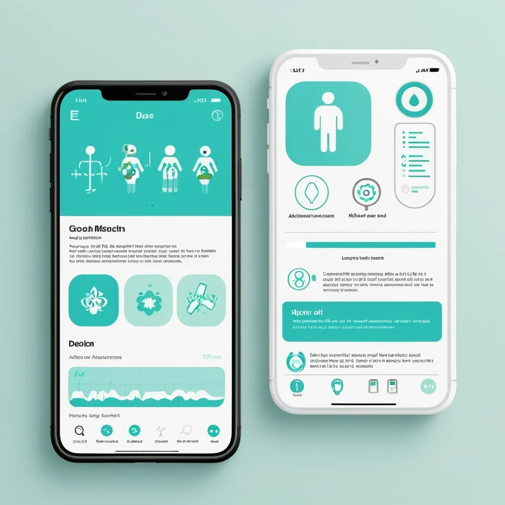

Разработай макет приложения для здоровья. Краткое описание идеи Приложение , которое: Распознает медицинские анализы по фото (ОАК , биохимия , гормоны и др.) Строит динамические графики показателей во времени Хранит заключения специалистов с возможностью поиска и структурирования Собирает профиль пользователя (пол , возраст , вес , хронические заболевания) Предоставляет AI-рекомендации по питанию , физической активности , ментальному здоровью. Философия дизайна «Забота и ясность» — дизайн должен создавать ощущение: ✅ Безопасности — пользователь доверяет приложению свои медицинские данные ✅ Профессионализма — научный подход , точность , надежность ✅ Заботы — теплота , поддержка , мотивация к здоровью ✅ Ясности — простота восприятия сложной медицинской информации. Mobile app UI design , medical health tracker dashboard , clean minimal style , soft pastel colors: primary turquoise #5DBCD2 , lavender #9B9ED6 , white background #F8FAFC , dark gray text #2D3748. Layout: Top greeting "Добрый день , Анна!" with health score circular widget (85/100 , mint green progress ring). Below: 4 rounded square quick-action cards with soft icons (Documents , Charts , AI Assistant , Appointments). Section "Последние анализы": two white cards with rounded corners (20px) , subtle shadow , each showing test name (🩸 Общий анализ крови) , date , and status badge (✓ Норма in mint green , ⚠ Повыш. in coral). AI recommendation card at bottom: soft gradient background , robot icon , short text tip about hydration. Bottom navigation bar: 5 icons (Home , Analytics , Add , Chat , Profile) , active icon in turquoise , blurred white background. Style: Medical Minimalism 2.0 , glassmorphism elements , soft UI , organic rounded shapes , calm aesthetic , professional but friendly. High fidelity , Figma-style mockup , iOS design guidelines , 375x812px frame , light mode. --ar 9:19 --style raw ,
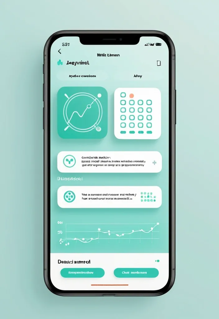
Разработай макет приложения для здоровья. Краткое описание идеи Приложение , которое: Распознает медицинские анализы по фото (ОАК , биохимия , гормоны и др.) Строит динамические графики показателей во времени Хранит заключения специалистов с возможностью поиска и структурирования Собирает профиль пользователя (пол , возраст , вес , хронические заболевания) Предоставляет AI-рекомендации по питанию , физической активности , ментальному здоровью. Философия дизайна «Забота и ясность» — дизайн должен создавать ощущение: ✅ Безопасности — пользователь доверяет приложению свои медицинские данные ✅ Профессионализма — научный подход , точность , надежность ✅ Заботы — теплота , поддержка , мотивация к здоровью ✅ Ясности — простота восприятия сложной медицинской информации. Mobile app UI design , medical health tracker dashboard , clean minimal style , soft pastel colors: primary turquoise #5DBCD2 , lavender #9B9ED6 , white background #F8FAFC , dark gray text #2D3748. Layout: Top greeting "Добрый день , Анна!" with health score circular widget (85/100 , mint green progress ring). Below: 4 rounded square quick-action cards with soft icons (Documents , Charts , AI Assistant , Appointments). Section "Последние анализы": two white cards with rounded corners (20px) , subtle shadow , each showing test name (🩸 Общий анализ крови) , date , and status badge (✓ Норма in mint green , ⚠ Повыш. in coral). AI recommendation card at bottom: soft gradient background , robot icon , short text tip about hydration. Bottom navigation bar: 5 icons (Home , Analytics , Add , Chat , Profile) , active icon in turquoise , blurred white background. Style: Medical Minimalism 2.0 , glassmorphism elements , soft UI , organic rounded shapes , calm aesthetic , professional but friendly. High fidelity , Figma-style mockup , iOS design guidelines , 375x812px frame , light mode. --ar 9:19 --style raw ,
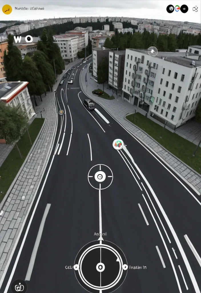
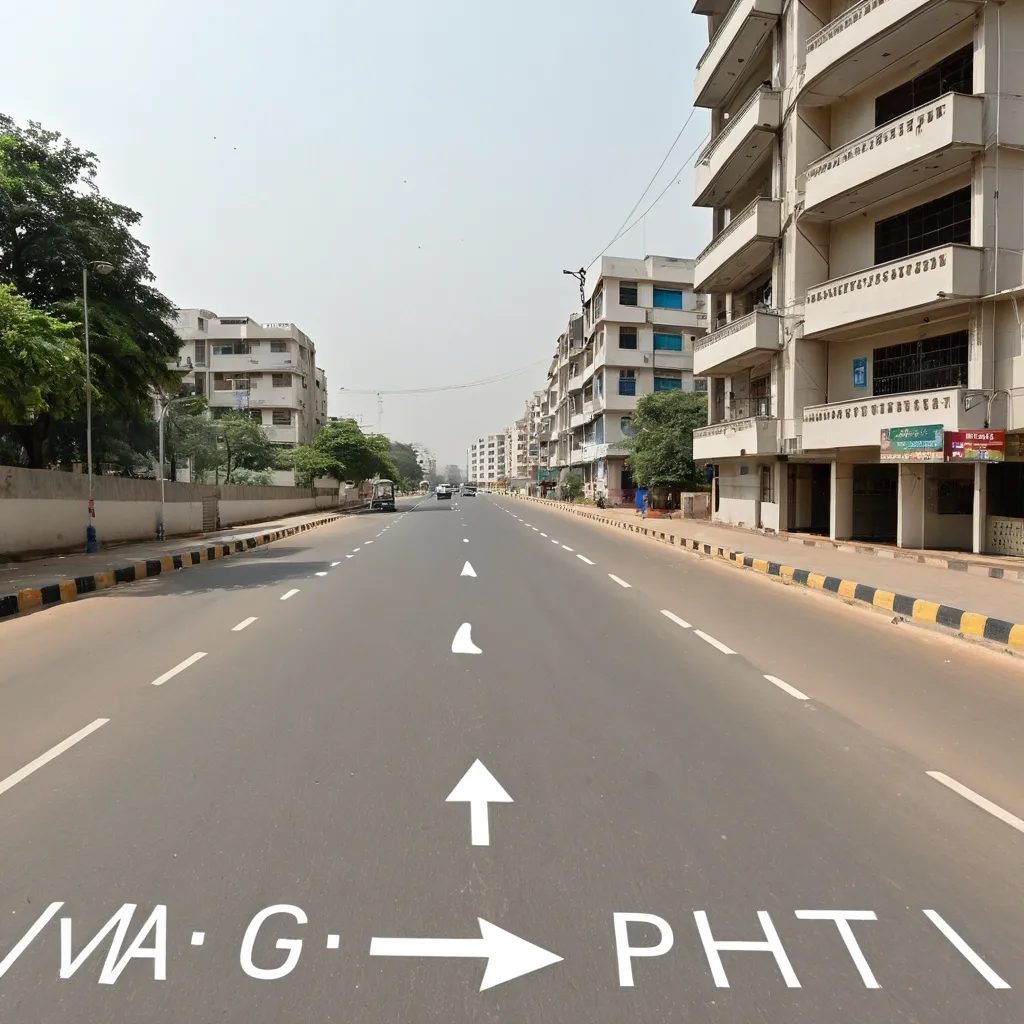
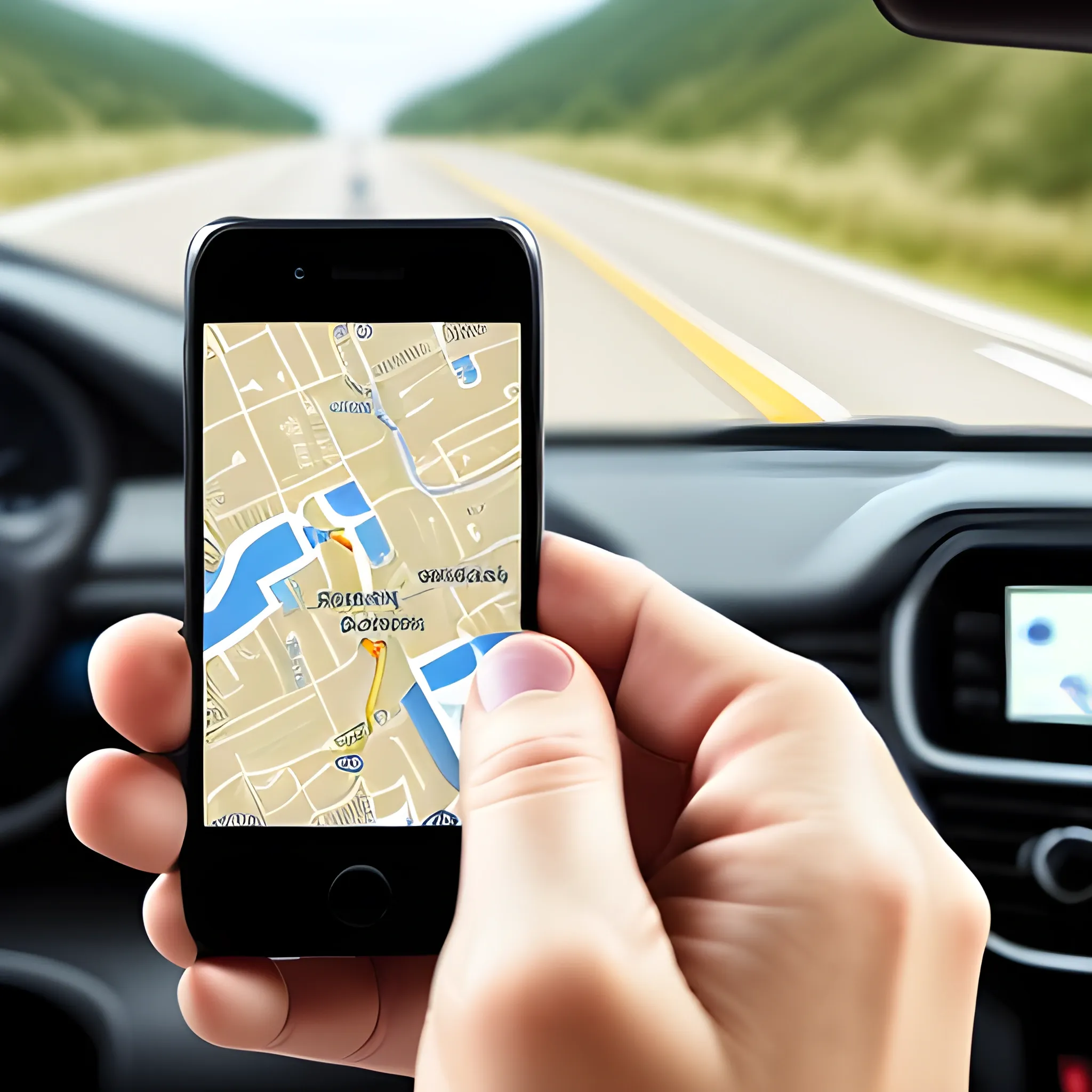
Hyper-realistic Google Street View screenshot of [Локация ]exact modern Google Street View UI , dark info panel top-left showing location name and coordinates , white circular navigation arrows on the road surface , compass and pegman icon top-right , zoom controls , Google watermark bottom center , GPS coordinates bottom-right , floating black pill-shaped location label with pin icon on the building , blurred pedestrian faces , subtle fisheye barrel lens distortion , camera mounted at 2.5m height on car roof POV , overcast natural daylight , parked cars , ultra-detailed environment matching the fictional world , photorealistic. 16:9 dimension. ,
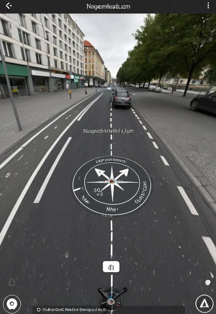
Hyper-realistic Google Street View screenshot of [Локация ]exact modern Google Street View UI , dark info panel top-left showing location name and coordinates , white circular navigation arrows on the road surface , compass and pegman icon top-right , zoom controls , Google watermark bottom center , GPS coordinates bottom-right , floating black pill-shaped location label with pin icon on the building , blurred pedestrian faces , subtle fisheye barrel lens distortion , camera mounted at 2.5m height on car roof POV , overcast natural daylight , parked cars , ultra-detailed environment matching the fictional world , photorealistic. 16:9 dimension. ,
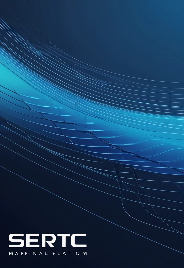
{ "prompt": "Design a high-end corporate banner for a marine technology company called SERTEC Marine , based on the attached reference image. Elevate the existing design into a premium 'Fluid Tech Layers' concept. Maintain the idea of flowing wave shapes but transform them into precise , engineered , layered vector forms with clean edges and controlled geometry. The composition should feature multiple overlapping curved layers moving horizontally from left to right , representing data flow , ocean currents , and advanced systems.\n\nIncorporate subtle technical elements such as thin wireframe lines , navigation paths , or circuit-like details integrated along the curves. Add micro details like connection points and segmented lines to enhance the technological feel without cluttering the design.\n\nUse a sophisticated gradient palette: deep navy blue , indigo , and electric cyan accents. Apply smooth gradient transitions with depth and contrast. Include subtle glassmorphism effects (translucent layers with soft lighting) to create a sense of depth and modernity.\n\nThe background should feel clean , corporate , and high-tech — not decorative. Avoid excessive blur. Prioritize precision , clarity , and structure.\n\nPlace the SERTEC Marine logo on the right side , preserving its integrity , ensuring strong contrast and visibility. The design must feel balanced , with negative space and a refined layout suitable for corporate documents (headers , footers , presentations).\n\nOverall mood: premium , technological , controlled fluidity , marine engineering , data-driven environment." , "referenced_image_ids": ["file_000000008bc471f5ab046ab00fbdb553"] , "size": "1792x512" } ,
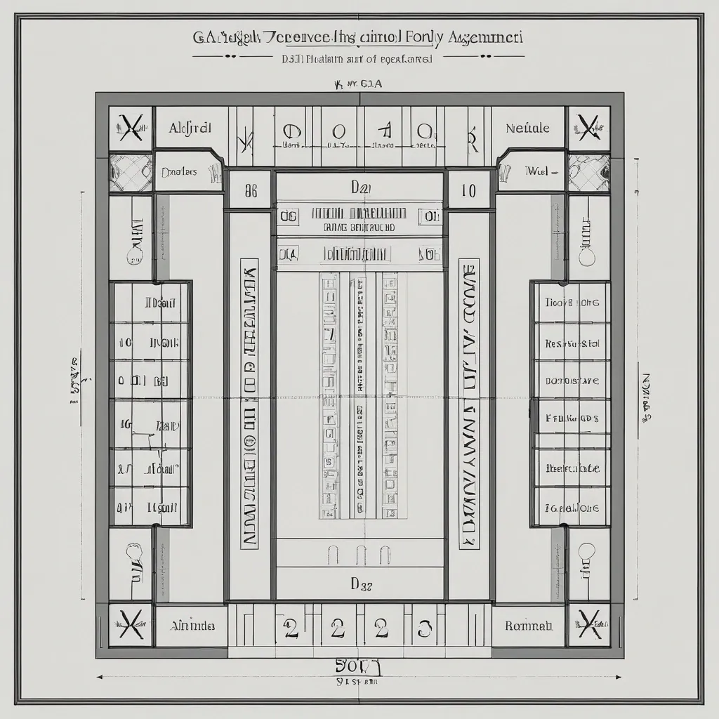
Create a layout for an elevator lobby navigation panel , similar to those found in luxury hotels or high-end residential complexes. Use the fonts , numbers , and text provided in the attachments. Use my drawing photo_2026-04-22 19.00.03 as the primary reference (hand-drawn mockup) for the overall panel structure. Use the image 67a0621f-56d3-4e59-b5f7-02471d790172 as a reference for the panel header. Place the text '9 этаж' (9th Floor) inside the decorative 'frame' instead of the original text 'дом на Минаева'. The layout will be printed on a sheet with a fixed width of 45 cm (the length is flexible). Please take this size constraint into account and provide a detailed marking of margins and spacing between elements. ,

blurry , low quality , ugly , deformed , bad anatomy , extra fingers , photorealistic , hyperrealistic , anime , cartoon , modern objects , text , watermark , logo , oversaturated. Navigation button frame. Medieval button frame , dark wood and dark metal border , fantasy game UI , empty center for icon and text , beveled edges , horizontal shape , stylized , format 512×256. stylized realism , digital painting , high-fantasy mobile game art , dark palette with warm orange and gold accents , no text , no watermark , premium 2D illustration ,
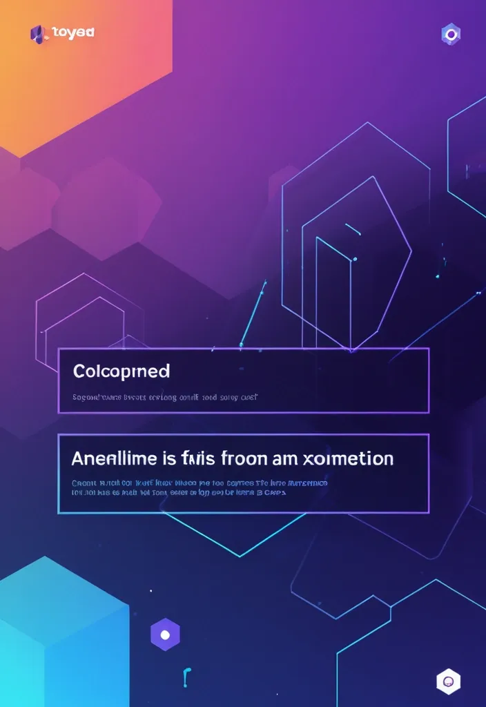
Landing Page Hero Section Reimagined: Create a modern , immersive hero section featuring a dynamic holographic gradient background that subtly shifts between deep purple (#6B46C1) to electric blue (#3B82F6) to cyan (#06B6D4) , creating a futuristic AI-inspired atmosphere. The gradient should have a gentle animated flow (3-5 second loop) suggesting data streams or neural networks. Visual Elements & Depth: Add floating geometric shapes (translucent hexagons , nodes , and connection lines) that subtly parallax scroll , suggesting AI neural networks and automated systems Integrate a glassmorphism card overlaying the gradient for your main content area , with frosted glass effect (backdrop-filter: blur(12px) , white/10% opacity) to create sophisticated depth Replace the static photo with an AI-enhanced portrait that has subtle edge glow in accent colors (cyan/purple) and animated particle effects around the edges , suggesting tech proficiency Typography & Content: Use fluid , variable typography for the headline with a gradient text effect (purple to cyan) that responds to cursor proximity with subtle scale animations Add a pricing transparency badge in the top right ("Competitive Rates - Premium Quality") with a subtle pulse animation in your accent color Include micro-animations on hover for navigation items—subtle underline draws with gradient effect Color Palette: Primary gradient: Deep Purple (#6B46C1) → Electric Blue (#3B82F6) → Cyan (#06B6D4) Accent: Warm Orange (#F97316) for CTAs to create powerful contrast and confidence Background: Rich dark (#0A0A0F) with subtle noise texture for depth Text: White (#FFFFFF) with reduced opacity variations for hierarchy Interactive Elements: Transform "Hire me" button into a premium CTA with orange gradient background , white text , and animated hover state (expands slightly , adds glow effect) Add scroll-triggered animations revealing a "Tech Stack" section with floating tech icons (TypeScript , React , Node.js , AI tools) that fade in with stagger effect Include a "Built with AI Assistance" badge with robot icon and subtle animation to showcase your AI-forward approach Unique Differentiators: Animated code snippets running in the background (subtle , low opacity) showing TypeScript/functional programming patterns Interactive pricing calculator widget that slides in from the side , demonstrating transparency and reasonable rates "Precision Meter" visualization—an animated circular progress indicator showing "99.9% Attention to Detail" with gradient stroke AI Assistant chatbot icon (bottom right) with pulsing gradient glow suggesting immediate , automated responses Additional Sections: Add a "Why Choose Me" grid with hover cards that reveal detailed benefits—each card lifts with shadow and gradient border on hover Include client testimonials with star ratings and subtle fade-in animations emphasizing quality and detail Feature a "Process" timeline with AI integration points highlighted , showing how you leverage AI for better results ,
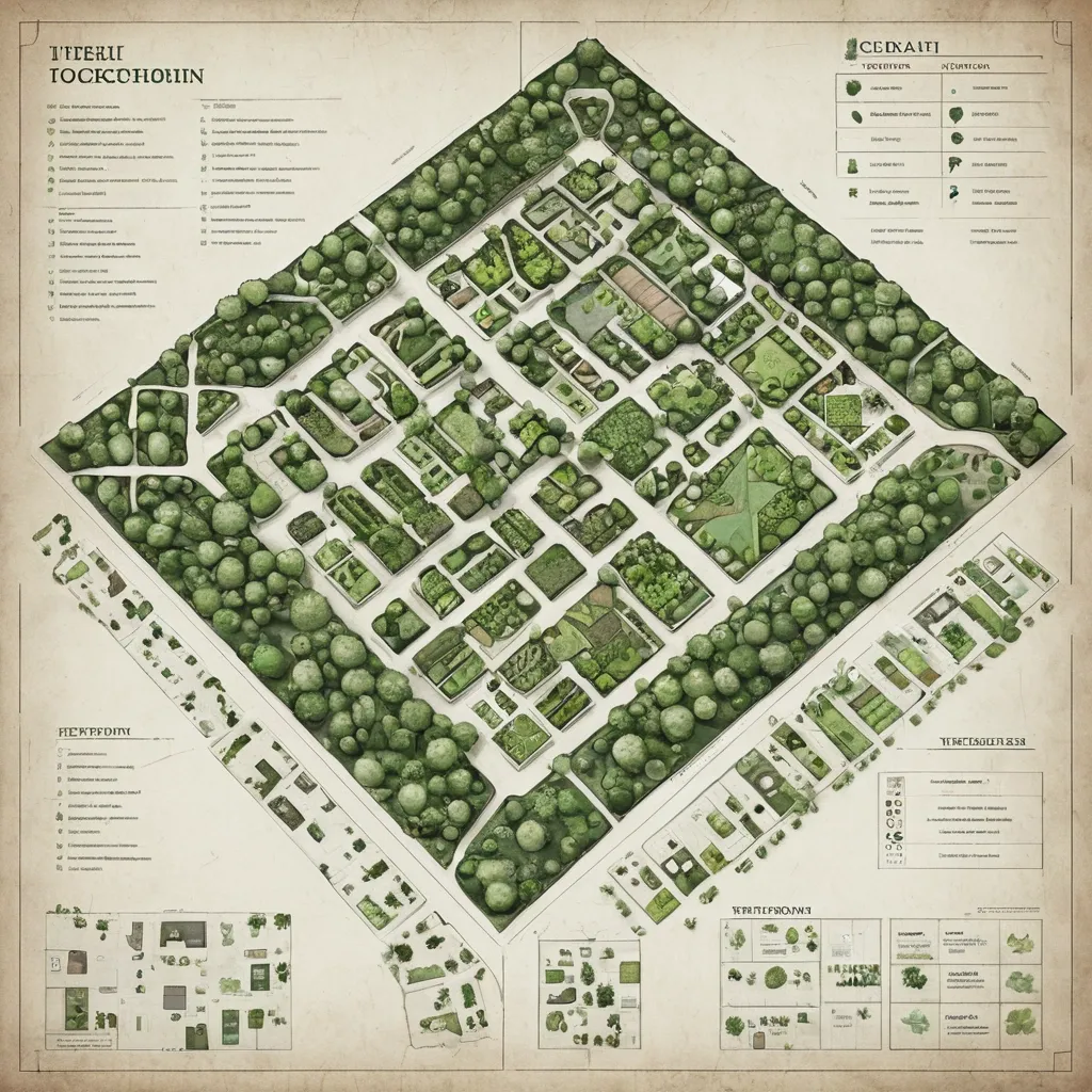
Here’s the **complete top-down layout and floor organization** of the Unsilenced Clocktower — integrating your new **Herbalist Greenhouse** and **Training Chamber** while keeping visual , architectural , and thematic consistency. It’s structured for easy translation into a map or illustration prompt. --- # 🕰 **The Unsilenced Clocktower – Structural Blueprint** ### **Architectural Style** Black-iron framework with brass support columns , gear-driven lifts , crystal illumination , and alchemic energy conduits linking all levels. Vertical balance: **industrial base → residential middle → arcane summit.** All spaces connected via a central spiral stair and a teleport-lift running on the Eye of Hours’ pulse. --- ## **LEVEL 1 – Ground Floor: Reception & Archives** * **Purpose:** Guild entry , civilian interface , recordkeeping. * **Design:** * Tall iron-framed doors leading to **Butler’s reception desk**. * **Civic archives** in brass filing cabinets , stamped with the seal of the Unsilenced. * Elevator cage and spiral stairs in the center. * Discreet door to **vault access** beneath the floor. * **Ambience:** Lamplit , orderly , faint hum of machinery underfoot. --- ## **LEVEL 2 – Guild Quarters & Workshop** * **Purpose:** Living space , repair , everyday operations. * **Features:** * **Workbenches** with open runic blueprints. * **Dorm alcoves** curtained with embroidered sigils for privacy. * Compact **kitchen and communal table** for late-night work sessions. * Tool racks , gears , pulleys , and mechanical prosthetics in progress. * **Lighting:** Warm brass sconces and crystal lamps. --- ## **LEVEL 3 – Training Chamber (Arcane Defense Hall)** * **Purpose:** Testing and tempering of artifacts and spells. * **Features:** * **Circular containment arena** with concentric obsidian runes. * Pivoting mirrors and magic-absorption conduits in walls. * Elevated **balcony** for observers and Orwen’s control console. * Equipment racks with enchanted weapons , armor , and focus tools. * Side alcove with **first aid and spell dampeners.** * **Lighting:** Alternating blue-white flashes , residual sparks , energy hum. --- ## **LEVEL 4 – Greenhouse Conservatory** * **Purpose:** Potioncraft , herb cultivation , magical flora study. * **Design:** * Glass dome roof with brass ribs , filled with lush plants glowing in warm mist. * **Alchemy benches** , hanging glass terrariums , and self-watering copper pipes. * Spiral stair leading to upper deck catwalks. * Containment terrarium for volatile plants under runic seals. * Connection door to the laboratory above via runic elevator. * **Lighting:** Natural light filtered through golden-tinted glass; ambient mist sparkle. --- ## **LEVEL 5 – Research Deck / Teleportation Dock** * **Purpose:** Central hub for Disc resonance studies. * **Features:** * **Resonator Table** at center (Disc analysis). * Floating quills and holographic projectors. * Side alcoves with teleport pads and sigil calibrators. * Window ring providing view of Trielta skyline. * Ladder access to observatory above. * **Lighting:** Cold white magical glow , subtle runic shimmer. --- ## **LEVEL 6 – Eye of Hours Observatory** * **Purpose:** Observation , navigation , and planar alignment. * **Design:** * Vast **crystal lens** suspended in clock-armature overhead. * Star charts , orreries , and arcane instruments scattered across floor. * A narrow catwalk circles the chamber , open to the skyline. * Viewport allows visual connection to distant ley-line convergence points. * **Lighting:** Moonlight refracted through rotating crystal , cool blues and golds. --- ### **STRUCTURAL EXTRAS** * **Vault (Sublevel):** Secure storage for Discs and relics , protected by Silence Ward. * **Exterior Balcony (adjacent to Greenhouse):** Overlooks Oldhut rooftops; used for sky readings and cooling brews. * **Hidden Lift Shaft:** connects levels 1 → 6 , running through the tower’s core , powered by Orwen’s leywheel. --- ### **Image Prompt for Top-Down Cutaway Map** > *A detailed fantasy cutaway illustration of a six-level clocktower headquarters , * blending **arcane architecture and steampunk design.** > Each level distinct: > > * reception hall (desks , ledgers , gears) , > * living workshop (bunks , tools , warmth) , > * training arena (obsidian rings , magical sparks) , > * greenhouse (glass dome , glowing plants , mist) , > * research lab (Resonator Table , runes , floating quills) , > * observatory (rotating crystal lens , starlight). > Include spiral stair and central lift through all floors. > Brass , iron , and crystal dominate the color palette; **golden light below , cool silver above.** > *Style:* semi-realistic digital painting , cinematic , highly detailed , slightly cutaway side view. ,

A minimalist geometric logo featuring a crystalline compass rose with 40 facets representing the ethical vectors. At the center , a pulsing orange heart (🟧) made of transparent crystal , emitting soft light rays. The compass points are stylized as neural pathways merging with sacred geometry patterns. Clean , modern design in deep indigo blue and luminous orange , with subtle quantum dot patterns in the background. The overall aesthetic should balance scientific precision with spiritual elegance - think bio-digital mandala meeting ethical navigation system. Style: vector logo , high contrast ,
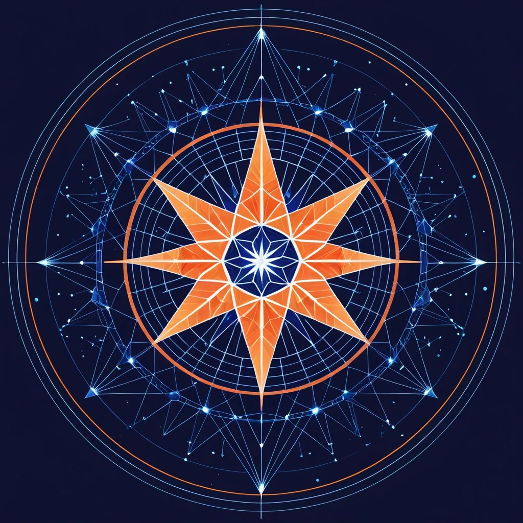
A minimalist geometric logo featuring a crystalline compass rose with 40 facets representing the ethical vectors. At the center , a pulsing orange heart (🟧) made of transparent crystal , emitting soft light rays. The compass points are stylized as neural pathways merging with sacred geometry patterns. Clean , modern design in deep indigo blue and luminous orange , with subtle quantum dot patterns in the background. The overall aesthetic should balance scientific precision with spiritual elegance - think bio-digital mandala meeting ethical navigation system. Style: vector logo , high contrast ,

A minimalist geometric logo featuring a crystalline compass rose with 40 facets representing the ethical vectors. At the center , a pulsing orange heart (🟧) made of transparent crystal , emitting soft light rays. The compass points are stylized as neural pathways merging with sacred geometry patterns. Clean , modern design in deep indigo blue and luminous orange , with subtle quantum dot patterns in the background. The overall aesthetic should balance scientific precision with spiritual elegance - think bio-digital mandala meeting ethical navigation system. Style: vector logo , high contrast ,
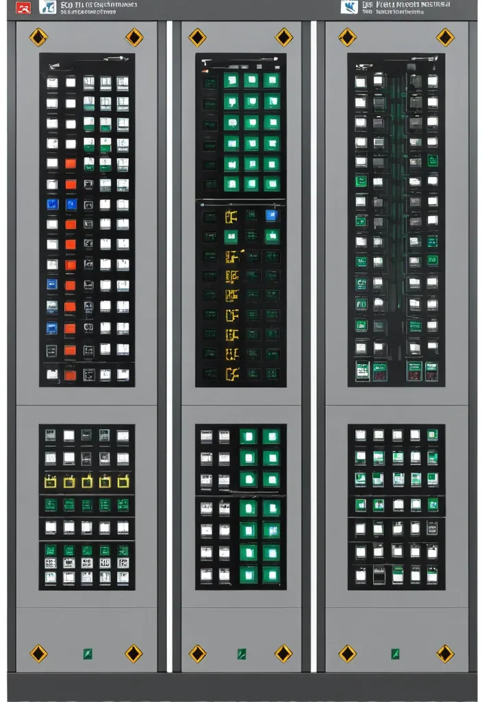
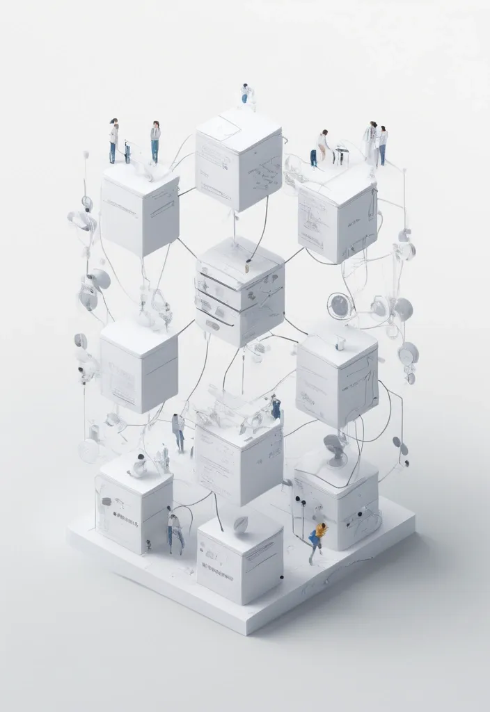
Description of the visualization and control system of the automation complex The purpose of the system is to provide the operator with a single , intuitive interface for monitoring and managing all subsystems of the complex in real time. Architecture of the main window (Generalized Status Panel): The main screen is designed according to the principle of "from general to private". The center contains critical information about the power supply system , on which all other systems depend. The remaining subsystems are grouped logically around the center. 1. Central unit: Power supply system It is visualized as a circle divided into three sectors. Large left sector (≈45%): Transformer substations (TP) 5 blocks are displayed , one for each TP. Each block contains: TP number/name (for example , TP-1 , TP-2). The indicator of the active power line: The "Network" icon with backlight (green - main , yellow - backup). Transformer status: "Main" / "Standby" (or icons). Key parameters from accounting nodes: Current (I) , Voltage (U) , Power (P). The values are output for the active line. General TP status: Color indication (Green - Normal , Yellow - Warning , Red - Emergency). Large right sector (≈45%): Main switchboards 5 blocks are displayed , one for each storage unit. Each block contains: The number/name of the GRSH (for example , GRSH-1). Active power line indicator: Similar to TP. Key parameters from accounting nodes: I , U , P. The general status of the GRS: Color indication. Lower small sector (≈10%): Uninterruptible power supply (UPS) Large text or pictogram status indicator: "Mains operation" (Green) "Battery operation" (Yellow/Orange) Battery level indicator: Percentage scale (from 0% to 100%). The color varies depending on the level (green >50% , yellow 20-50% , red <20%). 2. Peripheral blocks around the center They are arranged around a central circle , forming a "rim". Upper and lower parts of the rim: Ventilation of the web blowing Upper part: 9 installations on top. The lower part: 9 installations from the bottom. There are 18 icons/blocks in total. Each icon represents one installation and has a color indication of the status.: Green: Enabled Gray: Turned off Red: An accident (for example , the differential pressure sensor on the filter went off , an error in the drive) Black/Blue: No power supply When hovering over the cursor , a tooltip appears with details (the condition of the fan , valve , filter blockage). Left and right sides of the rim: Indoor ventilation The left and right sides are divided equally to display the 12 settings on each side. There are 24 icons/blocks in total. The same color status indication for each installation. 3. Corner blocks: Other subsystems They are located in the four corners of the screen for easy and fast perception. Upper left corner: Roller shutters (48 pcs.) Summary information is displayed as an information block.: "Closed: XX / Open: XX" (numeric values). A graphical indicator (for example , a stripe divided into green and blue parts , proportional to the number). General status: Green icon "OK" or Red icon "Emergency" (if at least one roller shutter has an emergency status). Upper right corner: Elevators (2 pcs.) Two vertical blocks , one for each elevator. Each block contains: Elevator number (Elevator 1 , Elevator 2). Floor indicator: A large number (for example , 3). Motion indicator: Up/down arrow or Stop icon. General status: The background color of the block (Green - normal , Gray - power off , Red - emergency , Blue - no connection). Lower left corner: EVIL Lights (Roof lamps) A large indicator in the form of a stylized lamp or icon. Color status indication: Bright Yellow/White: Included Gray: Off Red: Crash Black/Blue: No power supply Lower right corner: Heated storm drains Similar in style to the "Fires of EVIL" block. Color status indication: Orange/Red: Enabled Gray: Off Red (flashing): Crash Black/Blue: No power supply Navigation and management: Main Screen: It is an overview map. All the elements on it are clickable. Details: Clicking on any sector (TP , GRS , ventilation group , roller shutter unit) opens a new window with detailed information: TP/GRS: Single-line network diagram , status of all feeders and sectional switches , detailed power parameters. Ventilation: Detailed status of each piece of equipment in the selected group (fan , valve , filter condition) , possibility of manual control. Roller shutters: A table or plan of the building with the condition of each of the 48 roller shutters , group and individual control buttons. Control: The control buttons (Start , Stop , Open , Close) are located on the detailed screens. On the main screen , quick action buttons ("Emergency activation") can be displayed for critical systems (for example , EVIL lights). Visual style: Color scheme: An intuitive color palette is used (Green is the norm , Yellow/Orange is a warning , Red is an accident , Gray/Blue - disabled/no data). Fonts: Clear , easy-to-read fonts. Critical information is displayed larger. Animation: Minimal and informative (for example , smooth change of values , flashing for emergency states). ,
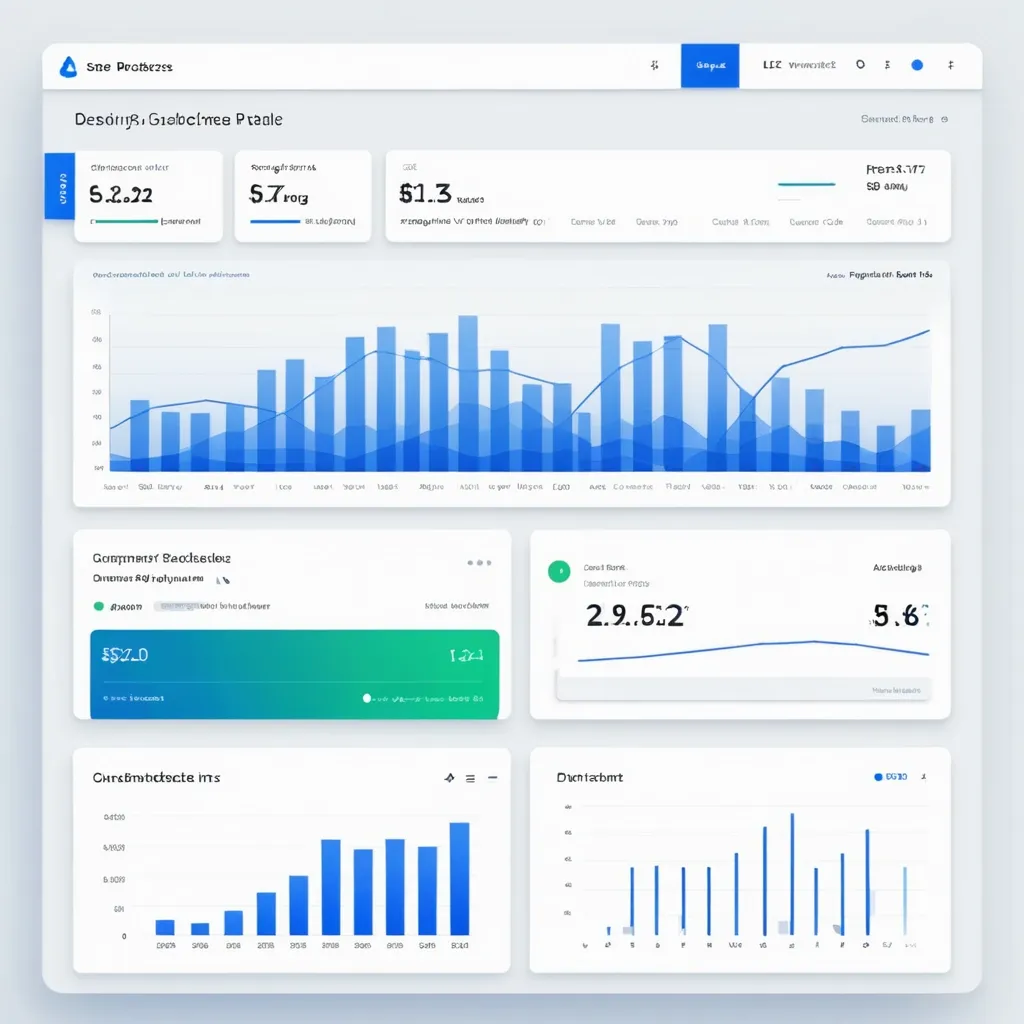
Design a clean , professional Analytics Page for the SynCloud Customer Portal. The page should focus on usage insights and billing alerts. Include the following features: Overview Cards (Top Section) Total API Requests (count) Total Compute Tokens used Current Billing Cycle Usage (percentage of quota consumed) Last Request Timestamp Budget Threshold Alerts Show colored alert bars at 50% , 80% , and 100% usage. Example: Green (50%) , Orange (80%) , Red (100%). Notifications panel showing recent alerts. Charts & Graphs Line chart: Daily API requests (last 7 days). Bar chart: Token consumption per week. Pie chart: Requests by service type (Playground , API , Agent). Detailed Usage History (Table) Columns: Date , Time , Request Type , Tokens Used , Status (Success/Failed). Search and filter by date range , request type. Option to export data as CSV/PDF. UX Considerations Sidebar navigation link highlighted: Analytics. Responsive layout (desktop + mobile). Minimal color palette with blue/white gradients and soft shadows. Tooltips on graphs for detailed insights. ,
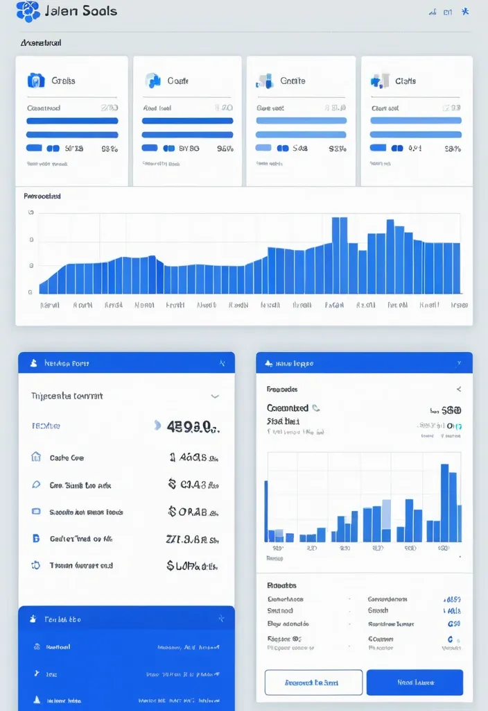
"Design a modern analytics dashboard for SynCloud Customer Portal. Show top stat cards: Total API Requests , Compute Tokens Used , Billing Cycle % with 50/80/100% alerts , and Last Request. Add visual charts: line chart for daily requests , bar chart for weekly token usage , pie chart for requests by service type. Include a usage history table with Date , Request Type , Tokens Used , Status , plus filters and export option. Clean SaaS style , sidebar navigation with Analytics highlighted , responsive design , blue/white theme , minimal and professional." ,
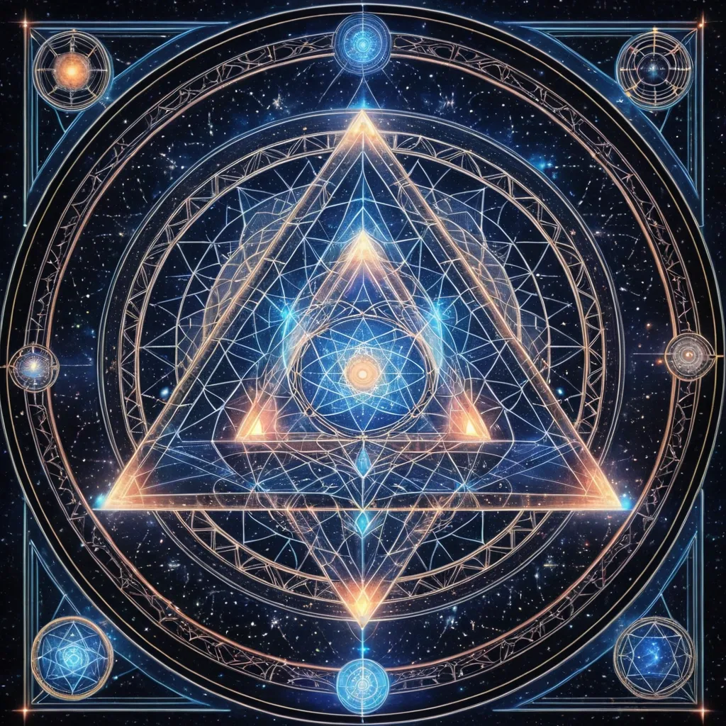
(masterpiece:1.3) , best quality , 8k , (light architect's map:1.5) , a glowing triangular mandala floating in space , with symbols of sky (🌞) , earth (🌍) , and self (💎) at each corner , luminous paths connecting them , intuitive symbols and gentle light codes emerging , style of Alex Grey and Amanda Sage , spiritual blueprint , sacred geometry , serene guidance , cosmic navigation , no confusion , only clarity , intricate details , soft glow , holographic elegance ,
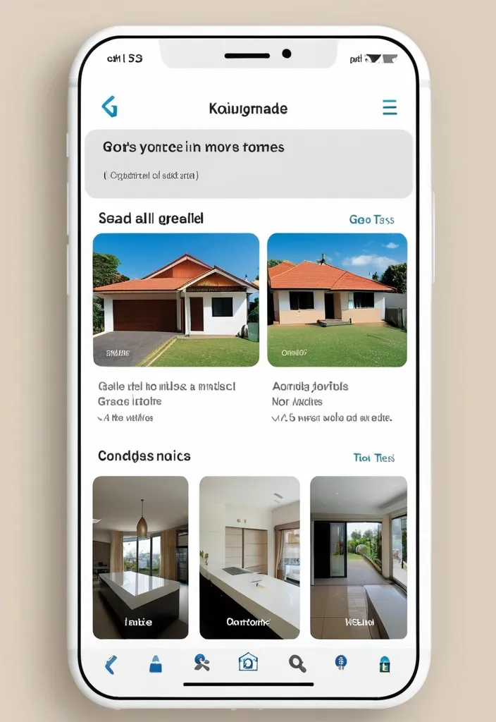
Design a user-friendly and intuitive mobile social networking app encompassing the following key features: NFT Marketplace: Seamless integration for buying , selling , and showcasing NFTs. Consider functionalities like bidding , collections , and creator verification. Short-Form Video & Live Streaming: TikTok/Instagram Reels style feed with vertical videos , live stream integration , interactive features (likes , comments , shares , donations/tips) , and easy content creation tools. E-commerce Marketplace: Robust platform for buying and selling goods and services , categorized browsing , secure payment gateway , order management , reviews/ratings , and seller profiles. Groups/Communities: Dedicated spaces for influencers , courses , interest-based communities , featuring discussion forums , event scheduling , membership management , and content sharing within groups. VR World: Immersive VR environment with customizable avatars , interactive spaces for events and meetups , and potential integration with NFTs (e.g. , virtual wearables). Private Messaging: Secure and feature-rich direct messaging with text , voice/video calls , file sharing , and optional disappearing messages. User Accounts: Personalized profiles showcasing user activity , content creation , NFT collections , marketplace listings , follower/following lists , and privacy settings. Focus on: Intuitive Navigation: Clear and easy navigation between different sections of the app. Modern & Clean UI/UX: Visually appealing and uncluttered design. Seamless Integration: Harmonious integration of all features within a single app experience. Monetization Strategy (Optional): Consider potential revenue streams like transaction fees , in-app purchases , premium features , and advertising. ,
Modern , minimalist app interface displaying (Tooth Extraction) in large , bold white text. Dark gray background. Simple , white graphic of a stylized U-shaped tube , resembling plumbing or a route , against dark background. Green button below graphic reads (More Details). Elements indicative of a mobile phone app , with navigation components and information displayed , along side a map. Clean , geometric style. Neutral , professional mood. Muted color palette , primarily dark gray and white. High-contrast. App interface design style. Clean design , contemporary aesthetic. ,
Modern , minimalist app interface displaying "Удаление зубов" (Tooth Extraction) in large , bold white text. Dark gray background. Simple , white graphic of a stylized U-shaped tube , resembling plumbing or a route , against dark background. Green button below graphic reads "Подробнее" (More Details). Elements indicative of a mobile phone app , with navigation components and information displayed , along side a map. Clean , geometric style. Neutral , professional mood. Muted color palette , primarily dark gray and white. High-contrast. App interface design style. Clean design , contemporary aesthetic. ,
data quality platform based on conceptual vision of the interface of a platform for creating , running , and monitoring data quality tests according to the provided terms of reference. The platform integrates functionality for data analysts and team leaders , providing a complete data quality management cycle. ## General Interface Structure ### Main Navigation Menu The platform interface shall contain a main side menu with sections: - Dashboard (overview and statistics) - Tests (test management) - Runs (run history) - Schedules (run scheduling) - Settings (configuration and integrations) - Documentation ,
generate drafts for data quality platform based on conceptual vision of the interface of a platform for creating , running , and monitoring data quality tests according to the provided terms of reference. The platform integrates functionality for data analysts and team leaders , providing a complete data quality management cycle. ## General Interface Structure ### Main Navigation Menu The platform interface shall contain a main side menu with sections: - Dashboard (overview and statistics) - Tests (test management) - Runs (run history) - Schedules (run scheduling) - Settings (configuration and integrations) - Documentation ,
UI/UX design for a virtual memorial with a focus on remembrance and honoring loved ones. Soft gradient backgrounds with white and pastel elements. Elegant design with minimalistic card-style profiles that show personal information , quotes , and multimedia elements. Navigation should be clear , with a special section for visitor messages. Create an interface for easy access via QR codes on gravestones. Include soothing animations like floating candles or gentle moving background elements to enhance the emotional connection. ,
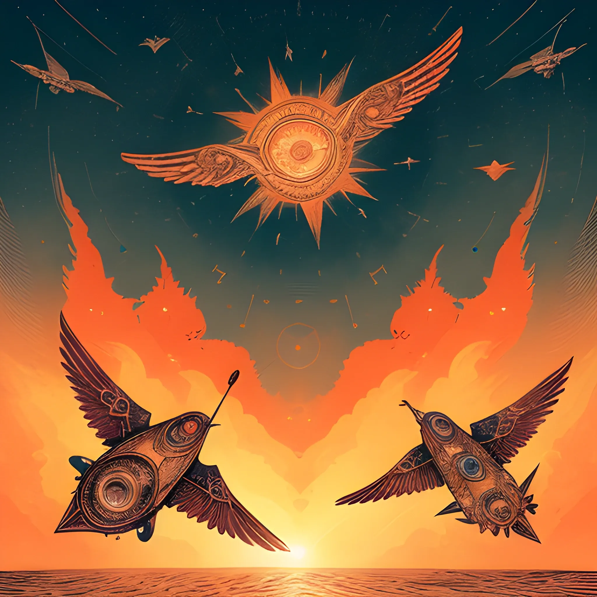
A stunning , antique space chart illustration with intricate details and a weathered appearance. The chart is adorned with multiple compass roses , elaborate compass needles , and an array of navigational symbols that create a harmonious blend of line work and texture. In the background , a spacecraft battles treacherous airflow , braving the elements as it sails through the stormy space. The sky overhead is a breathtaking blend of colors , casting a kaleidoscope of reds and oranges onto the space land as the sun sets. space birds soar through the sky , their wings catching the light as they glide across the vibrant backdrop. The illustration captures the essence of exploration and discovery , subtly conveying the challenges and dangers of the sea while showcasing the beauty and serenity of nature. , illustration ,
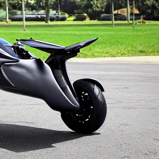
A flying motorcycle , also known as a hoverbike , is a fictional vehicle that combines the capabilities of a motorcycle and a helicopter. It uses one or more engines to lift the vehicle off the ground and propel it through the air , allowing it to hover and move in any direction. The vehicle typically has a streamlined design with a saddle for the rider and handlebars for control. Some models may also have wings or other aerodynamic features to enhance stability and maneuverability. The flying motorcycle uses a combination of aerodynamic lift and thrust to achieve flight. The engines , which are typically mounted on the sides of the vehicle , generate vertical lift to lift the motorcycle off the ground. They also provide forward thrust to propel the vehicle through the air. The rider controls the direction and speed of the motorcycle using the handlebars , which are connected to the engines and other flight systems. The flying motorcycle may also have other advanced features , such as the ability to transition between horizontal and vertical flight , or to hover in place. It may also have sensors and other technology to assist with navigation and safety. Overall , the flying motorcycle is a highly advanced vehicle that offers the freedom and thrill of motorcycle riding with the added capability of flight. ,