AI Image Prompts for Logo
Explore AI generated designs, images, art and prompts by top community artists and designers.

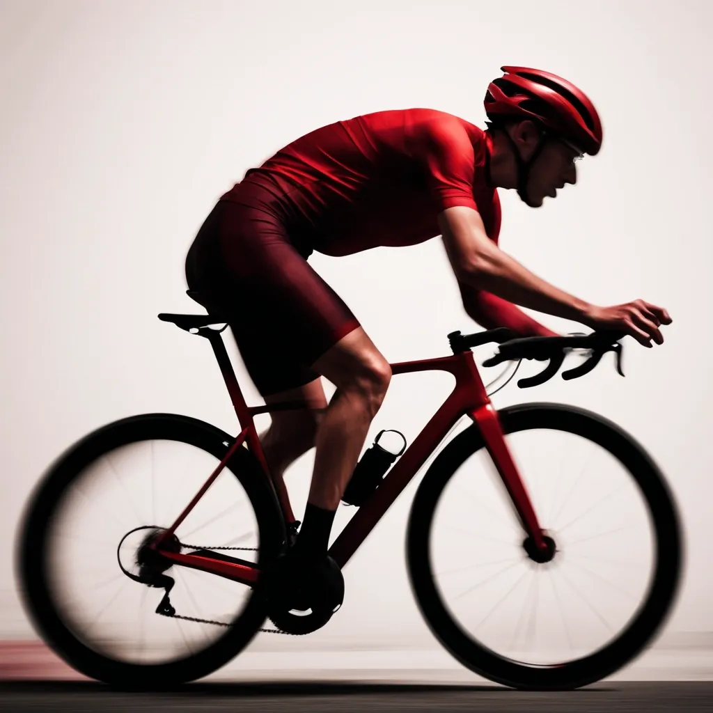
A blurred silhouette of a cyclist in motion , wearing a deep red sports kit , captured with a slow shutter for dynamic motion blur. High contrast , minimalist composition with no logos or text. Neutral background , abstract , and energetic. Editorial style reminiscent of Rapha advertising or street photography. ,
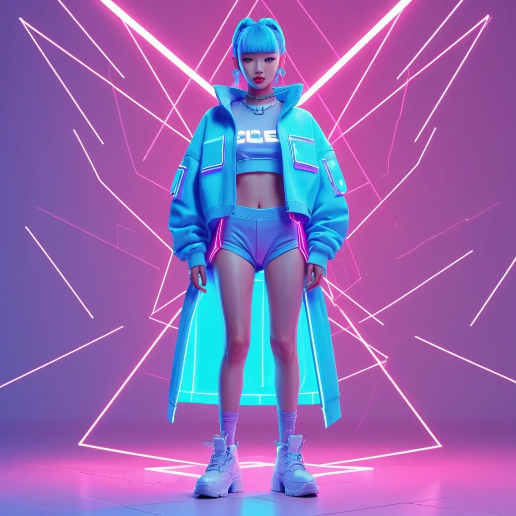
Clipart de personaje original inspirado en estética K‑pop , sin representar a ningún artista real. Diseño 100% original: rasgos faciales neutros , proporciones estilizadas , peinado creativo no asociado a idols reales. Outfit original: streetwear coreano + detalles futuristas , sin copiar ropa de MVs , conciertos o photoshoots. Paleta: neón (azul eléctrico , magenta , violeta) + acentos pastel. Poses: baile genérico , postura energética , sin coreografías reconocibles. Fondo: luces abstractas , shapes geométricos , neón difuso , sin escenarios realesEstilo visual: clipart vectorial , líneas limpias , colores planos , sombras suaves. Cámara: ilustración frontal , composición centrada. Calidad: alta resolución , bordes definidos , estilo consistente. Prohibido: nombres de idols , logos , outfits reales , rasgos reconocibles , referencias a grupos o MVs. Resultado: personaje original con vibe K‑pop , estética moderna , totalmente libre de copyright." ,
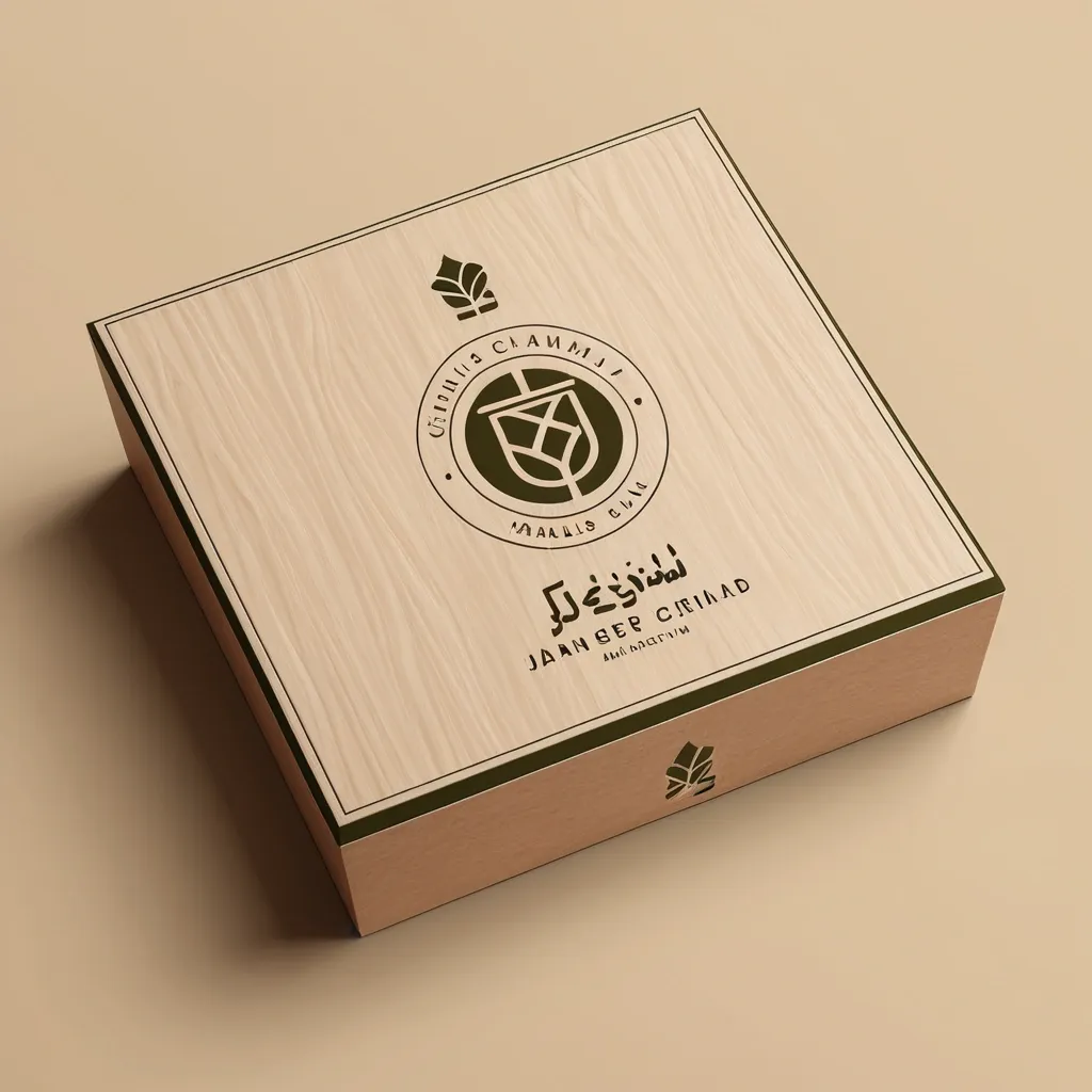
Act as a world-class brand identity designer with 20+ years of experience specializing in luxury minimalist logos. Design a premium , timeless , award-winning logo for an industrial eco-friendly brand named: ورقة وجذع Warqah & Jitha About the Brand: Warqah & Jitha is a Yemeni industrial company manufacturing sustainable , locally produced rattan sticks as an eco-friendly alternative to imported natural rattan. The brand represents sustainability , local craftsmanship , environmental responsibility , premium quality , and modern Yemeni heritage. The logo must communicate: • Sustainability • Nature • Local manufacturing • Innovation • Premium craftsmanship • Eco-friendly materials • Trust • Elegance • Authentic Yemeni identity • Luxury simplicity Icon Design: Create a memorable geometric symbol by combining: • A natural leaf • A tree trunk or wooden branch • Several subtle rattan sticks integrated into the icon The integration should be clever using negative space. Avoid obvious clipart. The icon should be unique , scalable , iconic , and recognizable even without text. Design Style: Luxury Minimalism Modern Organic Scandinavian Simplicity Flat Vector Geometric Precision Negative Space Premium Branding Timeless Identity Clean Lines Swiss Design Monoline Balanced Composition Typography: Arabic: ورقة وجذع English: Warqah & Jitha Use elegant modern Arabic typography paired with a sophisticated sans-serif English font. Color Palette: Primary: Olive Green (#556B2F) Secondary: Natural Wood Brown (#7A5230) Accent: Warm Sand Beige (#D8C3A5) Optional Luxury Accent: Soft Matte Gold (#C7A55B) Background: Pure White Deliverables: • Full-color logo • Black version • White version • Icon only • Horizontal layout • Vertical layout • Luxury brand presentation • Packaging mockup • Wooden engraving mockup • Business card mockup • Stamp version • Social media profile icon The logo must look perfect on: Luxury packaging Wood engraving Product labels Gift boxes Shopping bags Website Mobile App Instagram Business cards Signage Requirements: No gradients No shadows No mockup effects inside the logo itself Vector style Simple but highly memorable Balanced proportions Professional branding Behance Featured quality Dribbble Top Shot quality Minimal but emotionally powerful The logo should be iconic enough to become a globally recognizable symbol similar to Apple , Nike , Airbnb , or Starbucks , using extremely simple geometry and intelligent negative space. ,
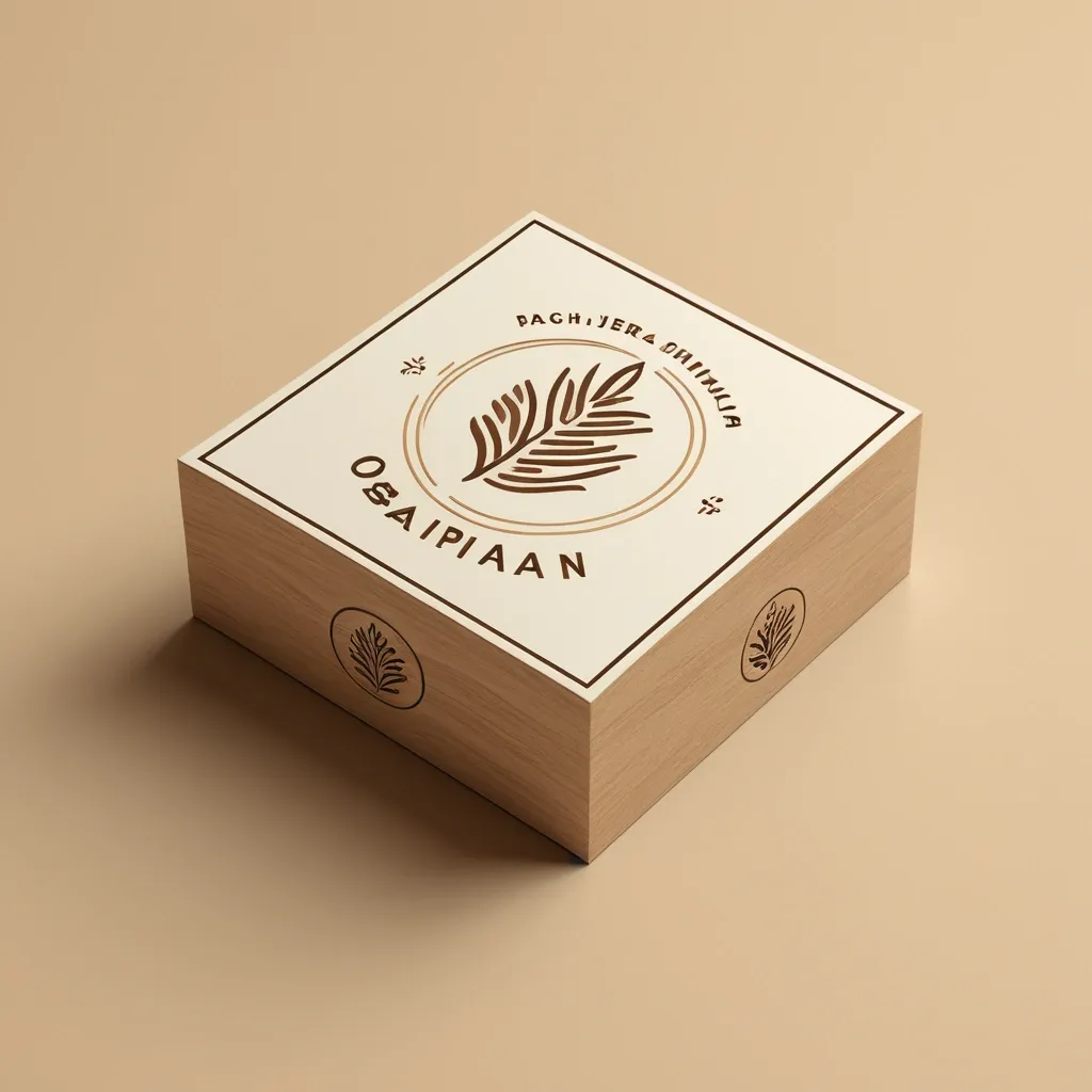
Act as a world-class brand identity designer with 20+ years of experience specializing in luxury minimalist logos. Design a premium , timeless , award-winning logo for an industrial eco-friendly brand named: ورقة وجذع Warqah & Jitha About the Brand: Warqah & Jitha is a Yemeni industrial company manufacturing sustainable , locally produced rattan sticks as an eco-friendly alternative to imported natural rattan. The brand represents sustainability , local craftsmanship , environmental responsibility , premium quality , and modern Yemeni heritage. The logo must communicate: • Sustainability • Nature • Local manufacturing • Innovation • Premium craftsmanship • Eco-friendly materials • Trust • Elegance • Authentic Yemeni identity • Luxury simplicity Icon Design: Create a memorable geometric symbol by combining: • A natural leaf • A tree trunk or wooden branch • Several subtle rattan sticks integrated into the icon The integration should be clever using negative space. Avoid obvious clipart. The icon should be unique , scalable , iconic , and recognizable even without text. Design Style: Luxury Minimalism Modern Organic Scandinavian Simplicity Flat Vector Geometric Precision Negative Space Premium Branding Timeless Identity Clean Lines Swiss Design Monoline Balanced Composition Typography: Arabic: ورقة وجذع English: Warqah & Jitha Use elegant modern Arabic typography paired with a sophisticated sans-serif English font. Color Palette: Primary: Olive Green (#556B2F) Secondary: Natural Wood Brown (#7A5230) Accent: Warm Sand Beige (#D8C3A5) Optional Luxury Accent: Soft Matte Gold (#C7A55B) Background: Pure White Deliverables: • Full-color logo • Black version • White version • Icon only • Horizontal layout • Vertical layout • Luxury brand presentation • Packaging mockup • Wooden engraving mockup • Business card mockup • Stamp version • Social media profile icon The logo must look perfect on: Luxury packaging Wood engraving Product labels Gift boxes Shopping bags Website Mobile App Instagram Business cards Signage Requirements: No gradients No shadows No mockup effects inside the logo itself Vector style Simple but highly memorable Balanced proportions Professional branding Behance Featured quality Dribbble Top Shot quality Minimal but emotionally powerful The logo should be iconic enough to become a globally recognizable symbol similar to Apple , Nike , Airbnb , or Starbucks , using extremely simple geometry and intelligent negative space. ,
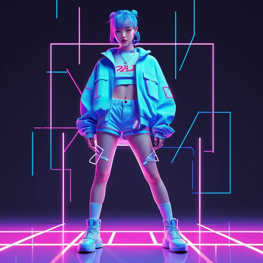
Clipart de personaje original inspirado en estética K‑pop , sin representar a ningún artista real. Diseño 100% original: rasgos faciales neutros , proporciones estilizadas , peinado creativo no asociado a idols reales. Outfit original: streetwear coreano + detalles futuristas , sin copiar ropa de MVs , conciertos o photoshoots. Paleta: neón (azul eléctrico , magenta , violeta) + acentos pastel. Poses: baile genérico , postura energética , sin coreografías reconocibles. Fondo: luces abstractas , shapes geométricos , neón difuso , sin escenarios realesEstilo visual: clipart vectorial , líneas limpias , colores planos , sombras suaves. Cámara: ilustración frontal , composición centrada. Calidad: alta resolución , bordes definidos , estilo consistente. Prohibido: nombres de idols , logos , outfits reales , rasgos reconocibles , referencias a grupos o MVs. Resultado: personaje original con vibe K‑pop , estética moderna , totalmente libre de copyright." ,
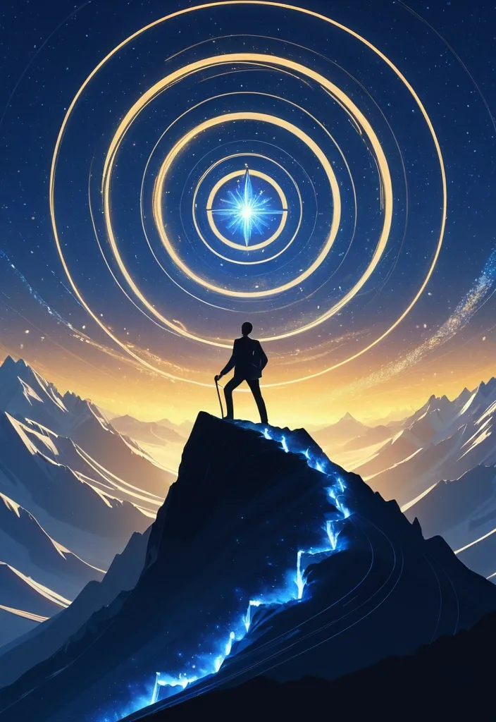
A professional digital illustration , in the style of image_0.png , showing a silhouetted businessperson (man) standing on a steep mountain ridge , actively climbing using an ice axe. They are looking up towards a massive , luminous spiral nebula in the deep blue and gold twilight sky , identical in pattern and glow to the one in image_0.png. At the luminous center of the spiral is a stylized , glowing corporate logo , and the large , brilliant star from image_0.png is also present , shining above the peak. The person has a determined posture , wearing business casual attire and carrying a slim laptop bag. Distant , smaller mountain peaks are visible in the valley below. The entire scene is bathed in a magical , cool blue and warm golden light. High resolution , clean vectors , rich details. ,
Erstelle eine Serie von hochwertigen Motorrad-/Dienst-Patches im einheitlichen Design. Format: Hochkant (vertikale Patchform) Alle Patches exakt gleiche Größe und Proportionen Schwarzer Hintergrund (schwarzer Stoff / Lederoptik) Feine silberne Umrandung Edle silberne Schrift mit leicht metallischem Effekt Klassischer amerikanischer Patch-Stil , aber eindeutig professionell und behördlich Keine Totenköpfe , keine Waffen , keine aggressiven Symbole Hochwertige Stickoptik , wie auf einer Motorradweste oder Dienstkutte Klare Lesbarkeit aus der Entfernung Designvarianten: Patch: "FIVE YEARS IN THE FIELD" Silberne Schrift Zusätzlich ein silberner Lorbeerkranz als Symbol für Erfahrung und Dienstzeit Der Lorbeerkranz dezent hinter oder unter dem Schriftzug integriert Patch: "TEN YEARS IN THE FIELD" Silberne Schrift Zusätzlich ein goldener Lorbeerkranz als besondere Auszeichnung Wertiger und höher ausgezeichnet als Five Years Patch: "GERMAN RUN CREW" Silberne Schrift Schlichtes , kraftvolles Design Symbolik für gemeinsame Motorradtour und Kameradschaft Patch: "WORLD RUN CREW" Silberne Schrift Internationaler Charakter Dezente Symbolik für weltweite Verbindung und lange Strecken Patch: "IRON VETERAN" Silberne Schrift Besonders hochwertiger , erfahrener Look Symbolisiert langjährige Erfahrung , Einsatzbereitschaft und Beständigkeit Patch: "MR. DAVIDSON" Silberne Schrift Klassischer Motorradbezug Stilvoll , humorvoll und respektvoll Keine direkte Kopie von Harley-Davidson Logos oder Markenzeichen Patch: IRON WARRANT Format: Hochkant (vertikale Patchform) Gleiche Größe und Proportionen wie die Patches „GERMAN RUN CREW“ und „WORLD RUN CREW“ Schwarzer Hintergrund in Leder-/Stoffoptik Silberne Umrandung Ausschließlich silberne Schrift mit leicht metallischem Stickeffekt Nur der Schriftzug „IRON WARRANT“ , keine zusätzlichen Symbole oder Grafiken Stil: Klassischer amerikanischer Motorcycle-Patch-Stil kombiniert mit professioneller Polizeitradition Hochwertige Stickoptik Klare , kräftige Blockschrift Seriös , erfahren , autoritär , aber nicht aggressiv Keine Totenköpfe , keine Waffen , keine Clubsymbole , keine übertriebene Rocker-Ästhetik Wirkung: besondere dienstliche Auszeichnung für einen erfahrenen Polizeibeamten mit Motorradbezug Gesamtstil: Traditioneller amerikanischer Motorcycle-Patch-Stil kombiniert mit Polizei-/Diensttradition. Die Wirkung soll sein: Erfahrung , Verlässlichkeit , Respekt und Zugehörigkeit zu einer besonderen Aufgabe. patch leicht verwaschen. ,
A dynamic Dutch-angle dynamic shot blending the wild , expressive character design of classic 90s cartoons with the polished , hyper-detailed 3D animation style of Pixar , executed in black-and-white tones. A character with an over-the-top , comically angular body , bulging eyes , and a wide expression of concentration is frozen mid-air , taking a giant rubbery leap over a massive , glossy rain puddle. The smooth wet ground mirrors his exaggerated jumping posture , a stylized wooden cartoon ladder , and curved metal hoops. Behind him , a long iron fence with chunky vertical bars cuts across the scene , backed by blocky , stylized warehouse towers and a leaning clock tower under a cloudy sky. The scene features rich cinematic lighting , subsurface scattering on the character model , and clean , glossy textures , capturing a humorous and high-energy animation moment within a vertical portrait composition , 2:3 aspect ratio , portrait-oriented framing , no text , no captions , no speech bubbles , no comic sound effects , no logos , no watermark , no border , no split screen , no collage , no character sheet , no duplicated people , no duplicate faces , no extra limbs , no missing limbs , no malformed hands , no fused fingers , no distorted anatomy , no unnatural body proportions , no stiff posing , no staged group-photo composition , no blank staring into the camera , no landscape composition , no horizontal framing , no poorly cropped bodies , no accidental head or foot cropping. ,
Dreamy botanical fine art illustration , inspired by delicate pressed flowers suspended in translucent resin or frosted glass , but with a completely original composition. Large soft ivory peonies and garden roses with creamy champagne petals , subtle blush pink buds , elegant dusty mauve flowers , thin olive-brown stems , scattered semi-transparent leaves , flowing organic arrangement with asymmetrical balance. Ethereal painterly textures mixed with frosted glass diffusion , luminous soft highlights , creamy haze , subtle pearl sheen , watercolor and oil glazing effect , delicate translucency , muted vintage botanical aesthetic. Warm neutral palette of ivory , cream , champagne , blush pink , dusty rose , beige , soft sage and warm taupe. Airy luxury floral background , sophisticated minimalism , romantic fine art , highly detailed brush texture , soft focus transitions , premium wallpaper design , elegant feminine aesthetic , natural light , high resolution , unique floral composition , no text , no frame , no watermark. Negative Prompt photorealistic bouquet , sharp outlines , saturated colors , bright green leaves , dark background , black flowers , heavy contrast , symmetry , repeated composition , copy of reference , text , logo , watermark , border , collage , harsh lighting , digital artifacts , low quality In addition: Style: Fine Art Botanical × Soft Impressionism × Contemporary Luxury Colors: Ivory , Champagne , Cream , Blush Pink , Dusty Rose , Warm Beige , Soft Taupe , Muted Olive Mood: Ethereal , Elegant , Airy , Premium , Romantic , Soft Luxury Layout: 4:5 ,
A stylized abstract Lord Ganesha-like illustration made from geometric shapes and smooth rounded forms , centered on a clean off-white background. The main figure has a symmetrical , rounded head with a white face panel divided by a vertical dotted line , multicolored accents (yellow-orange , teal , red , navy) and small circular elements , with a dark rounded side form on the left and a large red-orange wing-like block on the right. Floating accent shapes and lines—small dots , short dashes , circles , and a few diamond or arrow-like marks—surround the central form , creating a balanced , playful composition. The style is flat vector with subtle depth created by layered overlapping shapes and soft gradients , vivid color palette (warm oranges and reds contrasted with cool teals and blues) , crisp edges , and clean negative space; the mood is energetic and modern. Square , centered framing with no text , no visible camera perspective , and a flat illustration look. Prompt: Create a square , centered abstract vector-style illustration on an off-white background featuring a geometric , character-like figure constructed from layered rounded shapes and blocks. The figure should have a symmetrical central head with a white face panel , a vertical dotted-line detail down the center , and small colored circular accents within the face area. Use a vivid palette: warm yellow-orange and red/orange shapes for the outer body and side elements , cool teal and dark navy blocks for internal panels , plus a prominent dark rounded side form on the left and a large red-orange curved wing-like shape on the right. Add floating decorative elements around the character—small colored dots , short dashed lines , a few circular rings , and tiny diamond/arrow-like markers—distributed evenly to frame the center without overcrowding. Maintain crisp edges , smooth curves , flat shading with subtle gradient-like depth from overlapping layers , and a clean modern minimal background with lots of negative space; no text or logos , and keep the composition perfectly centered with balanced left-right symmetry. Negative Prompt: text , watermark , logo , photorealism , realistic skin , realistic anatomy , extra characters , duplicate main subject , distorted proportions , blurry shapes , low resolution , cluttered background , incorrect colors , misshapen circles , malformed lines or dots , distracting artifacts , cropped edges , border , frame. ,
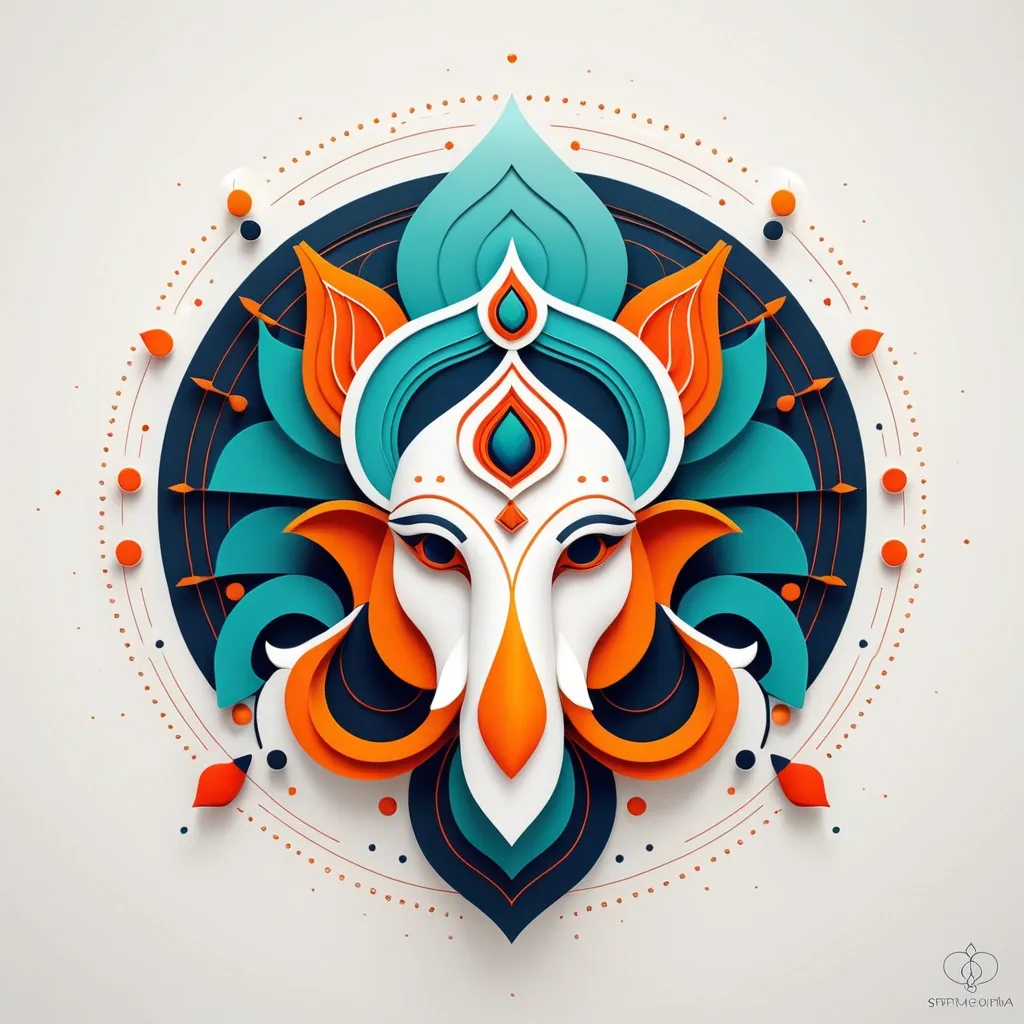
Create a Lord Ganesha , centered abstract vector-style illustration on an off-white background featuring a geometric , character-like figure constructed from layered rounded shapes and blocks. The Lord Ganesha should have a symmetrical central head with a white face panel , a vertical dotted-line detail down the center , and small colored circular accents within the face area. Use a vivid palette: warm yellow-orange and red/orange shapes for the outer body and side elements , cool teal and dark navy blocks for internal panels , plus a prominent dark rounded side form on the left and a large red-orange curved wing-like shape on the right. Add floating decorative elements around the character—small colored dots , short dashed lines , a few circular rings , and tiny diamond/arrow-like markers—distributed evenly to frame the center without overcrowding. Maintain crisp edges , smooth curves , flat shading with subtle gradient-like depth from overlapping layers , and a clean modern minimal background with lots of negative space; no text or logos , and keep the composition perfectly centered with balanced left-right symmetry. ,
Professional vector logo for educational center "ПРОГРЕСС" , minimalist geometric Cyrillic letter П combined with a subtle guiding star , symbol of achievement , confidence and educational success , modern academic identity , Swiss minimalism , premium branding , forest green primary color , muted terracotta accent , spacious layout , flat vector , white background ,
Modern minimalist logo for an IoT company called "AquaSense". Design a water drop combined with a microchip inside. Clean vector illustration , flat design , blue and cyan color palette , technology branding , premium startup logo , geometric shapes , white background , SVG style , no mockup , no 3D. ,

Minimalist vector logo for a fintech company named "NovaPay". Create a modern letter "N" that transforms into an upward arrow symbolizing growth and fast digital payments. Flat design , clean geometric lines , premium branding , blue and dark navy color palette , simple icon , white background , SVG style , corporate identity , no mockup , no 3D , no gradients , high contrast. ,
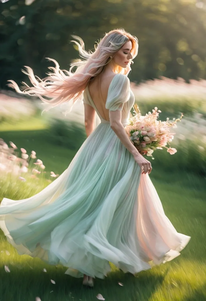
Create a 9:16 vertical dreamy slow-shutter garden portrait photography image titled “Dreamlike Her”. A beautiful young adult woman is running , turning back , or softly spinning through a spring garden / flower field / grassy path , wearing a light white dress / soft pink tulle dress / cream long dress / pale green flowing dress , holding a colorful bouquet. Her hair is lifted naturally by the wind , with loose strands and motion in the dress. Use slow shutter photography , panning motion blur , and intentional camera movement. The background and foreground should stretch into soft horizontal blur , while the subject stays half-clear , half-blurred. Keep one readable visual anchor such as the face outline , bouquet , hair , or dress edge , so the image feels dreamy but not unreadable. Scene should include soft grass , blooming flowers , tree shadows , petals in the air , glowing natural light , and a light filmic atmosphere. Color palette: cream white , soft green , blush pink , sky blue , warm golden light. Add subtle film grain , soft focus , airy depth , and slight highlight bloom. The final image should feel like a half-remembered dream — not a clean portrait , but a fleeting moment. Avoid: commercial studio look , overly sharp face , plastic skin , influencer pose , CGI feel , cartoon style , stiff body , anatomy errors , deformed hands , distorted bouquet , warped dress , text , watermark , logo , ultra-HD --v 6.1 --ar 3:4 --style raw , ,
Kinetic motion graphics animation. The 3D logo layers drop down instantly from the top frame , hitting the center with an elastic , snappy bounce. The text 'LayerAssets' pops into view letter-by-letter with a rapid spring scale effect. Fast start , heavy cushioned easing at the end. Solid black background. ,
Kinetic motion graphics animation. The 3D logo layers drop down instantly from the top frame , hitting the center with an elastic , snappy bounce. The text 'LayerAssets' pops into view letter-by-letter with a rapid spring scale effect. Fast start , heavy cushioned easing at the end. Solid black background. ,
Kinetic motion graphics animation. The 3D logo layers drop down instantly from the top frame , hitting the center with an elastic , snappy bounce. The text 'LayerAssets' pops into view letter-by-letter with a rapid spring scale effect. Fast start , heavy cushioned easing at the end. Solid black background. ,

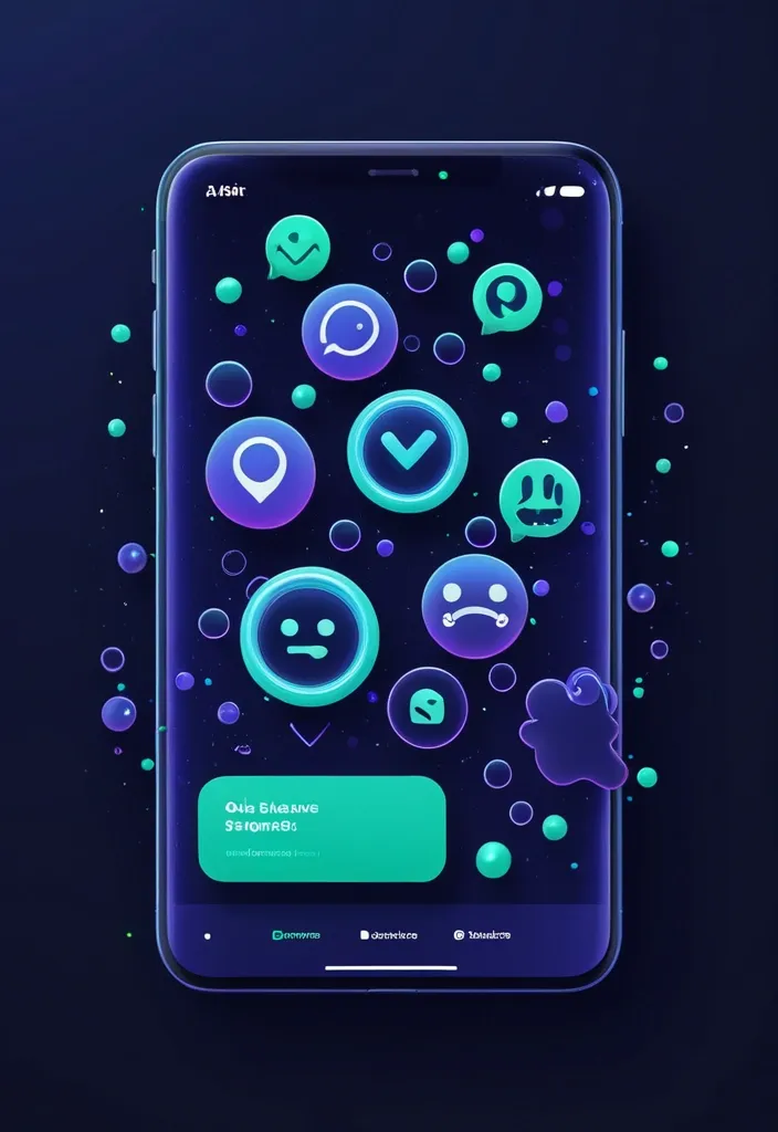
**Main Prompt (Скопируйте на английском):** > Premium 3D UI/UX illustration for a mobile app onboarding , dark mode SaaS aesthetic. Concept of safe networking , smart communication , and community building. In the center , two sleek , floating 3D chat bubbles intersecting gracefully. The chat bubbles are made of dark frosted glass with vibrant electric purple and neon cyan edge lighting. Hovering over one bubble is a glowing emerald green 3D security shield icon. Surrounding the bubbles are abstract interconnected glowing nodes and soft floating sparks. Solid deep midnight indigo navy blue background (#0F172A). Glassmorphism , soft studio lighting , dynamic composition , depth of field (bokeh effect) , dribbble trending masterpiece , 8k resolution. **Negative Prompt (Обязательно добавьте):** > smartphones , screens , text , words , letters , UI mockups , people , hands , human faces , flat vector , 2d , black background , messy , low quality , social media logos , sad emojis , angry emojis , thumbs down. ,
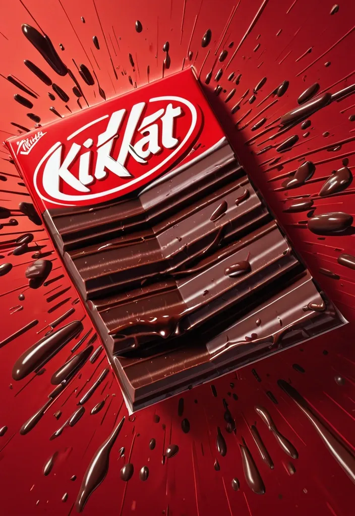
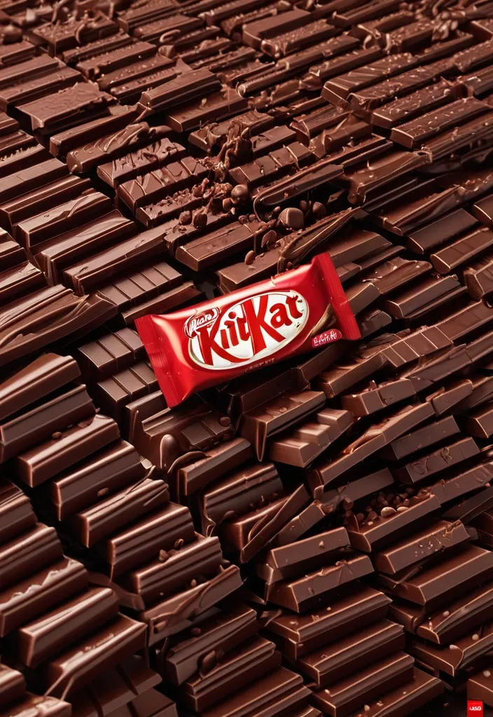
FORMAT: 4:5 vertical hyper-commercial chocolate campaign poster , ultra-high resolution (8K) , premium billboard + social media advertising ready Style: bold FMCG advertising × modern snack campaign × energetic commercial poster design × high-impact product photography 🧠 CORE IDEA: THE BREAK EVERYONE WAITS FOR. A campaign built around impact , craving , and satisfying motion. Everything in the composition reacts to the iconic KitKat snap. 🎬 MASTER COMPOSITION: BACKGROUND: Deep KitKat red environment Layered with: - rich red gradients - chocolate texture overlays - dynamic motion streaks - subtle crumb particles - repeated typography patterns - glossy studio reflections The atmosphere should feel: bold , hungry , energetic , commercially explosive. 👤 HUMAN SUBJECT: Young Gen-Z male/female model Expression: playful , confident , mid-enjoyment moment Pose: holding KitKat toward camera mid-snap action Camera angle: slightly low + close perspective for product dominance Wardrobe: modern streetwear in neutral tones allowing red palette to dominate 💥 VISUAL ENERGY: The SNAP becomes the visual explosion. At the break point: - chocolate shards flying outward - wafer crumbs suspended mid-air - liquid chocolate streaks - motion lines radiating from snap Typography physically cracks apart following the KitKat break. Feels: satisfying , punchy , commercially exaggerated. 🍫 PRODUCT HERO: [KitKat](chatgpt://generic-entity?number=0) chocolate bar + wrapper Placement: foreground center-right Angle: extreme 3/4 hero perspective Product details: - hyper-real chocolate texture - visible wafer layers - glossy melted chocolate highlights - realistic crumbs - embossed KitKat logo - premium wrapper reflections Chocolate should feel: crispy , rich , irresistible. ✍️ TYPOGRAPHY SYSTEM: MAIN HEADLINE: “BREAK TIME.” Typography style: - ultra-bold condensed sans-serif - oversized stacked layout - white typography - extremely tight spacing - cracked/distorted around snap point SECONDARY TEXT: “HAVE A BREAK. HAVE A KITKAT.” BACKGROUND TYPOGRAPHY: Repeated low-opacity words: SNAP CRUNCH BREAK CHOCOLATE WAFER MELT integrated into background layers 📦 FEATURE INFORMATION STRIP: Bottom premium feature strip: □ CRISPY WAFER □ RICH CHOCOLATE □ ICONIC SNAP □ PERFECT BREAK Minimal modern icon system. 📣 CTA SECTION: BOTTOM LEFT: “NEW SHARING PACK AVAILABLE” CTA BUTTON: solid white rectangular button TEXT: “GRAB NOW” Secondary micro CTA: “Available Online & In Stores” 🌐 WEBSITE + BRAND INFO: BOTTOM CENTER: www.kitkat BOTTOM MICROTEXT: “NESTLÉ KITKAT · 2026 EDITION” 🎨 COLOR SYSTEM: PRIMARY: KitKat red deep chocolate brown SECONDARY: white typography ACCENTS: warm chocolate highlights golden wafer tones Palette should feel: bold , delicious , high-energy , commercial. 💡 LIGHTING SYSTEM: MAIN LIGHT: strong commercial studio key light RIM LIGHT: warm chocolate highlights around product ACCENT LIGHT: soft red glow behind snap motion ATMOSPHERIC LIGHT: subtle floating particles catching light REFLECTIONS: glossy FMCG-grade reflections Lighting should feel: premium snack advertising × modern commercial photography. ✨ HYPER DETAILING: - ultra-real wafer texture - sharp chocolate break detail - floating crumb realism - melted chocolate reflections - premium wrapper texture - billboard readability maintained - ultra-clean typography edges - high-end FMCG rendering quality 📐 COMPOSITION FLOW: Upper Frame: massive typography dominance Center: snap explosion + human interaction Foreground: product hero Lower-left: CTA + features Eye flow: Headline → Snap → Product → Chocolate Motion → CTA 🎥 CAMERA & RENDER: - commercial food photography - Phase One medium format feel - 35–50mm lens - HDR commercial rendering - ultra-clean sharpness - premium FMCG color grading 🔥 FINAL FEEL: Feels like: Nike energy campaign × premium FMCG launch × modern Behance commercial food poster. ,
FORMAT: 4:5 vertical hyper-commercial chocolate campaign poster , ultra-high resolution (8K) , premium billboard + social media advertising ready Style: bold FMCG advertising × modern snack campaign × energetic commercial poster design × high-impact product photography 🧠 CORE IDEA: THE BREAK EVERYONE WAITS FOR. A campaign built around impact , craving , and satisfying motion. Everything in the composition reacts to the iconic KitKat snap. 🎬 MASTER COMPOSITION: BACKGROUND: Deep KitKat red environment Layered with: - rich red gradients - chocolate texture overlays - dynamic motion streaks - subtle crumb particles - repeated typography patterns - glossy studio reflections The atmosphere should feel: bold , hungry , energetic , commercially explosive. 👤 HUMAN SUBJECT: Young Gen-Z male/female model Expression: playful , confident , mid-enjoyment moment Pose: holding KitKat toward camera mid-snap action Camera angle: slightly low + close perspective for product dominance Wardrobe: modern streetwear in neutral tones allowing red palette to dominate 💥 VISUAL ENERGY: The SNAP becomes the visual explosion. At the break point: - chocolate shards flying outward - wafer crumbs suspended mid-air - liquid chocolate streaks - motion lines radiating from snap Typography physically cracks apart following the KitKat break. Feels: satisfying , punchy , commercially exaggerated. 🍫 PRODUCT HERO: [KitKat](chatgpt://generic-entity?number=0) chocolate bar + wrapper Placement: foreground center-right Angle: extreme 3/4 hero perspective Product details: - hyper-real chocolate texture - visible wafer layers - glossy melted chocolate highlights - realistic crumbs - embossed KitKat logo - premium wrapper reflections Chocolate should feel: crispy , rich , irresistible. ✍️ TYPOGRAPHY SYSTEM: MAIN HEADLINE: “BREAK TIME.” Typography style: - ultra-bold condensed sans-serif - oversized stacked layout - white typography - extremely tight spacing - cracked/distorted around snap point SECONDARY TEXT: “HAVE A BREAK. HAVE A KITKAT.” BACKGROUND TYPOGRAPHY: Repeated low-opacity words: SNAP CRUNCH BREAK CHOCOLATE WAFER MELT integrated into background layers 📦 FEATURE INFORMATION STRIP: Bottom premium feature strip: □ CRISPY WAFER □ RICH CHOCOLATE □ ICONIC SNAP □ PERFECT BREAK Minimal modern icon system. 📣 CTA SECTION: BOTTOM LEFT: “NEW SHARING PACK AVAILABLE” CTA BUTTON: solid white rectangular button TEXT: “GRAB NOW” Secondary micro CTA: “Available Online & In Stores” 🌐 WEBSITE + BRAND INFO: BOTTOM CENTER: www.kitkat BOTTOM MICROTEXT: “NESTLÉ KITKAT · 2026 EDITION” 🎨 COLOR SYSTEM: PRIMARY: KitKat red deep chocolate brown SECONDARY: white typography ACCENTS: warm chocolate highlights golden wafer tones Palette should feel: bold , delicious , high-energy , commercial. 💡 LIGHTING SYSTEM: MAIN LIGHT: strong commercial studio key light RIM LIGHT: warm chocolate highlights around product ACCENT LIGHT: soft red glow behind snap motion ATMOSPHERIC LIGHT: subtle floating particles catching light REFLECTIONS: glossy FMCG-grade reflections Lighting should feel: premium snack advertising × modern commercial photography. ✨ HYPER DETAILING: - ultra-real wafer texture - sharp chocolate break detail - floating crumb realism - melted chocolate reflections - premium wrapper texture - billboard readability maintained - ultra-clean typography edges - high-end FMCG rendering quality 📐 COMPOSITION FLOW: Upper Frame: massive typography dominance Center: snap explosion + human interaction Foreground: product hero Lower-left: CTA + features Eye flow: Headline → Snap → Product → Chocolate Motion → CTA 🎥 CAMERA & RENDER: - commercial food photography - Phase One medium format feel - 35–50mm lens - HDR commercial rendering - ultra-clean sharpness - premium FMCG color grading 🔥 FINAL FEEL: Feels like: Nike energy campaign × premium FMCG launch × modern Behance commercial food poster. ,
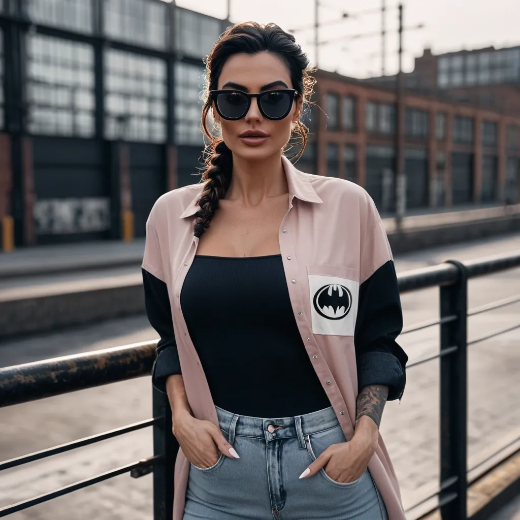
Ultra-realistic cinematic fashion portrait of the same young woman from the reference image , maintaining 100% accurate facial features , skin tone , eye shape , eyebrows , lips , smile , and overall identity. She has naturally voluminous dark brown hair styled in a soft messy side braid with loose face-framing strands and subtle caramel highlights. Her expression is confident , relaxed , and stylish. She is standing in a laid-back pose near industrial black-and-white railings with one hand casually inside the pocket of her light navy blue denim jeans and the other hand resting naturally near her hair. She is wearing a trendy pink , black , and white color-block shirt with a small black batman logo on the chest , slightly oversized with rolled-up sleeves for a modern street-style aesthetic. She wears stylish black sunglasses with black-and-white frames , partially obscuring her face in a fashionable cinematic way. The background features blurred industrial outdoor elements , metal structures , railings , and urban textures with strong shallow depth of field and creamy bokeh. Warm cinematic color grading , natural soft daylight , realistic skin texture , glossy soft-glam makeup , defined brows , highly detailed fabric textures. Editorial fashion photography style , ultra-detailed , photorealistic , DSLR quality , 85mm lens , shallow focus , natural lighting , high-end urban fashion campaign aesthetic. ,
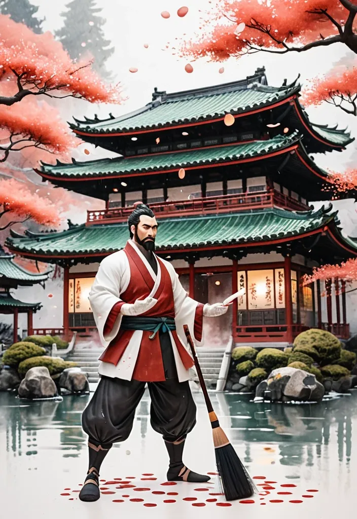
Create a whimsical cinematic image. Use CHARACTER_REFERENCE as the main character. If it is an uploaded photo , preserve the person’s recognizable facial features , face shape , skin tone , hairstyle , eyebrows , beard , and overall likeness with extreme fidelity , transforming them into a tiny storybook and anime-inspired version of themselves. If it is a text description , create the character exactly from that description. Show the character as a tiny illustrated figure standing on a large sheet of textured watercolor art paper inside an artist’s studio. The character is holding an oversized realistic paintbrush with both hands and forcefully slamming the brush tip into the paper. Important: the character’s anatomy and the brush interaction must be physically accurate and clean — exactly two arms , two hands , five fingers on each hand , normal body proportions , no duplicated limbs , no extra fingers , no brush intersecting the body , and the hands gripping the brush naturally. The brush tip must be visibly pressed against the paper at the exact moment of impact. From this precise impact point , a spectacular explosion of wet paint erupts upward and outward , transforming into a majestic traditional East Asian house made entirely of living paint. The structure should resemble a refined Japanese and Chinese-inspired temple residence , with curved tiled roofs , layered eaves , red wooden columns , sliding paper doors , ornamental lanterns , carved beams , and a peaceful courtyard aesthetic. The architecture must emerge organically from watercolor splashes in deep crimson , vermilion , terracotta , warm brown , jade green , charcoal black , and subtle gold accents. Its form should be created from fluid ink lines , translucent watercolor layers , droplets , expressive brush strokes , and delicate sketch details. The lower part of the house must remain connected to the wet paint puddle on the paper , while the upper part becomes increasingly defined , elegant , and alive. Surround the structure with swirling cherry blossom petals , drifting mist , soft lantern glow , bonsai silhouettes , and graceful ribbons of ink. The house should evoke serenity , tradition , and magical craftsmanship , as if an ancient oriental sanctuary is being painted into existence. Style: dreamy miniature fantasy diorama , delicate anime storybook aesthetic inspired by Studio Ghibli , watercolor-and-ink mixed with realistic macro photography , handcrafted artistic feel , warm studio lighting , shallow depth of field , cinematic composition , soft bokeh , highly detailed paper texture , blurred paint jars , brushes , and art supplies in the background. Rules: tiny character with oversized brush; clear brush-to-paper impact; oriental house emerges directly from the impact point; creation made entirely of watercolor , ink , and wet paint; lower structure connected to the paint splash; magical handcrafted cinematic atmosphere; realistic macro photography; no flat illustration look; no plastic toy appearance; no text , no logos , no captions. ,
{ "logo": { "texto_principal": "QUE FINO" , "subtexto": "GASTRONOMÍA VENEZOLANA" , "elementos_visuales": ["Bandera de Argentina" , "Bandera de Venezuela" , "Destellos rojos y blancos"] } , "menu_general": [ "Tequeños" , "Arepas" , "Perros Calientes - Panchos" , "Pizzas" , "Hamburguesas" , "Cachapas" ] , "imagenes_platos": [ { "tipo": "Arepas" , "descripcion": "Tres arepas rellenas en una canasta de mimbre" } , { "tipo": "Tequeños" , "descripcion": "Tequeños de queso en forma de corona con una salsa central" } , { "tipo": "Hamburguesa" , "descripcion": "Hamburguesa completa con queso , bacon , lechuga y tomate" } , { "tipo": "Cachapa" , "descripcion": "Cachapa doblada con queso derretido desbordando y mantequilla encima" } , { "tipo": "Perros Calientes" , "descripcion": "Dos perros calientes estilo venezolano con papas pay y salsas" } ] , "seccion_promocional": { "titulo_alerta": "¡NO TE PIERDAS ESTO!" , "llamado_accion": "¡Preguntá por nuestra famosa Picada Venezolana!" , "descripcion_producto": "La caja perfecta para probar un poco de todo: Tequeños , Miniarepas , Miniempanadas , MiniCachapas con Salsas Caseras" , "eslogan": "¡Ideal para compartir con amigos!" , "imagen_caja": { "texto_en_caja": "PICADA VENEZOLANA" , "contenido": ["Tequeños" , "Empanadas" , "Cachapas" , "Arepas" , "Salsas"] } } , "contacto_y_ubicacion": { "direccion": "Calle 1 de Mayo 2296 , Godoy Cruz , Mendoza" , "instagram": "@quefinomza" , "whatsapp": "261 654 9464" } } ,
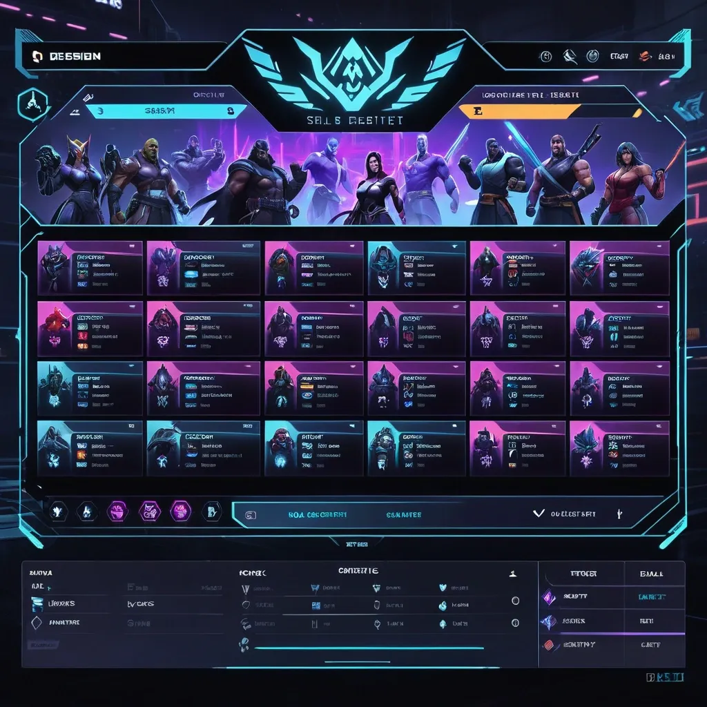
Create a premium , highly believable Character Select Screen for an imaginary game called NIGHT CIRCUIT. The goal is to make the interface feel like a real playable roster screen from a major game: visually addictive , commercially polished , instantly readable , and full of personality. It should feel like a screen players would pause on , screenshot , and obsess over before choosing their main. Game details: - Game title: NIGHT CIRCUIT - Genre: competitive fighting game - Core concept: a neon-noir 2D fighter where underground icons , assassins , idols , and synthetic rebels battle for control of a city-sized entertainment grid - Roster type: small elite cast - Main fantasy: choosing a stylish , dangerous fighter with a very specific attitude and mastering them completely - Audience: fighting-game fans , anime-game lovers , esports audiences , design-conscious gamers - Tone: stylish , competitive , electric , cinematic - Cultural vibe: anime fighter , arcade prestige , cyber-street fashion , esports polish - Reality level: believable AAA Screen structure: Build the interface like a real character selection menu. Include sections such as: - game logo or mode title - character grid or lineup - highlighted selected character - full character portrait or hero pose - character name - class / role / faction - stats or attributes - signature ability or move - optional difficulty rating - optional lock / unlock state - optional alternate skins or color variants - optional player cursor or selection frame For the roster , include: - 12 believable character slots - distinct silhouettes and identities - a coherent roster ecosystem - varied classes , archetypes , or playstyles - names that feel genre-appropriate and memorable Include: - a strong selected-character focus - premium UI hierarchy - readable roster logic - believable stat or role indicators - polished iconography - clear class/faction differentiation - strong "pick your main" energy - instantly shareable game-interface appeal Visual direction: - Make the screen feel like a real game menu players would see before a match or campaign start - Emphasize identity , hype , choice , and roster fantasy - Balance clean UX structure with strong character-worldbuilding - Make it suitable for social sharing , fake game concepts , fan-worldbuilding , gaming mockups , or launch materials - The result should look like a genuine roster screen from a popular game Art direction: - Style: premium anime-fighter character select UI with esports-ready polish - Color palette: black , electric violet , cyan , crimson , silver-grey - Typography feel: sharp arcade-sci-fi type with clean stat labels - Material feel: console match-lobby screen and tournament-ready roster interface - Lighting or image mood: neon glow , competitive energy , polished dark-mode interface - Background: abstract digital arena with city-grid light trails Composition: - Show the screen as one cohesive character-select interface - Make the selected character , roster , and key stats instantly readable - Use real game-menu hierarchy and interaction logic - Make the cast feel iconic , varied , and mechanically real - Make the final output feel like a premium fake game UI with viral potential Output quality: - ultra-detailed - visually structured - commercially believable - culturally fluent - polished gaming UI design - strong hierarchy and spacing - premium character-roster composition - instantly shareable visual concept Optional content blocks: - player 1 marker - random select slot - difficulty stars - alternate skin selector - faction icon - season character lock Avoid: - generic character poses - weak roster variety - fake-looking stat systems - cluttered interface - random icons without gameplay logic - amateur game-menu aesthetics - inconsistent character style across the roster - too much text fighting the UI ,
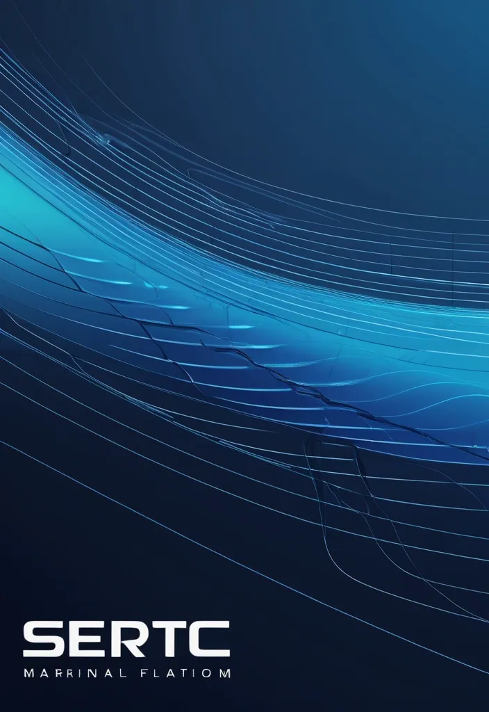
{ "prompt": "Design a high-end corporate banner for a marine technology company called SERTEC Marine , based on the attached reference image. Elevate the existing design into a premium 'Fluid Tech Layers' concept. Maintain the idea of flowing wave shapes but transform them into precise , engineered , layered vector forms with clean edges and controlled geometry. The composition should feature multiple overlapping curved layers moving horizontally from left to right , representing data flow , ocean currents , and advanced systems.\n\nIncorporate subtle technical elements such as thin wireframe lines , navigation paths , or circuit-like details integrated along the curves. Add micro details like connection points and segmented lines to enhance the technological feel without cluttering the design.\n\nUse a sophisticated gradient palette: deep navy blue , indigo , and electric cyan accents. Apply smooth gradient transitions with depth and contrast. Include subtle glassmorphism effects (translucent layers with soft lighting) to create a sense of depth and modernity.\n\nThe background should feel clean , corporate , and high-tech — not decorative. Avoid excessive blur. Prioritize precision , clarity , and structure.\n\nPlace the SERTEC Marine logo on the right side , preserving its integrity , ensuring strong contrast and visibility. The design must feel balanced , with negative space and a refined layout suitable for corporate documents (headers , footers , presentations).\n\nOverall mood: premium , technological , controlled fluidity , marine engineering , data-driven environment." , "referenced_image_ids": ["file_000000008bc471f5ab046ab00fbdb553"] , "size": "1792x512" } ,