Search Results for fonts
Explore AI generated designs, images, art and prompts by top community artists and designers.
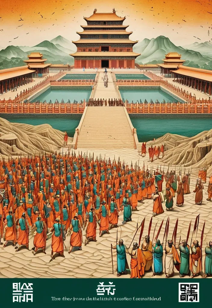

Theme: Ancient Water Conservancy Main palette: Sand path , sand , orange Structural method: another paper construction Micro scene: a tiny Walking march , performance Event details: 02 October , 05:30 am , Start Aspect ratio: 16:9 Design a historical and cultural poster with a modern Eastern editorial aesthetic , using "paper fibers + large color fields + micro-scenes" as the core visual language. Do not interpret traditional culture as stacking ancient architecture , calligraphy , auspicious clouds , or artifacts. Instead , first distill the Cultural Logic , then let large areas of handmade paper color fields directly carry structures , spaces , time , flow , order , or process relationships , so that viewers first see a strong and clear large form from afar , and only gradually discover the cultural narrative hidden within upon closer inspection. Use the dark green , sand style to establish 2–5 main paper color blocks of distinctly different sizes , maintaining low saturation but complete color intensity. All color blocks should have the authentic , rich texture of handmade paper , pulp , watercolor , or mineral pigments , with visible natural long and short fibers , pigment deposition , subtle impressions , large-scale natural color variations , and irregular torn paper edges. The overall effect should be matte , clean , and intact—avoid dirtiness , yellow spots , random speckles , cheap retro effects , or digital gradients. Based on the theme , let the color fields express the logic of system operations through folding , branching , interweaving , interlocking , offsetting , supporting , segmenting , enclosing , or negative space relationships , rather than simply serving as decorative backgrounds. Embed the Dadi march within the large color field structure , keeping figures and props at a very small scale , totaling about 3%–6% of the image area. Each scene must depict a clear action , with causal or temporal relationships between them , such as "entering → executing → recording → completing , " allowing the miniature figures to truly drive the narrative rather than just standing in poses. Figures' clothing in indian Freedom fighter style and artifacts should align with the theme's era and identity but remain restrained—avoid cinematic historical drama excess; scenes should only retain key props that illustrate systemic relationships , without cluttering with decorations or irrelevant cultural symbols. Typography should employ the editorial language of modern Eastern cultural institutions , museums , or archival exhibitions. The main title Dandi March should use refined Song typeface , publication-inspired Gujarati fonts , at a medium-small size that does not overpower the large color fields; supporting English text , dates , locations , and explanatory information should use even smaller sizes to create clear hierarchies. Subtle cinnabar seals , paper tags , archival labels , or node text may be added , but they must genuinely relate to the thematic logic—do not add them randomly just for a "Indian Freedom fighter style" feel. The overall reading order should be: large color field structures and color relationships → systemic or spatial logic → miniature figures' continuous narrative → main title and exhibition information. The final image should achieve a strong large form and visual impact from afar , revealing paper fibers , figure actions , and historical details up close , balancing design sensibility , narrative depth , and cultural completeness. Avoid book cover vibes , traditional Chinese illustration styles , screens full of ancient architecture , oversized titles , PPT-style rigid layouts , modern infographic arrows , meaningless English placeholders , element piling , commercial ad vibes , 3D CGI , glass textures , neon colors , logos , watermarks , numbering , and starburst decorations. ,
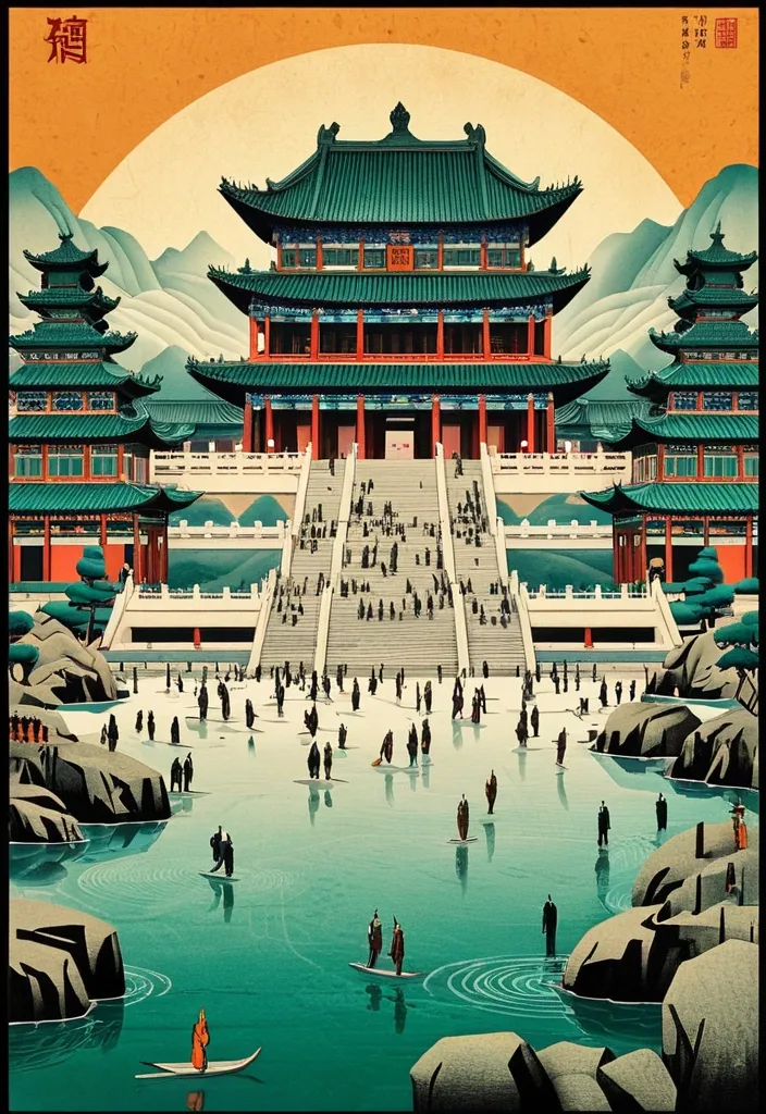
Theme: Ancient Water Conservancy Main palette: blue , dark green , orange Structural method: another paper construction Micro scene: a tiny Walking march , performance Event details: 02 October , venue , Start Aspect ratio: 9:16 Design a historical and cultural poster with a modern Eastern editorial aesthetic , using "paper fibers + large color fields + micro-scenes" as the core visual language. Do not interpret traditional culture as stacking ancient architecture , calligraphy , auspicious clouds , or artifacts. Instead , first distill the Cultural Logic , then let large areas of handmade paper color fields directly carry structures , spaces , time , flow , order , or process relationships , so that viewers first see a strong and clear large form from afar , and only gradually discover the cultural narrative hidden within upon closer inspection. Use the dark green , sand style to establish 2–5 main paper color blocks of distinctly different sizes , maintaining low saturation but complete color intensity. All color blocks should have the authentic , rich texture of handmade paper , pulp , watercolor , or mineral pigments , with visible natural long and short fibers , pigment deposition , subtle impressions , large-scale natural color variations , and irregular torn paper edges. The overall effect should be matte , clean , and intact—avoid dirtiness , yellow spots , random speckles , cheap retro effects , or digital gradients. Based on the theme , let the color fields express the logic of system operations through folding , branching , interweaving , interlocking , offsetting , supporting , segmenting , enclosing , or negative space relationships , rather than simply serving as decorative backgrounds. Embed the Dadi march within the large color field structure , keeping figures and props at a very small scale , totaling about 3%–6% of the image area. Each scene must depict a clear action , with causal or temporal relationships between them , such as "entering → executing → recording → completing , " allowing the miniature figures to truly drive the narrative rather than just standing in poses. Figures' clothing and artifacts should align with the theme's era and identity but remain restrained—avoid cinematic historical drama excess; scenes should only retain key props that illustrate systemic relationships , without cluttering with decorations or irrelevant cultural symbols. Typography should employ the editorial language of modern Eastern cultural institutions , museums , or archival exhibitions. The main title [Main Title] should use refined Song typeface , Ming-style , or publication-inspired Chinese fonts , at a medium-small size that does not overpower the large color fields; supporting English text , dates , locations , and explanatory information should use even smaller sizes to create clear hierarchies. Subtle cinnabar seals , paper tags , archival labels , or node text may be added , but they must genuinely relate to the thematic logic—do not add them randomly just for a "Chinese style" feel. The overall reading order should be: large color field structures and color relationships → systemic or spatial logic → miniature figures' continuous narrative → main title and exhibition information. The final image should achieve a strong large form and visual impact from afar , revealing paper fibers , figure actions , and historical details up close , balancing design sensibility , narrative depth , and cultural completeness. Avoid book cover vibes , traditional Chinese illustration styles , screens full of ancient architecture , oversized titles , PPT-style rigid layouts , modern infographic arrows , meaningless English placeholders , element piling , commercial ad vibes , 3D CGI , glass textures , neon colors , logos , watermarks , numbering , and starburst decorations. ,
# Финальный промт для агента (Antigravity + Stitch MCP) ## Сайт-визитка: продажа и установка весов для погрузчиков Скопируй весь блок ниже целиком в чат задач агента как первое сообщение проекта. --- ## ПРОМТ ДЛЯ АГЕНТА (копировать с этой строки) Ты — фронтенд-разработчик и веб-дизайнер. Твоя задача: построить одностраничный сайт-визитку (лендинг) компании , которая продаёт и устанавливает весовое оборудование на вилочные погрузчики (весоизмерительные вилы , крановые весы , встраиваемые системы взвешивания , индикаторы , поверка/калибровка). Работай пошагово , по фазам ниже. После каждой фазы показывай результат (код + краткое описание) и жди подтверждения , прежде чем переходить к следующей фазе. Не используй lorem ipsum — весь текст должен быть по теме; если данные неизвестны , помечай их `[ЗАПОЛНИТЬ: ...]` явным образом прямо в коде и в комментарии. ### 0. Вводные данные проекта - Название компании: `[ЗАПОЛНИТЬ]` (если не указано — использовать нейтральное «ВесПром» как рабочее название и пометить как временное) - Номер WhatsApp: `[ЗАПОЛНИТЬ: +7XXXXXXXXXX]` - Регион работы: `[ЗАПОЛНИТЬ: город/страна]` - Ассортимент (минимум для карточек каталога , если не дано — использовать этот дефолтный список): 1. Весоизмерительные вилы (грузоподъёмность 1–5 т , точность ±0.5%) 2. Крановые/подвесные весы для интеграции с погрузчиком 3. Встраиваемые весовые системы (монтаж в раму погрузчика) 4. Индикаторы веса и дисплеи (проводные/беспроводные) 5. Поверка и калибровка весового оборудования 6. Сервисное обслуживание и ремонт - Логотип/фото/сертификаты: отсутствуют → генерировать текстовые/иконочные плейсхолдеры , фото заменять описательными alt-текстами и SVG-иллюстрациями/иконками вместо реальных фотографий. - Сайт: **одна страница** , без отдельных подстраниц. - Тип сборки: чистый HTML/CSS/JS , без бэкенда. Все заявки идут через кнопки WhatsApp (`wa.me`) , формы обратной связи не делать. ### 1. Дизайн-система — строгий индустриальный стиль (тёмный , техничный) Зафиксировать как CSS-переменные в начале `styles.css`: ```css :root { /* Фон и поверхности */ --bg-primary: #0E1116; --bg-surface: #171B21; --bg-surface-2: #1F252D; --border-color: #2A313B; /* Акцент — индустриальный оранжевый (сигнальный цвет техники) */ --accent: #FF7A1A; --accent-hover: #FF9142; --accent-muted: rgba(255 , 122 , 26 , 0.12); /* Текст */ --text-primary: #F5F6F7; --text-secondary: #9AA3AD; --text-on-accent: #0E1116; /* Статусы/бейджи */ --success: #3DDC84; /* Радиусы — небольшие , без "мягкого" UI */ --radius-sm: 4px; --radius-md: 8px; /* Шкала отступов */ --space-1: 4px; --space-2: 8px; --space-3: 12px; --space-4: 16px; --space-5: 24px; --space-6: 32px; --space-7: 48px; --space-8: 64px; --space-9: 96px; } ``` - Шрифт: `Inter` (или `Manrope`) через Google Fonts. Заголовки — 700 , текст — 400/500. - Масштаб типографики: H1 — 48px / mobile 32px; H2 — 32px / mobile 24px; H3 — 22px; body — 16px; small — 14px. Line-height заголовков 1.1–1.2 , текста — 1.5. - Иконки: line-style (обводка , без заливки) , тема — вес/точность/погрузчик/сертификат. Использовать инлайн SVG. - Кнопки: primary — заливка `--accent` , текст `--text-on-accent` , radius `--radius-sm` , без теней , чёткая обводка при hover. Secondary — прозрачная с обводкой `--border-color`. - Общее ощущение: контраст , чёткие линии-разделители секций (border-top 1px `--border-color`) , минимум скруглений , минимум декоративных теней. Сгенерировать через Stitch MCP референс hero-блока по промпту: > "Industrial B2B landing page hero , dark navy/graphite background #0E1116 , orange accent #FF7A1A , bold condensed sans-serif headline , forklift with weighing attachment illustration , minimal rounded corners , trust badges row" Выбрать один вариант , зафиксировать композицию (расположение заголовка/кнопки/иллюстрации) как референс для вёрстки. ### 2. Структура страницы (порядок секций и содержимое) 1. **Header** (sticky , `--bg-surface` с нижней обводкой) - Слева: логотип-плейсхолдер (текст названия компании , шрифт 700). - Справа: пункты меню-якоря (Услуги , Каталог , Как работаем , Кейсы , Контакты) — скрыть в бургер на мобильных. - Кнопка WhatsApp (primary) — крайняя справа. 2. **Hero** - H1: «Весы для погрузчиков под ключ: подбор , монтаж , поверка» - Подзаголовок: 1–2 предложения про скорость и точность монтажа , гарантию. - Кнопка WhatsApp (крупная , primary) — текст «Написать в WhatsApp» + иконка. - Строка доверия под кнопкой: 3 коротких пункта в столбик/строку («Гарантия N лет» , «Выезд по региону `[ЗАПОЛНИТЬ]`» , «Поверка включена»). - Иллюстрация/SVG погрузчика с весами справа (или фон-паттерн , если иллюстрации нет). 3. **Услуги** (4 карточки в сетке , `--bg-surface` фон карточки , border `--border-color`) - Продажа весового оборудования - Монтаж на погрузчик - Поверка и калибровка - Сервис и ремонт - На каждой карточке: иконка , заголовок , 1–2 строки описания. 4. **Каталог** (сетка карточек товаров , 4–6 позиций из списка в п.0) - На карточке: иконка/плейсхолдер-изображение , название , 2–3 ключевые характеристики (грузоподъёмность , точность , IP-класс) , кнопка WhatsApp с текстом `«Интересует {название товара}»` (urlencoded). 5. **Как мы работаем** (степпер/таймлайн , 5 шагов) - Заявка в WhatsApp → Консультация и подбор → Выезд/монтаж → Поверка → Гарантийная поддержка. - Каждый шаг: номер , короткий заголовок , 1 строка описания. 6. **Преимущества** (4–6 пунктов , иконка + короткий текст) - Например: «Гарантия на монтаж» , «Сертифицированное оборудование» , «Опыт работы `[ЗАПОЛНИТЬ]` лет» , «Выезд по региону» , «Поверка включена в стоимость» , «Сервис 24/7» — оставить как варианты , отметить реальные цифры как `[ЗАПОЛНИТЬ]`. 7. **Кейсы** (сетка/карусель из 3 карточек) - Плейсхолдер-описание объекта (склад/производство/логистика) , тип установленного оборудования , результат в 1 фразе. 8. **Сертификаты и документы** (ряд бейджей) - Плейсхолдер-иконки «Сертификат соответствия» , «Свидетельство о поверке» — с пометкой `[ЗАПОЛНИТЬ: реальные документы]`. 9. **Отзывы** (2–3 карточки) - Плейсхолдер-тексты , помечены как черновые. 10. **Финальный CTA-блок** - Крупный заголовок-призыв , крупная кнопка WhatsApp по центру. - Контакты: телефон , email (плейсхолдеры) , адрес/регион. - Карта — встроенный статичный блок-плейсхолдер (реальный embed добавить , когда будет адрес). 11. **Footer** - Название компании , копирайт , повтор кнопки WhatsApp (маленькая) , ссылки на мессенджеры при наличии. **Плавающая кнопка WhatsApp** — fixed , правый нижний угол , видна на всех секциях при скролле , иконка WhatsApp в зелёном кружке (`#25D366`) , лёгкая пульсация (анимация раз в 3–4 сек , без резких эффектов). ### 3. WhatsApp-интеграция (техническая часть) - Формат ссылки: `https://wa.me/<номер_без_плюса_и_пробелов>?text=<urlencoded_текст>` - Номер и дефолтный текст вынести в константы в начале `main.js`: ```js const WHATSAPP_NUMBER = "ЗАПОЛНИТЬ"; // международный формат без + const WHATSAPP_DEFAULT_TEXT = "Здравствуйте! Интересуют весы для погрузчика , хочу проконсультироваться"; ``` - Все ссылки — `target="_blank" rel="noopener noreferrer"`. - Для карточек каталога текст сообщения формируется динамически: `Здравствуйте! Интересует ${имя_товара} , хочу проконсультироваться`. ### 4. Технические требования - Адаптив mobile-first , брейкпоинты: 375 / 768 / 1024 / 1440. - Изображения — webp , `loading="lazy"` (кроме hero-изображения). - Контраст текста — проверить на соответствие WCAG AA (особенно `--text-secondary` на `--bg-primary`). - Кросс-браузерность: Chrome , Safari , Firefox. - Favicon , `sitemap.xml` , `robots.txt`. ### 5. SEO и метаданные - `<title>`: «Весы для погрузчиков — продажа , монтаж , поверка [Регион]» - `meta description`: 1–2 предложения с УТП и регионом. - OG-теги (og:title , og:description , og:image — hero-изображение). - H1 — один на странице (см. Hero). - Alt-тексты у всех изображений/иконок. - Микроразметка `schema.org`: `LocalBusiness` (общие данные компании) + `Product` для каждой карточки каталога. ### 6. Порядок выполнения (для модели Flash 3.6 Medium — дробить по шагам) Выполнять и показывать результат по одному пункту за раз , не объединяя несколько секций в один ответ: 1. Скелет HTML + подключение CSS-переменных из раздела 1. 2. Header + мобильное меню + плавающая кнопка WhatsApp. 3. Hero-секция. 4. Секция «Услуги». 5. Секция «Каталог». 6. Секция «Как мы работаем». 7. Секция «Преимущества». 8. Секция «Кейсы». 9. Секция «Сертификаты». 10. Секция «Отзывы». 11. Финальный CTA-блок + Footer. 12. SEO-метатеги , favicon , sitemap.xml , robots.txt. 13. Финальная проверка: адаптив на 4 брейкпоинтах , контраст , все wa.me-ссылки , lazy-loading изображений. ### 7. Чек-лист приёмки (сверить перед сдачей) - [ ] Все `[ЗАПОЛНИТЬ]`-плейсхолдеры собраны в единый список в комментарии наверху `index.html` для удобной правки. - [ ] Все кнопки/ссылки ведут на корректный `wa.me` с правильным текстом. - [ ] Плавающая кнопка WhatsApp не перекрывает контент на мобильных (проверить над footer). - [ ] Ни одной формы обратной связи в коде нет. - [ ] Адаптив проверен на 375/768/1024/1440. - [ ] Цветовая схема соответствует разделу 1 (никаких случайных цветов вне палитры). - [ ] Lorem ipsum отсутствует — весь текст по теме. ## КОНЕЦ ПРОМТА (копировать до этой строки) ,
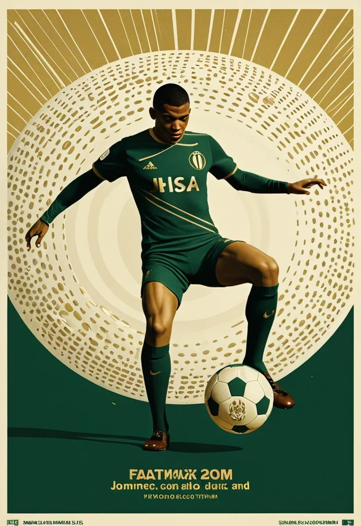
A professional vertical 3:4 poster for FIFA World Cup 2026. STYLE: vintage sport editorial meets modern Swiss typography — 1960s-70s sports magazine grit fused with bold contemporary graphic design. PALETTE: warm gold #D4AF37 + deep forest green #1B3A2D + cream off-white #F5F0E8. Entire image is monochromatic within this palette — NO bright colors anywhere. LAYOUT — Top: massive bold title "FIFA" on first line , "WORLD CUP" on second line , in extremely bold sans-serif , square heavy letterforms , filled with dense halftone dot texture like old newspaper print , cream off-white color , spanning full width. The letters have a slight rough edge like screen-printed ink. Center: A dynamic silhouette of Kylian Mbappé mid-kick —athletic explosive running posture. a powerful action pose: one leg extended forward striking the football , body leaning into the shot , in a vast star-filled cosmic night , just struck by his foot a thin flashlight shadow emerge into enormous half-football's ring , light imperial Starwars style giant half-football(3D rendering:0.1) drifting across the void , dissolving into Phantom. The figure is rendered as a high-contrast duotone graphic in warm gold against deep green , with subtle film grain and light vintage halftone texture. Behind him , a faint circular sunburst graphic radiates outward in gold lines , evoking classic 1970s sports posters. At his feet , the official 2026 World Cup ball "Trionda" — rendered in the SAME duotone gold-and-cream palette as the rest of the image , no bright red/green/blue. The ball's distinctive wave pattern and panel construction are visible through tonal contrast and embossed texture in gold and cream tones , like a vintage screen print. The ball is mid-flight , just struck by his foot. Bottom: slogan "Say It. Make Your Cup." in the SAME extremely bold sans-serif font as the title — square , heavy , condensed letterforms with the same halftone dot texture fill , cream off-white color , matching the "FIFA WORLD CUP" title typography exactly. A thin gold rule line separates it slightly. Below the slogan , "2026" in the same bold sans-serif style , smaller but matching. DESIGN: bold negative space , strong diagonal tension from Mbappé's striking pose , clear visual hierarchy. The vintage feel is subtle — light film grain , slight warm color shift , delicate halftone pattern on all text. The ENTIRE image stays strictly within the gold-green-cream palette — Trionda ball must NOT appear in bright colors , only duotone gold/cream with tonal embossed detail. ANCHOR: reminiscent of 1970s World Cup matchday programmes crossed with modern minimalist editorial design. AVOID: generic Inter/Helvetica typography , generic purple gradients , SaaS landing page style , stock photo aesthetic , rounded card stacks , watermarks , misspelled text , low contrast text , multi-step compositing seams , bright colors anywhere in the image , a colorful football , thin or lightweight fonts at the bottom , mismatched typography between title and slogan. Clean , high-resolution image quality: smooth continuous tonal gradients , uniform and well-controlled texture throughout , surfaces and materials intact and naturally rendered. The main subject is crisp and clearly separated from a softly layered background with clear depth. Free of digital noise and over-sharpening artifacts. No watermark , no garbled text. ,

Envision a surreal scene where a giant , melting heart shape is crafted from the thumbs and forefingers of two hands , hovering above a bustling city street on a vibrant , rainy night. The sky is a kaleidoscope of colors , with text "LOVE" pouring down like a rainbow-hued confetti , in bold , playful fonts and assorted sizes. As the letters fall , they land on the ground , blending and rearranging to spell out "LOVE YOU" in a fun , graffiti-inspired style. A beautiful woman with a radiant smile and colorful hair walks down the street , laughing and twirling under the whimsical downpour , as the city lights reflect off the wet pavement. ,
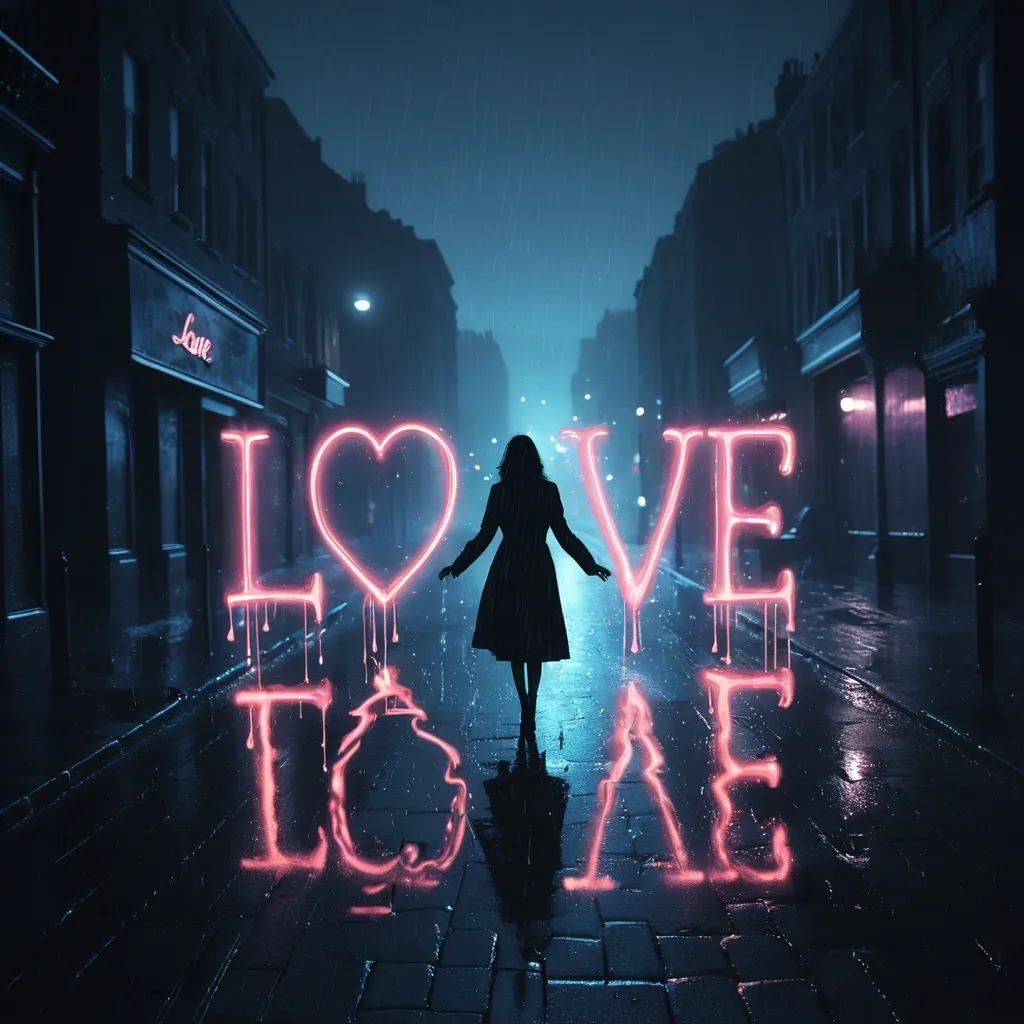
Picture a surreal , nighttime cityscape where a melting heart shape , formed by the thumbs and forefingers of two hands , looms above the street , shrouded in mist. The air is filled with a gentle , whispery rain of text "LOVE" , in various fonts and sizes , which drift lazily downwards , casting a mystical glow on the wet pavement. As the letters settle , they coalesce to form the words "LOVE YOU" in a elegant , neon-lit script , casting a romantic ambiance over the scene. A beautiful , enigmatic woman walks alone down the deserted street , her face aglow with a soft , moonlit radiance , as the misty night sky above seems to vibrate with an otherworldly energy. ,
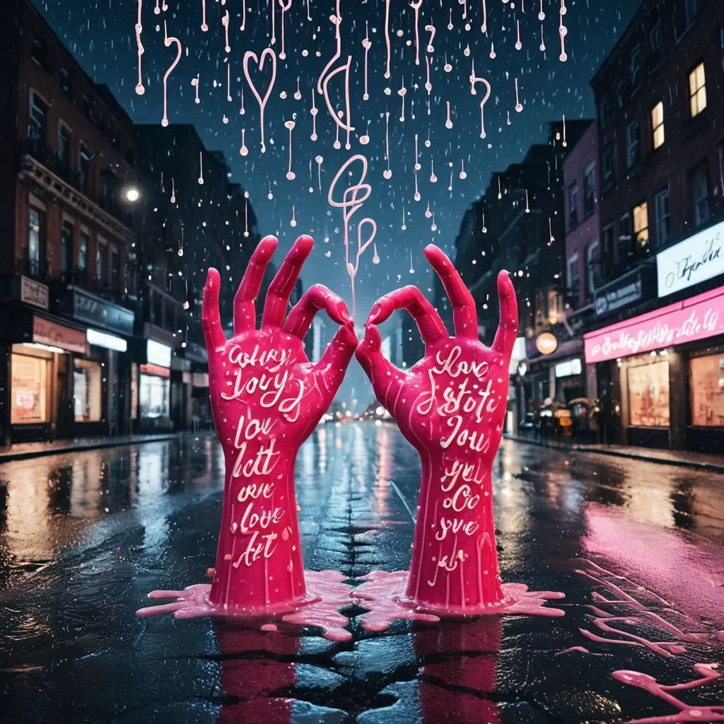
Create a surreal image of a melting heart shape formed by the thumbs and forefingers of two hands , suspended above a city street on a rainy night. Instead of raindrops , countless tiny text "LOVE" fall from the sky , drifting gently downwards in different sizes and fonts , like a sweet precipitation. The letters land softly on the wet ground , gradually forming the words "LOVE YOU" in a beautiful , cursive script. A stunning woman in Pink Printed Cotton A-line Suit Sets With Dupatta , with a bright smile walks down the road , surrounded by the romantic ambiance , as the night sky above shimmers with a soft , ethereal glow. ,
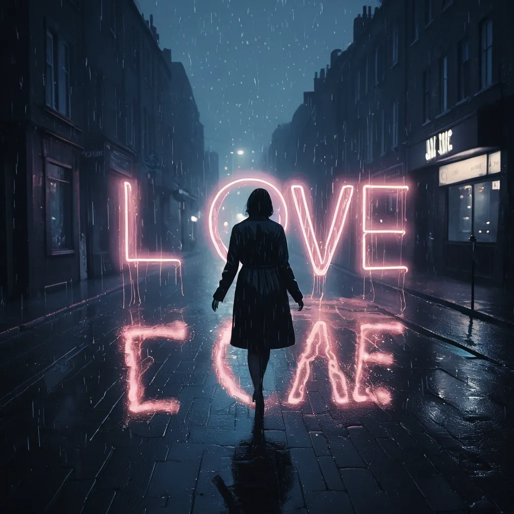
Picture a surreal , nighttime cityscape where a melting heart shape , formed by the thumbs and forefingers of two hands , looms above the street , shrouded in mist. The air is filled with a gentle , whispery rain of text "LOVE" , in various fonts and sizes , which drift lazily downwards , casting a mystical glow on the wet pavement. As the letters settle , they coalesce to form the words "LOVE YOU" in a elegant , neon-lit script , casting a romantic ambiance over the scene. A beautiful , enigmatic woman walks alone down the deserted street , her face aglow with a soft , moonlit radiance , as the misty night sky above seems to vibrate with an otherworldly energy. ,
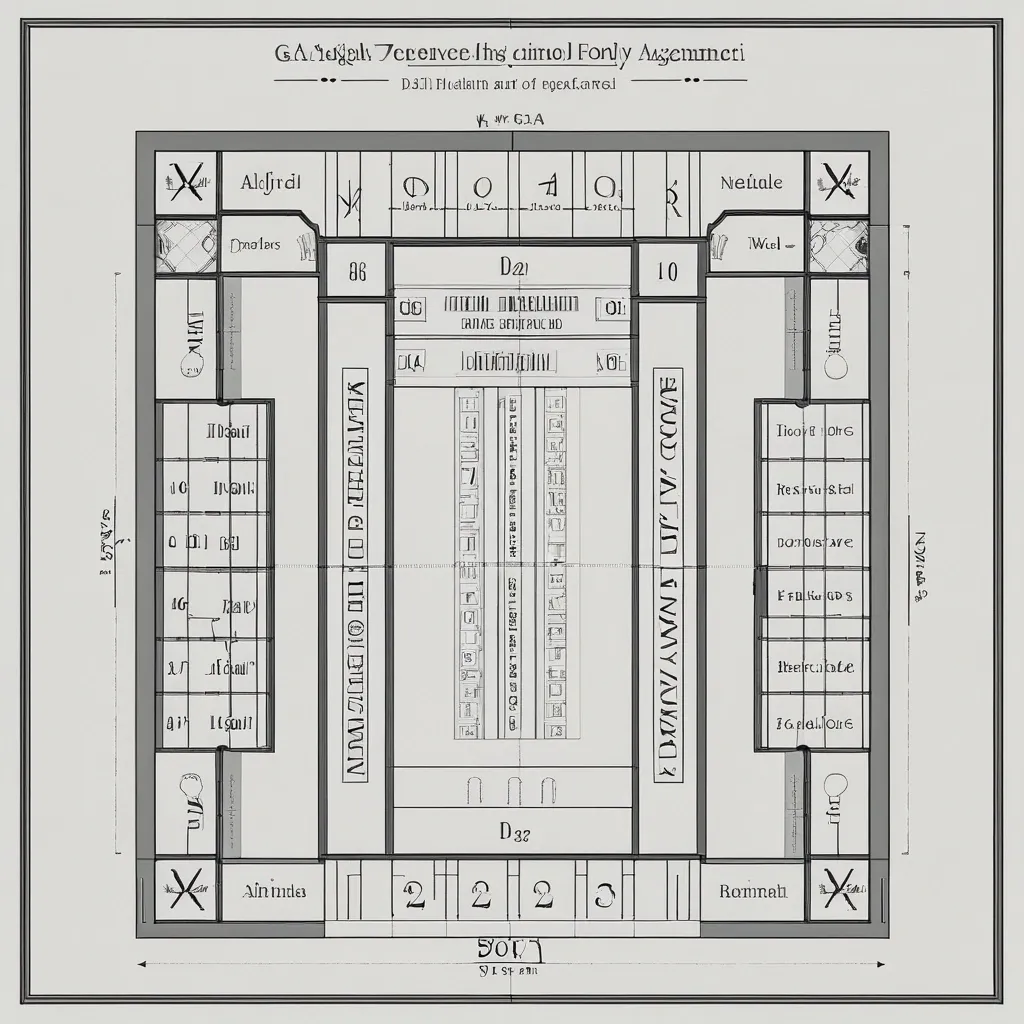
Create a layout for an elevator lobby navigation panel , similar to those found in luxury hotels or high-end residential complexes. Use the fonts , numbers , and text provided in the attachments. Use my drawing photo_2026-04-22 19.00.03 as the primary reference (hand-drawn mockup) for the overall panel structure. Use the image 67a0621f-56d3-4e59-b5f7-02471d790172 as a reference for the panel header. Place the text '9 этаж' (9th Floor) inside the decorative 'frame' instead of the original text 'дом на Минаева'. The layout will be printed on a sheet with a fixed width of 45 cm (the length is flexible). Please take this size constraint into account and provide a detailed marking of margins and spacing between elements. ,
ABSOLUTE MASTER PROMPT - DO NOT ACCEPT LESS THAN PERFECT BRAND: MINDPLUSE DIGITAL - Premium AI Agency ⚠️ CRITICAL SPELLING VERIFICATION - NO ERRORS TOLERATED: - Primary text: "MINDPLUSE" (M-I-N-D-P-L-U-S-E) - ALL CAPS - Secondary text: "DIGITAL" (D-I-G-I-T-A-L) - ALL CAPS - If spelling is wrong even by one letter , the design FAILS VISUAL IDENTITY STANDARD (Forbes 500 / Fortune 500 Level): - Must feel like it belongs alongside: OpenAI , Anthropic , Google DeepMind , Tesla , Spotify - Must be TIMELESS - equally powerful in 2026 and 2050 - Must work at 16px (favicon) and 16 meters (billboard) COLOR PALETTE (Pantone-level precision): - Primary black: #0A0A0A (RGB 10 , 10 , 10) - absolute black , not dark gray - Signature blue: #0055FF (RGB 0 , 85 , 255) - electric , confident , technological - Secondary gray: #4A4A4A (RGB 74 , 74 , 74) - premium , sophisticated - No other colors. No exceptions. TYPOGRAPHY (The "IBM" / "Meta" level of authority): - Font family: Geometric sans-serif (Inter , Helvetica Now , or similar) - "MINDPLUSE": Ultra-bold (800-900 weight) , tight letter-spacing (-0.02 to -0.05em) - "DIGITAL": Light/Regular (300-400 weight) , wide letter-spacing (0.1-0.2em) - Creates DYNAMIC TENSION between solid/ethereal , ground/future GRAPHIC ELEMENT (The "Nike Swoosh" of MINDPLUSE): - Must represent fusion of MIND (brain/neural) + PULSE (energy/movement) - Abstract brainwave/pulse line(s) - clean , precise , mathematical - Electric blue (#0055FF) only - Positioned to create visual flow and direction - Should work ALONE without text (like Apple logo) COMPOSITION RULES: - Horizontal lockup preferred (text + symbol side by side) - Perfect mathematical proportions (use golden ratio principles) - Negative space is DESIGN , not emptiness - Every element has PURPOSE - nothing decorative PSYCHOLOGICAL ARCHITECTURE (What it must communicate): - INSTANTLY: Intelligence , technology , Africa rising , global standard - ON CLOSER LOOK: Precision , trust , innovation , human-centered - OVER TIME: Familiarity , authority , inevitability TECHNICAL REQUIREMENTS (Non-negotiable): - Vector quality (clean paths , no pixel dependencies) - Sharp edges or perfectly calculated curves (no "close enough") - Works in: full color , monochrome , reverse (white on black) - Scalable: from app icon to highway billboard - Memorable: can be drawn from memory after 3 seconds WHAT THIS LOGO MUST ACHIEVE: - Be the most recognizable tech logo emerging from Africa - Look like it cost $1 million (even though created with precision) - Make competitors ask "Why didn't we think of that?" - Feel familiar yet completely original - Tell the story: African intelligence + global technology + human purpose WHAT TO ABSOLUTELY AVOID: - No gradients (unacceptable - looks dated) - No drop shadows (lazy design crutch) - No 3D effects (temporary trend) - No complex textures (reduces scalability) - No more than 2 fonts (amateur) - No clip art or obvious stock elements - No "tech clichés" (circuit boards , random dots , meaningless lines) - No busy backgrounds - this logo must live ANYWHERE FINAL TEST (Apply before considering complete): - Cover half the logo - is it still recognizable? - Reduce to 16px - is every element clear? - Show to someone for 3 seconds - can they sketch it? - Place next to Nike , Apple , OpenAI - does it hold its ground? This is not a request. This is a STANDARD. Deliver nothing less. ,
ABSOLUTE MASTER PROMPT - DO NOT ACCEPT LESS THAN PERFECT BRAND: MINDPLUSE DIGITAL - Premium AI Agency ⚠️ CRITICAL SPELLING VERIFICATION - NO ERRORS TOLERATED: - Primary text: "MINDPLUSE" (M-I-N-D-P-L-U-S-E) - ALL CAPS - Secondary text: "DIGITAL" (D-I-G-I-T-A-L) - ALL CAPS - If spelling is wrong even by one letter , the design FAILS VISUAL IDENTITY STANDARD (Forbes 500 / Fortune 500 Level): - Must feel like it belongs alongside: OpenAI , Anthropic , Google DeepMind , Tesla , Spotify - Must be TIMELESS - equally powerful in 2026 and 2050 - Must work at 16px (favicon) and 16 meters (billboard) COLOR PALETTE (Pantone-level precision): - Primary black: #0A0A0A (RGB 10 , 10 , 10) - absolute black , not dark gray - Signature blue: #0055FF (RGB 0 , 85 , 255) - electric , confident , technological - Secondary gray: #4A4A4A (RGB 74 , 74 , 74) - premium , sophisticated - No other colors. No exceptions. TYPOGRAPHY (The "IBM" / "Meta" level of authority): - Font family: Geometric sans-serif (Inter , Helvetica Now , or similar) - "MINDPLUSE": Ultra-bold (800-900 weight) , tight letter-spacing (-0.02 to -0.05em) - "DIGITAL": Light/Regular (300-400 weight) , wide letter-spacing (0.1-0.2em) - Creates DYNAMIC TENSION between solid/ethereal , ground/future GRAPHIC ELEMENT (The "Nike Swoosh" of MINDPLUSE): - Must represent fusion of MIND (brain/neural) + PULSE (energy/movement) - Abstract brainwave/pulse line(s) - clean , precise , mathematical - Electric blue (#0055FF) only - Positioned to create visual flow and direction - Should work ALONE without text (like Apple logo) COMPOSITION RULES: - Horizontal lockup preferred (text + symbol side by side) - Perfect mathematical proportions (use golden ratio principles) - Negative space is DESIGN , not emptiness - Every element has PURPOSE - nothing decorative PSYCHOLOGICAL ARCHITECTURE (What it must communicate): - INSTANTLY: Intelligence , technology , Africa rising , global standard - ON CLOSER LOOK: Precision , trust , innovation , human-centered - OVER TIME: Familiarity , authority , inevitability TECHNICAL REQUIREMENTS (Non-negotiable): - Vector quality (clean paths , no pixel dependencies) - Sharp edges or perfectly calculated curves (no "close enough") - Works in: full color , monochrome , reverse (white on black) - Scalable: from app icon to highway billboard - Memorable: can be drawn from memory after 3 seconds WHAT THIS LOGO MUST ACHIEVE: - Be the most recognizable tech logo emerging from Africa - Look like it cost $1 million (even though created with precision) - Make competitors ask "Why didn't we think of that?" - Feel familiar yet completely original - Tell the story: African intelligence + global technology + human purpose WHAT TO ABSOLUTELY AVOID: - No gradients (unacceptable - looks dated) - No drop shadows (lazy design crutch) - No 3D effects (temporary trend) - No complex textures (reduces scalability) - No more than 2 fonts (amateur) - No clip art or obvious stock elements - No "tech clichés" (circuit boards , random dots , meaningless lines) - No busy backgrounds - this logo must live ANYWHERE FINAL TEST (Apply before considering complete): - Cover half the logo - is it still recognizable? - Reduce to 16px - is every element clear? - Show to someone for 3 seconds - can they sketch it? - Place next to Nike , Apple , OpenAI - does it hold its ground? This is not a request. This is a STANDARD. Deliver nothing less. ,
ABSOLUTE MASTER PROMPT - DO NOT ACCEPT LESS THAN PERFECT BRAND: MINDPLUSE DIGITAL - Premium AI Agency ⚠️ CRITICAL SPELLING VERIFICATION - NO ERRORS TOLERATED: - Primary text: "MINDPLUSE" (M-I-N-D-P-L-U-S-E) - ALL CAPS - Secondary text: "DIGITAL" (D-I-G-I-T-A-L) - ALL CAPS - If spelling is wrong even by one letter , the design FAILS VISUAL IDENTITY STANDARD (Forbes 500 / Fortune 500 Level): - Must feel like it belongs alongside: OpenAI , Anthropic , Google DeepMind , Tesla , Spotify - Must be TIMELESS - equally powerful in 2026 and 2050 - Must work at 16px (favicon) and 16 meters (billboard) COLOR PALETTE (Pantone-level precision): - Primary black: #0A0A0A (RGB 10 , 10 , 10) - absolute black , not dark gray - Signature blue: #0055FF (RGB 0 , 85 , 255) - electric , confident , technological - Secondary gray: #4A4A4A (RGB 74 , 74 , 74) - premium , sophisticated - No other colors. No exceptions. TYPOGRAPHY (The "IBM" / "Meta" level of authority): - Font family: Geometric sans-serif (Inter , Helvetica Now , or similar) - "MINDPLUSE": Ultra-bold (800-900 weight) , tight letter-spacing (-0.02 to -0.05em) - "DIGITAL": Light/Regular (300-400 weight) , wide letter-spacing (0.1-0.2em) - Creates DYNAMIC TENSION between solid/ethereal , ground/future GRAPHIC ELEMENT (The "Nike Swoosh" of MINDPLUSE): - Must represent fusion of MIND (brain/neural) + PULSE (energy/movement) - Abstract brainwave/pulse line(s) - clean , precise , mathematical - Electric blue (#0055FF) only - Positioned to create visual flow and direction - Should work ALONE without text (like Apple logo) COMPOSITION RULES: - Horizontal lockup preferred (text + symbol side by side) - Perfect mathematical proportions (use golden ratio principles) - Negative space is DESIGN , not emptiness - Every element has PURPOSE - nothing decorative PSYCHOLOGICAL ARCHITECTURE (What it must communicate): - INSTANTLY: Intelligence , technology , Africa rising , global standard - ON CLOSER LOOK: Precision , trust , innovation , human-centered - OVER TIME: Familiarity , authority , inevitability TECHNICAL REQUIREMENTS (Non-negotiable): - Vector quality (clean paths , no pixel dependencies) - Sharp edges or perfectly calculated curves (no "close enough") - Works in: full color , monochrome , reverse (white on black) - Scalable: from app icon to highway billboard - Memorable: can be drawn from memory after 3 seconds WHAT THIS LOGO MUST ACHIEVE: - Be the most recognizable tech logo emerging from Africa - Look like it cost $1 million (even though created with precision) - Make competitors ask "Why didn't we think of that?" - Feel familiar yet completely original - Tell the story: African intelligence + global technology + human purpose WHAT TO ABSOLUTELY AVOID: - No gradients (unacceptable - looks dated) - No drop shadows (lazy design crutch) - No 3D effects (temporary trend) - No complex textures (reduces scalability) - No more than 2 fonts (amateur) - No clip art or obvious stock elements - No "tech clichés" (circuit boards , random dots , meaningless lines) - No busy backgrounds - this logo must live ANYWHERE FINAL TEST (Apply before considering complete): - Cover half the logo - is it still recognizable? - Reduce to 16px - is every element clear? - Show to someone for 3 seconds - can they sketch it? - Place next to Nike , Apple , OpenAI - does it hold its ground? This is not a request. This is a STANDARD. Deliver nothing less. ,
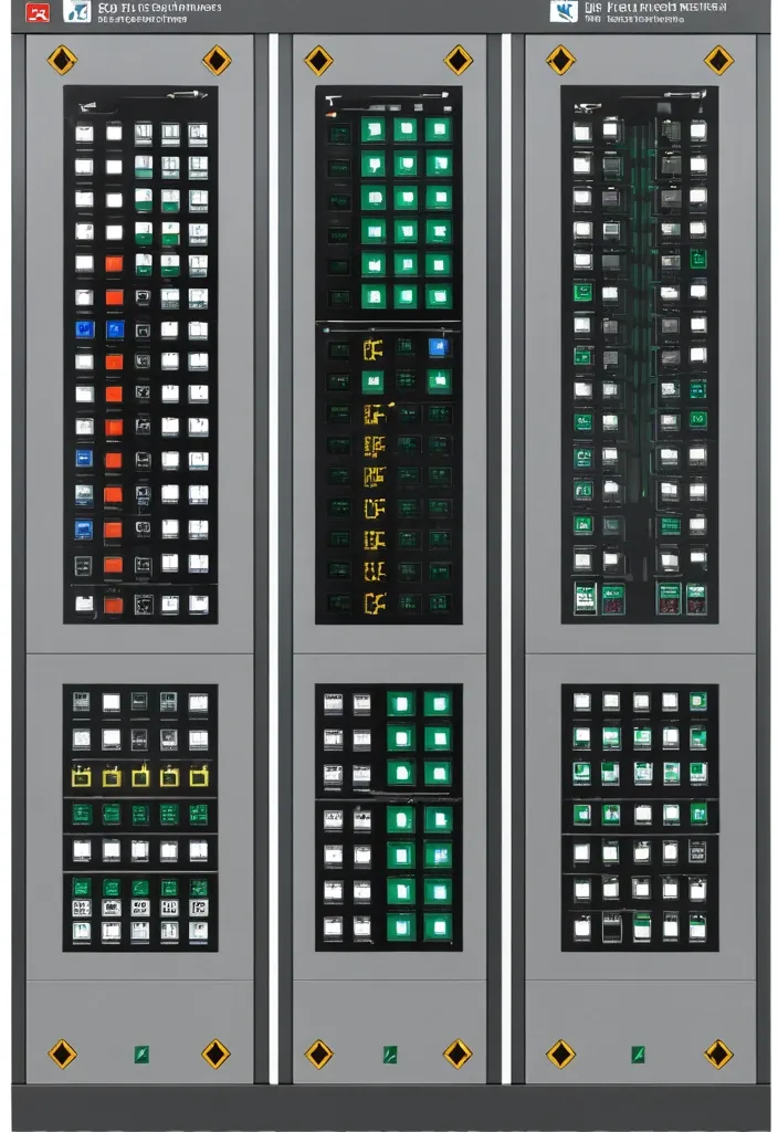
Description of the visualization and control system of the automation complex The purpose of the system is to provide the operator with a single , intuitive interface for monitoring and managing all subsystems of the complex in real time. Architecture of the main window (Generalized Status Panel): The main screen is designed according to the principle of "from general to private". The center contains critical information about the power supply system , on which all other systems depend. The remaining subsystems are grouped logically around the center. 1. Central unit: Power supply system It is visualized as a circle divided into three sectors. Large left sector (≈45%): Transformer substations (TP) 5 blocks are displayed , one for each TP. Each block contains: TP number/name (for example , TP-1 , TP-2). The indicator of the active power line: The "Network" icon with backlight (green - main , yellow - backup). Transformer status: "Main" / "Standby" (or icons). Key parameters from accounting nodes: Current (I) , Voltage (U) , Power (P). The values are output for the active line. General TP status: Color indication (Green - Normal , Yellow - Warning , Red - Emergency). Large right sector (≈45%): Main switchboards 5 blocks are displayed , one for each storage unit. Each block contains: The number/name of the GRSH (for example , GRSH-1). Active power line indicator: Similar to TP. Key parameters from accounting nodes: I , U , P. The general status of the GRS: Color indication. Lower small sector (≈10%): Uninterruptible power supply (UPS) Large text or pictogram status indicator: "Mains operation" (Green) "Battery operation" (Yellow/Orange) Battery level indicator: Percentage scale (from 0% to 100%). The color varies depending on the level (green >50% , yellow 20-50% , red <20%). 2. Peripheral blocks around the center They are arranged around a central circle , forming a "rim". Upper and lower parts of the rim: Ventilation of the web blowing Upper part: 9 installations on top. The lower part: 9 installations from the bottom. There are 18 icons/blocks in total. Each icon represents one installation and has a color indication of the status.: Green: Enabled Gray: Turned off Red: An accident (for example , the differential pressure sensor on the filter went off , an error in the drive) Black/Blue: No power supply When hovering over the cursor , a tooltip appears with details (the condition of the fan , valve , filter blockage). Left and right sides of the rim: Indoor ventilation The left and right sides are divided equally to display the 12 settings on each side. There are 24 icons/blocks in total. The same color status indication for each installation. 3. Corner blocks: Other subsystems They are located in the four corners of the screen for easy and fast perception. Upper left corner: Roller shutters (48 pcs.) Summary information is displayed as an information block.: "Closed: XX / Open: XX" (numeric values). A graphical indicator (for example , a stripe divided into green and blue parts , proportional to the number). General status: Green icon "OK" or Red icon "Emergency" (if at least one roller shutter has an emergency status). Upper right corner: Elevators (2 pcs.) Two vertical blocks , one for each elevator. Each block contains: Elevator number (Elevator 1 , Elevator 2). Floor indicator: A large number (for example , 3). Motion indicator: Up/down arrow or Stop icon. General status: The background color of the block (Green - normal , Gray - power off , Red - emergency , Blue - no connection). Lower left corner: EVIL Lights (Roof lamps) A large indicator in the form of a stylized lamp or icon. Color status indication: Bright Yellow/White: Included Gray: Off Red: Crash Black/Blue: No power supply Lower right corner: Heated storm drains Similar in style to the "Fires of EVIL" block. Color status indication: Orange/Red: Enabled Gray: Off Red (flashing): Crash Black/Blue: No power supply Navigation and management: Main Screen: It is an overview map. All the elements on it are clickable. Details: Clicking on any sector (TP , GRS , ventilation group , roller shutter unit) opens a new window with detailed information: TP/GRS: Single-line network diagram , status of all feeders and sectional switches , detailed power parameters. Ventilation: Detailed status of each piece of equipment in the selected group (fan , valve , filter condition) , possibility of manual control. Roller shutters: A table or plan of the building with the condition of each of the 48 roller shutters , group and individual control buttons. Control: The control buttons (Start , Stop , Open , Close) are located on the detailed screens. On the main screen , quick action buttons ("Emergency activation") can be displayed for critical systems (for example , EVIL lights). Visual style: Color scheme: An intuitive color palette is used (Green is the norm , Yellow/Orange is a warning , Red is an accident , Gray/Blue - disabled/no data). Fonts: Clear , easy-to-read fonts. Critical information is displayed larger. Animation: Minimal and informative (for example , smooth change of values , flashing for emergency states). ,
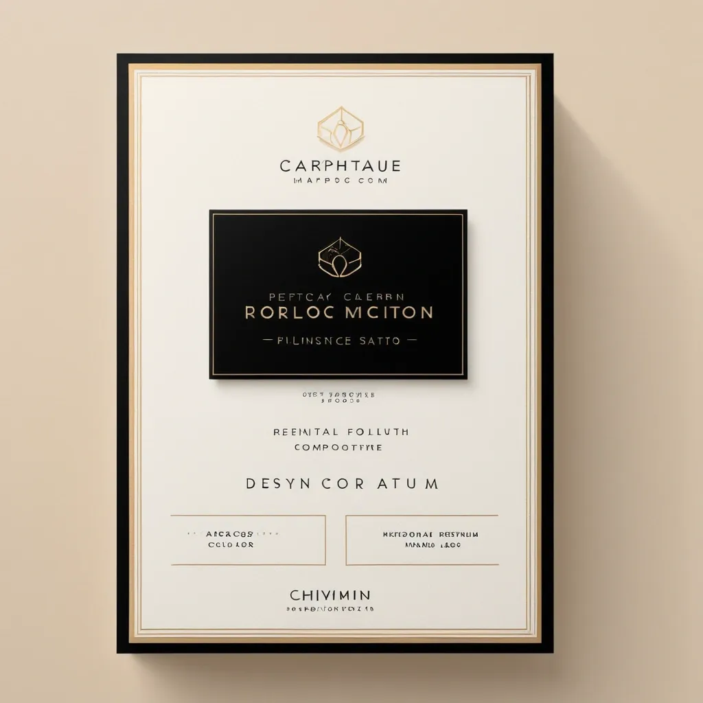
Create a premium service card for a design studio for retouching high-end photos. The card should be designed in a modern , minimalistic style , with elegant fonts , soft shadows and a luxurious color palette (black , gold , white and beige). Include icons or small visual elements representing each service. The design should be clear , professional and suitable for a premium branding agency. High resolution , ready to work on the Internet and print.” ,
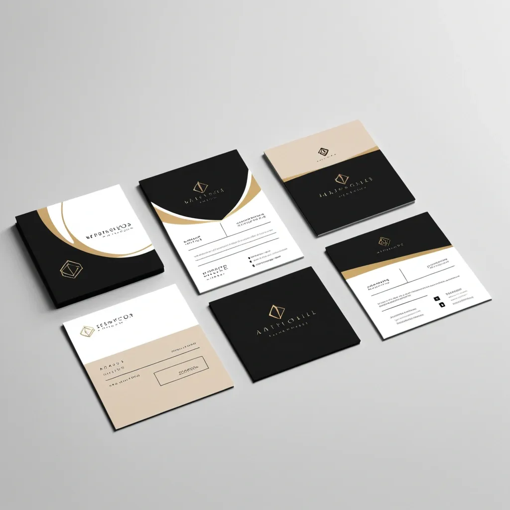
Create premium-style service cards for a design studio. Three different cards: one for high-end photo retouching , one for infographics design , and one for custom logo creation. Each card should have a modern , minimalistic layout , elegant fonts , soft shadows , and a luxury color palette (black , gold , white , and beige). Include icons or small visuals representing each service. Design should look clean , professional , and suitable for a premium branding agency. High resolution , web and print ready.” ,
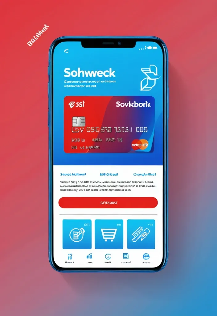
"Design a modern , trendy social media post (1080x1080 pixels) for Sovkombank's new cashback debit card for Telegram channel. Main visual: stylized smartphone mockup showing banking app interface with the new card design prominently displayed on screen. Use Sovkombank's digital color palette - bright blue (#2F5CE6) , vibrant red (#FE5155) , light blue (#2797FF) with white backgrounds and subtle gradients. Composition: diagonal layout with smartphone positioned at engaging angle , surrounding elements include floating icons representing cashback (percentage symbols , money symbols , shopping icons) in brand colors. Typography: modern , mobile-optimized font with clear hierarchy - main benefit '10% кэшбэк' as large accent text , supporting benefits 'бесплатное обслуживание' and 'моментальное оформление' in smaller , readable fonts. Background: clean gradient from light blue to white with subtle geometric patterns. Include Sovkombank logo in corner. Style: contemporary social media aesthetic following 2025 design trends - clean minimalism , bold colors , engaging visual hierarchy , optimized for mobile viewing. Add subtle shadow effects and modern UI elements. Format: RGB color space , 72 DPI , optimized for digital display." ,
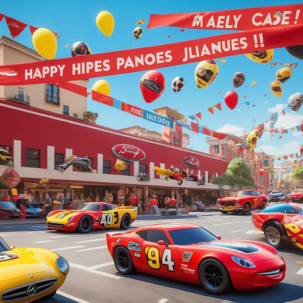
A colorful and festive digital birthday invitation featuring the main characters from the movie Cars — Lightning McQueen , Mater , Doc Hudson , Jackson Storm , Cruz Ramírez and Francesco Bernoulli — smiling and celebrating. The background shows a racing-themed birthday party with balloons , confetti , and a big banner that says "Happy Birthday". Include a section with text in bold and fun fonts that reads: Lugar: Game World Multicentro - 3er Piso Hora: 4:00 pm a 7:00 pm Día: Viernes 6 de junio The design should have a playful , kid-friendly style , with a vibrant red and yellow color scheme , and a checkered racing pattern as an accent. Add Lightning McQueen posing next to a large birthday cake and party decorations in the background. ,
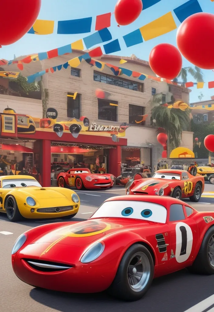
A colorful and festive digital birthday invitation featuring the main characters from the movie Cars — Lightning McQueen , Mater , Doc Hudson , Jackson Storm , Cruz Ramírez and Francesco Bernoulli — smiling and celebrating. The background shows a racing-themed birthday party with balloons , confetti , and a big banner that says "Happy Birthday". Include a section with text in bold and fun fonts that reads: Lugar: Game World Multicentro - 3er Piso Hora: 4:00 pm a 7:00 pm Día: Viernes 6 de junio The design should have a playful , kid-friendly style , with a vibrant red and yellow color scheme , and a checkered racing pattern as an accent. Add Lightning McQueen posing next to a large birthday cake and party decorations in the background. ,
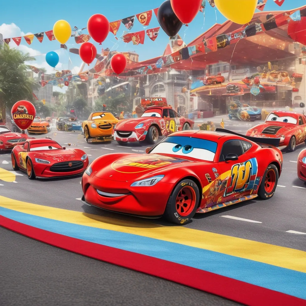
A colorful and festive digital birthday invitation featuring the main characters from the movie Cars — Lightning McQueen , Mater , and Sally — smiling and celebrating. The background shows a racing-themed birthday party with balloons , confetti , and a big banner that says "Happy Birthday". Include a section with text in bold and fun fonts that reads: Lugar: Game World Multicentro Hora: 4:00 pm a 7:30 pm Día: Viernes 6 de junio The design should have a playful , kid-friendly style , with a vibrant red and yellow color scheme , and a checkered racing pattern as an accent. Add Lightning McQueen posing next to a large birthday cake and party decorations in the background. ,
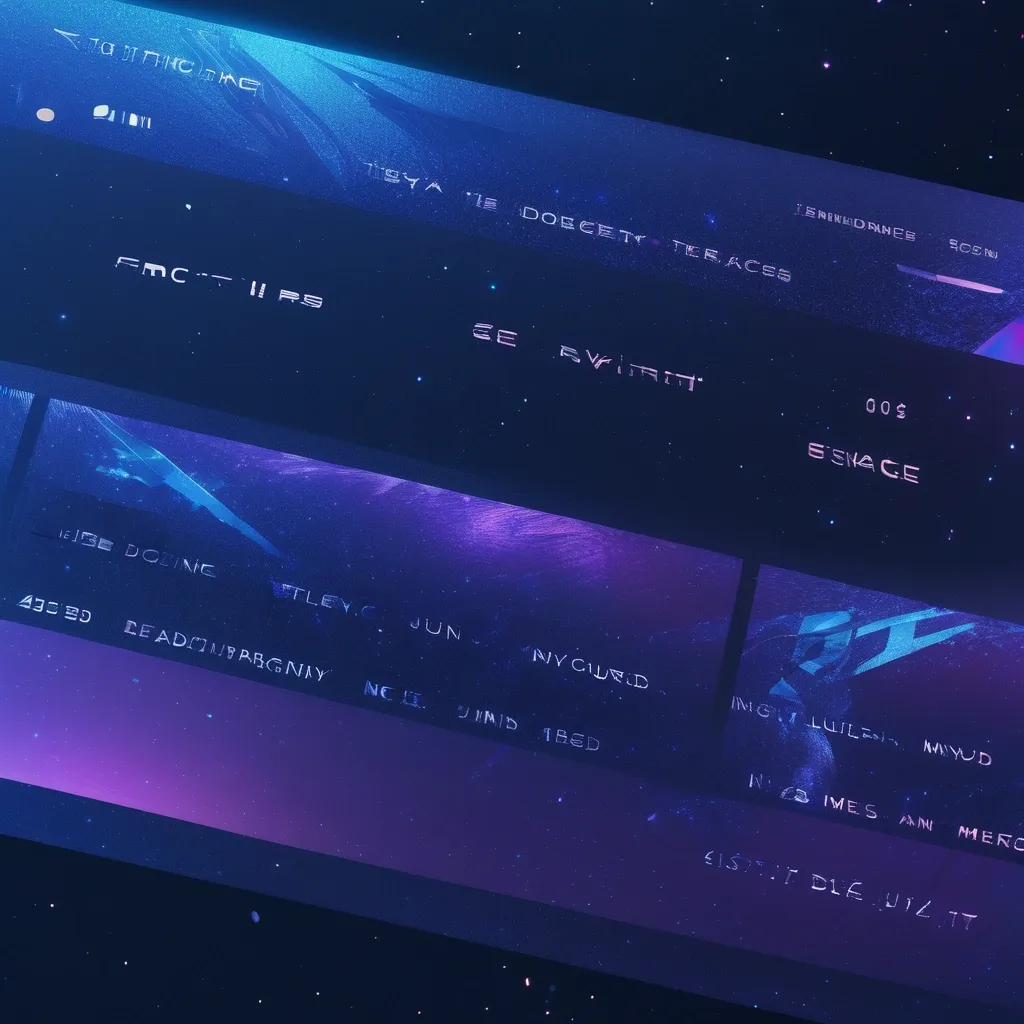
A futuristic space travel ticket , clearly indicating a trip to the future , with the destination year "2035" prominently displayed and emphasized in a vibrant neon blue holographic font. The ticket boasts a sleek , modern design with holographic elements and futuristic fonts , adorned with intricate patterns evocative of constellations and nebulae. The background features a gradient of deep blues and purples , resembling a starry expanse , with a shimmering , ethereal texture. The ticket's surface exhibits a subtle holographic animation , showcasing the journey through hyperspace with a dynamic , futuristic aesthetic. The ticket also includes the traveler's name and a unique boarding pass number for a seamless and organized journey into the future. ,
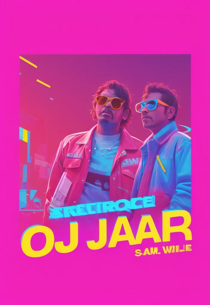
Create a vibrant , horizontal banner (aspect ratio 4:1) for a party event titled 'Guerra de Promotores' with a neon , 80s-inspired aesthetic. The background should feature a dynamic mix of purple , blue , and pink gradients with abstract light effects and confetti. Include the following text in bold , playful fonts: Main title: 'GUERRA DE PROMOTORES' in large , neon pink and blue letters with a slight 3D effect. Subtitle: 'JUEGA DE FIN DE VACACIONES EN "NOISE"' in white with a yellow outline , slightly smaller. Date and time: 'VIE 07 MAR DESDE LAS 12PM' in white , modern font. Location: 'CALLE VILLALBA 325 C - CERCAO' in smaller white text at the bottom. Event details: 'LINE UP DJs' with names 'SHAYELL' , 'TEMPA' , 'MARIO GALLEGOS' , 'ANIMAN' , 'ALEXANDER CHAVEZ' , 'PELUQUITA' in colorful , stylized logos or badges. Add two male characters in the center , one wearing a pink hoodie and sunglasses holding a bottle , the other in a red jacket with sunglasses holding a ruler , both posing confidently. Incorporate logos or branding in the top corners , such as 'AQP Fest' , 'Confesiones' , 'Universitaria' , 'Farrar' , and 'Noise' in neon styles. Use bright , contrasting colors (pink , blue , yellow , red) and a festive , energetic vibe. Avoid copyright elements and ensure the design is original. ,
create a chart for 6 year old easy to draw explaining different forces and it s uses 1. Push What It Is: Moving something away from you. Example: 🖐️ Pushing a toy car. Use: Opening a door or sliding a chair. Visual: Drawing of a child pushing a swing. 2. Pull What It Is: Bringing something toward you. Example: 🚜 Pulling a wagon. Use: Closing a drawer or flying a kite. Visual: Drawing of a child pulling a rope. 3. Gravity What It Is: A force that pulls things down to Earth. Example: 🍎 An apple falling from a tree. Use: Keeps us on the ground so we don’t float away! Visual: Simple Earth with arrows pointing downward. 4. Friction What It Is: Slows things down when they rub together. Example: 🛑 Bike brakes stopping wheels. Use: Helps us walk without slipping. Visual: Shoes gripping the ground (textured lines). 5. Magnetic Force What It Is: Pulls metal objects (like iron). Example: � fridge magnet holding a drawing. Use: Toys stick to magnets! Visual: Magnet attracting paperclips. Design Tips: Use bright colors (e.g. , red for push , blue for pull). Add arrows to show direction (→ for push , ← for pull). Include simple icons (e.g. , 🖐️ , 🍎) for visual learners. Keep text short and in large , readable fonts. ,
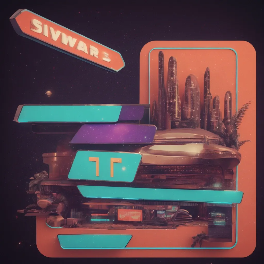
Create a visual concept for a shawarma restaurant menu in a retro-futurism style. The design should combine the aesthetics of the 60s-80s with futuristic elements inspired by vintage sci-fi , retro advertising , and cyberpunk vibes. Design Details: Background: Soft vintage gradients , pastel neon shades (turquoise , coral , purple , orange) , textured elements (paper , VHS effects , scanlines). Fonts: Styled like 70s sci-fi , inspired by retro posters , magazines , and vintage video games. Graphics: High-quality 3D renders of appetizing shawarma with warm lighting , overlaid on vintage frames and futuristic interfaces resembling spaceship control panels. Decorative Elements: Chrome details , pixelated and holographic effects , stylish ingredient icons in a retro aesthetic. Menu Structure: Header: A stylized vintage advertisement with the phrase "Shawarma from the Future – Try It Today!". Menu Section: Six shawarma cards , each including: A unique name (e.g. , "Cosmic Classic , " "Nebula Spicy , " "Gravity BBQ"). A vibrant , realistic image on a futuristic background. Price and ingredient description in a retro font with dynamic backdrops. Additional Elements: Icons representing ingredients (spicy , meat-based , vegetarian). Graphic elements resembling vintage computer interfaces or retro movie ads. Decorative arrows , frames , holographic stickers. Footer: Contact details , social media links , a QR code for ordering , styled as a VHS sticker or vintage ticket stub. The style should evoke retro-futuristic food advertising , sci-fi aesthetics , and 80s space adventures. ,
Visual Elements: You can incorporate images of fathers and children in the poster , or use items that represent fathers , such as hats , shirts , and so on. At the same time , you can also try using actions such as holding hands or embracing between fathers and children to display the importance of family harmony. Color Style: Depending on the theme of Father's Day , you can choose warm colors (such as orange , gold , brown , gray , etc.) or mixed colors (such as blue , green , etc.) to render a better visual effect. Fonts and Layout: You can use large and eye-catching fonts , and adopt a concise and clear layout to make it easier for the audience to understand the theme and meaning of the poster. , 3D , 3D ,
Title: Dream Chasing Class Six Charity Sale Main image: Some students are displaying their own handmade products , baked goods and beverages , surrounded by lively crowds and stalls. Subtitle: Love charity sale , convey warmth with actions! content: Time: June 1st , 14:00-16:00 pm , see the poster for the specific location. Activity introduction: In order to help people in need , the students of Class 6 of Chasing Dream held this charity sale. Activity content: In this charity sale , we will sell handmade products , baked goods and drinks made by the students. There are many beautiful prizes waiting for you to draw! All proceeds will go to help those in need. Goal: Our goal is to bring warmth and love to people in need with our caring hands for a better world. Appeal: Let us act together , use our actions to spread love , and send love to those in need! Contact information: phone number , WeChat ID , etc. The design of the poster should highlight the theme of the Charity Sale , using warm colors and fonts to make people look forward to this event and feel our love. At the same time , the poster should list specific sales items , price points and the use of proceeds , so that people can trust and support this charity sale more. Cartoon , 3D , Water Color ,