Search Results for one strong
Explore AI generated designs, images, art and prompts by top community artists and designers.
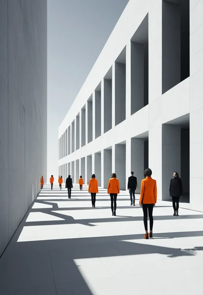

BRAND NAME: AKOTA SERIES: Max0.5 MAIN TITLE: Mastram DEPTH SYSTEM: layered slabs PRIMARY COLOR: Orange ACCENT COLOR: Gray ASPECT RATIO: 9:16 Create a high-end multi-person editorial campaign poster where depth and perspective become the main design system. Build the scene around one strong spatial structure , such as nested architectural frames , lines converging toward a vanishing point , irregular stacked platforms , or large horizontal layers. The architecture should immediately create a clear foreground , middle ground , and background. Place multiple adult figures at different distances and heights within the same coherent perspective field. Their scale must change naturally with depth. Use one or two strong foreground figures , several smaller midground figures , and a few distant figures. Avoid evenly spaced people , grids , lineups , or team-photo compositions. Make people and architecture physically overlap. Some figures should pass through frames , disappear behind walls , be partially hidden by platforms , appear between layers , or emerge from deeper spaces. The result should feel like one real photographed environment , not separate people pasted onto a layout. Integrate the main title into the architecture whenever possible. Let typography follow the perspective of a frame , wall , platform , or structural edge. It may change scale , become partially occluded , or stretch across several depth planes , but it should remain readable. Keep the environment minimal and sculptural. Use large geometric forms , controlled negative space , one dominant color system , realistic directional daylight , and consistent architectural shadows. The spatial idea should still read clearly at thumbnail size. Use realistic fashion photography for the cast: natural skin texture , believable anatomy , real hair , accurate hands and feet , natural fabric folds , varied poses , and subtle movement. Avoid duplicated figures , plastic skin , floating bodies , or overly staged model poses. Supporting typography should stay minimal and secondary. The final image should feel like a real contemporary fashion , cultural , or brand campaign where people , architecture , type , and perspective are all part of the same composition. ,

OBJECT SHAPE: flying Eagle MEDIUM: points SPATIAL MECHANISM: depth SUBJECT: small human figure MAIN COLOR: blue FORMAT: 9:16 vertical poster Create a contemporary volumetric perspective shape poster where the main object exists through elements distributed across real three-dimensional space rather than on a flat surface. Build the shape from the chosen medium: suspended threads , physical points , beams of light , layered line grids , or another spatial system. Individual elements should appear fragmented or abstract from other viewpoints , but align into one bold , visual shape from the intended camera position. Keep clear foreground , midground and background depth. The shape structure should dominate roughly 35–55% of the composition while still revealing how the spatial structure creates it. For points , use suspended objects to form volumetric dots shapes. If a person is included , keep them small and use them mainly as a scale reference , with realistic occlusion between the subject and the spatial elements. Use one strong accent color with a restrained architectural palette. Add only minimal editorial information such as project name , location , date and one short thematic line. Overall style: perspective shape structure , volumetric installation , spatial graphic design , contemporary exhibition art , clean hierarchy and strong visual impact. Avoid flat printed text , ordinary 3D shapes , weak depth , random distortion , neon sci-fi styling , excessive filler copy , cluttered backgrounds , watermarks and numbering. ,
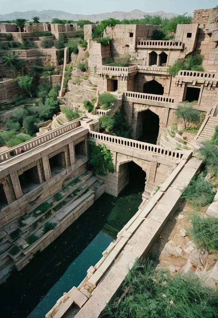
Bird's eye view of a vivid , clear photo (((35mm film photograph , National Geographic style))) of a deep quarry of pale stone converted into a abandoned Rajasthani fort of flowering vines and fruit trees climbing the vine-clad stone walls , verdant greenery sprouting from every crevice , set against Brutalist red Stone Geometry , framed by monolithic slabs , repeating windows , and stark architectural mass. Cascading waterfalls and intricate stone bridges crossing at multiple levels showcase the ingenuity of the fort's design , a still pool on the quarry floor reflecting the terraces and a narrow strip of sky a prominent figure in light clothing standing on one of the lower terraces reaching toward a cluster of fruit gentle wonder rich plant color against pale stone strong vertical walls cinematic atmosphere highly detailed striking composition. Construction began in the 1970s with hopes of creating a luxury desertside fort for wealthy travelers. However , within just a few short years , the project was completely abandoned. ,
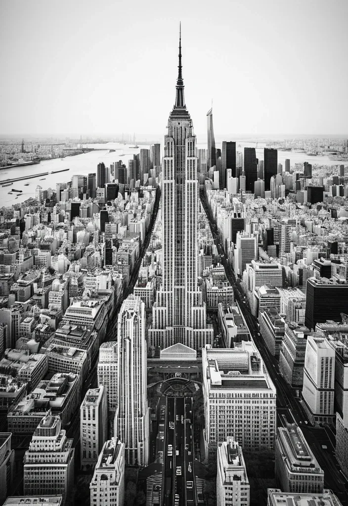
CITY: [TOKYO / NEW YORK / PARIS / DUBAI / YOUR CITY] MAIN LANDMARK: [most iconic landmark] OTHER LANDMARKS: [4–5 recognizable landmarks] TYPE COLOR: [accent color] FOREGROUND DETAIL: [cherry blossoms / taxi / leaves / palm leaves] COUNTRY: [country name] Create a 9:16 vertical city poster using iconic landmarks from the same city. Treat each landmark as an independent architectural collage element rather than a realistic street scene. Place the landmarks around the edges of the frame using an extreme worm’s-eye perspective , with their forms rising and converging toward the center of the sky. Use the MAIN LANDMARK as the central vertical anchor. Keep it the most complete and recognizable structure in the composition. Arrange the other landmarks from the upper-left , upper-right , lower-left and lower-right edges. Make them large near the frame edges and gradually narrower toward the center , creating a strong radial , upward-moving composition. Do not follow real geographic positions. The goal is to reconstruct the visual identity of the city through its landmarks. Behind the architecture , place the city name in huge ultra-tall condensed sans-serif typography. The letters should occupy around 45–60% of the image , partially hidden behind the landmarks while remaining clearly readable. Keep the city-name typography clean , solid and sharp. No distressed texture , cracks or worn lettering. Use a limited three-color system: warm off-white paper background , charcoal / grayscale architecture , one strong accent color for the city name. Render the landmarks with realistic architectural photography , then add subtle vintage editorial print texture , fine grain , halftone and paper texture. Add a small blurred foreground detail connected to the city , occupying only around 5–10% of the lower edge , to create depth and local atmosphere. Core visual formula: iconic landmarks + extreme low-angle perspective + radial convergence + giant city typography + limited colors + subtle foreground depth. ,