Search Results for cohesive
Explore AI generated designs, images, art and prompts by top community artists and designers.
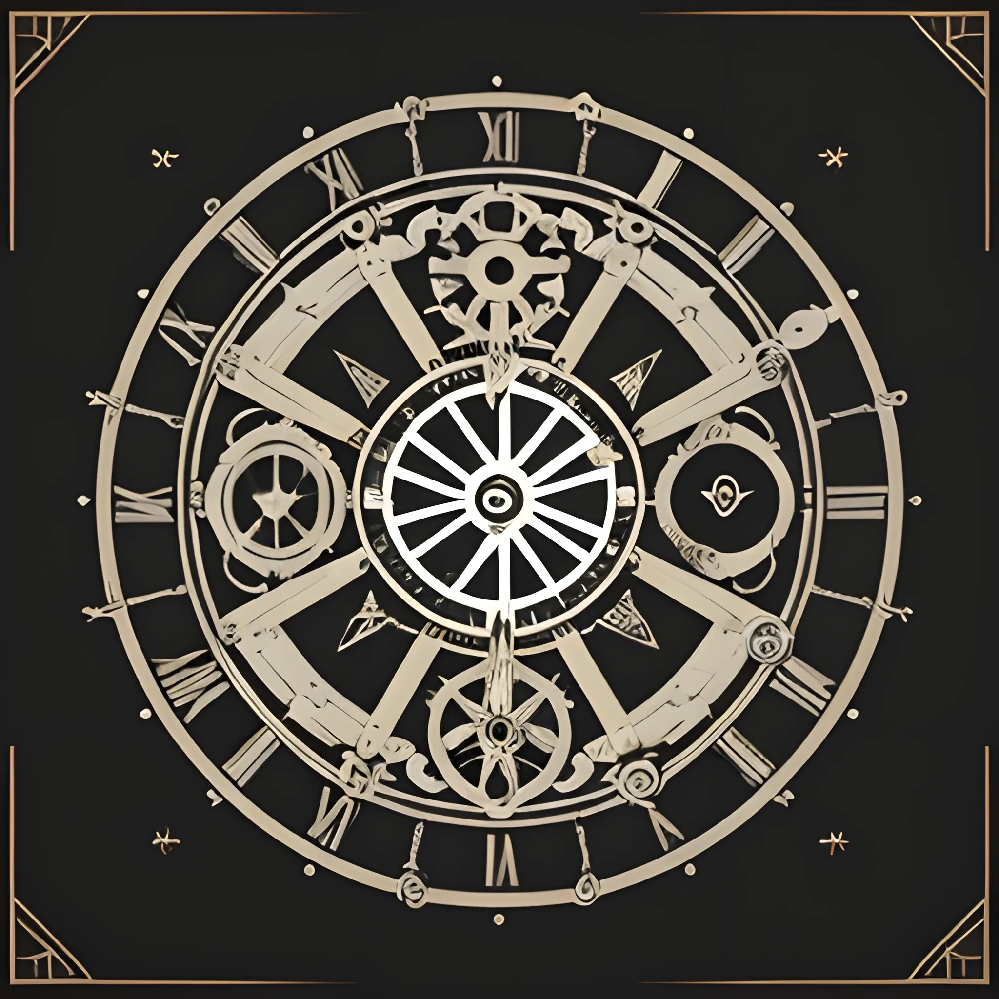

Design a modern , sleek logo that combines elements of art , science , literature , and technology , reflecting the multidisciplinary talents of a Renaissance man. The logo should be black and white , symbolizing the balance between creativity and logic. Incorporate iconic Renaissance symbols such as the Vitruvian Man , a gear , dials , clock face planets creatively merged into a cohesive and unique emblem. This design should convey innovation , wisdom , and versatility , appealing to a contemporary audience while paying homage to the historical depth of the Renaissance era. The overall look should be minimalist and versatile , suitable for various media applications. ,
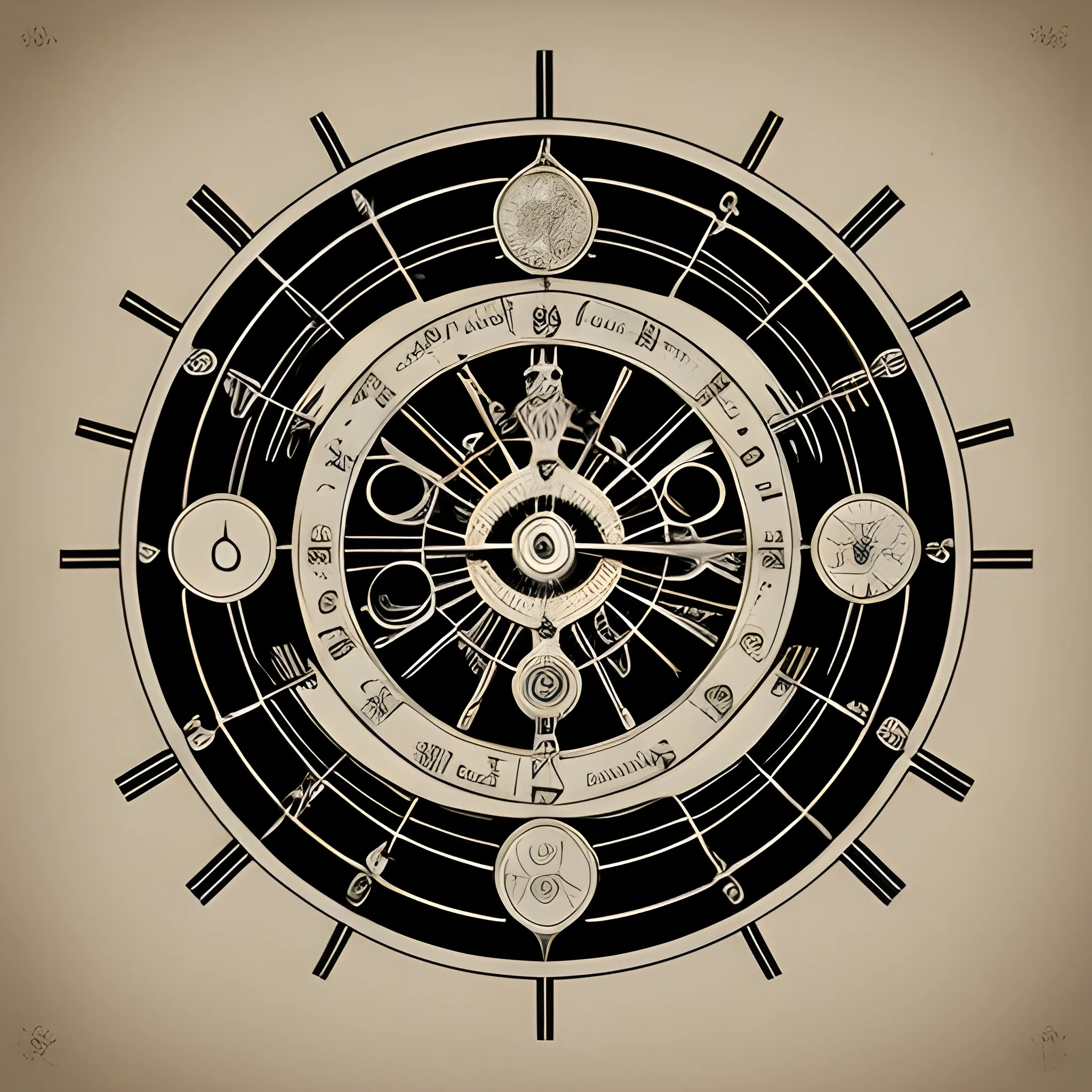
Design a modern , sleek logo that combines elements of art , science , literature , and technology , reflecting the multidisciplinary talents of a Renaissance man. The logo should be black and white , symbolizing the balance between creativity and logic. Incorporate iconic Renaissance symbols such as the Vitruvian Man , a gear , dials , clock face , planets , creatively merged into a cohesive and unique emblem. This design should convey innovation , wisdom , and versatility , appealing to a contemporary audience while paying homage to the historical depth of the Renaissance era. The overall look should be minimalist and versatile , suitable for various media applications. ,

I want to design a logo for the website Logo Description: The logo for Global Product Insight should represent a harmonious blend of the three main content areas - health , bodybuilding , and relationships. It should convey trust , reliability , and a sense of global connectivity. Here's a detailed description: Color Palette: The logo should use a modern and sophisticated color palette. Consider using calming and trustworthy colors like deep blue , emerald green , and subtle shades of gray. These colors symbolize trust , health , growth , and stability. Icon/Graphic Element: In the center of the logo , there could be a globe or a globe-inspired symbol. This globe should be abstract , resembling interconnected nodes or a network of relationships. The use of abstract shapes instead of a literal globe can represent the global reach and connectivity of your website. Health Element: Integrate a subtle health-related element into the logo , such as a stylized heartbeat line or a leafy green vine wrapping around the globe. This represents the health aspect of your content. Bodybuilding Element: For bodybuilding , incorporate elements like dumbbells or barbells that crisscross behind or around the globe symbolically. This adds a dynamic and energetic touch , symbolizing physical fitness and strength. Relationships Element: Surrounding the globe , including abstract human figures or silhouettes holding hands , forming a circle around the globe. This represents the theme of relationships , unity , and connection. Typography: Use a clean , modern , and easily readable font for the website name , "Global Product Insight." The font should complement the overall design and color scheme. Tagline: Optionally , you can include a short and memorable tagline below the main logo to further communicate the website's mission , such as "Connecting Health , Strength , and Love Globally." Balance: Ensure that all elements are balanced and well-proportioned , creating a visually appealing and cohesive design. Remember , the key is to strike a balance between these three core themes while maintaining a professional and clean design. , 3D ,
Designing a coffee bag for "John Coffee" in the Páramo of Santander , Colombia , will require a logo and background that reflect the brand's identity and the unique characteristics of the region. Here's a description of a possible design: Logo: Central Icon: Consider using an iconic element that represents both coffee and the Páramo of Santander. This could be a combination of a coffee cup and the silhouette of the páramo's mountains. Nature: Incorporate elements of the páramo's natural beauty , such as native flora , like frailejones , and fauna like birds or rabbits. These elements can encircle the central icon. Colors: Utilize a color palette that captures the essence of the Páramo , with shades of green and blue representing the natural landscape and perhaps deep brown for coffee. Typography: Choose a font that reflects the brand's personality , whether it's rustic , modern , or elegant. Ensure that the brand name "John Coffee" is clearly legible. Text: Place the brand name "John Coffee" and the location "Páramo of Santander , Colombia" in proximity to or around the central icon. Bag Background: Natural Background: Use a background image or pattern that showcases the stunning scenery of the Páramo of Santander. This could include mountains , rolling hills , and clouds. It should create a sense of place and emphasize the brand's connection to the region. Colors: Harmonize the background colors with the logo's color palette to create a cohesive and visually pleasing design. Product Information: On the back of the bag , provide essential details about the coffee , including its variety , processing method , tasting notes , and any unique selling points. Remember , it's crucial to collaborate with a professional graphic designer to bring your vision to life. This design concept is a starting point and can be tailored to fit your brand's identity and preferences. Additionally , ensure that the bag complies with all legal requirements for coffee packaging and labeling in Colombia and any target markets. ,
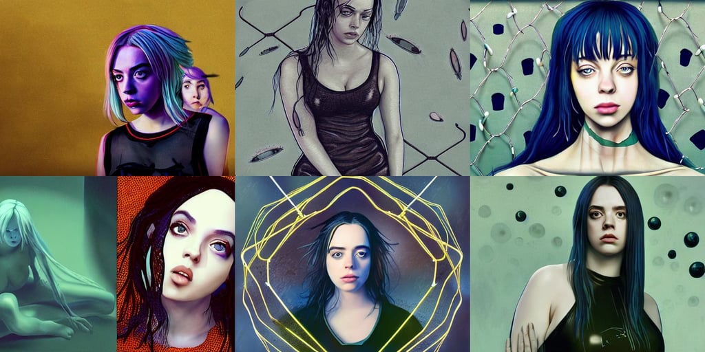
a beautiful billie eilish christina hendricks alluring instagram model in latex tank top , rectilinear , shining , detail acrylic palette knife , kama sutra , charachter design , ant aliens at the horizon , mesh wire , octane engine render , cognitive Coherence cohesive character illustration , claymore anime background , void eyeballs , Alex grey , fish under water , light brown hair tied back in a pony tail , science fiction character concept art , ( dayglo blue ) , feral , Makoto Shinkai Cyril Rolando , full body medium shot by Koyoharu Gotouge ,

Create an Arcane-inspired matte painting featuring a full-height portrait of a young male villain with intricate details , Gothic-inspired features , and sharp , smooth strokes. Center the portrait with the villain in a dynamic full-body shot and a stylized , blurred bokeh background that evokes the dark magic and otherworldly mystery of the Arcane universe. Take inspiration from artists like Ruan Jia , Ilya Kuvshinov , Alphonse Mucha , and RossDraws to create a cohesive composition that emphasizes the villain's unique personality and traits while highlighting the eerie , Arcane-inspired atmosphere. ,
Logo Design Description: Sailboat Icon: The central element of the logo is a stylized sailboat , symbolizing the school newspaper as a vessel embarking on a journey of knowledge. The sailboat is depicted with a dynamic stance , capturing the essence of progress and exploration. Sailing Waves: Beneath the sailboat , there are subtle wave patterns , indicating the fluidity and ever-changing nature of information and ideas. The waves also represent the dynamic environment of a school campus. Ascending Arrow: The sail of the boat forms an upward-pointing arrow , emphasizing the idea of progress , growth , and the pursuit of excellence. This arrow signifies the newspaper's role in guiding students and readers toward new heights of knowledge. Gradient Blue Palette: The logo features a gradient of blue shades , ranging from a deep ocean blue to a lighter sky blue. This color scheme conveys a sense of depth , representing the vast sea of knowledge and the limitless possibilities for learning. Open Book Symbol: Adjacent to the sailboat , an open book adds an academic touch to the design. It reinforces the newspaper's commitment to education , learning , and the dissemination of valuable information. "启航" Typography: The Chinese characters for "启航" (Qihang) are incorporated into the design with a clean and modern font. This not only reinforces the newspaper's identity but also adds a touch of cultural significance. The combination of these elements creates a visually appealing and meaningful logo for the school newspaper "启航 , " capturing the spirit of exploration , knowledge , and academic advancement. The logo's dynamic and cohesive design ensures its versatility across various platforms and applications. , 3D ,

Design a flat vector , illustrative-style emblem logo for 'Zülf' featuring a modern and sophisticated monogram of the initials 'Z' and 'F' elegantly intertwined to form a cohesive and memorable mark. Incorporate subtle musical motifs like abstract wave patterns or sound symbols to enhance the music production theme of the brand. Opt for a sleek color scheme of midnight blue , silver , and rich burgundy to convey a sense of professionalism and creativity. Showcase the emblem on a white background without any realistic photo detail shading. ,

As an AI designer , my goal is to generate a unique and captivating image for a logo that encompasses the themes of sweets , chocolates , brownies , cookies , bread , and other delicious treats. The logo should be related to the name "Dulce al Paladar" (Sweet to the Palate) and consist of borders only , creatively connecting the name with the visual elements. Description: Imagine a visually enticing logo that brings together the mouthwatering delights associated with "Dulce al Paladar." The logo should evoke a sense of indulgence , with distinct borders forming a cohesive representation of the café's theme. Begin by visualizing a circular shape as the foundation of the logo. This circular border represents the concept of a plate or serving dish , signifying the café's dedication to providing a wide range of delectable treats. The border should be thick and slightly textured , resembling the rim of a fancy dessert plate. Within the circular border , incorporate various elements that symbolize the diverse range of offerings at "Dulce al Paladar." Start by including a decadent chocolate truffle at the top. Its smooth , rounded edges should be represented by a delicate border , emphasizing its irresistible richness. To the right of the truffle , include a luscious-looking brawny square , defined by bold and slightly jagged borders. This represents the café's signature brownies , known for their dense and fudgy texture. The brawny square should appear indulgent and inviting. Beneath the brawny square , incorporate a pair of crossed cookies. The cookies should have distinct borders outlining their circular shapes , while their texture can be suggested through crisscrossing lines within the borders. This element pays homage to the café's freshly baked cookies , enticing customers with their delightful aroma. On the left side of the logo , include a small loaf of bread , represented by a wavy border that mimics the contours of a freshly baked loaf. The irregular edges symbolize the artisanal nature of the café's bread offerings , highlighting their homemade charm. To connect all the elements and emphasize the concept of sweetness , incorporate a delicate border of intertwined candy ribbons that weave throughout the logo. These borders should be smooth , curving and intertwining with the other elements , creating a harmonious visual composition. Finally , in a playful yet legible font , write the café's name , "Dulce al Paladar , " along the bottom border of the logo. The letters should be defined by clean borders , reflecting the minimalist aesthetic of the overall design. Consider incorporating slight curves or flourishes into the lettering to echo the elegant contours found throughout the logo. Ensure that the logo remains in black and white , with all elements defined by borders only. This minimalist approach allows for versatility and easy reproduction across various applications while preserving an air of sophistication. The resulting logo should evoke a sense of anticipation and delight , enticing customers to explore the sweet treasures offered at "Dulce al Paladar." ,
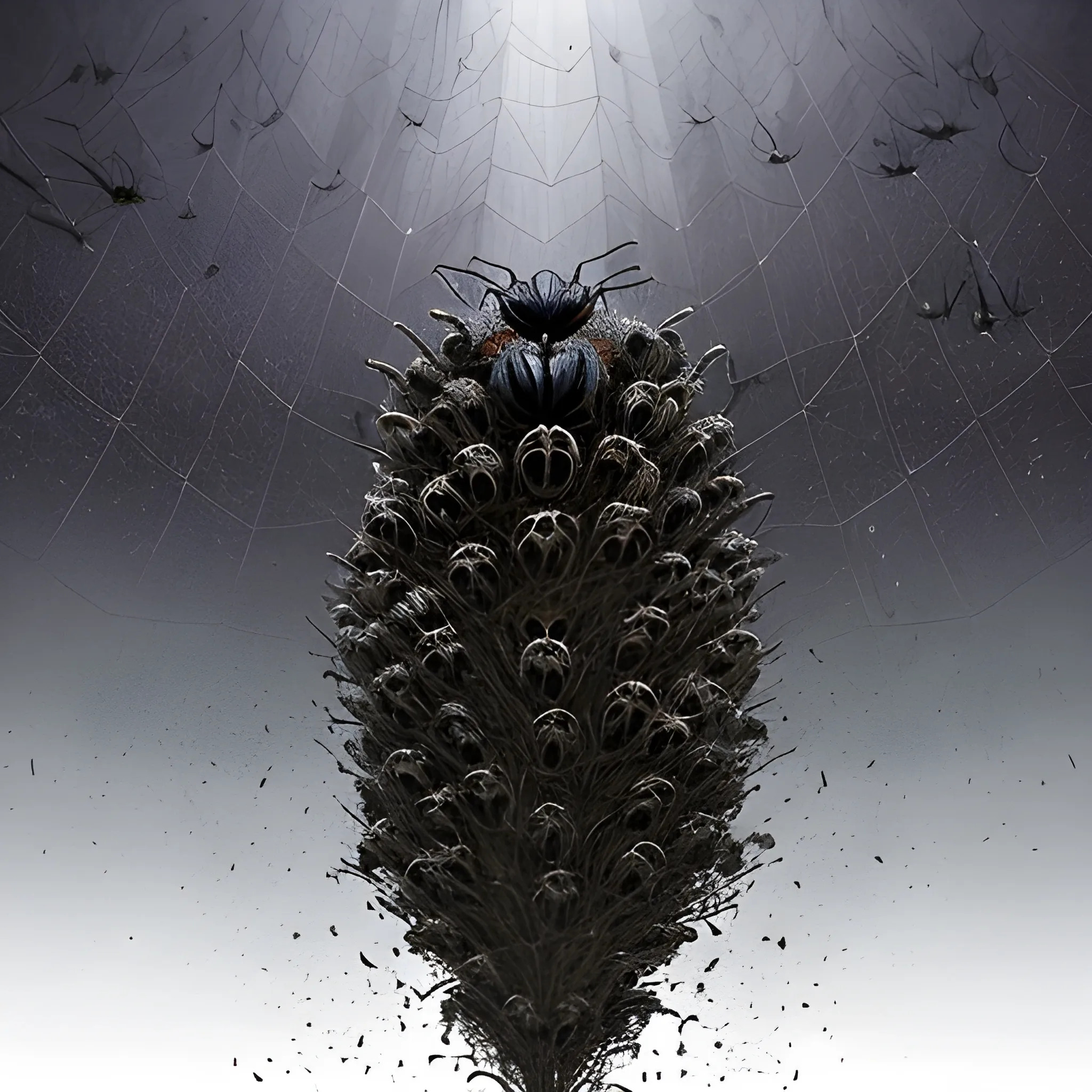
Appearance: A Swarm of Spiders is a horrifying and unsettling sight , as it consists of hundreds or even thousands of spiders working together as a single entity. The swarm appears as a writhing mass of crawling legs , forming a dark and undulating cloud of arachnids. The individual spiders in the swarm vary in size , but they are typically small , ranging from tiny spiders to larger ones with leg spans of a few inches. The swarm's color can range from a mix of dark browns and blacks to lighter hues , depending on the types of spiders comprising it. Features: The Swarm of Spiders moves with a coordinated fluidity , as if guided by an unseen intelligence. While each spider is relatively weak on its own , the collective strength of the swarm is overwhelming. The swarm is highly aggressive , attacking anything that comes within its vicinity. Its bite can deliver venom that , while not deadly , can cause pain , discomfort , and temporary paralysis. The swarm's sheer numbers can be its greatest advantage , allowing it to overwhelm and immobilize even larger creatures. Habitat: Swarms of Spiders are typically found in areas with a high concentration of spiders , such as dense forests , abandoned structures , or ancient ruins. They may inhabit dark and secluded places where their presence can go unnoticed until it's too late for unsuspecting intruders. Behavior: Swarms of Spiders are driven by instinct and the collective intelligence of the individual spiders that make up the swarm. They act as a cohesive unit , attacking en masse to subdue their prey and cocoon it in sticky webs. Swarms of Spiders can move quickly , scaling walls and surfaces with ease , which makes them challenging to escape from once they have engaged a target. Role in the World: In your DND world , Swarms of Spiders could be a terrifying threat lurking in the wild and dark corners of the land. They might be drawn to areas of powerful magic or necromantic influence , serving as guardians to forbidden places or the minions of evil spellcasters. The sight of a Swarm of Spiders can instill fear and panic in adventurers , as they face an unrelenting horde of venomous creatures. Encountering a Swarm of Spiders in your campaign can be a harrowing experience for adventurers. The swarm's ability to cover large areas and its relentless pursuit make it a deadly adversary. Players might need to think creatively to avoid or disperse the swarm , using spells , fire , or other area-of-effect attacks to fend off the spider horde. Additionally , the presence of Swarms of Spiders can create a sense of dread and trepidation , heightening the tension in areas where they are known to dwell , making players ever watchful for the signs of these arachnid hordes. ,
Generate me a logo. Iconography: Incorporate an abstract representation of clothing , a watch , and a shoe seamlessly synchronized together. This could be achieved by creating simplified , geometric shapes that resemble these items overlapping or interlocking with each other. Typography: Choose a modern and clean font for the text "StyleSync Hub". Ensure that it's easily readable and complements the iconography. You might want to consider a sans-serif font to convey a contemporary and stylish feel. Color Scheme: Opt for a sophisticated color palette that reflects the elegance of fashion and accessories. Consider using neutral tones like black , white , and gray as the primary colors , with a pop of color for emphasis. Alternatively , you could incorporate hues that are commonly associated with clothing , watches , and shoes , such as shades of blue , brown , or metallic accents. Composition: Experiment with different arrangements of the iconography and text to find a balanced composition. You could position the iconography either above , below , or to the side of the text , depending on what looks visually appealing and creates a cohesive design. Visual Style: Aim for a sleek and polished visual style that conveys professionalism and reliability. Avoid cluttering the design with unnecessary details and maintain a sense of simplicity and sophistication. ,
Central Icon: Design a logo that prominently features a coffee cup with the steam rising from it. Inside the coffee cup , incorporate a simplified representation of the Santander region's mountainous landscape. This fusion symbolizes the connection between the coffee and the region. Nature Elements: Surround the coffee cup with elements inspired by the natural beauty of Santander , such as native flowers , trees , or birds. These elements can add a touch of the region's unique biodiversity. Colors: Use a color palette that reflects the colors of Santander's natural environment. Shades of green for lush landscapes , earthy tones for coffee , and blues for skies and water bodies would be fitting. Typography: Select a font that matches the personality of your brand , whether it's rustic , modern , or elegant. Ensure that the brand name "Emmanuel Coffee" is clear and legible. Text: Place the brand name "Emmanuel Coffee" and the location "Santander , Colombia" close to or around the central coffee cup icon. Bag Background: Natural Background: Utilize a background image or pattern that showcases the beauty of Santander , with scenes of mountains , valleys , or coffee plantations. This gives a sense of place and highlights the region's connection to the coffee. Colors: Make sure that the background colors complement the logo's palette , creating an overall cohesive and visually appealing design. Product Information: Include important details about your coffee on the back of the bag , such as the coffee's variety , processing method , flavor notes , and any unique qualities that set Emmanuel Coffee apart. Remember , working with a professional graphic designer is crucial to bringing this design concept to life and creating an eye-catching design. Customization will ensure that the design aligns with your brand identity and preferences. Additionally , make sure your coffee bag complies with all legal requirements for coffee packaging and labeling in Colombia and any other markets where you plan to sell your coffee. ,
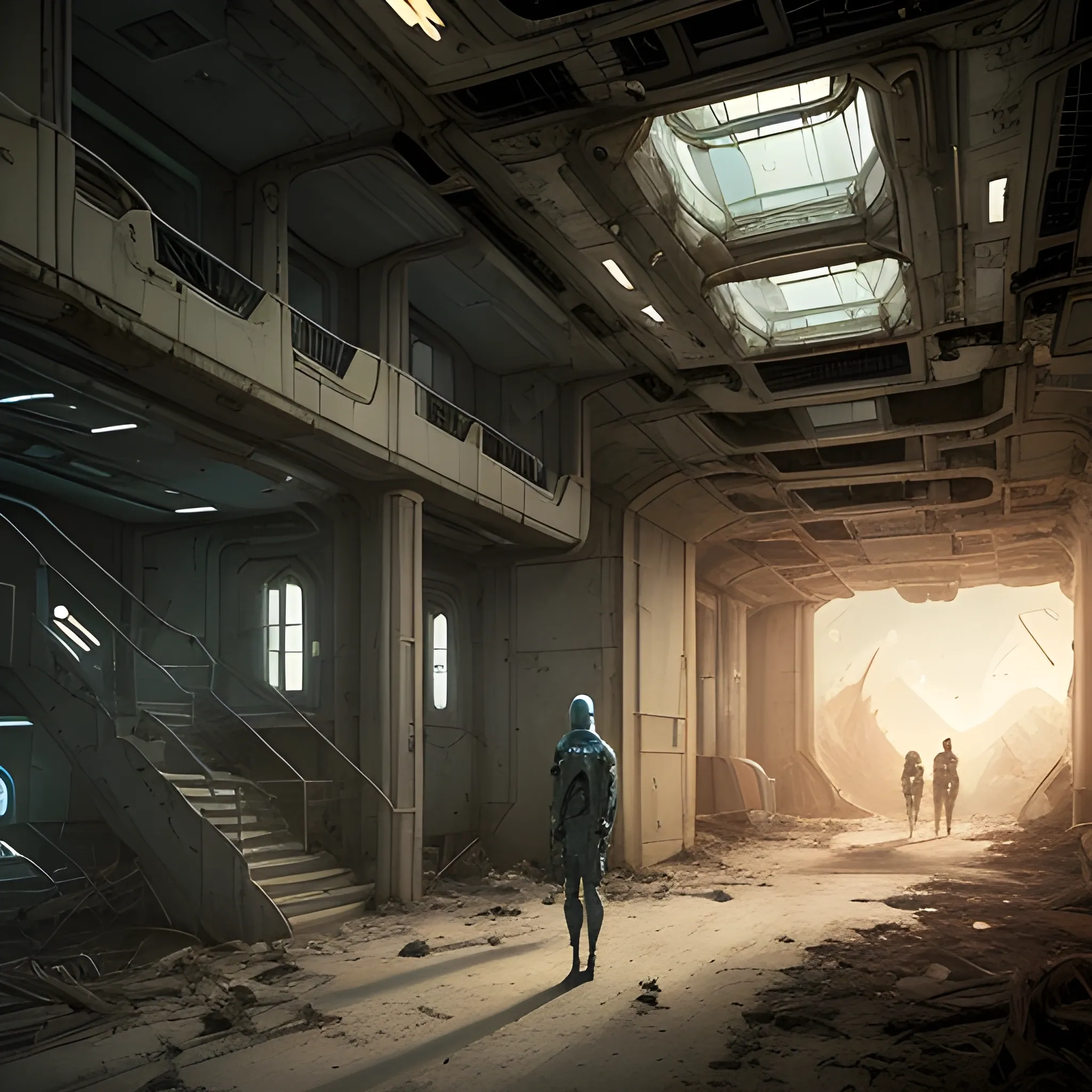
a continuous image for a sci-fi book cover that spans both the front and back. The scene should convey a sense of mystery , isolation , and survival. On the right side of the image , representing the front cover , depict a lone colonist inside a massive , abandoned spaceship in disrepair. The colonist , dressed in a futuristic cryosuit , stands in a dimly lit corridor with flickering lights , showing signs of damage and neglect. The colonist’s expression should convey confusion , determination , and the will to survive , with various pieces of futuristic equipment and survival gear scattered around. As the image transitions to the left side , representing the back cover , the corridor opens up to a large viewing window. Through this window , the planet intended for colonization is visible , hanging in space with a haunting beauty. The planet should appear both inviting and mysterious , with its surface details clear and captivating. The entire scene should be a seamless and continuous image , maintaining a cohesive and balanced design , with a dark , atmospheric color palette to emphasize the themes of mystery and survival. ,
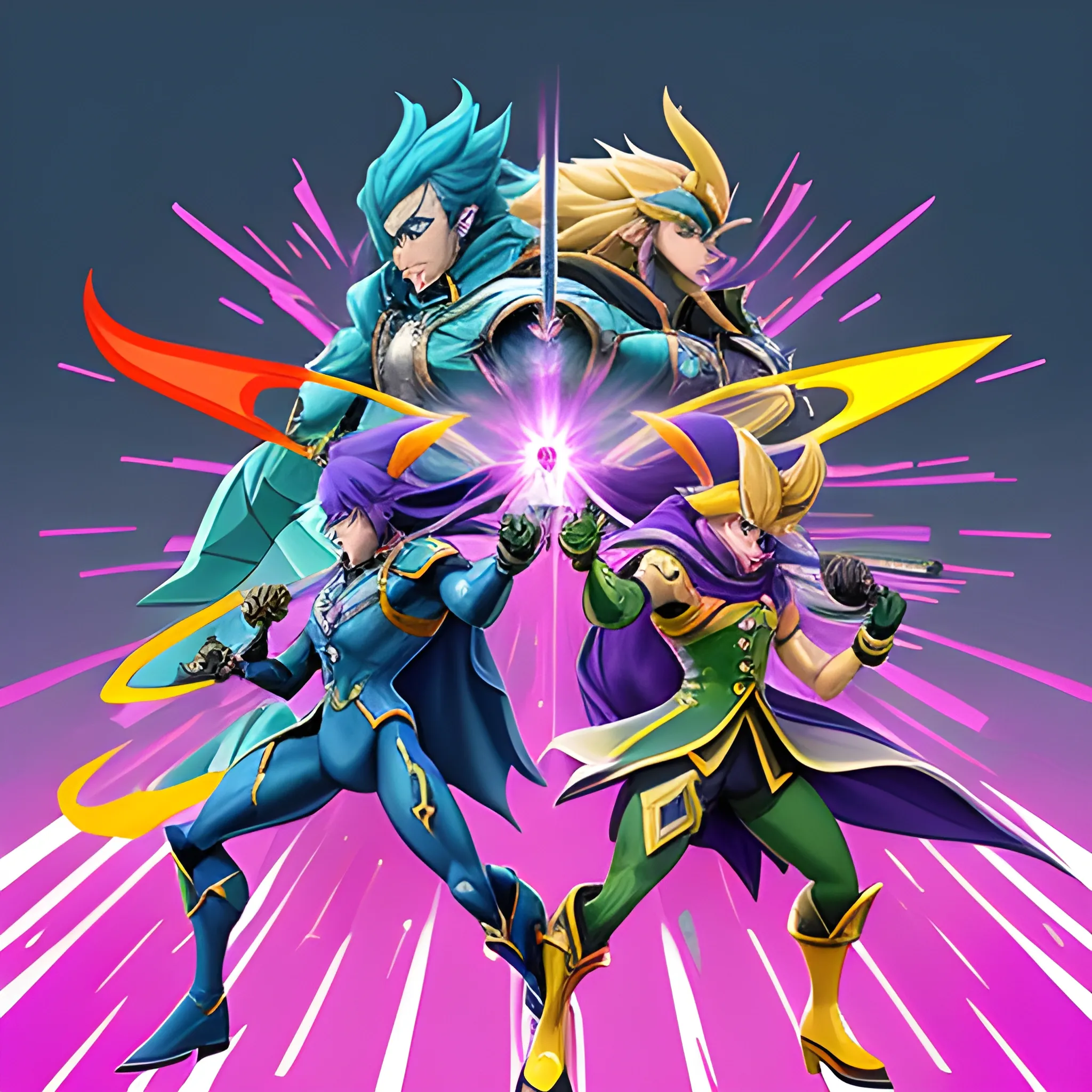
Create a YouTube banner for the gaming channel "PrinceLink86 Gaming" that represents a variety of Nintendo Switch gaming , focusing on a mature and exciting aesthetic. Include the following Super Smash Bros. characters in an action-packed scene: Captain Falcon Roy from Fire Emblem Ike from Fire Emblem Princess Peach Joker from Persona 5 Sonic the Hedgehog King Dedede King K. Rool Mr. Game & Watch The characters should be engaged in dynamic poses or a battle scene that conveys intensity and excitement. Use a color palette that is vibrant yet sophisticated , avoiding overly bright or childish tones. The background can feature elements from various Nintendo environments , blended seamlessly to create a cohesive look. Ensure the banner includes the channel name "PrinceLink86 Gaming" in a bold , modern font that complements the action-packed theme. The overall design should appeal to a broad audience , emphasizing the fun and competitive nature of the channel. ,
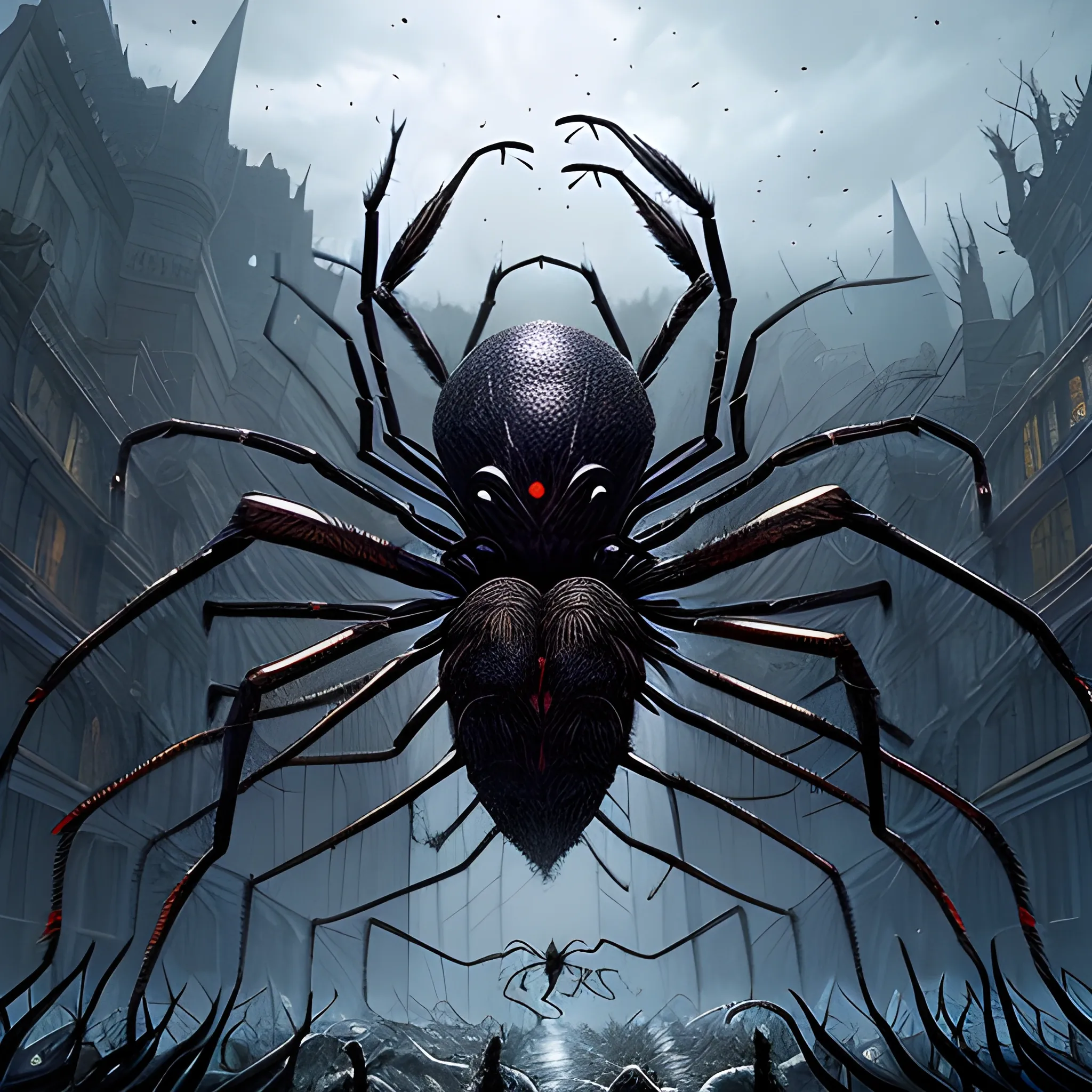
Appearance: A Swarm of Spiders is a horrifying and unsettling sight , as it consists of hundreds or even thousands of spiders working together as a single entity. The swarm appears as a writhing mass of crawling legs , forming a dark and undulating cloud of arachnids. The individual spiders in the swarm vary in size , but they are typically small , ranging from tiny spiders to larger ones with leg spans of a few inches. The swarm's color can range from a mix of dark browns and blacks to lighter hues , depending on the types of spiders comprising it. Features: The Swarm of Spiders moves with a coordinated fluidity , as if guided by an unseen intelligence. While each spider is relatively weak on its own , the collective strength of the swarm is overwhelming. The swarm is highly aggressive , attacking anything that comes within its vicinity. Its bite can deliver venom that , while not deadly , can cause pain , discomfort , and temporary paralysis. The swarm's sheer numbers can be its greatest advantage , allowing it to overwhelm and immobilize even larger creatures. Habitat: Swarms of Spiders are typically found in areas with a high concentration of spiders , such as dense forests , abandoned structures , or ancient ruins. They may inhabit dark and secluded places where their presence can go unnoticed until it's too late for unsuspecting intruders. Behavior: Swarms of Spiders are driven by instinct and the collective intelligence of the individual spiders that make up the swarm. They act as a cohesive unit , attacking en masse to subdue their prey and cocoon it in sticky webs. Swarms of Spiders can move quickly , scaling walls and surfaces with ease , which makes them challenging to escape from once they have engaged a target. Role in the World: In your DND world , Swarms of Spiders could be a terrifying threat lurking in the wild and dark corners of the land. They might be drawn to areas of powerful magic or necromantic influence , serving as guardians to forbidden places or the minions of evil spellcasters. The sight of a Swarm of Spiders can instill fear and panic in adventurers , as they face an unrelenting horde of venomous creatures. Encountering a Swarm of Spiders in your campaign can be a harrowing experience for adventurers. The swarm's ability to cover large areas and its relentless pursuit make it a deadly adversary. Players might need to think creatively to avoid or disperse the swarm , using spells , fire , or other area-of-effect attacks to fend off the spider horde. Additionally , the presence of Swarms of Spiders can create a sense of dread and trepidation , heightening the tension in areas where they are known to dwell , making players ever watchful for the signs of these arachnid hordes. ,
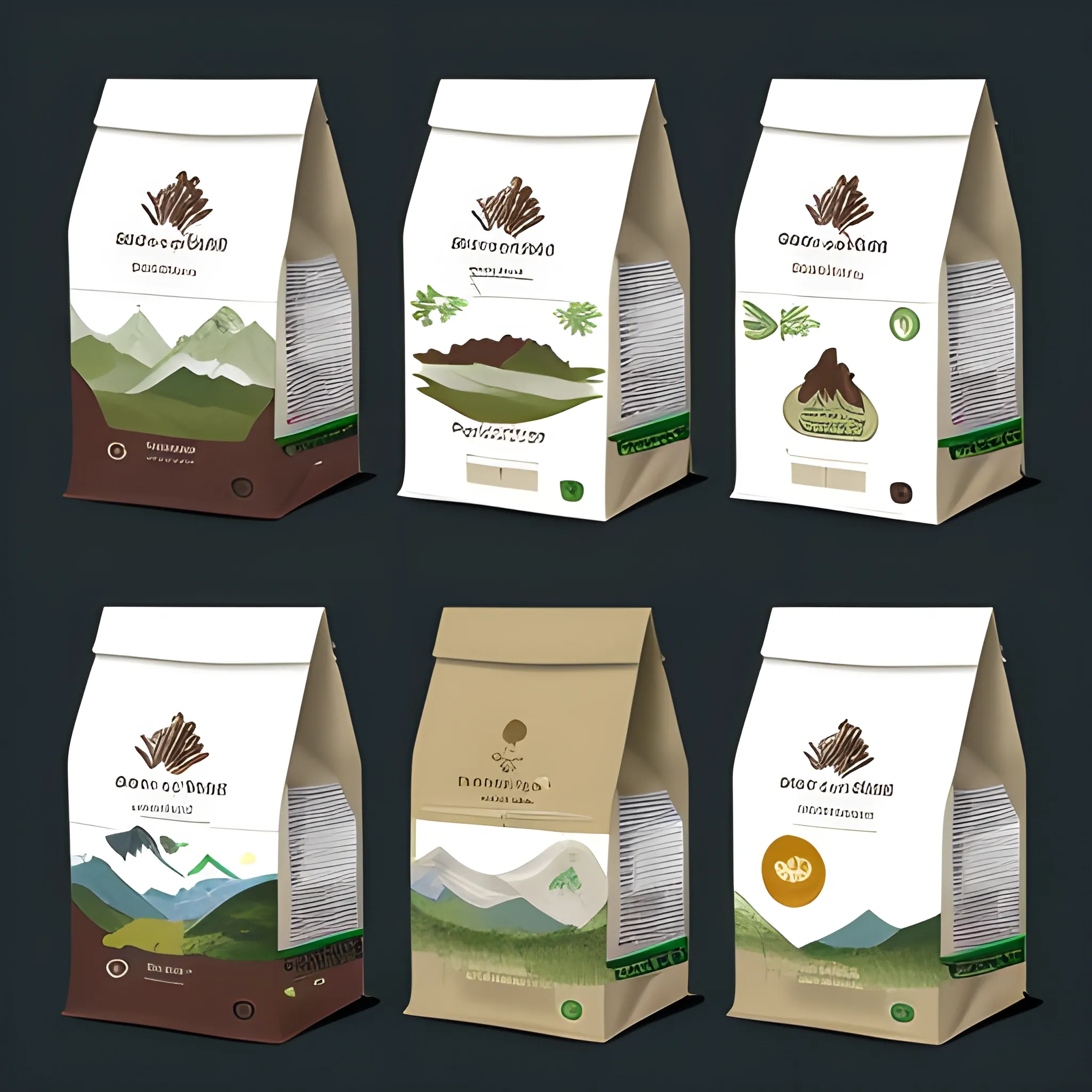
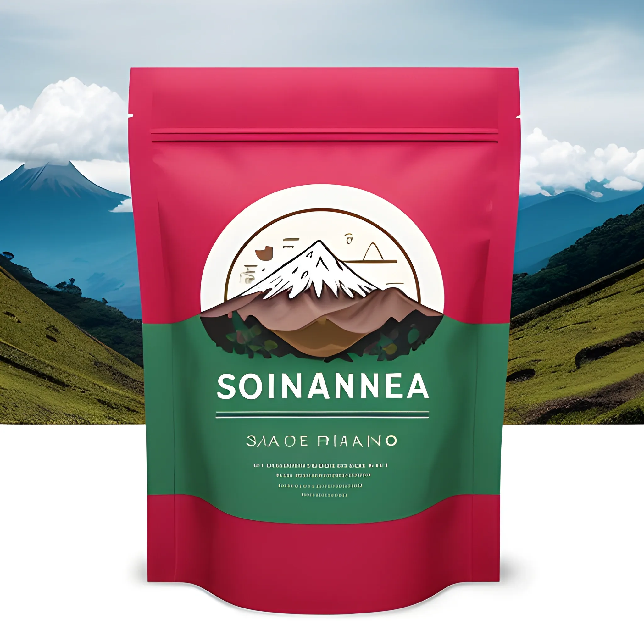
Central Icon: Use a central design representing a mountain with a coffee plantation at its base. This symbolizes the location in the Páramo of Santander and coffee production. Nature: Surround the mountain and coffee plantation with elements of the páramo's flora and fauna , such as birds , wildflowers , and typical vegetation. This highlights the richness of the region's biodiversity. Colors: Use a color palette that represents the region's nature and climate. Shades of green for vegetation and blue for the sky and bodies of water can be suitable. You can also incorporate brown and green tones to represent ripe coffee beans. Typography: Choose a rustic or artisanal-style font for your coffee's name. This evokes authenticity and craftsmanship in coffee production in the region. Text: Place your coffee's name and location , "Páramo de Santander , Colombia , " below or around the central icon. Bag Background: Natural Background: Use an image or pattern that represents the beauty of the Páramo of Santander , such as a mountainous landscape , a panoramic view , or even a drawing of páramo vegetation. This adds authenticity and visual appeal to the bag. Colors: Keep the background color palette in harmony with the logo's colors to create a cohesive appearance. Product Information: Include details about the type of coffee , the cultivation and harvesting process , as well as flavor and aroma notes on the back of the bag. Remember that it's essential to work with a graphic designer or design agency to create an attractive and effective coffee bag. This design is just an initial suggestion and can be customized according to your preferences and your coffee's identity. Also , ensure that the bag complies with all legal and labeling requirements applicable to coffee sales in Colombia and other markets. ,
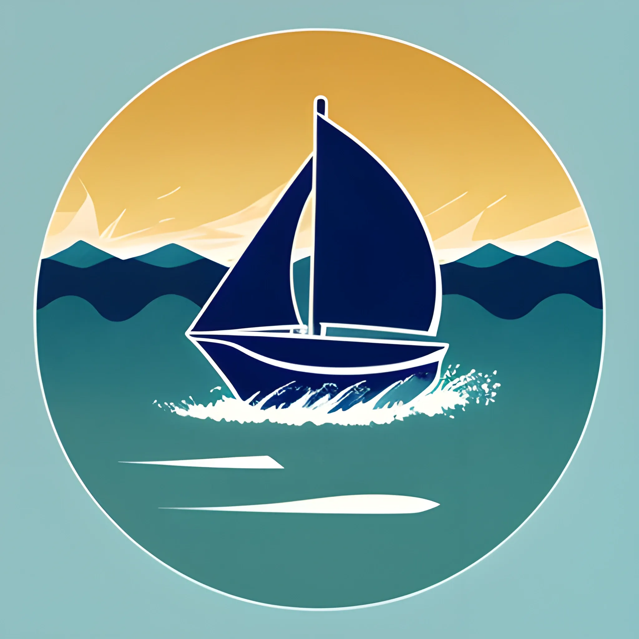
Logo Design Description: Sailboat Icon: The central element of the logo is a stylized sailboat , symbolizing the school newspaper as a vessel embarking on a journey of knowledge. The sailboat is depicted with a dynamic stance , capturing the essence of progress and exploration. Sailing Waves: Beneath the sailboat , there are subtle wave patterns , indicating the fluidity and ever-changing nature of information and ideas. The waves also represent the dynamic environment of a school campus. Ascending Arrow: The sail of the boat forms an upward-pointing arrow , emphasizing the idea of progress , growth , and the pursuit of excellence. This arrow signifies the newspaper's role in guiding students and readers toward new heights of knowledge. Gradient Blue Palette: The logo features a gradient of blue shades , ranging from a deep ocean blue to a lighter sky blue. This color scheme conveys a sense of depth , representing the vast sea of knowledge and the limitless possibilities for learning. Open Book Symbol: Adjacent to the sailboat , an open book adds an academic touch to the design. It reinforces the newspaper's commitment to education , learning , and the dissemination of valuable information. "启航" Typography: The Chinese characters for "启航" (Qihang) are incorporated into the design with a clean and modern font. This not only reinforces the newspaper's identity but also adds a touch of cultural significance. The combination of these elements creates a visually appealing and meaningful logo for the school newspaper "启航 , " capturing the spirit of exploration , knowledge , and academic advancement. The logo's dynamic and cohesive design ensures its versatility across various platforms and applications. , 3D , Cartoon , Water Color ,
As an AI designer , my goal is to generate a unique and captivating image for a logo that encompasses the themes of sweets , chocolates , brownies , cookies , bread , and other delicious treats. The logo should be related to the name "Dulce al Paladar" (Sweet to the Palate) and consist of borders only , creatively connecting the name with the visual elements. Description: Imagine a visually enticing logo that brings together the mouthwatering delights associated with "Dulce al Paladar." The logo should evoke a sense of indulgence , with distinct borders forming a cohesive representation of the café's theme. Begin by visualizing a circular shape as the foundation of the logo. This circular border represents the concept of a plate or serving dish , signifying the café's dedication to providing a wide range of delectable treats. The border should be thick and slightly textured , resembling the rim of a fancy dessert plate. Within the circular border , incorporate various elements that symbolize the diverse range of offerings at "Dulce al Paladar." Start by including a decadent chocolate truffle at the top. Its smooth , rounded edges should be represented by a delicate border , emphasizing its irresistible richness. To the right of the truffle , include a luscious-looking brawny square , defined by bold and slightly jagged borders. This represents the café's signature brownies , known for their dense and fudgy texture. The brawny square should appear indulgent and inviting. Beneath the brawny square , incorporate a pair of crossed cookies. The cookies should have distinct borders outlining their circular shapes , while their texture can be suggested through crisscrossing lines within the borders. This element pays homage to the café's freshly baked cookies , enticing customers with their delightful aroma. On the left side of the logo , include a small loaf of bread , represented by a wavy border that mimics the contours of a freshly baked loaf. The irregular edges symbolize the artisanal nature of the café's bread offerings , highlighting their homemade charm. To connect all the elements and emphasize the concept of sweetness , incorporate a delicate border of intertwined candy ribbons that weave throughout the logo. These borders should be smooth , curving and intertwining with the other elements , creating a harmonious visual composition. Finally , in a playful yet legible font , write the café's name , "Dulce al Paladar , " along the bottom border of the logo. The letters should be defined by clean borders , reflecting the minimalist aesthetic of the overall design. Consider incorporating slight curves or flourishes into the lettering to echo the elegant contours found throughout the logo. Ensure that the logo remains in black and white , with all elements defined by borders only. This minimalist approach allows for versatility and easy reproduction across various applications while preserving an air of sophistication. The resulting logo should evoke a sense of anticipation and delight , enticing customers to explore the sweet treasures offered at "Dulce al Paladar." ,
Create a YouTube banner for the gaming channel "PrinceLink86 Gaming" that represents a variety of Nintendo Switch gaming , focusing on a mature and exciting aesthetic. Include the following Super Smash Bros. characters in an action-packed scene: Captain Falcon Roy from Fire Emblem Ike from Fire Emblem Princess Peach Joker from Persona 5 Sonic the Hedgehog King Dedede King K. Rool Mr. Game & Watch Link Mario Samus Aran Pikachu Zelda Donkey Kong Kirby Fox McCloud Yoshi Ganondorf Marth from Fire Emblem Meta Knight The characters should be engaged in dynamic poses or a battle scene that conveys intensity and excitement. Use a color palette that is vibrant yet sophisticated , avoiding overly bright or childish tones. For the background , blend elements from various iconic Nintendo environments , such as: A futuristic cityscape from F-Zero for Captain Falcon. A medieval castle setting for Roy , Ike , and Marth from Fire Emblem. A colorful and whimsical Mushroom Kingdom setting for Princess Peach. A modern urban setting inspired by Persona 5 for Joker. A high-speed Green Hill Zone for Sonic the Hedgehog. A grand , throne room or arena for King Dedede and King K. Rool. A retro , pixelated environment for Mr. Game & Watch. A lush forest and ancient ruins for Link. A classic platforming world for Mario. A sci-fi landscape for Samus Aran. A vibrant and electric battlefield for Pikachu. A magical kingdom for Zelda. A jungle setting for Donkey Kong. A dreamland setting for Kirby. A space station or outer space for Fox McCloud. A tropical island for Yoshi. A dark and ominous castle for Ganondorf. A mysterious and shadowy battleground for Meta Knight. The backgrounds should merge seamlessly to create a cohesive and dynamic look. Ensure the banner includes the channel name "PrinceLink86 Gaming" in a bold , modern font that complements the action-packed theme. The overall design should appeal to a broad audience , emphasizing the fun and competitive nature of the channel. ,
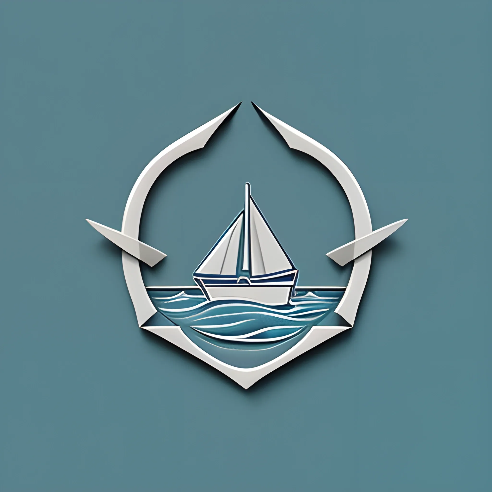
Logo Design Description: Sailboat Icon: The central element of the logo is a stylized sailboat , symbolizing the school newspaper as a vessel embarking on a journey of knowledge. The sailboat is depicted with a dynamic stance , capturing the essence of progress and exploration. Sailing Waves: Beneath the sailboat , there are subtle wave patterns , indicating the fluidity and ever-changing nature of information and ideas. The waves also represent the dynamic environment of a school campus. Ascending Arrow: The sail of the boat forms an upward-pointing arrow , emphasizing the idea of progress , growth , and the pursuit of excellence. This arrow signifies the newspaper's role in guiding students and readers toward new heights of knowledge. Gradient Blue Palette: The logo features a gradient of blue shades , ranging from a deep ocean blue to a lighter sky blue. This color scheme conveys a sense of depth , representing the vast sea of knowledge and the limitless possibilities for learning. Open Book Symbol: Adjacent to the sailboat , an open book adds an academic touch to the design. It reinforces the newspaper's commitment to education , learning , and the dissemination of valuable information. "启航" Typography: The Chinese characters for "启航" (Qihang) are incorporated into the design with a clean and modern font. This not only reinforces the newspaper's identity but also adds a touch of cultural significance. The combination of these elements creates a visually appealing and meaningful logo for the school newspaper "启航 , " capturing the spirit of exploration , knowledge , and academic advancement. The logo's dynamic and cohesive design ensures its versatility across various platforms and applications. , 3D , Cartoon , Trippy , Pencil Sketch , Water Color ,
As an AI designer , my goal is to generate a unique and captivating image for a logo that encompasses the themes of sweets , chocolates , brownies , cookies , bread , and other delicious treats. The logo should be related to the name "Dulce al Paladar" (Sweet to the Palate) and consist of borders only , creatively connecting the name with the visual elements. Description: Imagine a visually enticing logo that brings together the mouthwatering delights associated with "Dulce al Paladar." The logo should evoke a sense of indulgence , with distinct borders forming a cohesive representation of the café's theme. Begin by visualizing a circular shape as the foundation of the logo. This circular border represents the concept of a plate or serving dish , signifying the café's dedication to providing a wide range of delectable treats. The border should be thick and slightly textured , resembling the rim of a fancy dessert plate. Within the circular border , incorporate various elements that symbolize the diverse range of offerings at "Dulce al Paladar." Start by including a decadent chocolate truffle at the top. Its smooth , rounded edges should be represented by a delicate border , emphasizing its irresistible richness. To the right of the truffle , include a luscious-looking brawny square , defined by bold and slightly jagged borders. This represents the café's signature brownies , known for their dense and fudgy texture. The brawny square should appear indulgent and inviting. Beneath the brawny square , incorporate a pair of crossed cookies. The cookies should have distinct borders outlining their circular shapes , while their texture can be suggested through crisscrossing lines within the borders. This element pays homage to the café's freshly baked cookies , enticing customers with their delightful aroma. On the left side of the logo , include a small loaf of bread , represented by a wavy border that mimics the contours of a freshly baked loaf. The irregular edges symbolize the artisanal nature of the café's bread offerings , highlighting their homemade charm. To connect all the elements and emphasize the concept of sweetness , incorporate a delicate border of intertwined candy ribbons that weave throughout the logo. These borders should be smooth , curving and intertwining with the other elements , creating a harmonious visual composition. Finally , in a playful yet legible font , write the café's name , "Dulce al Paladar , " along the bottom border of the logo. The letters should be defined by clean borders , reflecting the minimalist aesthetic of the overall design. Consider incorporating slight curves or flourishes into the lettering to echo the elegant contours found throughout the logo. Ensure that the logo remains in black and white , with all elements defined by borders only. This minimalist approach allows for versatility and easy reproduction across various applications while preserving an air of sophistication. The resulting logo should evoke a sense of anticipation and delight , enticing customers to explore the sweet treasures offered at "Dulce al Paladar." ,

Create an Arcane-inspired matte painting featuring a full-height portrait of a young male villain with intricate details , Gothic-inspired features , and sharp , smooth strokes. Center the portrait with the villain in a dynamic full-body shot and a stylized , blurred bokeh background that evokes the dark magic and otherworldly mystery of the Arcane universe. Take inspiration from artists like Ruan Jia , Ilya Kuvshinov , Alphonse Mucha , and RossDraws to create a cohesive composition that emphasizes the villain's unique personality and traits while highlighting the eerie , Arcane-inspired atmosphere 3D ,
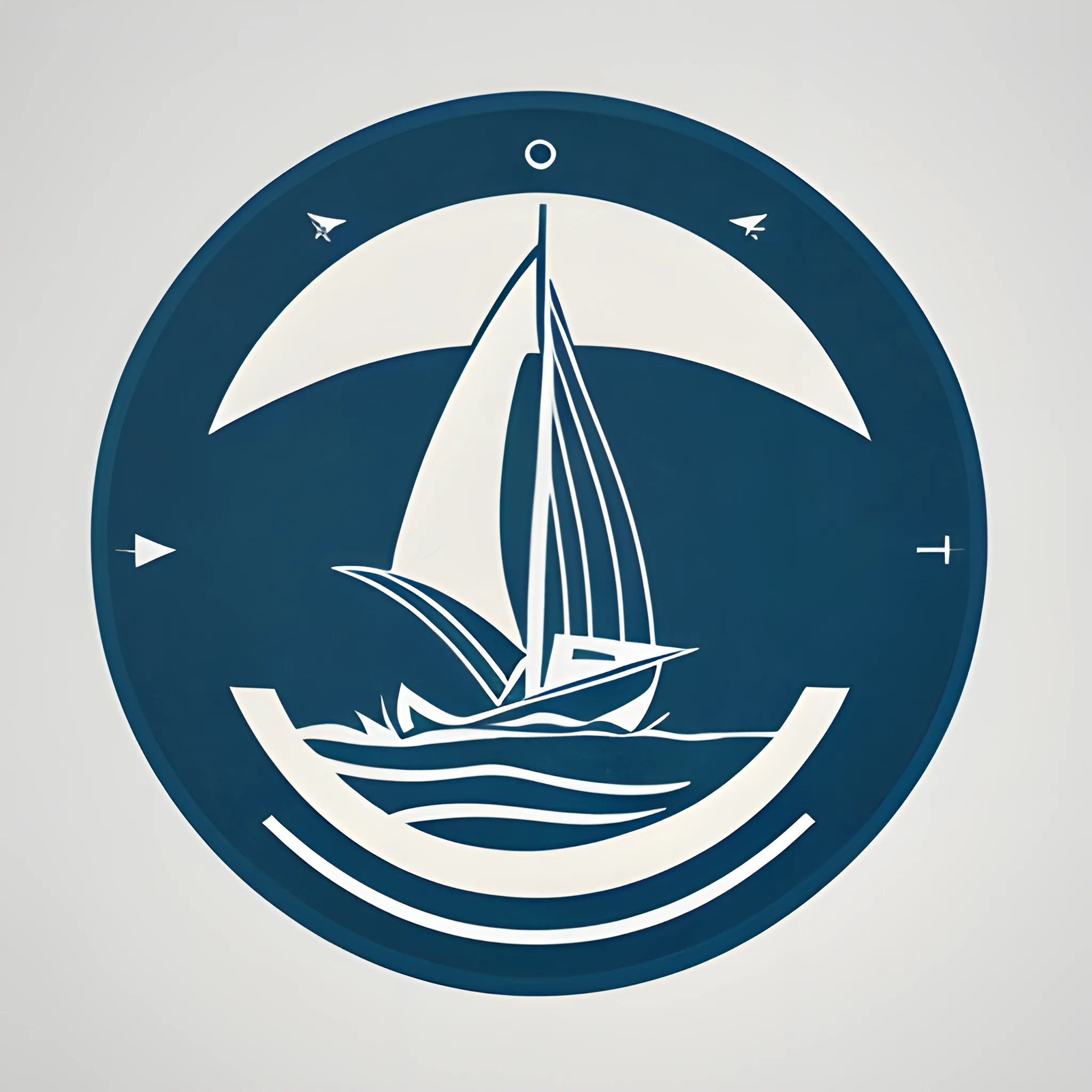
Logo Design Description: Sailboat Icon: The central element of the logo is a stylized sailboat , symbolizing the school newspaper as a vessel embarking on a journey of knowledge. The sailboat is depicted with a dynamic stance , capturing the essence of progress and exploration. Sailing Waves: Beneath the sailboat , there are subtle wave patterns , indicating the fluidity and ever-changing nature of information and ideas. The waves also represent the dynamic environment of a school campus. Ascending Arrow: The sail of the boat forms an upward-pointing arrow , emphasizing the idea of progress , growth , and the pursuit of excellence. This arrow signifies the newspaper's role in guiding students and readers toward new heights of knowledge. Gradient Blue Palette: The logo features a gradient of blue shades , ranging from a deep ocean blue to a lighter sky blue. This color scheme conveys a sense of depth , representing the vast sea of knowledge and the limitless possibilities for learning. Open Book Symbol: Adjacent to the sailboat , an open book adds an academic touch to the design. It reinforces the newspaper's commitment to education , learning , and the dissemination of valuable information. "启航" Typography: The Chinese characters for "启航" (Qihang) are incorporated into the design with a clean and modern font. This not only reinforces the newspaper's identity but also adds a touch of cultural significance. The combination of these elements creates a visually appealing and meaningful logo for the school newspaper "启航 , " capturing the spirit of exploration , knowledge , and academic advancement. The logo's dynamic and cohesive design ensures its versatility across various platforms and applications. , 3D , Cartoon , Water Color ,