
moisesgamer3302
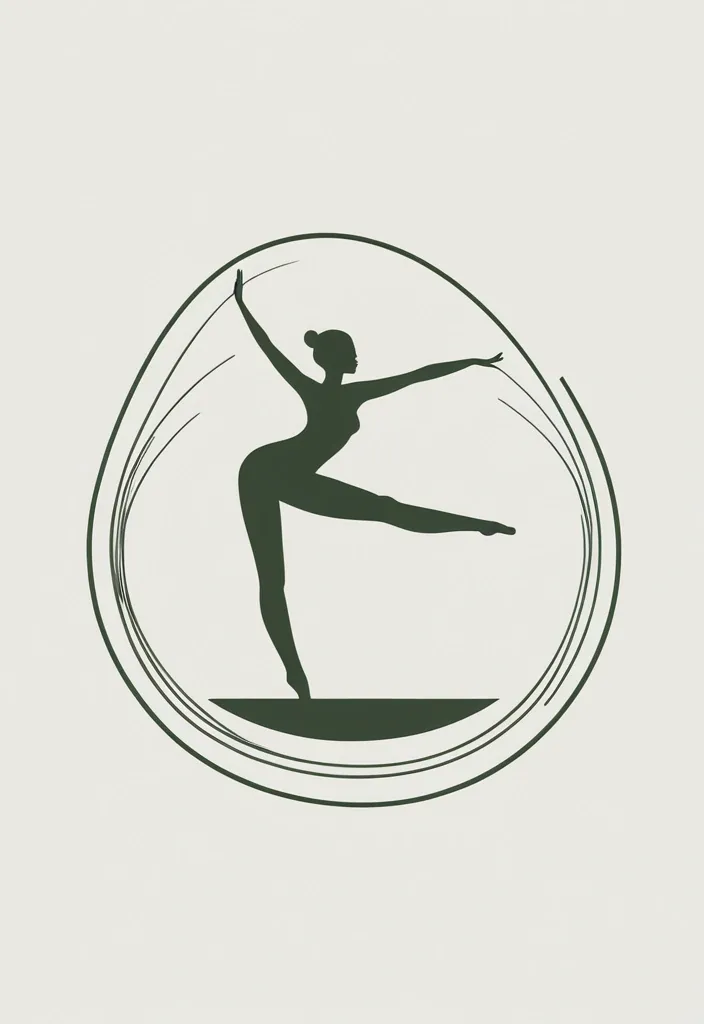
*An ultra-minimalist , high-end logo for a Pilates and holistic wellness studio. The design consists solely of a single , symbolic icon—no text—centered on a pristine white background. The icon is a gracefully stylized human silhouette in a poised Pilates posture (e.g. , single-leg balance or controlled extension) , rendered with feather-light , fluid lines that evoke breath , flow , and mindful movement. Key detail: the foot is clearly elevated or delicately detached from the ground—creating intentional negative space between the sole and an implied floor—emphasizing lightness , recovery , and dynamic balance. The entire silhouette uses clean , ultra-thin line work (0.25–0.5 pt equivalent) , with subtle curvature and tapered ends , avoiding any heaviness or visual clutter. Color palette: a sophisticated harmony of muted moss green (#6B8E6B or similar) , warm ivory beige (#F5F0E6) , and soft graphite grey (#4A4A4A) , applied with high contrast but gentle tonal transitions. Use color sparingly—ideally one or two tones max—to maintain elegance and scalability. The overall aesthetic merges architectural precision with organic softness: think Japanese minimalism meets Scandinavian wellness design. It must feel serene , inclusive , and quietly powerful—conveying feminine energy without excluding any gender. Optimized for die-cut production , luxury merchandise (tote bags , ceramic mugs , apparel embroidery) , and large-format signage. Every curve must be vector-ready , with no fills—only delicate contours that breathe negative space.* ,