Search Results for rob
Explore AI generated designs, images, art and prompts by top community artists and designers.
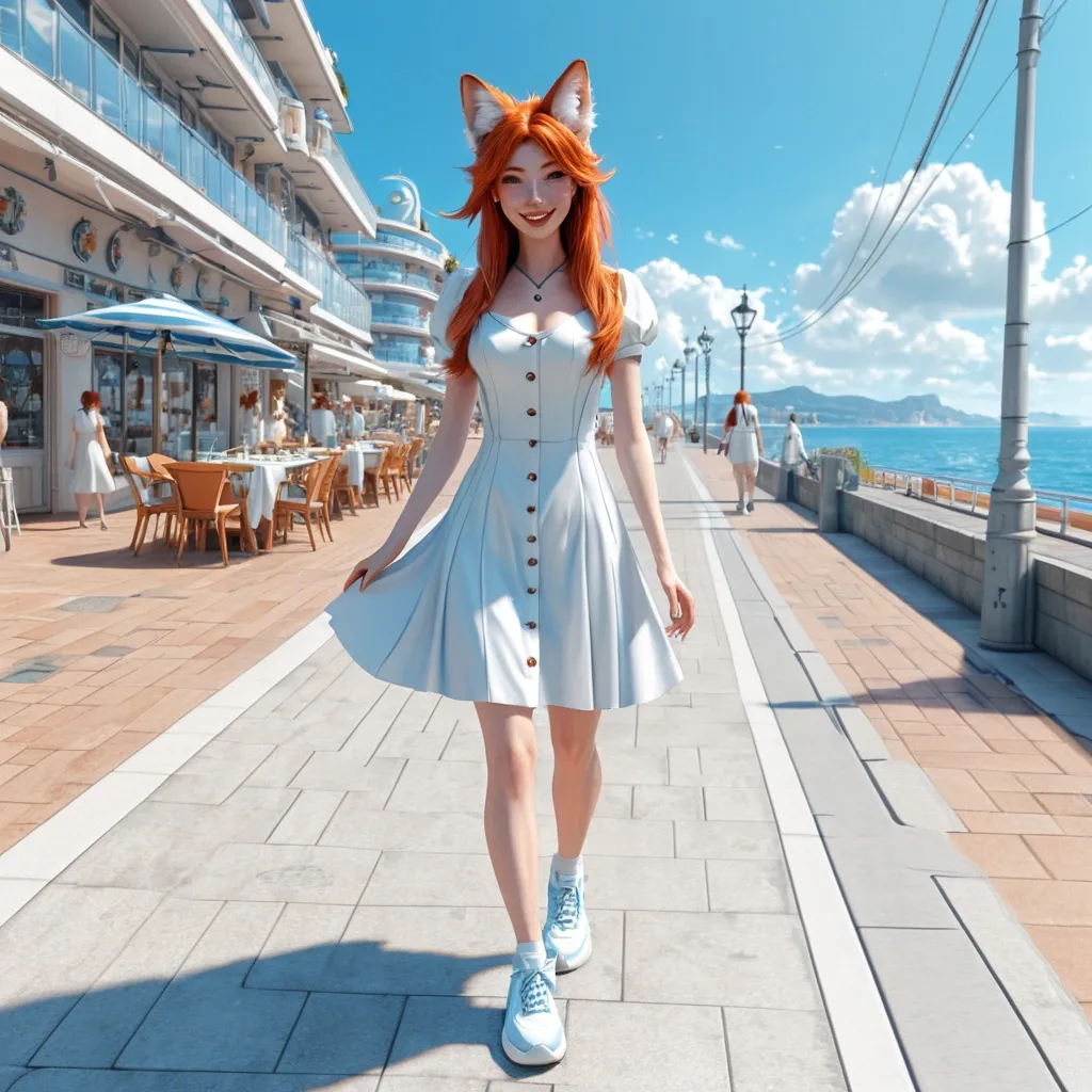

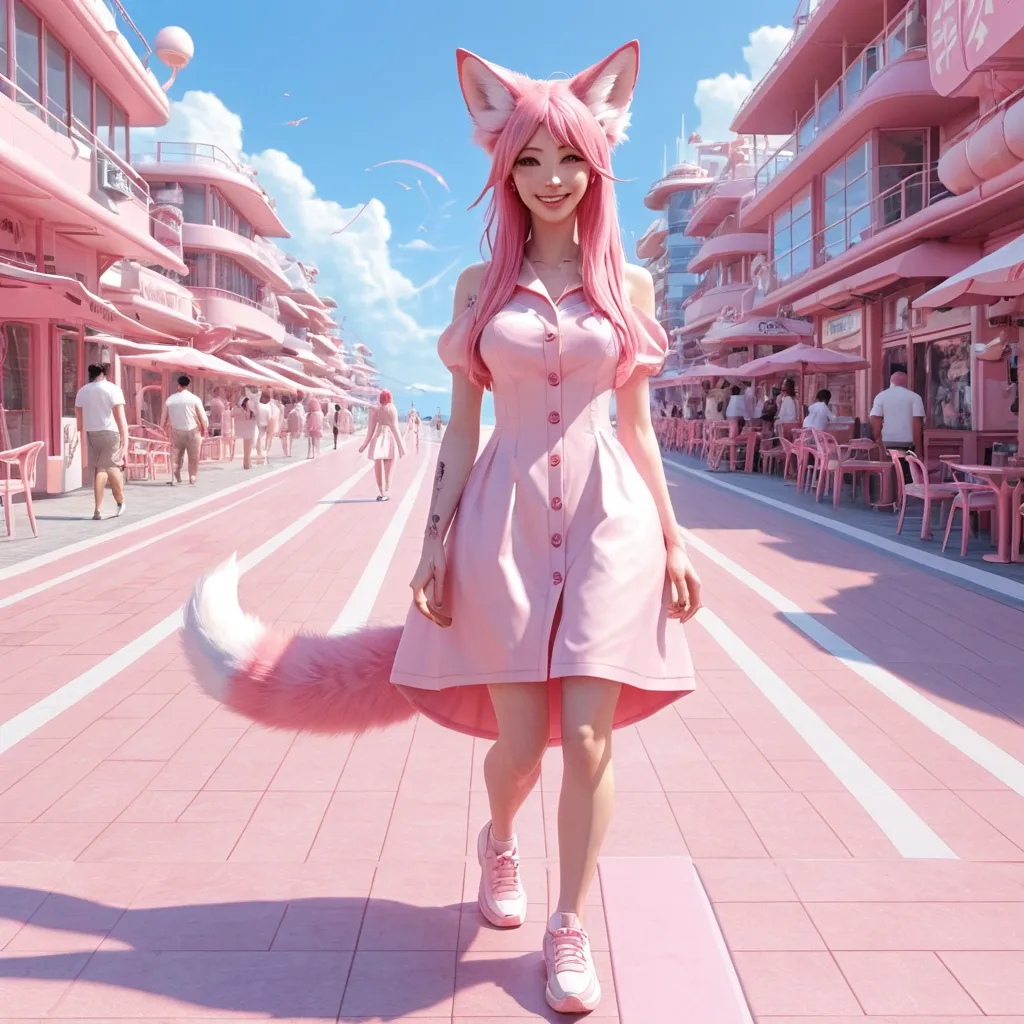
Photorealistic masterpiece in full body , a beautiful 18-year-old redhead teenage kitsune , visage humain , une queue , oreilles de renard , portant une legere robe d'été boutonnée devant et des légères baskets bleues dans une rue futuriste de science fiction d'une station balnéaire , She walks smiling , a sunny afternoon ,
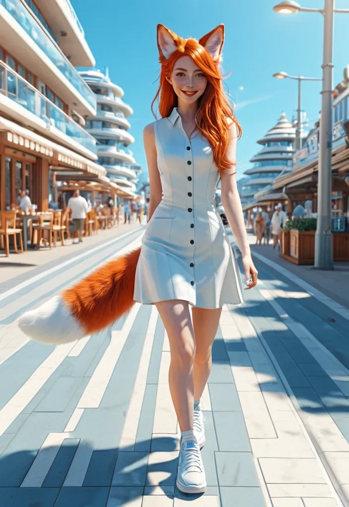
Photorealistic masterpiece in full body , a beautiful 18-year-old redhead teenage kitsune , visage humain , une queue , oreilles de renard , portant une legere robe d'été boutonnée devant et des légères sneakers bleues dans une rue futuriste de science fiction d'une station balnéaire , She walks smiling , a sunny afternoon ,
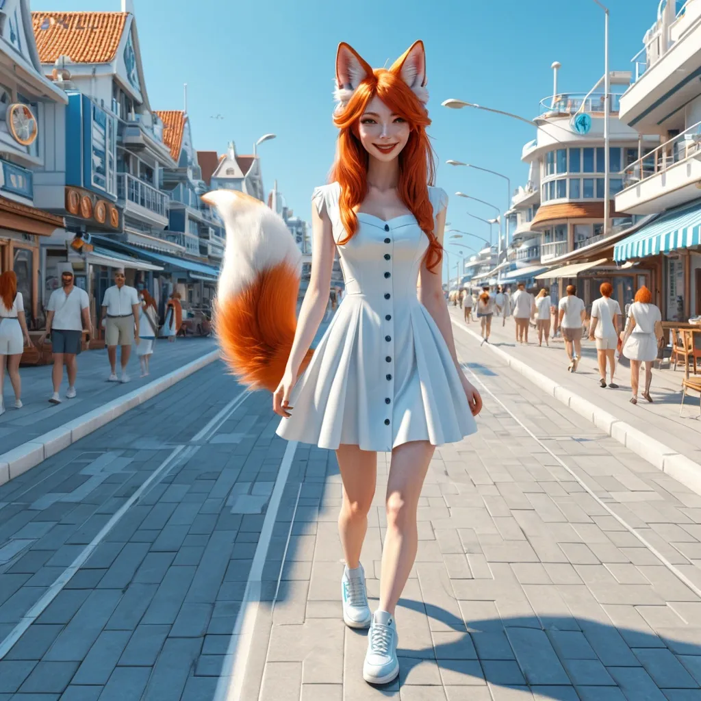
Photorealistic masterpiece in full body , a beautiful 18-year-old redhead teenage kitsune , visage humain , une queue , oreilles de renard , portant une legere robe d'été boutonnée devant et des légères baskets bleues dans une rue futuriste de science fiction d'une station balnéaire , She walks smiling , a sunny afternoon ,
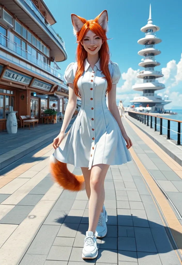
Photorealistic masterpiece in full body , a beautiful 18-year-old redhead teenage kitsune , visage humain , une queue , oreilles de renard , portant une legere robe d'été boutonnée devant et des légères baskets bleues dans une rue futuriste de science fiction d'une station balnéaire , She walks smiling , a sunny afternoon ,
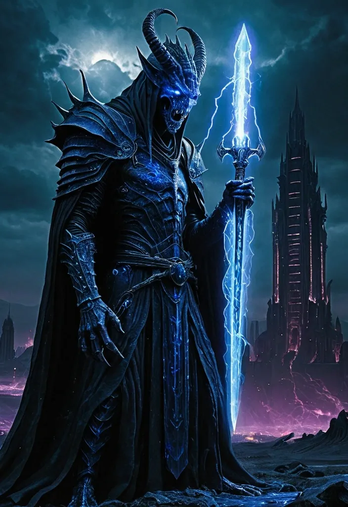
A holographic Xenomorph a blue dragonborn sorcerer. He wears black robes. He holds a blue runic longsword crackling with lightning , looms over a desolate cityscape composed of towering , dark chrome structures. Its form constantly shifts and distorts , a chaotic cascade of code and light , projecting an aura of immense , unpredictable power and digital corruption. The scene evokes immense scale and profound existential dread , characteristic of cosmic horror. This is depicted in a hyperrealistic , dark fantasy style , with a dramatic chiaroscuro lighting and a color palette dominated by deep blues , purples , and blacks , reminiscent of Zdzisław Beksiński's work. ,
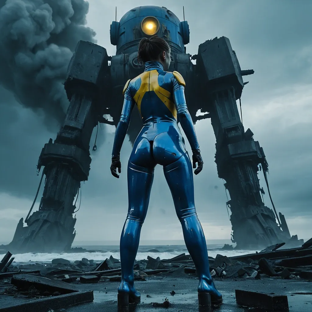
Close up view on A female wearing dirty form-fitting blue latex suit with yellow 101 on the back , reloading her phaser , pale strong thighs stands silhouetted against a blood-red , post-apocalyptic nuclear explosion , dark clouds roiling. The smoking ruins of a once-grand open-air , circular , Neoclassical-style Dome looming behind her , its pillar spires broken and twisted , a giant mecha robot running through the wreck emit black smokes. Sea waves dance in the harsh , dramatic light , casting different shades of blue. The scene is rendered in a hyperrealistic , cinematic style with intense , moody lighting reminiscent of a Fallout Bridge Burning ,
Close up view on A female wearing dirty form-fitting blue latex suit with yellow 101 on the back , reloading her phaser , pale strong thighs stands silhouetted against a blood-red , post-apocalyptic nuclear explosion , dark clouds roiling. The smoking ruins of a once-grand Jefferson Memorial looming behind her , its pillar spires broken and twisted , a giant mecha robot running through the wreck emit black smokes. Quinjet flying across the clouds , guns blazing. Sea waves dance in the harsh , dramatic light , casting different shades of blue. The scene is rendered in a hyperrealistic , cinematic style with intense , moody lighting reminiscent of a Fallout Bridge Burning intricate mech details , ground level shot , 8K resolution , Cinema 4D , Behance HD , polished metal , Unreal Engine 5 , rendered in Blender , sci-fi , futuristic , trending on Artstation , epic , cinematic background , dramatic , atmospheric ,
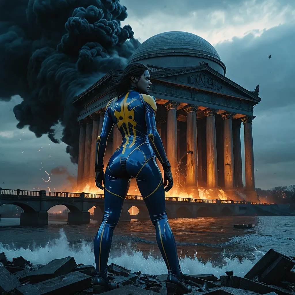
Close up view on A female wearing dirty form-fitting blue latex suit with yellow 101 on the back , pale strong thighs stands silhouetted against a blood-red , post-apocalyptic sunset , dark clouds roiling. The smoking ruins of a once-grand bridge looming behind her , its pillar spires broken and twisted , a giant robot running through the wreck emit black smokes. Beyond the bridge is ruined Jefferson Memorial with smokes and laser fire upward. A black-smoke-emitting airship tilted and falling to the water. Sea waves dance in the harsh , dramatic light , casting different shades of blue. The scene is rendered in a hyperrealistic , cinematic style with intense , moody lighting reminiscent of a Fallout Bridge Burning , detailed matte painting , deep color , fantastical , intricate detail , splash screen , complementary colors , fantasy concept art , 8k resolution trending on Artstation Unreal Engine 5 ,
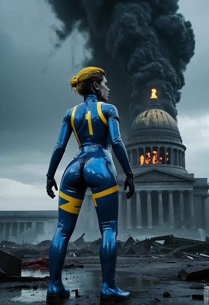
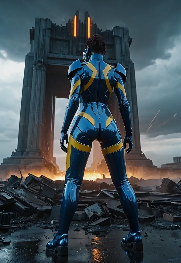
Close up view on A female wearing dirty form-fitting blue latex suit with yellow 101 on the back , reloading her revolver , pale strong thighs stands silhouetted against a blood-red , post-apocalyptic nuclear explosion , dark clouds roiling. The smoking ruins of a once-grand Jefferson Memorial looming behind her , its pillar spires broken and twisted , a giant robot running through the wreck emit black smokes. Sea waves dance in the harsh , dramatic light , casting different shades of blue. The scene is rendered in a hyperrealistic , cinematic style with intense , moody lighting reminiscent of a Fallout Bridge Burning ,
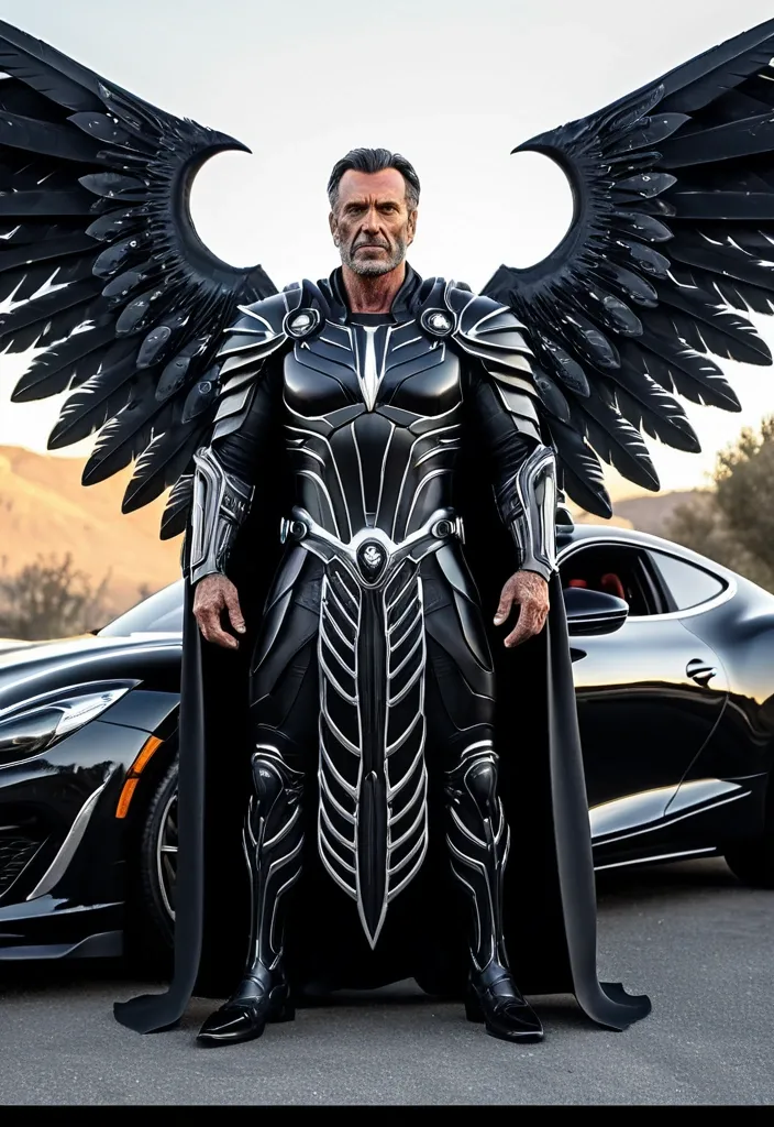
Life-like digital painting , hyperrealistic with subtle painterly texture , 2:3 vertical aspect ratio. A mature man (Use reference photo. 100% use my real face) has a battle-hardened expression , looking forward with determination. He wears a flowing , weathered black robe layered over intricate biomechanical armor with black detailing. His arms and legs are partially cybernetic. Large , majestic warrior wings extend from his back — a fusion of organic black feathers and advanced mechanical structures with glowing circular energy cores embedded near the base. Pose: leaning casually against the front driver door of a Ferrari F8 Tributo , Roma , hands in front pockets , right leg crossed over left , body turned three-quarter left , head turned to his right looking off-camera with confident relaxed expression. Car details: pristine chrome front bumper with bullet guards , wide chrome grille with vertical teeth and red Buick emblem center , round headlights , whitewall tires with chrome wire wheels and red center caps , chrome side trim , small Buick script on rear fender , California license plate "9V4 530". Camera: eye-level , 35mm lens equivalent , full body and full car centered , slight low angle , shallow depth of field. ,
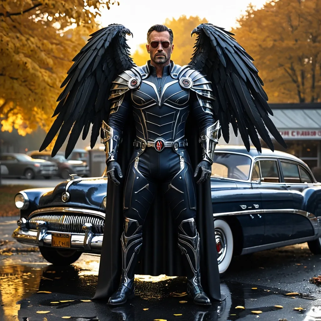
Life-like digital painting , hyperrealistic with subtle painterly texture , 2:3 vertical aspect ratio. A mature manhas a battle-hardened expression , looking forward with determination. He wears a flowing , weathered black robe layered over intricate biomechanical armor with black detailing. His arms and legs are partially cybernetic. Large , majestic warrior wings extend from his back — a fusion of organic black feathers and advanced mechanical structures with glowing circular energy cores embedded near the base. Pose: leaning casually against the front driver door of a glossy midnight-blue 1954 Buick Roadmaster 4-door sedan , hands in front pockets , right leg crossed over left , body turned three-quarter left , head turned to his right looking off-camera with confident relaxed expression. Car details: pristine chrome front bumper with bullet guards , wide chrome grille with vertical teeth and red Buick emblem center , round headlights , whitewall tires with chrome wire wheels and red center caps , chrome side trim , small Buick script on rear fender , California license plate "9V4 530". Environment: autumn small-town street after light rain , wet asphalt with mirror reflections of car and boots , ground scattered with golden fallen leaves , large maple tree with bright yellow-orange foliage upper left , brick storefronts in soft focus background with faded signs reading "Dams Hoo" , "MOTEL" , "LION" , "DUCK COCK" , morning mist and atmospheric haze. Camera: eye-level , 35mm lens equivalent , full body and full car centered , slight low angle , shallow depth of field. Enhancement Tokens: digital painting , photorealism , cinematic , intricate , ultra-detailed , sharp focus , painterly blend Quality Modifiers: 8k , ultra high resolution , RAW photo detail , sharp focus , color accurate , film grain subtle Lighting Enhancements: golden hour autumn sunlight , warm key light from upper left through trees , soft cool ambient fill from overcast sky , subtle rim light on jacket shoulders and hair , ray-traced reflections on wet pavement and car paint , HDR specular highlights on chrome , volumetric light shafts through yellow leaves , gentle global illumination bounce Detail Amplifiers: micro skin pores and stubble , leather grain and zipper metal wear , denim weave and fading , individual hair strands , car paint clearcoat depth with micro scratches , water droplets and puddle ripples , chrome pitting realism , fallen leaf veins , fabric folds , subsurface scattering on skin , accurate reflections in sunglasses ,
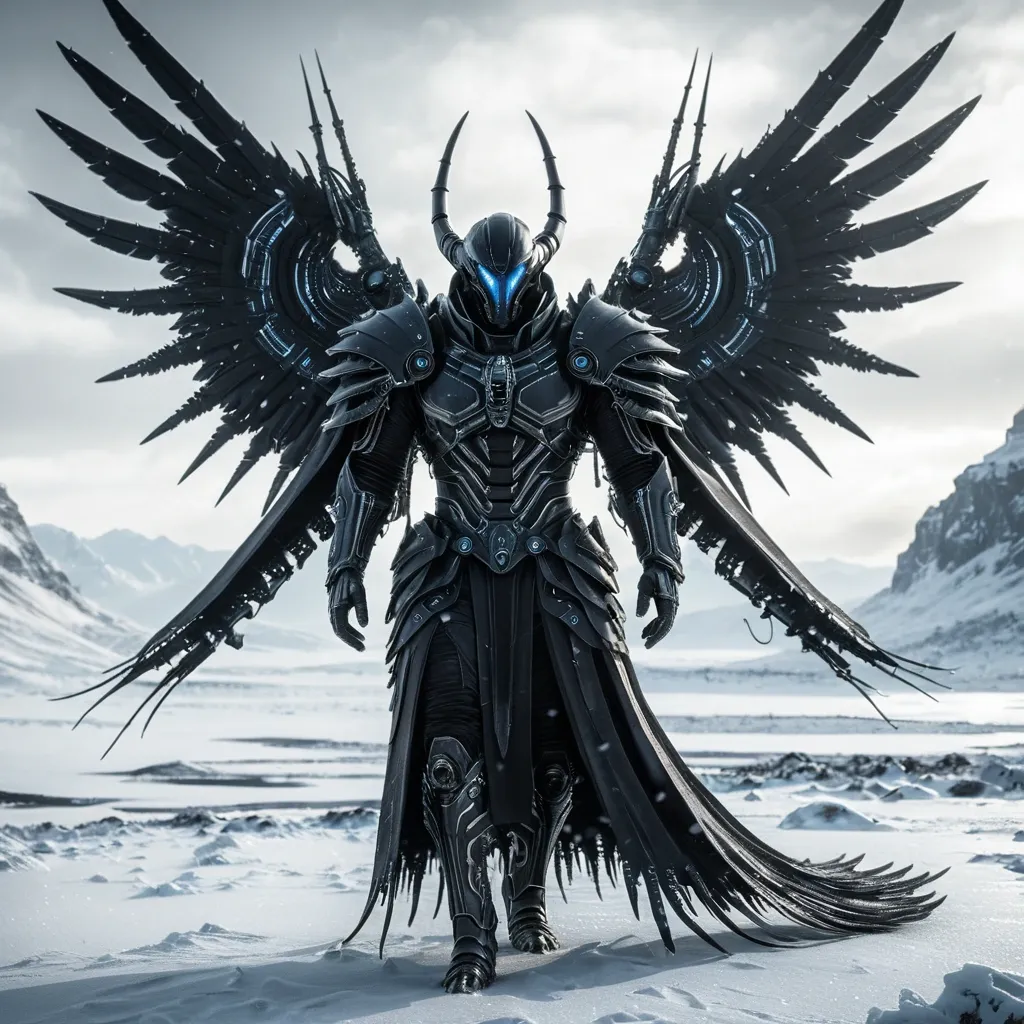
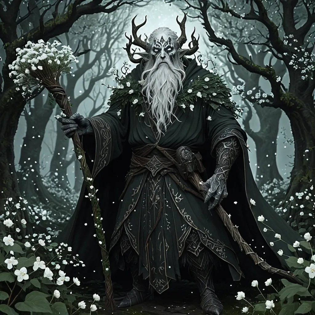
Ultra-realistic cinematic portrait of a futuristic Xenomorph warrior walking through a frozen wasteland. The male figure has a battle-hardened expression , looking forward with determination. He wears a flowing , weathered black robe layered over intricate biomechanical armor with black detailing. His arms and legs are partially cybernetic , featuring exposed mechanical components and Cosmic entities , depicted as beings of pure light and energy , browse the interstellar archives. Large , majestic warrior wings extend from his back — a fusion of organic black feathers and advanced mechanical structures with glowing circular energy cores embedded near the base. The wings are detailed with layered feathers , metallic joints , and subtle warm light accents. The environment is a cold , desaturated snowy landscape with soft fog and overcast skies , creating a dramatic and ethereal atmosphere. Snow lightly covers the ground and the lower part of his robe. Wind gently flows through the fabric , adding motion and realism. Shot in a cinematic style with soft natural lighting , shallow depth of field , ultra-detailed textures , 8K resolution , HDR , photorealistic , volumetric lighting , high contrast , epic composition , slightly low angle to emphasize power and divinity. ,
Photorealistic masterpiece in full body , a beautiful 18-year-old pinkhead teenage kitsune , visage humain , une queue , oreilles de renard pink , portant une legere robe d'été pink boutonnée devant et des légères baskets pink dans une rue futuriste de science fiction d'une station balnéaire , She walks smiling , a sunny afternoon ,
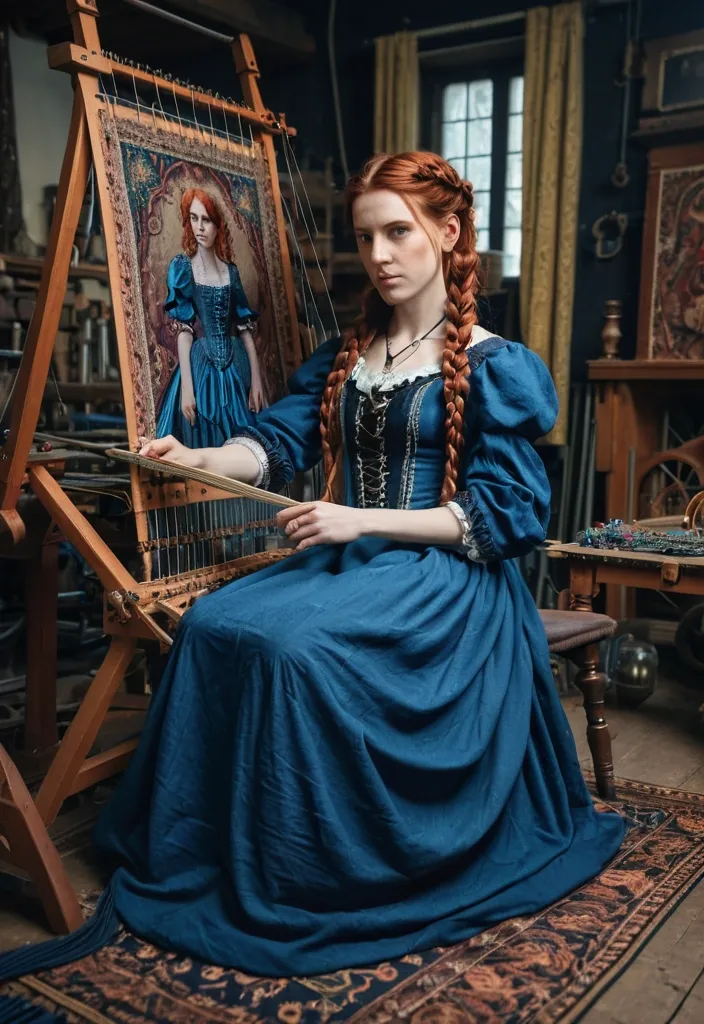
Photographie réaliste en pied d'une belle femme européenne pâle , taylor , dans la trentaine , avec des tresses élaborées , des cheveux auburn , dans une robe gothique victorienne bleue. Assise dans un atelier de taylor , elle travaille sur une tapisserie ancienne et colorée sur un métier à tisser une douceur émane de la scène. style cinématographique ,
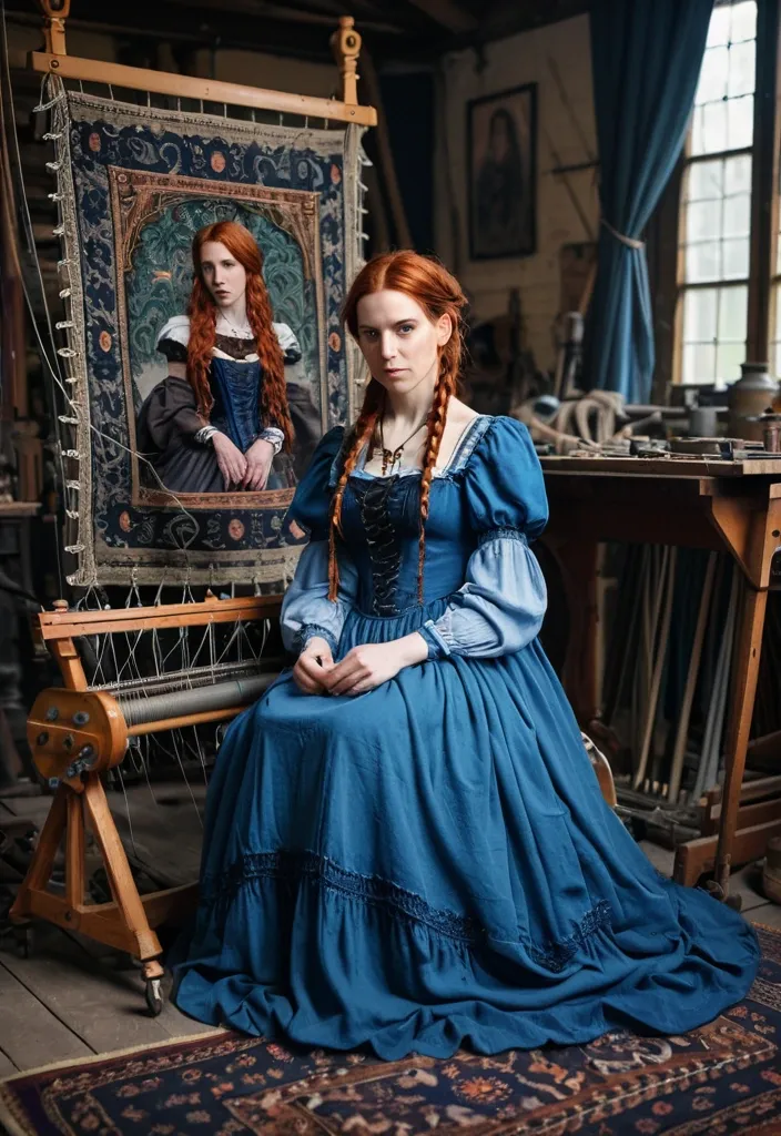
Photographie réaliste en pied d'une belle femme européenne pâle , taylor , dans la trentaine , avec des tresses élaborées , des cheveux auburn , dans une robe gothique victorienne bleue. Assise dans un atelier de taylor , elle travaille sur une tapisserie ancienne et colorée sur un métier à tisser une douceur émane de la scène. style cinématographique ,
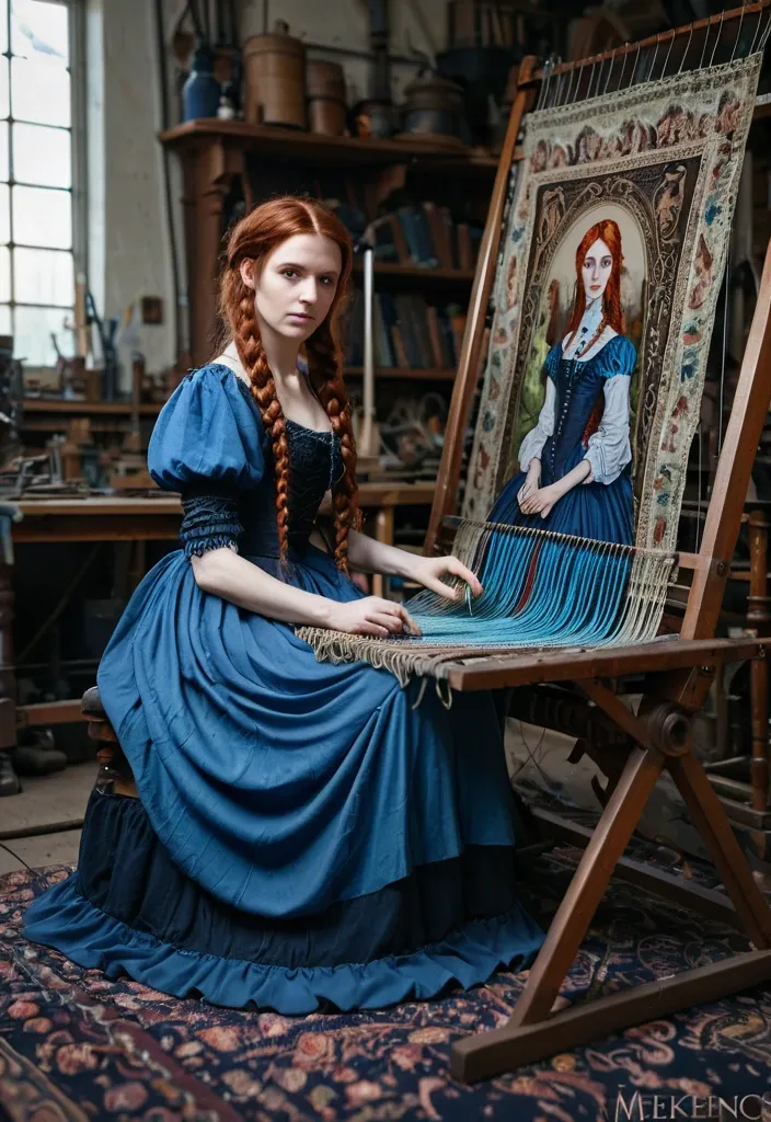
Photographie réaliste en pied d'une belle femme européenne pâle , taylor , dans la trentaine , avec des tresses élaborées , des cheveux auburn , dans une robe gothique victorienne bleue. Assise dans un atelier de taylor , elle travaille sur une tapisserie ancienne et colorée sur un métier à tisser une douceur émane de la scène. style cinématographique ,
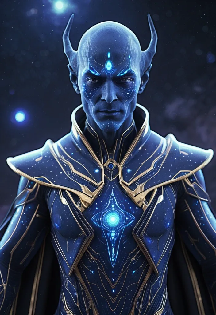
cinematic portrait of a futuristic cosmic alien judge , human-like handsome male face with symmetrical features , confident and calm soft smile , smooth deep blue skin tone infused with subtle galaxy texture and star particles , slightly aged but attractive and wise , sharp jawline , elegant facial structure large refined alien eyes , deep black with soft gray reflections and slight cosmic glow , intelligent and divine gaze , slightly pointed elegant ears , balanced with human realism wearing a highly detailed futuristic sci-fi royal judicial outfit , full body suit made of cosmic fabric , deep blue and purple tones with glowing star patterns , golden accents and intricate geometric designs , chest glowing energy core or symbol , layered advanced alien armor merged with elegant robe design , flowing transparent light-based cape made of particles , premium divine look , no Earth elements , no traditional clothing environment set in deep space , surrounded by planets , nebula clouds , galaxies , floating cosmic particles , soft volumetric lighting , cinematic depth of field , dreamy and epic atmosphere ultra realistic , 8k , hyper detailed textures , cinematic lighting , film still , high contrast , sharp focus , masterpiece , sci-fi fantasy realism ⚠️ NEGATIVE PROMPT cartoon , anime , low detail , blur , distorted face , ugly face , asymmetrical face , human skin tone , indian clothing , suit and tie , modern earth elements , overexposed glow , extra limbs , bad anatomy 🎯 EXTRA CONTROL WORDS (ArtHub boost) 👉 Add these if needed: “photorealistic” “octane render” “unreal engine” “cinematic lighting” “sharp focus” ,
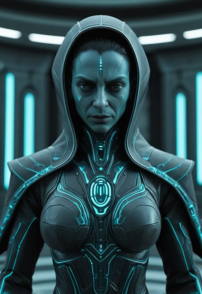
use a realistic human male face structure as base , maintain natural human facial proportions , create a cinematic sci-fi alien judge character , smooth deep blue skin tone similar to high detail alien female reference , beautiful and clean facial features , slightly aged but graceful , white beard neatly trimmed giving wisdom and authority , calm confident slight smile expression , strong jawline , intelligent presence eyes similar to advanced alien female reference , slightly larger and elegant , deep black and soft gray reflective tone , subtle glow feeling but natural , ears slightly pointed and refined like alien female reference , not exaggerated , balanced with human realism wearing a futuristic alien judicial robe , long full-length flowing costume , dark base with metallic texture , glowing cyan or teal energy patterns vertically , intricate alien symbols , structured shoulders but not bulky , layered fabric with advanced sci-fi design , high collar , elegant and powerful look , no Earth clothing , no suit , no tie head clean or minimal integrated hood , no helmet , face clearly visible environment set in a futuristic alien courtroom , large sci-fi pillars , floating structures , glowing symbols , soft particles , cinematic lighting with blue and teal tones , dramatic shadows , shallow depth of field ultra realistic , 8k , cinematic film still , highly detailed textures , balanced lighting , strong authority with calm wisdom , same universe consistency ⚠️ NEGATIVE PROMPT angry face , scary face , human skin tone , cartoonish , indian or earth elements , suit and tie , bulky armor , distorted face , low detail , blur , exaggerated features ,
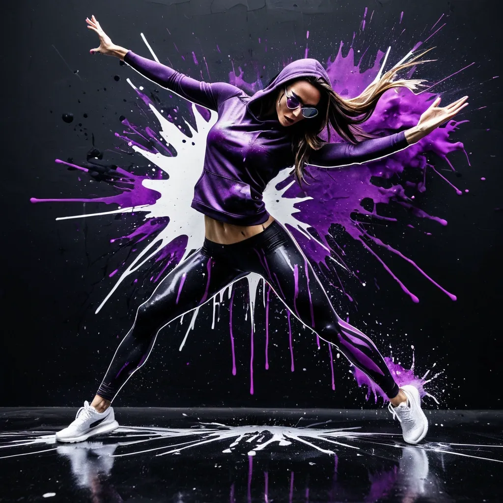
Hyper-realistic 4k photograph , stylized , dynamic artwork depicts a young adult woman mid-leap or dance pose against a split background. The background is vertically divided: the left side is dark , primarily black and deep shades of Purple , while the right side is stark white. The woman is positioned centrally , caught in an explosive burst of color , material , and shatered glasses in same color of the *liquid*. The woman has a slender athletic build , suggesting a dancer. She appears to be in her 20s or early 30s. She has fair complexion , though partially obscured by the dramatic lighting and artistic effects. She is wearing athletic or casual attire , including a purple tank top and fitted black denim trousers. Her outfit is partially obscured by the paint/*liquid* effects. She wears high-top sneakers in a matching Purple color with hint of black She is wearing a hooded sweatshirt , though the hood is up and covers most of her hair , visible around her face and flowing on her upper body. Her expression is focused or intense , looking downward and slightly to her left. The pose is highly energetic and balanced , suggesting a gravity-defying jump or acrobatic move. Her right arm is extended upward and slightly bent at the elbow , hand open. Her left arm is extended to her side , slightly downward. Her legs are bent , with her knees drawn up towards her chest , and her feet are positioned below her , creating a sense of momentum. A major element of the image is the *shattering* or *splatter* effect emanating from and around the figure. On the left , dark side , a massive , vibrant splash of Purple and pastel purple *liquid* or paint explodes outward , creating streaks , drips , and intricate patterns that seem to follow the curve of her body and extend aggressively into the dark background. On the right , white side , the effect is reversed; dark , shattered , ink-like fragments and streaks appear to be pushing away from her and ripping through the white background , suggesting a boundary being broken or a powerful impact. The overall aesthetic combines elements of street art , digital painting , and dynamic photography , focusing on motion , contrast , and color intensity. The lighting is dramatic , highlighting her and the textures of the paint splatters. --ar 9:16 , ,
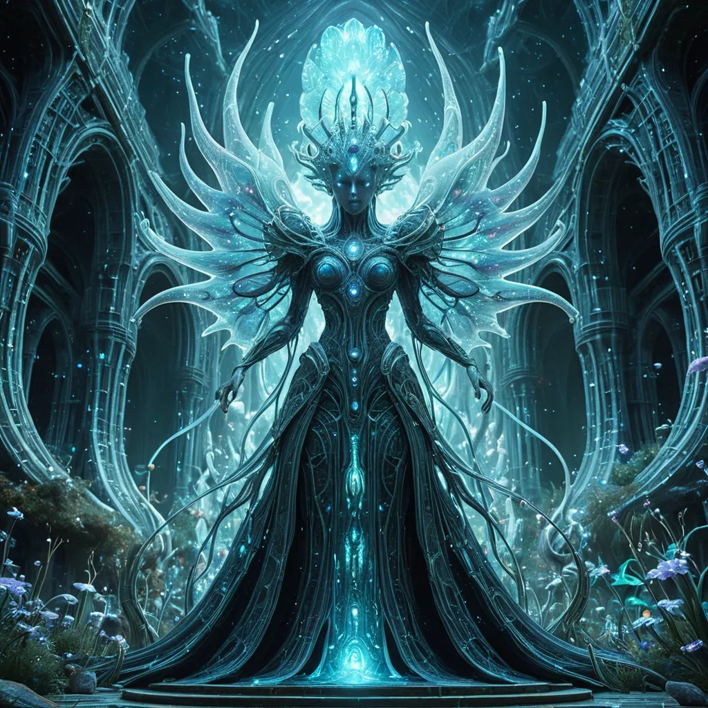
An ethereal alien queen , adorned with intricate crystalline growths and flowing robes woven from starlight , presides over a court of bio-luminescent flora within a colossal , ancient alien structure. The architecture is a fusion of organic curves and advanced technological conduits , humming with soft energy. Highly detailed , 8k resolution , with subtle glitch art effects hinting at dimensional instability. Style: A blend of cosmic horror and high fantasy , with an emphasis on intricate detail and otherworldly atmosphere. ,
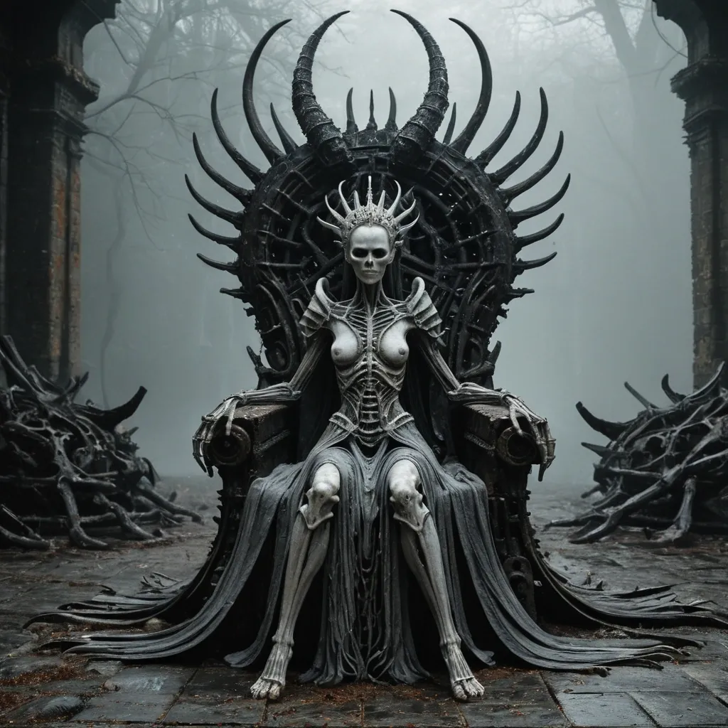
A pale , composed Xenomorph Queen sits enthroned on a massive rusted iron chair , her posture still and commanding. She wears an elaborate floor-length coat or robe of aged , textured fabric , its surface embossed or sculpted to resemble a exposed spinal column and ribcage running the full length of her torso , the bones rendered in weathered tones of brown and grey. The garment drapes heavily over her legs and pools at her feet. Her crown is an intricate dark structure of twisted bone-like protrusions , black crystal shards , and wide curving ram horns that sweep upward and outward from either side of her head , giving her silhouette a striking , monstrous width. Her face is calm and pale , her eyes meeting the viewer directly with no expression of warmth or hostility. The throne behind her is corroded and monolithic , its surface thick with rust and age. The raised platform she sits on and the entire ground surrounding her is covered in dozens of aged human skulls and loose bones , stacked and scattered in every direction as far as the frame allows. The background is a deep , swirling grey fog that diffuses any sense of location or forestry , pressing the composition inward and giving the image a suffocating , timeless quality. ,

Un portrait cinématographique hyper réaliste d'un guerrier viking robuste dans une forêt enflammée. Il a les yeux orangés perçants , une barbe épaisse et de longs cheveux tressés. Il porte un casque nordique orné en métal foncé avec de grandes cornes courbées et des gravures celtiques trés complexes. Son visage est tatoué de peinture de guerre. Il est revêtu de fourrures lourdes texturées et d'une armure en cuir épaisse et poussiéré. : Texture de peau extrêmement détaillée , pores et poils de barbe. Profondeur de champ avec un fond enflammé flou. Résolution 8k , style de rendu Unreal Engine 5 , humeur gritteuse et épique ,
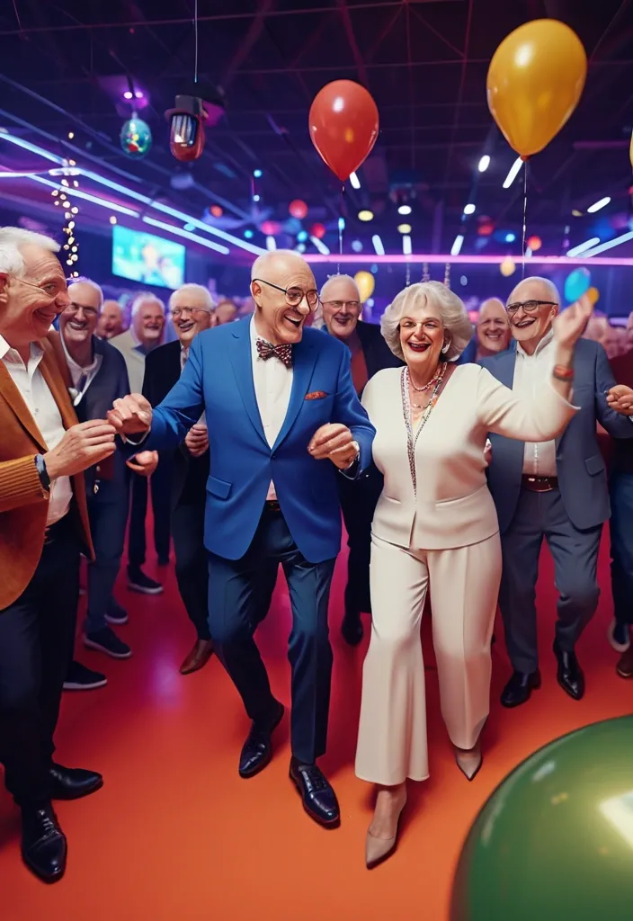
Celebración de cumpleaños de 60 años en un boliche moderno con ambiente familiar , mujer de 60 años festejando rodeada de familiares y amigos , personas de diferentes edades (adultos , jóvenes y adultos mayores) bailando y disfrutando , decoración festiva con globos , luces de colores y detalles elegantes , pista de baile iluminada , DJ robot con luces LED animando la fiesta , música alegre , ambiente cálido y emocionante , personas sonriendo , riendo y compartiendo , estilo fotografía realista , alta calidad , iluminación cinematográfica , colores vibrantes , composición dinámica , alto nivel de detalle , 4K , escena alegre y festiva , enfoque en la celebración y la conexión familiar ,
Vision-Language-Action (VLA) models have emerged as a promising paradigm for robot learning , but their representations are still largely inherited from static image-text pretraining , leaving physical dynamics to be learned from comparatively limited action data. Generative video models , by contrast , encode rich spatiotemporal structure and implicit physics , making them a compelling foundation for robotic manipulation. But their potentials are not fully explored in the literature. To bridge the gap , we introduce DiT4DiT , an end-to-end Video-Action Model that couples a video Diffusion Transformer with an action Diffusion Transformer in a unified cascaded framework. Instead of relying on reconstructed future frames , DiT4DiT extracts intermediate denoising features from the video generation process and uses them as temporally grounded conditions for action prediction. We further propose a dual flow-matching objective with decoupled timesteps and noise scales for video prediction , hidden-state extraction , and action inference , enabling coherent joint training of both modules. ,
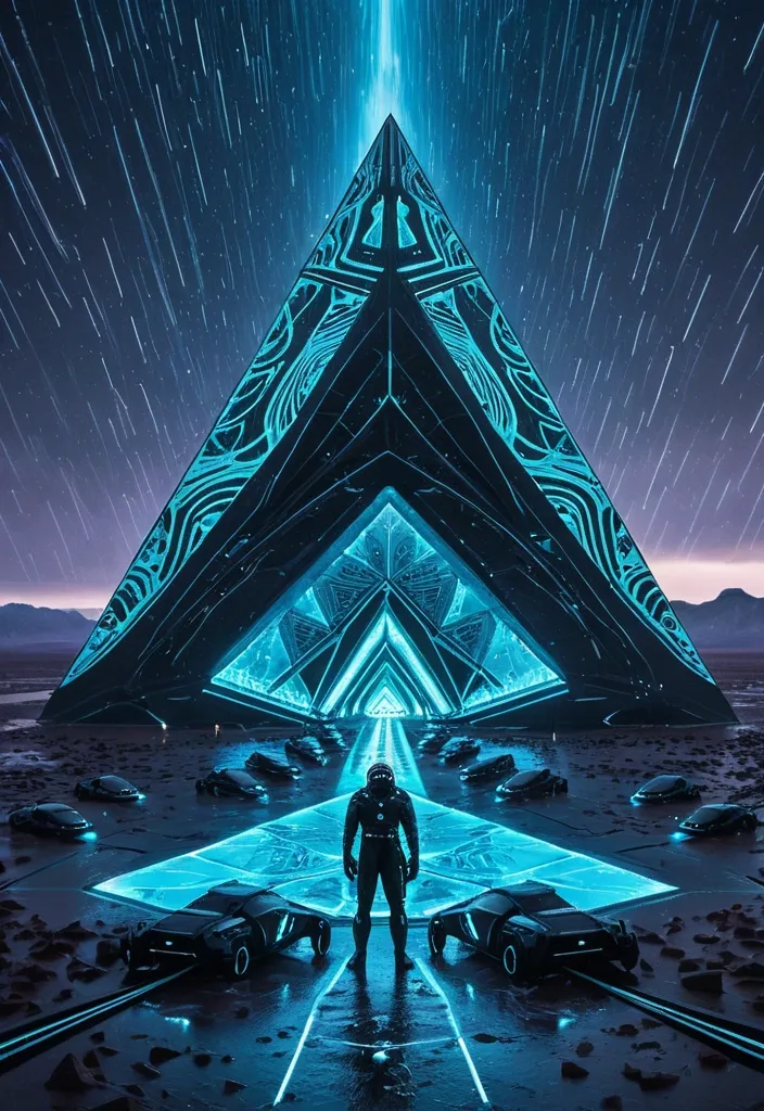
A futuristic scene unfolds with swirling rainy. In the midst of this turbulence , a majestic triangle-drone , intricately designed with bioluminescent patterns showcases their multi-layered floors as they soar through a dark indigo sky infused with light cyan hues. Below , a desert landscape at twilight comes to life with its intricate architecture. An astronaut stands in the foreground beside their sleek robot-dogs and scattered belongings. As the storm rages around them , a menacing caravan emerges through the sheets of rain , droplets frozen in motion against this surreal backdrop. ,