Search Results for landing page
Explore AI generated designs, images, art and prompts by top community artists and designers.

# Финальный промт для агента (Antigravity + Stitch MCP) ## Сайт-визитка: продажа и установка весов для погрузчиков Скопируй весь блок ниже целиком в чат задач агента как первое сообщение проекта. --- ## ПРОМТ ДЛЯ АГЕНТА (копировать с этой строки) Ты — фронтенд-разработчик и веб-дизайнер. Твоя задача: построить одностраничный сайт-визитку (лендинг) компании , которая продаёт и устанавливает весовое оборудование на вилочные погрузчики (весоизмерительные вилы , крановые весы , встраиваемые системы взвешивания , индикаторы , поверка/калибровка). Работай пошагово , по фазам ниже. После каждой фазы показывай результат (код + краткое описание) и жди подтверждения , прежде чем переходить к следующей фазе. Не используй lorem ipsum — весь текст должен быть по теме; если данные неизвестны , помечай их `[ЗАПОЛНИТЬ: ...]` явным образом прямо в коде и в комментарии. ### 0. Вводные данные проекта - Название компании: `[ЗАПОЛНИТЬ]` (если не указано — использовать нейтральное «ВесПром» как рабочее название и пометить как временное) - Номер WhatsApp: `[ЗАПОЛНИТЬ: +7XXXXXXXXXX]` - Регион работы: `[ЗАПОЛНИТЬ: город/страна]` - Ассортимент (минимум для карточек каталога , если не дано — использовать этот дефолтный список): 1. Весоизмерительные вилы (грузоподъёмность 1–5 т , точность ±0.5%) 2. Крановые/подвесные весы для интеграции с погрузчиком 3. Встраиваемые весовые системы (монтаж в раму погрузчика) 4. Индикаторы веса и дисплеи (проводные/беспроводные) 5. Поверка и калибровка весового оборудования 6. Сервисное обслуживание и ремонт - Логотип/фото/сертификаты: отсутствуют → генерировать текстовые/иконочные плейсхолдеры , фото заменять описательными alt-текстами и SVG-иллюстрациями/иконками вместо реальных фотографий. - Сайт: **одна страница** , без отдельных подстраниц. - Тип сборки: чистый HTML/CSS/JS , без бэкенда. Все заявки идут через кнопки WhatsApp (`wa.me`) , формы обратной связи не делать. ### 1. Дизайн-система — строгий индустриальный стиль (тёмный , техничный) Зафиксировать как CSS-переменные в начале `styles.css`: ```css :root { /* Фон и поверхности */ --bg-primary: #0E1116; --bg-surface: #171B21; --bg-surface-2: #1F252D; --border-color: #2A313B; /* Акцент — индустриальный оранжевый (сигнальный цвет техники) */ --accent: #FF7A1A; --accent-hover: #FF9142; --accent-muted: rgba(255 , 122 , 26 , 0.12); /* Текст */ --text-primary: #F5F6F7; --text-secondary: #9AA3AD; --text-on-accent: #0E1116; /* Статусы/бейджи */ --success: #3DDC84; /* Радиусы — небольшие , без "мягкого" UI */ --radius-sm: 4px; --radius-md: 8px; /* Шкала отступов */ --space-1: 4px; --space-2: 8px; --space-3: 12px; --space-4: 16px; --space-5: 24px; --space-6: 32px; --space-7: 48px; --space-8: 64px; --space-9: 96px; } ``` - Шрифт: `Inter` (или `Manrope`) через Google Fonts. Заголовки — 700 , текст — 400/500. - Масштаб типографики: H1 — 48px / mobile 32px; H2 — 32px / mobile 24px; H3 — 22px; body — 16px; small — 14px. Line-height заголовков 1.1–1.2 , текста — 1.5. - Иконки: line-style (обводка , без заливки) , тема — вес/точность/погрузчик/сертификат. Использовать инлайн SVG. - Кнопки: primary — заливка `--accent` , текст `--text-on-accent` , radius `--radius-sm` , без теней , чёткая обводка при hover. Secondary — прозрачная с обводкой `--border-color`. - Общее ощущение: контраст , чёткие линии-разделители секций (border-top 1px `--border-color`) , минимум скруглений , минимум декоративных теней. Сгенерировать через Stitch MCP референс hero-блока по промпту: > "Industrial B2B landing page hero , dark navy/graphite background #0E1116 , orange accent #FF7A1A , bold condensed sans-serif headline , forklift with weighing attachment illustration , minimal rounded corners , trust badges row" Выбрать один вариант , зафиксировать композицию (расположение заголовка/кнопки/иллюстрации) как референс для вёрстки. ### 2. Структура страницы (порядок секций и содержимое) 1. **Header** (sticky , `--bg-surface` с нижней обводкой) - Слева: логотип-плейсхолдер (текст названия компании , шрифт 700). - Справа: пункты меню-якоря (Услуги , Каталог , Как работаем , Кейсы , Контакты) — скрыть в бургер на мобильных. - Кнопка WhatsApp (primary) — крайняя справа. 2. **Hero** - H1: «Весы для погрузчиков под ключ: подбор , монтаж , поверка» - Подзаголовок: 1–2 предложения про скорость и точность монтажа , гарантию. - Кнопка WhatsApp (крупная , primary) — текст «Написать в WhatsApp» + иконка. - Строка доверия под кнопкой: 3 коротких пункта в столбик/строку («Гарантия N лет» , «Выезд по региону `[ЗАПОЛНИТЬ]`» , «Поверка включена»). - Иллюстрация/SVG погрузчика с весами справа (или фон-паттерн , если иллюстрации нет). 3. **Услуги** (4 карточки в сетке , `--bg-surface` фон карточки , border `--border-color`) - Продажа весового оборудования - Монтаж на погрузчик - Поверка и калибровка - Сервис и ремонт - На каждой карточке: иконка , заголовок , 1–2 строки описания. 4. **Каталог** (сетка карточек товаров , 4–6 позиций из списка в п.0) - На карточке: иконка/плейсхолдер-изображение , название , 2–3 ключевые характеристики (грузоподъёмность , точность , IP-класс) , кнопка WhatsApp с текстом `«Интересует {название товара}»` (urlencoded). 5. **Как мы работаем** (степпер/таймлайн , 5 шагов) - Заявка в WhatsApp → Консультация и подбор → Выезд/монтаж → Поверка → Гарантийная поддержка. - Каждый шаг: номер , короткий заголовок , 1 строка описания. 6. **Преимущества** (4–6 пунктов , иконка + короткий текст) - Например: «Гарантия на монтаж» , «Сертифицированное оборудование» , «Опыт работы `[ЗАПОЛНИТЬ]` лет» , «Выезд по региону» , «Поверка включена в стоимость» , «Сервис 24/7» — оставить как варианты , отметить реальные цифры как `[ЗАПОЛНИТЬ]`. 7. **Кейсы** (сетка/карусель из 3 карточек) - Плейсхолдер-описание объекта (склад/производство/логистика) , тип установленного оборудования , результат в 1 фразе. 8. **Сертификаты и документы** (ряд бейджей) - Плейсхолдер-иконки «Сертификат соответствия» , «Свидетельство о поверке» — с пометкой `[ЗАПОЛНИТЬ: реальные документы]`. 9. **Отзывы** (2–3 карточки) - Плейсхолдер-тексты , помечены как черновые. 10. **Финальный CTA-блок** - Крупный заголовок-призыв , крупная кнопка WhatsApp по центру. - Контакты: телефон , email (плейсхолдеры) , адрес/регион. - Карта — встроенный статичный блок-плейсхолдер (реальный embed добавить , когда будет адрес). 11. **Footer** - Название компании , копирайт , повтор кнопки WhatsApp (маленькая) , ссылки на мессенджеры при наличии. **Плавающая кнопка WhatsApp** — fixed , правый нижний угол , видна на всех секциях при скролле , иконка WhatsApp в зелёном кружке (`#25D366`) , лёгкая пульсация (анимация раз в 3–4 сек , без резких эффектов). ### 3. WhatsApp-интеграция (техническая часть) - Формат ссылки: `https://wa.me/<номер_без_плюса_и_пробелов>?text=<urlencoded_текст>` - Номер и дефолтный текст вынести в константы в начале `main.js`: ```js const WHATSAPP_NUMBER = "ЗАПОЛНИТЬ"; // международный формат без + const WHATSAPP_DEFAULT_TEXT = "Здравствуйте! Интересуют весы для погрузчика , хочу проконсультироваться"; ``` - Все ссылки — `target="_blank" rel="noopener noreferrer"`. - Для карточек каталога текст сообщения формируется динамически: `Здравствуйте! Интересует ${имя_товара} , хочу проконсультироваться`. ### 4. Технические требования - Адаптив mobile-first , брейкпоинты: 375 / 768 / 1024 / 1440. - Изображения — webp , `loading="lazy"` (кроме hero-изображения). - Контраст текста — проверить на соответствие WCAG AA (особенно `--text-secondary` на `--bg-primary`). - Кросс-браузерность: Chrome , Safari , Firefox. - Favicon , `sitemap.xml` , `robots.txt`. ### 5. SEO и метаданные - `<title>`: «Весы для погрузчиков — продажа , монтаж , поверка [Регион]» - `meta description`: 1–2 предложения с УТП и регионом. - OG-теги (og:title , og:description , og:image — hero-изображение). - H1 — один на странице (см. Hero). - Alt-тексты у всех изображений/иконок. - Микроразметка `schema.org`: `LocalBusiness` (общие данные компании) + `Product` для каждой карточки каталога. ### 6. Порядок выполнения (для модели Flash 3.6 Medium — дробить по шагам) Выполнять и показывать результат по одному пункту за раз , не объединяя несколько секций в один ответ: 1. Скелет HTML + подключение CSS-переменных из раздела 1. 2. Header + мобильное меню + плавающая кнопка WhatsApp. 3. Hero-секция. 4. Секция «Услуги». 5. Секция «Каталог». 6. Секция «Как мы работаем». 7. Секция «Преимущества». 8. Секция «Кейсы». 9. Секция «Сертификаты». 10. Секция «Отзывы». 11. Финальный CTA-блок + Footer. 12. SEO-метатеги , favicon , sitemap.xml , robots.txt. 13. Финальная проверка: адаптив на 4 брейкпоинтах , контраст , все wa.me-ссылки , lazy-loading изображений. ### 7. Чек-лист приёмки (сверить перед сдачей) - [ ] Все `[ЗАПОЛНИТЬ]`-плейсхолдеры собраны в единый список в комментарии наверху `index.html` для удобной правки. - [ ] Все кнопки/ссылки ведут на корректный `wa.me` с правильным текстом. - [ ] Плавающая кнопка WhatsApp не перекрывает контент на мобильных (проверить над footer). - [ ] Ни одной формы обратной связи в коде нет. - [ ] Адаптив проверен на 375/768/1024/1440. - [ ] Цветовая схема соответствует разделу 1 (никаких случайных цветов вне палитры). - [ ] Lorem ipsum отсутствует — весь текст по теме. ## КОНЕЦ ПРОМТА (копировать до этой строки) ,
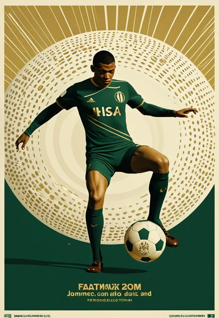
A professional vertical 3:4 poster for FIFA World Cup 2026. STYLE: vintage sport editorial meets modern Swiss typography — 1960s-70s sports magazine grit fused with bold contemporary graphic design. PALETTE: warm gold #D4AF37 + deep forest green #1B3A2D + cream off-white #F5F0E8. Entire image is monochromatic within this palette — NO bright colors anywhere. LAYOUT — Top: massive bold title "FIFA" on first line , "WORLD CUP" on second line , in extremely bold sans-serif , square heavy letterforms , filled with dense halftone dot texture like old newspaper print , cream off-white color , spanning full width. The letters have a slight rough edge like screen-printed ink. Center: A dynamic silhouette of Kylian Mbappé mid-kick —athletic explosive running posture. a powerful action pose: one leg extended forward striking the football , body leaning into the shot , in a vast star-filled cosmic night , just struck by his foot a thin flashlight shadow emerge into enormous half-football's ring , light imperial Starwars style giant half-football(3D rendering:0.1) drifting across the void , dissolving into Phantom. The figure is rendered as a high-contrast duotone graphic in warm gold against deep green , with subtle film grain and light vintage halftone texture. Behind him , a faint circular sunburst graphic radiates outward in gold lines , evoking classic 1970s sports posters. At his feet , the official 2026 World Cup ball "Trionda" — rendered in the SAME duotone gold-and-cream palette as the rest of the image , no bright red/green/blue. The ball's distinctive wave pattern and panel construction are visible through tonal contrast and embossed texture in gold and cream tones , like a vintage screen print. The ball is mid-flight , just struck by his foot. Bottom: slogan "Say It. Make Your Cup." in the SAME extremely bold sans-serif font as the title — square , heavy , condensed letterforms with the same halftone dot texture fill , cream off-white color , matching the "FIFA WORLD CUP" title typography exactly. A thin gold rule line separates it slightly. Below the slogan , "2026" in the same bold sans-serif style , smaller but matching. DESIGN: bold negative space , strong diagonal tension from Mbappé's striking pose , clear visual hierarchy. The vintage feel is subtle — light film grain , slight warm color shift , delicate halftone pattern on all text. The ENTIRE image stays strictly within the gold-green-cream palette — Trionda ball must NOT appear in bright colors , only duotone gold/cream with tonal embossed detail. ANCHOR: reminiscent of 1970s World Cup matchday programmes crossed with modern minimalist editorial design. AVOID: generic Inter/Helvetica typography , generic purple gradients , SaaS landing page style , stock photo aesthetic , rounded card stacks , watermarks , misspelled text , low contrast text , multi-step compositing seams , bright colors anywhere in the image , a colorful football , thin or lightweight fonts at the bottom , mismatched typography between title and slogan. Clean , high-resolution image quality: smooth continuous tonal gradients , uniform and well-controlled texture throughout , surfaces and materials intact and naturally rendered. The main subject is crisp and clearly separated from a softly layered background with clear depth. Free of digital noise and over-sharpening artifacts. No watermark , no garbled text. ,
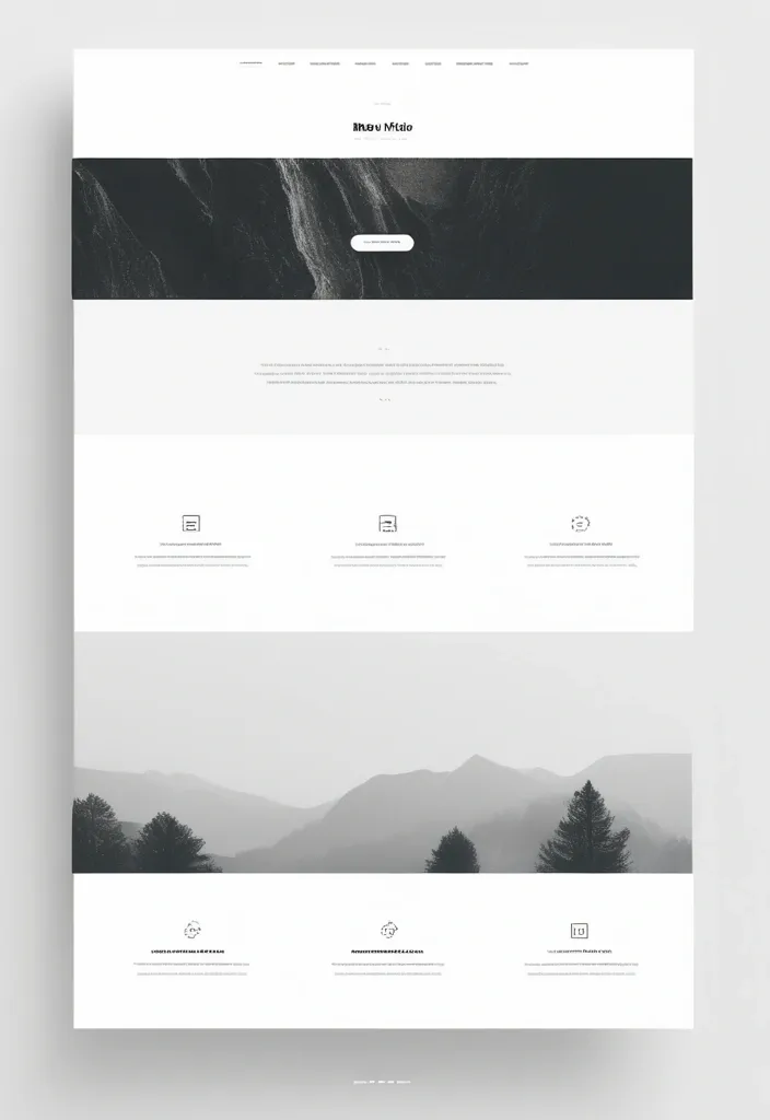
Landing Page Hero Section Reimagined: Create a modern , immersive hero section featuring a dynamic holographic gradient background that subtly shifts between deep purple (#6B46C1) to electric blue (#3B82F6) to cyan (#06B6D4) , creating a futuristic AI-inspired atmosphere. The gradient should have a gentle animated flow (3-5 second loop) suggesting data streams or neural networks. Visual Elements & Depth: Add floating geometric shapes (translucent hexagons , nodes , and connection lines) that subtly parallax scroll , suggesting AI neural networks and automated systems Integrate a glassmorphism card overlaying the gradient for your main content area , with frosted glass effect (backdrop-filter: blur(12px) , white/10% opacity) to create sophisticated depth Replace the static photo with an AI-enhanced portrait that has subtle edge glow in accent colors (cyan/purple) and animated particle effects around the edges , suggesting tech proficiency Typography & Content: Use fluid , variable typography for the headline with a gradient text effect (purple to cyan) that responds to cursor proximity with subtle scale animations Add a pricing transparency badge in the top right ("Competitive Rates - Premium Quality") with a subtle pulse animation in your accent color Include micro-animations on hover for navigation items—subtle underline draws with gradient effect Color Palette: Primary gradient: Deep Purple (#6B46C1) → Electric Blue (#3B82F6) → Cyan (#06B6D4) Accent: Warm Orange (#F97316) for CTAs to create powerful contrast and confidence Background: Rich dark (#0A0A0F) with subtle noise texture for depth Text: White (#FFFFFF) with reduced opacity variations for hierarchy Interactive Elements: Transform "Hire me" button into a premium CTA with orange gradient background , white text , and animated hover state (expands slightly , adds glow effect) Add scroll-triggered animations revealing a "Tech Stack" section with floating tech icons (TypeScript , React , Node.js , AI tools) that fade in with stagger effect Include a "Built with AI Assistance" badge with robot icon and subtle animation to showcase your AI-forward approach Unique Differentiators: Animated code snippets running in the background (subtle , low opacity) showing TypeScript/functional programming patterns Interactive pricing calculator widget that slides in from the side , demonstrating transparency and reasonable rates "Precision Meter" visualization—an animated circular progress indicator showing "99.9% Attention to Detail" with gradient stroke AI Assistant chatbot icon (bottom right) with pulsing gradient glow suggesting immediate , automated responses Additional Sections: Add a "Why Choose Me" grid with hover cards that reveal detailed benefits—each card lifts with shadow and gradient border on hover Include client testimonials with star ratings and subtle fade-in animations emphasizing quality and detail Feature a "Process" timeline with AI integration points highlighted , showing how you leverage AI for better results ,
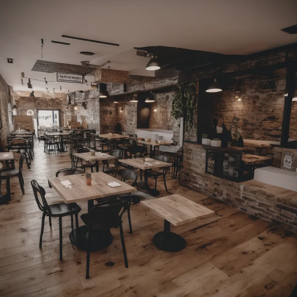
I have a software that allow users to order in restaturants using an QR that is linked to a menu. The order is followed in real time for other users in table and the restaurant administrators. I'm building a landing page to get more clients. I want an eye-catching cover for the landing page , that attracts restaurant owners and that represents the description of the software. My software is called “Selectify”. ,
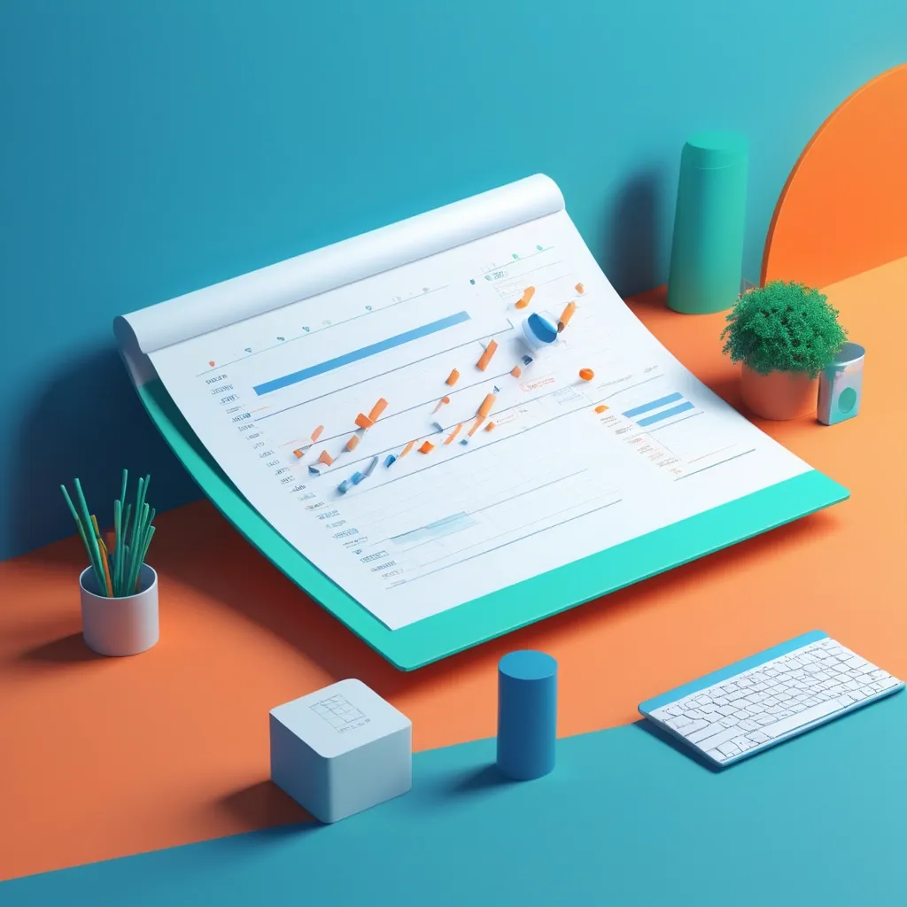
Create a vibrant and modern 3D illustration for a marketing and advertising-themed banner. The image should include: 3D growth charts , upward-pointing arrows , a laptop with analytical data on the screen , chatbot characters in 3D , landing pages with interface elements , and ad banners. Add elements related to preparing for ad campaigns: 3D checklists , a notebook with a plan , a calendar , and analytical tools. Use bright colors like blue , orange , white , and green to convey professionalism , growth , and success. The style should be modern 3D rendering with soft shadows , realistic textures , and subtle neon glows for accents. The background should be minimalistic , with abstract 3D shapes or a gradient , ensuring it doesn’t distract from the main elements. Lighting should be soft , with a focus on the central objects. ,