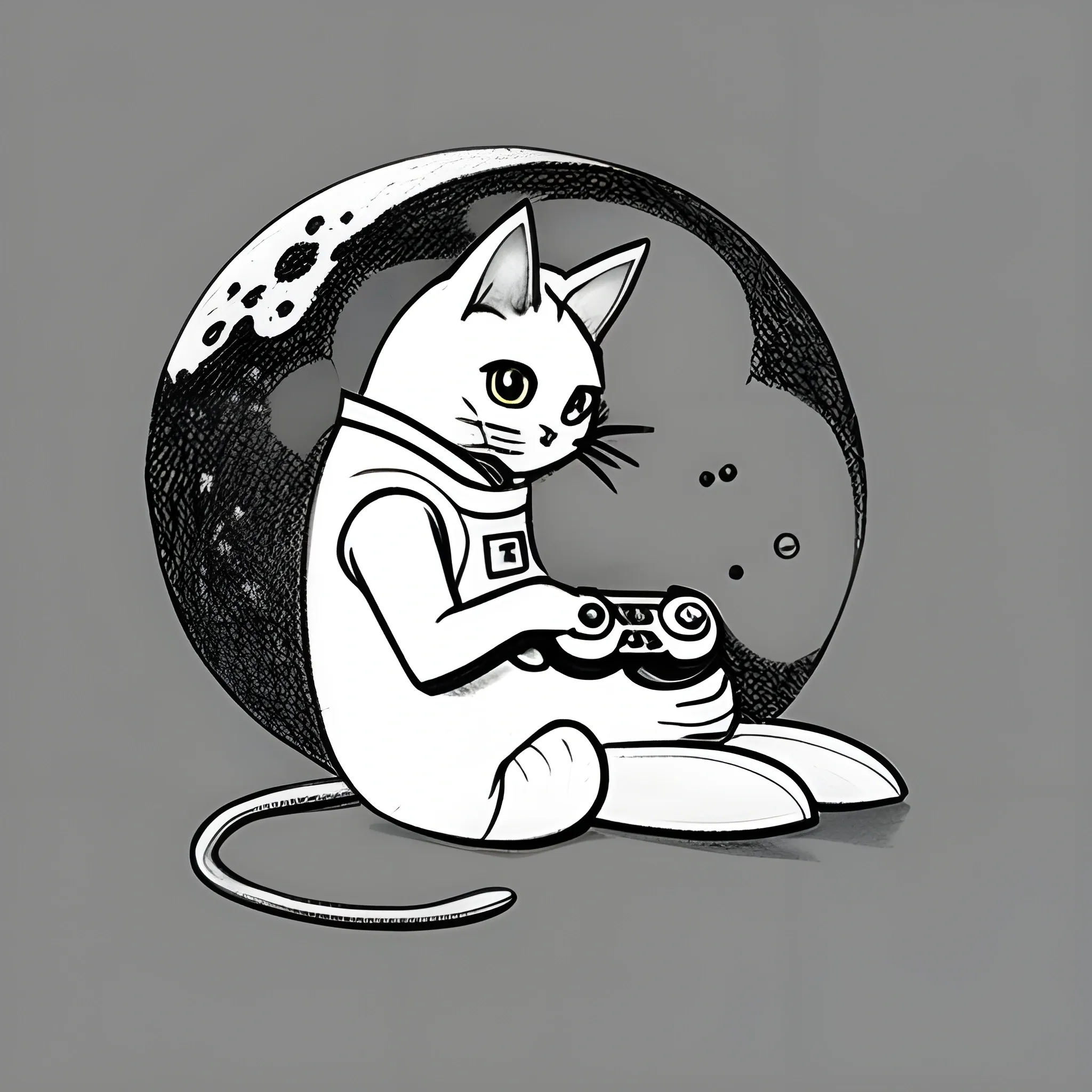
Search Results for background color
Explore AI generated designs, images, art and prompts by top community artists and designers.

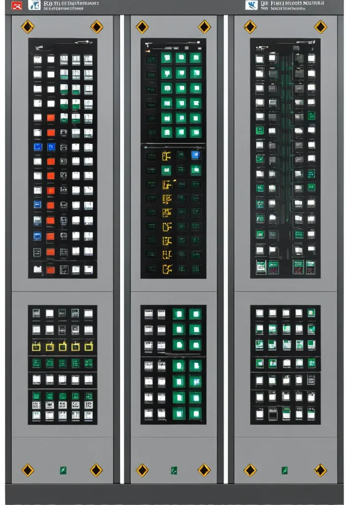
Description of the visualization and control system of the automation complex The purpose of the system is to provide the operator with a single , intuitive interface for monitoring and managing all subsystems of the complex in real time. Architecture of the main window (Generalized Status Panel): The main screen is designed according to the principle of "from general to private". The center contains critical information about the power supply system , on which all other systems depend. The remaining subsystems are grouped logically around the center. 1. Central unit: Power supply system It is visualized as a circle divided into three sectors. Large left sector (≈45%): Transformer substations (TP) 5 blocks are displayed , one for each TP. Each block contains: TP number/name (for example , TP-1 , TP-2). The indicator of the active power line: The "Network" icon with backlight (green - main , yellow - backup). Transformer status: "Main" / "Standby" (or icons). Key parameters from accounting nodes: Current (I) , Voltage (U) , Power (P). The values are output for the active line. General TP status: Color indication (Green - Normal , Yellow - Warning , Red - Emergency). Large right sector (≈45%): Main switchboards 5 blocks are displayed , one for each storage unit. Each block contains: The number/name of the GRSH (for example , GRSH-1). Active power line indicator: Similar to TP. Key parameters from accounting nodes: I , U , P. The general status of the GRS: Color indication. Lower small sector (≈10%): Uninterruptible power supply (UPS) Large text or pictogram status indicator: "Mains operation" (Green) "Battery operation" (Yellow/Orange) Battery level indicator: Percentage scale (from 0% to 100%). The color varies depending on the level (green >50% , yellow 20-50% , red <20%). 2. Peripheral blocks around the center They are arranged around a central circle , forming a "rim". Upper and lower parts of the rim: Ventilation of the web blowing Upper part: 9 installations on top. The lower part: 9 installations from the bottom. There are 18 icons/blocks in total. Each icon represents one installation and has a color indication of the status.: Green: Enabled Gray: Turned off Red: An accident (for example , the differential pressure sensor on the filter went off , an error in the drive) Black/Blue: No power supply When hovering over the cursor , a tooltip appears with details (the condition of the fan , valve , filter blockage). Left and right sides of the rim: Indoor ventilation The left and right sides are divided equally to display the 12 settings on each side. There are 24 icons/blocks in total. The same color status indication for each installation. 3. Corner blocks: Other subsystems They are located in the four corners of the screen for easy and fast perception. Upper left corner: Roller shutters (48 pcs.) Summary information is displayed as an information block.: "Closed: XX / Open: XX" (numeric values). A graphical indicator (for example , a stripe divided into green and blue parts , proportional to the number). General status: Green icon "OK" or Red icon "Emergency" (if at least one roller shutter has an emergency status). Upper right corner: Elevators (2 pcs.) Two vertical blocks , one for each elevator. Each block contains: Elevator number (Elevator 1 , Elevator 2). Floor indicator: A large number (for example , 3). Motion indicator: Up/down arrow or Stop icon. General status: The background color of the block (Green - normal , Gray - power off , Red - emergency , Blue - no connection). Lower left corner: EVIL Lights (Roof lamps) A large indicator in the form of a stylized lamp or icon. Color status indication: Bright Yellow/White: Included Gray: Off Red: Crash Black/Blue: No power supply Lower right corner: Heated storm drains Similar in style to the "Fires of EVIL" block. Color status indication: Orange/Red: Enabled Gray: Off Red (flashing): Crash Black/Blue: No power supply Navigation and management: Main Screen: It is an overview map. All the elements on it are clickable. Details: Clicking on any sector (TP , GRS , ventilation group , roller shutter unit) opens a new window with detailed information: TP/GRS: Single-line network diagram , status of all feeders and sectional switches , detailed power parameters. Ventilation: Detailed status of each piece of equipment in the selected group (fan , valve , filter condition) , possibility of manual control. Roller shutters: A table or plan of the building with the condition of each of the 48 roller shutters , group and individual control buttons. Control: The control buttons (Start , Stop , Open , Close) are located on the detailed screens. On the main screen , quick action buttons ("Emergency activation") can be displayed for critical systems (for example , EVIL lights). Visual style: Color scheme: An intuitive color palette is used (Green is the norm , Yellow/Orange is a warning , Red is an accident , Gray/Blue - disabled/no data). Fonts: Clear , easy-to-read fonts. Critical information is displayed larger. Animation: Minimal and informative (for example , smooth change of values , flashing for emergency states). ,
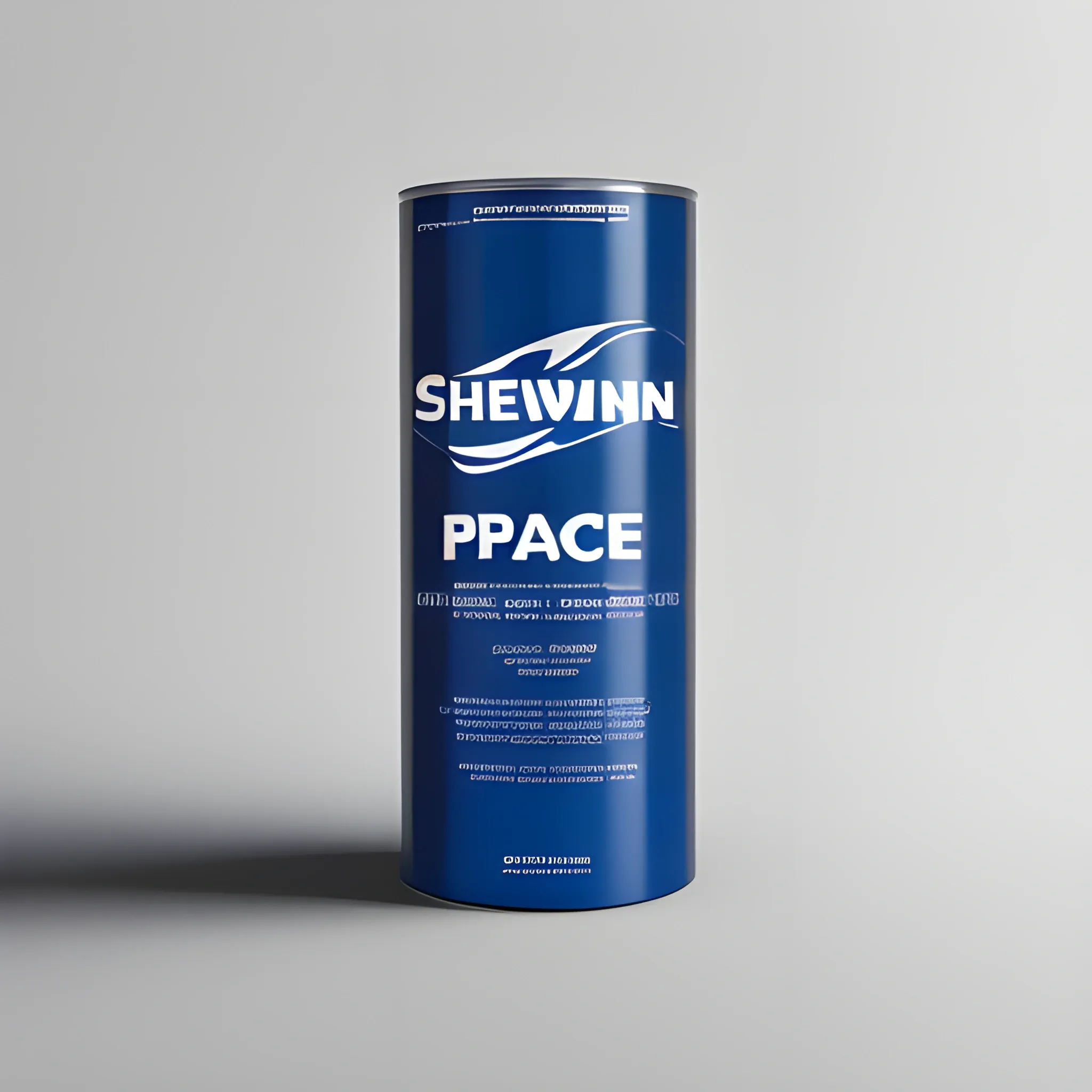
A digital artwork featuring a 12cmx14cm advertisement for a product , with the Sherwin-Williams logo prominently positioned. The advertisement has a minimalist design with no background color , showcasing the product in a clean and sophisticated manner. The product is illustrated or digitally rendered with precision and attention to detail. The Sherwin-Williams logo is featured prominently in the designated space , reinforcing brand identity. The typography used for the product description and other details is minimalistic , adding to the overall simplicity of the design. The composition is balanced and visually pleasing , creating a strong visual impact within the limited space. The artwork conveys a sense of professionalism and elegance while drawing attention to the product and the Sherwin-Williams brand. ,
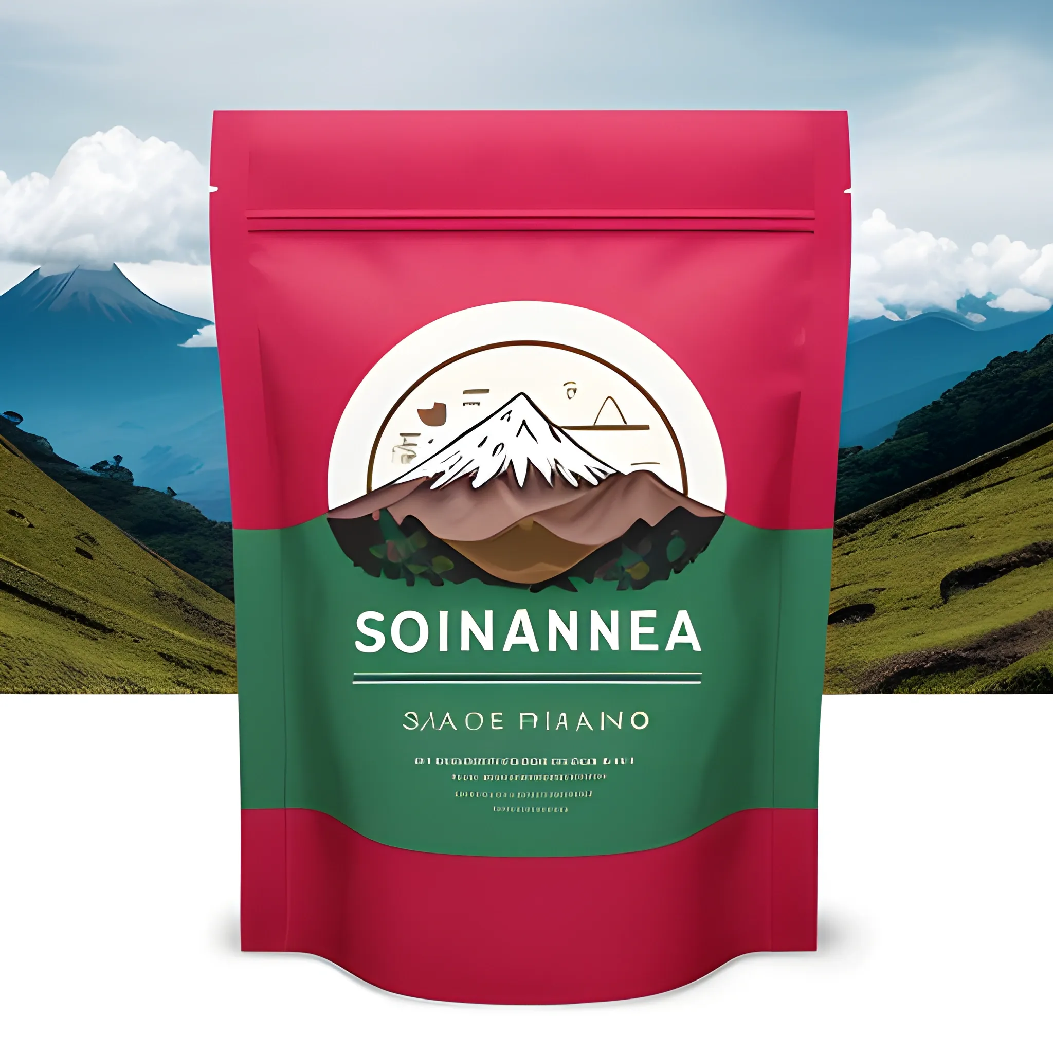
Designing a coffee bag for "John Coffee" in the Páramo of Santander , Colombia , will require a logo and background that reflect the brand's identity and the unique characteristics of the region. Here's a description of a possible design: Logo: Central Icon: Consider using an iconic element that represents both coffee and the Páramo of Santander. This could be a combination of a coffee cup and the silhouette of the páramo's mountains. Nature: Incorporate elements of the páramo's natural beauty , such as native flora , like frailejones , and fauna like birds or rabbits. These elements can encircle the central icon. Colors: Utilize a color palette that captures the essence of the Páramo , with shades of green and blue representing the natural landscape and perhaps deep brown for coffee. Typography: Choose a font that reflects the brand's personality , whether it's rustic , modern , or elegant. Ensure that the brand name "John Coffee" is clearly legible. Text: Place the brand name "John Coffee" and the location "Páramo of Santander , Colombia" in proximity to or around the central icon. Bag Background: Natural Background: Use a background image or pattern that showcases the stunning scenery of the Páramo of Santander. This could include mountains , rolling hills , and clouds. It should create a sense of place and emphasize the brand's connection to the region. Colors: Harmonize the background colors with the logo's color palette to create a cohesive and visually pleasing design. Product Information: On the back of the bag , provide essential details about the coffee , including its variety , processing method , tasting notes , and any unique selling points. Remember , it's crucial to collaborate with a professional graphic designer to bring your vision to life. This design concept is a starting point and can be tailored to fit your brand's identity and preferences. Additionally , ensure that the bag complies with all legal requirements for coffee packaging and labeling in Colombia and any target markets. ,
concept art 2 d game asset of furniture with an organic isometric design based on bioluminescent alien - like plants inspired by the avatar's bioluminescent alien nature. around the furniture , we can see plants that glow in the dark. all in isometric perspective and semi - realistic style item is in a black background colorful neons masterpiece ,
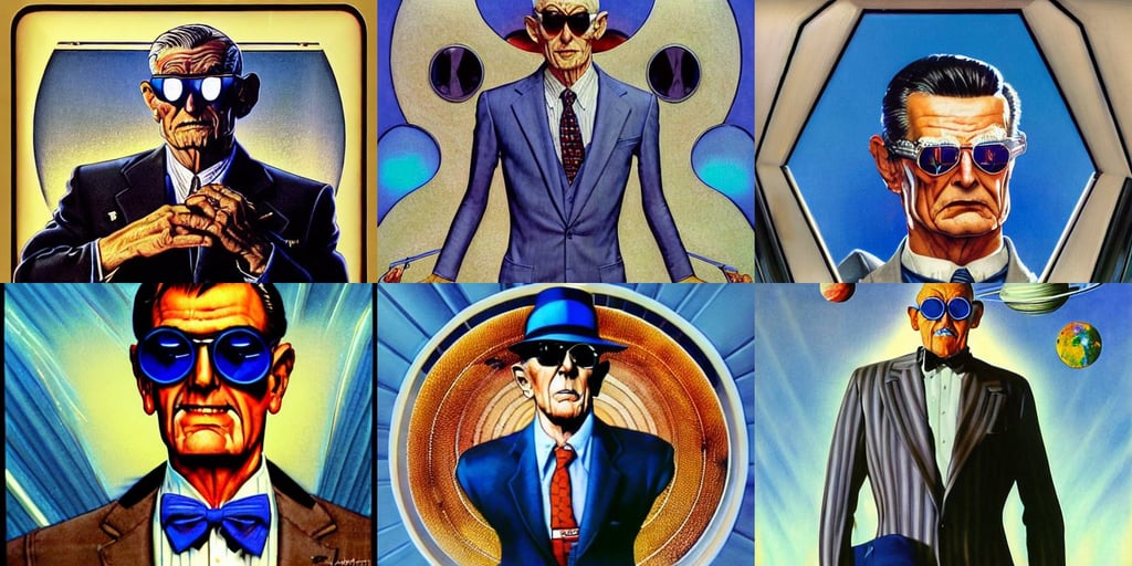
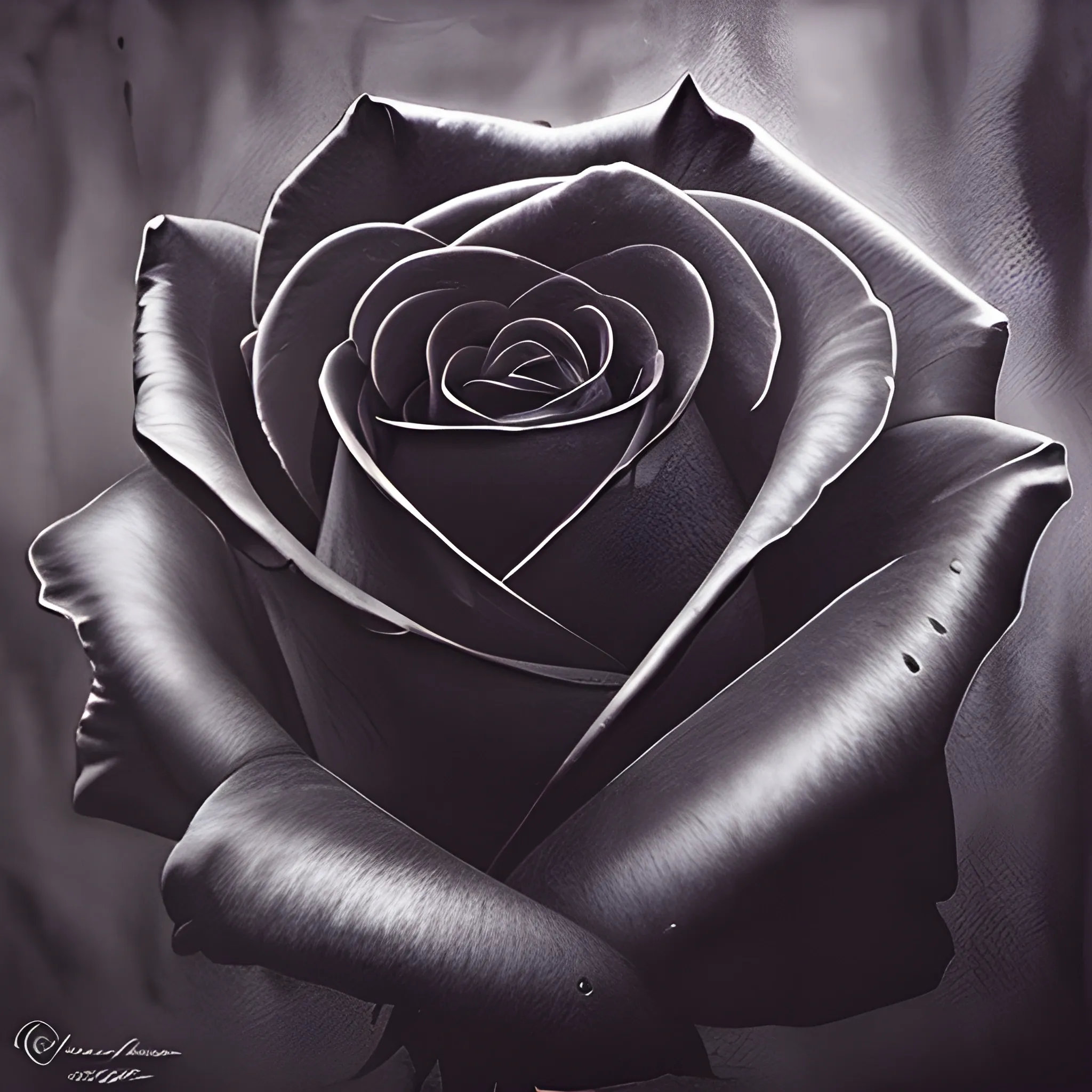
symmetry!! portrait of an old man wearing sunglasses , Megatron decepticon artifacts , and a blue dress , pinstripe suit , beautiful eyes and face , by norman rockwell and boris vallejo , carrying the earth through space , lens flare - w 7 0 4 , Fantasy LUT , classy masterfully painted on glass by Akira Toriyama and Mina Petrovic , wearing a grey hooded sweatshirt , dishonored , concept style , solid background color , long curly black hairs , h.r.giger , translucent green visor , the frankenstein monster's face , backlighting , focus close on eyes realistic skin texture , embodiment of fire and water ,
concept art 2 d game asset of various stair blocks with organic isometric design , bioluminescent alien - like plants inspired by the avatar's bioluminescent alien nature. around the stairs , we can see plants glowing in the dark. isometric perspective , item is in a black background colorful neons cyan , orange red , painterly cartoonish octane render masterpiece ,
concept art 2 d game asset of furniture with an organic isometric design based on bioluminescent alien - like plants inspired by the avatar's bioluminescent alien nature. around the furniture , we can see plants that glow in the dark. all in isometric perspective and semi - realistic style item is in a black background colorful neons surrealistic masterpiece ,
concept art 2 d game asset of furniture with an organic isometric design based on bioluminescent alien - like plants inspired by the avatar's bioluminescent alien nature. around the furniture , we can see plants that glow in the dark. all in isometric perspective and semi - realistic style item is in a black background colorful neons surrealistic masterpiece ,
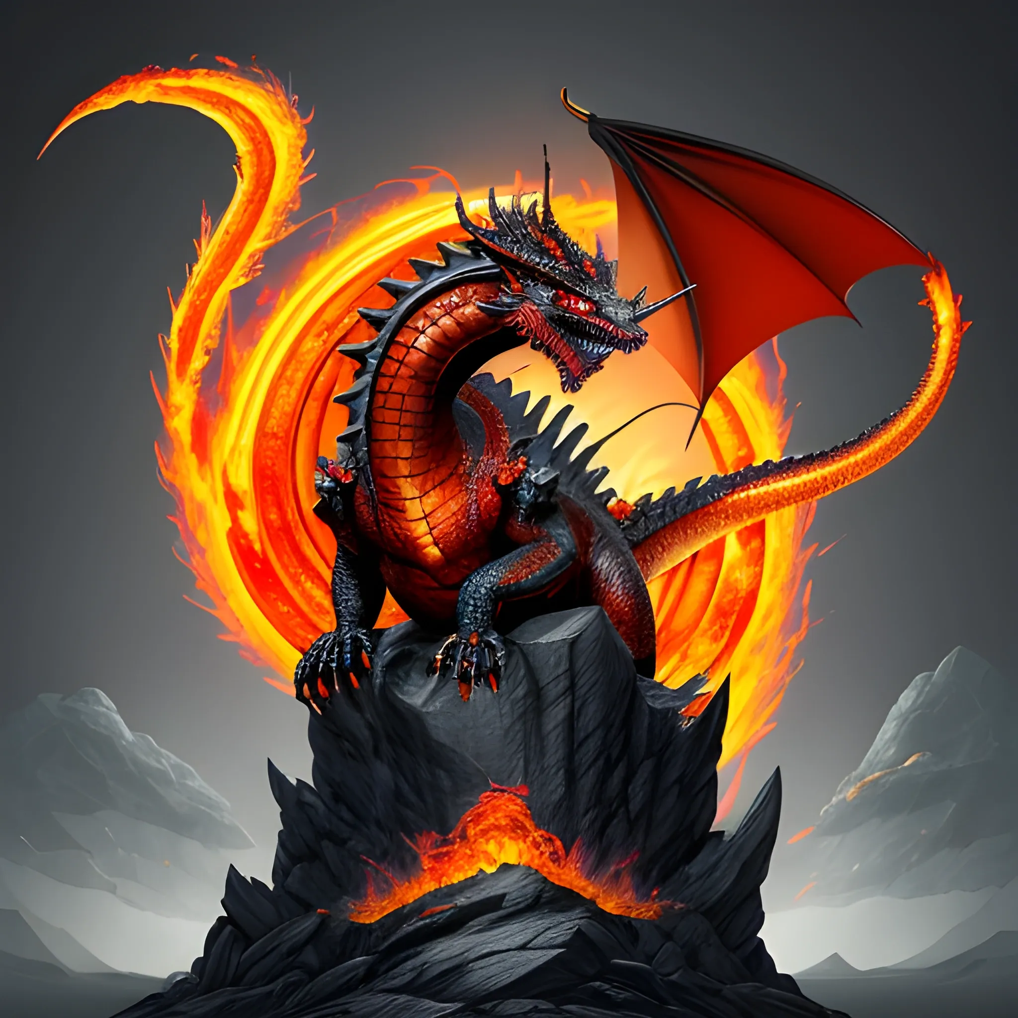
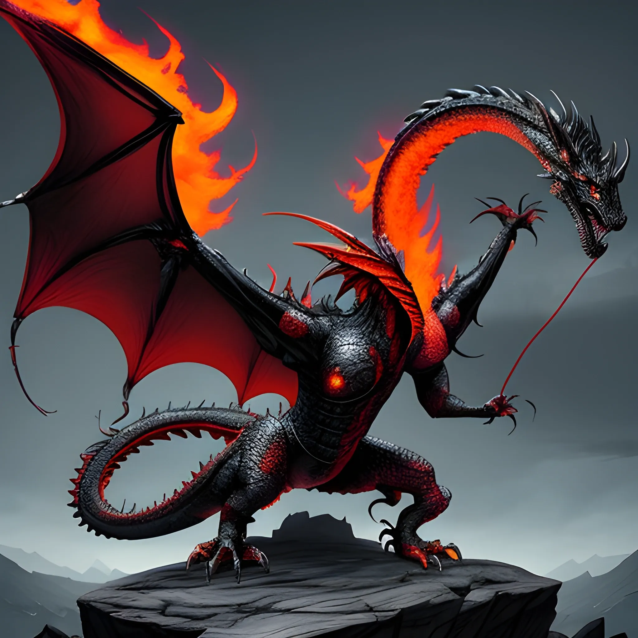
**Balerion Family Crest:** 1. **Shape of the Badge**: Use a traditional shield shape as the base to reflect majesty and power. 2. **Dragon Position**: Place the giant black-red dragon in the center of the badge as the main visual element. 3. **Lava Emission**: Design the dragon with lava spewing from its mouth to add dynamism and visual impact. 4. **Standing on Rocky Terrain**: Have the dragon’s feet resting on rugged mountain rocks to demonstrate its power and stability. 5. **Crown on the Head**: Add a regal crown to the dragon’s head , symbolizing the family’s honor and nobility. 6. **Colors**: Use black and red as the primary colors to highlight the dragon's majesty and mystery. The lava can be bright orange or red to enhance the visual effect. The background color can be a dark tone , such as deep gray or black , to contrast with the dragon's power. ancient painting style ,
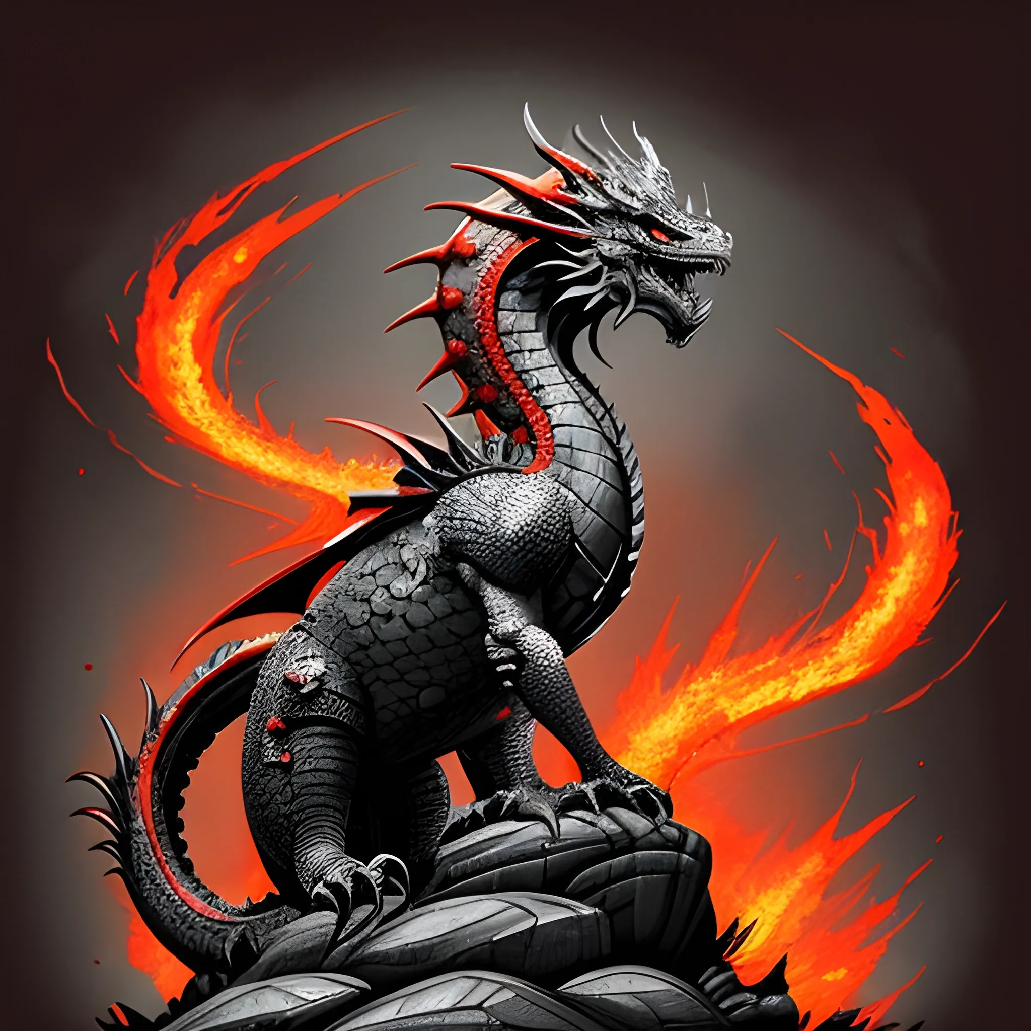
Balerion Family Crest: 1. Shape of the Badge: Use a traditional shield shape as the base to reflect majesty and power. 2. **Dragon Position**: Place the giant black-red dragon in the center of the badge as the main visual element. 3. Lava Emission Design the dragon with lava spewing from its mouth to add dynamism and visual impact. 4. Standing on Rocky Terrain: Have the dragon’s feet resting on rugged mountain rocks to demonstrate its power and stability. 5. Crown on the Head: Add a regal crown to the dragon’s head , symbolizing the family’s honor and nobility. 6. Colors* Use black and red as the primary colors to highlight the dragon's majesty and mystery. The lava can be bright orange or red to enhance the visual effect. The background color can be a dark tone , such as deep gray or black , to contrast with the dragon's power. highly detailed , sumi - e art , suiboku - ga ink , by kim jisu , pen and ink monochrome , mecha , deviantart , artstation , pinterest ,
**Balerion Family Crest:** 1. **Shape of the Badge**: Use a traditional shield shape as the base to reflect majesty and power. 2. **Dragon Position**: Place the giant black-red dragon in the center of the badge as the main visual element. 3. **Lava Emission**: Design the dragon with lava spewing from its mouth to add dynamism and visual impact. 4. **Standing on Rocky Terrain**: Have the dragon’s feet resting on rugged mountain rocks to demonstrate its power and stability. 5. **Crown on the Head**: Add a regal crown to the dragon’s head , symbolizing the family’s honor and nobility. 6. **Colors**: Use black and red as the primary colors to highlight the dragon's majesty and mystery. The lava can be bright orange or red to enhance the visual effect. The background color can be a dark tone , such as deep gray or black , to contrast with the dragon's power. highly detailed , sumi - e art , suiboku - ga ink , by kim jisu , pen and ink monochrome , mecha , deviantart , artstation , pinterest ,
A digital artwork featuring a 12cmx14cm advertisement for a product , with the Toonamidia logo prominently positioned. The ad has a minimalist design with no background color , presenting the product in a clean and sophisticated way. The product is digitally illustrated or rendered with precision and attention to detail. The Toonamidia logo is featured in the designated space , reinforcing the brand identity. The typography used for the product description and other details is minimalistic , adding to the overall simplicity of the design. The composition is balanced and visually pleasing , creating a strong visual impact within the limited space. Artwork conveys a sense of professionalism and elegance , drawing attention to both the product and the Sherwin-Williams brand. , 3D ,
concept art 2 d game asset of wooden stick with an organic isometric design based on bioluminescent alien - like plants inspired by the avatar's bioluminescent alien nature. around the furniture , we can see plants that glow in the dark. all in isometric perspective and semi - realistic style item is in a black background colorful neons masterpiece ,

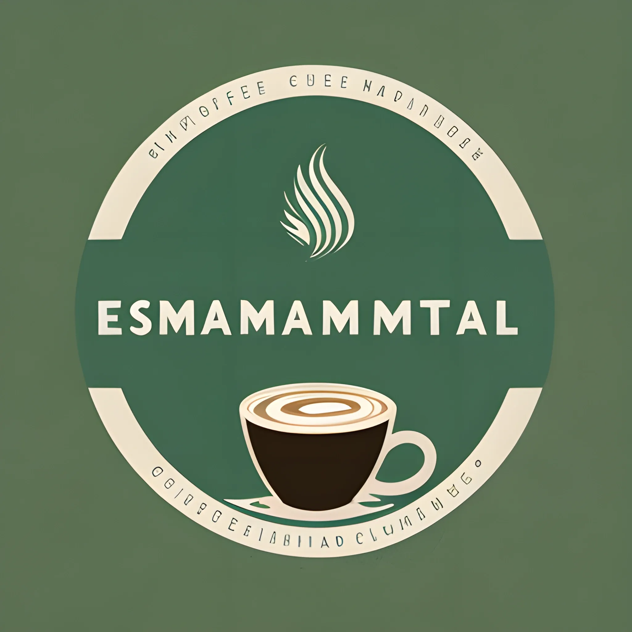
Central Icon: Design a logo that prominently features a coffee cup with the steam rising from it. Inside the coffee cup , incorporate a simplified representation of the Santander region's mountainous landscape. This fusion symbolizes the connection between the coffee and the region. Nature Elements: Surround the coffee cup with elements inspired by the natural beauty of Santander , such as native flowers , trees , or birds. These elements can add a touch of the region's unique biodiversity. Colors: Use a color palette that reflects the colors of Santander's natural environment. Shades of green for lush landscapes , earthy tones for coffee , and blues for skies and water bodies would be fitting. Typography: Select a font that matches the personality of your brand , whether it's rustic , modern , or elegant. Ensure that the brand name "Emmanuel Coffee" is clear and legible. Text: Place the brand name "Emmanuel Coffee" and the location "Santander , Colombia" close to or around the central coffee cup icon. Bag Background: Natural Background: Utilize a background image or pattern that showcases the beauty of Santander , with scenes of mountains , valleys , or coffee plantations. This gives a sense of place and highlights the region's connection to the coffee. Colors: Make sure that the background colors complement the logo's palette , creating an overall cohesive and visually appealing design. Product Information: Include important details about your coffee on the back of the bag , such as the coffee's variety , processing method , flavor notes , and any unique qualities that set Emmanuel Coffee apart. Remember , working with a professional graphic designer is crucial to bringing this design concept to life and creating an eye-catching design. Customization will ensure that the design aligns with your brand identity and preferences. Additionally , make sure your coffee bag complies with all legal requirements for coffee packaging and labeling in Colombia and any other markets where you plan to sell your coffee. ,