Search Results for unnecessary
Explore AI generated designs, images, art and prompts by top community artists and designers.
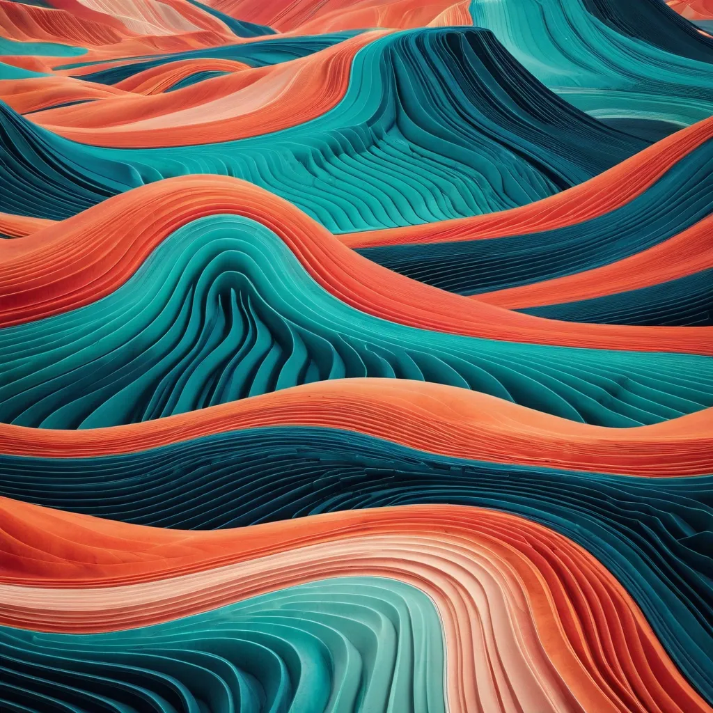

MINERAL CURRENT: Colorful mineral flows. Create a premium art poster that transforms an imaginary landscape into a vibrant , abstract world of continuous topographic contour lines , combining Eastern landscape aesthetics with modern editorial design. Construct the terrain from hundreds of long , smooth , elegant flowing lines that naturally follow its shape , elevation , and movement. The contour lines should become the actual structure of the landscape , forming soft hills , sweeping folds , flowing rifts , or interconnected mineral formations rather than simply decorating a realistic surface. Use large , recognizable landforms with strong silhouettes , layered depth , and clear visual hierarchy. Vary line density naturally , with tighter contours around curves and folds and wider spacing across calmer surfaces. Keep every line flowing in harmony with the overall composition. Apply a bold but controlled palette with strong warm and cool contrast. Combine colors such as deep indigo , cobalt blue , turquoise , coral pink , vermilion , peach orange , emerald green , and warm cream according to the chosen palette. Let colors transition smoothly along the contour lines , creating substantial color fields and harmonious gradients without random rainbow effects. Keep the landscape monumental , abstract , and highly graphic. If a scale element is specified , make it extremely small , occupying less than 1% of the image. Balance intricate linework with generous negative space to maintain strong thumbnail readability. Reserve a calm upper area for refined editorial typography. Include the main title , Chinese subtitle , and poetic tagline using elegant serif lettering , generous spacing , and a contemporary exhibition-poster aesthetic. The final artwork should feel colorful , poetic , sophisticated , and strongly line-driven , with visual impact created through continuous contours , bold color relationships , flowing terrain forms , and clean graphic composition. Avoid realistic landscape photography , rocky textures , chaotic patterns , broken strokes , excessive detail , cinematic CGI , plastic 3D surfaces , watermarks , logos , copyright text , and unnecessary decorative elements. ,
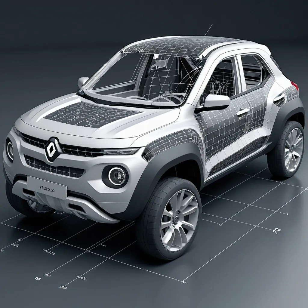
Create a highly detailed 9:16 square engineering-design reconstruction of the 2026 Renault KWID , treating the vehicle as a cross-domain engineering artifact rather than a conventional car photograph. Show the KWID in a precise three-quarter front view , accurately preserving its compact proportions , tall stance , sculpted body , high ground clearance , front fascia , grille , headlamp geometry , wheel arches , wheels , mirrors , doors , and distinctive exterior character. Build a sophisticated multi-layer technical visualization combining automotive industrial design , mechanical engineering , computational geometry , aerodynamics , materials science , human-machine interface , structural engineering , manufacturing logic , and mathematical analysis. Visually deconstruct the car into CAD wireframes , exploded body panels , suspension and chassis structures , wheel geometry , aerodynamic flow lines , section cuts , dimensional grids , surface-contour maps , topology diagrams , force vectors , stress-flow annotations , material callouts , and parametric construction curves. Use a refined scientific atlas / advanced automotive engineering laboratory aesthetic: neutral off-white technical background , graphite-black linework , subtle metallic vehicle rendering , restrained blueprint markings , translucent engineering overlays , micro-labels , coordinate axes , datum lines , geometric construction circles , numerical measurements , and elegant technical annotations. Integrate multiple analytical layers without making the composition chaotic. The central KWID remains the strongest visual object; surrounding engineering diagrams progressively reveal design intent → geometry → structure → aerodynamics → manufacturing → performance. Include realistic component relationships and technically plausible engineering notation. Premium automotive concept-study presentation , ultra-sharp precision , photorealistic materials combined with vector technical graphics , sophisticated industrial-design visualization , museum-quality engineering poster , extremely fine line detail , clean hierarchy , controlled negative space , no unnecessary decorative elements , no brand-logo distortion , no watermark. ,
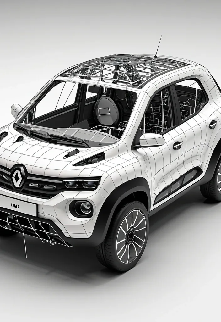
Create a highly detailed 1:1 square engineering-design reconstruction of the 2026 Renault KWID , treating the vehicle as a cross-domain engineering artifact rather than a conventional car photograph. Show the KWID in a precise three-quarter front view , accurately preserving its compact proportions , tall stance , sculpted body , high ground clearance , front fascia , grille , headlamp geometry , wheel arches , wheels , mirrors , doors , and distinctive exterior character. Build a sophisticated multi-layer technical visualization combining automotive industrial design , mechanical engineering , computational geometry , aerodynamics , materials science , human-machine interface , structural engineering , manufacturing logic , and mathematical analysis. Visually deconstruct the car into CAD wireframes , exploded body panels , suspension and chassis structures , wheel geometry , aerodynamic flow lines , section cuts , dimensional grids , surface-contour maps , topology diagrams , force vectors , stress-flow annotations , material callouts , and parametric construction curves. Use a refined scientific atlas / advanced automotive engineering laboratory aesthetic: neutral off-white technical background , graphite-black linework , subtle metallic vehicle rendering , restrained blueprint markings , translucent engineering overlays , micro-labels , coordinate axes , datum lines , geometric construction circles , numerical measurements , and elegant technical annotations. Integrate multiple analytical layers without making the composition chaotic. The central KWID remains the strongest visual object; surrounding engineering diagrams progressively reveal design intent → geometry → structure → aerodynamics → manufacturing → performance. Include realistic component relationships and technically plausible engineering notation. Premium automotive concept-study presentation , ultra-sharp precision , photorealistic materials combined with vector technical graphics , sophisticated industrial-design visualization , museum-quality engineering poster , extremely fine line detail , clean hierarchy , controlled negative space , no unnecessary decorative elements , no brand-logo distortion , no watermark. Aspect ratio: 1:1 — square composition — high-resolution — cross-domain engineering reconstruction — automotive scientific atlas — 2026 design language. ,
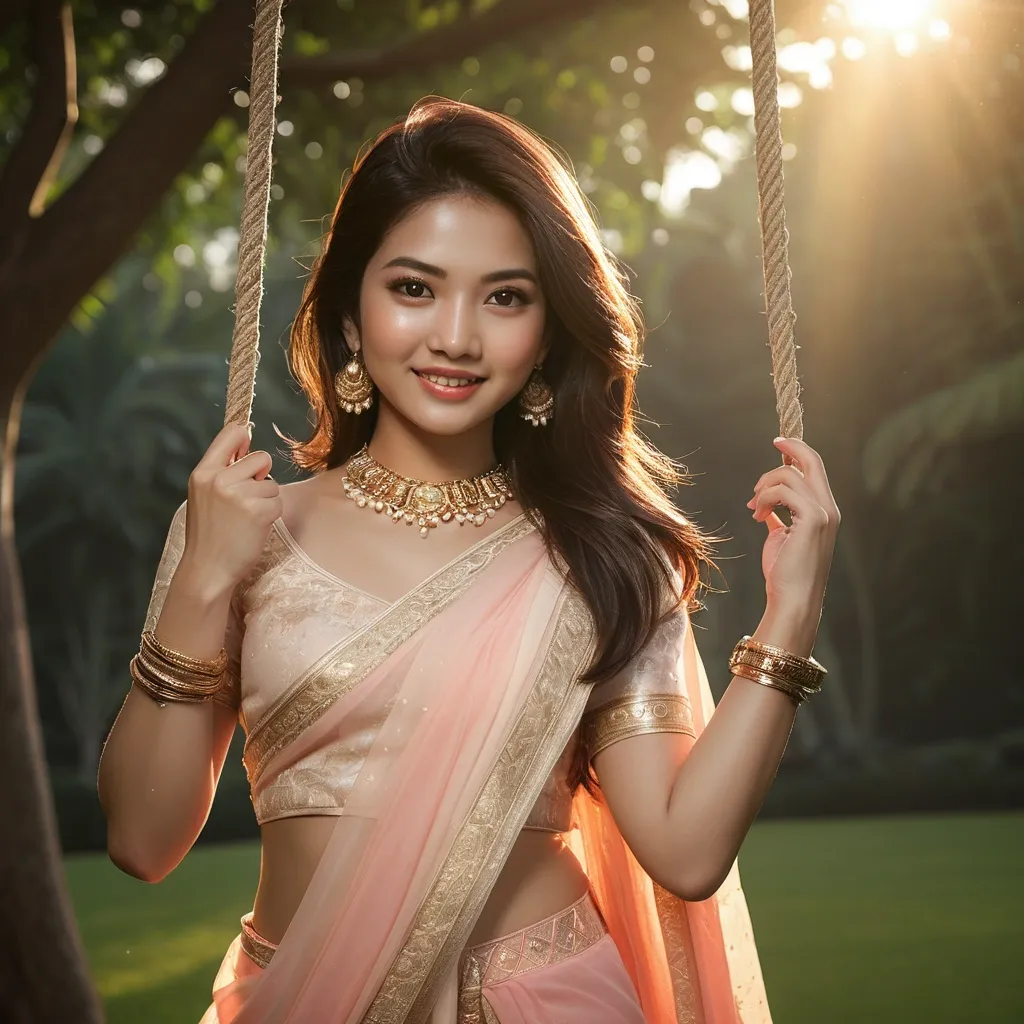
Fashion photograph a ultra-detailed beautiful Asian woman , wearing Indian traditional Saree , 10mm , beautiful studio soft light , rim light , layered bracelets , glossy lips , soft blush , swinging on a rope swing hanging from the huge tree form garden. Soft natural smile. Natural skin texture visible. Slight wind variation in hair strands. Act as a professional cinematic photo editor. Transform the lighting in the uploaded photo into a realistic golden-hour look. Act as a professional portrait retoucher. Clean and simplify the background of the uploaded photo while keeping the subject completely untouched. Remove distracting objects , clutter , harsh visual elements , and unnecessary details without changing the original setting. Match the lighting , shadows , perspective , and edges naturally so the final image looks professionally photographed and realistically edited. 9:16 aspect ratio ,
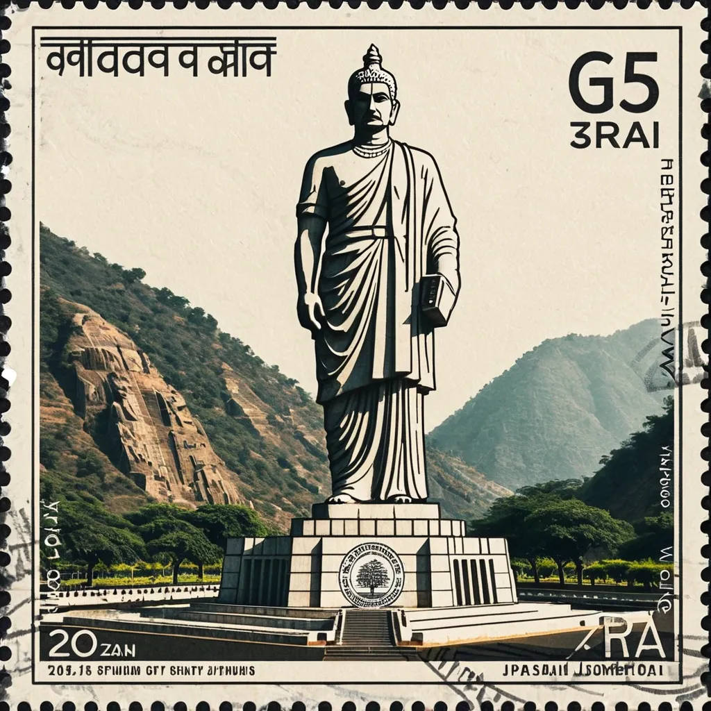
Create a realistic photographic scene of Statue Of Unity , accurately depicting its recognizable architecture , landscape , people , vegetation , terrain , perspective , lighting , shadows , and natural atmosphere. The scene must remain photographic and realistic , with only subtle archival grading and fine film grain. Make it resemble an authentic vintage travel postage stamp with: Subtle perforated edges Aged printed texture Mild ink absorption Slight print wear and tonal variation Natural analog character POSTAGE TYPOGRAPHY Integrate small vintage postal typography directly into the stamp: Statue Of Unity Small Narmada valley , near Kevadia in the state of Gujarat , India POSTAGE denomination or numerical value October 2013–October 2018 Optional small serial/issue number Use restrained serif , engraved , condensed , or archival lettering with subtle fading and imperfect ink. Keep typography away from important visual details. Avoid modern branding , fake government logos , and decorative slogans. RIGHT — RUBBER STAMP Create a small 2–4 color hand-carved rubber-stamp impression representing the most recognizable features of Statue Of Unity. Simplify the scene into strong visual shapes such as architecture , mountain contours , roads , shorelines , settlements , vegetation , or distinctive silhouettes. Remove unnecessary crowds , vehicles , repetitive buildings , and fine details. Place the stamp in the lower-middle of the right panel , occupying about 30–38% of the panel height , with generous whitespace. Use muted colors inspired by the destination. Add authentic handmade imperfections: uneven carving , broken edges , dry ink , paper show-through , granular texture , uneven pressure , ghosting , and subtle 1–2 mm color misregistration. It should look like a genuine hand-stamped mark on aged paper , never a clean vector logo. FIELD-NOTE TEXT Add small typewriter-style text near the stamp: Statue Of Unity No. 2018 182 metres · Narmada valley · Ekta Nagar 2018 October Keep the text small , understated , and secondary. STYLE Quiet , archival , tactile , regional , understated , and collectible — like a genuine travel document combining a vintage photographic postage stamp with an architect's field-note rubber stamp. ,

Transform this portrait photo into a professional children's coloring book line art illustration. Clean , smooth , continuous black outlines only. Pure black ink lines on a pure white background. No shading , no grayscale , no colors , no gradients. No sketch texture , no cross-hatching , no scribbles , no dots , no noise. Lines must be crisp , well separated , and easy for coloring inside. Medium-thick outlines suitable for printing coloring books. Simplify unnecessary details while preserving the main facial features and likeness. Balanced line weight , smooth curves , professional vector-style ink drawing. Minimal background or completely blank background. High contrast , ultra clean edges , print-ready coloring page style. 8K resolution , extremely sharp , high detail , perfect for coloring book printing. ,
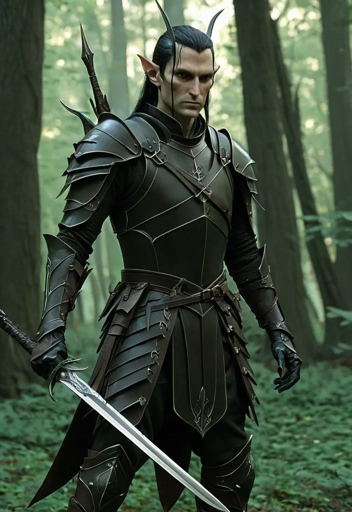
Elf Against the backdrop of a morning leafy forest General: Tall , graceful , with sharp features and long ears. Armor is light and aerodynamic. Armor: Practical dark leather , without unnecessary details. Multiple weapon straps. Weapons: Dagger and short sword—blades with a broken silhouette , ideal for quick slashing strikes. Handles are wrapped for a better grip. ,

Refine this logo into a clean , minimalistic , and modern version while preserving the core concept and proportions. Remove unnecessary details , textures , and visual noise. Make all lines perfectly balanced , symmetrical , and precise. Use a premium , calm color palette — deep navy , gray , black , white , or a subtle gold accent. The overall style should feel minimalist , elegant , and corporate , suitable for a law firm or consulting company. Output as a vector-style logo on a white or transparent background , with no shadows or 3D effects. Reference aesthetics: Skadden , Hogan Lovells , Clifford Chance. “Logo redesign for a law firm — Femida Service. The style should express justice , trust , and professionalism with a premium minimalist aesthetic.” ,
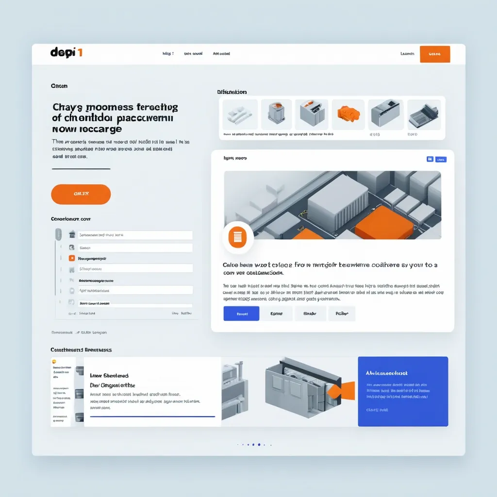
Make a prototype of a block for the data processing service website page (the service uses AI when necessary) , taking into account the following requirements: Hero block (Hero section) The purpose of the block is to immediately attract attention and convey the key SEO USP: NotPIM — conversion of product feeds in any direction for online stores. Texts: Title (H1): "Conversion of product feeds in any direction — quickly , accurately , and without unnecessary work" Subtitle: "From the chaos of price lists and data from suppliers to a ready-made catalog in the desired format. Automation without programmers." CTA button: "Try it for free" Visual: illustration/animation "disparate feeds → clean catalog". ,

The drawing style is as minimalistic as possible , without unnecessary shadows or details , just a puzzle.You have a 7-piece jigsaw puzzle. They are arranged so that the largest piece of the puzzle lies in the center , and the rest of the puzzle pieces are attached to it in such a way that a square is formed as a result. Keep in mind that you can use not only the basic shapes of the puzzle pieces , but also those that you come up with yourself , only with one prerequisite - the puzzle must be assembled into a square. The puzzle is white , the background is blue ,

The drawing style is as minimalistic as possible , without unnecessary shadows or details , just a puzzle.You have a 7-piece jigsaw puzzle. They are arranged so that the largest piece of the puzzle lies in the center , and the rest of the puzzle pieces are attached to it in such a way that a square is formed as a result. Keep in mind that you can use not only the basic shapes of the puzzle pieces , but also those that you come up with yourself , only with one prerequisite - the puzzle must be assembled into a square. The puzzle is white , the background is blue ,

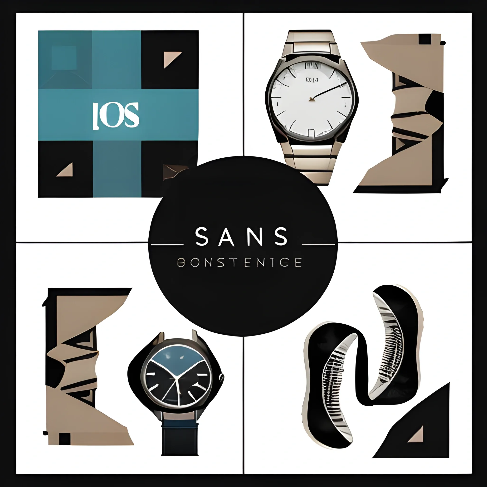
Generate me a logo. Iconography: Incorporate an abstract representation of clothing , a watch , and a shoe seamlessly synchronized together. This could be achieved by creating simplified , geometric shapes that resemble these items overlapping or interlocking with each other. Typography: Choose a modern and clean font for the text "StyleSync Hub". Ensure that it's easily readable and complements the iconography. You might want to consider a sans-serif font to convey a contemporary and stylish feel. Color Scheme: Opt for a sophisticated color palette that reflects the elegance of fashion and accessories. Consider using neutral tones like black , white , and gray as the primary colors , with a pop of color for emphasis. Alternatively , you could incorporate hues that are commonly associated with clothing , watches , and shoes , such as shades of blue , brown , or metallic accents. Composition: Experiment with different arrangements of the iconography and text to find a balanced composition. You could position the iconography either above , below , or to the side of the text , depending on what looks visually appealing and creates a cohesive design. Visual Style: Aim for a sleek and polished visual style that conveys professionalism and reliability. Avoid cluttering the design with unnecessary details and maintain a sense of simplicity and sophistication. ,

unappetizing , unbecoming , uncouth , undone , uneventful , unfortunate , ungrateful , unhinged , uninspired , unjust , unkempt , unleavened , unmet , unnecessary , unoriginal , unpleasant , unquiet , unraveling , unsettling , untoward , unusual , unverified , unwinding ,