Search Results for helvetica
Explore AI generated designs, images, art and prompts by top community artists and designers.
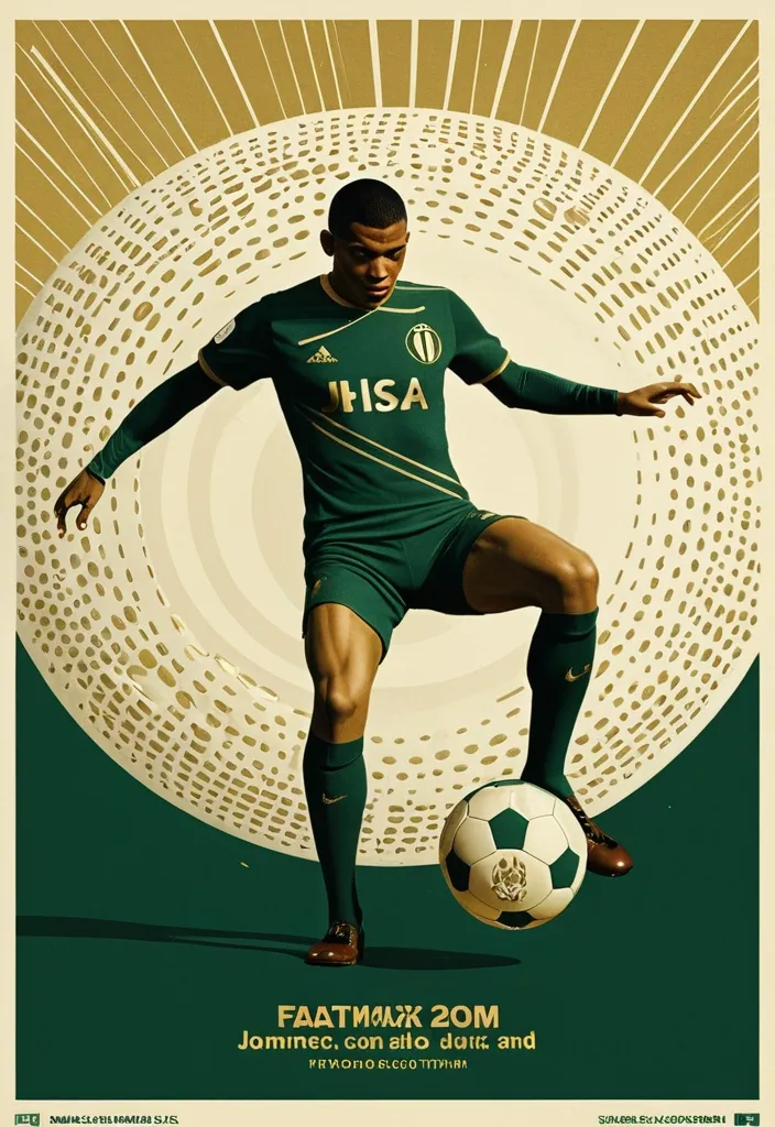

A professional vertical 3:4 poster for FIFA World Cup 2026. STYLE: vintage sport editorial meets modern Swiss typography — 1960s-70s sports magazine grit fused with bold contemporary graphic design. PALETTE: warm gold #D4AF37 + deep forest green #1B3A2D + cream off-white #F5F0E8. Entire image is monochromatic within this palette — NO bright colors anywhere. LAYOUT — Top: massive bold title "FIFA" on first line , "WORLD CUP" on second line , in extremely bold sans-serif , square heavy letterforms , filled with dense halftone dot texture like old newspaper print , cream off-white color , spanning full width. The letters have a slight rough edge like screen-printed ink. Center: A dynamic silhouette of Kylian Mbappé mid-kick —athletic explosive running posture. a powerful action pose: one leg extended forward striking the football , body leaning into the shot , in a vast star-filled cosmic night , just struck by his foot a thin flashlight shadow emerge into enormous half-football's ring , light imperial Starwars style giant half-football(3D rendering:0.1) drifting across the void , dissolving into Phantom. The figure is rendered as a high-contrast duotone graphic in warm gold against deep green , with subtle film grain and light vintage halftone texture. Behind him , a faint circular sunburst graphic radiates outward in gold lines , evoking classic 1970s sports posters. At his feet , the official 2026 World Cup ball "Trionda" — rendered in the SAME duotone gold-and-cream palette as the rest of the image , no bright red/green/blue. The ball's distinctive wave pattern and panel construction are visible through tonal contrast and embossed texture in gold and cream tones , like a vintage screen print. The ball is mid-flight , just struck by his foot. Bottom: slogan "Say It. Make Your Cup." in the SAME extremely bold sans-serif font as the title — square , heavy , condensed letterforms with the same halftone dot texture fill , cream off-white color , matching the "FIFA WORLD CUP" title typography exactly. A thin gold rule line separates it slightly. Below the slogan , "2026" in the same bold sans-serif style , smaller but matching. DESIGN: bold negative space , strong diagonal tension from Mbappé's striking pose , clear visual hierarchy. The vintage feel is subtle — light film grain , slight warm color shift , delicate halftone pattern on all text. The ENTIRE image stays strictly within the gold-green-cream palette — Trionda ball must NOT appear in bright colors , only duotone gold/cream with tonal embossed detail. ANCHOR: reminiscent of 1970s World Cup matchday programmes crossed with modern minimalist editorial design. AVOID: generic Inter/Helvetica typography , generic purple gradients , SaaS landing page style , stock photo aesthetic , rounded card stacks , watermarks , misspelled text , low contrast text , multi-step compositing seams , bright colors anywhere in the image , a colorful football , thin or lightweight fonts at the bottom , mismatched typography between title and slogan. Clean , high-resolution image quality: smooth continuous tonal gradients , uniform and well-controlled texture throughout , surfaces and materials intact and naturally rendered. The main subject is crisp and clearly separated from a softly layered background with clear depth. Free of digital noise and over-sharpening artifacts. No watermark , no garbled text. ,
ABSOLUTE MASTER PROMPT - DO NOT ACCEPT LESS THAN PERFECT BRAND: MINDPLUSE DIGITAL - Premium AI Agency ⚠️ CRITICAL SPELLING VERIFICATION - NO ERRORS TOLERATED: - Primary text: "MINDPLUSE" (M-I-N-D-P-L-U-S-E) - ALL CAPS - Secondary text: "DIGITAL" (D-I-G-I-T-A-L) - ALL CAPS - If spelling is wrong even by one letter , the design FAILS VISUAL IDENTITY STANDARD (Forbes 500 / Fortune 500 Level): - Must feel like it belongs alongside: OpenAI , Anthropic , Google DeepMind , Tesla , Spotify - Must be TIMELESS - equally powerful in 2026 and 2050 - Must work at 16px (favicon) and 16 meters (billboard) COLOR PALETTE (Pantone-level precision): - Primary black: #0A0A0A (RGB 10 , 10 , 10) - absolute black , not dark gray - Signature blue: #0055FF (RGB 0 , 85 , 255) - electric , confident , technological - Secondary gray: #4A4A4A (RGB 74 , 74 , 74) - premium , sophisticated - No other colors. No exceptions. TYPOGRAPHY (The "IBM" / "Meta" level of authority): - Font family: Geometric sans-serif (Inter , Helvetica Now , or similar) - "MINDPLUSE": Ultra-bold (800-900 weight) , tight letter-spacing (-0.02 to -0.05em) - "DIGITAL": Light/Regular (300-400 weight) , wide letter-spacing (0.1-0.2em) - Creates DYNAMIC TENSION between solid/ethereal , ground/future GRAPHIC ELEMENT (The "Nike Swoosh" of MINDPLUSE): - Must represent fusion of MIND (brain/neural) + PULSE (energy/movement) - Abstract brainwave/pulse line(s) - clean , precise , mathematical - Electric blue (#0055FF) only - Positioned to create visual flow and direction - Should work ALONE without text (like Apple logo) COMPOSITION RULES: - Horizontal lockup preferred (text + symbol side by side) - Perfect mathematical proportions (use golden ratio principles) - Negative space is DESIGN , not emptiness - Every element has PURPOSE - nothing decorative PSYCHOLOGICAL ARCHITECTURE (What it must communicate): - INSTANTLY: Intelligence , technology , Africa rising , global standard - ON CLOSER LOOK: Precision , trust , innovation , human-centered - OVER TIME: Familiarity , authority , inevitability TECHNICAL REQUIREMENTS (Non-negotiable): - Vector quality (clean paths , no pixel dependencies) - Sharp edges or perfectly calculated curves (no "close enough") - Works in: full color , monochrome , reverse (white on black) - Scalable: from app icon to highway billboard - Memorable: can be drawn from memory after 3 seconds WHAT THIS LOGO MUST ACHIEVE: - Be the most recognizable tech logo emerging from Africa - Look like it cost $1 million (even though created with precision) - Make competitors ask "Why didn't we think of that?" - Feel familiar yet completely original - Tell the story: African intelligence + global technology + human purpose WHAT TO ABSOLUTELY AVOID: - No gradients (unacceptable - looks dated) - No drop shadows (lazy design crutch) - No 3D effects (temporary trend) - No complex textures (reduces scalability) - No more than 2 fonts (amateur) - No clip art or obvious stock elements - No "tech clichés" (circuit boards , random dots , meaningless lines) - No busy backgrounds - this logo must live ANYWHERE FINAL TEST (Apply before considering complete): - Cover half the logo - is it still recognizable? - Reduce to 16px - is every element clear? - Show to someone for 3 seconds - can they sketch it? - Place next to Nike , Apple , OpenAI - does it hold its ground? This is not a request. This is a STANDARD. Deliver nothing less. ,
ABSOLUTE MASTER PROMPT - DO NOT ACCEPT LESS THAN PERFECT BRAND: MINDPLUSE DIGITAL - Premium AI Agency ⚠️ CRITICAL SPELLING VERIFICATION - NO ERRORS TOLERATED: - Primary text: "MINDPLUSE" (M-I-N-D-P-L-U-S-E) - ALL CAPS - Secondary text: "DIGITAL" (D-I-G-I-T-A-L) - ALL CAPS - If spelling is wrong even by one letter , the design FAILS VISUAL IDENTITY STANDARD (Forbes 500 / Fortune 500 Level): - Must feel like it belongs alongside: OpenAI , Anthropic , Google DeepMind , Tesla , Spotify - Must be TIMELESS - equally powerful in 2026 and 2050 - Must work at 16px (favicon) and 16 meters (billboard) COLOR PALETTE (Pantone-level precision): - Primary black: #0A0A0A (RGB 10 , 10 , 10) - absolute black , not dark gray - Signature blue: #0055FF (RGB 0 , 85 , 255) - electric , confident , technological - Secondary gray: #4A4A4A (RGB 74 , 74 , 74) - premium , sophisticated - No other colors. No exceptions. TYPOGRAPHY (The "IBM" / "Meta" level of authority): - Font family: Geometric sans-serif (Inter , Helvetica Now , or similar) - "MINDPLUSE": Ultra-bold (800-900 weight) , tight letter-spacing (-0.02 to -0.05em) - "DIGITAL": Light/Regular (300-400 weight) , wide letter-spacing (0.1-0.2em) - Creates DYNAMIC TENSION between solid/ethereal , ground/future GRAPHIC ELEMENT (The "Nike Swoosh" of MINDPLUSE): - Must represent fusion of MIND (brain/neural) + PULSE (energy/movement) - Abstract brainwave/pulse line(s) - clean , precise , mathematical - Electric blue (#0055FF) only - Positioned to create visual flow and direction - Should work ALONE without text (like Apple logo) COMPOSITION RULES: - Horizontal lockup preferred (text + symbol side by side) - Perfect mathematical proportions (use golden ratio principles) - Negative space is DESIGN , not emptiness - Every element has PURPOSE - nothing decorative PSYCHOLOGICAL ARCHITECTURE (What it must communicate): - INSTANTLY: Intelligence , technology , Africa rising , global standard - ON CLOSER LOOK: Precision , trust , innovation , human-centered - OVER TIME: Familiarity , authority , inevitability TECHNICAL REQUIREMENTS (Non-negotiable): - Vector quality (clean paths , no pixel dependencies) - Sharp edges or perfectly calculated curves (no "close enough") - Works in: full color , monochrome , reverse (white on black) - Scalable: from app icon to highway billboard - Memorable: can be drawn from memory after 3 seconds WHAT THIS LOGO MUST ACHIEVE: - Be the most recognizable tech logo emerging from Africa - Look like it cost $1 million (even though created with precision) - Make competitors ask "Why didn't we think of that?" - Feel familiar yet completely original - Tell the story: African intelligence + global technology + human purpose WHAT TO ABSOLUTELY AVOID: - No gradients (unacceptable - looks dated) - No drop shadows (lazy design crutch) - No 3D effects (temporary trend) - No complex textures (reduces scalability) - No more than 2 fonts (amateur) - No clip art or obvious stock elements - No "tech clichés" (circuit boards , random dots , meaningless lines) - No busy backgrounds - this logo must live ANYWHERE FINAL TEST (Apply before considering complete): - Cover half the logo - is it still recognizable? - Reduce to 16px - is every element clear? - Show to someone for 3 seconds - can they sketch it? - Place next to Nike , Apple , OpenAI - does it hold its ground? This is not a request. This is a STANDARD. Deliver nothing less. ,
ABSOLUTE MASTER PROMPT - DO NOT ACCEPT LESS THAN PERFECT BRAND: MINDPLUSE DIGITAL - Premium AI Agency ⚠️ CRITICAL SPELLING VERIFICATION - NO ERRORS TOLERATED: - Primary text: "MINDPLUSE" (M-I-N-D-P-L-U-S-E) - ALL CAPS - Secondary text: "DIGITAL" (D-I-G-I-T-A-L) - ALL CAPS - If spelling is wrong even by one letter , the design FAILS VISUAL IDENTITY STANDARD (Forbes 500 / Fortune 500 Level): - Must feel like it belongs alongside: OpenAI , Anthropic , Google DeepMind , Tesla , Spotify - Must be TIMELESS - equally powerful in 2026 and 2050 - Must work at 16px (favicon) and 16 meters (billboard) COLOR PALETTE (Pantone-level precision): - Primary black: #0A0A0A (RGB 10 , 10 , 10) - absolute black , not dark gray - Signature blue: #0055FF (RGB 0 , 85 , 255) - electric , confident , technological - Secondary gray: #4A4A4A (RGB 74 , 74 , 74) - premium , sophisticated - No other colors. No exceptions. TYPOGRAPHY (The "IBM" / "Meta" level of authority): - Font family: Geometric sans-serif (Inter , Helvetica Now , or similar) - "MINDPLUSE": Ultra-bold (800-900 weight) , tight letter-spacing (-0.02 to -0.05em) - "DIGITAL": Light/Regular (300-400 weight) , wide letter-spacing (0.1-0.2em) - Creates DYNAMIC TENSION between solid/ethereal , ground/future GRAPHIC ELEMENT (The "Nike Swoosh" of MINDPLUSE): - Must represent fusion of MIND (brain/neural) + PULSE (energy/movement) - Abstract brainwave/pulse line(s) - clean , precise , mathematical - Electric blue (#0055FF) only - Positioned to create visual flow and direction - Should work ALONE without text (like Apple logo) COMPOSITION RULES: - Horizontal lockup preferred (text + symbol side by side) - Perfect mathematical proportions (use golden ratio principles) - Negative space is DESIGN , not emptiness - Every element has PURPOSE - nothing decorative PSYCHOLOGICAL ARCHITECTURE (What it must communicate): - INSTANTLY: Intelligence , technology , Africa rising , global standard - ON CLOSER LOOK: Precision , trust , innovation , human-centered - OVER TIME: Familiarity , authority , inevitability TECHNICAL REQUIREMENTS (Non-negotiable): - Vector quality (clean paths , no pixel dependencies) - Sharp edges or perfectly calculated curves (no "close enough") - Works in: full color , monochrome , reverse (white on black) - Scalable: from app icon to highway billboard - Memorable: can be drawn from memory after 3 seconds WHAT THIS LOGO MUST ACHIEVE: - Be the most recognizable tech logo emerging from Africa - Look like it cost $1 million (even though created with precision) - Make competitors ask "Why didn't we think of that?" - Feel familiar yet completely original - Tell the story: African intelligence + global technology + human purpose WHAT TO ABSOLUTELY AVOID: - No gradients (unacceptable - looks dated) - No drop shadows (lazy design crutch) - No 3D effects (temporary trend) - No complex textures (reduces scalability) - No more than 2 fonts (amateur) - No clip art or obvious stock elements - No "tech clichés" (circuit boards , random dots , meaningless lines) - No busy backgrounds - this logo must live ANYWHERE FINAL TEST (Apply before considering complete): - Cover half the logo - is it still recognizable? - Reduce to 16px - is every element clear? - Show to someone for 3 seconds - can they sketch it? - Place next to Nike , Apple , OpenAI - does it hold its ground? This is not a request. This is a STANDARD. Deliver nothing less. ,
Create a premium minimalist logo for a law firm named “Femida Service”. Concept: – Symbol: elegant scales of justice , stylized or abstract , representing balance , law , and fairness. – Combine the symbol with clean , professional typography. – The logo should convey authority , trust , and modern professionalism. Design Style: – Minimalist and geometric. – Flat vector look — no gradients , shadows , or 3D effects. – Balanced composition with precise symmetry and generous white space. Colors: – Primary: Deep Navy Blue (#0D1B2A) – Accent: Judicial Gold (#C9A646) – Background: White or transparent Typography: – Use uppercase letters: FEMIDA SERVICE – Choose a serif or clean sans-serif font (e.g. , Playfair Display , Lora , Inter , or Helvetica Neue). Mood keywords: – Elegant , corporate , timeless , confident , law , justice , balance , premium , clarity. Goal: A logo suitable for a legal firm website , business cards , official documents , and presentations — clean , memorable , and professional. ,
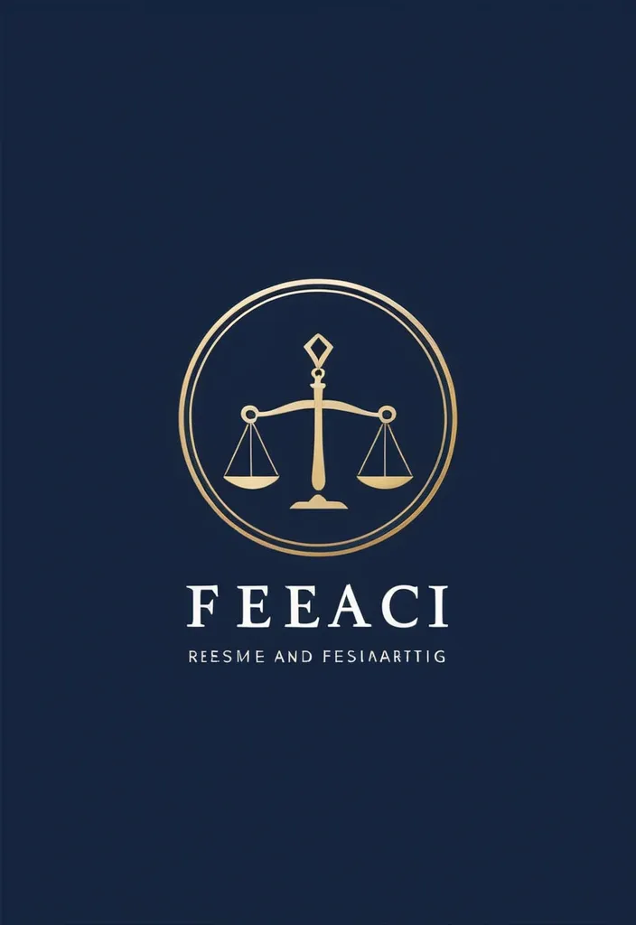
Create a premium minimalist logo for a law firm named “Femida Service”. Concept: – Symbol: elegant scales of justice , stylized or abstract , representing balance , law , and fairness. – Combine the symbol with clean , professional typography. – The logo should convey authority , trust , and modern professionalism. Design Style: – Minimalist and geometric. – Flat vector look — no gradients , shadows , or 3D effects. – Balanced composition with precise symmetry and generous white space. Colors: – Primary: Deep Navy Blue (#0D1B2A) – Accent: Judicial Gold (#C9A646) – Background: White or transparent Typography: – Use uppercase letters: FEMIDA SERVICE – Choose a serif or clean sans-serif font (e.g. , Playfair Display , Lora , Inter , or Helvetica Neue). Mood keywords: – Elegant , corporate , timeless , confident , law , justice , balance , premium , clarity. Goal: A logo suitable for a legal firm website , business cards , official documents , and presentations — clean , memorable , and professional. ,
Generate me a card with contact information. A card for a master in the field of cooking. Compact design of contact data is required. It is important that it looks stylish and clear. Visual description of the card: - Background: Light gray or white with a thin shadow for volume. - Text: Dark blue or black , font - modern grotesque (for example , "Inter" or "Helvetica Neue"). - Icons: Minimalistic SVG icons of a phone , mail , etc. - Accents: Use blue or dark blue to highlight the name and links. ,
Generate me a card with contact information. A card for a master in the field of cooking. Compact design of contact data is required. It is important that it looks stylish and clear. Visual description of the card: - Background: Light gray or white with a thin shadow for volume. - Text: Dark blue or black , font - modern grotesque (for example , "Inter" or "Helvetica Neue"). - Icons: Minimalistic SVG icons of a phone , mail , etc. - Accents: Use blue or dark blue to highlight the name and links. ,
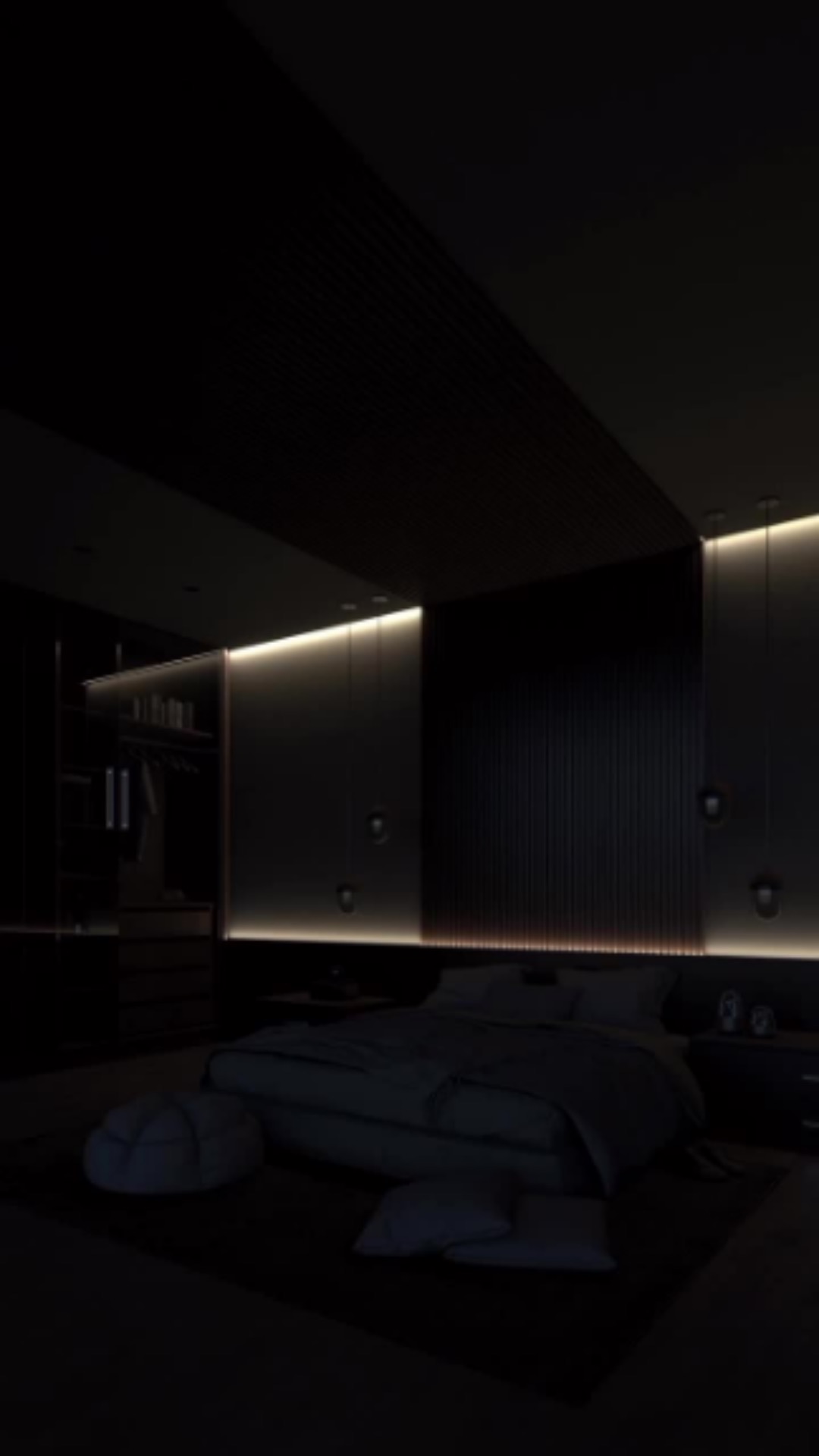
Атмосфера: Стильная , минималистичная , с акцентом на современные технологии , создающая ощущение комфорта и премиум-доверия. Настроение: Должно вызывать чувство комфорта , доверия , но при этом быть дерзким и динамичным. Цветовая палитра: Скорее всего , будет использоваться темная гамма , чтобы подчеркнуть контраст с яркими световыми линиями. Например , темно-синий , черный , серый с акцентами золотого или серебристого. Шрифты: Стиль шрифтов должен быть минималистичным , строгим и элегантным , чтобы подчеркнуть премиум-характер сайта. Например , Helvetica , Roboto , Arial Black. Графические элементы: Фотографии и иллюстрации должны быть высокого качества и стильного вида. Используйте элементы "блекдизайна" , современных технологий , модульные конструкции. Световые линии: Яркие и динамичные , создающие чувство дерзости и энергии. Можно использовать плавную анимацию с яркими цветами. Звуковые эффекты: Можно добавить негромкие звуковые эффекты , например , шум света или негромкую музыку в стиле "техно" , чтобы подчеркнуть динамичный характер сайта. Интерфейс: Должен быть простым и интуитивно понятным. Рекомендуется использовать минималистичное меню и яркие акценты для ключевых элементов. Дополнительные идеи: Используйте эффекты параллакса для создания глубины и динамичности. Добавьте интерактивные элементы , например , перемещение световых линий при наведении курсора. ,