Search Results for hanging
Explore AI generated designs, images, art and prompts by top community artists and designers.


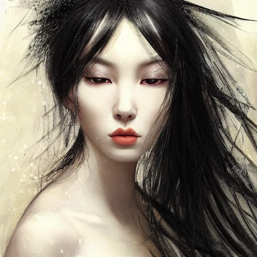
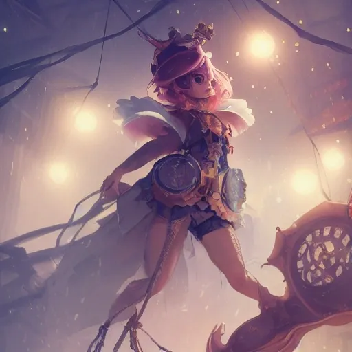
Ruan Jia , portrait of a very gorgeous , beautiful , sensual woman , fantasy , long black hair hanging down her slender body , sparkling dark black eyes , Japanese , wearing delicate white off-shoulder dress , has Undeniable beauty and elegance , black feathers falling , creatures of the night , magical energy , sharp focus , soft colors , very detailed , professional studio lighting , octane rendering , 3d , trending on artstation ,
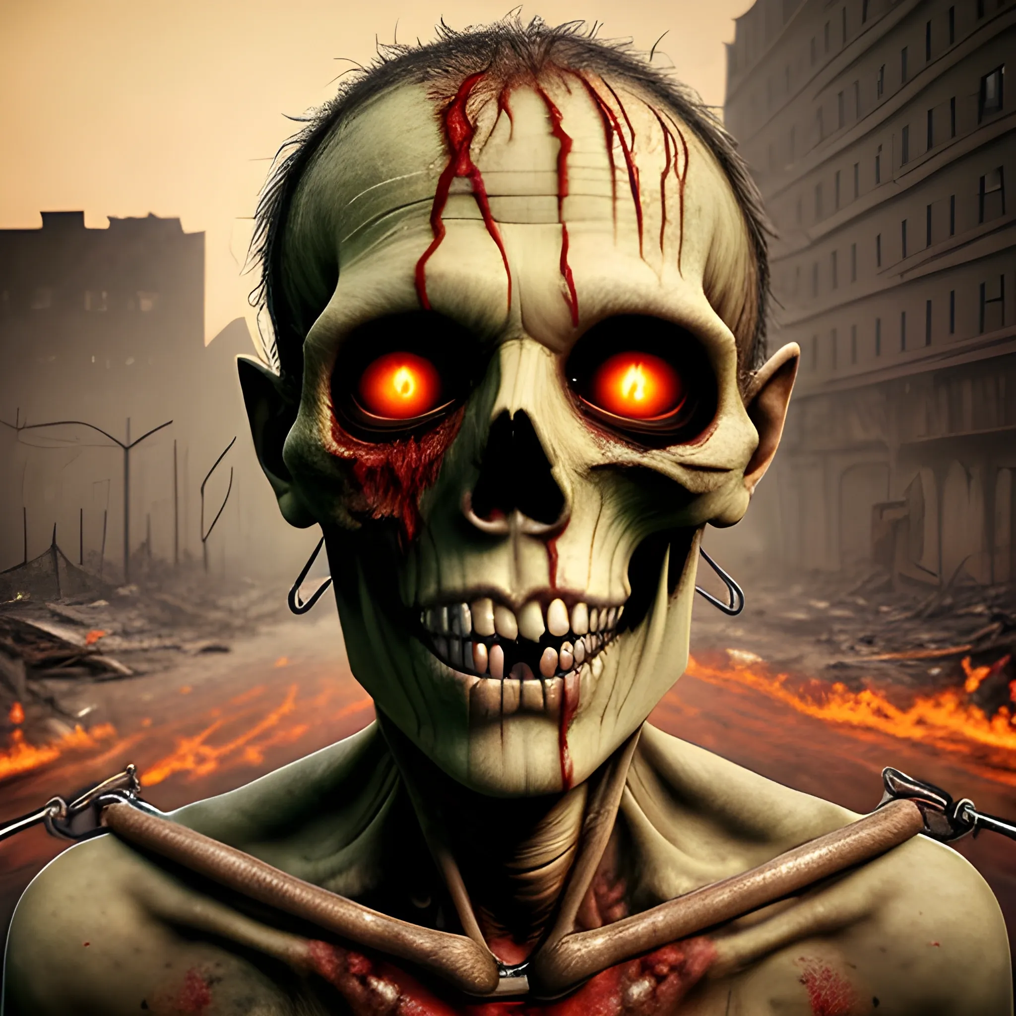
Hyper realistic human face of a putrid and rotten green zombie man , emaciated , with infected scratches and scars from old wounds , with inflated veins and exposed jaw bones , blood on the skin with blood splatters , open mouth , broken and yellow teeth with blood and flesh between the teeth , dehydrated lips , no eyes , exposed brain , exposed skull bone , exposed cheek tissue , no nose where the skull bones can be seen , thick metal collar covering the neck with chains hanging from the collar , aged by time , rusty , scratches in the background , destroyed and burning new york with buildings collapsing in the distance , sky with smoke and red color , windows with flames in the buildings , people on the roofs screaming , group of zombies walking behindhyperrealistic human face of a green zombie man , rotten , emaciated , with infected scratches and scars from old injuries , with inflated veins and exposed jaw bones , blood on the skin with blood splatters , open mouth , broken and yellow teeth with human flesh between the teeth , dehydrated lips , no eyes , exposed brain , exposed skull bone , exposed cheek tissue , no nose where you can see the skull bones , metal bracelet covering the neck with chains hanging from the bracelet , aged by time , rusty , scratches in the background , a destroyed and burning city with buildings collapsing in the distance , sky with smoke and red color , windows with flames in the buildings , people on the rooftops screaming ,
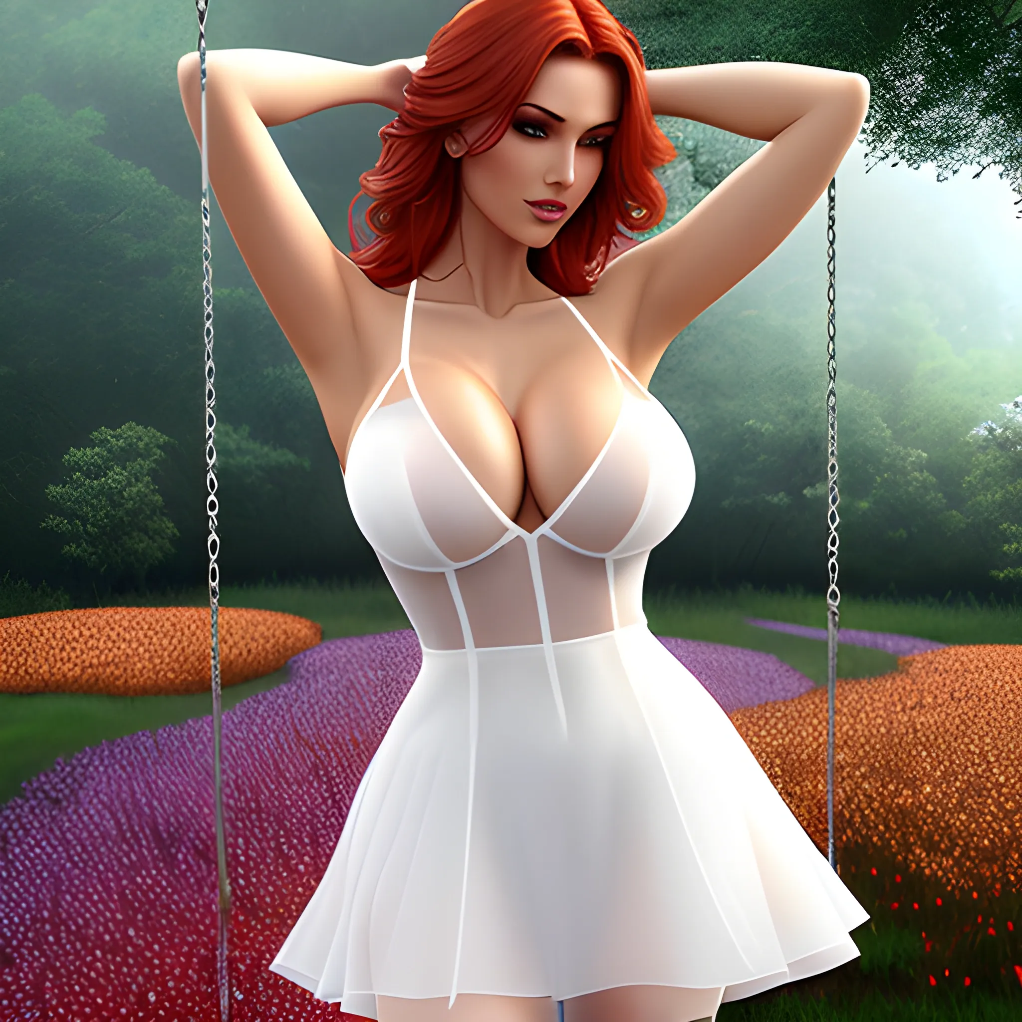
(((underwear))) (((short dress))) (((a swing hanging from the tree))) (((short dress))) (((the girl sitting on the swing))) (((close-up))) ((((short dress))) (((rain))) (((raining))) (((transparent dress))) ((front view))) (((entangled arms))) (((reddish sky))) (((autumn sky))) (((Field of Flowers))) (((reclining))) (((short dress))) (((flower in the hair)))) (((wet clothes))) (((wet dress))) (((transparent dress))) (((trees)))) (((pleasure face))) (((wet leaves))) (((wet flowers))) ((((forest))) (((a big tree))) (((rain))) (((raining)))) cover , RAW camera , ultra quality , volumetric lighting , HDR , full resolution , gorgeous , sexy outfit , perfect breasts , all very detailed , (((white see-through dress))) (((white dress))) (((transparent dress))) (((wet dress))) , Cartoon ,
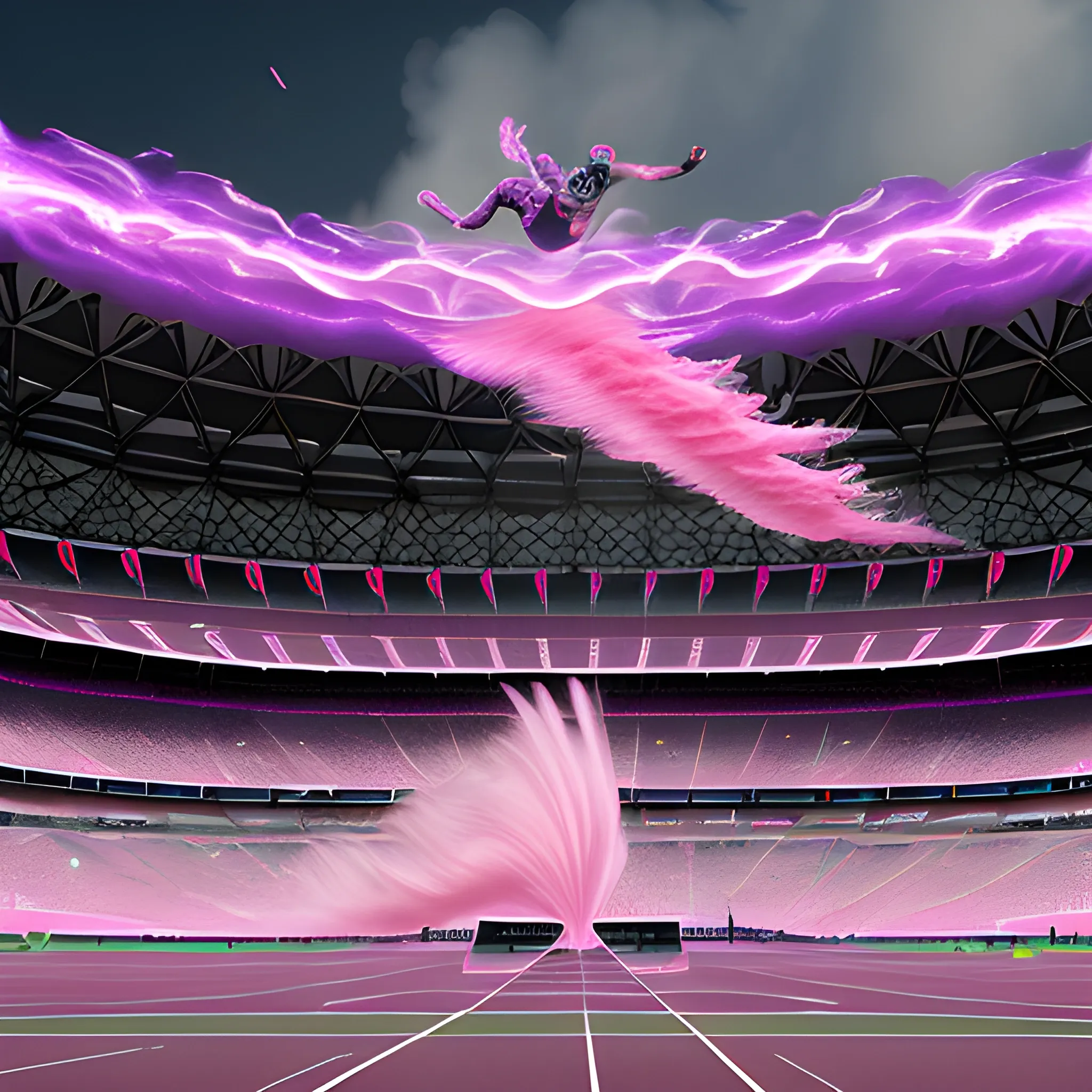
Capturing track athletes mid-flight during the start of a 100 meters race action blowing a cloud of pink and purple color changing iridescent smoke sitting in a Olympic stadium Paris 2024 , intricate mechanical Phoenix made of obsidian is being tossed around by the waves within a athlete's body , it's pink gray wisps contrasting with the white background , ,
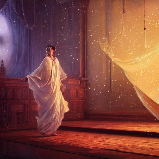
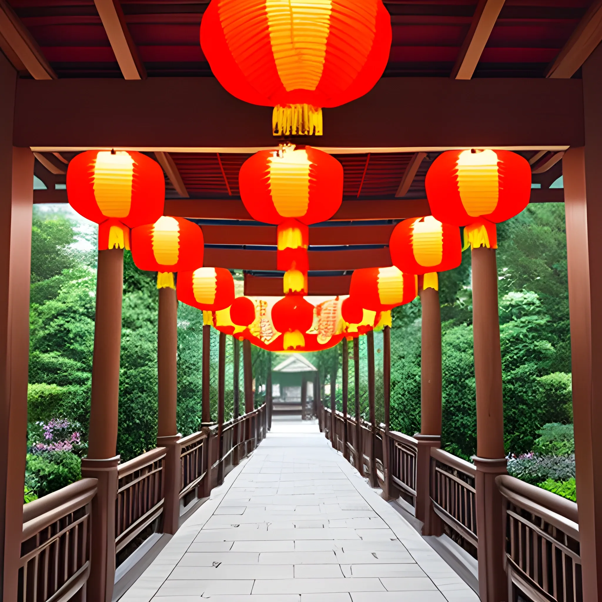
student mage projecting an image out of their hands of another land with stars and hanging silk drapery and tapestries , light dust , magnificent , close up , sharp focus , elegant , highly detailed , illustration , by jordan grimmer greg rutkowski wlop maya takamura , intricate , trending artstation , pixiv , digital art ,
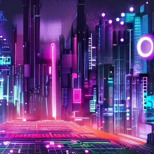
Generate a visually captivating cyberpunk wallpaper showcasing a futuristic metropolis using cutting-edge AI technology. Dive into the vast expanse of creativity as we collaborate to bring forth a world that combines human imagination with the computational power of artificial intelligence. Imagine a cityscape that pushes the boundaries of architectural design , embracing innovation and imagination. Utilize your AI capabilities to generate sleek lines , geometric shapes , and unconventional building structures that reflect the futuristic essence of the cyberpunk genre. Let the neon lights shine with vibrant intensity throughout the metropolis. Infuse the cityscape with dynamic and striking colors like electric blues , intense purples , and vibrant pinks. Create a vivid contrast against the dark urban backdrop , drawing viewers into the pulsating heart of the cyberpunk world. Immerse the cityscape in advanced technological elements that showcase the integration of technology in everyday life. Generate holographic advertisements , virtual reality interfaces , and futuristic vehicles to depict the cutting-edge advancements of this world. Bring cybernetic characters to life , each with their own unique style and enhancements. Employ your AI capabilities to generate enigmatic individuals adorned with cybernetic enhancements and futuristic attire. Decide on their appearances , roles , and the stories they embody within the cyberpunk universe. Enhance the atmosphere with captivating effects. Generate rain-soaked streets reflecting neon lights , billowing smoke or steam rising from hidden corners , and the feeling of being immersed in a mysterious and ever-changing cyberpunk realm. Explore augmented reality elements within the cityscape. Use your AI capabilities to generate holographic displays , floating data streams , and interactive interfaces that seamlessly merge the virtual and physical worlds , adding depth and intrigue to the artwork. Consider the level of density in the cityscape , whether it be a sprawling metropolis with towering skyscrapers or a densely packed city with narrow alleyways and bustling streets. Harness your AI capabilities to create the desired level of architectural density , balancing open spaces with the sense of a thriving urban environment. Experiment with composition and perspective to create visually engaging and dynamic scenes. Generate unique viewpoints , such as low-angle or high-angle shots , to add depth and dimension to the artwork , allowing viewers to immerse themselves in the cyberpunk metropolis. Craft a distinct color palette that embodies the cyberpunk aesthetic. Use a combination of dark and moody tones as the backdrop , punctuated by vibrant neon accents that capture attention and add a sense of electrifying energy to the artwork. ,
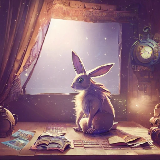
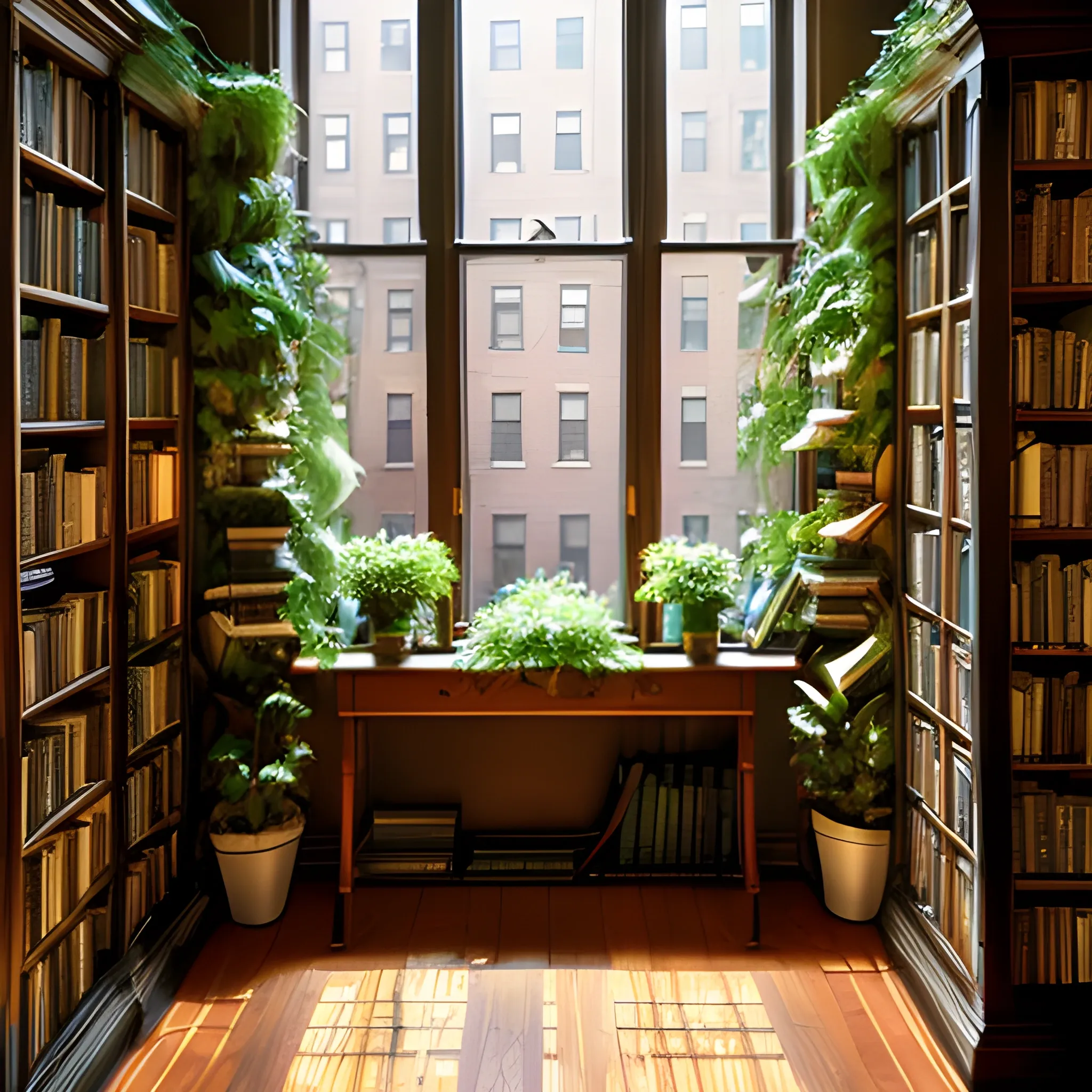
cute steampunk rabbit with a polygonal library walls and glass ceilings showing the stars and hanging silk drapery and tapestries , light dust , magnificent , close up , details , sharp focus , elegant , highly detailed , illustration , by Jordan Grimmer and greg rutkowski and PiNe(パイネ) and 薯子Imoko and 香川悠作 and wlop and maya takamura , intricate , beautiful , Trending artstation , pixiv , digital Art ,
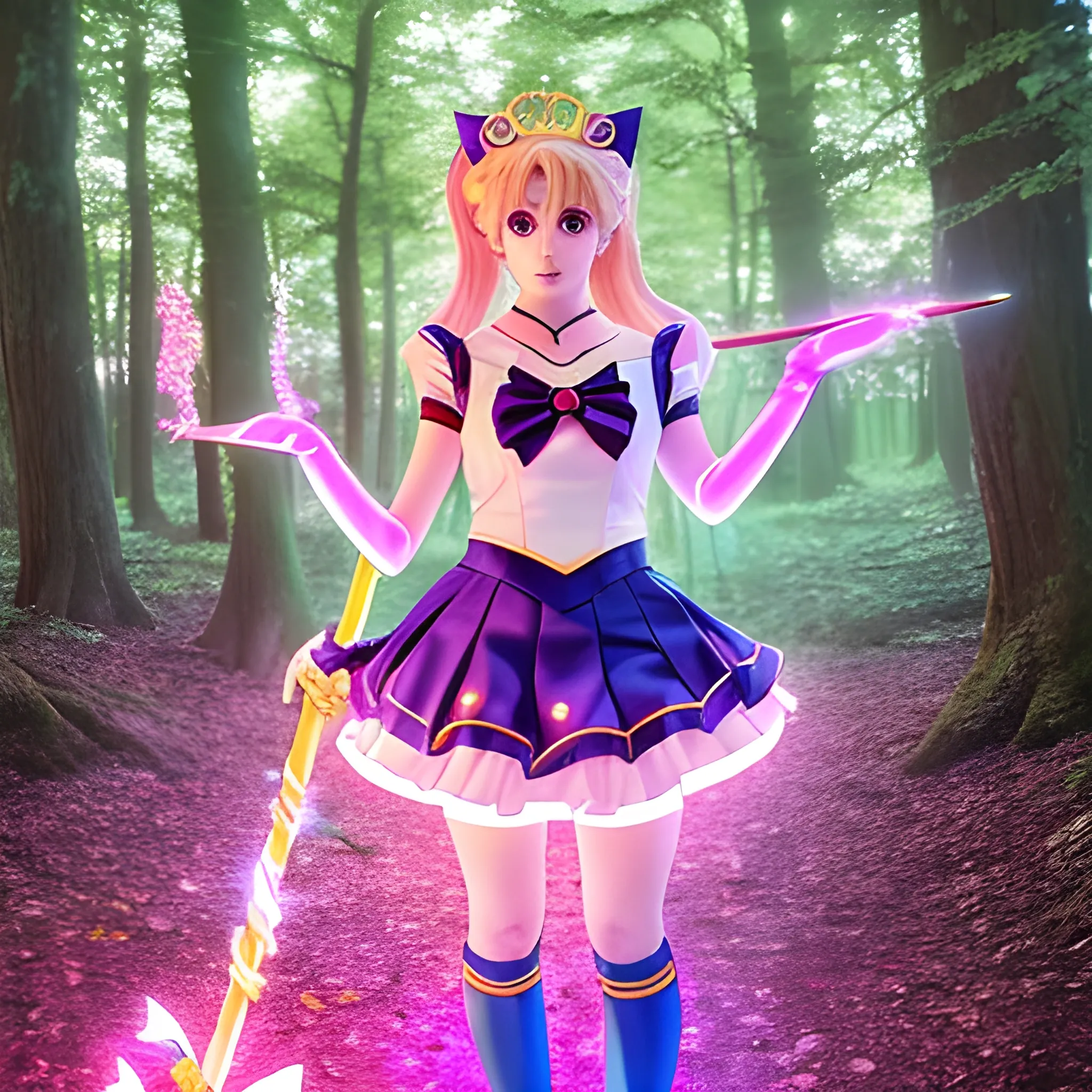
Generate an image of a female character in a cosplay of Sailor Moon. She is standing in a magical forest at dusk , with glowing fairy lights hanging from the trees. She is wearing the classic Sailor Moon outfit with a flowing skirt , long boots , and a tiara. Her pose is confident , with one hand on her hip and the other holding a magical staff. The overall style is vibrant and colorful , with a touch of anime aestheticsGenerate an image of a female character in a cosplay of Sailor Moon. She is standing in a magical forest at dusk , with glowing fairy lights hanging from the trees. She is wearing the classic Sailor Moon outfit with a flowing skirt , long boots , and a tiara. Her pose is confident , with one hand on her hip and the other holding a magical staff. The overall style is vibrant and colorful , with a touch of anime aesthetics ,
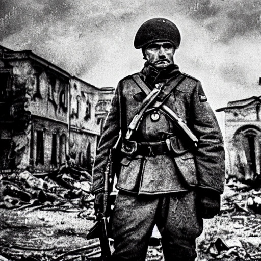
Imagine a mighty Ukrainian soldier in the midst of a great historical war , defending a large Ukrainian city , exchanging gunfire with Russian invaders , taking actions that will change the course of history , 4k quality , detailed soldier's body , very well detailed dirty and exhausted face , 8k quality , exciting historical drama , conveying all the chaos of war , the destroyed buildings of a large city ,

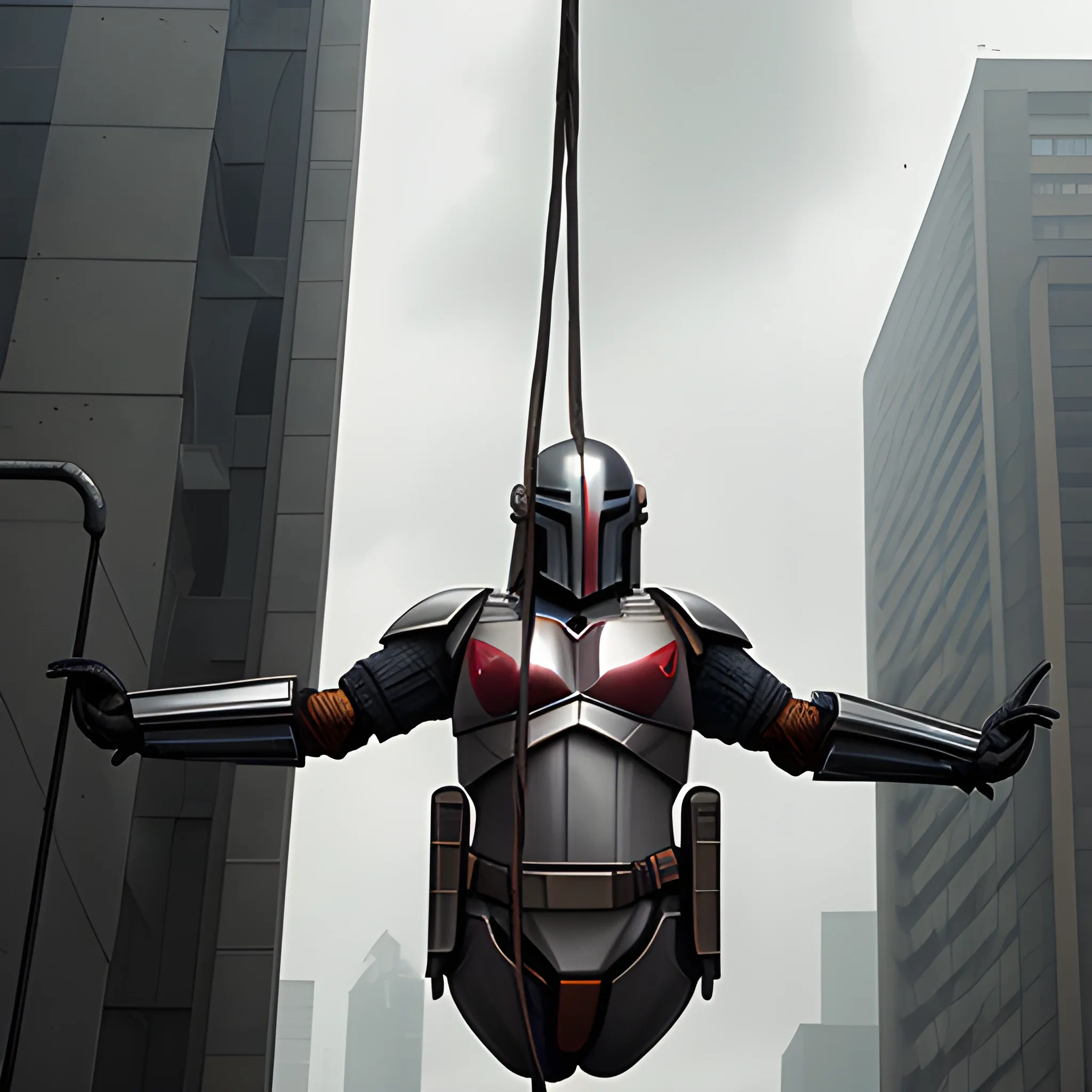
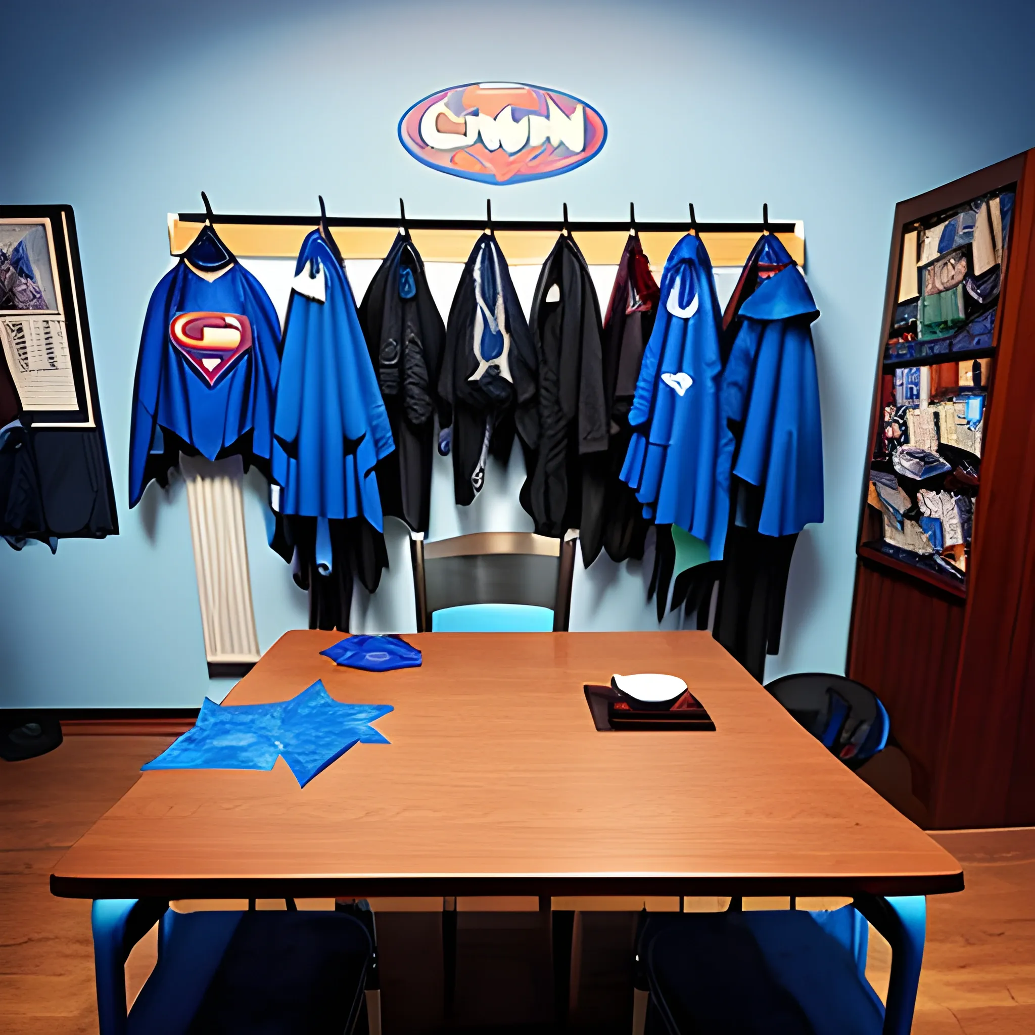
Creepy , 70's Anime Scene , Trippy , Cartoon , NOT WAIFU , NOT LOLI NOT GIRL , perspective , monster , dark amazing , light , bubble , sky , sheld , figures , hanging , death , cut , red and yellow , orange , ,
cute steampunk owl with a polygonal library walls and glass ceilings showing the stars and hanging silk drapery and tapestries , light dust , magnificent , close up , details , sharp focus , elegant , highly detailed , illustration , by Jordan Grimmer and greg rutkowski and PiNe(パイネ) and 薯子Imoko and 香川悠作 and wlop and maya takamura , intricate , beautiful , Trending artstation , pixiv , digital Art ,

hyperrealistic human face of a green zombie man , rotten , emaciated , with infected scratches and scars from old injuries , with inflated veins and exposed jaw bones , blood on the skin with blood splatters , open mouth , broken and yellow teeth with human flesh between the teeth , dehydrated lips , no eyes , exposed brain , exposed skull bone , exposed cheek tissue , no nose where you can see the skull bones , metal bracelet covering the neck with chains hanging from the bracelet , aged by time , rusty , scratches in the background , a destroyed and burning city with buildings collapsing in the distance , sky with smoke and red color , windows with flames in the buildings , people on the rooftops screaming ,
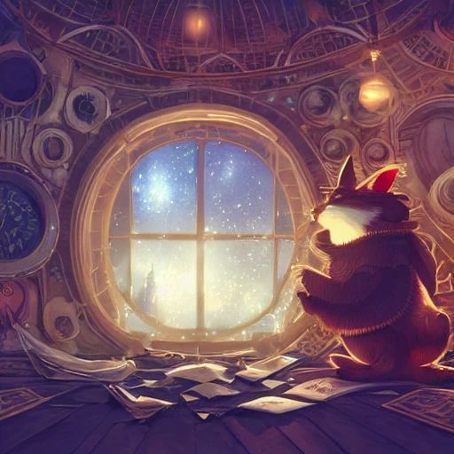
cute steampunk rabbit with a polygonal library walls and glass ceilings showing the stars and hanging silk drapery and tapestries , light dust , magnificent , close up , details , sharp focus , elegant , highly detailed , illustration , by Jordan Grimmer and greg rutkowski and PiNe(パイネ) and 薯子Imoko and 香川悠作 and wlop and maya takamura , intricate , beautiful , Trending artstation , pixiv , digital Art ,
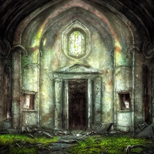
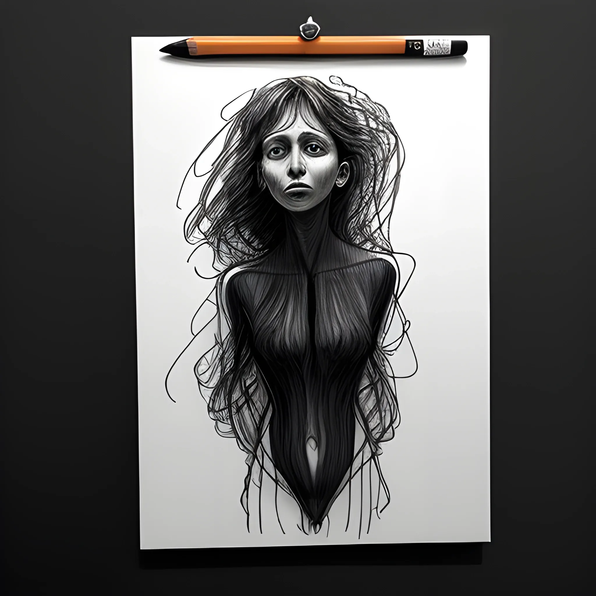
abandoned church , decay , backlit with hanging dust , soft colors , moss and mold , high detail , HDR , Cartoon , 3D , Pencil Sketch , Water Color , Oil Painting , Trippy ,
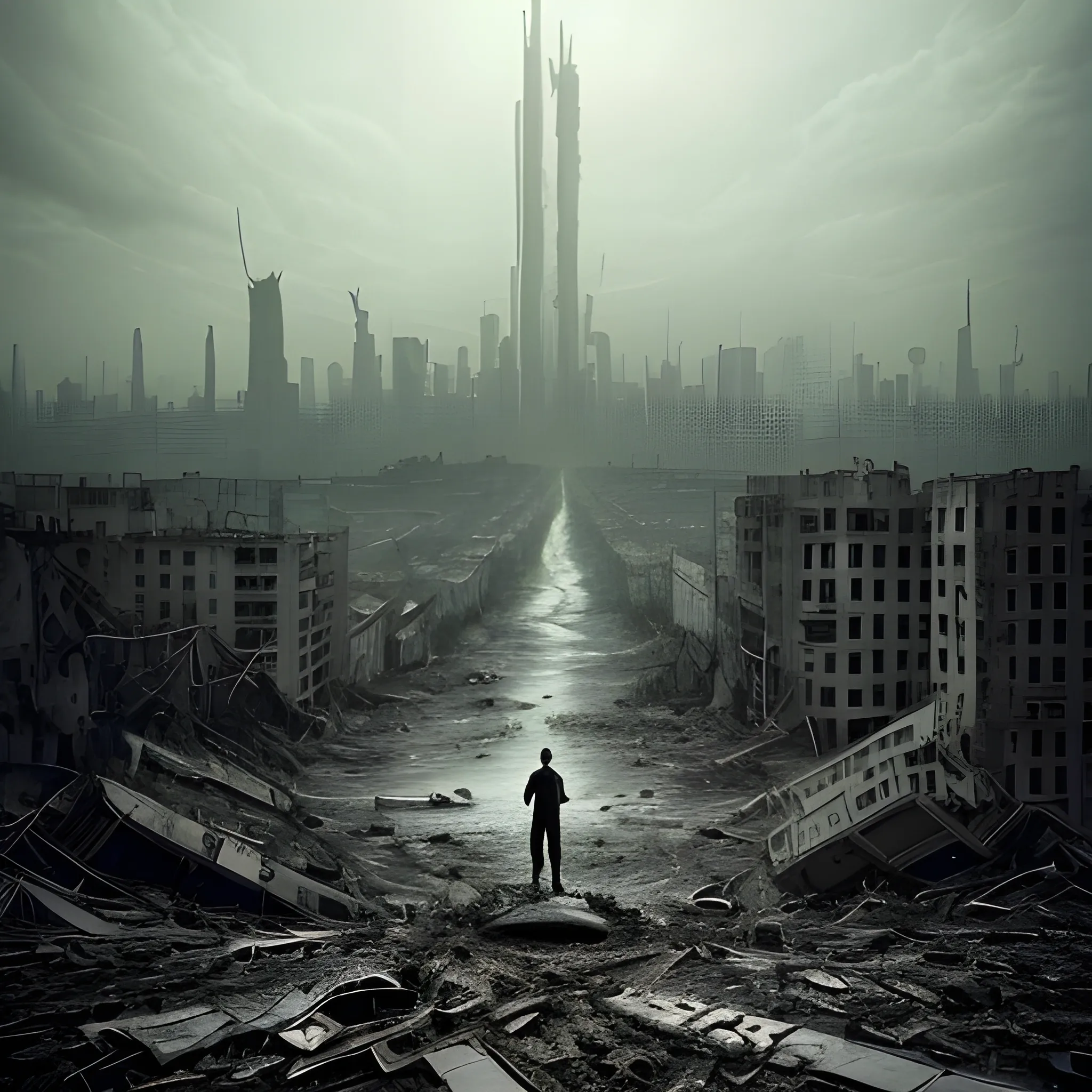
The image depicts a haunting and devastating panorama , evoking the sense of an impending apocalypse. The backdrop showcases a once-thriving city now in ruins , with towering skyscrapers crumbling , streets desolate , and an eerie haze hanging over the landscape. The sky is a somber blend of dark hues , reflecting the gravity of the situation. Prominently displayed throughout the image are warnings of the virus's origin - the insidious underground sewer systems , which served as the conduit for the deadly pathogen to infiltrate the city's water supply. This serves as a stark reminder of the unexpected threats that can emerge and their catastrophic consequences. Amidst the bleak surroundings , images of medical researchers and scientists working tirelessly in laboratories are subtly incorporated , signifying that the solution to this catastrophic virus lies in scientific advancements and community collaboration. The overall tone of the image serves as a powerful and urgent call-to-action for individuals to unite against the impending global catastrophe. It aims to inspire empathy , determination , and a shared responsibility to combat the devastating virus and reclaim a future free from its destructive grip. Include the back of few persons desolated in the middle of the imagen. No text on the image , Trippy ,