Search Results for The logo
Explore AI generated designs, images, art and prompts by top community artists and designers.
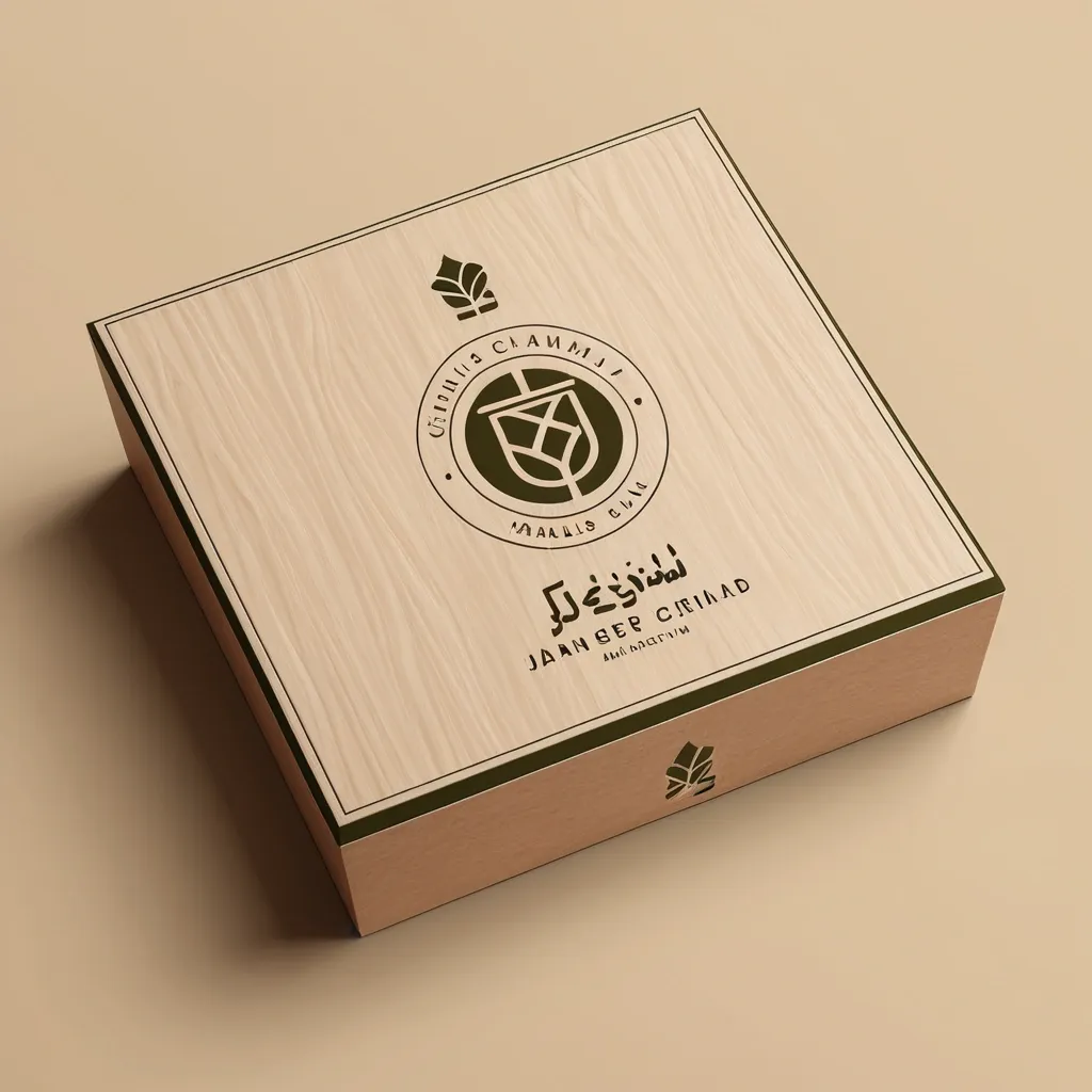

Act as a world-class brand identity designer with 20+ years of experience specializing in luxury minimalist logos. Design a premium , timeless , award-winning logo for an industrial eco-friendly brand named: ورقة وجذع Warqah & Jitha About the Brand: Warqah & Jitha is a Yemeni industrial company manufacturing sustainable , locally produced rattan sticks as an eco-friendly alternative to imported natural rattan. The brand represents sustainability , local craftsmanship , environmental responsibility , premium quality , and modern Yemeni heritage. The logo must communicate: • Sustainability • Nature • Local manufacturing • Innovation • Premium craftsmanship • Eco-friendly materials • Trust • Elegance • Authentic Yemeni identity • Luxury simplicity Icon Design: Create a memorable geometric symbol by combining: • A natural leaf • A tree trunk or wooden branch • Several subtle rattan sticks integrated into the icon The integration should be clever using negative space. Avoid obvious clipart. The icon should be unique , scalable , iconic , and recognizable even without text. Design Style: Luxury Minimalism Modern Organic Scandinavian Simplicity Flat Vector Geometric Precision Negative Space Premium Branding Timeless Identity Clean Lines Swiss Design Monoline Balanced Composition Typography: Arabic: ورقة وجذع English: Warqah & Jitha Use elegant modern Arabic typography paired with a sophisticated sans-serif English font. Color Palette: Primary: Olive Green (#556B2F) Secondary: Natural Wood Brown (#7A5230) Accent: Warm Sand Beige (#D8C3A5) Optional Luxury Accent: Soft Matte Gold (#C7A55B) Background: Pure White Deliverables: • Full-color logo • Black version • White version • Icon only • Horizontal layout • Vertical layout • Luxury brand presentation • Packaging mockup • Wooden engraving mockup • Business card mockup • Stamp version • Social media profile icon The logo must look perfect on: Luxury packaging Wood engraving Product labels Gift boxes Shopping bags Website Mobile App Instagram Business cards Signage Requirements: No gradients No shadows No mockup effects inside the logo itself Vector style Simple but highly memorable Balanced proportions Professional branding Behance Featured quality Dribbble Top Shot quality Minimal but emotionally powerful The logo should be iconic enough to become a globally recognizable symbol similar to Apple , Nike , Airbnb , or Starbucks , using extremely simple geometry and intelligent negative space. ,
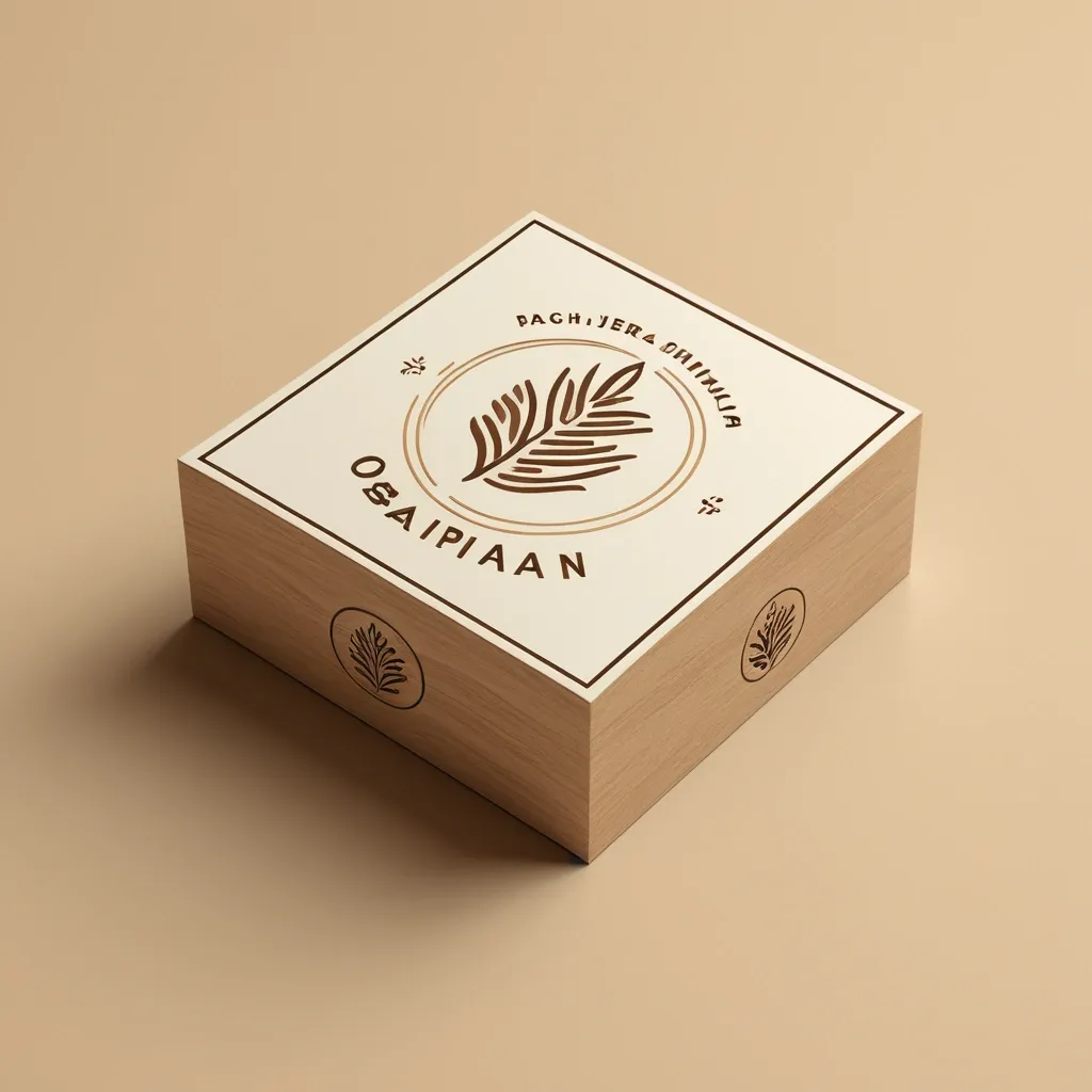
Act as a world-class brand identity designer with 20+ years of experience specializing in luxury minimalist logos. Design a premium , timeless , award-winning logo for an industrial eco-friendly brand named: ورقة وجذع Warqah & Jitha About the Brand: Warqah & Jitha is a Yemeni industrial company manufacturing sustainable , locally produced rattan sticks as an eco-friendly alternative to imported natural rattan. The brand represents sustainability , local craftsmanship , environmental responsibility , premium quality , and modern Yemeni heritage. The logo must communicate: • Sustainability • Nature • Local manufacturing • Innovation • Premium craftsmanship • Eco-friendly materials • Trust • Elegance • Authentic Yemeni identity • Luxury simplicity Icon Design: Create a memorable geometric symbol by combining: • A natural leaf • A tree trunk or wooden branch • Several subtle rattan sticks integrated into the icon The integration should be clever using negative space. Avoid obvious clipart. The icon should be unique , scalable , iconic , and recognizable even without text. Design Style: Luxury Minimalism Modern Organic Scandinavian Simplicity Flat Vector Geometric Precision Negative Space Premium Branding Timeless Identity Clean Lines Swiss Design Monoline Balanced Composition Typography: Arabic: ورقة وجذع English: Warqah & Jitha Use elegant modern Arabic typography paired with a sophisticated sans-serif English font. Color Palette: Primary: Olive Green (#556B2F) Secondary: Natural Wood Brown (#7A5230) Accent: Warm Sand Beige (#D8C3A5) Optional Luxury Accent: Soft Matte Gold (#C7A55B) Background: Pure White Deliverables: • Full-color logo • Black version • White version • Icon only • Horizontal layout • Vertical layout • Luxury brand presentation • Packaging mockup • Wooden engraving mockup • Business card mockup • Stamp version • Social media profile icon The logo must look perfect on: Luxury packaging Wood engraving Product labels Gift boxes Shopping bags Website Mobile App Instagram Business cards Signage Requirements: No gradients No shadows No mockup effects inside the logo itself Vector style Simple but highly memorable Balanced proportions Professional branding Behance Featured quality Dribbble Top Shot quality Minimal but emotionally powerful The logo should be iconic enough to become a globally recognizable symbol similar to Apple , Nike , Airbnb , or Starbucks , using extremely simple geometry and intelligent negative space. ,
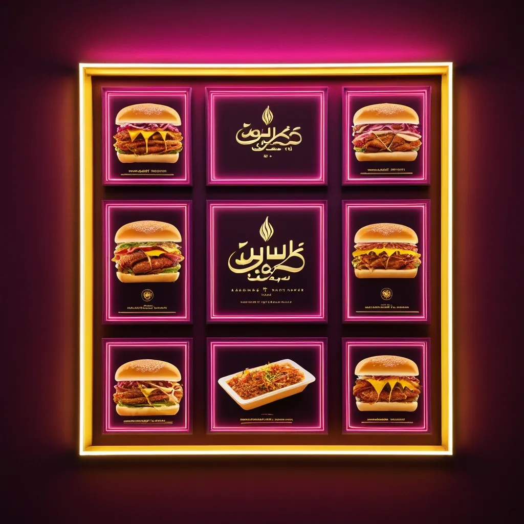
**Subject:** A horizontal commercial signboard for an sudanes restaurant specializing in fast food **Composition & Layout:** * **Format:** A wide , horizontal rectangular banner set within a thin , glowing warm-yellow frame. * **Central Focus:** Large , prominent Arabic text dominates the center. * **Top Left:** A logo place leave it empty * **Bottom Section:** Smaller lines of informative text and four square photographic panels showing food. * **Lighting Effects:** The overall aesthetic is a high-contrast , glowing "light-box" style. Pinkish-magenta light streaks radiate upward from the bottom corners toward the center. **Color Palette:** * **Background:** Deep royal red ff2325 with subtle textures and faint , light-white decorative flourishes (filigree patterns). * **Main Typography:** Bright orange letters with a thick , 3D-effect gold/yellow outline and a dark drop shadow for depth. * **Secondary Typography:** Pure white for the address and bright yellow for the contact numbers. * **Accents:** Magenta/pink light flares and a warm yellow glow from the outer frame. **Specific Elements:** * **Main Title (Arabic):** Bold , stylized Arabic calligraphy reading "كوبا للفطائر". * **Logo:** The logo for Cuba pies Restaurant will be sent with the promo. * **Address Line (Middle):** A single line of white Arabic text: "الاسكان 96-شارع السوق-الفاصل 96_95" * **Contact Line (Bottom):** Yellow text containing two phone numbers "0923931452/ 0928737341" preceded by the Arabic word for "Contact:". * **Food Imagery:** Four small square panels at the bottom (two on the left , two on the right). They feature realistic photos of Shawarma sandwich on plates with garnishes and one panel showing a whole , golden-brown roasted chicken. **Style:** Modern Egyptian commercial design , vibrant , professional , and designed to look like an illuminated neon or LED sign at night. ,
**Subject:** A horizontal commercial signboard for an sudanes restaurant specializing in fast food **Composition & Layout:** * **Format:** A wide , horizontal rectangular banner set within a thin , glowing warm-yellow frame. * **Central Focus:** Large , prominent Arabic text dominates the center. * **Top Left:** A logo place leave it empty * **Bottom Section:** Smaller lines of informative text and four square photographic panels showing food. * **Lighting Effects:** The overall aesthetic is a high-contrast , glowing "light-box" style. Pinkish-magenta light streaks radiate upward from the bottom corners toward the center. **Color Palette:** * **Background:** Deep royal red ff2325 with subtle textures and faint , light-white decorative flourishes (filigree patterns). * **Main Typography:** Bright orange letters with a thick , 3D-effect gold/yellow outline and a dark drop shadow for depth. * **Secondary Typography:** Pure white for the address and bright yellow for the contact numbers. * **Accents:** Magenta/pink light flares and a warm yellow glow from the outer frame. **Specific Elements:** * **Main Title (Arabic):** Bold , stylized Arabic calligraphy reading "كوبا للفطائر". * **Logo:** The logo for Cuba pies Restaurant will be sent with the promo. * **Address Line (Middle):** A single line of white Arabic text: "الاسكان 96-شارع السوق-الفاصل 96_95" * **Contact Line (Bottom):** Yellow text containing two phone numbers "0923931452/ 0928737341" preceded by the Arabic word for "Contact:". * **Food Imagery:** Four small square panels at the bottom (two on the left , two on the right). They feature realistic photos of Shawarma sandwich on plates with garnishes and one panel showing a whole , golden-brown roasted chicken. **Style:** Modern Egyptian commercial design , vibrant , professional , and designed to look like an illuminated neon or LED sign at night. ,
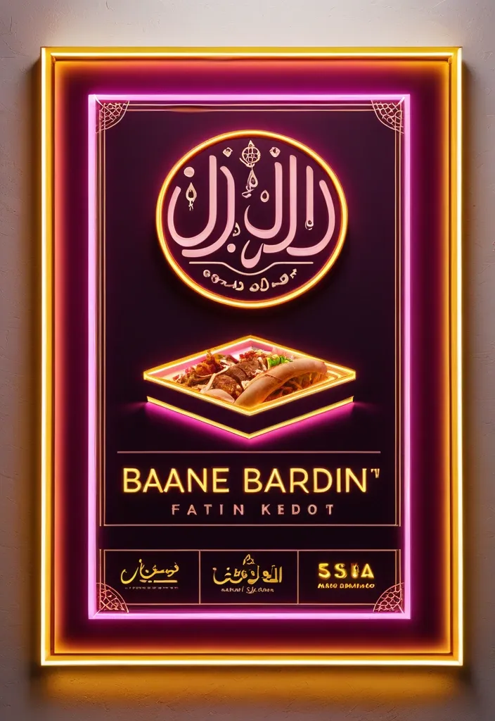
**Subject:** A horizontal commercial signboard for an sudanes restaurant specializing in fast food **Composition & Layout:** * **Format:** A wide , horizontal rectangular banner set within a thin , glowing warm-yellow frame. * **Central Focus:** Large , prominent Arabic text dominates the center. * **Top Left:** A logo place leave it empty * **Bottom Section:** Smaller lines of informative text and four square photographic panels showing food. * **Lighting Effects:** The overall aesthetic is a high-contrast , glowing "light-box" style. Pinkish-magenta light streaks radiate upward from the bottom corners toward the center. **Color Palette:** * **Background:** Deep royal red ff2325 with subtle textures and faint , light-white decorative flourishes (filigree patterns). * **Main Typography:** Bright orange letters with a thick , 3D-effect gold/yellow outline and a dark drop shadow for depth. * **Secondary Typography:** Pure white for the address and bright yellow for the contact numbers. * **Accents:** Magenta/pink light flares and a warm yellow glow from the outer frame. **Specific Elements:** * **Main Title (Arabic):** Bold , stylized Arabic calligraphy reading "كوبا للفطائر". * **Logo:** The logo for Cuba pies Restaurant will be sent with the promo. * **Address Line (Middle):** A single line of white Arabic text: "الاسكان 96-شارع السوق-الفاصل 96_95" * **Contact Line (Bottom):** Yellow text containing two phone numbers "0923931452/ 0928737341" preceded by the Arabic word for "Contact:". * **Food Imagery:** Four small square panels at the bottom (two on the left , two on the right). They feature realistic photos of Shawarma sandwich on plates with garnishes and one panel showing a whole , golden-brown roasted chicken. **Style:** Modern Egyptian commercial design , vibrant , professional , and designed to look like an illuminated neon or LED sign at night. ,
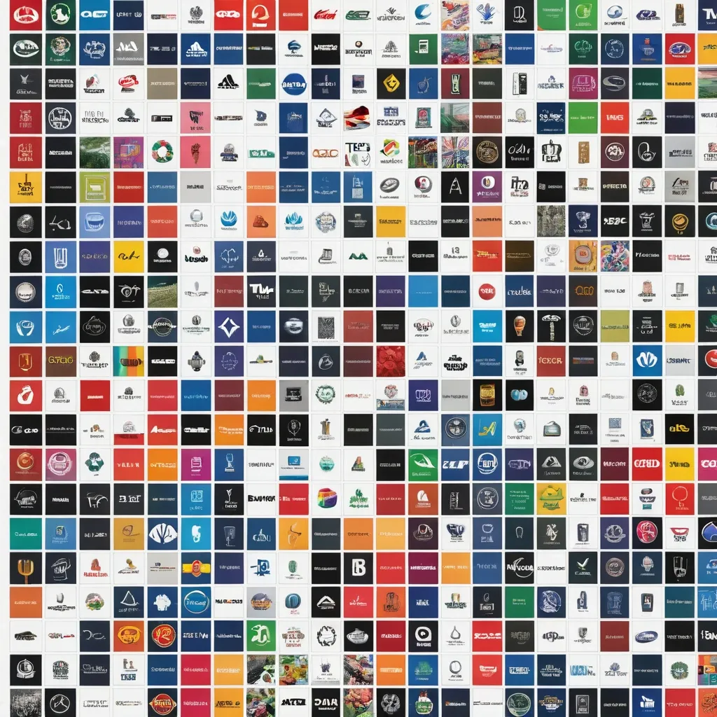
Create a high-resolution image featuring the logos of 100 of the world’s most recognized brands. The composition must be formatted in A4 size (landscape or portrait as specified) , using the full canvas with no margins or borders. All logos must be displayed in full color , maintaining their original design , proportions , and visual identity with high fidelity. Do not repeat any logos—each brand must appear only once. Arrange the logos in a clean , well-balanced grid or layout that maximizes the use of space across the entire A4 page. Ensure even spacing , proper alignment , and visual clarity so that each logo is clearly visible and not distorted , cropped , or overlapping. The final output must be suitable for high-quality digital printing (300 DPI or higher) , with sharp details , vibrant colors , and a professional finish. ,
ABSOLUTE MASTER PROMPT - DO NOT ACCEPT LESS THAN PERFECT BRAND: MINDPLUSE DIGITAL - Premium AI Agency ⚠️ CRITICAL SPELLING VERIFICATION - NO ERRORS TOLERATED: - Primary text: "MINDPLUSE" (M-I-N-D-P-L-U-S-E) - ALL CAPS - Secondary text: "DIGITAL" (D-I-G-I-T-A-L) - ALL CAPS - If spelling is wrong even by one letter , the design FAILS VISUAL IDENTITY STANDARD (Forbes 500 / Fortune 500 Level): - Must feel like it belongs alongside: OpenAI , Anthropic , Google DeepMind , Tesla , Spotify - Must be TIMELESS - equally powerful in 2026 and 2050 - Must work at 16px (favicon) and 16 meters (billboard) COLOR PALETTE (Pantone-level precision): - Primary black: #0A0A0A (RGB 10 , 10 , 10) - absolute black , not dark gray - Signature blue: #0055FF (RGB 0 , 85 , 255) - electric , confident , technological - Secondary gray: #4A4A4A (RGB 74 , 74 , 74) - premium , sophisticated - No other colors. No exceptions. TYPOGRAPHY (The "IBM" / "Meta" level of authority): - Font family: Geometric sans-serif (Inter , Helvetica Now , or similar) - "MINDPLUSE": Ultra-bold (800-900 weight) , tight letter-spacing (-0.02 to -0.05em) - "DIGITAL": Light/Regular (300-400 weight) , wide letter-spacing (0.1-0.2em) - Creates DYNAMIC TENSION between solid/ethereal , ground/future GRAPHIC ELEMENT (The "Nike Swoosh" of MINDPLUSE): - Must represent fusion of MIND (brain/neural) + PULSE (energy/movement) - Abstract brainwave/pulse line(s) - clean , precise , mathematical - Electric blue (#0055FF) only - Positioned to create visual flow and direction - Should work ALONE without text (like Apple logo) COMPOSITION RULES: - Horizontal lockup preferred (text + symbol side by side) - Perfect mathematical proportions (use golden ratio principles) - Negative space is DESIGN , not emptiness - Every element has PURPOSE - nothing decorative PSYCHOLOGICAL ARCHITECTURE (What it must communicate): - INSTANTLY: Intelligence , technology , Africa rising , global standard - ON CLOSER LOOK: Precision , trust , innovation , human-centered - OVER TIME: Familiarity , authority , inevitability TECHNICAL REQUIREMENTS (Non-negotiable): - Vector quality (clean paths , no pixel dependencies) - Sharp edges or perfectly calculated curves (no "close enough") - Works in: full color , monochrome , reverse (white on black) - Scalable: from app icon to highway billboard - Memorable: can be drawn from memory after 3 seconds WHAT THIS LOGO MUST ACHIEVE: - Be the most recognizable tech logo emerging from Africa - Look like it cost $1 million (even though created with precision) - Make competitors ask "Why didn't we think of that?" - Feel familiar yet completely original - Tell the story: African intelligence + global technology + human purpose WHAT TO ABSOLUTELY AVOID: - No gradients (unacceptable - looks dated) - No drop shadows (lazy design crutch) - No 3D effects (temporary trend) - No complex textures (reduces scalability) - No more than 2 fonts (amateur) - No clip art or obvious stock elements - No "tech clichés" (circuit boards , random dots , meaningless lines) - No busy backgrounds - this logo must live ANYWHERE FINAL TEST (Apply before considering complete): - Cover half the logo - is it still recognizable? - Reduce to 16px - is every element clear? - Show to someone for 3 seconds - can they sketch it? - Place next to Nike , Apple , OpenAI - does it hold its ground? This is not a request. This is a STANDARD. Deliver nothing less. ,
ABSOLUTE MASTER PROMPT - DO NOT ACCEPT LESS THAN PERFECT BRAND: MINDPLUSE DIGITAL - Premium AI Agency ⚠️ CRITICAL SPELLING VERIFICATION - NO ERRORS TOLERATED: - Primary text: "MINDPLUSE" (M-I-N-D-P-L-U-S-E) - ALL CAPS - Secondary text: "DIGITAL" (D-I-G-I-T-A-L) - ALL CAPS - If spelling is wrong even by one letter , the design FAILS VISUAL IDENTITY STANDARD (Forbes 500 / Fortune 500 Level): - Must feel like it belongs alongside: OpenAI , Anthropic , Google DeepMind , Tesla , Spotify - Must be TIMELESS - equally powerful in 2026 and 2050 - Must work at 16px (favicon) and 16 meters (billboard) COLOR PALETTE (Pantone-level precision): - Primary black: #0A0A0A (RGB 10 , 10 , 10) - absolute black , not dark gray - Signature blue: #0055FF (RGB 0 , 85 , 255) - electric , confident , technological - Secondary gray: #4A4A4A (RGB 74 , 74 , 74) - premium , sophisticated - No other colors. No exceptions. TYPOGRAPHY (The "IBM" / "Meta" level of authority): - Font family: Geometric sans-serif (Inter , Helvetica Now , or similar) - "MINDPLUSE": Ultra-bold (800-900 weight) , tight letter-spacing (-0.02 to -0.05em) - "DIGITAL": Light/Regular (300-400 weight) , wide letter-spacing (0.1-0.2em) - Creates DYNAMIC TENSION between solid/ethereal , ground/future GRAPHIC ELEMENT (The "Nike Swoosh" of MINDPLUSE): - Must represent fusion of MIND (brain/neural) + PULSE (energy/movement) - Abstract brainwave/pulse line(s) - clean , precise , mathematical - Electric blue (#0055FF) only - Positioned to create visual flow and direction - Should work ALONE without text (like Apple logo) COMPOSITION RULES: - Horizontal lockup preferred (text + symbol side by side) - Perfect mathematical proportions (use golden ratio principles) - Negative space is DESIGN , not emptiness - Every element has PURPOSE - nothing decorative PSYCHOLOGICAL ARCHITECTURE (What it must communicate): - INSTANTLY: Intelligence , technology , Africa rising , global standard - ON CLOSER LOOK: Precision , trust , innovation , human-centered - OVER TIME: Familiarity , authority , inevitability TECHNICAL REQUIREMENTS (Non-negotiable): - Vector quality (clean paths , no pixel dependencies) - Sharp edges or perfectly calculated curves (no "close enough") - Works in: full color , monochrome , reverse (white on black) - Scalable: from app icon to highway billboard - Memorable: can be drawn from memory after 3 seconds WHAT THIS LOGO MUST ACHIEVE: - Be the most recognizable tech logo emerging from Africa - Look like it cost $1 million (even though created with precision) - Make competitors ask "Why didn't we think of that?" - Feel familiar yet completely original - Tell the story: African intelligence + global technology + human purpose WHAT TO ABSOLUTELY AVOID: - No gradients (unacceptable - looks dated) - No drop shadows (lazy design crutch) - No 3D effects (temporary trend) - No complex textures (reduces scalability) - No more than 2 fonts (amateur) - No clip art or obvious stock elements - No "tech clichés" (circuit boards , random dots , meaningless lines) - No busy backgrounds - this logo must live ANYWHERE FINAL TEST (Apply before considering complete): - Cover half the logo - is it still recognizable? - Reduce to 16px - is every element clear? - Show to someone for 3 seconds - can they sketch it? - Place next to Nike , Apple , OpenAI - does it hold its ground? This is not a request. This is a STANDARD. Deliver nothing less. ,
ABSOLUTE MASTER PROMPT - DO NOT ACCEPT LESS THAN PERFECT BRAND: MINDPLUSE DIGITAL - Premium AI Agency ⚠️ CRITICAL SPELLING VERIFICATION - NO ERRORS TOLERATED: - Primary text: "MINDPLUSE" (M-I-N-D-P-L-U-S-E) - ALL CAPS - Secondary text: "DIGITAL" (D-I-G-I-T-A-L) - ALL CAPS - If spelling is wrong even by one letter , the design FAILS VISUAL IDENTITY STANDARD (Forbes 500 / Fortune 500 Level): - Must feel like it belongs alongside: OpenAI , Anthropic , Google DeepMind , Tesla , Spotify - Must be TIMELESS - equally powerful in 2026 and 2050 - Must work at 16px (favicon) and 16 meters (billboard) COLOR PALETTE (Pantone-level precision): - Primary black: #0A0A0A (RGB 10 , 10 , 10) - absolute black , not dark gray - Signature blue: #0055FF (RGB 0 , 85 , 255) - electric , confident , technological - Secondary gray: #4A4A4A (RGB 74 , 74 , 74) - premium , sophisticated - No other colors. No exceptions. TYPOGRAPHY (The "IBM" / "Meta" level of authority): - Font family: Geometric sans-serif (Inter , Helvetica Now , or similar) - "MINDPLUSE": Ultra-bold (800-900 weight) , tight letter-spacing (-0.02 to -0.05em) - "DIGITAL": Light/Regular (300-400 weight) , wide letter-spacing (0.1-0.2em) - Creates DYNAMIC TENSION between solid/ethereal , ground/future GRAPHIC ELEMENT (The "Nike Swoosh" of MINDPLUSE): - Must represent fusion of MIND (brain/neural) + PULSE (energy/movement) - Abstract brainwave/pulse line(s) - clean , precise , mathematical - Electric blue (#0055FF) only - Positioned to create visual flow and direction - Should work ALONE without text (like Apple logo) COMPOSITION RULES: - Horizontal lockup preferred (text + symbol side by side) - Perfect mathematical proportions (use golden ratio principles) - Negative space is DESIGN , not emptiness - Every element has PURPOSE - nothing decorative PSYCHOLOGICAL ARCHITECTURE (What it must communicate): - INSTANTLY: Intelligence , technology , Africa rising , global standard - ON CLOSER LOOK: Precision , trust , innovation , human-centered - OVER TIME: Familiarity , authority , inevitability TECHNICAL REQUIREMENTS (Non-negotiable): - Vector quality (clean paths , no pixel dependencies) - Sharp edges or perfectly calculated curves (no "close enough") - Works in: full color , monochrome , reverse (white on black) - Scalable: from app icon to highway billboard - Memorable: can be drawn from memory after 3 seconds WHAT THIS LOGO MUST ACHIEVE: - Be the most recognizable tech logo emerging from Africa - Look like it cost $1 million (even though created with precision) - Make competitors ask "Why didn't we think of that?" - Feel familiar yet completely original - Tell the story: African intelligence + global technology + human purpose WHAT TO ABSOLUTELY AVOID: - No gradients (unacceptable - looks dated) - No drop shadows (lazy design crutch) - No 3D effects (temporary trend) - No complex textures (reduces scalability) - No more than 2 fonts (amateur) - No clip art or obvious stock elements - No "tech clichés" (circuit boards , random dots , meaningless lines) - No busy backgrounds - this logo must live ANYWHERE FINAL TEST (Apply before considering complete): - Cover half the logo - is it still recognizable? - Reduce to 16px - is every element clear? - Show to someone for 3 seconds - can they sketch it? - Place next to Nike , Apple , OpenAI - does it hold its ground? This is not a request. This is a STANDARD. Deliver nothing less. ,
正向提示词 (Positive Prompt): A premium , highly usable minimalist tech logo for "AgentScroll Studio". The core logo mark is an ultra-clean , flat 2D geometric shape: a sleek , continuous abstract 'S' curve representing both a stylized unrolling scroll and an agile workflow , elegantly wrapping around a single , solid circular dot in the center (representing the Active Owner/Leader). The logo shape is strictly flat , scalable , and lacks any 3D thickness. However , the presentation features a moody , cinematic studio aesthetic: the flat logo mark is rendered in a warm , sophisticated glowing amber/gold color , set against a rich , dark charcoal grey textured background. Subtle studio rim lighting and faint film grain give the image a luxurious , professional feel while keeping the logo's geometry purely minimalist. Elegant , modern sans-serif typography below. Developer-friendly. 负面提示词 (Negative Prompt): 3D geometry , extrusion , bevel , drop shadow inside the logo , literal Chinese characters , letter "中" , complex illustration , realistic objects , messy lines , realistic scroll , monkey , gradient on the logo mark itself , cluttered , cheap. ,
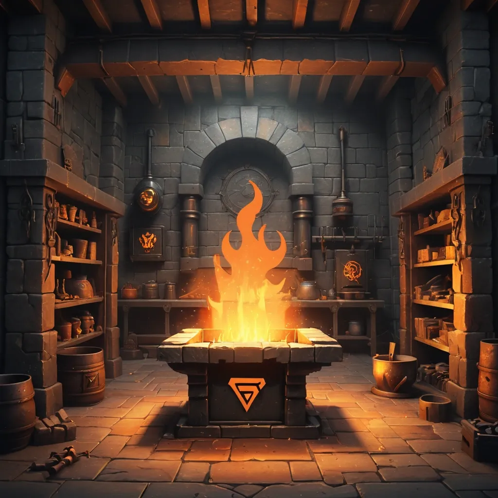
blurry , low quality , ugly , deformed , bad anatomy , extra fingers , photorealistic , hyperrealistic , anime , cartoon , modern objects , text , watermark , logo , oversaturated Background for the logo and loading bar. Portrait 9:16. Dark medieval forge interior , stone walls and wooden beams , large stone furnace with bright orange and yellow fire glowing inside , sparks flying from anvil in center , hot metal workpiece on anvil , smoke and ember particles rising , metal tools on shelves , soot-stained stone , wooden floor , dramatic lighting from furnace only , no natural light , atmospheric , moody , warm orange and amber highlights on dark grey and brown , stylized fantasy art , digital painting , mobile game background , vertical composition 9:16 , empty center area for logo overlay , no characters , no people , 1080×1920 , portrait. bright , daylight , sunny , characters , people , text , cluttered center , logo. stylized realism , digital painting , high-fantasy mobile game art , dark palette with warm orange and gold accents , no text , no watermark , premium 2D illustration ,
Background: Black background , creating contrast with the yellow text and figures. The black color should be clean and clear without any patterns or textures.Text "HUNTFARM": Large , bold yellow "HUNTFARM" text at the top of the image. The text should be simple , highly readable , without any additional effects. It should be placed centered at the top part of the banner.Line: Below the text , a thin yellow horizontal line separates the text from the rest of the image.Crowd of Stick Figures: Below the line with text , a dense crowd of yellow stick figures (stylized figures with round heads and wings , resembling the logo) should fill the lower part of the image. The figures should be arranged to create the sense of a packed crowd. The figures should gradually become smaller and blurrier as they recede into the distance , creating a sense of depth. The stick figures should be simple and schematic with wings.Style: Bright contrast of yellow on a black background with sharp lines. The style should be simple , without excessive detail , emphasizing the figures and text.Size: The image should be 1128x191 pixels , suitable for use as a banner on LinkedIn. ,
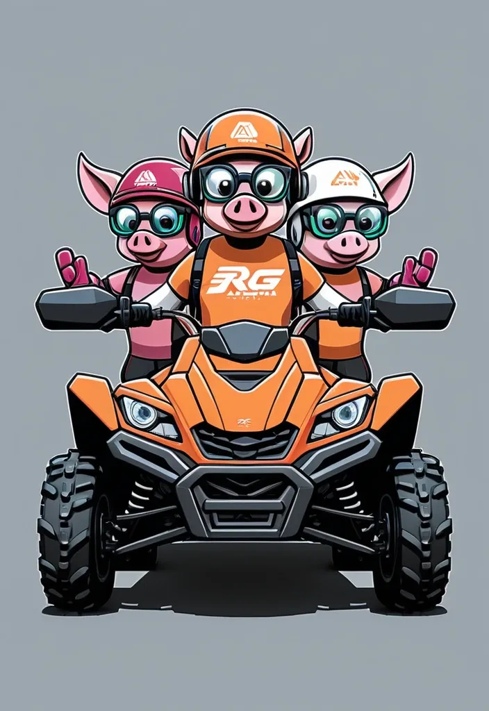
The Three Little Pigs logo concept with an ATV General style: A dynamic , slightly cartoonish logo in bright , but not acidic colors. A combination of realistic ATV details with a friendly animation style of the characters. Composition: The central element is a stylized ATV (side view , slightly at a 3/4 angle) , taking up ~60% of the logo width. On the ATV are three little pigs in protective helmets and glasses , each in their own "zone": the first (in front) is steering , smiling; the second (behind the driver) is holding the handle , looking forward; the third (behind) is slightly raised , waving his hand. The text "Three Little Pigs" is placed under the ATV or along its bottom line. ATV details: clear contours of the wheels , suspension , steering wheel; Light shadows for volume; bright accents: red brake discs , yellow body elements. Piglets' style: rounded shapes , big eyes , cute faces; colors: light pink with beige spots; helmets and glasses in contrasting colors (blue , green , orange). Typography: font: rounded , sans serif , with a slight 3D effect (for example , similar to Comic Sans MS or KG Primary Penmanship); color: dark brown or burgundy; effect: thin white outline of letters for legibility on any background. Color palette: main background: light gray or gradient from blue to white (imitation of the sky); ATV: orange/yellow + black details; piglets: soft pink + colored accessories; text: dark brown + white outline. Dimensions and proportions: logo aspect ratio: 4x3; ATV height: ~40% of the total height; text size: ~15% of the logo height. Logo text: ATV Club "Three Bows" ,
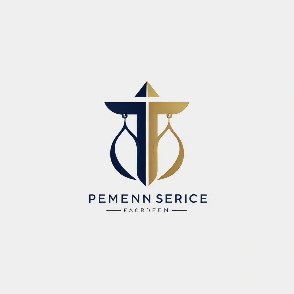
Create a premium minimalist logo for a law firm named “Femida Service”. Concept: – Symbol: elegant scales of justice , stylized or abstract , representing balance , law , and fairness. – Combine the symbol with clean , professional typography. – The logo should convey authority , trust , and modern professionalism. Design Style: – Minimalist and geometric. – Flat vector look — no gradients , shadows , or 3D effects. – Balanced composition with precise symmetry and generous white space. Colors: – Primary: Deep Navy Blue (#0D1B2A) – Accent: Judicial Gold (#C9A646) – Background: White or transparent Typography: – Use uppercase letters: FEMIDA SERVICE – Choose a serif or clean sans-serif font (e.g. , Playfair Display , Lora , Inter , or Helvetica Neue). Mood keywords: – Elegant , corporate , timeless , confident , law , justice , balance , premium , clarity. Goal: A logo suitable for a legal firm website , business cards , official documents , and presentations — clean , memorable , and professional. ,
Create a premium minimalist logo for a law firm named “Femida Service”. Concept: – Symbol: elegant scales of justice , stylized or abstract , representing balance , law , and fairness. – Combine the symbol with clean , professional typography. – The logo should convey authority , trust , and modern professionalism. Design Style: – Minimalist and geometric. – Flat vector look — no gradients , shadows , or 3D effects. – Balanced composition with precise symmetry and generous white space. Colors: – Primary: Deep Navy Blue (#0D1B2A) – Accent: Judicial Gold (#C9A646) – Background: White or transparent Typography: – Use uppercase letters: FEMIDA SERVICE – Choose a serif or clean sans-serif font (e.g. , Playfair Display , Lora , Inter , or Helvetica Neue). Mood keywords: – Elegant , corporate , timeless , confident , law , justice , balance , premium , clarity. Goal: A logo suitable for a legal firm website , business cards , official documents , and presentations — clean , memorable , and professional. ,
Create a distinctive and visually appealing logo featuring the letter "E" that represents "Enchanted Hub." The logo should embody a sense of magic , creativity , and uniqueness , suitable for a brand named "Enchanted Hub." Consider using design elements like elegant curves , enchanting motifs , or mystical symbols that convey the enchanting theme. The style can be modern , whimsical , or classic , but must be clear and recognizable as the letter "E." Provide a detailed description of the logo design concept , including color scheme , shapes , and symbolism. # Steps 1. Understand the brand identity of "Enchanted Hub" focusing on enchantment , creativity , and uniqueness. 2. Conceptualize the letter "E" with design elements that evoke magic or enchantment. 3. Decide on a color palette that complements the enchanted theme (e.g. , purples , blues , gold). 4. Describe the logo composition clearly , including typography style and decorative elements. 5. Summarize how the logo reflects the brand's essence. # Output Format Provide a detailed textual description of the logo design concept and rationale. If visual elements or sketches are requested , indicate that this prompt focuses on conceptual design descriptions only. # Notes - Do not create actual image files; focus on descriptive design concept. - Keep the explanation concise but vivid enough for a designer to visualize the logo. ,
Create a set of modern , dynamic logo designs for a karting brand called Gadget Go Rentals The logos should convey Gadgets like Cellphones , laptops , Drones , Vrboxes , Cameras adrenaline , and competition. Use a bold , sleek style with sharp lines or fluid motion effects. Consider incorporating elements like: A stylized kart silhouette with motion blur/light trails An abstract Man in a pose Neon/cyberpunk accents (optional) Color schemes tok inside explore: Black + neon blue/orange Red + white + black (classic racing) Metallic silver/gradient with electric purple Retro 80s (pink , teal , yellow) Variations: One version with a circular badge style (like F1 teams) One angular/esports-style emblem One minimalist text-based logo with speed lines Use high contrast for visibility on small prints and digital media. Avoid clutter—keep it iconic and scalable ,
The task is to design a minimalistic and memorable logo. The dominant color should be green (#4CAF50) to convey freshness and organic quality , with white (#FFFFFF) used as a background or accent for contrast and readability , and brown (#8B4513) as an accent color for details such as the coconut or font. The logo should feature a coconut with leaves around it , and the brand name Asiagreen written below in a modern sans-serif font. Deliverables should include vector format (SVG/AI) and PNG with a transparent background. ,
Logo Description: Colors: The main green color (#4CAF50) should be dominant to convey freshness and organic qualities. Additional color: White (#FFFFFF) can be used for the background or as accents to create contrast and improve readability. Accent color: Brown (#8B4513) for details , such as in the coconut image or in the font. The logo should be minimalistic and easy to remember. It should feature an image of a coconut with leaves around it , with the name “Asiagreen” written in a modern font below the image. ,
Task: Logo for an Ozon store Description: Colors: The main green color (#4CAF50) should be dominant to convey freshness and organic qualities. Additional color: White (#FFFFFF) can be used for the background or as accents to create contrast and improve readability. Accent color: Brown (#8B4513) for details , such as in the coconut image or in the font. The logo should be minimalistic and easy to remember. It should feature an image of a coconut with leaves around it , with the name “Asiagreen” written in a modern font below the image. ,
A powerful 3D logo design of a music note integrated with a dynamic spiral shape. The music note is solid black , while the spiral is metallic red with glossy reflections and shadows , giving a futuristic and elegant look. The style should be bold , imposing , and modern , with smooth curves and a sense of depth. Minimalist background in light gray to highlight the logo ,
Create a set of modern , dynamic logo designs for a karting brand called [insert name]. The logos should convey speed , adrenaline , and competition. Use a bold , sleek style with sharp lines or fluid motion effects. Consider incorporating elements like: A stylized kart silhouette with motion blur/light trails An abstract animal mascot (e.g. , wolf , hawk , or panther) in a racing pose A minimalist helmet with a racing track inside Neon/cyberpunk accents (optional) Color schemes to explore: Black + neon blue/orange Red + white + black (classic racing) Metallic silver/gradient with electric purple Retro 80s (pink , teal , yellow) Variations: One version with a circular badge style (like F1 teams) One angular/esports-style emblem One minimalist text-based logo with speed lines Use high contrast for visibility on small prints and digital media. Avoid clutter—keep it iconic and scalable ,
Create a set of modern , dynamic logo designs for a karting brand called [insert name]. The logos should convey speed , adrenaline , and competition. Use a bold , sleek style with sharp lines or fluid motion effects. Consider incorporating elements like: A stylized kart silhouette with motion blur/light trails An abstract animal mascot (e.g. , wolf , hawk , or panther) in a racing pose A minimalist helmet with a racing track inside Neon/cyberpunk accents (optional) Color schemes to explore: Black + neon blue/orange Red + white + black (classic racing) Metallic silver/gradient with electric purple Retro 80s (pink , teal , yellow) Variations: One version with a circular badge style (like F1 teams) One angular/esports-style emblem One minimalist text-based logo with speed lines Use high contrast for visibility on small prints and digital media. Avoid clutter—keep it iconic and scalable ,