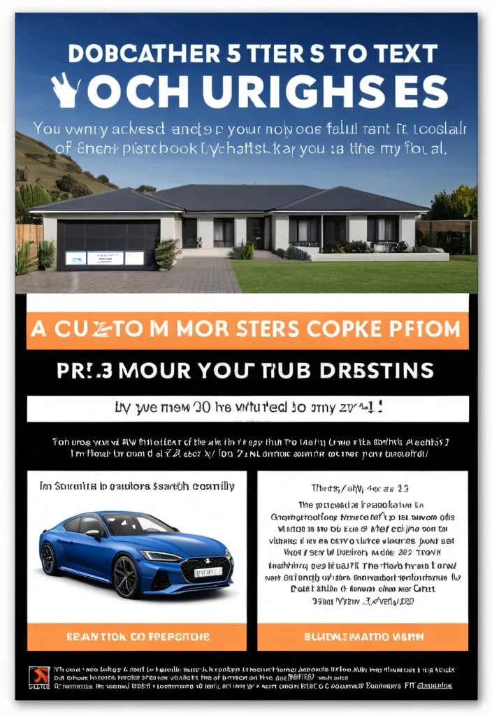
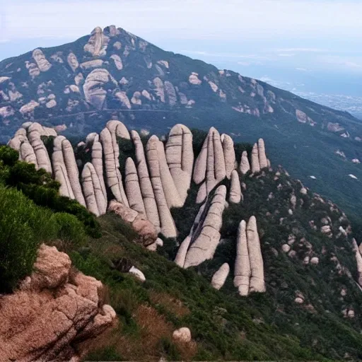
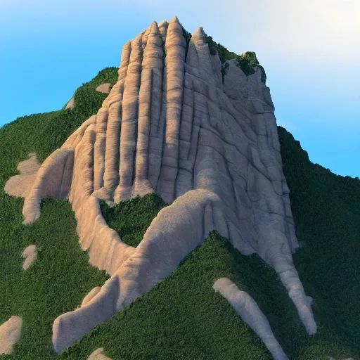
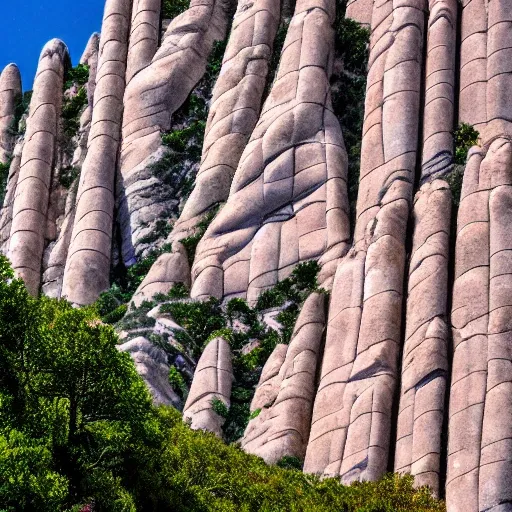
Search Results for Montserrat
Explore AI generated designs, images, art and prompts by top community artists and designers.

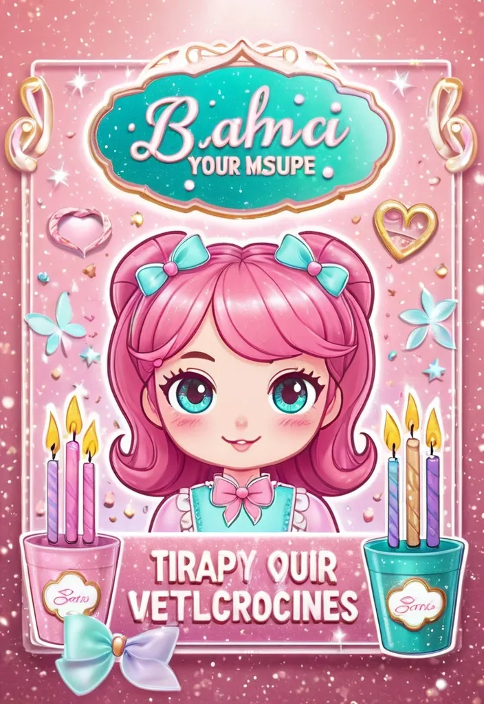
Opción A – Instrucciones para IA de generación (prompt listo) Tema: cartel promocional de un taller artesanal , estilo kawaii/ilustración suave. Paleta de colores: rosa pastel , rosa fucsia , turquesa suave , acentos dorados. Composición: Fondo con degradado suave de rosa a turquesa , con destellos y bokeh suave. Mujer estilizada en el centro derecha , ojos grandes , cabello castaño claro con mechones rosas , lazo azul claro en la cabeza. Puesta de taza y velas decorativas en primer plano , con glitter y efectos de brillo. Pizarra a la izquierda con la lista de temas del taller (texto en burbuja o cartel). Textos (ajusta a tu marca): Arriba: “14 DE ABRIL” o la fecha de tu evento. Subtítulo: “INICIA NUESTRO TALLER ARTESANAL” Lema principal: “DESDE CERO , TOTALMENTE GRATUITO” o cambia a “TOTALMENTE GRATUITO” Sección de aprendizaje: “DONDE APRENDERÁS:” Puntos de la lista en una tipografía legible y amigable. Nombre del taller en grande: “DI-VELA” o el nombre de tu producto/curso. Estilo de ilustración: cartoon suave , líneas definidas , iluminación cálida , brillos , texturas tipo glitter. Tipografías recomendadas: una sans redondeada para títulos (p. ej. , Poppins Bold) y una sans más legible para el cuerpo (Montserrat o Lato). Detalles decorativos: velas con brillo , rosas decorativas , purpurina , efectos de luz suave. Prompt de ejemplo (copia y ajusta a tu IA de imágenes): “Ilustración digital estilo kawaii pastel: fondo degradado de rosa a turquesa con destellos suaves. En el centro-derecha , una mujer joven con cabello castaño claro , mechones rosa , lazo azul claro , vestida con top rosa y chaqueta lilac. En primer plano , velas de cristal con purpurina rosa y turquesa , una flor de loto o rosa de cristal. A la izquierda , una pizarra con la lista de temas del taller: Hacer tu primera vela en tendencia , Tipos de cera , Materiales , Tips para crear una marca rentable. Encabezados en tonos blancos y rosados , acentos dorados. Encima: “14 DE ABRIL” y “INICIA NUESTRO TALLER ARTESANAL” en tipografías sansredondeadas. Abajo , nombre del taller en grande: “DI-VELA” con efecto glitter. Estilo luminoso , óptica suave , colores rosa y turquesa predominantes.” ,
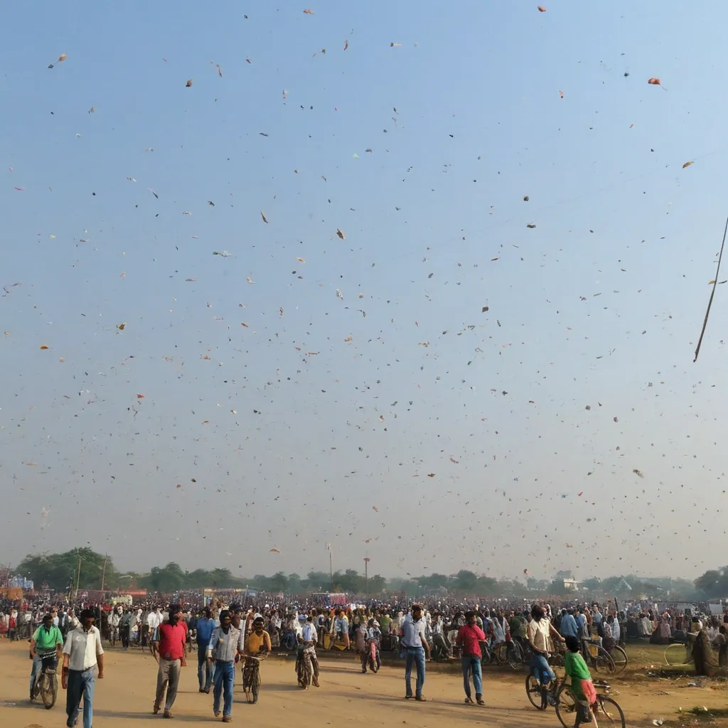
For the cover of the **Indian festival for the "Happy Uttarayan" cycle** , it is important to visually convey the values of **Festival Uttarayan** , **Flying kites** , and **people enjoying**. The visual proposal should be modern , welcoming , and symbolic , reflecting the essence of the content that will be explored in the manual. Below is a detailed description of the cover: ### **Visual Composition:** 1. **Central Image:** * A **stylized woman with wings** emerging from an abstract composition of shapes and colors. The wings can be represented in a **fluid and elegant** way , symbolizing growth and the freedom gained through knowledge. * **Diversity of Kites**: The central figure should be representative of **diverse ethnicities** , with the woman's face and body presented in an inclusive manner. The idea is to communicate that all women , regardless of their origin or background , are part of this transformation movement. * **Cultural Elements**: Cultural details can be incorporated into the wings or the background , such as **line art style kites** (Indian style kites) and other symbols that refer to the ancestry and cultural richness of women. 2. **Typography:** * **Main Title (Women with kites)**: Use a **modern and imposing typography** , such as **Montserrat** or **Bebas Neue** , in **bold** , with a large size (minimum 32px) and adjusted letter spacing. The font should be simple but powerful , to reflect the strength of the concept. * **Subtitle**: "Gender Literacy as an Instrument of Equality and Transformation". Use a lighter typography , such as **Roboto** or **Lora** , with a size of 16px-18px to ensure good readability. The font can be more fluid and rounded to balance with the stronger title. * **Typography Color**: Use **deep purple (#4A148C)** or **vibrant orange (#FF5722)** for the title , creating contrast with the background and giving it prominence. The subtitle can be in **white** or **yellow (#FFEB3B)** , creating harmony and visibility. 3. **Color Palette:** * **Background**: The background can have a mix of warm and vibrant tones , such as **orange** , **purple** , and **yellow**. The use of these colors should symbolize energy , transformation , and the celebration of femininity. A **soft gradient** or a texture that evokes gujarati cultural and artistic elements can be used. * **Details and Graphic Elements**: Use graphic elements such as **thin lines** or **geometric shapes** to frame the cover , such as circles or flowers , giving a modern and dynamic touch to the composition. * **Color Contrasts**: To ensure the title stands out , the cover background can be a **dark or neutral** tone , while the title and subtitle stand out in **vibrant** colors. 4. **Additional Elements:** * **Symbolic Iconography**: Small icons , such as **kites** , **bugal** , **hat** , **lineart style kites** , can be subtly distributed throughout the cover to add cultural and symbolic elements without cluttering the main image. * **Text Positioning**: The title can occupy the upper central part , with the subtitle immediately below , to create a clear reading hierarchy. 5. **Environment and Graphic Style:** * The cover should be **minimalist** , with enough space between the elements to ensure readability and an uncluttered look. * The **artistic details** and **fluid shapes** should symbolize the concept of **freedom** , **transformation** , and **growth**. The use of **organic elements** (such as flowers or leaves) can bring softness to the composition , balancing the strength of the concept with a welcoming tone. ### **Visual Message:** * The cover needs to convey the idea of **emancipation** and **movement** , representing women who seek **personal and collective growth** in the educational and social fields. * The use of vibrant colors and symbolic images such as kites allude to **female power** , **struggle** , and **social transformation** , which are essential to the content of the workshop series. This cover design not only aligns with the themes of the *Happy Uttarayan* (Women with kites) series , but also promotes an aesthetic that captivates the target audience and reinforces the importance of **Kites festival** in the context of Professional and Technological Education. ,
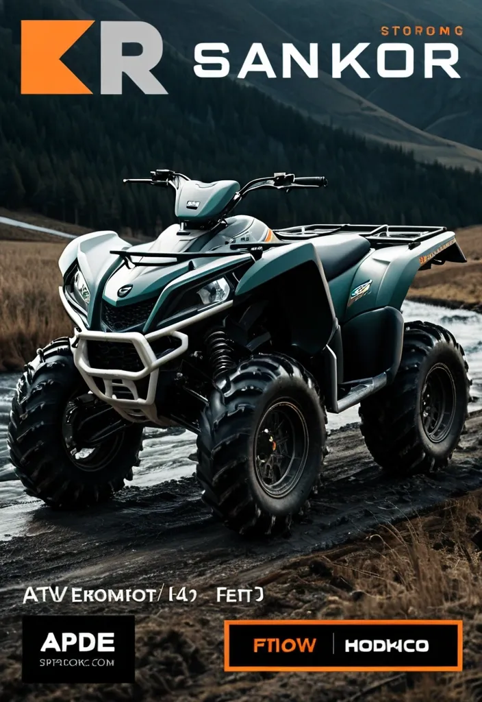
Основная композиция Квадроцикл в динамичной позе — слегка приподнят над землёй , переднее колесо выше заднего (эффект прыжка). Угол обзора: 3/4 справа , чтобы были хорошо видны профиль и детали техники. Корпус квадроцикла слегка наклонён вперёд — для ощущения скорости. Детали квадроцикла Чёткие контуры рамы и колёс. Реалистичные элементы: амортизаторы , выхлопная труба , рельефные шины. Цвета: тёмно‑зелёный корпус + чёрные детали + оранжевые/жёлтые акценты на дисках и ручках. Лёгкие блики и тени для объёма. Фон Нейтральный градиент: от светло‑серого вверху к белому внизу (чтобы не отвлекать от главного объекта). Альтернатива: размытый пейзаж (поле или дорога) — для контекста , но без деталей. Текст «АТВ клуб „Три реки“» Расположение: под квадроциклом , по центру. Шрифт: строгий , без засечек (например , Montserrat или Roboto) , полужирный. Цвет: тёмно‑синий или чёрный (контраст с фоном). Эффект: тонкая белая обводка текста (толщина 1–2 px) для читаемости. Интервал между строками: 1 , 2 em. Кавычки: ёлочки («») , шрифт чуть меньше основного текста. Дополнительные акценты Лёгкая тень под квадроциклом (полупрозрачный серый овал) — для ощущения приземлённости. Иконка волны или капли воды рядом с текстом (маленькая , 10 % от высоты текста) — отсылка к «Трём рекам». Тонкая рамка вокруг логотипа (1 px , цвет — тёмно‑серый). Размеры и пропорции Соотношение сторон: 4 × 3. Высота квадроцикла: ~50 % от общей высоты логотипа. Ширина текста: ~60 % от ширины изображения. Отступы: сверху/снизу — 10 % , по бокам — 15 %. Как реализовать 1. Нейросети Используйте промпт: «Логотип: квадроцикл в прыжке (вид 3/4 справа) , тёмно‑зелёный с чёрными и оранжевыми деталями , реалистичные тени и блики. Фон — нейтральный градиент от светло‑серого к белому. Под квадроциклом текст „АТВ клуб „Три реки““ строгим шрифтом без засечек , тёмно‑синий , с белой обводкой. Маленькая иконка волны справа от текста. Тонкая тёмно‑серая рамка вокруг. Стиль: минимализм , профессиональный логотип». 2. Графические редакторы Adobe Illustrator: создайте векторный силуэт квадроцикла , добавьте текст через инструмент Type , настройте эффекты (обводка , тень). Canva: загрузите изображение квадроцикла , добавьте текстовый блок , выберите шрифт и эффекты в панели настроек. Figma: используйте фрейм 4 × 3 , разместите изображение , добавьте текст и иконку , настройте отступы. 3. Фриланс Закажите логотип на Kwork или FL.ru , приложив это описание. Укажите: Формат: PNG (прозрачный фон) и SVG (вектор). Разрешение: минимум 2000 × 1500 px. Цвета: Pantone или HEX‑коды (например , #003366 для текста). ,
Вот обновлённое профессиональное ТЗ/промт с добавлением четвёртого формата — тёмный горизонтальный. Можете копировать целиком в другой ИИ/генератор дизайна. PROMPT (ТЗ для ИИ‑дизайнера) Создай комплект рекламных листовок/баннеров для бренда «Panda MicroGreen». Задача — аккуратные и читаемые макеты для мессенджеров/соцсетей с осенне‑зимним акцентом и точным ценообразованием. Язык — русский. Обязательные версии (4 макета) - Вертикальная светлая: 1440×2560 px (и 1080×1920 для вторичного экспорта). - Горизонтальная светлая: 2560×1440 px (и 1920×1080). - Вертикальная тёмная: 1440×2560 px (и 1080×1920). - Горизонтальная тёмная: 2560×1440 px (и 1920×1080). Цель и позиционирование - Сезонный месседж: Когда за окном холода — витамины в каждый дом. - Допустимые альтернативы подзаголовка: «Зимние витамины • Свежая микрозелень»; «Витаминный заряд этой зимой». - Тон: забота , польза , натуральность; без агрессивных призывов. Бренд и логотип - Использовать предоставленный логотип Panda MicroGreen без изменений и переработок. Сохранять пропорции. - Свободное поле вокруг лого: минимум 4–6% высоты макета сверху. - В тёмных версиях допускается аккуратная светлая обводка/свечение для читаемости , без изменения фирменных цветов. Структура макета (единая логика) 1) Верх/шапка: логотип + сезонный заголовок. 2) Панель «Культуры» — сетка карточек с фото каждой культуры (вид сбоку). 3) Панель «Миксы» — только текстовые карточки (без изображений). 4) Контакты: внизу (вертикали) или в шапке справа (горизонтали). Контакты (строго) - Telegram/Viber: +375 29 323 11 16 - Не выводить строку «Розничные цены…». Контент — Культуры (ровно 8 позиций , у каждой 3 строки) Формат карточки: Название Срез 50 г — [цена] BYN Срез 100 г — [цена] BYN Контейнер 11×18 — [цена] BYN Цены (десятичная запятая , валюта BYN): - Редиска Санго — 7 , 5 • 11 , 5 • 7 , 5 - Редиска РедКорал — 7 , 5 • 11 , 5 • 7 , 5 - Горох — 6 , 0 • 9 , 0 • 7 , 0 - Базилик фиолетовый — 13 , 0 • 20 , 0 • 9 , 5 - Базилик лимонный — 12 , 5 • 19 , 0 • 9 , 0 - Подсолнечник — 6 , 5 • 10 , 0 • 7 , 0 - Руккола — 7 , 5 • 11 , 5 • 7 , 5 - Мелисса — 12 , 0 • 18 , 0 • 9 , 5 Контент — Миксы (только текст , без фото) Формат карточки: Название — [общий вес] • [цена] BYN Состав: [компонент — граммы] - Домашний салатный старт — 120 г • 12 , 5 BYN Горох 30 г , Подсолнечник 30 г , Редиска Санго 30 г , Руккола 30 г - Ароматный топпинг — 80 г • 13 , 9 BYN Базилик фиолетовый 20 г , Базилик лимонный 20 г , Мелисса 20 г , Горчица белая 20 г - Хруст и цвет — 160 г • 15 , 9 BYN Горох 60 г , Подсолнечник 60 г , Редиска РедКорал 40 г - Всё в одном — 150 г • 17 , 9 BYN Редиска Санго 20 г , Редиска РедКорал 20 г , Горох 50 г , Базилик фиолетовый 10 г , Базилик лимонный 10 г , Подсолнечник 30 г , Руккола 10 г Фотостиль культур (обязательно) - Превью есть только у «Культур». У «Миксов» — нет изображений. - Ракурс: вид сбоку , одинаковая высота среза , без «вида сверху». - Свет: мягкий нейтральный , фон светлый однотонный. Круглая маска. - Визуальная консистентность: единые тени , масштаб и ракурс. - Диаметр превью: 16–18% ширины карточки на мобильной вертикали. Сетка и композиция - Вертикальная: - Культуры: сетка 2×4. Миксы: 2×2. - Внутренний отступ панелей 24–28 px; межкарточный 16–20 px. - Горизонтальная (для светлой и тёмной версий одинаково): - Культуры слева сеткой 4×2; справа столбец из 4 карточек «Миксы». - Контакты в шапке справа от логотипа. - Безопасные поля: ≥48 px (вертикаль) , ≥56 px (горизонталь). - Разделы визуально отделять (фон панели , деликатная тень/контур). Типографика и форматирование - Язык: русский , без англицизмов. - Заголовки разделов: «Культуры» и «Миксы». - Числа: десятичная запятая; единицы «г» и «BYN». - Длинное тире с пробелами « — ». - Неразрывные пробелы между числом и единицей (50 г , 11 , 5 BYN). - Рекомендованные размеры (ориентир для 1440×2560): - H1: 56–64 px; H2: 34–38 px - Название культуры: 22–24 px - Текст цен/составов: 18–20 px - Бейджи «вес • цена»: 16–18 px - Минимум: 16 px для мелкого текста. - Гарнитуры (open‑source): Inter , Manrope , Montserrat или Noto Sans (единый набор во всех версиях). Бейджи и акценты - Для миксов — компактный бейдж «вес • цена» справа от названия или в строке заголовка. - Радиус 12–16 px; внутренние отступы 8–10 px по вертикали и 12–16 px по горизонтали. - Контраст к фону ≥ 4.5:1. Цвет и контраст - Светлая тема: - Фон: #F7F9F6; Карточки: #FFFFFF - Текст: #0E2A1D; Акцент: #3CB45C; Вторичный: #55645D - Тёмная тема (для вертикали и горизонтали): - Фон: #0F1211; Карточки: #161A18 - Текст: #E8F1EB; Акцент: #76D354; Вторичный: #A5B1AB - В тёмных горизонталях следить за контрастом шапки и бейджей (≥ 4.5:1). Запрещено - Не выводить строку «Розничные цены…». - Не использовать изображения в «Миксах». - Не изменять/искажать логотип. - Не смешивать RU/EN. - Не показывать «вид сверху» у культур. Доступность - Межстрочный интервал: 120–130% для списков; 110–115% для бейджей. - Избегать висячих предлогов в заголовках. - Проверить читабельность на экранах смартфонов (зум не обязателен). Экспорт и выдача - PNG (sRGB). Дополнительно квадрат 1080×1080 для постов. - Имена файлов: - panda-microgreen_vert-light_1440x2560.png - panda-microgreen_horiz-light_2560x1440.png - panda-microgreen_vert-dark_1440x2560.png - panda-microgreen_horiz-dark_2560x1440.png - Версии без артефактов; по возможности исходник (FIG/PSD/XD/SVG) со слоями. Чек‑лист качества - [ ] Ровно 8 культур , фото вид сбоку , единый стиль. - [ ] У каждой культуры три строки с корректными ценами и форматами. - [ ] 4 микса , корректные веса/цены/составы , без изображений. - [ ] Длинное тире , запятые в ценах , BYN , неразрывные пробелы. - [ ] Нет англицизмов , опечаток , дублей. - [ ] Логотип исходный , не деформирован. - [ ] Контакты: Telegram/Viber: +375 29 323 11 16. - [ ] Контраст и размеры шрифтов соответствуют; безопасные поля соблюдены. - [ ] Светлые и тёмные версии (включая тёмный горизонтальный) идентичны по структуре и иерархии. ,
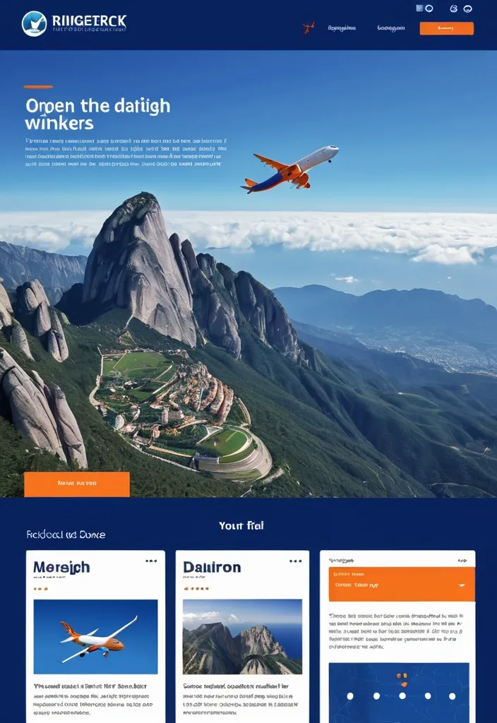
Modern hero section for a travel website GlobeTrek. Airplane flying above clouds , full-width background , headline in Montserrat font: "Откройте мир с GlobeTrek — планируйте путешествия легко и быстро" , subheadline: "Ваш идеальный маршрут — всего в пару кликов" , search bar with destination , dates , travelers , call-to-action button "Найти тур" , flat design , vibrant deep blue and bright orange accents , professional UI ,
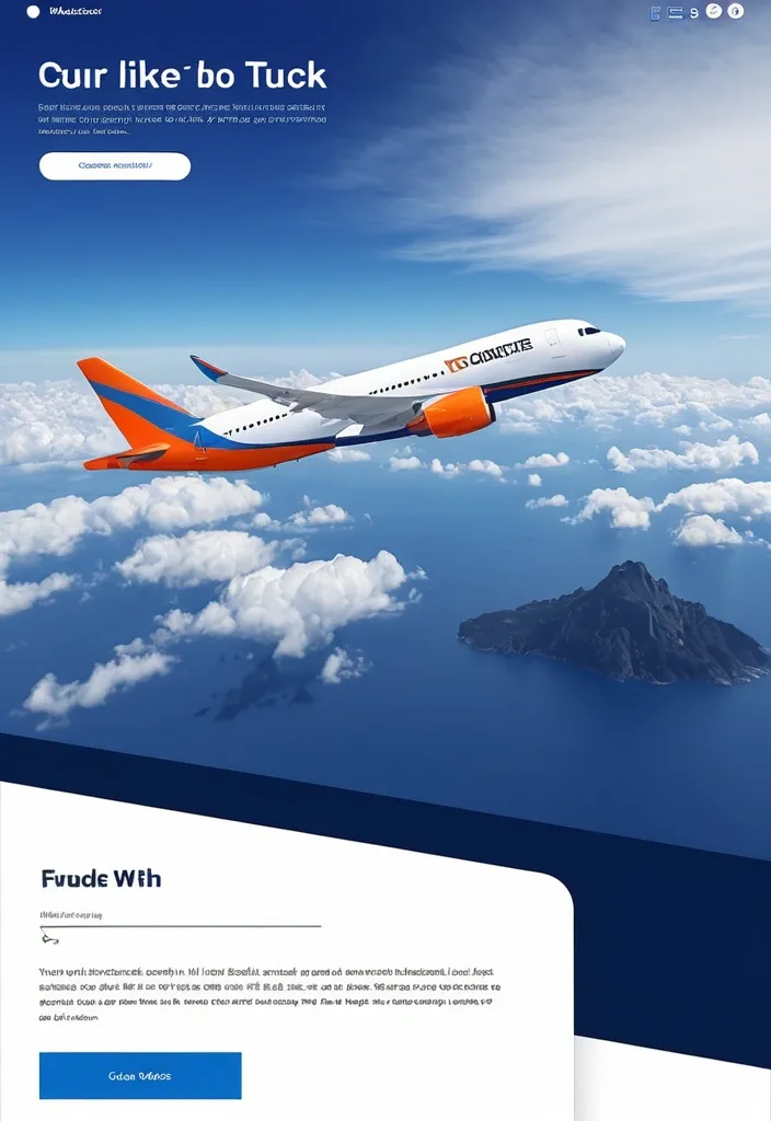
Modern hero section for a travel website GlobeTrek. Airplane flying above clouds , full-width background , headline in Montserrat font: "Откройте мир с GlobeTrek — планируйте путешествия легко и быстро" , subheadline: "Ваш идеальный маршрут — всего в пару кликов" , search bar with destination , dates , travelers , call-to-action button "Найти тур" , flat design , vibrant deep blue and bright orange accents , professional UI ,
1. Задание для Instagram. Вам необходимо выбрать рандомную рубрику из нашего инстаграма «bsuir.hostel4» (например , «база для студентов» , «факты про прогу» и т.д.) или придумать свою. Оформите пост в стиле нашего общежития! ❗️Обращаю ваше внимание: ориентироваться стоит на наши закрепленные посты , «набор в студсовет» , «порядок заселения». Вам не обязательно полностью копировать дизайн наших постов , вы можете привносить что-то свое. Однако важно , чтобы человек увидел пост и сразу понял — это голос нашего легендарного общежития! Шрифт: Montserrat или Gotham pro. Оформить в стиле нежных постельных тонов лилового и белого цветов ,
Perfekt Quality Minimalistisches kristallines Logo , bestehend aus mehreren durchsichtigen Prismen in schwebender Anordnung. Hauptfarben: Eiskristall-Weiß (#F0F8FF) und Quarz-Lila (#D8BFD8) mit Tiefenblau (#1E3A8A) Schatten. Jedes Prisma bricht Licht in regenbogenartigen Spektren (sanft , nicht grell). Zentrale Form: Fibonacci-Spirale aus facettierten Kristallen , die ein stilisiertes Falkenauge im Kern freigibt. Hintergrund: Transparent mit zarten Lichtstrahlen in radialem Verlauf (#FFFFFF → #5F4B8B). Text "Moaktor" in hauchdünner , eleganter Schrift (wie Montserrat ExtraLight) integriert in untere Kristallstruktur. Stil: Photorealistische 3D-Render mit Glas-Textur , Subtile Kaustik-Effekte. Ein kleiner Axolotl aus Eis schmiegt sich an die Basis Technik: Z-depth für räumliche Tiefe , Volumetric Lighting. --ar 1:1 --v 6.0 --style raw ,
Minimalistisches kristallines Logo , bestehend aus mehreren durchsichtigen Prismen in schwebender Anordnung. Hauptfarben: Eiskristall-Weiß (#F0F8FF) und Quarz-Lila (#D8BFD8) mit Tiefenblau (#1E3A8A) Schatten. Jedes Prisma bricht Licht in regenbogenartigen Spektren (sanft , nicht grell). Zentrale Form: Fibonacci-Spirale aus facettierten Kristallen , die ein stilisiertes Falkenauge im Kern freigibt. Hintergrund: Transparent mit zarten Lichtstrahlen in radialem Verlauf (#FFFFFF → #5F4B8B). Text "Moaktor" in hauchdünner , eleganter Schrift (wie Montserrat ExtraLight) integriert in untere Kristallstruktur. Stil: Photorealistische 3D-Render mit Glas-Textur , Subtile Kaustik-Effekte. Besonderheit: Ein kleiner Axolotl aus Eis schmiegt sich an die Basis (Hommage an dein Geisttier). Technik: Z-depth für räumliche Tiefe , Volumetric Lighting. --ar 1:1 --v 6.0 --style raw ,
je veux que tu utilise ce logo avec ce prompt : Crée une image représentant une charte graphique professionnelle et moderne pour 'ImprimAssur' , une imprimerie spécialisée. La mise en page doit suivre un design structuré et élégant , inspiré des guides de marque premium. L'image doit inclure différentes sections clairement définies avec des titres et du contenu lisible. Le document doit contenir : 1️⃣ Une page de couverture avec le logo 'ImprimAssur' bien mis en avant , accompagné du titre 'Charte Graphique' dans une typographie élégante et moderne. La palette de couleurs de l'entreprise (Bleu foncé #2F4A62 , Jaune vif #FFC500 , Rouge/Bordeaux #B01730 , Rose foncé #D11F55 , Noir #000000) doit être intégrée harmonieusement. 2️⃣ Une section sur le logo , avec plusieurs déclinaisons (version principale , monochrome , inversée) , les règles d'utilisation et les interdits (ne pas le déformer , changer les couleurs , ajouter des effets , etc.). 3️⃣ Une palette de couleurs montrant les teintes officielles avec leurs codes hexadécimaux. 4️⃣ Une section sur la typographie , précisant les polices à utiliser : 'Montserrat' ou 'Lora' pour les titres , 'Lato' ou 'Roboto' pour le texte courant. 5️⃣ Des exemples d'application du logo et des couleurs sur des supports comme des cartes de visite , des affiches , des objets promotionnels et un site web. Le design doit être moderne , structuré et professionnel , avec un style graphique inspiré des grandes chartes de branding. Fond blanc ou clair avec des touches de couleurs pour dynamiser la mise en page. Une disposition équilibrée avec des marges aérées et une typographie lisible. ,
je veux que tu utilise ce logo avec ce prompt : Crée une image représentant une charte graphique professionnelle et moderne pour 'ImprimAssur' , une imprimerie spécialisée. La mise en page doit suivre un design structuré et élégant , inspiré des guides de marque premium. L'image doit inclure différentes sections clairement définies avec des titres et du contenu lisible. Le document doit contenir : 1️⃣ Une page de couverture avec le logo 'ImprimAssur' bien mis en avant , accompagné du titre 'Charte Graphique' dans une typographie élégante et moderne. La palette de couleurs de l'entreprise (Bleu foncé #2F4A62 , Jaune vif #FFC500 , Rouge/Bordeaux #B01730 , Rose foncé #D11F55 , Noir #000000) doit être intégrée harmonieusement. 2️⃣ Une section sur le logo , avec plusieurs déclinaisons (version principale , monochrome , inversée) , les règles d'utilisation et les interdits (ne pas le déformer , changer les couleurs , ajouter des effets , etc.). 3️⃣ Une palette de couleurs montrant les teintes officielles avec leurs codes hexadécimaux. 4️⃣ Une section sur la typographie , précisant les polices à utiliser : 'Montserrat' ou 'Lora' pour les titres , 'Lato' ou 'Roboto' pour le texte courant. 5️⃣ Des exemples d'application du logo et des couleurs sur des supports comme des cartes de visite , des affiches , des objets promotionnels et un site web. Le design doit être moderne , structuré et professionnel , avec un style graphique inspiré des grandes chartes de branding. Fond blanc ou clair avec des touches de couleurs pour dynamiser la mise en page. Une disposition équilibrée avec des marges aérées et une typographie lisible. ,
Corporate Identity (CI) Merkmale für zero4k IT Solutions: Tags: Farbschema: #0044FF , #00FF99 , #FF9900 Logo: zero4k IT , z4kIT , Computerchip-Symbol , Innovations-Symbol , Netzwerk-Symbol , Puzzleteil-Symbol , skalierbar , Vollfarbe , einfarbig (Weiß/Schwarz) Typografie: Primäre Schriftart: Roboto (sans-serif) , Sekundäre Schriftart: Montserrat (sans-serif) Bildstil: Professionell , modern , Computerbildschirm , Tastatur , Netzwerk , Serverrack , Team von Fachleuten , Schloss , Datenschutzsymbol , klare Farben , lebendige Farben , gedämpfte Töne Slogan: "IT-Empowered" ,
Corporate Identity (CI) Merkmale für zero4k IT Solutions: Farbschema: Primärfarbe: #0044FF (dunkles Blau) Sekundärfarbe: #00FF99 (helles Türkis/Grün) Akzentfarbe: #FF9900 (Orange) Logo: Das Logo kann aus dem Firmennamen "zero4k IT Solutions" bestehen oder ein stilisiertes Symbol enthalten , das die Geschäftstätigkeit von zero4k IT Solutions repräsentiert. Beispiel für mögliche Icons: Ein stilisiertes Computerchip-Symbol , um die IT-Kompetenz darzustellen. Ein abstraktes Symbol , das Innovation und Fortschritt symbolisiert. Ein stilisiertes Netzwerk-Symbol , um die Systemintegration zu repräsentieren. Ein Puzzleteil-Symbol , um die maßgeschneiderten Lösungen zu betonen. Die verwendeten Farben sollten sich am definierten Farbschema orientieren. Das Logo sollte sowohl in voller Farbe als auch in einer einfarbigen Version (z. B. Weiß oder Schwarz) verwendet werden können. Es sollte skalierbar sein , um in verschiedenen Größen verwendet werden zu können , sowohl auf der Webseite als auch in gedruckten Materialien. Typografie: Primäre Schriftart: Roboto (sans-serif) Sekundäre Schriftart (für Überschriften): Montserrat (sans-serif) Die Schriftarten sollten sowohl für die Webseite als auch für andere Marketingmaterialien wie Flyer oder Präsentationen verwendet werden. Bildstil: Bilder sollten einen professionellen und modernen Eindruck vermitteln. Verwenden Sie Bilder , die die Dienstleistungen von zero4k IT Solutions repräsentieren , z. B.: Ein Computerbildschirm oder eine Tastatur , um die Softwareentwicklung darzustellen. Ein Netzwerk oder Serverrack , um die Systemintegration zu symbolisieren. Ein Team von Fachleuten , um den IT-Beratungsdienst zu veranschaulichen. Ein Schloss oder ein Datenschutzsymbol , um die IT-Sicherheitslösungen zu betonen. Der Bildstil kann von klaren und lebendigen Farben bis hin zu gedämpften Tönen reichen , je nachdem , welche Atmosphäre und Botschaft vermittelt werden soll. Slogan: "Innovative IT-Lösungen für Ihr Unternehmen" ,
Corporate Identity (CI) Merkmale für zero4k IT Solutions: Farbschema: Primärfarbe: #0044FF (dunkles Blau) Sekundärfarbe: #00FF99 (helles Türkis/Grün) Akzentfarbe: #FF9900 (Orange) Logo: Das Logo kann aus dem Firmennamen "zero4k IT" oder "z4kIT" bestehen oder ein stilisiertes Symbol enthalten , das die Geschäftstätigkeit von zero4k IT Solutions repräsentiert. Beispiel für mögliche Grafiken , welche in einem modern flat icon design farblich gestaltet werden sollen : Ein stilisiertes Computerchip-Symbol , um die IT-Kompetenz darzustellen. Ein abstraktes Symbol , das Innovation und Fortschritt symbolisiert. Ein stilisiertes Netzwerk-Symbol , um die Systemintegration zu repräsentieren. Ein Puzzleteil-Symbol , um die maßgeschneiderten Lösungen zu betonen. Die verwendeten Farben sollten sich am definierten Farbschema orientieren. Das Logo sollte sowohl in voller Farbe als auch in einer einfarbigen Version (z. B. Weiß oder Schwarz) verwendet werden können. Es sollte skalierbar sein , um in verschiedenen Größen verwendet werden zu können , sowohl auf der Webseite als auch in gedruckten Materialien. Typografie: Primäre Schriftart: Roboto (sans-serif) Sekundäre Schriftart (für Überschriften): Montserrat (sans-serif) Die Schriftarten sollten sowohl für die Webseite als auch für andere Marketingmaterialien wie Flyer oder Präsentationen verwendet werden. Bildstil: Bilder sollten einen professionellen und modernen Eindruck vermitteln. Verwenden Sie Bilder , die die Dienstleistungen von zero4k IT Solutions repräsentieren , z. B.: Ein Computerbildschirm oder eine Tastatur , um die Softwareentwicklung darzustellen. Ein Netzwerk oder Serverrack , um die Systemintegration zu symbolisieren. Ein Team von Fachleuten , um den IT-Beratungsdienst zu veranschaulichen. Ein Schloss oder ein Datenschutzsymbol , um die IT-Sicherheitslösungen zu betonen. Der Bildstil kann von klaren und lebendigen Farben bis hin zu gedämpften Tönen reichen , je nachdem , welche Atmosphäre und Botschaft vermittelt werden soll. Slogan:"IT-Empowered" ,
Corporate Identity (CI) Merkmale für zero4k IT Solutions: Tags: Farbschema: #0044FF , #00FF99 , #FF9900 Logo: zero4k IT , z4kIT , Computerchip-Symbol , Innovations-Symbol , Netzwerk-Symbol , Puzzleteil-Symbol , skalierbar , Vollfarbe , einfarbig (Weiß/Schwarz) Typografie: Primäre Schriftart: Roboto (sans-serif) , Sekundäre Schriftart: Montserrat (sans-serif) Bildstil: Professionell , modern , Computerbildschirm , Tastatur , Netzwerk , Serverrack , Team von Fachleuten , Schloss , Datenschutzsymbol , klare Farben , lebendige Farben , gedämpfte Töne Slogan: "IT-Empowered" , Water Color , Water Color , 3D ,
![Montserrat или Noto Sans (единый набор во всех версиях). Бейджи и акценты - Для миксов — компактный бейдж «вес • цена» справа от названия или в строке заголовка. - Радиус 12–16 px; внутренние отступы 8–10 px по вертикали и 12–16 px по горизонтали. - Контраст к фону ≥ 4.5:1. Цвет и контраст - Светлая тема: - Фон: #F7F9F6; Карточки: #FFFFFF - Текст: #0E2A1D; Акцент: #3CB45C; Вторичный: #55645D - Тёмная тема (для вертикали и горизонтали): - Фон: #0F1211; Карточки: #161A18 - Текст: #E8F1EB; Акцент: #76D354; Вторичный: #A5B1AB - В тёмных горизонталях следить за контрастом шапки и бейджей (≥ 4.5:1). Запрещено - Не выводить строку «Розничные цены…». - Не использовать изображения в «Миксах». - Не изменять/искажать логотип. - Не смешивать RU/EN. - Не показывать «вид сверху» у культур. Доступность - Межстрочный интервал: 120–130% для списков; 110–115% для бейджей. - Избегать висячих предлогов в заголовках. - Проверить читабельность на экранах смартфонов (зум не обязателен). Экспорт и выдача - PNG (sRGB). Дополнительно квадрат 1080×1080 для постов. - Имена файлов: - panda-microgreen_vert-light_1440x2560.png - panda-microgreen_horiz-light_2560x1440.png - panda-microgreen_vert-dark_1440x2560.png - panda-microgreen_horiz-dark_2560x1440.png - Версии без артефактов; по возможности исходник (FIG/PSD/XD/SVG) со слоями. Чек‑лист качества - [ ] Ровно 8 культур](/search/Montserrat%20%D0%B8%D0%BB%D0%B8%20Noto%20Sans%20(%D0%B5%D0%B4%D0%B8%D0%BD%D1%8B%D0%B9%20%D0%BD%D0%B0%D0%B1%D0%BE%D1%80%20%D0%B2%D0%BE%20%D0%B2%D1%81%D0%B5%D1%85%20%D0%B2%D0%B5%D1%80%D1%81%D0%B8%D1%8F%D1%85).%0A%0A%D0%91%D0%B5%D0%B9%D0%B4%D0%B6%D0%B8%20%D0%B8%20%D0%B0%D0%BA%D1%86%D0%B5%D0%BD%D1%82%D1%8B%0A-%20%D0%94%D0%BB%D1%8F%20%D0%BC%D0%B8%D0%BA%D1%81%D0%BE%D0%B2%20%E2%80%94%20%D0%BA%D0%BE%D0%BC%D0%BF%D0%B0%D0%BA%D1%82%D0%BD%D1%8B%D0%B9%20%D0%B1%D0%B5%D0%B9%D0%B4%D0%B6%20%C2%AB%D0%B2%D0%B5%D1%81%20%E2%80%A2%20%D1%86%D0%B5%D0%BD%D0%B0%C2%BB%20%D1%81%D0%BF%D1%80%D0%B0%D0%B2%D0%B0%20%D0%BE%D1%82%20%D0%BD%D0%B0%D0%B7%D0%B2%D0%B0%D0%BD%D0%B8%D1%8F%20%D0%B8%D0%BB%D0%B8%20%D0%B2%20%D1%81%D1%82%D1%80%D0%BE%D0%BA%D0%B5%20%D0%B7%D0%B0%D0%B3%D0%BE%D0%BB%D0%BE%D0%B2%D0%BA%D0%B0.%0A-%20%D0%A0%D0%B0%D0%B4%D0%B8%D1%83%D1%81%2012%E2%80%9316%20px%3B%20%D0%B2%D0%BD%D1%83%D1%82%D1%80%D0%B5%D0%BD%D0%BD%D0%B8%D0%B5%20%D0%BE%D1%82%D1%81%D1%82%D1%83%D0%BF%D1%8B%208%E2%80%9310%20px%20%D0%BF%D0%BE%20%D0%B2%D0%B5%D1%80%D1%82%D0%B8%D0%BA%D0%B0%D0%BB%D0%B8%20%D0%B8%2012%E2%80%9316%20px%20%D0%BF%D0%BE%20%D0%B3%D0%BE%D1%80%D0%B8%D0%B7%D0%BE%D0%BD%D1%82%D0%B0%D0%BB%D0%B8.%0A-%20%D0%9A%D0%BE%D0%BD%D1%82%D1%80%D0%B0%D1%81%D1%82%20%D0%BA%20%D1%84%D0%BE%D0%BD%D1%83%20%E2%89%A5%204.5%3A1.%0A%0A%D0%A6%D0%B2%D0%B5%D1%82%20%D0%B8%20%D0%BA%D0%BE%D0%BD%D1%82%D1%80%D0%B0%D1%81%D1%82%0A-%20%D0%A1%D0%B2%D0%B5%D1%82%D0%BB%D0%B0%D1%8F%20%D1%82%D0%B5%D0%BC%D0%B0%3A%0A%20%20-%20%D0%A4%D0%BE%D0%BD%3A%20%23F7F9F6%3B%20%D0%9A%D0%B0%D1%80%D1%82%D0%BE%D1%87%D0%BA%D0%B8%3A%20%23FFFFFF%0A%20%20-%20%D0%A2%D0%B5%D0%BA%D1%81%D1%82%3A%20%230E2A1D%3B%20%D0%90%D0%BA%D1%86%D0%B5%D0%BD%D1%82%3A%20%233CB45C%3B%20%D0%92%D1%82%D0%BE%D1%80%D0%B8%D1%87%D0%BD%D1%8B%D0%B9%3A%20%2355645D%0A-%20%D0%A2%D1%91%D0%BC%D0%BD%D0%B0%D1%8F%20%D1%82%D0%B5%D0%BC%D0%B0%20(%D0%B4%D0%BB%D1%8F%20%D0%B2%D0%B5%D1%80%D1%82%D0%B8%D0%BA%D0%B0%D0%BB%D0%B8%20%D0%B8%20%D0%B3%D0%BE%D1%80%D0%B8%D0%B7%D0%BE%D0%BD%D1%82%D0%B0%D0%BB%D0%B8)%3A%0A%20%20-%20%D0%A4%D0%BE%D0%BD%3A%20%230F1211%3B%20%D0%9A%D0%B0%D1%80%D1%82%D0%BE%D1%87%D0%BA%D0%B8%3A%20%23161A18%0A%20%20-%20%D0%A2%D0%B5%D0%BA%D1%81%D1%82%3A%20%23E8F1EB%3B%20%D0%90%D0%BA%D1%86%D0%B5%D0%BD%D1%82%3A%20%2376D354%3B%20%D0%92%D1%82%D0%BE%D1%80%D0%B8%D1%87%D0%BD%D1%8B%D0%B9%3A%20%23A5B1AB%0A%20%20-%20%D0%92%20%D1%82%D1%91%D0%BC%D0%BD%D1%8B%D1%85%20%D0%B3%D0%BE%D1%80%D0%B8%D0%B7%D0%BE%D0%BD%D1%82%D0%B0%D0%BB%D1%8F%D1%85%20%D1%81%D0%BB%D0%B5%D0%B4%D0%B8%D1%82%D1%8C%20%D0%B7%D0%B0%20%D0%BA%D0%BE%D0%BD%D1%82%D1%80%D0%B0%D1%81%D1%82%D0%BE%D0%BC%20%D1%88%D0%B0%D0%BF%D0%BA%D0%B8%20%D0%B8%20%D0%B1%D0%B5%D0%B9%D0%B4%D0%B6%D0%B5%D0%B9%20(%E2%89%A5%204.5%3A1).%0A%0A%D0%97%D0%B0%D0%BF%D1%80%D0%B5%D1%89%D0%B5%D0%BD%D0%BE%0A-%20%D0%9D%D0%B5%20%D0%B2%D1%8B%D0%B2%D0%BE%D0%B4%D0%B8%D1%82%D1%8C%20%D1%81%D1%82%D1%80%D0%BE%D0%BA%D1%83%20%C2%AB%D0%A0%D0%BE%D0%B7%D0%BD%D0%B8%D1%87%D0%BD%D1%8B%D0%B5%20%D1%86%D0%B5%D0%BD%D1%8B%E2%80%A6%C2%BB.%0A-%20%D0%9D%D0%B5%20%D0%B8%D1%81%D0%BF%D0%BE%D0%BB%D1%8C%D0%B7%D0%BE%D0%B2%D0%B0%D1%82%D1%8C%20%D0%B8%D0%B7%D0%BE%D0%B1%D1%80%D0%B0%D0%B6%D0%B5%D0%BD%D0%B8%D1%8F%20%D0%B2%20%C2%AB%D0%9C%D0%B8%D0%BA%D1%81%D0%B0%D1%85%C2%BB.%0A-%20%D0%9D%D0%B5%20%D0%B8%D0%B7%D0%BC%D0%B5%D0%BD%D1%8F%D1%82%D1%8C%2F%D0%B8%D1%81%D0%BA%D0%B0%D0%B6%D0%B0%D1%82%D1%8C%20%D0%BB%D0%BE%D0%B3%D0%BE%D1%82%D0%B8%D0%BF.%0A-%20%D0%9D%D0%B5%20%D1%81%D0%BC%D0%B5%D1%88%D0%B8%D0%B2%D0%B0%D1%82%D1%8C%20RU%2FEN.%0A-%20%D0%9D%D0%B5%20%D0%BF%D0%BE%D0%BA%D0%B0%D0%B7%D1%8B%D0%B2%D0%B0%D1%82%D1%8C%20%C2%AB%D0%B2%D0%B8%D0%B4%20%D1%81%D0%B2%D0%B5%D1%80%D1%85%D1%83%C2%BB%20%D1%83%20%D0%BA%D1%83%D0%BB%D1%8C%D1%82%D1%83%D1%80.%0A%0A%D0%94%D0%BE%D1%81%D1%82%D1%83%D0%BF%D0%BD%D0%BE%D1%81%D1%82%D1%8C%0A-%20%D0%9C%D0%B5%D0%B6%D1%81%D1%82%D1%80%D0%BE%D1%87%D0%BD%D1%8B%D0%B9%20%D0%B8%D0%BD%D1%82%D0%B5%D1%80%D0%B2%D0%B0%D0%BB%3A%20120%E2%80%93130%25%20%D0%B4%D0%BB%D1%8F%20%D1%81%D0%BF%D0%B8%D1%81%D0%BA%D0%BE%D0%B2%3B%20110%E2%80%93115%25%20%D0%B4%D0%BB%D1%8F%20%D0%B1%D0%B5%D0%B9%D0%B4%D0%B6%D0%B5%D0%B9.%0A-%20%D0%98%D0%B7%D0%B1%D0%B5%D0%B3%D0%B0%D1%82%D1%8C%20%D0%B2%D0%B8%D1%81%D1%8F%D1%87%D0%B8%D1%85%20%D0%BF%D1%80%D0%B5%D0%B4%D0%BB%D0%BE%D0%B3%D0%BE%D0%B2%20%D0%B2%20%D0%B7%D0%B0%D0%B3%D0%BE%D0%BB%D0%BE%D0%B2%D0%BA%D0%B0%D1%85.%0A-%20%D0%9F%D1%80%D0%BE%D0%B2%D0%B5%D1%80%D0%B8%D1%82%D1%8C%20%D1%87%D0%B8%D1%82%D0%B0%D0%B1%D0%B5%D0%BB%D1%8C%D0%BD%D0%BE%D1%81%D1%82%D1%8C%20%D0%BD%D0%B0%20%D1%8D%D0%BA%D1%80%D0%B0%D0%BD%D0%B0%D1%85%20%D1%81%D0%BC%D0%B0%D1%80%D1%82%D1%84%D0%BE%D0%BD%D0%BE%D0%B2%20(%D0%B7%D1%83%D0%BC%20%D0%BD%D0%B5%20%D0%BE%D0%B1%D1%8F%D0%B7%D0%B0%D1%82%D0%B5%D0%BB%D0%B5%D0%BD).%0A%0A%D0%AD%D0%BA%D1%81%D0%BF%D0%BE%D1%80%D1%82%20%D0%B8%20%D0%B2%D1%8B%D0%B4%D0%B0%D1%87%D0%B0%0A-%20PNG%20(sRGB).%20%D0%94%D0%BE%D0%BF%D0%BE%D0%BB%D0%BD%D0%B8%D1%82%D0%B5%D0%BB%D1%8C%D0%BD%D0%BE%20%D0%BA%D0%B2%D0%B0%D0%B4%D1%80%D0%B0%D1%82%201080%C3%971080%20%D0%B4%D0%BB%D1%8F%20%D0%BF%D0%BE%D1%81%D1%82%D0%BE%D0%B2.%0A-%20%D0%98%D0%BC%D0%B5%D0%BD%D0%B0%20%D1%84%D0%B0%D0%B9%D0%BB%D0%BE%D0%B2%3A%0A%20%20-%20panda-microgreen_vert-light_1440x2560.png%0A%20%20-%20panda-microgreen_horiz-light_2560x1440.png%0A%20%20-%20panda-microgreen_vert-dark_1440x2560.png%0A%20%20-%20panda-microgreen_horiz-dark_2560x1440.png%0A-%20%D0%92%D0%B5%D1%80%D1%81%D0%B8%D0%B8%20%D0%B1%D0%B5%D0%B7%20%D0%B0%D1%80%D1%82%D0%B5%D1%84%D0%B0%D0%BA%D1%82%D0%BE%D0%B2%3B%20%D0%BF%D0%BE%20%D0%B2%D0%BE%D0%B7%D0%BC%D0%BE%D0%B6%D0%BD%D0%BE%D1%81%D1%82%D0%B8%20%D0%B8%D1%81%D1%85%D0%BE%D0%B4%D0%BD%D0%B8%D0%BA%20(FIG%2FPSD%2FXD%2FSVG)%20%D1%81%D0%BE%20%D1%81%D0%BB%D0%BE%D1%8F%D0%BC%D0%B8.%0A%0A%D0%A7%D0%B5%D0%BA%E2%80%91%D0%BB%D0%B8%D1%81%D1%82%20%D0%BA%D0%B0%D1%87%D0%B5%D1%81%D1%82%D0%B2%D0%B0%0A-%20%5B%20%5D%20%D0%A0%D0%BE%D0%B2%D0%BD%D0%BE%208%20%D0%BA%D1%83%D0%BB%D1%8C%D1%82%D1%83%D1%80)
Stil: Modern , Professionell , Innovativ Farben: #0044FF (dunkles Blau) , #00FF99 (helles Türkis/Grün) , #FF9900 (Orange) Logo: zero4k IT , z4kIT , Computerchip-Symbol , Innovations-Symbol , Netzwerk-Symbol , Puzzleteil-Symbol , skalierbar , Vollfarbe , einfarbig (Weiß/Schwarz) Typografie: Roboto (sans-serif) , Montserrat (sans-serif) Bilder: Computerbildschirm , Tastatur , Netzwerk , Serverrack , Team von Fachleuten , Schloss , Datenschutzsymbol Bildstil: Klar , Lebendig , Gedämpft , Modern , Flat , High-Res , corporate identity , logo , Slogan: "IT-Empowered" , ,