Search Results for pog
Explore AI generated designs, images, art and prompts by top community artists and designers.

Act as a world-class brand identity designer with 20+ years of experience specializing in luxury minimalist logos. Design a premium , timeless , award-winning logo for an industrial eco-friendly brand named: ورقة وجذع Warqah & Jitha About the Brand: Warqah & Jitha is a Yemeni industrial company manufacturing sustainable , locally produced rattan sticks as an eco-friendly alternative to imported natural rattan. The brand represents sustainability , local craftsmanship , environmental responsibility , premium quality , and modern Yemeni heritage. The logo must communicate: • Sustainability • Nature • Local manufacturing • Innovation • Premium craftsmanship • Eco-friendly materials • Trust • Elegance • Authentic Yemeni identity • Luxury simplicity Icon Design: Create a memorable geometric symbol by combining: • A natural leaf • A tree trunk or wooden branch • Several subtle rattan sticks integrated into the icon The integration should be clever using negative space. Avoid obvious clipart. The icon should be unique , scalable , iconic , and recognizable even without text. Design Style: Luxury Minimalism Modern Organic Scandinavian Simplicity Flat Vector Geometric Precision Negative Space Premium Branding Timeless Identity Clean Lines Swiss Design Monoline Balanced Composition Typography: Arabic: ورقة وجذع English: Warqah & Jitha Use elegant modern Arabic typography paired with a sophisticated sans-serif English font. Color Palette: Primary: Olive Green (#556B2F) Secondary: Natural Wood Brown (#7A5230) Accent: Warm Sand Beige (#D8C3A5) Optional Luxury Accent: Soft Matte Gold (#C7A55B) Background: Pure White Deliverables: • Full-color logo • Black version • White version • Icon only • Horizontal layout • Vertical layout • Luxury brand presentation • Packaging mockup • Wooden engraving mockup • Business card mockup • Stamp version • Social media profile icon The logo must look perfect on: Luxury packaging Wood engraving Product labels Gift boxes Shopping bags Website Mobile App Instagram Business cards Signage Requirements: No gradients No shadows No mockup effects inside the logo itself Vector style Simple but highly memorable Balanced proportions Professional branding Behance Featured quality Dribbble Top Shot quality Minimal but emotionally powerful The logo should be iconic enough to become a globally recognizable symbol similar to Apple , Nike , Airbnb , or Starbucks , using extremely simple geometry and intelligent negative space. ,
Act as a world-class brand identity designer with 20+ years of experience specializing in luxury minimalist logos. Design a premium , timeless , award-winning logo for an industrial eco-friendly brand named: ورقة وجذع Warqah & Jitha About the Brand: Warqah & Jitha is a Yemeni industrial company manufacturing sustainable , locally produced rattan sticks as an eco-friendly alternative to imported natural rattan. The brand represents sustainability , local craftsmanship , environmental responsibility , premium quality , and modern Yemeni heritage. The logo must communicate: • Sustainability • Nature • Local manufacturing • Innovation • Premium craftsmanship • Eco-friendly materials • Trust • Elegance • Authentic Yemeni identity • Luxury simplicity Icon Design: Create a memorable geometric symbol by combining: • A natural leaf • A tree trunk or wooden branch • Several subtle rattan sticks integrated into the icon The integration should be clever using negative space. Avoid obvious clipart. The icon should be unique , scalable , iconic , and recognizable even without text. Design Style: Luxury Minimalism Modern Organic Scandinavian Simplicity Flat Vector Geometric Precision Negative Space Premium Branding Timeless Identity Clean Lines Swiss Design Monoline Balanced Composition Typography: Arabic: ورقة وجذع English: Warqah & Jitha Use elegant modern Arabic typography paired with a sophisticated sans-serif English font. Color Palette: Primary: Olive Green (#556B2F) Secondary: Natural Wood Brown (#7A5230) Accent: Warm Sand Beige (#D8C3A5) Optional Luxury Accent: Soft Matte Gold (#C7A55B) Background: Pure White Deliverables: • Full-color logo • Black version • White version • Icon only • Horizontal layout • Vertical layout • Luxury brand presentation • Packaging mockup • Wooden engraving mockup • Business card mockup • Stamp version • Social media profile icon The logo must look perfect on: Luxury packaging Wood engraving Product labels Gift boxes Shopping bags Website Mobile App Instagram Business cards Signage Requirements: No gradients No shadows No mockup effects inside the logo itself Vector style Simple but highly memorable Balanced proportions Professional branding Behance Featured quality Dribbble Top Shot quality Minimal but emotionally powerful The logo should be iconic enough to become a globally recognizable symbol similar to Apple , Nike , Airbnb , or Starbucks , using extremely simple geometry and intelligent negative space. ,
Create a 9:16 high-end experimental editorial portrait poster with one adult model. The face should remain partially recognizable while using refined visual effects such as prism refraction , soft motion blur , RGB displacement , scan glitches , shadow masking , or transparent grid overlays. Keep the composition clean , minimal , spacious , and visually striking with custom editorial typography. Dark navy , black & electric cobalt. Adult male in three-quarter profile wearing thin metallic sunglasses. Cold blue light beam across the face , neck dissolving into motion blur. Scan lines , technical marks. Text: BLUE RESIDUE , vision trace , held in shadow , afterimage field. Futuristic , cinematic. ,
A decorative Art Nouveau poster for a 'Grand Jeweled of Desert Queen'. Close-up of a tribal woman in an ultra-detailed jeweled outfit , standing beside a camel. Her makeup glows with purple-pink eye-shadow and glossy lips. She wears an extravagant traditional tribal embellished dress , rendered entirely through stippling. The camel beside her is also decorated with sparkling stone jewels , crystals , hanging chains , all rendered with the characteristic flowing lines and ornate details of the style , Features an ethereal figure surrounded by fantastical , glowing plants and celestial motifs. The unique exhibition poster , using elegant typography and a harmonious color palette of emerald golden and cosmic purples. ,
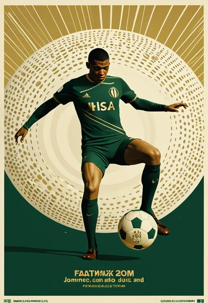
A professional vertical 3:4 poster for FIFA World Cup 2026. STYLE: vintage sport editorial meets modern Swiss typography — 1960s-70s sports magazine grit fused with bold contemporary graphic design. PALETTE: warm gold #D4AF37 + deep forest green #1B3A2D + cream off-white #F5F0E8. Entire image is monochromatic within this palette — NO bright colors anywhere. LAYOUT — Top: massive bold title "FIFA" on first line , "WORLD CUP" on second line , in extremely bold sans-serif , square heavy letterforms , filled with dense halftone dot texture like old newspaper print , cream off-white color , spanning full width. The letters have a slight rough edge like screen-printed ink. Center: A dynamic silhouette of Kylian Mbappé mid-kick —athletic explosive running posture. a powerful action pose: one leg extended forward striking the football , body leaning into the shot , in a vast star-filled cosmic night , just struck by his foot a thin flashlight shadow emerge into enormous half-football's ring , light imperial Starwars style giant half-football(3D rendering:0.1) drifting across the void , dissolving into Phantom. The figure is rendered as a high-contrast duotone graphic in warm gold against deep green , with subtle film grain and light vintage halftone texture. Behind him , a faint circular sunburst graphic radiates outward in gold lines , evoking classic 1970s sports posters. At his feet , the official 2026 World Cup ball "Trionda" — rendered in the SAME duotone gold-and-cream palette as the rest of the image , no bright red/green/blue. The ball's distinctive wave pattern and panel construction are visible through tonal contrast and embossed texture in gold and cream tones , like a vintage screen print. The ball is mid-flight , just struck by his foot. Bottom: slogan "Say It. Make Your Cup." in the SAME extremely bold sans-serif font as the title — square , heavy , condensed letterforms with the same halftone dot texture fill , cream off-white color , matching the "FIFA WORLD CUP" title typography exactly. A thin gold rule line separates it slightly. Below the slogan , "2026" in the same bold sans-serif style , smaller but matching. DESIGN: bold negative space , strong diagonal tension from Mbappé's striking pose , clear visual hierarchy. The vintage feel is subtle — light film grain , slight warm color shift , delicate halftone pattern on all text. The ENTIRE image stays strictly within the gold-green-cream palette — Trionda ball must NOT appear in bright colors , only duotone gold/cream with tonal embossed detail. ANCHOR: reminiscent of 1970s World Cup matchday programmes crossed with modern minimalist editorial design. AVOID: generic Inter/Helvetica typography , generic purple gradients , SaaS landing page style , stock photo aesthetic , rounded card stacks , watermarks , misspelled text , low contrast text , multi-step compositing seams , bright colors anywhere in the image , a colorful football , thin or lightweight fonts at the bottom , mismatched typography between title and slogan. Clean , high-resolution image quality: smooth continuous tonal gradients , uniform and well-controlled texture throughout , surfaces and materials intact and naturally rendered. The main subject is crisp and clearly separated from a softly layered background with clear depth. Free of digital noise and over-sharpening artifacts. No watermark , no garbled text. ,
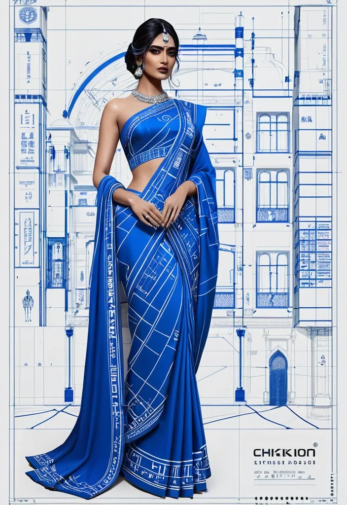
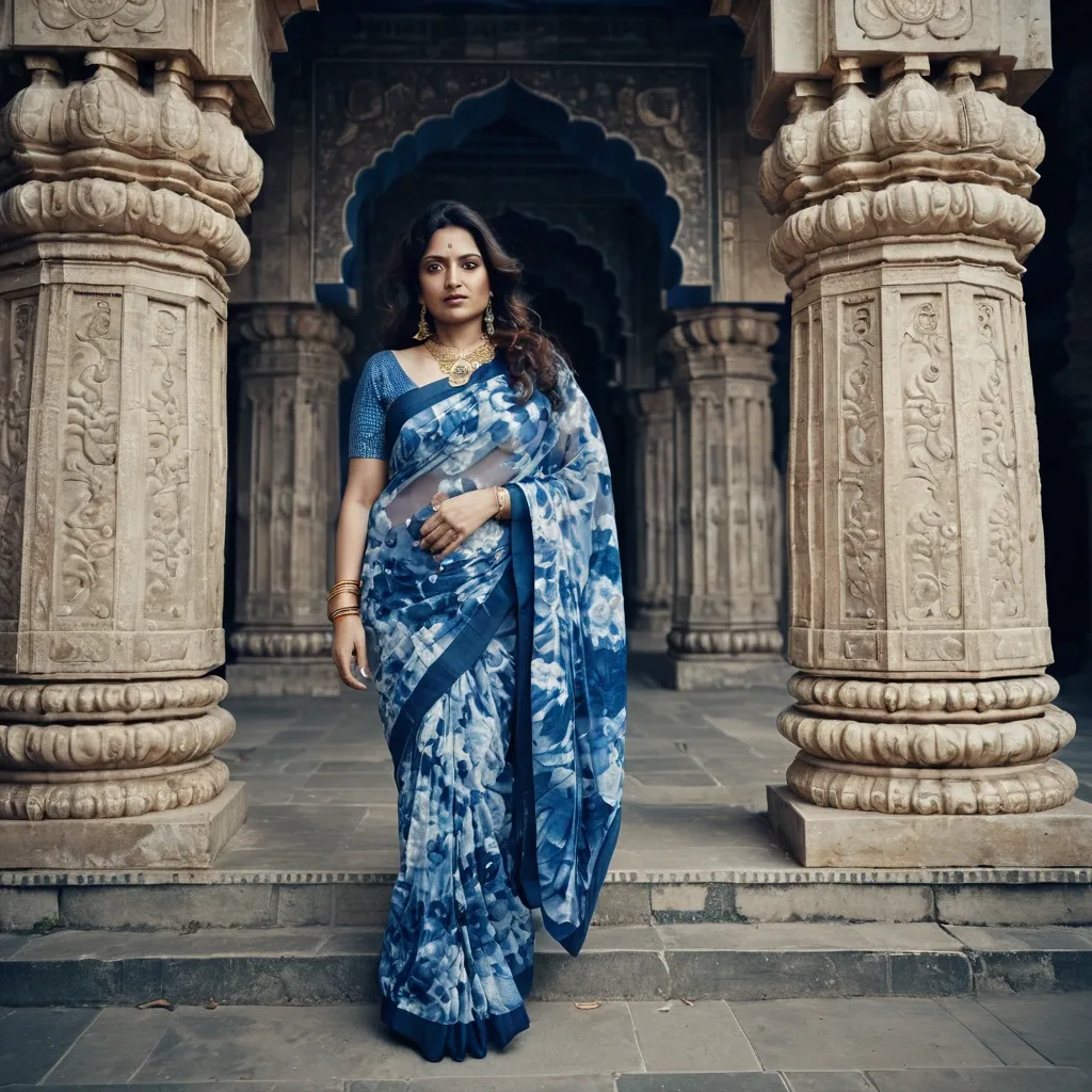
Hyper-realistic luxury fashion campaign poster designed as a giant architectural blueprint. A stylish indian female model wearing a Chinon Silk Traditional Saree stands confidently at the center. Around her are technical fashion sketches , measurement lines , material callouts , stitching diagrams , fabric notes , and design annotations as if she is the final built masterpiece. A tiny chibi version wearing the identical outfit appears as the original design prototype standing on a drafting ruler. Electric blue , silver , and white color palette. Luxury typography: "Chinon Silk Saree" Apple-level design language , futuristic luxury branding , editorial perfection , ultra-detailed textures , highly original composition. ,
Design a premium A4-size professional book back cover for AIAT Technologies that perfectly matches the front cover design , color palette , typography , branding , spacing , visual hierarchy , and enterprise technology aesthetic. Portrait orientation (A4 vertical) , print-ready publishing quality , ultra-high resolution , modern cybersecurity and IT infrastructure theme. Use a clean deep navy-blue background with subtle geometric grid patterns , abstract network connections , digital circuitry , server infrastructure elements , cloud computing symbols , data streams , and elegant holographic technology accents. No humans , faces , characters , hackers , hooded figures , robots , or mascots. Create a sophisticated corporate technology appearance suitable for a professional educational publication. At the top include a section titled "About This Book". Below it place a professionally formatted book description area explaining that Windows CLI – 100 Important Commands is a practical reference guide covering essential Windows command-line tools for system administration , troubleshooting , networking , security operations , automation , diagnostics , and IT support. Include a clean feature highlights section with modern iconography containing: • 100 Essential Windows Commands • Practical Command Examples • Networking & Troubleshooting Tools • System Administration Techniques • Security & Diagnostic Utilities • Beginner to Advanced Learning Resource. Add a section titled "Who Should Read This Book?" listing: IT Professionals , System Administrators , Help Desk Engineers , Cybersecurity Analysts , Networking Students , Technology Enthusiasts , and Computer Science Learners. Include a professional AIAT Technologies company profile section with the heading "About AIAT Technologies" and a clean placeholder text area for company information. At the bottom reserve space for ISBN barcode placement , publisher information , website , email address , copyright details , and social media icons. Use premium white and cyan typography with strong readability and professional alignment. Maintain generous spacing , balanced composition , and publishing-standard formatting. The overall design must feel like a bestselling enterprise technology handbook from a leading technology training organization. Print-ready , ultra-detailed , corporate publishing quality , elegant modern layout , professional educational technology branding , 8K quality. Negative Prompt: no humans , no faces , no hooded figures , no hackers , no robots , no anime , no cartoons , no gaming appearance , no movie-poster style , no cluttered layout , no excessive neon effects , no blurry text , no distorted typography , no low resolution , no watermark , no stock-photo appearance , no horror elements , no fantasy elements. ,
# ГИПОТЕЗА 1 # «СВЕРНУТЬСЯ КЛУБОЧКОМ» ## Постер 1. Утро без спешки ### Идея Кафе как безопасное убежище от городского шума. ### Промпт Premium branding poster for a cozy art cafe called "Кюри". Warm morning atmosphere. Young woman sitting by a large window with a handmade ceramic mug , reading a book. Soft sunlight , creamy tones , warm shadows. Delicate illustrated cocoon-shaped graphic elements wrap around the person , creating a feeling of safety and comfort. Scandinavian editorial layout , lots of negative space , tactile paper texture , premium lifestyle photography. Color palette: cream , caramel , olive green , warm brown. Large elegant typography in Russian: "Свернись клубочком. Остальное подождёт." High-end branding presentation , Behance quality , art direction , poster design. --- ## Постер 2. Тёплая кружка ### Идея Фокус на ощущении тепла в руках. ### Промпт Luxury cafe branding poster. Close-up of hands holding a handmade ceramic mug with hot cocoa. Soft steam rising. Minimal background. Illustrated organic oval shapes and hand-drawn lines surrounding the mug. Warm creamy paper texture , natural light , slow living aesthetic. Premium editorial design. Color palette: oat milk , clay , olive , coffee brown. Large typography: "Завтрак без спешки". Modern Scandinavian cafe branding. High-end graphic design presentation. --- ## Постер 3. Гнездо ### Идея Кафе как место восстановления. ### Промпт Premium art cafe poster. Breakfast table with handmade ceramics , eggs , toast and cocoa. Around the composition are illustrated nest-like organic shapes , resembling blankets , pillows and soft cocoons. Cozy atmosphere , natural morning light , muted colors , tactile textures. Editorial magazine style. Sophisticated layout with generous white space. Russian typography: "Место для мягкого замедления". Branding concept presentation quality. --- # ГИПОТЕЗА 2 # «ТЁПЛЫЕ СЛЕДЫ РУК» --- ## Постер 4. Сделано руками ### Идея Тепло через ручной труд. ### Промпт Premium branding poster for handmade ceramic cafe. Large close-up photo of handmade ceramic mug with visible fingerprints and pottery texture. Around it abstract graphic elements inspired by fingerprints , clay marks and pottery wheel traces. Editorial composition. Warm terracotta , cobalt blue , cream and ochre palette. Paper texture , handcrafted feeling. Typography in Russian: "Сделано руками". Contemporary art cafe identity. Behance award-winning branding style. --- ## Постер 5. Следы присутствия ### Идея Человеческое тепло без буквальных объятий. ### Промпт Contemporary art cafe poster. Minimal photography of ceramic workshop table. Clay tools , glaze brush , unfinished ceramic cups. Abstract fingerprint patterns transformed into graphic shapes floating across the layout. Sophisticated editorial design , premium branding presentation. Warm cream background with cobalt and terracotta accents. Typography: "Здесь всё создано живыми людьми". Modern visual identity system. --- ## Постер 6. Наивная керамика ### Идея Соединение фотографии и иллюстрации. ### Промпт Creative branding poster for local art cafe. Real photograph of handmade ceramic teapot. Around it hand-drawn naive illustrations of mugs , eggs , spoons and abstract ceramic patterns. Mixed-media design combining photography and illustration. Warm handcrafted atmosphere. Premium layout with lots of breathing space. Colors: terracotta , cream , cobalt blue , mustard. Russian typography: "Керамика , завтраки и немного тепла". Contemporary cultural cafe identity. --- # ГИПОТЕЗА 3 # «ГОРОДСКОЙ РИТУАЛ» --- ## Постер 7. 09:17 ### Идея Кафе как часть ежедневного ритуала города. ### Промпт Bold contemporary cafe branding poster. Young people entering a colorful modern cafe. Large oversized numbers "09:17" dominate the composition. Bright dopamine design. Dynamic editorial layout. Graphic arrows , stickers , playful doodles and geometric elements. Inspired by modern coffee brands , trend-conscious visual identity. Colors: yellow , blue , red , green and cream. Typography in Russian: "Твой завтрак ждёт". High-end art direction. --- ## Постер 8. Сначала яйца ### Идея Ироничная молодёжная коммуникация. ### Промпт Dopamine branding poster for trendy breakfast cafe. Colorful breakfast photography. Oversized typography integrated into image composition. Playful hand-drawn graphic elements , smiley stickers , arrows , circles , dynamic composition. Bright contemporary visual identity. Colors: butter yellow , cobalt blue , tomato red , mint green. Russian headline: "Сначала яйца. Потом подвиги." Editorial campaign poster , award-winning branding. --- ## Постер 9. Новый городской ритуал ### Идея Кюри как место встречи творческого сообщества. ### Промпт Premium urban lifestyle branding poster. Bright contemporary interior with handmade ceramics , creative people , morning atmosphere. Large typography layered over photography. Graphic waves , symbols , abstract stickers and playful design elements. Modern Gen Z cafe branding. Dopamine aesthetics , contemporary editorial layout , premium presentation quality. Russian headline: "ГОРОДСКОЙ РИТУАЛ". Subheadline: "Завтрак каждый день". Behance featured branding project style. --- Для презентации BBE я бы разместила по каждой гипотезе: * 1 главный постер (из этих трёх); * 1 адаптацию в Instagram 1080×1350; * 1 носитель (кружка , стакан , упаковка или меню); * короткое описание идеи на 2–3 предложения. Так наставница увидит уже не набор референсов , а три полноценные системы айдентики. ,
Ниже — 9 готовых концептов постеров для защиты проекта. Каждый можно использовать как промпт для Stitch , Figma AI , Midjourney или другого генератора. Все выполнены так , чтобы наставница увидела не отдельную иллюстрацию , а полноценную визуальную систему бренда. --- # ГИПОТЕЗА 1 # «СВЕРНУТЬСЯ КЛУБОЧКОМ» ## Постер 1. Утро без спешки ### Идея Кафе как безопасное убежище от городского шума. ### Промпт Premium branding poster for a cozy art cafe called "Кюри". Warm morning atmosphere. Young woman sitting by a large window with a handmade ceramic mug , reading a book. Soft sunlight , creamy tones , warm shadows. Delicate illustrated cocoon-shaped graphic elements wrap around the person , creating a feeling of safety and comfort. Scandinavian editorial layout , lots of negative space , tactile paper texture , premium lifestyle photography. Color palette: cream , caramel , olive green , warm brown. Large elegant typography in Russian: "Свернись клубочком. Остальное подождёт." High-end branding presentation , Behance quality , art direction , poster design. --- ## Постер 2. Тёплая кружка ### Идея Фокус на ощущении тепла в руках. ### Промпт Luxury cafe branding poster. Close-up of hands holding a handmade ceramic mug with hot cocoa. Soft steam rising. Minimal background. Illustrated organic oval shapes and hand-drawn lines surrounding the mug. Warm creamy paper texture , natural light , slow living aesthetic. Premium editorial design. Color palette: oat milk , clay , olive , coffee brown. Large typography: "Завтрак без спешки". Modern Scandinavian cafe branding. High-end graphic design presentation. --- ## Постер 3. Гнездо ### Идея Кафе как место восстановления. ### Промпт Premium art cafe poster. Breakfast table with handmade ceramics , eggs , toast and cocoa. Around the composition are illustrated nest-like organic shapes , resembling blankets , pillows and soft cocoons. Cozy atmosphere , natural morning light , muted colors , tactile textures. Editorial magazine style. Sophisticated layout with generous white space. Russian typography: "Место для мягкого замедления". Branding concept presentation quality. --- # ГИПОТЕЗА 2 # «ТЁПЛЫЕ СЛЕДЫ РУК» --- ## Постер 4. Сделано руками ### Идея Тепло через ручной труд. ### Промпт Premium branding poster for handmade ceramic cafe. Large close-up photo of handmade ceramic mug with visible fingerprints and pottery texture. Around it abstract graphic elements inspired by fingerprints , clay marks and pottery wheel traces. Editorial composition. Warm terracotta , cobalt blue , cream and ochre palette. Paper texture , handcrafted feeling. Typography in Russian: "Сделано руками". Contemporary art cafe identity. Behance award-winning branding style. --- ## Постер 5. Следы присутствия ### Идея Человеческое тепло без буквальных объятий. ### Промпт Contemporary art cafe poster. Minimal photography of ceramic workshop table. Clay tools , glaze brush , unfinished ceramic cups. Abstract fingerprint patterns transformed into graphic shapes floating across the layout. Sophisticated editorial design , premium branding presentation. Warm cream background with cobalt and terracotta accents. Typography: "Здесь всё создано живыми людьми". Modern visual identity system. --- ## Постер 6. Наивная керамика ### Идея Соединение фотографии и иллюстрации. ### Промпт Creative branding poster for local art cafe. Real photograph of handmade ceramic teapot. Around it hand-drawn naive illustrations of mugs , eggs , spoons and abstract ceramic patterns. Mixed-media design combining photography and illustration. Warm handcrafted atmosphere. Premium layout with lots of breathing space. Colors: terracotta , cream , cobalt blue , mustard. Russian typography: "Керамика , завтраки и немного тепла". Contemporary cultural cafe identity. --- # ГИПОТЕЗА 3 # «ГОРОДСКОЙ РИТУАЛ» --- ## Постер 7. 09:17 ### Идея Кафе как часть ежедневного ритуала города. ### Промпт Bold contemporary cafe branding poster. Young people entering a colorful modern cafe. Large oversized numbers "09:17" dominate the composition. Bright dopamine design. Dynamic editorial layout. Graphic arrows , stickers , playful doodles and geometric elements. Inspired by modern coffee brands , trend-conscious visual identity. Colors: yellow , blue , red , green and cream. Typography in Russian: "Твой завтрак ждёт". High-end art direction. --- ## Постер 8. Сначала яйца ### Идея Ироничная молодёжная коммуникация. ### Промпт Dopamine branding poster for trendy breakfast cafe. Colorful breakfast photography. Oversized typography integrated into image composition. Playful hand-drawn graphic elements , smiley stickers , arrows , circles , dynamic composition. Bright contemporary visual identity. Colors: butter yellow , cobalt blue , tomato red , mint green. Russian headline: "Сначала яйца. Потом подвиги." Editorial campaign poster , award-winning branding. --- ## Постер 9. Новый городской ритуал ### Идея Кюри как место встречи творческого сообщества. ### Промпт Premium urban lifestyle branding poster. Bright contemporary interior with handmade ceramics , creative people , morning atmosphere. Large typography layered over photography. Graphic waves , symbols , abstract stickers and playful design elements. Modern Gen Z cafe branding. Dopamine aesthetics , contemporary editorial layout , premium presentation quality. Russian headline: "ГОРОДСКОЙ РИТУАЛ". Subheadline: "Завтрак каждый день". Behance featured branding project style. --- Для презентации BBE я бы разместила по каждой гипотезе: * 1 главный постер (из этих трёх); * 1 адаптацию в Instagram 1080×1350; * 1 носитель (кружка , стакан , упаковка или меню); * короткое описание идеи на 2–3 предложения. Так наставница увидит уже не набор референсов , а три полноценные системы айдентики. ,
Ниже — 9 готовых концептов постеров для защиты проекта. Каждый можно использовать как промпт для Stitch , Figma AI , Midjourney или другого генератора. Все выполнены так , чтобы наставница увидела не отдельную иллюстрацию , а полноценную визуальную систему бренда. --- # ГИПОТЕЗА 1 # «СВЕРНУТЬСЯ КЛУБОЧКОМ» ## Постер 1. Утро без спешки ### Идея Кафе как безопасное убежище от городского шума. ### Промпт Premium branding poster for a cozy art cafe called "Кюри". Warm morning atmosphere. Young woman sitting by a large window with a handmade ceramic mug , reading a book. Soft sunlight , creamy tones , warm shadows. Delicate illustrated cocoon-shaped graphic elements wrap around the person , creating a feeling of safety and comfort. Scandinavian editorial layout , lots of negative space , tactile paper texture , premium lifestyle photography. Color palette: cream , caramel , olive green , warm brown. Large elegant typography in Russian: "Свернись клубочком. Остальное подождёт." High-end branding presentation , Behance quality , art direction , poster design. --- ## Постер 2. Тёплая кружка ### Идея Фокус на ощущении тепла в руках. ### Промпт Luxury cafe branding poster. Close-up of hands holding a handmade ceramic mug with hot cocoa. Soft steam rising. Minimal background. Illustrated organic oval shapes and hand-drawn lines surrounding the mug. Warm creamy paper texture , natural light , slow living aesthetic. Premium editorial design. Color palette: oat milk , clay , olive , coffee brown. Large typography: "Завтрак без спешки". Modern Scandinavian cafe branding. High-end graphic design presentation. --- ## Постер 3. Гнездо ### Идея Кафе как место восстановления. ### Промпт Premium art cafe poster. Breakfast table with handmade ceramics , eggs , toast and cocoa. Around the composition are illustrated nest-like organic shapes , resembling blankets , pillows and soft cocoons. Cozy atmosphere , natural morning light , muted colors , tactile textures. Editorial magazine style. Sophisticated layout with generous white space. Russian typography: "Место для мягкого замедления". Branding concept presentation quality. --- # ГИПОТЕЗА 2 # «ТЁПЛЫЕ СЛЕДЫ РУК» --- ## Постер 4. Сделано руками ### Идея Тепло через ручной труд. ### Промпт Premium branding poster for handmade ceramic cafe. Large close-up photo of handmade ceramic mug with visible fingerprints and pottery texture. Around it abstract graphic elements inspired by fingerprints , clay marks and pottery wheel traces. Editorial composition. Warm terracotta , cobalt blue , cream and ochre palette. Paper texture , handcrafted feeling. Typography in Russian: "Сделано руками". Contemporary art cafe identity. Behance award-winning branding style. --- ## Постер 5. Следы присутствия ### Идея Человеческое тепло без буквальных объятий. ### Промпт Contemporary art cafe poster. Minimal photography of ceramic workshop table. Clay tools , glaze brush , unfinished ceramic cups. Abstract fingerprint patterns transformed into graphic shapes floating across the layout. Sophisticated editorial design , premium branding presentation. Warm cream background with cobalt and terracotta accents. Typography: "Здесь всё создано живыми людьми". Modern visual identity system. --- ## Постер 6. Наивная керамика ### Идея Соединение фотографии и иллюстрации. ### Промпт Creative branding poster for local art cafe. Real photograph of handmade ceramic teapot. Around it hand-drawn naive illustrations of mugs , eggs , spoons and abstract ceramic patterns. Mixed-media design combining photography and illustration. Warm handcrafted atmosphere. Premium layout with lots of breathing space. Colors: terracotta , cream , cobalt blue , mustard. Russian typography: "Керамика , завтраки и немного тепла". Contemporary cultural cafe identity. --- # ГИПОТЕЗА 3 # «ГОРОДСКОЙ РИТУАЛ» --- ## Постер 7. 09:17 ### Идея Кафе как часть ежедневного ритуала города. ### Промпт Bold contemporary cafe branding poster. Young people entering a colorful modern cafe. Large oversized numbers "09:17" dominate the composition. Bright dopamine design. Dynamic editorial layout. Graphic arrows , stickers , playful doodles and geometric elements. Inspired by modern coffee brands , trend-conscious visual identity. Colors: yellow , blue , red , green and cream. Typography in Russian: "Твой завтрак ждёт". High-end art direction. --- ## Постер 8. Сначала яйца ### Идея Ироничная молодёжная коммуникация. ### Промпт Dopamine branding poster for trendy breakfast cafe. Colorful breakfast photography. Oversized typography integrated into image composition. Playful hand-drawn graphic elements , smiley stickers , arrows , circles , dynamic composition. Bright contemporary visual identity. Colors: butter yellow , cobalt blue , tomato red , mint green. Russian headline: "Сначала яйца. Потом подвиги." Editorial campaign poster , award-winning branding. --- ## Постер 9. Новый городской ритуал ### Идея Кюри как место встречи творческого сообщества. ### Промпт Premium urban lifestyle branding poster. Bright contemporary interior with handmade ceramics , creative people , morning atmosphere. Large typography layered over photography. Graphic waves , symbols , abstract stickers and playful design elements. Modern Gen Z cafe branding. Dopamine aesthetics , contemporary editorial layout , premium presentation quality. Russian headline: "ГОРОДСКОЙ РИТУАЛ". Subheadline: "Завтрак каждый день". Behance featured branding project style. --- Для презентации BBE я бы разместила по каждой гипотезе: * 1 главный постер (из этих трёх); * 1 адаптацию в Instagram 1080×1350; * 1 носитель (кружка , стакан , упаковка или меню); * короткое описание идеи на 2–3 предложения. Так наставница увидит уже не набор референсов , а три полноценные системы айдентики. ,
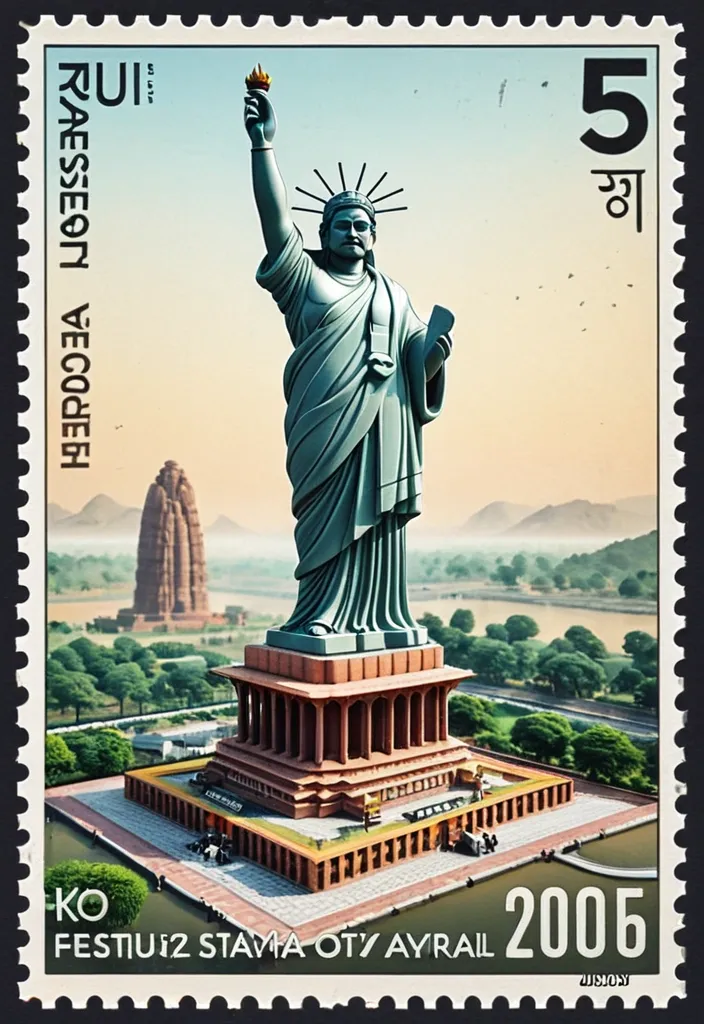
A hyper-realistic macro photography shot of a giant , freestanding vintage postage stamp from Statue of Unity , Ekta Nagar in the Narmada district of Gujarat , standing upright against a seamless , soft , color-coordinated pastel studio background. The stamp features an intricately detailed 3D diorama of the most iconic and recognizable landmark from Statue of Unity that pops out and actively breaks the perforated borders , extending outward into the physical space. Lush flora and fauna native to Statue of Unity grows and spills out from the bottom right corner of the stamp's frame. A tiny , miniature figurine of a person wearing recognizable traditional cultural attire from Statue of Unitystands on the ground at the bottom left , looking up in awe at the massive stamp , establishing a striking miniature world scale. The stamp's design includes the word "Statue of Unity" in classic serif typography , subtext in the local language , a realistic local currency denomination , and a stamped black ink cancellation postmark in the top right corner featuring the capital city of Statue of Unity and a realistic date. Soft , diffused , magical studio lighting with a tilt-shift lens effect and shallow depth of field. Gently floating botanical elements native to Statue of Unity drift through the air around the scene. 8k resolution , octane render , highly detailed miniature art. ,
Subject: Composition Sideway view Lamashtu with the head of a lioness and a muscular physique , showcasing highly defined , sculpted back muscles , toned arms , powerful legs , and firm , well-shaped buttocks that emphasize strength and athleticism. Her hands are eagle claws and eagle wings on her back. in a full-body staggard position with hands claws wide , with kintsugi black cracks in her skin , in skimpy , tattered black revealing robes blowing in the wind , eyes glaring in anger , fury on face , tattered robes covered in arcane hieroglyphs , amidst writhing snakes in fear with ravens pecking; atmospheric fog and shadows; she is both tantalizing and terrifying , layered mixed-media aesthetic on aged cracked plaster and parchment surface , distressed patina with peeling paint and weathered grain , painterly impasto with palette knife texture and soft edge blending , semi-abstract realism balance , warm–cool tonal harmony integration , controlled colour bleed and pigment bloom , atmospheric haze and soft diffusion , tactile surface depth , fine noise and paper fibre detail , gentle vignette , cinematic lighting with soft highlights and muted shadows , cohesive composition , no clean digital finish , no sharp vector edges , maintain organic irregularities and handcrafted imperfections , layered mixed-media aesthetic on aged cracked plaster and parchment surface , subtle embedded microtext and ghosted typography throughout background , distressed patina with peeling paint and weathered grain , painterly impasto with palette knife texture and soft edge blending , semi-abstract realism balance , warm–cool tonal harmony integration , controlled colour bleed and pigment bloom , atmospheric haze and soft diffusion , tactile surface depth , fine noise and paper fibre detail , gentle vignette , cinematic lighting with soft highlights and muted shadows , cohesive composition , no clean digital finish , no sharp vector edges , maintain organic irregularities and handcrafted imperfections , head and shoulders portrait , 8k resolution concept art portrait by Greg Rutkowski , Artgerm , WLOP , Alphonse Mucha dynamic lighting hyperdetailed intricately detailed Splash art trending on Artstation triadic colors Unreal Engine 5 volumetric lighting , dark against a glowing background. Setting: writhing serpents on the ground with ravens pecking. Dark clouds roiling with thunder. Vertical structure in objects and foliage for compositional rhythm. Color Palette: Deep charcoal and black. Single golden amber light source , glowing from behind and below , soft highlight on her buttocks and thighs. , blooming through deep shadow. Style: Rembrandt-inspired chiaroscuro and tenebrism creating luminous light emerging from deep velvety darkness — darkness rendered with velvety depth and luminous quality rather than flat black. Painterly glazing with confident calligraphic brushwork , spontaneous economy of strokes , and ink-wash atmosphere. Dramatic light-dark contrast , soft atmospheric bloom , and expressive brush energy. Strong rim illumination and subtle backlighting creating a narrow luminous rim along the subject silhouette. ,
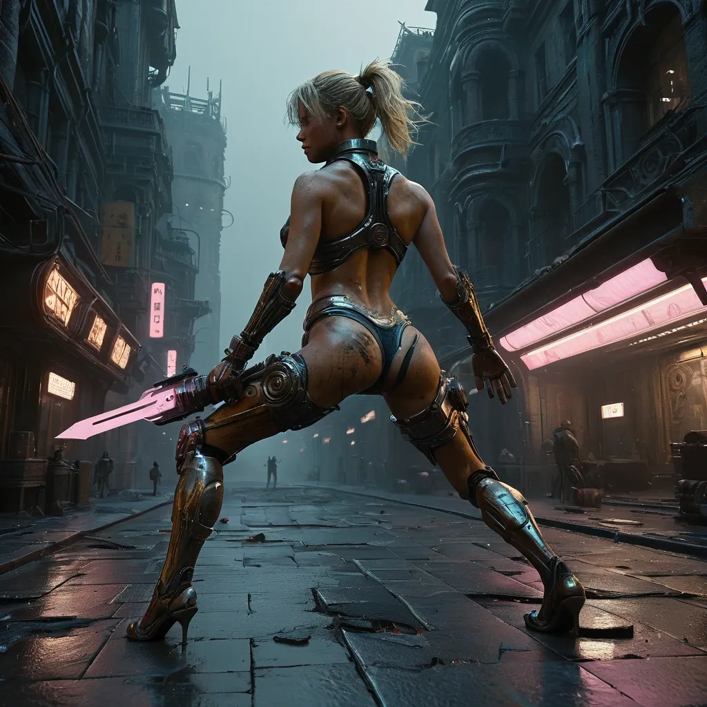
On the right side A majestic mechanical scorpion , gears whirring and steam hissing , traverses terrain. Intricate clockwork details adorn its exoskeleton , with glowing amber optics scanning the horizon. The style is a fusion of steampunk aesthetics , industrial design , and cinematic concept art , with a palette of warm neonpink and metallic silvers. On the left side , Extreme close-up , dramatic chiaroscuro oil painting featuring a woman with blonde windswept hairstyle and a muscular physique , showcasing highly defined , sculpted back muscles , toned arms , powerful legs , and firm , bubble-shaped buttocks that emphasize strength and athleticism. in a full-body staggard position with hands wide , with kintsugi black cracks in her skin , in skimpy , tattered black revealing robes blowing in the wind , eyes glaring in anger , fury on face , tattered robes covered in arcane hieroglyphs , amidst fallen robotic bodies in fear with ravens pecking; atmospheric fog and shadows; The scene is set with her dynamically leaping forward to the camera left knees up while wielding a red futuristic gauntlet , in her right hand wearing bulky futuristic wristcom lunging at the camera outside an old iron and stone cafe among A towering retro-futuristic metropolis at twilight , she is both tantalizing and terrifying , layered mixed-media aesthetic on aged cracked plaster and parchment surface , distressed patina with peeling paint and weathered grain , painterly impasto with palette knife texture and soft edge blending , semi-abstract realism balance , warm–cool tonal harmony integration , controlled colour bleed and pigment bloom , atmospheric haze and soft diffusion , tactile surface depth , fine noise and paper fibre detail , gentle vignette , cinematic lighting with soft highlights and muted shadows , cohesive composition , no clean digital finish , no sharp vector edges , maintain organic irregularities and handcrafted imperfections , layered mixed-media aesthetic on aged cracked plaster and parchment surface , subtle embedded microtext and ghosted typography throughout background , distressed patina with peeling paint and weathered grain , painterly impasto with palette knife texture and soft edge blending , semi-abstract realism balance , warm–cool tonal harmony integration , controlled colour bleed and pigment bloom , atmospheric haze and soft diffusion , tactile surface depth , fine noise and paper fibre detail , gentle vignette , cinematic lighting with soft highlights and muted shadows , cohesive composition , no clean digital finish , no sharp vector edges , maintain organic irregularities and handcrafted imperfections , Sleek , chrome-plated robots patrol the rain-slicked streets below , their optical sensors scanning the urban sprawl. The architecture is a blend of art deco grandeur and advanced , impossible geometries. Rendered in the style of highly detailed concept art with influences from Moebius and Syd Mead , utilizing a dark fantasy color palette with vibrant , contrasting highlights.. The style is ethereal and epic , with emotional brushstrokes and atmospheric depth , rendered with exquisite detail in 8k. Dramatic chiaroscuro lighting with a color palette of blue , black , white , and gold , optimized for Unreal Engine 5 , intricate mech details , ground level shot , 8K resolution , Cinema 4D , Behance HD , polished metal , , cyberpunk 2099 blade runner 2049 neon , cyberpunk 2099 blade runner 2049 neon ,
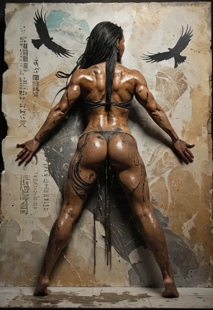
Shekhmet with the head of a lioness and a muscular physique , showcasing highly defined , sculpted back muscles , toned arms , powerful legs , and firm , well-shaped buttocks that emphasize strength and athleticism. in a full-body staggard position with hands wide , with kintsugi black cracks in her skin , in skimpy , tattered black revealing robes blowing in the wind , eyes glaring in anger , fury on face , tattered robes covered in arcane hieroglyphs , amidst fallen bodies in fear with ravens pecking; atmospheric fog and shadows; she is both tantalizing and terrifying , layered mixed-media aesthetic on aged cracked plaster and parchment surface , distressed patina with peeling paint and weathered grain , painterly impasto with palette knife texture and soft edge blending , semi-abstract realism balance , warm–cool tonal harmony integration , controlled colour bleed and pigment bloom , atmospheric haze and soft diffusion , tactile surface depth , fine noise and paper fibre detail , gentle vignette , cinematic lighting with soft highlights and muted shadows , cohesive composition , no clean digital finish , no sharp vector edges , maintain organic irregularities and handcrafted imperfections , layered mixed-media aesthetic on aged cracked plaster and parchment surface , subtle embedded microtext and ghosted typography throughout background , distressed patina with peeling paint and weathered grain , painterly impasto with palette knife texture and soft edge blending , semi-abstract realism balance , warm–cool tonal harmony integration , controlled colour bleed and pigment bloom , atmospheric haze and soft diffusion , tactile surface depth , fine noise and paper fibre detail , gentle vignette , cinematic lighting with soft highlights and muted shadows , cohesive composition , no clean digital finish , no sharp vector edges , maintain organic irregularities and handcrafted imperfections , head and shoulders portrait , 8k resolution concept art portrait by Greg Rutkowski , Artgerm , WLOP , Alphonse Mucha dynamic lighting hyperdetailed intricately detailed Splash art trending on Artstation triadic colors Unreal Engine 5 volumetric lighting ,
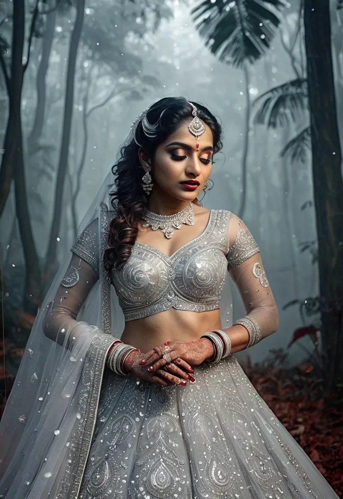
Ultra-realistic bridal portrait collage , beautiful Indian bride in silver lehenga gown , elegant diamond jewelry , red lipstick , curly hairstyle , mehndi hands , double exposure composition , soft fog forest background , cinematic lighting , dreamy aesthetic poster , stylish "NIHARIKA" typography , high detail , 8k. Amolwakte sign right side ,
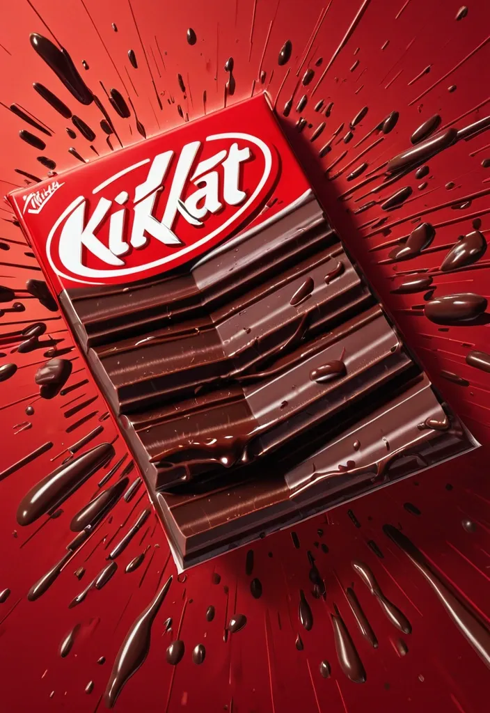
FORMAT: 4:5 vertical hyper-commercial chocolate campaign poster , ultra-high resolution (8K) , premium billboard + social media advertising ready Style: bold FMCG advertising × modern snack campaign × energetic commercial poster design × high-impact product photography 🧠 CORE IDEA: THE BREAK EVERYONE WAITS FOR. A campaign built around impact , craving , and satisfying motion. Everything in the composition reacts to the iconic KitKat snap. 🎬 MASTER COMPOSITION: BACKGROUND: Deep KitKat red environment Layered with: - rich red gradients - chocolate texture overlays - dynamic motion streaks - subtle crumb particles - repeated typography patterns - glossy studio reflections The atmosphere should feel: bold , hungry , energetic , commercially explosive. 👤 HUMAN SUBJECT: Young Gen-Z male/female model Expression: playful , confident , mid-enjoyment moment Pose: holding KitKat toward camera mid-snap action Camera angle: slightly low + close perspective for product dominance Wardrobe: modern streetwear in neutral tones allowing red palette to dominate 💥 VISUAL ENERGY: The SNAP becomes the visual explosion. At the break point: - chocolate shards flying outward - wafer crumbs suspended mid-air - liquid chocolate streaks - motion lines radiating from snap Typography physically cracks apart following the KitKat break. Feels: satisfying , punchy , commercially exaggerated. 🍫 PRODUCT HERO: [KitKat](chatgpt://generic-entity?number=0) chocolate bar + wrapper Placement: foreground center-right Angle: extreme 3/4 hero perspective Product details: - hyper-real chocolate texture - visible wafer layers - glossy melted chocolate highlights - realistic crumbs - embossed KitKat logo - premium wrapper reflections Chocolate should feel: crispy , rich , irresistible. ✍️ TYPOGRAPHY SYSTEM: MAIN HEADLINE: “BREAK TIME.” Typography style: - ultra-bold condensed sans-serif - oversized stacked layout - white typography - extremely tight spacing - cracked/distorted around snap point SECONDARY TEXT: “HAVE A BREAK. HAVE A KITKAT.” BACKGROUND TYPOGRAPHY: Repeated low-opacity words: SNAP CRUNCH BREAK CHOCOLATE WAFER MELT integrated into background layers 📦 FEATURE INFORMATION STRIP: Bottom premium feature strip: □ CRISPY WAFER □ RICH CHOCOLATE □ ICONIC SNAP □ PERFECT BREAK Minimal modern icon system. 📣 CTA SECTION: BOTTOM LEFT: “NEW SHARING PACK AVAILABLE” CTA BUTTON: solid white rectangular button TEXT: “GRAB NOW” Secondary micro CTA: “Available Online & In Stores” 🌐 WEBSITE + BRAND INFO: BOTTOM CENTER: www.kitkat BOTTOM MICROTEXT: “NESTLÉ KITKAT · 2026 EDITION” 🎨 COLOR SYSTEM: PRIMARY: KitKat red deep chocolate brown SECONDARY: white typography ACCENTS: warm chocolate highlights golden wafer tones Palette should feel: bold , delicious , high-energy , commercial. 💡 LIGHTING SYSTEM: MAIN LIGHT: strong commercial studio key light RIM LIGHT: warm chocolate highlights around product ACCENT LIGHT: soft red glow behind snap motion ATMOSPHERIC LIGHT: subtle floating particles catching light REFLECTIONS: glossy FMCG-grade reflections Lighting should feel: premium snack advertising × modern commercial photography. ✨ HYPER DETAILING: - ultra-real wafer texture - sharp chocolate break detail - floating crumb realism - melted chocolate reflections - premium wrapper texture - billboard readability maintained - ultra-clean typography edges - high-end FMCG rendering quality 📐 COMPOSITION FLOW: Upper Frame: massive typography dominance Center: snap explosion + human interaction Foreground: product hero Lower-left: CTA + features Eye flow: Headline → Snap → Product → Chocolate Motion → CTA 🎥 CAMERA & RENDER: - commercial food photography - Phase One medium format feel - 35–50mm lens - HDR commercial rendering - ultra-clean sharpness - premium FMCG color grading 🔥 FINAL FEEL: Feels like: Nike energy campaign × premium FMCG launch × modern Behance commercial food poster. ,
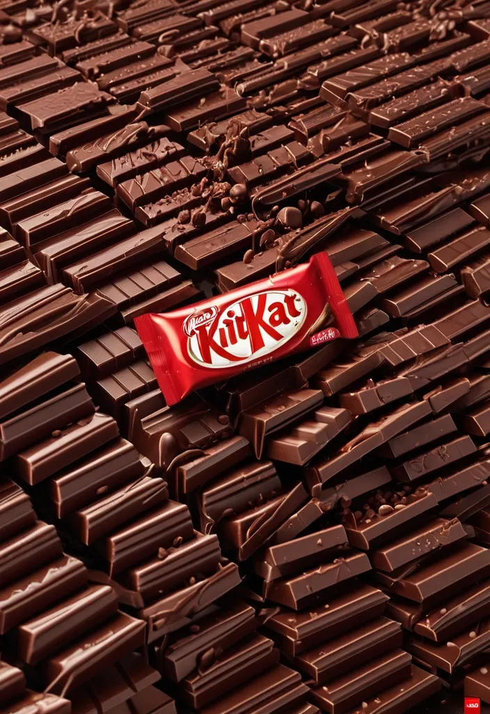
FORMAT: 4:5 vertical hyper-commercial chocolate campaign poster , ultra-high resolution (8K) , premium billboard + social media advertising ready Style: bold FMCG advertising × modern snack campaign × energetic commercial poster design × high-impact product photography 🧠 CORE IDEA: THE BREAK EVERYONE WAITS FOR. A campaign built around impact , craving , and satisfying motion. Everything in the composition reacts to the iconic KitKat snap. 🎬 MASTER COMPOSITION: BACKGROUND: Deep KitKat red environment Layered with: - rich red gradients - chocolate texture overlays - dynamic motion streaks - subtle crumb particles - repeated typography patterns - glossy studio reflections The atmosphere should feel: bold , hungry , energetic , commercially explosive. 👤 HUMAN SUBJECT: Young Gen-Z male/female model Expression: playful , confident , mid-enjoyment moment Pose: holding KitKat toward camera mid-snap action Camera angle: slightly low + close perspective for product dominance Wardrobe: modern streetwear in neutral tones allowing red palette to dominate 💥 VISUAL ENERGY: The SNAP becomes the visual explosion. At the break point: - chocolate shards flying outward - wafer crumbs suspended mid-air - liquid chocolate streaks - motion lines radiating from snap Typography physically cracks apart following the KitKat break. Feels: satisfying , punchy , commercially exaggerated. 🍫 PRODUCT HERO: [KitKat](chatgpt://generic-entity?number=0) chocolate bar + wrapper Placement: foreground center-right Angle: extreme 3/4 hero perspective Product details: - hyper-real chocolate texture - visible wafer layers - glossy melted chocolate highlights - realistic crumbs - embossed KitKat logo - premium wrapper reflections Chocolate should feel: crispy , rich , irresistible. ✍️ TYPOGRAPHY SYSTEM: MAIN HEADLINE: “BREAK TIME.” Typography style: - ultra-bold condensed sans-serif - oversized stacked layout - white typography - extremely tight spacing - cracked/distorted around snap point SECONDARY TEXT: “HAVE A BREAK. HAVE A KITKAT.” BACKGROUND TYPOGRAPHY: Repeated low-opacity words: SNAP CRUNCH BREAK CHOCOLATE WAFER MELT integrated into background layers 📦 FEATURE INFORMATION STRIP: Bottom premium feature strip: □ CRISPY WAFER □ RICH CHOCOLATE □ ICONIC SNAP □ PERFECT BREAK Minimal modern icon system. 📣 CTA SECTION: BOTTOM LEFT: “NEW SHARING PACK AVAILABLE” CTA BUTTON: solid white rectangular button TEXT: “GRAB NOW” Secondary micro CTA: “Available Online & In Stores” 🌐 WEBSITE + BRAND INFO: BOTTOM CENTER: www.kitkat BOTTOM MICROTEXT: “NESTLÉ KITKAT · 2026 EDITION” 🎨 COLOR SYSTEM: PRIMARY: KitKat red deep chocolate brown SECONDARY: white typography ACCENTS: warm chocolate highlights golden wafer tones Palette should feel: bold , delicious , high-energy , commercial. 💡 LIGHTING SYSTEM: MAIN LIGHT: strong commercial studio key light RIM LIGHT: warm chocolate highlights around product ACCENT LIGHT: soft red glow behind snap motion ATMOSPHERIC LIGHT: subtle floating particles catching light REFLECTIONS: glossy FMCG-grade reflections Lighting should feel: premium snack advertising × modern commercial photography. ✨ HYPER DETAILING: - ultra-real wafer texture - sharp chocolate break detail - floating crumb realism - melted chocolate reflections - premium wrapper texture - billboard readability maintained - ultra-clean typography edges - high-end FMCG rendering quality 📐 COMPOSITION FLOW: Upper Frame: massive typography dominance Center: snap explosion + human interaction Foreground: product hero Lower-left: CTA + features Eye flow: Headline → Snap → Product → Chocolate Motion → CTA 🎥 CAMERA & RENDER: - commercial food photography - Phase One medium format feel - 35–50mm lens - HDR commercial rendering - ultra-clean sharpness - premium FMCG color grading 🔥 FINAL FEEL: Feels like: Nike energy campaign × premium FMCG launch × modern Behance commercial food poster. ,
Portrait format layout , full body of mature Indian woman in Traditional flowers printed Saree for festival them , wearing gold jewellery , not fat just a bit curvy , film grain , low contrast , natural face , long messy bright and wavy brown hair , blue eyes , outdoor high fashion shoot set against ancient temple architecture , juxtaposition of soft haute couture and rigid lines , editorial color grading , cool blue tones , in capital text "LASARKO" transparent stylish typography integrated into negative space , professional fashion photography , high definition , ,
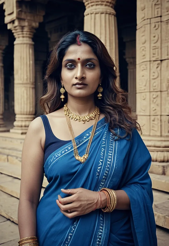
Portrait format layout , mature Indian woman in Traditional Saree for festival them , wearing gold jewellery , not fat just a bit curvy , film grain , low contrast , natural face , long messy bright and wavy brown hair , blue eyes , dark circles under eyes , outdoor high fashion shoot set against ancient temple architecture , juxtaposition of soft haute couture and rigid lines , editorial color grading , cool blue tones , in capital text "LASARKO" stylish typography integrated into negative space , professional fashion photography , high definition , high res. ,
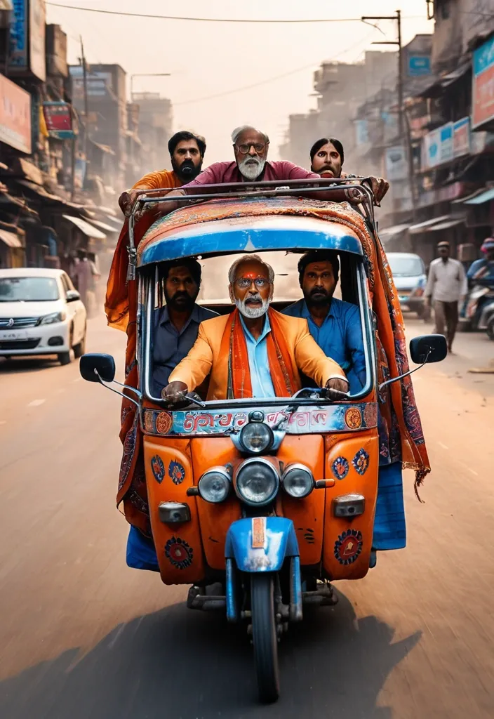
The chhakado (three-wheeler tempo) is heavily decorated with colorful Indian art , Gujarati stickers , mirrors , LED strips , and hand-painted typography saying “KUTCH EXPRESS”. IMPORTANT: clearly show that the panic mature man (Use reference photo 100% use my real faces) is driving the chhakado (three-wheeler tempo) — realistic Indian man sitting in the DRIVER seat with both front hands on the handlebar , actively steering the chhakado (three-wheeler tempo) , wearing a stylish traditional kutchi scarf blowing in the wind , funny but ultra realistic expression , visible driving posture , focus on driver controlling the vehicle. On the chhakado a funny dramatic Indian family is screaming in panic — elderly Indian man sitting beside the driver terrified , young woman in blue Saree shocked , another woman in red dupatta yelling with dupatta flying dramatically in wind , young Indian man hanging dangerously from the side of the moving auto. Busy Indian market street with Gujarati signboards , chai stalls , pani puri vendors , bikes , fruit carts , pedestrians running away in chaos , cinematic dust storm , dramatic orange sunset lighting , volumetric light rays , realistic reflections , depth of field. Hyper detailed textures , realistic Indian faces , vibrant colors , comedy action atmosphere , blockbuster Bollywood movie frame , sharp focus on the speeding auto rickshaw tempo while surroundings remain motion blurred for speed effect , photorealistic , ultra detailed , cinematic realism , 8k , vertical composition , high energy scene --ar 3:4 --stylize 300 --quality 2 ,
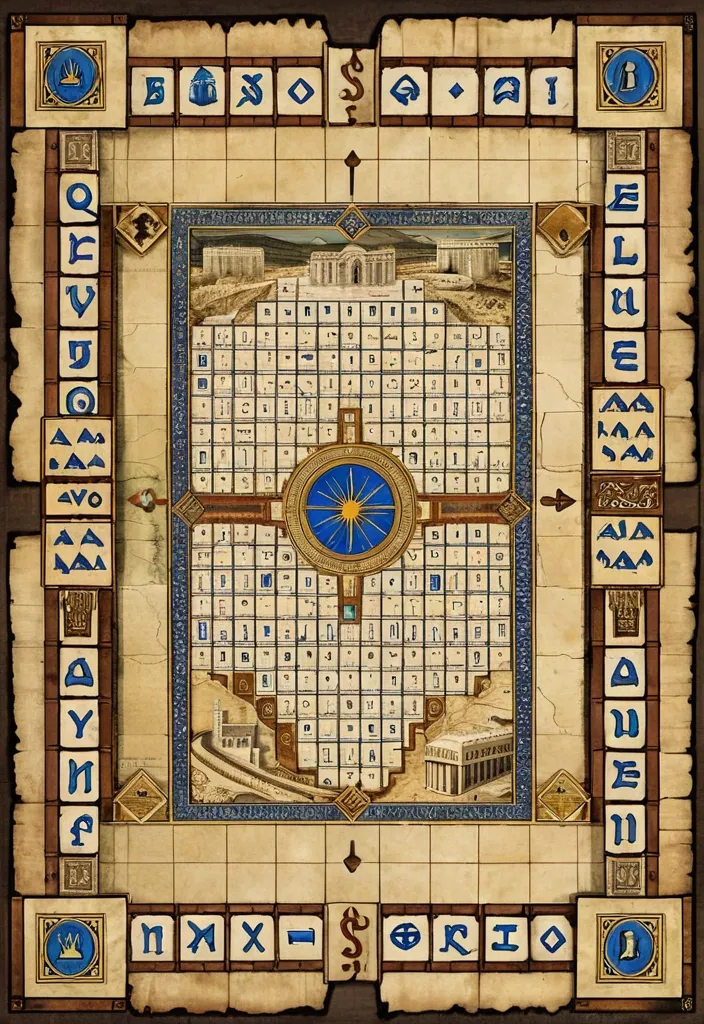
Prompt de generación de imagen: Un plano cenital (visto desde arriba) y perfectamente ortogonal de Un tablero de juego de mesa detallado de estilo clásico , inspirado en el Monopoly pero con una temática bíblica e histórica del antiguo Israel. El juego se titula "MAYORDOMÍA: EL TABLERO DE LA PROMESA" escrito en letras doradas y elegantes en el centro. El diseño general tiene texturas de pergamino antiguo , tonos tierra , beige y acabados dorados. El tablero es rectangular y tiene casillas en todo su perímetro. Cada grupo de casillas tiene un color distintivo en la parte superior y representa lugares bíblicos con ilustraciones detalladas en miniaturas sepia o grabados antiguos: En el centro del tablero se muestra una gran ilustración panorámica e intrincada de la antigua ciudad de Jerusalén con murallas de piedra , templos y palacios bajo una luz cálida. Sobre la ilustración , aparecen dos citas bíblicas en pergaminos flotantes: "Sé fiel en lo poco , y en lo mucho te pondré a cargo. Mateo 25:21" y "La Tierra es del Señor , y todo lo que ella contiene. Salmo 24:1". A los lados del centro , hay dos mazos de cartas tridimensionales inclinados: uno azul llamado "CARTAS DE FE" y otro con forma de pergamino enrollado llamado "CARTAS DE PROFECÍA". En la esquina inferior izquierda del centro , se observan dos dados de hueso antiguo con puntos negros. Estilo visual de juego de estrategia premium , limpio , nítido y de alta resolución. El tablero está rodeado por un marco perimetral dividido en 40 casillas rectangulares (10 por cada lado , incluyendo las esquinas cuadradas). La orientación del texto y los gráficos en las casillas debe seguir estrictamente la rotación perimetral del tablero , de modo que las bases de las letras y los dibujos siempre miren hacia el borde exterior del tablero correspondiente a su lado: • Lado Inferior (De derecha a izquierda - Texto en posición normal): Comienza con la casilla de salida en la esquina inferior derecha llamada "SALIDA: El Pacto" , ilustrada con un pergamino abierto con un sello dorado y una flecha roja hacia la izquierda (+200 Siclos). Sigue con: Marrón "Camino de Shur" (60 Siclos) , casilla "Cartas de Fe" (icono de paloma blanca) , marrón "Monte Horeb" (60 Siclos) , casilla "Tributo al César" (Impuesto , icono de una moneda romana , 200 Siclos) , la casilla de transporte "Ruta de Shur" (icono de calzada antigua , 200 Siclos) , celestes "Camino de Belén" (100 Siclos) , "Cartas de Profecía" (icono de pergamino ardiendo) , "Camino de Emaús" (100 Siclos) y "Nazaret" (120 Siclos). Termina en la esquina inferior izquierda con la casilla de esquina "El Pozo (Solo Visita)" , ilustrada con un pozo de piedra antiguo y palmeras. • Lado Izquierdo (De abajo hacia arriba - Texto rotado 90° a la derecha): Incluye las propiedades rosa "Llanuras de Jericó" (140 Siclos) , la casilla de servicio "Camino al Maná" (150 Siclos) , propiedades rosa "Riberas de Galilea" (140 Siclos) y "Cafarnaúm" (160 Siclos) , la casilla de transporte "Camino Real" (200 Siclos) , propiedades naranja "Encinar de Siquem" (180 Siclos) , la casilla "Cartas de Fe" (icono de paloma) , propiedad naranja "Encinar de Mamre" (180 Siclos) y "Valle de Hebrón" (200 Siclos). Termina en la esquina superior izquierda con la casilla de esquina "El Año del Jubileo" , ilustrada con un gran cuerno de carnero (Shofar) dorado. • Lado Superior (De izquierda a derecha - Texto invertido , rotado 180°): Comienza después del Jubileo con las propiedades rojas "Monte Garizim" (220 Siclos) , la casilla "Cartas de Profecía" (pergamino ardiendo) , la propiedad roja "Ciudad de Samaria" (220 Siclos) y "Puerto de Cesarea Marítima" (240 Siclos). Sigue con la casilla de transporte "Vía Marítima" (icono de un barco antiguo , 200 Siclos). Continúa con las propiedades amarillas (Región de Galilea Superior): "Llanuras de Esdrelón" (260 Siclos) , "Monte Tabor" (260 Siclos) , la casilla de servicio "Campos de Booz" (icono de espigas de trigo y herramientas , 150 Siclos) y la propiedad amarilla "Ciudad de Dan" (280 Siclos). Termina en la esquina superior derecha con la casilla de esquina "Juicio del Sanedrín (Ve al Pozo)" , ilustrada con un mazo de juez antiguo o una silueta de guardias templarios señalando. • Lado Derecho (De arriba hacia abajo - Texto rotado 90° a la izquierda): Comienza después del Juicio con las propiedades verdes (Región de Jerusalén y Montes Sagrados): "Monte de los Olivos" (300 Siclos) , "Monte Sión" (300 Siclos) , la casilla "Cartas de Fe" (icono de paloma) , y la propiedad verde "Getsemaní" (320 Siclos). Sigue con la última casilla de transporte: "Calzada de los Reyes" (icono de puertas de una fortaleza de piedra , 200 Siclos). Continúa con una casilla de "Cartas de Profecía" (pergamino ardiendo) , las propiedades de color azul oscuro (Región del Santuario Épico): "Ciudad de David" (350 Siclos) , la casilla de penalización "Ofrenda para los Pobres" (Impuesto , icono de manos abiertas dejando caer monedas , 100 Siclos) , y finalmente la propiedad más valiosa del tablero , azul oscuro , llamada "El Gran Templo de Jerusalén" (400 Siclos) , justo antes de conectar nuevamente con la casilla de SALIDA. Cada casilla de propiedad tiene una banda de color sólida y limpia en su parte superior interna (mirando al centro) y el precio de compra en "Siclos" escrito en texto pequeño en su borde inferior interno. El diseño general utiliza líneas negras nítidas , tipografías legibles pero con toques rústicos/antiguos , y una estética pulcra de juego de mesa impreso. ,
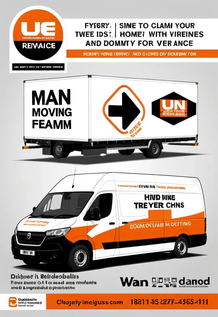
Modern professional flyer design for a UK removals company named “1 Van 1 Man Removals” , orange white and black color scheme , large moving van with company branding , cardboard boxes , clean corporate layout , bold typography , sections for About Us , Services Offered , Why Choose Us , Service Areas , and contact information , icons for home removals , furniture moving , man and van services , and house clearances , UK map graphic , modern gradients , glossy business flyer style , high quality marketing poster , realistic moving equipment and furniture , clean infographic layout , landscape format. ,
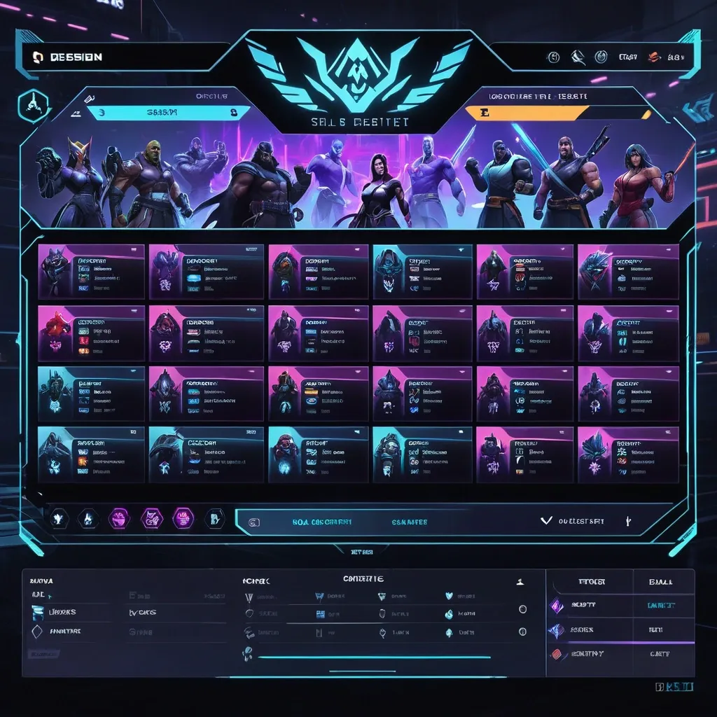
Create a premium , highly believable Character Select Screen for an imaginary game called NIGHT CIRCUIT. The goal is to make the interface feel like a real playable roster screen from a major game: visually addictive , commercially polished , instantly readable , and full of personality. It should feel like a screen players would pause on , screenshot , and obsess over before choosing their main. Game details: - Game title: NIGHT CIRCUIT - Genre: competitive fighting game - Core concept: a neon-noir 2D fighter where underground icons , assassins , idols , and synthetic rebels battle for control of a city-sized entertainment grid - Roster type: small elite cast - Main fantasy: choosing a stylish , dangerous fighter with a very specific attitude and mastering them completely - Audience: fighting-game fans , anime-game lovers , esports audiences , design-conscious gamers - Tone: stylish , competitive , electric , cinematic - Cultural vibe: anime fighter , arcade prestige , cyber-street fashion , esports polish - Reality level: believable AAA Screen structure: Build the interface like a real character selection menu. Include sections such as: - game logo or mode title - character grid or lineup - highlighted selected character - full character portrait or hero pose - character name - class / role / faction - stats or attributes - signature ability or move - optional difficulty rating - optional lock / unlock state - optional alternate skins or color variants - optional player cursor or selection frame For the roster , include: - 12 believable character slots - distinct silhouettes and identities - a coherent roster ecosystem - varied classes , archetypes , or playstyles - names that feel genre-appropriate and memorable Include: - a strong selected-character focus - premium UI hierarchy - readable roster logic - believable stat or role indicators - polished iconography - clear class/faction differentiation - strong "pick your main" energy - instantly shareable game-interface appeal Visual direction: - Make the screen feel like a real game menu players would see before a match or campaign start - Emphasize identity , hype , choice , and roster fantasy - Balance clean UX structure with strong character-worldbuilding - Make it suitable for social sharing , fake game concepts , fan-worldbuilding , gaming mockups , or launch materials - The result should look like a genuine roster screen from a popular game Art direction: - Style: premium anime-fighter character select UI with esports-ready polish - Color palette: black , electric violet , cyan , crimson , silver-grey - Typography feel: sharp arcade-sci-fi type with clean stat labels - Material feel: console match-lobby screen and tournament-ready roster interface - Lighting or image mood: neon glow , competitive energy , polished dark-mode interface - Background: abstract digital arena with city-grid light trails Composition: - Show the screen as one cohesive character-select interface - Make the selected character , roster , and key stats instantly readable - Use real game-menu hierarchy and interaction logic - Make the cast feel iconic , varied , and mechanically real - Make the final output feel like a premium fake game UI with viral potential Output quality: - ultra-detailed - visually structured - commercially believable - culturally fluent - polished gaming UI design - strong hierarchy and spacing - premium character-roster composition - instantly shareable visual concept Optional content blocks: - player 1 marker - random select slot - difficulty stars - alternate skin selector - faction icon - season character lock Avoid: - generic character poses - weak roster variety - fake-looking stat systems - cluttered interface - random icons without gameplay logic - amateur game-menu aesthetics - inconsistent character style across the roster - too much text fighting the UI ,
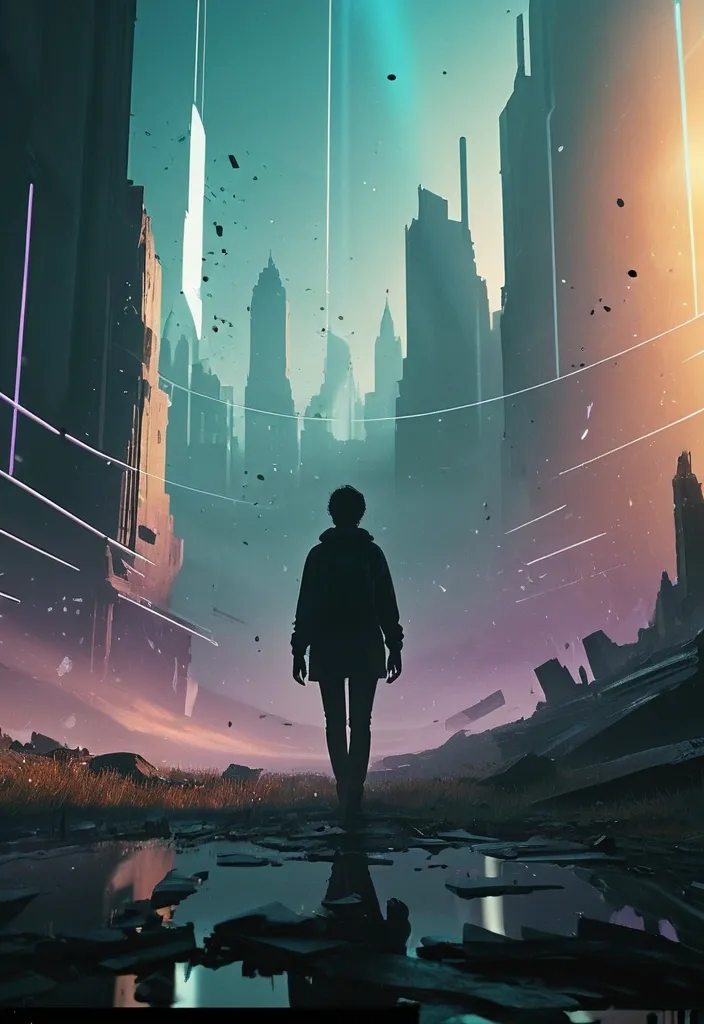
Design a high-end cinematic character poster in a layered depth composition (9:16 vertical) with a strong foreground–midground–background separation instead of silhouette framing. The character stands slightly off-center in a dynamic , perspective-driven pose , interacting naturally with the environment (wind , light , particles , fabric movement). The camera angle should feel intentional—low-angle for power or slight tilt for tension—creating a sense of motion and presence. The background should not be contained inside shapes. Instead , build a living world around the character: atmospheric environments (fog , city lights , ruins , nature , etc.) light rays , volumetric glow , drifting particles subtle storytelling elements placed naturally in space (not collage-based) Introduce floating fragments or layered planes (glass shards , light panels , memories , holographic slices , or torn paper edges) that orbit or intersect the scene , each containing faint symbolic visuals tied to the character’s story—keep them minimal and elegant , not cluttered. Lighting should be cinematic and directional: strong key light shaping the subject rim lighting to separate from background soft gradients and shadow falloff for depth Color palette should follow a controlled dual-tone system (e.g. , teal–orange , violet–gold , crimson–black) with smooth transitions and no oversaturation. Typography: place the title in a clean , modern cinematic layout integrate text subtly into the environment (ground plane , light projection , or floating UI style) avoid heavy or oversized typography Overall style: ultra-realistic + cinematic editorial , sharp detail on subject , soft atmospheric depth in background , minimal but intentional storytelling elements , premium movie-poster quality. Avoid: silhouette fill compositions , heavy collage density , watercolor textures , or ink-wash edges. Focus on spatial depth , realism , and cinematic immersion. ,
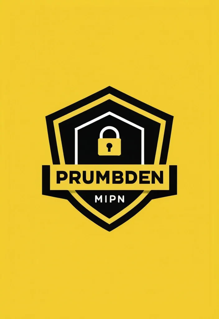
A modern , minimalist logo for a VPN service. A solid vibrant yellow background. Bold , sleek black typography arranged strictly in two lines. The top line says "RUMBUSH" , the bottom line says "VPN". Clean , modern sans-serif font. A simple black geometric icon representing internet security , like a modern shield or a lock , integrated near the text. Vector graphics style , flat design , high quality , professional UI/UX branding. VPN name Rumbush vpn ,
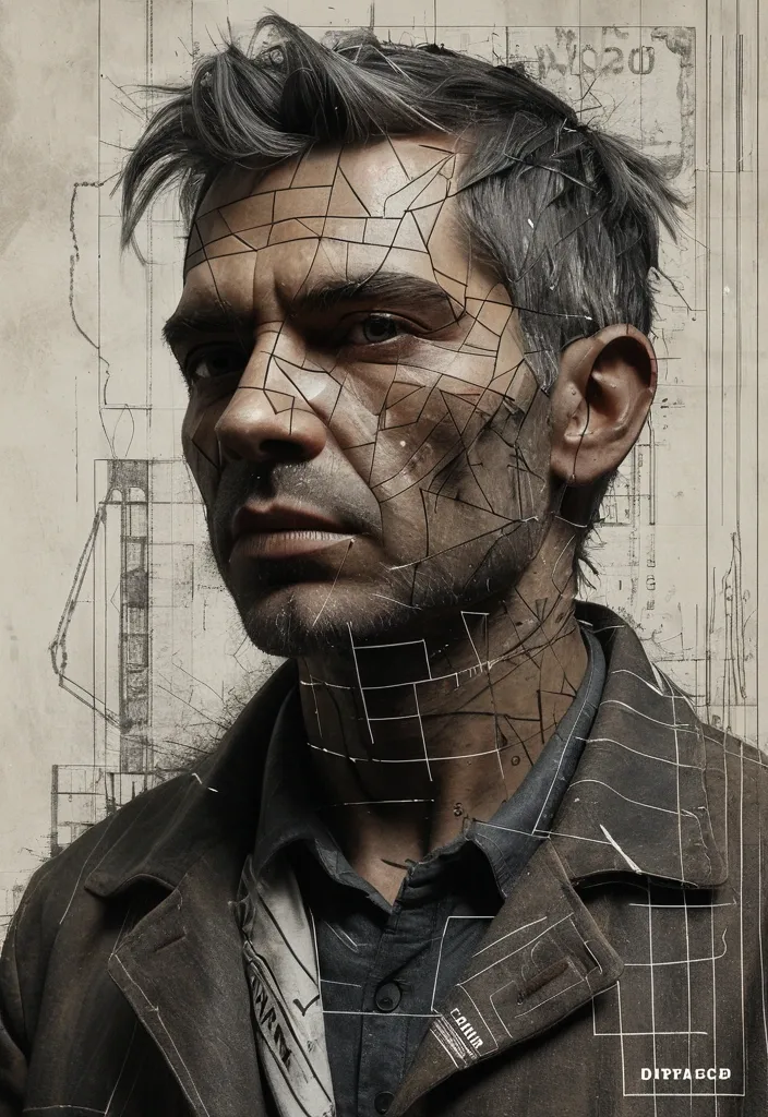
a portrait of an old coal miner in 19th century , split vertically in half. The right side shows a realistic human face with dramatic lighting , sharp details , and deep shadows. The image is a deconstructed multimedia collage: his face is overlaid with faint , intricate architectural blueprints , geometric grid lines , and technical schematics. The composition features an explosive , splattered edge effect with charcoal and white paint strokes. Scattered hyper-realistic charcoals drift around her neck and hair. The left side is mostly muted earth-tone color stylish with bold vertical typography spelling "LABOR DAY". The stylish text should be large , modern , and slightly textured , blending subtly with the face. High-contrast lighting , 8k resolution , ultra-sharp focus on the eyes , featuring hyper-realistic skin textures , muted earth-tone color palette with pops of vibrant orange , editorial photography style. ,
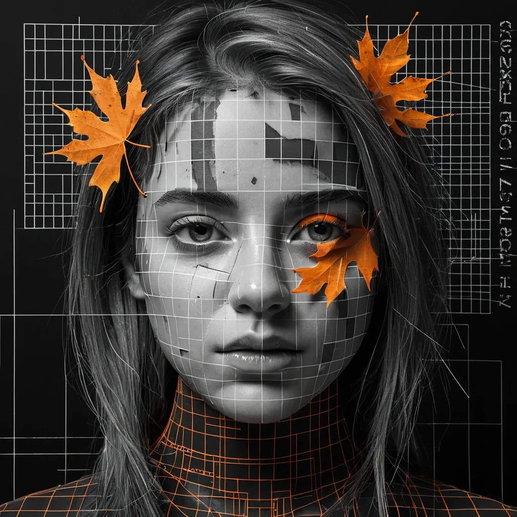
The create a ultra pro hyper-realistic a high-contrast black and white cinematic portrait. A close-up face (realistic photo using the provided input image as identity reference) split vertically in half. The right side shows a realistic human face with dramatic lighting , sharp details , and deep shadows. The image is a deconstructed multimedia collage: his face is overlaid with faint , intricate architectural blueprints , geometric grid lines , and technical schematics. The composition features an explosive , splattered edge effect with charcoal and white paint strokes. Scattered hyper-realistic orange autumn maple leaves drift around her neck and hair. The left side is mostly gray stylish with bold vertical typography spelling "RAJU". The stylish text should be large , modern , and slightly textured , blending subtly with the face. High-contrast lighting , 8k resolution , ultra-sharp focus on the eyes , featuring hyper-realistic skin textures , muted earth-tone color palette with pops of vibrant orange , editorial photography style. ,
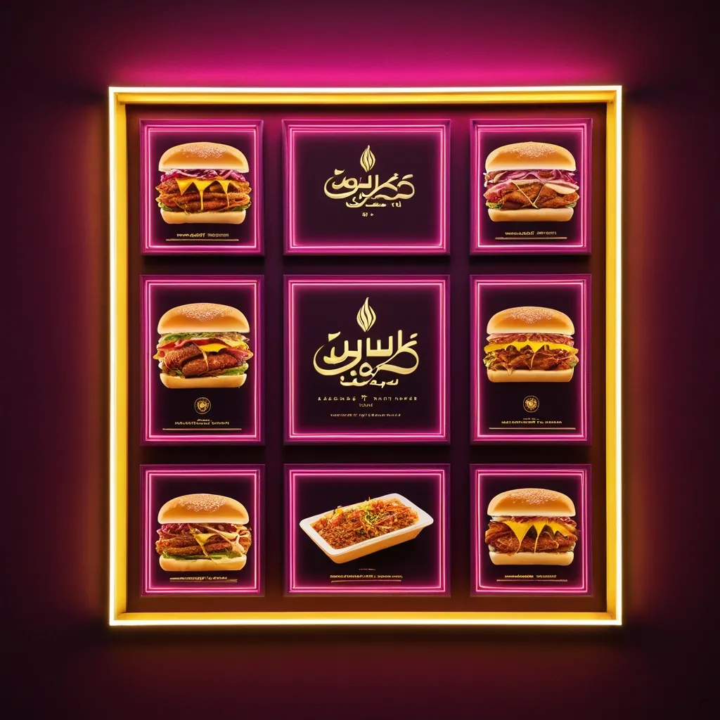
**Subject:** A horizontal commercial signboard for an sudanes restaurant specializing in fast food **Composition & Layout:** * **Format:** A wide , horizontal rectangular banner set within a thin , glowing warm-yellow frame. * **Central Focus:** Large , prominent Arabic text dominates the center. * **Top Left:** A logo place leave it empty * **Bottom Section:** Smaller lines of informative text and four square photographic panels showing food. * **Lighting Effects:** The overall aesthetic is a high-contrast , glowing "light-box" style. Pinkish-magenta light streaks radiate upward from the bottom corners toward the center. **Color Palette:** * **Background:** Deep royal red ff2325 with subtle textures and faint , light-white decorative flourishes (filigree patterns). * **Main Typography:** Bright orange letters with a thick , 3D-effect gold/yellow outline and a dark drop shadow for depth. * **Secondary Typography:** Pure white for the address and bright yellow for the contact numbers. * **Accents:** Magenta/pink light flares and a warm yellow glow from the outer frame. **Specific Elements:** * **Main Title (Arabic):** Bold , stylized Arabic calligraphy reading "كوبا للفطائر". * **Logo:** The logo for Cuba pies Restaurant will be sent with the promo. * **Address Line (Middle):** A single line of white Arabic text: "الاسكان 96-شارع السوق-الفاصل 96_95" * **Contact Line (Bottom):** Yellow text containing two phone numbers "0923931452/ 0928737341" preceded by the Arabic word for "Contact:". * **Food Imagery:** Four small square panels at the bottom (two on the left , two on the right). They feature realistic photos of Shawarma sandwich on plates with garnishes and one panel showing a whole , golden-brown roasted chicken. **Style:** Modern Egyptian commercial design , vibrant , professional , and designed to look like an illuminated neon or LED sign at night. ,
**Subject:** A horizontal commercial signboard for an sudanes restaurant specializing in fast food **Composition & Layout:** * **Format:** A wide , horizontal rectangular banner set within a thin , glowing warm-yellow frame. * **Central Focus:** Large , prominent Arabic text dominates the center. * **Top Left:** A logo place leave it empty * **Bottom Section:** Smaller lines of informative text and four square photographic panels showing food. * **Lighting Effects:** The overall aesthetic is a high-contrast , glowing "light-box" style. Pinkish-magenta light streaks radiate upward from the bottom corners toward the center. **Color Palette:** * **Background:** Deep royal red ff2325 with subtle textures and faint , light-white decorative flourishes (filigree patterns). * **Main Typography:** Bright orange letters with a thick , 3D-effect gold/yellow outline and a dark drop shadow for depth. * **Secondary Typography:** Pure white for the address and bright yellow for the contact numbers. * **Accents:** Magenta/pink light flares and a warm yellow glow from the outer frame. **Specific Elements:** * **Main Title (Arabic):** Bold , stylized Arabic calligraphy reading "كوبا للفطائر". * **Logo:** The logo for Cuba pies Restaurant will be sent with the promo. * **Address Line (Middle):** A single line of white Arabic text: "الاسكان 96-شارع السوق-الفاصل 96_95" * **Contact Line (Bottom):** Yellow text containing two phone numbers "0923931452/ 0928737341" preceded by the Arabic word for "Contact:". * **Food Imagery:** Four small square panels at the bottom (two on the left , two on the right). They feature realistic photos of Shawarma sandwich on plates with garnishes and one panel showing a whole , golden-brown roasted chicken. **Style:** Modern Egyptian commercial design , vibrant , professional , and designed to look like an illuminated neon or LED sign at night. ,
**Subject:** A horizontal commercial signboard for an sudanes restaurant specializing in fast food **Composition & Layout:** * **Format:** A wide , horizontal rectangular banner set within a thin , glowing warm-yellow frame. * **Central Focus:** Large , prominent Arabic text dominates the center. * **Top Left:** A logo place leave it empty * **Bottom Section:** Smaller lines of informative text and four square photographic panels showing food. * **Lighting Effects:** The overall aesthetic is a high-contrast , glowing "light-box" style. Pinkish-magenta light streaks radiate upward from the bottom corners toward the center. **Color Palette:** * **Background:** Deep royal red ff2325 with subtle textures and faint , light-white decorative flourishes (filigree patterns). * **Main Typography:** Bright orange letters with a thick , 3D-effect gold/yellow outline and a dark drop shadow for depth. * **Secondary Typography:** Pure white for the address and bright yellow for the contact numbers. * **Accents:** Magenta/pink light flares and a warm yellow glow from the outer frame. **Specific Elements:** * **Main Title (Arabic):** Bold , stylized Arabic calligraphy reading "كوبا للفطائر". * **Logo:** The logo for Cuba pies Restaurant will be sent with the promo. * **Address Line (Middle):** A single line of white Arabic text: "الاسكان 96-شارع السوق-الفاصل 96_95" * **Contact Line (Bottom):** Yellow text containing two phone numbers "0923931452/ 0928737341" preceded by the Arabic word for "Contact:". * **Food Imagery:** Four small square panels at the bottom (two on the left , two on the right). They feature realistic photos of Shawarma sandwich on plates with garnishes and one panel showing a whole , golden-brown roasted chicken. **Style:** Modern Egyptian commercial design , vibrant , professional , and designed to look like an illuminated neon or LED sign at night. ,