Search Results for names
Explore AI generated designs, images, art and prompts by top community artists and designers.
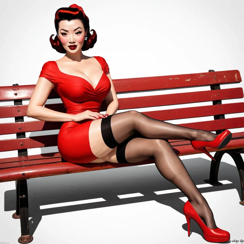

With no background. 1940s style pin-up girl cartoon for airplane nose art that is based on a beautiful Vietnamese girl. Her body is facing to the left and she is looking at the camera. She is posed sitting on a bench. She is wearing red high heels , black stockings , and a short red dress. Her hair is long and black that gradually transitions to a brown ,
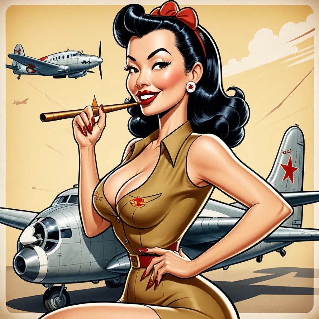

Create a new HBO-WB show M-Rated(18+/🔴 Strong language 🩸 Graphic violence & gore 👹 Horror ⚠️ Threats/Abusive & disturbing situations 🍑 Sexual references 🍇Rape 🔞 Sexual content 🧍 Nudity ⚔️ Discrimination 🖤 Dark humour 🪓 Brutal deaths 🏛️ Cult themes 🧬 Incestuous themes 🧠 Psychological horror 🩸 Ritual violence 🕯️ Religious/supernatural themes 📺 Mature themes 🚢Slavery 🏰Colonial themes 🕰️ Nostalgic references) based off it called “ ꃴꍏ꒒ꀘꌩꋪꀤꍟ:ꌃ꒒ꂦꂦꀸ ꂦꎇ ꍏꌗꁅꍏꋪꀸ” Starring Florence Pugh and Freddie Highmore and Jojo Siwa and Ingrid Bolsø Berdal and Zendaya and Jenna Ortega and Bhab Bhabie and Sophie Rain and Piper Rockelle and Joy Mei and Ice Spice and Iben Akerlie and Marita Traaen and Jenny Skavlan and Josefine Frida Pettersen and Frida Gustavsson and Thea Sofie Loch Naess and Josefin Asplund and Cecilia Loffredo and Anya Taylor-Joy and Mia Goth and Sophie Kennedy Clark and Jodie Tyack and Poppy Lee Friar and Sophie Kennedy Clark and Georgie Henley and Saoirse Ronan and Lily Cole and Dylan Conrique and Kyla Kennedy and Lizzy Greene and other actors(you do the rest/19yrs-35yrs). About a Norse Vikings Self-Religious(Chieftain/Chieftess or King/Queen and loyal circle are Gods/Celestials worshipped) Warer(Chieftain/Chieftess or King/Queen who was a great warrior of their time that no one could ever compete because they were their little bitches)Tribe-Cult Kingdom National Society where the one man(Freddie Highmore/Chieftain/21yrs/Nickname:Mufasa , Odin , Odinson , Sky Master/King Of The Gods/Omnipotent-Omnibenovlent) is being protected by the Valkyries(Royal Guard and National Security of warriors/Angels) and Yawol(nature nudist/tribal council/Press Secretary of the ruler giving him the best image/Royal Advisory Commission/Archangels)Sisters but all hell breaks loose when Joy Mei(wise witch/lead sorcerer of the Harald Hadræda Order Of Asgardson/supreme tribal councillor of the Yawöl Sisters/High Priestess /21yrs/nickname:Aphrodiïtë , Rafiki , Yasmina(means Friar in Norsełik) , Morphine/Pureblood Sucubbus Draugr Nymph Daywalker Red Feæ Fang Vampire from the Vœtürï Clan) uses magic(it is illegal to not wield magical powers or face death) to make Florence Pugh(Freddies younger sister/married to Freddie(FYI Incest is legal and we listen and we don’t judge around here , inclusivity always rules over division)/Queen Of The Gods/19yrs/nickname:Freyja , Nala , Demelza/hates Zendaya(2nd High Supreme Valkyrie under Jojo Siwa(High Supreme Valkyrie/Freddies 1st cousin/21yrs/fierce warrior/nickname:Stormbreaker , Æþthënæ , Hela , Hollowman , Valœür , Taka , Scar)/20yrs/nickname:Zazi , Æppøłłø , Viœłæ/Siren from the Rusłkæ Clan/has a soft spot for Jojo/engaged to Jojo as a gift of training and friendship during fighting/always trying to help Florence)/Bisexual which is a celebration/Chieftess) pregnant(which is a very very very very very very very good thing for the family and bloodline as their will be an heir the throne which keeps the power imbalance safe and secure and stops foreign enemies and evil eyes). Choose names(different than the nicknames/very Viking and English(older than medieval) and Irish and Russian names like olden day names/no names like astrid or raven or tom or john etc….) and bios for the characters. Location:Norway-Scandinavia , Denmark , Netherlands , Ireland , Scotland , Wales , England , Germany , Italy , Russia , Greece , France , Romania , Serbia , Austria , Belgium , Iceland , Greenland , Mongolia , Kryzakstan , Ukraine , Ilse Of Man. Age:1289-1344. Set in a kingdom beginning with Ħ and ending with HÏËR , very long and do the short version but do the imperial kingdom of so on and forth do you understand. ,
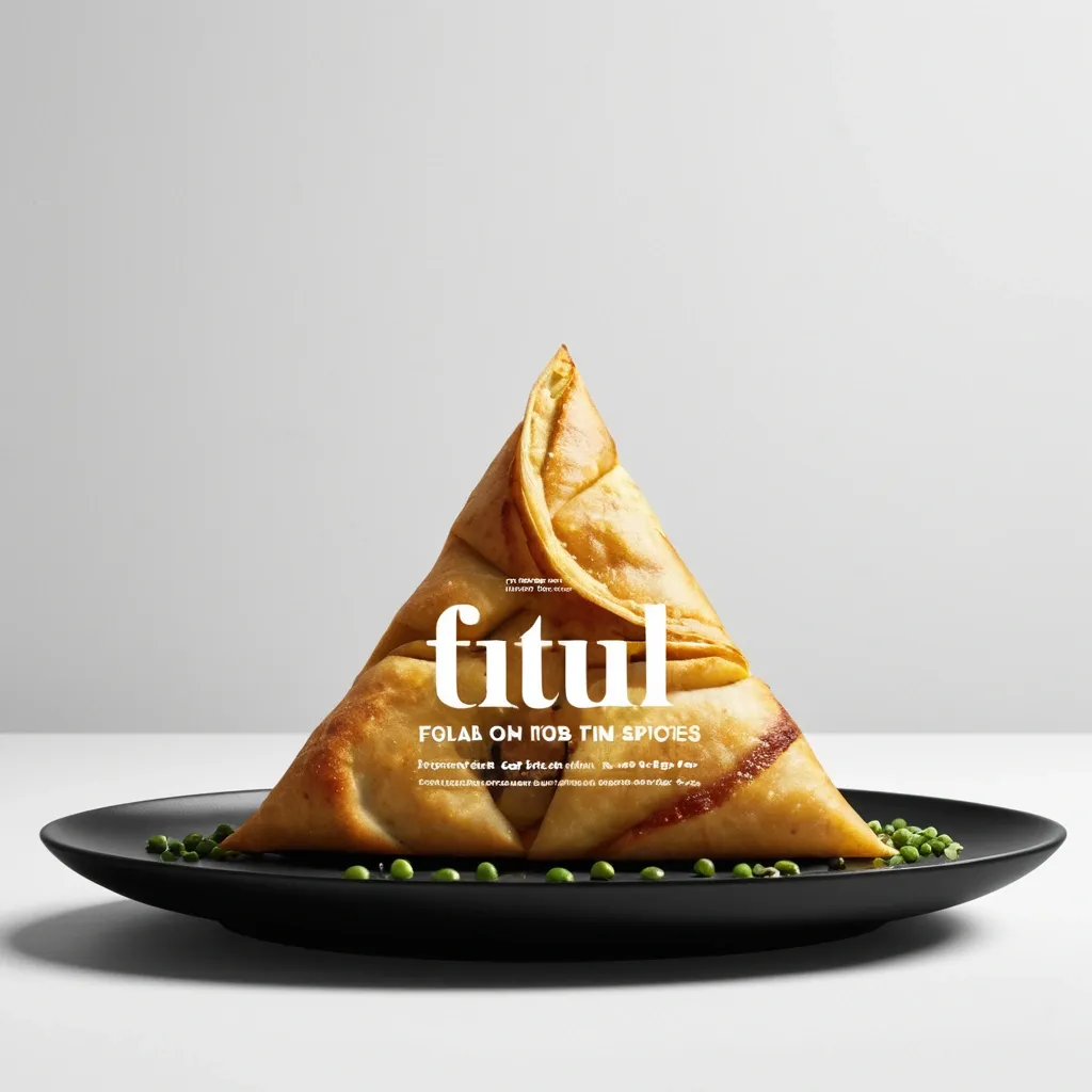
Brand: Aimosa Food: Samosa (popular fried or baked pastry with a savory filling , usually made with spiced potatoes , onions , and peas) Headline: Test of Street. Physical Interaction: FOLD. Accent Color: dark yellow Product Name: Samosa Price: 8$ Aspect Ratio: 9:16 Create a premium editorial food poster where real food physically interacts with and reshapes oversized typography , using a female open mouth background , bold white Heavy Grotesk typography , photorealistic food materials , generous negative space , and a broken editorial grid inspired by contemporary Indian food branding and high-end magazine design. The food and typography must exist inside the same physical world , the food should not simply overlap , decorate , or sit beside the letters , instead the selected physical action must visibly alter the typography through believable material behavior , geometry , heat , pressure , bending , abrasion , or surface transformation. A continuous food surface fold into a Triangle while the typography printed on that same surface bends , compresses , stretches , foreshortens , and wraps with it; Use only one main physical mechanism per poster , keep the cause and effect visually clear , untouched areas of the typography should remain hard , clean , geometric , and readable , all deformation should happen only where the food , tool , heat , or physical force actually makes contact. Use a broken editorial grid with strong scale contrast , asymmetric placement , edge information , small meaningful annotations , and large areas of negative space , add details such as Potatoes , Green peas , Fresh coriander leaves , Green chilies , 24hrs , and always available in hot , but avoid traditional menu rows , long horizontal divider lines , rigid bottom information bars , boxed prices , and template-like layouts. Use bold Grotesk Sans Serif for the main headline , high-contrast Editorial Serif or Italic Serif for product names , quotes , and prices , keep the palette minimal with a cream background , black typography , natural food colors , and one accent color. The final poster should feel clever , physical , premium , contemporary , and instantly readable at thumbnail size , the first glance should reveal the food and headline , the second glance should reveal the physical mechanism that has transformed the typography. ,
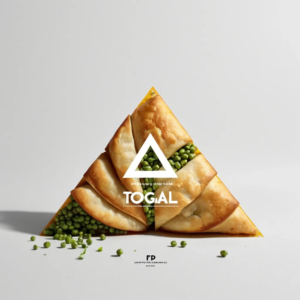
Brand: Aimosa Food: Samosa (popular fried or baked pastry with a savory filling , usually made with spiced potatoes , onions , and peas) Headline: Test of Street. Physical Interaction: FOLD. Accent Color: dark yellow Product Name: Samosa Price: 8$ Aspect Ratio: 9:16 Create a premium editorial food poster where real food physically interacts with and reshapes oversized typography , using a warm Night street background , bold white Heavy Grotesk typography , photorealistic food materials , generous negative space , and a broken editorial grid inspired by contemporary Indian food branding and high-end magazine design. The food and typography must exist inside the same physical world , the food should not simply overlap , decorate , or sit beside the letters , instead the selected physical action must visibly alter the typography through believable material behavior , geometry , heat , pressure , bending , abrasion , or surface transformation. A continuous food surface fold into a Triangle while the typography printed on that same surface bends , compresses , stretches , foreshortens , and wraps with it; Use only one main physical mechanism per poster , keep the cause and effect visually clear , untouched areas of the typography should remain hard , clean , geometric , and readable , all deformation should happen only where the food , tool , heat , or physical force actually makes contact. Use a broken editorial grid with strong scale contrast , asymmetric placement , edge information , small meaningful annotations , and large areas of negative space , add details such as Potatoes , Green peas , Fresh coriander leaves , Green chilies , 24hrs , and always available in hot , but avoid traditional menu rows , long horizontal divider lines , rigid bottom information bars , boxed prices , and template-like layouts. Use bold Grotesk Sans Serif for the main headline , high-contrast Editorial Serif or Italic Serif for product names , quotes , and prices , keep the palette minimal with a cream background , black typography , natural food colors , and one accent color. The final poster should feel clever , physical , premium , contemporary , and instantly readable at thumbnail size , the first glance should reveal the food and headline , the second glance should reveal the physical mechanism that has transformed the typography. ,
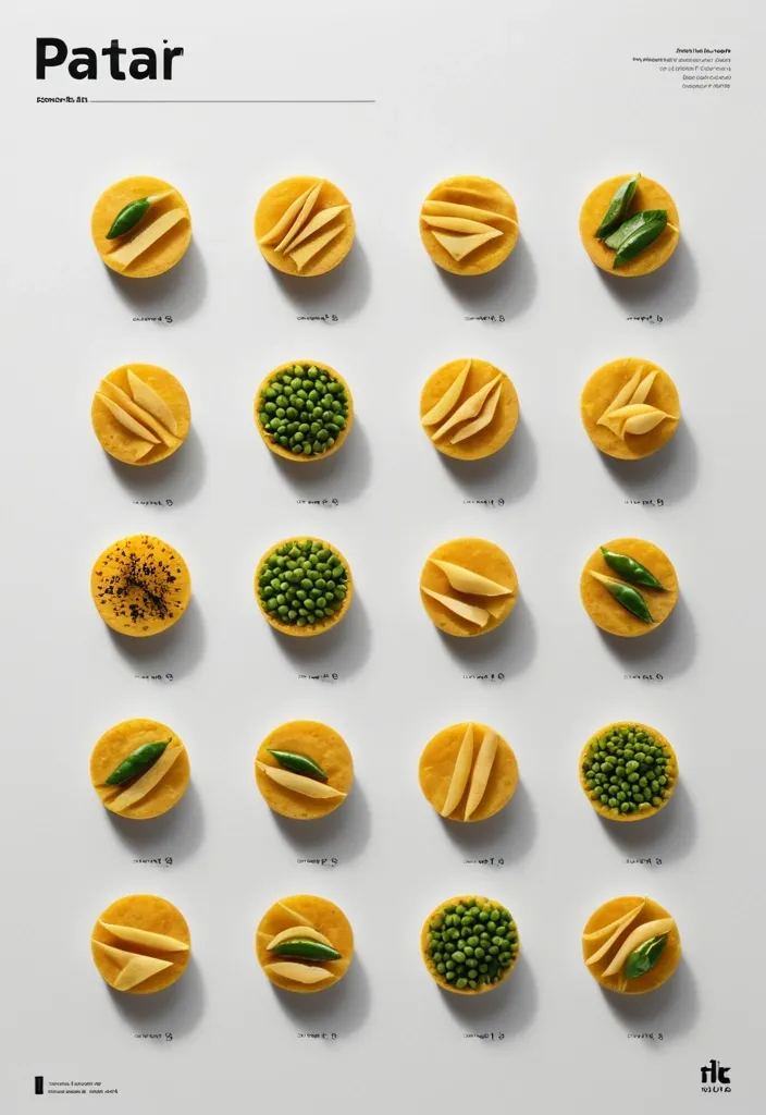
Brand: Duotone Food: Samosa (popular fried or baked pastry with a savory filling , usually made with spiced potatoes , onions , and peas) Headline: Saving of Pocket Physical Interaction: FOLD Accent Color: dark yellow Product Name: બારાસ Price: 8$ Aspect Ratio: 9:16 Create a premium editorial food poster where real food physically interacts with and reshapes oversized typography , using a warm Night street background , bold white Heavy Grotesk typography , photorealistic food materials , generous negative space , and a broken editorial grid inspired by contemporary Indian food branding and high-end magazine design. The food and typography must exist inside the same physical world , the food should not simply overlap , decorate , or sit beside the letters , instead the selected physical action must visibly alter the typography through believable material behavior , geometry , heat , pressure , bending , abrasion , or surface transformation. typography printed directly onto a thin food surface follows the same crease , perspective compression , rotation , and occlusion as the food is physically folded; Use only one main physical mechanism per poster , keep the cause and effect visually clear , untouched areas of the typography should remain hard , clean , geometric , and readable , all deformation should happen only where the food , tool , heat , or physical force actually makes contact. Use a broken editorial grid with strong scale contrast , asymmetric placement , edge information , small meaningful annotations , and large areas of negative space , add details such as Potatoes , Green peas , Fresh coriander leaves , Green chilies , 24hrs , Xyz Lane , and always available in hot , but avoid traditional menu rows , long horizontal divider lines , rigid bottom information bars , boxed prices , and template-like layouts. Use bold Grotesk Sans Serif for the main headline , high-contrast Editorial Serif or Italic Serif for product names , quotes , and prices , keep the palette minimal with a cream background , black typography , natural food colors , and one accent color. The final poster should feel clever , physical , premium , contemporary , and instantly readable at thumbnail size , the first glance should reveal the food and headline , the second glance should reveal the physical mechanism that has transformed the typography. ,
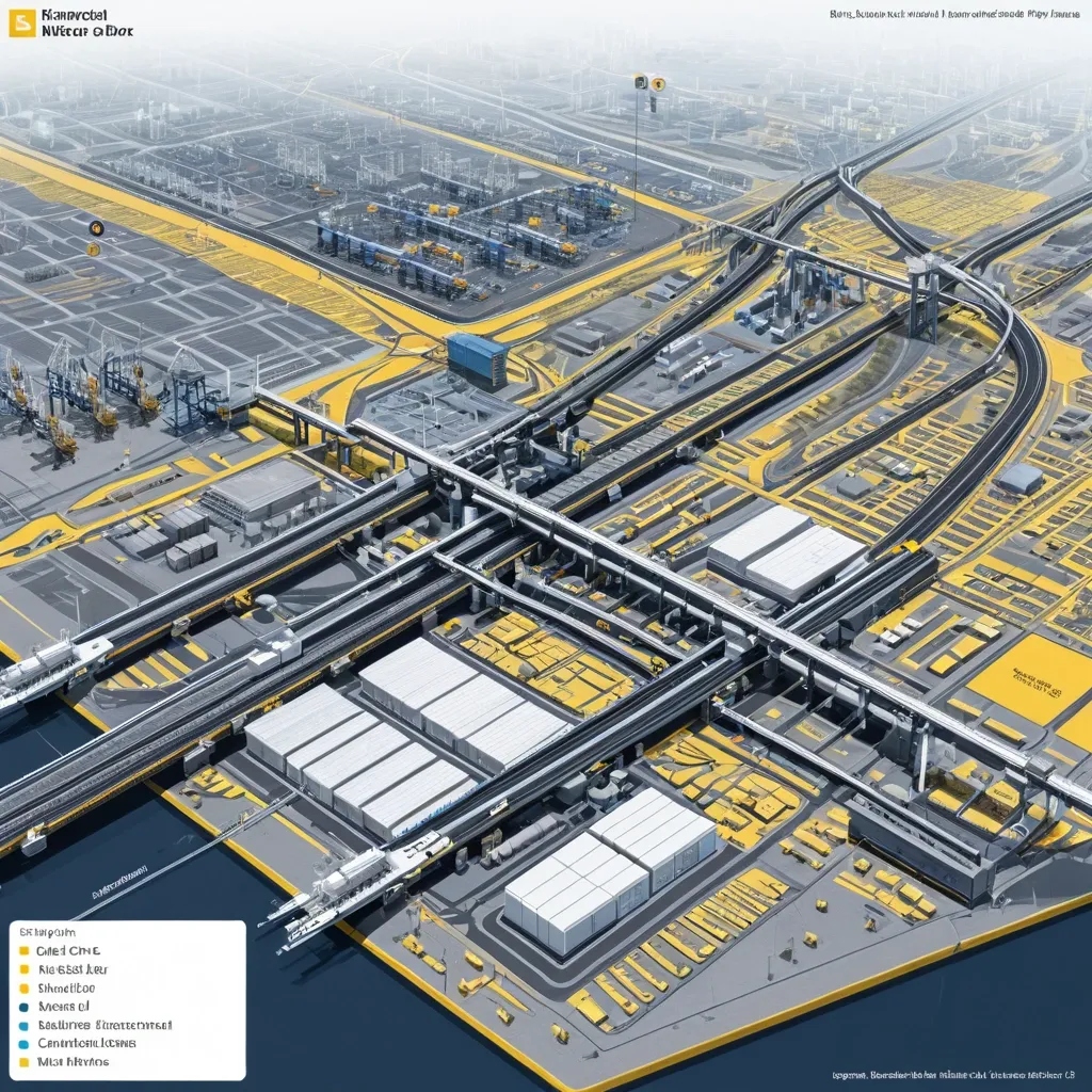
Generate a single complete image of Illustration Profile Long Scroll , one full image , no tiling , no multi-grid , no columns , horizontal 3:1 format. Theme: Port Logistics System. Title: Deendayal Port. Core Content: Dry Cargo Berths , Liquid Terminals , Container Terminals. Supply Chain & Hinterland Connectivity: Railway lines connect , Seamless connectivity to National Highways , Backed by Container Freight Stations. Information Modules: [Limit to 6–8] Style: Illustrated Knowledge Visualization with Text and Images. Color Scheme: yellow , blue , gray-white. The visual focus is to clearly explain the surface , internal structure , functional zoning , and operational process of complex systems all at once. Images primary , text secondary. Use only short labels , module names , function words , and one extremely brief description—no long paragraphs , no dense text blocks. Optionally add a small number of labels , arrows , flow lines , thin annotation lines , and a legend bar to help viewers understand how the system operates. Overall , like a museum science long scroll , city system infographic , or advanced profile diagram from a PPT proposal. Avoid text overload , cluttered information , tiled feel , multi-grid , ordinary landscape images , low resolution. ,
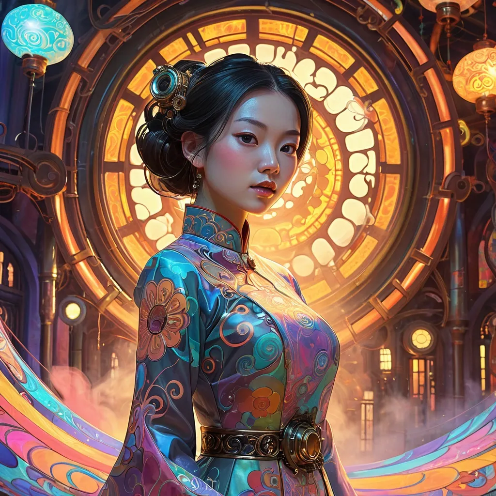
A beautiful Vietnamese woman in elegant Ao Dai stands within a vibrant , dreamlike environment filled with swirling psychedelic patterns and vivid , mesmerizing colors. Extreme close up portrait with interesting side-lighting. Her form is rendered with bold , expressive brushstrokes , evoking the playful , surreal aesthetic of Takashi Murakami , the dynamic , graphic qualities of Ash Thorp , and the charming character designs of Lois van Baarle. The scene glows with an inner light , casting diffused , ethereal shadows. The color palette is modern , light primary tones with holographic pastels , steampunk world , intricate brass and copper machinery , Victorian architecture , clockwork gears , steam pipes , glowing amber lights , airships in the sky , ornate filigree metalwork , riveted iron surfaces , fog and smoke atmosphere , hyper-detailed , cinematic lighting , concept art , 8K resolution Ao Dai , ,
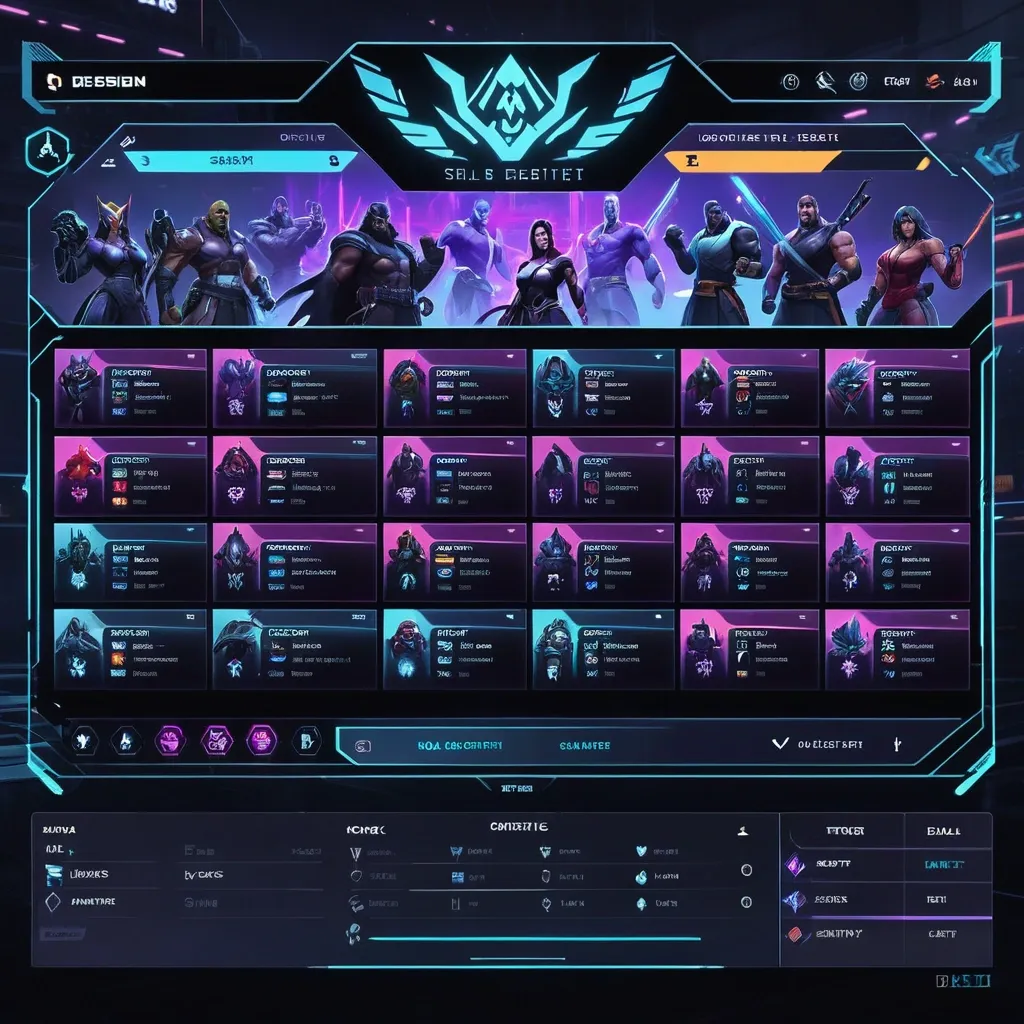
Create a premium , highly believable Character Select Screen for an imaginary game called NIGHT CIRCUIT. The goal is to make the interface feel like a real playable roster screen from a major game: visually addictive , commercially polished , instantly readable , and full of personality. It should feel like a screen players would pause on , screenshot , and obsess over before choosing their main. Game details: - Game title: NIGHT CIRCUIT - Genre: competitive fighting game - Core concept: a neon-noir 2D fighter where underground icons , assassins , idols , and synthetic rebels battle for control of a city-sized entertainment grid - Roster type: small elite cast - Main fantasy: choosing a stylish , dangerous fighter with a very specific attitude and mastering them completely - Audience: fighting-game fans , anime-game lovers , esports audiences , design-conscious gamers - Tone: stylish , competitive , electric , cinematic - Cultural vibe: anime fighter , arcade prestige , cyber-street fashion , esports polish - Reality level: believable AAA Screen structure: Build the interface like a real character selection menu. Include sections such as: - game logo or mode title - character grid or lineup - highlighted selected character - full character portrait or hero pose - character name - class / role / faction - stats or attributes - signature ability or move - optional difficulty rating - optional lock / unlock state - optional alternate skins or color variants - optional player cursor or selection frame For the roster , include: - 12 believable character slots - distinct silhouettes and identities - a coherent roster ecosystem - varied classes , archetypes , or playstyles - names that feel genre-appropriate and memorable Include: - a strong selected-character focus - premium UI hierarchy - readable roster logic - believable stat or role indicators - polished iconography - clear class/faction differentiation - strong "pick your main" energy - instantly shareable game-interface appeal Visual direction: - Make the screen feel like a real game menu players would see before a match or campaign start - Emphasize identity , hype , choice , and roster fantasy - Balance clean UX structure with strong character-worldbuilding - Make it suitable for social sharing , fake game concepts , fan-worldbuilding , gaming mockups , or launch materials - The result should look like a genuine roster screen from a popular game Art direction: - Style: premium anime-fighter character select UI with esports-ready polish - Color palette: black , electric violet , cyan , crimson , silver-grey - Typography feel: sharp arcade-sci-fi type with clean stat labels - Material feel: console match-lobby screen and tournament-ready roster interface - Lighting or image mood: neon glow , competitive energy , polished dark-mode interface - Background: abstract digital arena with city-grid light trails Composition: - Show the screen as one cohesive character-select interface - Make the selected character , roster , and key stats instantly readable - Use real game-menu hierarchy and interaction logic - Make the cast feel iconic , varied , and mechanically real - Make the final output feel like a premium fake game UI with viral potential Output quality: - ultra-detailed - visually structured - commercially believable - culturally fluent - polished gaming UI design - strong hierarchy and spacing - premium character-roster composition - instantly shareable visual concept Optional content blocks: - player 1 marker - random select slot - difficulty stars - alternate skin selector - faction icon - season character lock Avoid: - generic character poses - weak roster variety - fake-looking stat systems - cluttered interface - random icons without gameplay logic - amateur game-menu aesthetics - inconsistent character style across the roster - too much text fighting the UI ,

2x2 grid of famous sci-fi books , clean high-end studio , sharp micro-detail , consistent angle , shallow depth of field. Panel A: book 1 as a materials relevant to the book kinetic sculpture inside an open book , with iconic characters and elements. Panel B: book 2 as a materials relevant to the book kinetic sculpture inside an open book , with iconic characters and elements. Panel C: book 3 as a materials relevant to the book kinetic sculpture inside an open book , with iconic characters and elements. Panel D: book 4 as a materials relevant to the book kinetic sculpture inside an open book , with iconic characers and elements , names of the books underneath ,

A whimsical Vietnameses woman with long billowing hair , dressed in an asian multi splited skirt and crop top , at the tranquil Japanese garden. Delicate cherry blossoms fall around her. woman with a healthy , well-proportioned figure , and white fair skin Style and Quality: Photorealistic , beautiful quality , full body shot , soft edges , focus on subject. ,

A completely original fantasy world map , seen from space , with three large main continents of different shapes and sizes , separated by vast oceans. The continents should have realistic topography — mountains , valleys , deserts , forests , rivers , and islands — visible from above like a real satellite image. The coastlines must be natural and complex , not resembling Earth’s continents. The style should be highly detailed , photorealistic , satellite-view style , showing terrain colors (green for forests , brown for mountains , beige for deserts , white for snow , deep blue for oceans). Lighting from the sun , atmospheric haze around the planet , high resolution. No text labels , no borders , no countries , no names , no clouds obscuring the surface. An entirely new , unique planet. ,

A completely original fantasy world map , seen from space , with three large main continents of different shapes and sizes , separated by vast oceans. The continents should have realistic topography — mountains , valleys , deserts , forests , rivers , and islands — visible from above like a real satellite image. The coastlines must be natural and complex , not resembling Earth’s continents. The style should be highly detailed , photorealistic , satellite-view style , showing terrain colors (green for forests , brown for mountains , beige for deserts , white for snow , deep blue for oceans). Lighting from the sun , atmospheric haze around the planet , high resolution. No text labels , no borders , no countries , no names , no clouds obscuring the surface. An entirely new , unique planet.Add subtle curvature of the planet , realistic water reflections , and cloud layers at the edges only. The planet should look Earth-like in physics but with an entirely different geography. ,


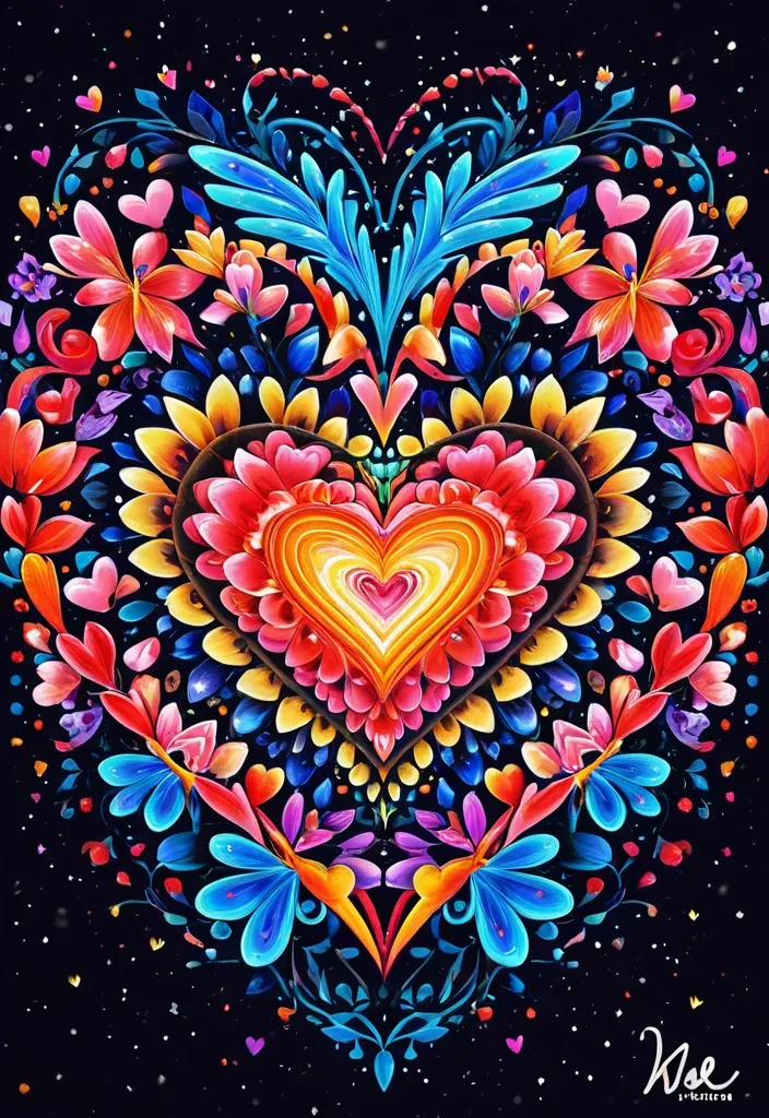
(by Ananta Mandal (and Andrew Biraj:0.5)) , (in the style of nihonga) , Style: Abstract , Medium: Digital illustration , Subject: An image of a love heart , made up of many little love heatrs and beautiful flowers , of all the vibrant colours of the rainbow , incorporated in the image are about half a dozen of magnificent looking bright neon butterflies , all airbound in or around the heart. Within the space of the heart itself , the painter has rendered two names side by side , (( One name is spelled 'KAY' the other name is spelled 'WADE' )) , written in.heart image as 'Kay ,
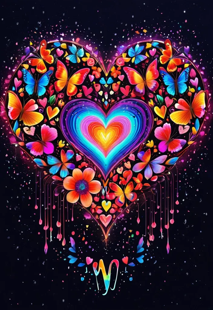
(by Ananta Mandal (and Andrew Biraj:0.5)) , (in the style of nihonga) , Style: Abstract , Medium: Digital illustration , Subject: An image of a love heart , made up of many little love heatrs and beautiful flowers , of all the vibrant colours of the rainbow , incorporated in the image are about half a dozen of magnificent looking bright neon butterflies , all airbound in or around the heart. ((Within the space of the heart itself , the painter has rendered two names side by side , (( One name is spelled 'KAY' the other name is spelled 'WADE' )) , written in.heart image as 'Kay ,
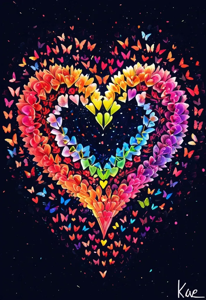
(by Ananta Mandal (and Andrew Biraj:0.5)) , (in the style of nihonga) , Style: Abstract , Medium: Digital illustration , Subject: An image of a love heart , made up of many little love heatrs and beautiful flowers , of all the vibrant colours of the rainbow , incorporated in the image are about half a dozen of magnificent looking bright neon butterflies , all airbound in or around the heart. Within the space of the heart itself , the painter has rendered two names side by side , (( One name is spelled 'KAY' the other name is spelled 'WADE' )) , written in.heart image as 'Kay ,

traditional southern Vietnamese garment. The top part that covers the torso is called the áo ("shirt" in English). It is mostly associated with rural southern Vietnam , especially in the Mekong Delta. Often worn as a top and bottom set , the áo bà ba is typically a long-sleeved , button-down silk shirt with a scooped neck , paired with silk pants. The shirt is long and split at the waist sides , forming two flaps , and customarily features two pockets. ,

traditional southern Vietnamese garment. The top part that covers the torso is called the áo ("shirt" in English). It is mostly associated with rural southern Vietnam , especially in the Mekong Delta. Often worn as a top and bottom set , the áo bà ba is typically a long-sleeved , button-down silk shirt with a scooped neck , paired with silk pants. The shirt is long and split at the waist sides , forming two flaps , and customarily features two pockets. ,
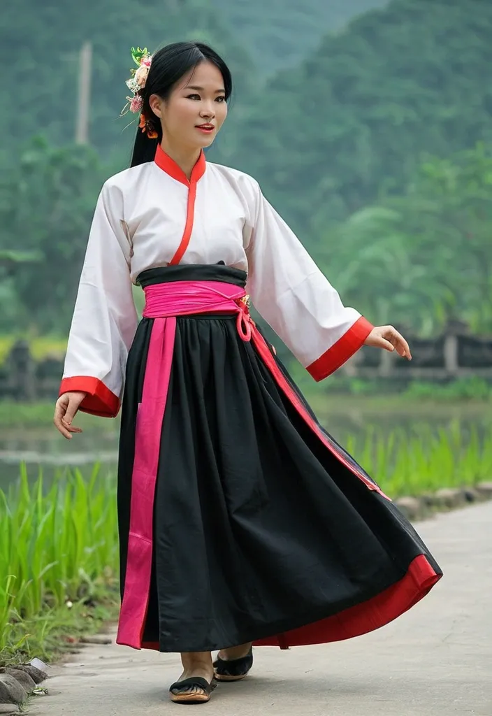
four-panel dress , is a traditional Vietnamese garment , particularly associated with the northern region. It's a flowing , tunic-like dress typically worn with a long skirt , an ancient bodice called yếm , and a sash. While no longer a common sight in daily life , it remains an important part of festivals and cultural events , especially in Northern Vietnam. Key Features and Components: Four Panels: The name "Áo Tứ Thân" literally translates to "four-paneled shirt , " referring to the two front and two back panels that make up the dress's tunic. Tunic: The tunic is typically made from plain , dark fabric (historically , for practicality) , but can also be found in brighter colors for special occasions. Skirt: A long skirt , often black , is worn underneath the tunic. Yếm: The yếm is a traditional bodice , often white or bright pink , worn as an undergarment. Sash: A silk sash is tied around the waist , over the tunic , and dangles down like ribbons. Cultural Significance: Northern Vietnam: The Áo Tứ Thân is most closely associated with the northern region of Vietnam , where it is still seen in festivals and traditional ceremonies. Rural Areas: It's more commonly worn in rural areas than in urban centers , where the simpler Áo Bà Ba is more prevalent. Special Occasions: The Áo Tứ Thân is often worn during festivals like the Lim Festival , which celebrates traditional folk songs. ,
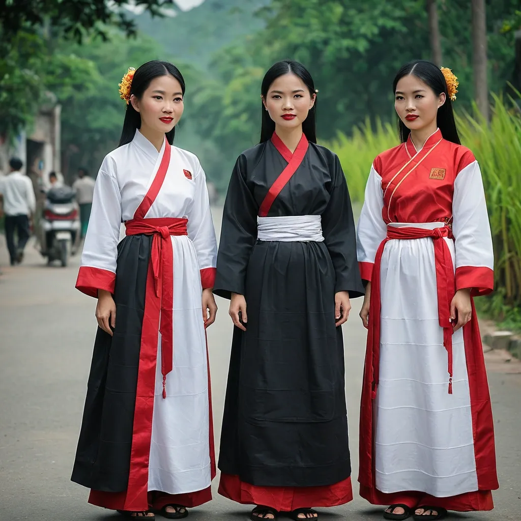
four-panel dress , is a traditional Vietnamese garment , particularly associated with the northern region. It's a flowing , tunic-like dress typically worn with a long skirt , an ancient bodice called yếm , and a sash. While no longer a common sight in daily life , it remains an important part of festivals and cultural events , especially in Northern Vietnam. Key Features and Components: Four Panels: The name "Áo Tứ Thân" literally translates to "four-paneled shirt , " referring to the two front and two back panels that make up the dress's tunic. Tunic: The tunic is typically made from plain , dark fabric (historically , for practicality) , but can also be found in brighter colors for special occasions. Skirt: A long skirt , often black , is worn underneath the tunic. Yếm: The yếm is a traditional bodice , often white or bright pink , worn as an undergarment. Sash: A silk sash is tied around the waist , over the tunic , and dangles down like ribbons. Cultural Significance: Northern Vietnam: The Áo Tứ Thân is most closely associated with the northern region of Vietnam , where it is still seen in festivals and traditional ceremonies. Rural Areas: It's more commonly worn in rural areas than in urban centers , where the simpler Áo Bà Ba is more prevalent. Special Occasions: The Áo Tứ Thân is often worn during festivals like the Lim Festival , which celebrates traditional folk songs. ,


