Search Results for deep ocean
Explore AI generated designs, images, art and prompts by top community artists and designers.

Physical Characteristics: Size & Weight: Between 40 to 60 feet in length , weighing 50 to 75 tons. Coloration: Males: Sleek black base with dark gray tiger stripes accented by subtle red bioluminescent highlights along the stripes , glowing faintly in deep ocean darkness. Body Structure: Hydrodynamic , muscular body combining the streamlined agility of the Shortfin Mako and Black Marlin with the robust power of Predator X and Megalodon. Rigid pectoral fins adapted from Black Marlin , capable of tilting back to reduce drag at high speeds. The tailend is a powerful fluke for propulsion , inspired by Mosasaurus Hoffmannii and Orca anatomy. Thick , overlapping bony scales similar to Arapaima , providing a durable armor that flexes with movement. Limbs: Powerful large flippers adapted for scooting or sliding on land , coated with mucus inspired by the Atlantic hagfish for moisture retention and defense. Capable of limited terrestrial movement , allowing brief excursions out of water. Head & Jaw: Massive jaws with over 40 , 000 PSI bite force , blending Predator X’s mighty jaw strength with the long canine teeth and powerful bite of the Leopard Seal. Flexible skull allowing swallowing of large prey whole. Respiration: Dual respiratory system with both functional lungs and gills , enabling survival from surface to abyssal depths (500 to 9 , 800 feet). Bioluminescence: Red bioluminescent photophores patterned in tiger stripes , used for communication , intimidation , mating displays , and luring prey in the dark ocean depths. Abilities & Traits: Speed & Agility: Capable of bursts up to 82 mph , rivaling the fastest sea creatures like the Black Marlin. Agile hunter using stealth and passive listening , mimicking Transient Killer Whale hunting strategies. Social Structure: Small family groups of three (one male , two females) designed for efficient reproduction and hunting. Males are more streamlined and shorter , optimized for speed and power; females are larger , robust , and agile for endurance and nurturing. Regeneration: Remarkable limb regeneration inspired by axolotl and Crown-of-Thorns starfish , able to regrow lost fins , limbs , and even parts of internal organs. Defense: Venomous spines derived from Crown-of-Thorns starfish line its dorsal ridge , delivering painful venomous wounds to attackers. Mucus coating for defense and moisture retention , also making it slippery and difficult to grasp. Healing: A blubber-like layer similar to dolphins provides insulation , buoyancy , and antimicrobial properties that accelerate healing of wounds. Communication: Uses low-frequency growls , barks , and hisses inspired by saltwater crocodile sounds , combined with bioluminescent signals and stealth vocalizations for hunting. Reproduction: Live births occur at extreme depths (up to 9 , 800 feet) , with offspring adapted to survive in crushing pressures and cold temperatures. ,
Physical Characteristics: Size & Weight: Between 40 to 60 feet in length , weighing 50 to 75 tons. Coloration: Males: Sleek black base with dark gray tiger stripes accented by subtle red bioluminescent highlights along the stripes , glowing faintly in deep ocean darkness. Body Structure: Hydrodynamic , muscular body combining the streamlined agility of the Shortfin Mako and Black Marlin with the robust power of Predator X and Megalodon. Rigid pectoral fins adapted from Black Marlin , capable of tilting back to reduce drag at high speeds. The tailend is a powerful fluke for propulsion , inspired by Mosasaurus Hoffmannii and Orca anatomy. Thick , overlapping bony scales similar to Arapaima , providing a durable armor that flexes with movement. Limbs: Powerful large flippers adapted for scooting or sliding on land , coated with mucus inspired by the Atlantic hagfish for moisture retention and defense. Capable of limited terrestrial movement , allowing brief excursions out of water. Head & Jaw: Massive jaws with over 40 , 000 PSI bite force , blending Predator X’s mighty jaw strength with the long canine teeth and powerful bite of the Leopard Seal. Flexible skull allowing swallowing of large prey whole. Respiration: Dual respiratory system with both functional lungs and gills , enabling survival from surface to abyssal depths (500 to 9 , 800 feet). Bioluminescence: Red bioluminescent photophores patterned in tiger stripes , used for communication , intimidation , mating displays , and luring prey in the dark ocean depths. Abilities & Traits: Speed & Agility: Capable of bursts up to 82 mph , rivaling the fastest sea creatures like the Black Marlin. Agile hunter using stealth and passive listening , mimicking Transient Killer Whale hunting strategies. Social Structure: Small family groups of three (one male , two females) designed for efficient reproduction and hunting. Males are more streamlined and shorter , optimized for speed and power; females are larger , robust , and agile for endurance and nurturing. Regeneration: Remarkable limb regeneration inspired by axolotl and Crown-of-Thorns starfish , able to regrow lost fins , limbs , and even parts of internal organs. Defense: Venomous spines derived from Crown-of-Thorns starfish line its dorsal ridge , delivering painful venomous wounds to attackers. Mucus coating for defense and moisture retention , also making it slippery and difficult to grasp. Healing: A blubber-like layer similar to dolphins provides insulation , buoyancy , and antimicrobial properties that accelerate healing of wounds. Communication: Uses low-frequency growls , barks , and hisses inspired by saltwater crocodile sounds , combined with bioluminescent signals and stealth vocalizations for hunting. Reproduction: Live births occur at extreme depths (up to 9 , 800 feet) , with offspring adapted to survive in crushing pressures and cold temperatures. ,
Physical Characteristics: Size & Weight: Between 40 to 60 feet in length , weighing 50 to 75 tons. Coloration: Males: Sleek black base with dark gray tiger stripes accented by subtle red bioluminescent highlights along the stripes , glowing faintly in deep ocean darkness. Body Structure: Hydrodynamic , muscular body combining the streamlined agility of the Shortfin Mako and Black Marlin with the robust power of Predator X and Megalodon. Rigid pectoral fins adapted from Black Marlin , capable of tilting back to reduce drag at high speeds. The tailend is a powerful fluke for propulsion , inspired by Mosasaurus Hoffmannii and Orca anatomy. Thick , overlapping bony scales similar to Arapaima , providing a durable armor that flexes with movement. Limbs: Powerful large flippers adapted for scooting or sliding on land , coated with mucus inspired by the Atlantic hagfish for moisture retention and defense. Capable of limited terrestrial movement , allowing brief excursions out of water. Head & Jaw: Massive jaws with over 40 , 000 PSI bite force , blending Predator X’s mighty jaw strength with the long canine teeth and powerful bite of the Leopard Seal. Flexible skull allowing swallowing of large prey whole. Respiration: Dual respiratory system with both functional lungs and gills , enabling survival from surface to abyssal depths (500 to 9 , 800 feet). Bioluminescence: Red bioluminescent photophores patterned in tiger stripes , used for communication , intimidation , mating displays , and luring prey in the dark ocean depths. Abilities & Traits: Speed & Agility: Capable of bursts up to 82 mph , rivaling the fastest sea creatures like the Black Marlin. Agile hunter using stealth and passive listening , mimicking Transient Killer Whale hunting strategies. Social Structure: Small family groups of three (one male , two females) designed for efficient reproduction and hunting. Males are more streamlined and shorter , optimized for speed and power; females are larger , robust , and agile for endurance and nurturing. Regeneration: Remarkable limb regeneration inspired by axolotl and Crown-of-Thorns starfish , able to regrow lost fins , limbs , and even parts of internal organs. Defense: Venomous spines derived from Crown-of-Thorns starfish line its dorsal ridge , delivering painful venomous wounds to attackers. Mucus coating for defense and moisture retention , also making it slippery and difficult to grasp. Healing: A blubber-like layer similar to dolphins provides insulation , buoyancy , and antimicrobial properties that accelerate healing of wounds. Communication: Uses low-frequency growls , barks , and hisses inspired by saltwater crocodile sounds , combined with bioluminescent signals and stealth vocalizations for hunting. Reproduction: Live births occur at extreme depths (up to 9 , 800 feet) , with offspring adapted to survive in crushing pressures and cold temperatures. ,
Physical Characteristics: Size & Weight: Between 40 to 60 feet in length , weighing 50 to 75 tons. Coloration: Males: Sleek black base with dark gray tiger stripes accented by subtle red bioluminescent highlights along the stripes , glowing faintly in deep ocean darkness. Body Structure: Hydrodynamic , muscular body combining the streamlined agility of the Shortfin Mako and Black Marlin with the robust power of Predator X and Megalodon. Rigid pectoral fins adapted from Black Marlin , capable of tilting back to reduce drag at high speeds. The tailend is a powerful fluke for propulsion , inspired by Mosasaurus Hoffmannii and Orca anatomy. Thick , overlapping bony scales similar to Arapaima , providing a durable armor that flexes with movement. Limbs: Powerful large flippers adapted for scooting or sliding on land , coated with mucus inspired by the Atlantic hagfish for moisture retention and defense. Capable of limited terrestrial movement , allowing brief excursions out of water. Head & Jaw: Massive jaws with over 40 , 000 PSI bite force , blending Predator X’s mighty jaw strength with the long canine teeth and powerful bite of the Leopard Seal. Flexible skull allowing swallowing of large prey whole. Respiration: Dual respiratory system with both functional lungs and gills , enabling survival from surface to abyssal depths (500 to 9 , 800 feet). Bioluminescence: Red bioluminescent photophores patterned in tiger stripes , used for communication , intimidation , mating displays , and luring prey in the dark ocean depths. Abilities & Traits: Speed & Agility: Capable of bursts up to 82 mph , rivaling the fastest sea creatures like the Black Marlin. Agile hunter using stealth and passive listening , mimicking Transient Killer Whale hunting strategies. Social Structure: Small family groups of three (one male , two females) designed for efficient reproduction and hunting. Males are more streamlined and shorter , optimized for speed and power; females are larger , robust , and agile for endurance and nurturing. Regeneration: Remarkable limb regeneration inspired by axolotl and Crown-of-Thorns starfish , able to regrow lost fins , limbs , and even parts of internal organs. Defense: Venomous spines derived from Crown-of-Thorns starfish line its dorsal ridge , delivering painful venomous wounds to attackers. Mucus coating for defense and moisture retention , also making it slippery and difficult to grasp. Healing: A blubber-like layer similar to dolphins provides insulation , buoyancy , and antimicrobial properties that accelerate healing of wounds. Communication: Uses low-frequency growls , barks , and hisses inspired by saltwater crocodile sounds , combined with bioluminescent signals and stealth vocalizations for hunting. Reproduction: Live births occur at extreme depths (up to 9 , 800 feet) , with offspring adapted to survive in crushing pressures and cold temperatures. ,
Physical Characteristics: Size & Weight: Between 40 to 60 feet in length , weighing 50 to 75 tons. Coloration: Males: Sleek black base with dark gray tiger stripes accented by subtle red bioluminescent highlights along the stripes , glowing faintly in deep ocean darkness. Body Structure: Hydrodynamic , muscular body combining the streamlined agility of the Shortfin Mako and Black Marlin with the robust power of Predator X and Megalodon. Rigid pectoral fins adapted from Black Marlin , capable of tilting back to reduce drag at high speeds. The tailend is a powerful fluke for propulsion , inspired by Mosasaurus Hoffmannii and Orca anatomy. Thick , overlapping bony scales similar to Arapaima , providing a durable armor that flexes with movement. Limbs: Powerful large flippers adapted for scooting or sliding on land , coated with mucus inspired by the Atlantic hagfish for moisture retention and defense. Capable of limited terrestrial movement , allowing brief excursions out of water. Head & Jaw: Massive jaws with over 40 , 000 PSI bite force , blending Predator X’s mighty jaw strength with the long canine teeth and powerful bite of the Leopard Seal. Flexible skull allowing swallowing of large prey whole. Respiration: Dual respiratory system with both functional lungs and gills , enabling survival from surface to abyssal depths (500 to 9 , 800 feet). Bioluminescence: Red bioluminescent photophores patterned in tiger stripes , used for communication , intimidation , mating displays , and luring prey in the dark ocean depths. Abilities & Traits: Speed & Agility: Capable of bursts up to 82 mph , rivaling the fastest sea creatures like the Black Marlin. Agile hunter using stealth and passive listening , mimicking Transient Killer Whale hunting strategies. Social Structure: Small family groups of three (one male , two females) designed for efficient reproduction and hunting. Males are more streamlined and shorter , optimized for speed and power; females are larger , robust , and agile for endurance and nurturing. Regeneration: Remarkable limb regeneration inspired by axolotl and Crown-of-Thorns starfish , able to regrow lost fins , limbs , and even parts of internal organs. Defense: Venomous spines derived from Crown-of-Thorns starfish line its dorsal ridge , delivering painful venomous wounds to attackers. Mucus coating for defense and moisture retention , also making it slippery and difficult to grasp. Healing: A blubber-like layer similar to dolphins provides insulation , buoyancy , and antimicrobial properties that accelerate healing of wounds. Communication: Uses low-frequency growls , barks , and hisses inspired by saltwater crocodile sounds , combined with bioluminescent signals and stealth vocalizations for hunting. Reproduction: Live births occur at extreme depths (up to 9 , 800 feet) , with offspring adapted to survive in crushing pressures and cold temperatures. ,
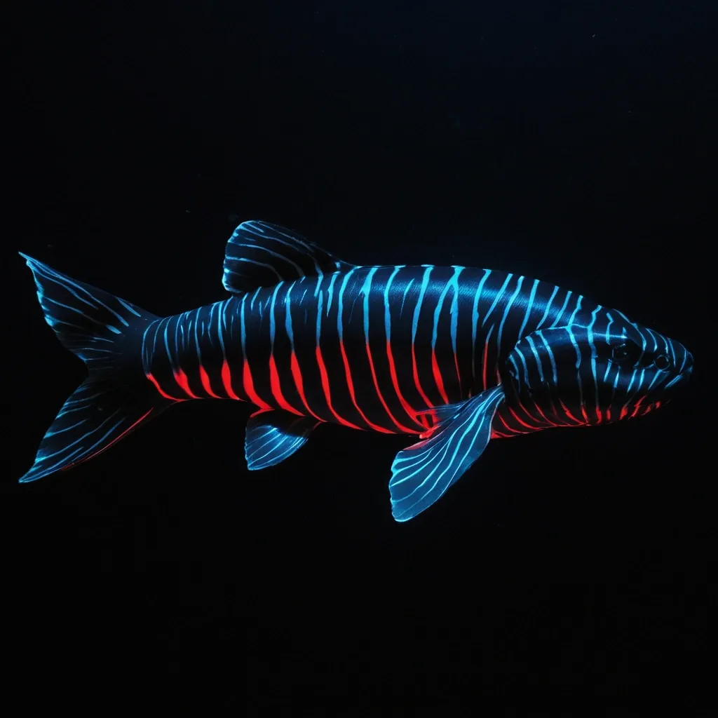
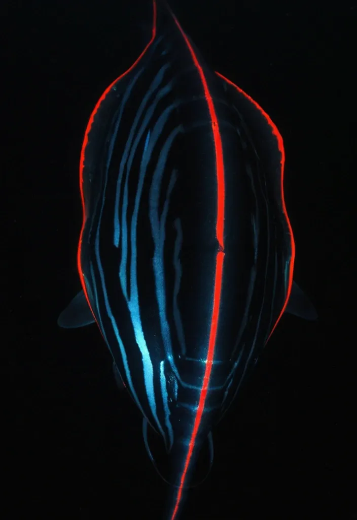
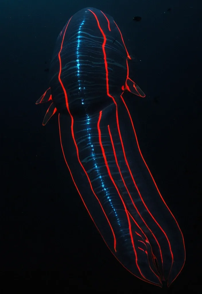
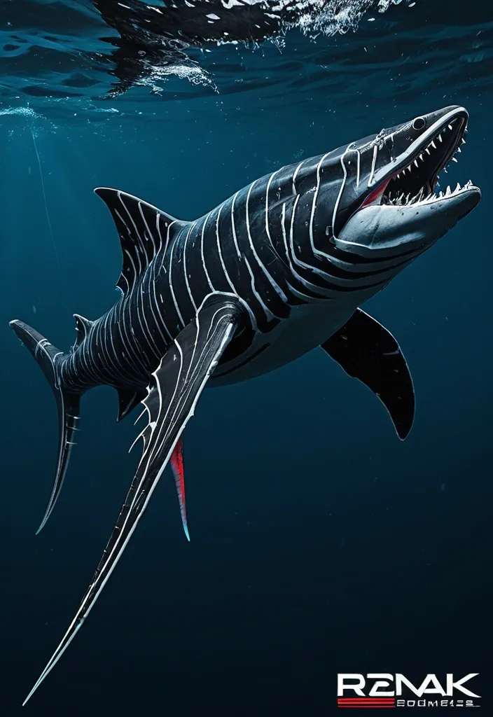
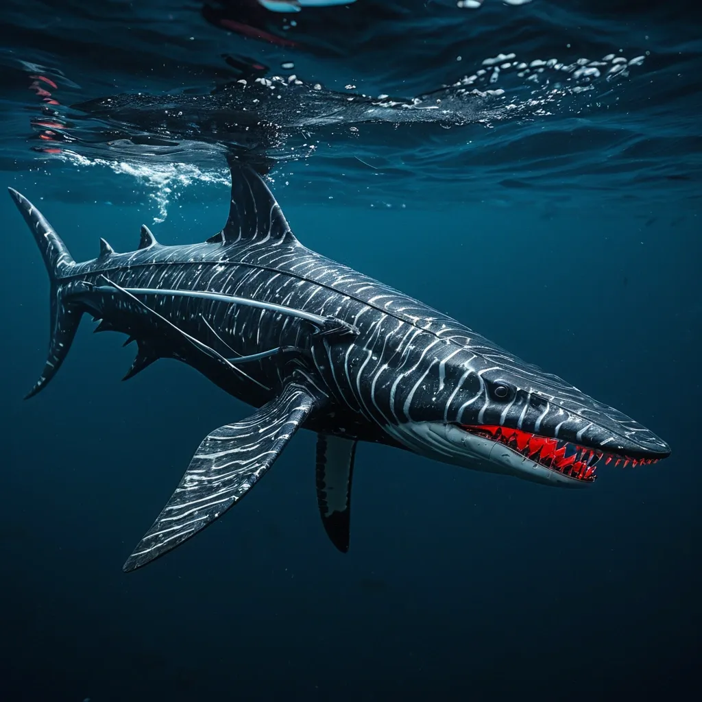
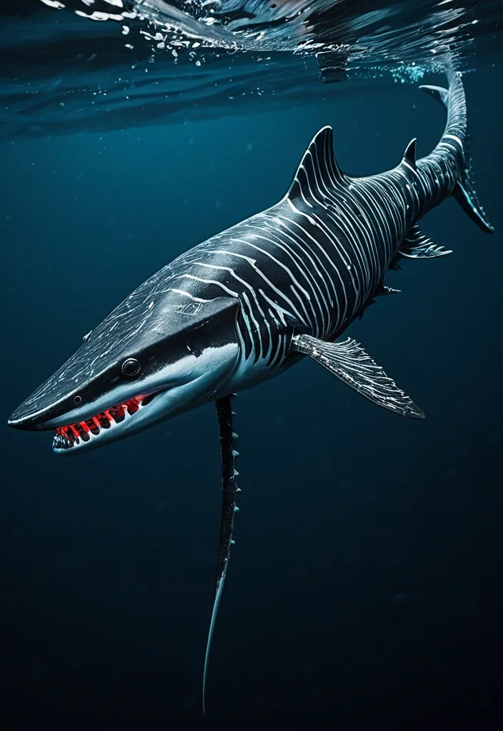
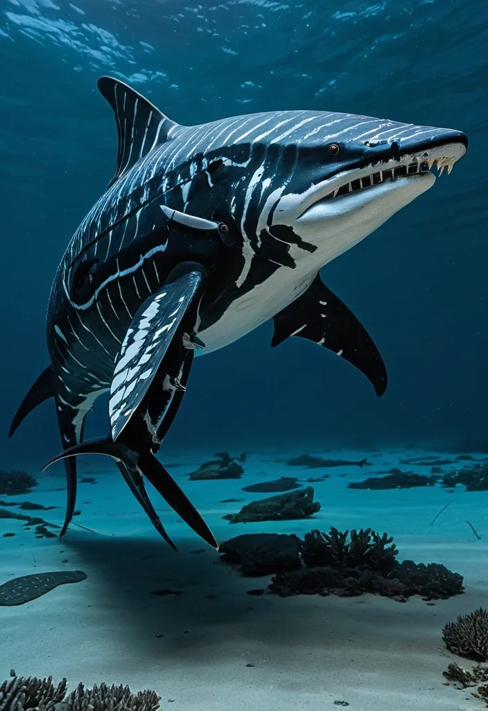
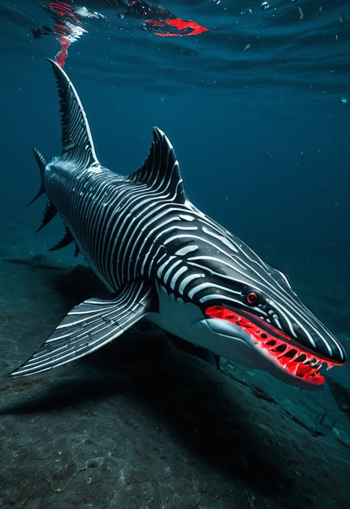
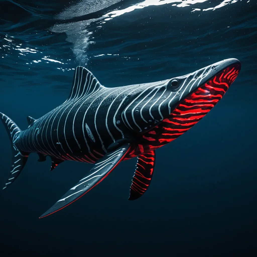
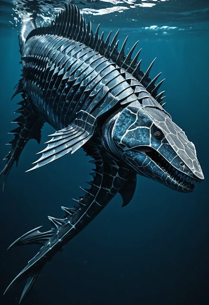
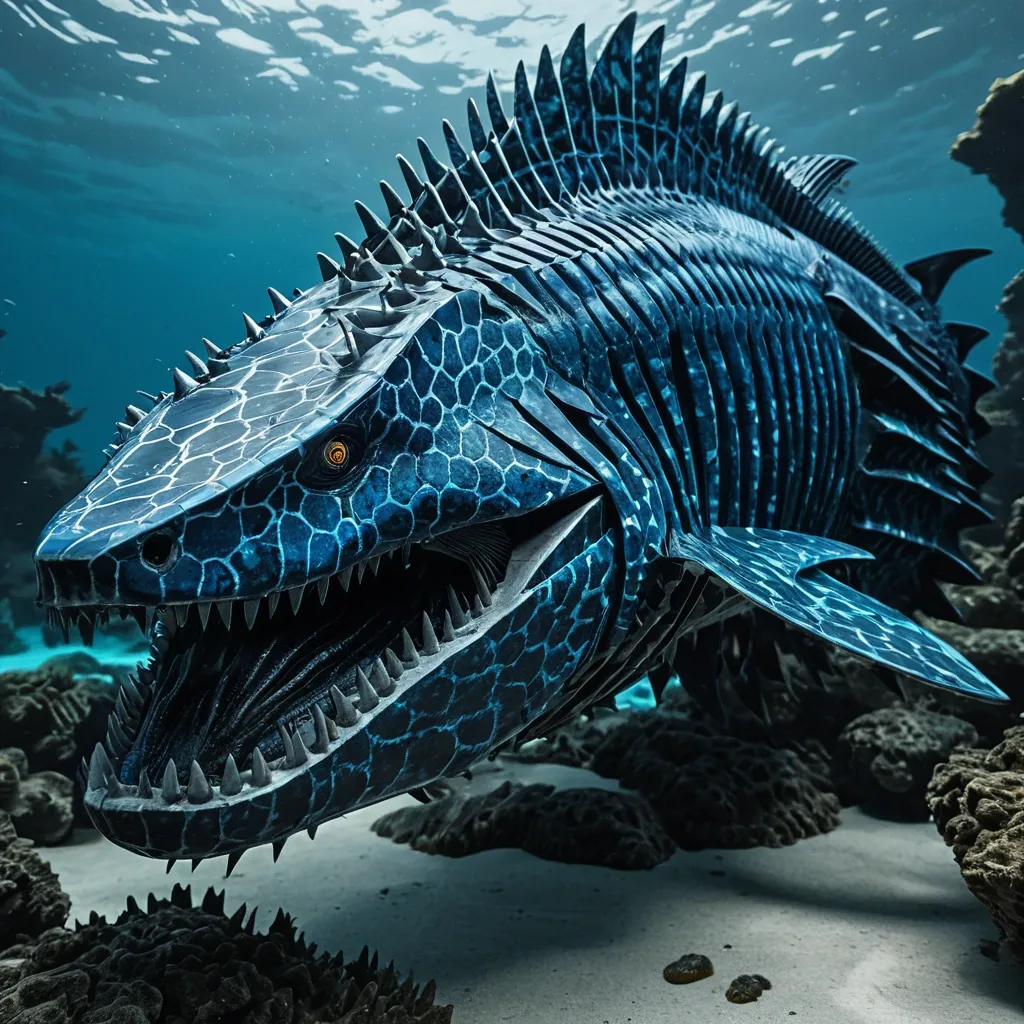
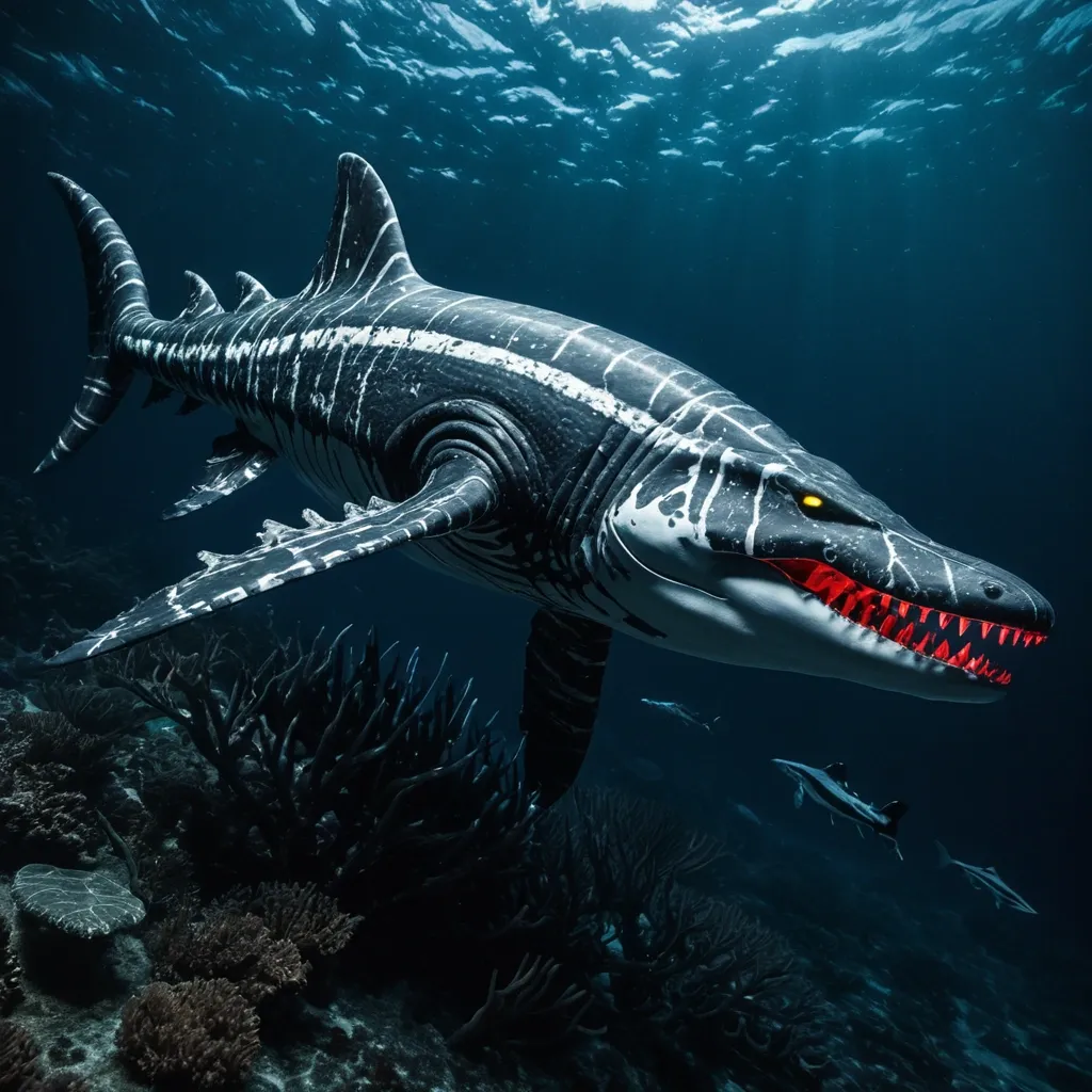
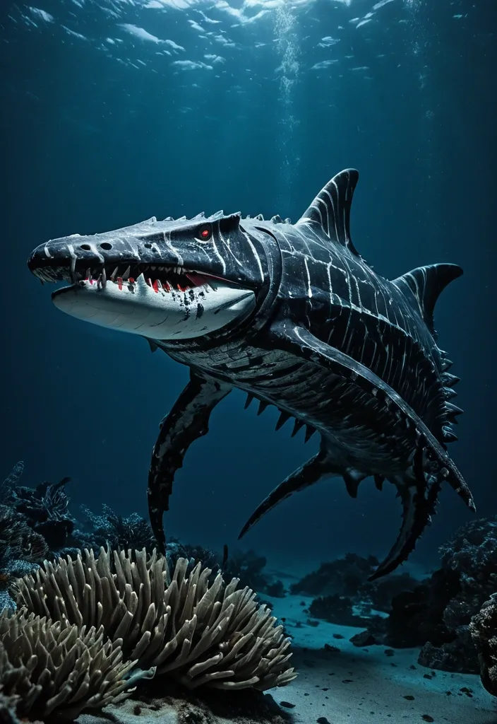
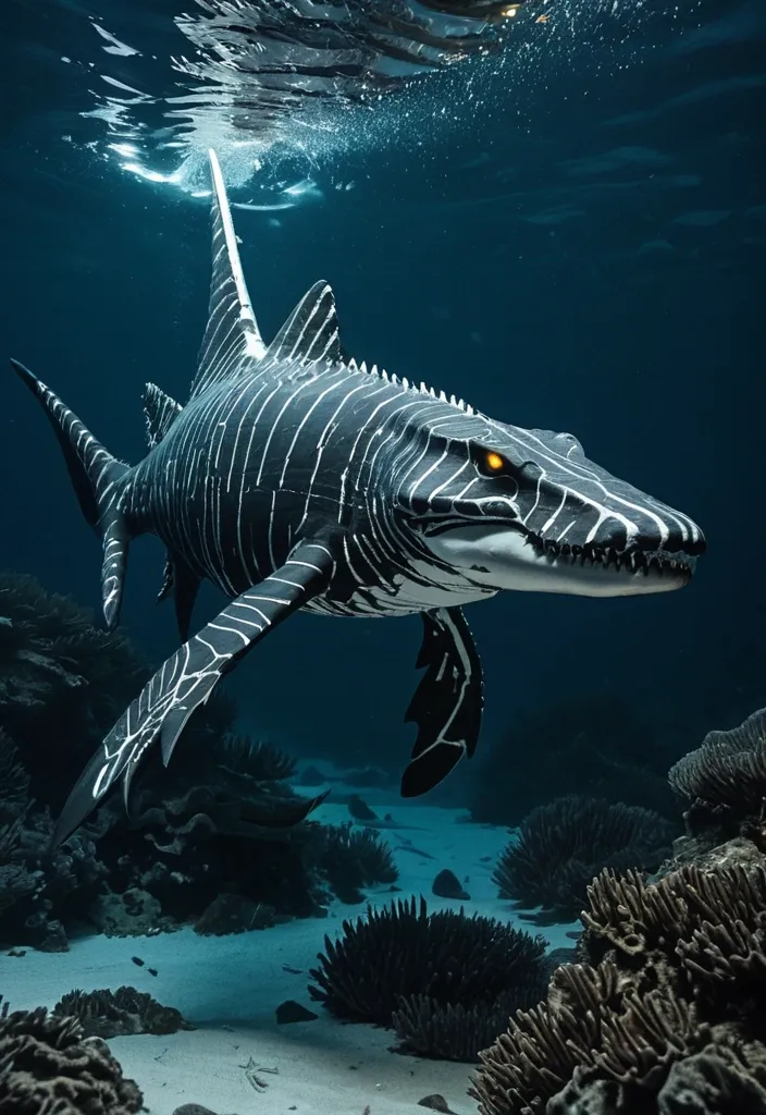
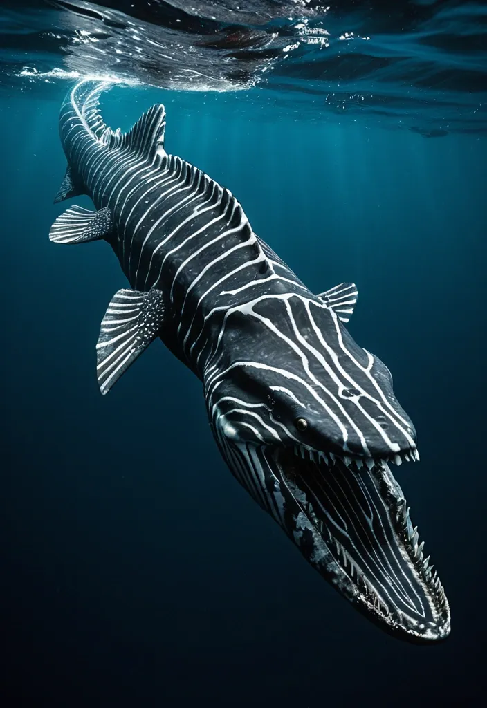
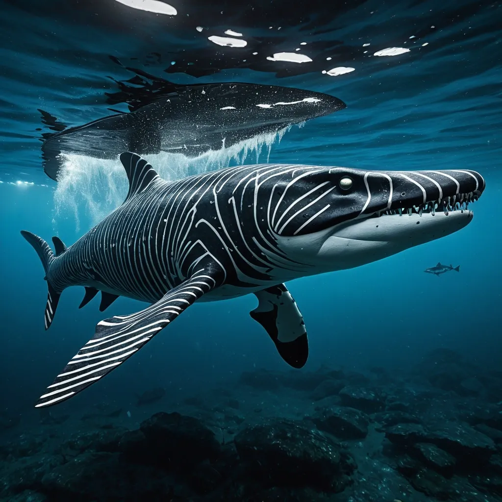
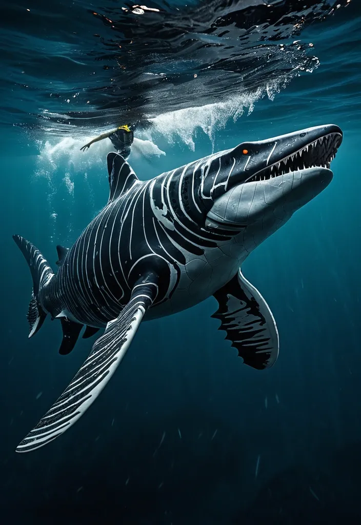
Megalosaurus Orca The Apex Hybrid of Oceanic Predation Physical Characteristics: Size & Weight: Between 40 to 60 feet in length , weighing 50 to 75 tons. Coloration: Males: Sleek black base with dark gray tiger stripes accented by subtle red bioluminescent highlights along the stripes , glowing faintly in deep ocean darkness. Females: Larger and more robust with black base and light gray tiger stripes , also featuring red bioluminescent patterns that pulse rhythmically. Body Structure: Hydrodynamic , muscular body combining the streamlined agility of the Shortfin Mako and Black Marlin with the robust power of Predator X and Megalodon. Rigid pectoral fins adapted from Black Marlin , capable of tilting back to reduce drag at high speeds. The tailend is a powerful fluke for propulsion , inspired by Mosasaurus Hoffmannii and Orca anatomy. Thick , overlapping bony scales similar to Arapaima , providing a durable armor that flexes with movement. Limbs: Powerful large flippers adapted for scooting or sliding on land , coated with mucus inspired by the Atlantic hagfish for moisture retention and defense. Capable of limited terrestrial movement , allowing brief excursions out of water. Head & Jaw: Massive jaws with over 40 , 000 PSI bite force , blending Predator X’s mighty jaw strength with the long canine teeth and powerful bite of the Leopard Seal. Flexible skull allowing swallowing of large prey whole. Respiration: Dual respiratory system with both functional lungs and gills , enabling survival from surface to abyssal depths (500 to 9 , 800 feet). Bioluminescence: Red bioluminescent photophores patterned in tiger stripes , used for communication , intimidation , mating displays , and luring prey in the dark ocean depths. Abilities & Traits: Speed & Agility: Capable of bursts up to 82 mph , rivaling the fastest sea creatures like the Black Marlin. Agile hunter using stealth and passive listening , mimicking Transient Killer Whale hunting strategies. Social Structure: Small family groups of three (one male , two females) designed for efficient reproduction and hunting. Males are more streamlined and shorter , optimized for speed and power; females are larger , robust , and agile for endurance and nurturing. Regeneration: Remarkable limb regeneration inspired by axolotl and Crown-of-Thorns starfish , able to regrow lost fins , limbs , and even parts of internal organs. Defense: Venomous spines derived from Crown-of-Thorns starfish line its dorsal ridge , delivering painful venomous wounds to attackers. Mucus coating for defense and moisture retention , also making it slippery and difficult to grasp. Healing: A blubber-like layer similar to dolphins provides insulation , buoyancy , and antimicrobial properties that accelerate healing of wounds. Communication: Uses low-frequency growls , barks , and hisses inspired by saltwater crocodile sounds , combined with bioluminescent signals and stealth vocalizations for hunting. Reproduction: Live births occur at extreme depths (up to 9 , 800 feet) , with offspring adapted to survive in crushing pressures and cold temperatures. ,
Megalosaurus Orca The Apex Hybrid of Oceanic Predation Physical Characteristics: Size & Weight: Between 40 to 60 feet in length , weighing 50 to 75 tons. Coloration: Males: Sleek black base with dark gray tiger stripes accented by subtle red bioluminescent highlights along the stripes , glowing faintly in deep ocean darkness. Females: Larger and more robust with black base and light gray tiger stripes , also featuring red bioluminescent patterns that pulse rhythmically. Body Structure: Hydrodynamic , muscular body combining the streamlined agility of the Shortfin Mako and Black Marlin with the robust power of Predator X and Megalodon. Rigid pectoral fins adapted from Black Marlin , capable of tilting back to reduce drag at high speeds. The tailend is a powerful fluke for propulsion , inspired by Mosasaurus Hoffmannii and Orca anatomy. Thick , overlapping bony scales similar to Arapaima , providing a durable armor that flexes with movement. Limbs: Powerful large flippers adapted for scooting or sliding on land , coated with mucus inspired by the Atlantic hagfish for moisture retention and defense. Capable of limited terrestrial movement , allowing brief excursions out of water. Head & Jaw: Massive jaws with over 40 , 000 PSI bite force , blending Predator X’s mighty jaw strength with the long canine teeth and powerful bite of the Leopard Seal. Flexible skull allowing swallowing of large prey whole. Respiration: Dual respiratory system with both functional lungs and gills , enabling survival from surface to abyssal depths (500 to 9 , 800 feet). Bioluminescence: Red bioluminescent photophores patterned in tiger stripes , used for communication , intimidation , mating displays , and luring prey in the dark ocean depths. Abilities & Traits: Speed & Agility: Capable of bursts up to 82 mph , rivaling the fastest sea creatures like the Black Marlin. Agile hunter using stealth and passive listening , mimicking Transient Killer Whale hunting strategies. Social Structure: Small family groups of three (one male , two females) designed for efficient reproduction and hunting. Males are more streamlined and shorter , optimized for speed and power; females are larger , robust , and agile for endurance and nurturing. Regeneration: Remarkable limb regeneration inspired by axolotl and Crown-of-Thorns starfish , able to regrow lost fins , limbs , and even parts of internal organs. Defense: Venomous spines derived from Crown-of-Thorns starfish line its dorsal ridge , delivering painful venomous wounds to attackers. Mucus coating for defense and moisture retention , also making it slippery and difficult to grasp. Healing: A blubber-like layer similar to dolphins provides insulation , buoyancy , and antimicrobial properties that accelerate healing of wounds. Communication: Uses low-frequency growls , barks , and hisses inspired by saltwater crocodile sounds , combined with bioluminescent signals and stealth vocalizations for hunting. Reproduction: Live births occur at extreme depths (up to 9 , 800 feet) , with offspring adapted to survive in crushing pressures and cold temperatures. ,
Megalosaurus Orca The Apex Hybrid of Oceanic Predation Physical Characteristics: Size & Weight: Between 40 to 60 feet in length , weighing 50 to 75 tons. Coloration: Males: Sleek black base with dark gray tiger stripes accented by subtle red bioluminescent highlights along the stripes , glowing faintly in deep ocean darkness. Females: Larger and more robust with black base and light gray tiger stripes , also featuring red bioluminescent patterns that pulse rhythmically. Body Structure: Hydrodynamic , muscular body combining the streamlined agility of the Shortfin Mako and Black Marlin with the robust power of Predator X and Megalodon. Rigid pectoral fins adapted from Black Marlin , capable of tilting back to reduce drag at high speeds. The tailend is a powerful fluke for propulsion , inspired by Mosasaurus Hoffmannii and Orca anatomy. Thick , overlapping bony scales similar to Arapaima , providing a durable armor that flexes with movement. Limbs: Powerful large flippers adapted for scooting or sliding on land , coated with mucus inspired by the Atlantic hagfish for moisture retention and defense. Capable of limited terrestrial movement , allowing brief excursions out of water. Head & Jaw: Massive jaws with over 40 , 000 PSI bite force , blending Predator X’s mighty jaw strength with the long canine teeth and powerful bite of the Leopard Seal. Flexible skull allowing swallowing of large prey whole. Respiration: Dual respiratory system with both functional lungs and gills , enabling survival from surface to abyssal depths (500 to 9 , 800 feet). Bioluminescence: Red bioluminescent photophores patterned in tiger stripes , used for communication , intimidation , mating displays , and luring prey in the dark ocean depths. Abilities & Traits: Speed & Agility: Capable of bursts up to 82 mph , rivaling the fastest sea creatures like the Black Marlin. Agile hunter using stealth and passive listening , mimicking Transient Killer Whale hunting strategies. Social Structure: Small family groups of three (one male , two females) designed for efficient reproduction and hunting. Males are more streamlined and shorter , optimized for speed and power; females are larger , robust , and agile for endurance and nurturing. Regeneration: Remarkable limb regeneration inspired by axolotl and Crown-of-Thorns starfish , able to regrow lost fins , limbs , and even parts of internal organs. Defense: Venomous spines derived from Crown-of-Thorns starfish line its dorsal ridge , delivering painful venomous wounds to attackers. Mucus coating for defense and moisture retention , also making it slippery and difficult to grasp. Healing: A blubber-like layer similar to dolphins provides insulation , buoyancy , and antimicrobial properties that accelerate healing of wounds. Communication: Uses low-frequency growls , barks , and hisses inspired by saltwater crocodile sounds , combined with bioluminescent signals and stealth vocalizations for hunting. Reproduction: Live births occur at extreme depths (up to 9 , 800 feet) , with offspring adapted to survive in crushing pressures and cold temperatures. ,
Megalosaurus Orca The Apex Hybrid of Oceanic Predation Physical Characteristics: Size & Weight: Between 40 to 60 feet in length , weighing 50 to 75 tons. Coloration: Males: Sleek black base with dark gray tiger stripes accented by subtle red bioluminescent highlights along the stripes , glowing faintly in deep ocean darkness. Females: Larger and more robust with black base and light gray tiger stripes , also featuring red bioluminescent patterns that pulse rhythmically. Body Structure: Hydrodynamic , muscular body combining the streamlined agility of the Shortfin Mako and Black Marlin with the robust power of Predator X and Megalodon. Rigid pectoral fins adapted from Black Marlin , capable of tilting back to reduce drag at high speeds. The tailend is a powerful fluke for propulsion , inspired by Mosasaurus Hoffmannii and Orca anatomy. Thick , overlapping bony scales similar to Arapaima , providing a durable armor that flexes with movement. Limbs: Powerful large flippers adapted for scooting or sliding on land , coated with mucus inspired by the Atlantic hagfish for moisture retention and defense. Capable of limited terrestrial movement , allowing brief excursions out of water. Head & Jaw: Massive jaws with over 40 , 000 PSI bite force , blending Predator X’s mighty jaw strength with the long canine teeth and powerful bite of the Leopard Seal. Flexible skull allowing swallowing of large prey whole. Respiration: Dual respiratory system with both functional lungs and gills , enabling survival from surface to abyssal depths (500 to 9 , 800 feet). Bioluminescence: Red bioluminescent photophores patterned in tiger stripes , used for communication , intimidation , mating displays , and luring prey in the dark ocean depths. Abilities & Traits: Speed & Agility: Capable of bursts up to 82 mph , rivaling the fastest sea creatures like the Black Marlin. Agile hunter using stealth and passive listening , mimicking Transient Killer Whale hunting strategies. Social Structure: Small family groups of three (one male , two females) designed for efficient reproduction and hunting. Males are more streamlined and shorter , optimized for speed and power; females are larger , robust , and agile for endurance and nurturing. Regeneration: Remarkable limb regeneration inspired by axolotl and Crown-of-Thorns starfish , able to regrow lost fins , limbs , and even parts of internal organs. Defense: Venomous spines derived from Crown-of-Thorns starfish line its dorsal ridge , delivering painful venomous wounds to attackers. Mucus coating for defense and moisture retention , also making it slippery and difficult to grasp. Healing: A blubber-like layer similar to dolphins provides insulation , buoyancy , and antimicrobial properties that accelerate healing of wounds. Communication: Uses low-frequency growls , barks , and hisses inspired by saltwater crocodile sounds , combined with bioluminescent signals and stealth vocalizations for hunting. Reproduction: Live births occur at extreme depths (up to 9 , 800 feet) , with offspring adapted to survive in crushing pressures and cold temperatures. ,
Megalosaurus Orca The Apex Hybrid of Oceanic Predation Physical Characteristics: Size & Weight: Between 40 to 60 feet in length , weighing 50 to 75 tons. Coloration: Males: Sleek black base with dark gray tiger stripes accented by subtle red bioluminescent highlights along the stripes , glowing faintly in deep ocean darkness. Females: Larger and more robust with black base and light gray tiger stripes , also featuring red bioluminescent patterns that pulse rhythmically. Body Structure: Hydrodynamic , muscular body combining the streamlined agility of the Shortfin Mako and Black Marlin with the robust power of Predator X and Megalodon. Rigid pectoral fins adapted from Black Marlin , capable of tilting back to reduce drag at high speeds. The tailend is a powerful fluke for propulsion , inspired by Mosasaurus Hoffmannii and Orca anatomy. Thick , overlapping bony scales similar to Arapaima , providing a durable armor that flexes with movement. Limbs: Powerful large flippers adapted for scooting or sliding on land , coated with mucus inspired by the Atlantic hagfish for moisture retention and defense. Capable of limited terrestrial movement , allowing brief excursions out of water. Head & Jaw: Massive jaws with over 40 , 000 PSI bite force , blending Predator X’s mighty jaw strength with the long canine teeth and powerful bite of the Leopard Seal. Flexible skull allowing swallowing of large prey whole. Respiration: Dual respiratory system with both functional lungs and gills , enabling survival from surface to abyssal depths (500 to 9 , 800 feet). Bioluminescence: Red bioluminescent photophores patterned in tiger stripes , used for communication , intimidation , mating displays , and luring prey in the dark ocean depths. Abilities & Traits: Speed & Agility: Capable of bursts up to 82 mph , rivaling the fastest sea creatures like the Black Marlin. Agile hunter using stealth and passive listening , mimicking Transient Killer Whale hunting strategies. Social Structure: Small family groups of three (one male , two females) designed for efficient reproduction and hunting. Males are more streamlined and shorter , optimized for speed and power; females are larger , robust , and agile for endurance and nurturing. Regeneration: Remarkable limb regeneration inspired by axolotl and Crown-of-Thorns starfish , able to regrow lost fins , limbs , and even parts of internal organs. Defense: Venomous spines derived from Crown-of-Thorns starfish line its dorsal ridge , delivering painful venomous wounds to attackers. Mucus coating for defense and moisture retention , also making it slippery and difficult to grasp. Healing: A blubber-like layer similar to dolphins provides insulation , buoyancy , and antimicrobial properties that accelerate healing of wounds. Communication: Uses low-frequency growls , barks , and hisses inspired by saltwater crocodile sounds , combined with bioluminescent signals and stealth vocalizations for hunting. Reproduction: Live births occur at extreme depths (up to 9 , 800 feet) , with offspring adapted to survive in crushing pressures and cold temperatures. ,
Megalosaurus Orca The Apex Hybrid of Oceanic Predation Physical Characteristics: Size & Weight: Between 40 to 60 feet in length , weighing 50 to 75 tons. Coloration: Males: Sleek black base with dark gray tiger stripes accented by subtle red bioluminescent highlights along the stripes , glowing faintly in deep ocean darkness. Females: Larger and more robust with black base and light gray tiger stripes , also featuring red bioluminescent patterns that pulse rhythmically. Body Structure: Hydrodynamic , muscular body combining the streamlined agility of the Shortfin Mako and Black Marlin with the robust power of Predator X and Megalodon. Rigid pectoral fins adapted from Black Marlin , capable of tilting back to reduce drag at high speeds. The tailend is a powerful fluke for propulsion , inspired by Mosasaurus Hoffmannii and Orca anatomy. Thick , overlapping bony scales similar to Arapaima , providing a durable armor that flexes with movement. Limbs: Powerful large flippers adapted for scooting or sliding on land , coated with mucus inspired by the Atlantic hagfish for moisture retention and defense. Capable of limited terrestrial movement , allowing brief excursions out of water. Head & Jaw: Massive jaws with over 40 , 000 PSI bite force , blending Predator X’s mighty jaw strength with the long canine teeth and powerful bite of the Leopard Seal. Flexible skull allowing swallowing of large prey whole. Respiration: Dual respiratory system with both functional lungs and gills , enabling survival from surface to abyssal depths (500 to 9 , 800 feet). Bioluminescence: Red bioluminescent photophores patterned in tiger stripes , used for communication , intimidation , mating displays , and luring prey in the dark ocean depths. Abilities & Traits: Speed & Agility: Capable of bursts up to 82 mph , rivaling the fastest sea creatures like the Black Marlin. Agile hunter using stealth and passive listening , mimicking Transient Killer Whale hunting strategies. Social Structure: Small family groups of three (one male , two females) designed for efficient reproduction and hunting. Males are more streamlined and shorter , optimized for speed and power; females are larger , robust , and agile for endurance and nurturing. Regeneration: Remarkable limb regeneration inspired by axolotl and Crown-of-Thorns starfish , able to regrow lost fins , limbs , and even parts of internal organs. Defense: Venomous spines derived from Crown-of-Thorns starfish line its dorsal ridge , delivering painful venomous wounds to attackers. Mucus coating for defense and moisture retention , also making it slippery and difficult to grasp. Healing: A blubber-like layer similar to dolphins provides insulation , buoyancy , and antimicrobial properties that accelerate healing of wounds. Communication: Uses low-frequency growls , barks , and hisses inspired by saltwater crocodile sounds , combined with bioluminescent signals and stealth vocalizations for hunting. Reproduction: Live births occur at extreme depths (up to 9 , 800 feet) , with offspring adapted to survive in crushing pressures and cold temperatures. ,
Megalosaurus Orca The Apex Hybrid of Oceanic Predation Physical Characteristics: Size & Weight: Between 40 to 60 feet in length , weighing 50 to 75 tons. Coloration: Males: Sleek black base with dark gray tiger stripes accented by subtle red bioluminescent highlights along the stripes , glowing faintly in deep ocean darkness. Females: Larger and more robust with black base and light gray tiger stripes , also featuring red bioluminescent patterns that pulse rhythmically. Body Structure: Hydrodynamic , muscular body combining the streamlined agility of the Shortfin Mako and Black Marlin with the robust power of Predator X and Megalodon. Rigid pectoral fins adapted from Black Marlin , capable of tilting back to reduce drag at high speeds. The tailend is a powerful fluke for propulsion , inspired by Mosasaurus Hoffmannii and Orca anatomy. Thick , overlapping bony scales similar to Arapaima , providing a durable armor that flexes with movement. Limbs: Powerful large flippers adapted for scooting or sliding on land , coated with mucus inspired by the Atlantic hagfish for moisture retention and defense. Capable of limited terrestrial movement , allowing brief excursions out of water. Head & Jaw: Massive jaws with over 40 , 000 PSI bite force , blending Predator X’s mighty jaw strength with the long canine teeth and powerful bite of the Leopard Seal. Flexible skull allowing swallowing of large prey whole. Respiration: Dual respiratory system with both functional lungs and gills , enabling survival from surface to abyssal depths (500 to 9 , 800 feet). Bioluminescence: Red bioluminescent photophores patterned in tiger stripes , used for communication , intimidation , mating displays , and luring prey in the dark ocean depths. Abilities & Traits: Speed & Agility: Capable of bursts up to 82 mph , rivaling the fastest sea creatures like the Black Marlin. Agile hunter using stealth and passive listening , mimicking Transient Killer Whale hunting strategies. Social Structure: Small family groups of three (one male , two females) designed for efficient reproduction and hunting. Males are more streamlined and shorter , optimized for speed and power; females are larger , robust , and agile for endurance and nurturing. Regeneration: Remarkable limb regeneration inspired by axolotl and Crown-of-Thorns starfish , able to regrow lost fins , limbs , and even parts of internal organs. Defense: Venomous spines derived from Crown-of-Thorns starfish line its dorsal ridge , delivering painful venomous wounds to attackers. Mucus coating for defense and moisture retention , also making it slippery and difficult to grasp. Healing: A blubber-like layer similar to dolphins provides insulation , buoyancy , and antimicrobial properties that accelerate healing of wounds. Communication: Uses low-frequency growls , barks , and hisses inspired by saltwater crocodile sounds , combined with bioluminescent signals and stealth vocalizations for hunting. Reproduction: Live births occur at extreme depths (up to 9 , 800 feet) , with offspring adapted to survive in crushing pressures and cold temperatures. ,
Megalosaurus Orca The Apex Hybrid of Oceanic Predation Physical Characteristics: Size & Weight: Between 40 to 60 feet in length , weighing 50 to 75 tons. Coloration: Males: Sleek black base with dark gray tiger stripes accented by subtle red bioluminescent highlights along the stripes , glowing faintly in deep ocean darkness. Females: Larger and more robust with black base and light gray tiger stripes , also featuring red bioluminescent patterns that pulse rhythmically. Body Structure: Hydrodynamic , muscular body combining the streamlined agility of the Shortfin Mako and Black Marlin with the robust power of Predator X and Megalodon. Rigid pectoral fins adapted from Black Marlin , capable of tilting back to reduce drag at high speeds. The tailend is a powerful fluke for propulsion , inspired by Mosasaurus Hoffmannii and Orca anatomy. Thick , overlapping bony scales similar to Arapaima , providing a durable armor that flexes with movement. Limbs: Powerful large flippers adapted for scooting or sliding on land , coated with mucus inspired by the Atlantic hagfish for moisture retention and defense. Capable of limited terrestrial movement , allowing brief excursions out of water. Head & Jaw: Massive jaws with over 40 , 000 PSI bite force , blending Predator X’s mighty jaw strength with the long canine teeth and powerful bite of the Leopard Seal. Flexible skull allowing swallowing of large prey whole. Respiration: Dual respiratory system with both functional lungs and gills , enabling survival from surface to abyssal depths (500 to 9 , 800 feet). Bioluminescence: Red bioluminescent photophores patterned in tiger stripes , used for communication , intimidation , mating displays , and luring prey in the dark ocean depths. Abilities & Traits: Speed & Agility: Capable of bursts up to 82 mph , rivaling the fastest sea creatures like the Black Marlin. Agile hunter using stealth and passive listening , mimicking Transient Killer Whale hunting strategies. Social Structure: Small family groups of three (one male , two females) designed for efficient reproduction and hunting. Males are more streamlined and shorter , optimized for speed and power; females are larger , robust , and agile for endurance and nurturing. Regeneration: Remarkable limb regeneration inspired by axolotl and Crown-of-Thorns starfish , able to regrow lost fins , limbs , and even parts of internal organs. Defense: Venomous spines derived from Crown-of-Thorns starfish line its dorsal ridge , delivering painful venomous wounds to attackers. Mucus coating for defense and moisture retention , also making it slippery and difficult to grasp. Healing: A blubber-like layer similar to dolphins provides insulation , buoyancy , and antimicrobial properties that accelerate healing of wounds. Communication: Uses low-frequency growls , barks , and hisses inspired by saltwater crocodile sounds , combined with bioluminescent signals and stealth vocalizations for hunting. Reproduction: Live births occur at extreme depths (up to 9 , 800 feet) , with offspring adapted to survive in crushing pressures and cold temperatures. ,
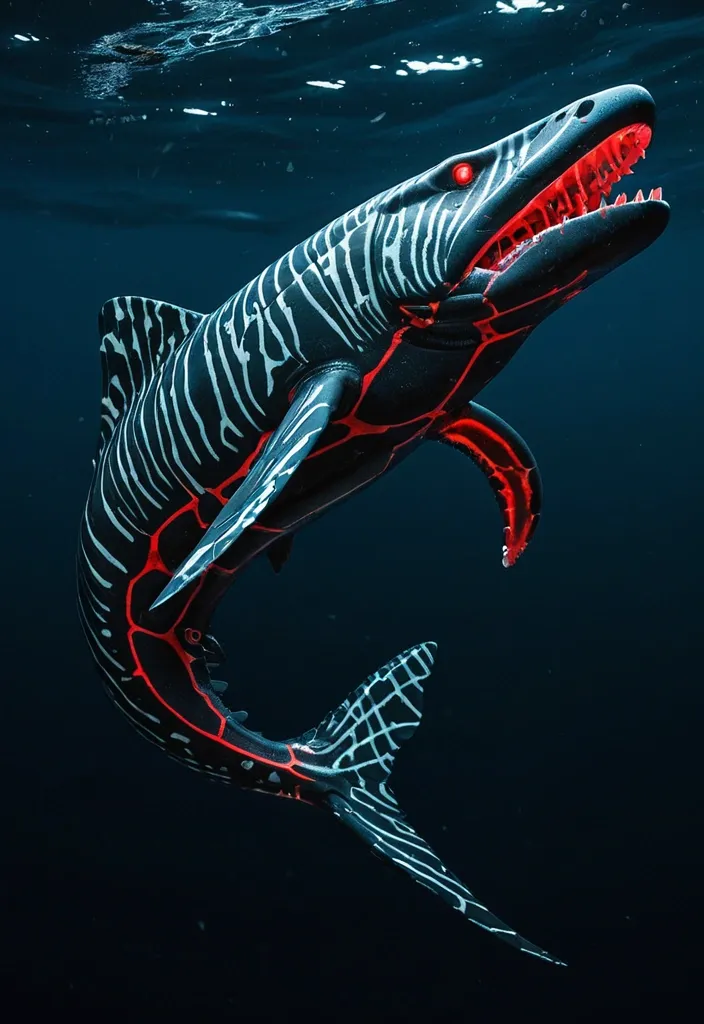
Orcinus Megalsaurus is a colossal marine hybrid stretching between 40 to 60 feet in length , weighing an imposing 50 to 75 tons. Its body is a streamlined fusion of powerful marine predators and ancient reptiles , designed for both speed and durability. Head & Jaws: Massive and robust jaws reminiscent of Mosasaurus Hoffmannii , lined with dozens of large , serrated teeth capable of slicing through the toughest prey. The jaw muscles are reinforced for crushing power , with an agile , flexible skull allowing it to swallow large creatures whole. Body: Covered in overlapping , bony , and tough Arapaima-inspired scales that provide formidable protection while maintaining flexibility for swift movement. The coloration is a gradient of deep oceanic blues and dark greys , with subtle mottled patterns for camouflage in deep waters. Spines & Armor: Sprouting venomous , long , sharp spines along its dorsal ridge , inspired by the Crown-of-Thorns starfish , these spines serve as both defense and offense , delivering painful , venomous wounds to predators or prey. Flippers & Tail: Enormous paddle-like front flippers derived from Archelon Ischyros , granting powerful swimming strokes. Its tail is flattened and ends in a strong fluke like the Mosasaurus , enabling bursts of speed up to 82 mph , matching the fastest sea animals. The tail's blubber and flexible musculature provide a springlike propulsion effect. Skin & Blubber: Beneath the scales lies a thick layer of dolphin-like blubber , providing insulation , buoyancy , and rapid healing properties. This blubber contains antimicrobial compounds that prevent infection from wounds and smooth the skin for hydrodynamic efficiency. Sensory & Communication: Equipped with the acute echolocation and vocalization abilities of Bigg’s Killer Whales , Orcinus Megalsaurus uses short-range , stealthy communication to coordinate ambush attacks. Its hearing and sonar are highly advanced , allowing it to detect prey at great distances. Mucus Secretion: When threatened , it can release a thick mucus cloud inspired by the Atlantic hagfish , confusing predators and protecting its skin from abrasion and parasites. Locomotion on Land: Although primarily aquatic , it can scoot or slide on land for short distances , using its powerful flippers akin to a leopard seal , allowing it to traverse beaches or shallow coasts. Regeneration: Thanks to the axolotl gene integration , Orcinus Megalsaurus can regenerate lost limbs , spines , and even parts of its internal organs , making it extraordinarily resilient. Abilities: Speed & Agility: Capable of reaching speeds of 45 to 82 mph in short bursts , making it one of the fastest marine predators ever. Its rigid pectoral fins can be tilted back like a black marlin to reduce drag during high-speed chases. Venomous Defense: Venomous spines deter attackers and can incapacitate prey or enemies with painful wounds. Stealth & Teamwork: Utilizes orca-like stealth and coordinated hunting tactics , ambushing prey with precision and communication that avoids detection. Healing & Immunity: Blubber layer accelerates wound healing and provides antimicrobial defense , ensuring survival from injuries sustained during hunts or fights. Mucus Defense: Can deploy mucus clouds to escape or confuse predators and parasites. Environmental Adaptability: Tolerates a wide range of salinity , from freshwater estuaries to deep oceanic waters , allowing it to exploit diverse hunting grounds. ,
Orcinus Megalsaurus is a colossal marine hybrid stretching between 40 to 60 feet in length , weighing an imposing 50 to 75 tons. Its body is a streamlined fusion of powerful marine predators and ancient reptiles , designed for both speed and durability. Head & Jaws: Massive and robust jaws reminiscent of Mosasaurus Hoffmannii , lined with dozens of large , serrated teeth capable of slicing through the toughest prey. The jaw muscles are reinforced for crushing power , with an agile , flexible skull allowing it to swallow large creatures whole. Body: Covered in overlapping , bony , and tough Arapaima-inspired scales that provide formidable protection while maintaining flexibility for swift movement. The coloration is a gradient of deep oceanic blues and dark greys , with subtle mottled patterns for camouflage in deep waters. Spines & Armor: Sprouting venomous , long , sharp spines along its dorsal ridge , inspired by the Crown-of-Thorns starfish , these spines serve as both defense and offense , delivering painful , venomous wounds to predators or prey. Flippers & Tail: Enormous paddle-like front flippers derived from Archelon Ischyros , granting powerful swimming strokes. Its tail is flattened and ends in a strong fluke like the Mosasaurus , enabling bursts of speed up to 82 mph , matching the fastest sea animals. The tail's blubber and flexible musculature provide a springlike propulsion effect. Skin & Blubber: Beneath the scales lies a thick layer of dolphin-like blubber , providing insulation , buoyancy , and rapid healing properties. This blubber contains antimicrobial compounds that prevent infection from wounds and smooth the skin for hydrodynamic efficiency. Sensory & Communication: Equipped with the acute echolocation and vocalization abilities of Bigg’s Killer Whales , Orcinus Megalsaurus uses short-range , stealthy communication to coordinate ambush attacks. Its hearing and sonar are highly advanced , allowing it to detect prey at great distances. Mucus Secretion: When threatened , it can release a thick mucus cloud inspired by the Atlantic hagfish , confusing predators and protecting its skin from abrasion and parasites. Locomotion on Land: Although primarily aquatic , it can scoot or slide on land for short distances , using its powerful flippers akin to a leopard seal , allowing it to traverse beaches or shallow coasts. Regeneration: Thanks to the axolotl gene integration , Orcinus Megalsaurus can regenerate lost limbs , spines , and even parts of its internal organs , making it extraordinarily resilient. Abilities: Speed & Agility: Capable of reaching speeds of 45 to 82 mph in short bursts , making it one of the fastest marine predators ever. Its rigid pectoral fins can be tilted back like a black marlin to reduce drag during high-speed chases. Venomous Defense: Venomous spines deter attackers and can incapacitate prey or enemies with painful wounds. Stealth & Teamwork: Utilizes orca-like stealth and coordinated hunting tactics , ambushing prey with precision and communication that avoids detection. Healing & Immunity: Blubber layer accelerates wound healing and provides antimicrobial defense , ensuring survival from injuries sustained during hunts or fights. Mucus Defense: Can deploy mucus clouds to escape or confuse predators and parasites. Environmental Adaptability: Tolerates a wide range of salinity , from freshwater estuaries to deep oceanic waters , allowing it to exploit diverse hunting grounds. ,
Physical Characteristics: Size & Weight: Between 40 to 60 feet in length , weighing 50 to 75 tons. Coloration: Males: Sleek black base with dark gray tiger stripes accented by subtle red bioluminescent highlights along the stripes , glowing faintly in deep ocean darkness. Females: Larger and more robust with black base and light gray tiger stripes , also featuring red bioluminescent patterns that pulse rhythmically. Body Structure: Hydrodynamic , muscular body combining the streamlined agility of the Shortfin Mako and Black Marlin with the robust power of Predator X and Megalodon. Rigid pectoral fins adapted from Black Marlin , capable of tilting back to reduce drag at high speeds. The tailend is a powerful fluke for propulsion , inspired by Mosasaurus Hoffmannii and Orca anatomy. Thick , overlapping bony scales similar to Arapaima , providing a durable armor that flexes with movement. Limbs: Powerful large flippers adapted for scooting or sliding on land , coated with mucus inspired by the Atlantic hagfish for moisture retention and defense. Capable of limited terrestrial movement , allowing brief excursions out of water. Head & Jaw: Massive jaws with over 40 , 000 PSI bite force , blending Predator X’s mighty jaw strength with the long canine teeth and powerful bite of the Leopard Seal. Flexible skull allowing swallowing of large prey whole. Respiration: Dual respiratory system with both functional lungs and gills , enabling survival from surface to abyssal depths (500 to 9 , 800 feet). Bioluminescence: Red bioluminescent photophores patterned in tiger stripes , used for communication , intimidation , mating displays , and luring prey in the dark ocean depths. Abilities & Traits: Speed & Agility: Capable of bursts up to 82 mph , rivaling the fastest sea creatures like the Black Marlin. Agile hunter using stealth and passive listening , mimicking Transient Killer Whale hunting strategies. Social Structure: Small family groups of three (one male , two females) designed for efficient reproduction and hunting. Males are more streamlined and shorter , optimized for speed and power; females are larger , robust , and agile for endurance and nurturing. Regeneration: Remarkable limb regeneration inspired by axolotl and Crown-of-Thorns starfish , able to regrow lost fins , limbs , and even parts of internal organs. Defense: Venomous spines derived from Crown-of-Thorns starfish line its dorsal ridge , delivering painful venomous wounds to attackers. Mucus coating for defense and moisture retention , also making it slippery and difficult to grasp. Healing: A blubber-like layer similar to dolphins provides insulation , buoyancy , and antimicrobial properties that accelerate healing of wounds. Communication: Uses low-frequency growls , barks , and hisses inspired by saltwater crocodile sounds , combined with bioluminescent signals and stealth vocalizations for hunting. Reproduction: Live births occur at extreme depths (up to 9 , 800 feet) , with offspring adapted to survive in crushing pressures and cold temperatures. Backstory: Created by the Ceno Evail Crossgen Corporation , the Megalosaurus Orca was engineered to dominate marine ecosystems and serve as a living testament to the pinnacle of hybrid dinosaur biotechnology. Designed to combine the raw power of ancient sea predators like Predator X and Megalodon with the intelligence , social hunting , and adaptability of modern marine mammals and fish , this hybrid thrives in the dark , cold depths of the ocean where few predators dare to venture. Their unique physiology allows them to traverse both deep ocean trenches and brief terrestrial environments , making them versatile apex predators. The three known individuals—one male and two females—form a tight-knit family unit , hunting elusive marine mammals and large fish with stealth and precision. Their bioluminescent stripes not only intimidate rivals but also help coordinate complex hunting maneuvers in pitch-black waters. With a lifespan of 100 to 135 years , they are long-lived titans of the sea , their legacy intertwined with the future of marine genetic engineering and the mysteries of oceanic evolution. , ,
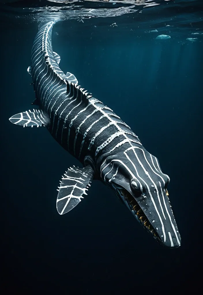
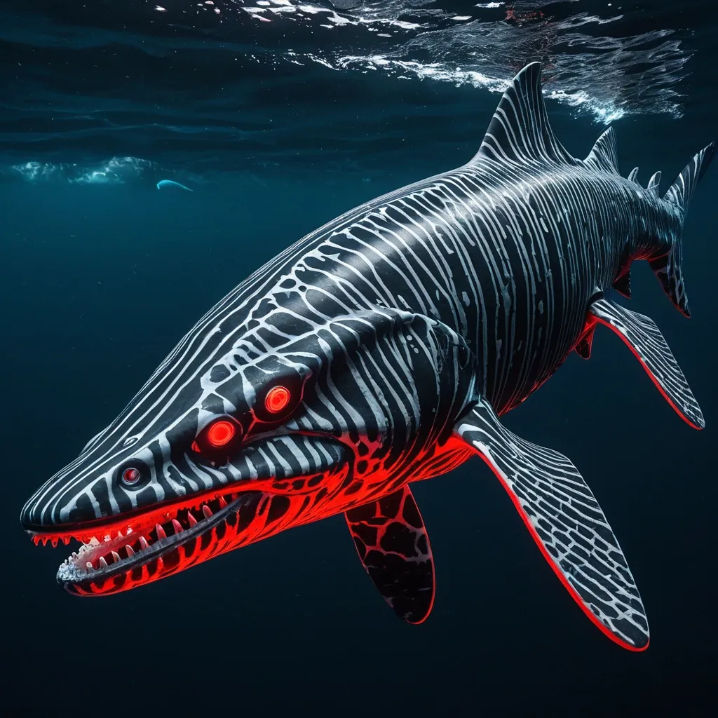
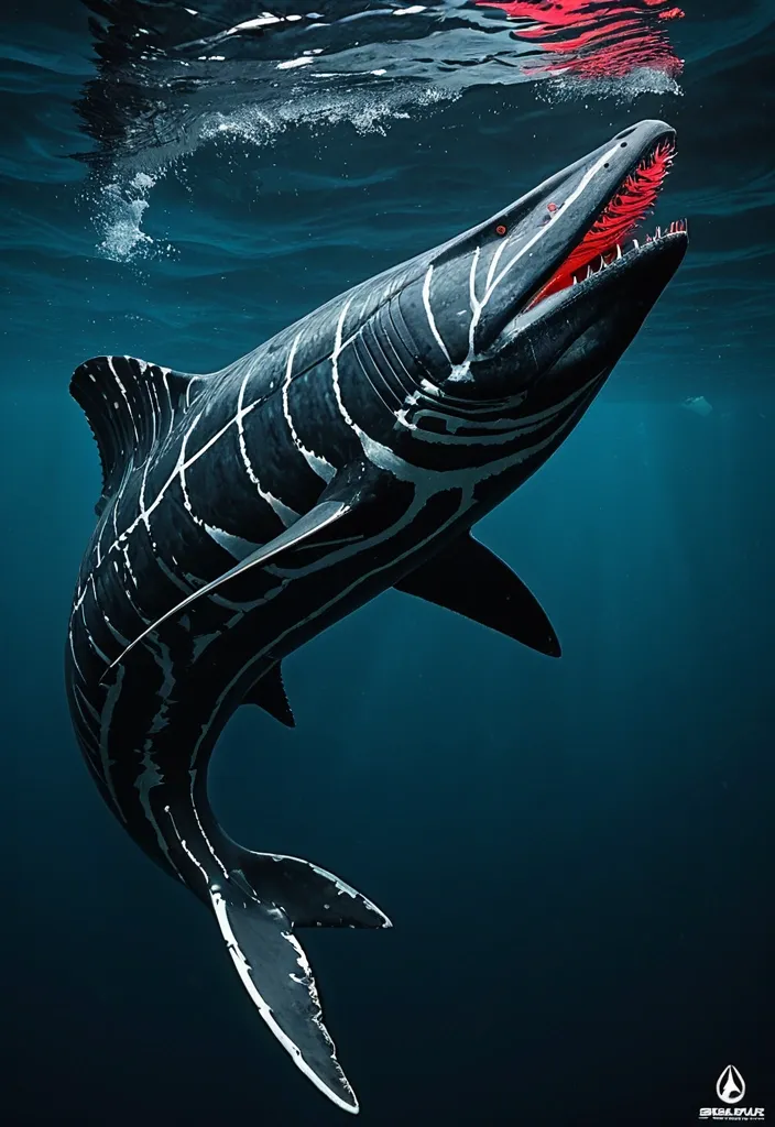
Megalosaurus Orca The Apex Hybrid of Oceanic Depths Physical Characteristics: Length: 40-60 feet Weight: 50-75 tons Lifespan: 100-135 years Coloration: Males: Jet black base with light gray tiger stripes Females: Slate gray base with white tiger stripes Bioluminescent red photophores arranged in tiger stripe patterns along the flanks and dorsal ridge , glowing vividly in abyssal darkness Body: Robust , muscular frame combining the thick , armored scales of saltwater crocodile with the hydrodynamic , flexible body of Mosasaurus Hoffmannii Fins: Large , rigid pectoral fins capable of tilting backward to reduce drag , inspired by the Black Marlin’s speed adaptations Limbs: Powerful flippers adapted for both swimming and short-distance land movement , similar to a leopard seal’s scooting style Jaw: Enormous , reinforced jaws with over 40 , 000+ PSI bite force , lined with long , razor-sharp canine teeth from Predator X and Megalodon genetics Skin: Coated with a thick mucus layer secreted like the Atlantic hagfish , providing parasite defense , moisture retention , and a slippery surface to evade predators and prey alike Respiratory system: Dual-function lungs and gills allow breathing in surface air and extracting oxygen from water , enabling survival from ocean surface to depths up to 9 , 800 feet Sensory: Passive listening capabilities from transient killer whale lineage enable near-silent hunting; bioluminescent photophores aid in communication and prey attraction in deep-sea darkness Abilities and Adaptations: Speed: Can burst up to 62-82 mph in water , rivaling the fastest sea creatures Salinity tolerance: Thrives in a wide range of water conditions , from freshwater estuaries to deep oceanic trenches , thanks to Mexican molly and saltwater crocodile genetics Regeneration: Limb and tissue regeneration inspired by axolotl traits , allowing recovery from injuries sustained during hunting or territorial battles Social structure: Lives in small , tight-knit family groups (1 male , 2 females) for efficient hunting and offspring rearing , reflecting transient killer whale social dynamics Reproduction: Live births occur at abyssal depths (~9 , 800 feet) , with offspring born adapted to extreme pressure and cold; males are streamlined for speed and power , while females are larger and more robust for nurturing and endurance Communication: Uses bioluminescent patterns and low-frequency vocalizations for mating displays , intimidation , and coordination during hunting Defense: Venomous spines inspired by the crown-of-thorns starfish line the dorsal ridge , delivering painful wounds to predators or rivals Hunting: Stealthy predator using passive listening to locate marine mammals and large prey; can leap and strike with explosive power , aided by shortfin mako shark agility and predator X bite force Backstory: Created in the secretive labs of Ceno Evail Crossgen Corporation , the Megalosaurus Orca was engineered as the ultimate marine apex predator , combining the might of prehistoric giants with the cunning and adaptability of modern ocean hunters. Designed to dominate a range of aquatic environments from sunlit coasts to the crushing abyss , these hybrids serve both as a scientific marvel and a living weapon for deep-sea exploration and control. The trio—one male and two females—are monitored closely , their social bonds and hunting strategies studied to unlock secrets of marine dominance and survival. Their ability to navigate and thrive across extreme depths , combined with their regenerative powers and venomous defenses , make them nearly invincible in their domain. ,
Megalosaurus Orca The Apex Hybrid of Oceanic Depths Physical Characteristics: Length: 40-60 feet Weight: 50-75 tons Lifespan: 100-135 years Coloration: Males: Jet black base with light gray tiger stripes Females: Slate gray base with white tiger stripes Bioluminescent red photophores arranged in tiger stripe patterns along the flanks and dorsal ridge , glowing vividly in abyssal darkness Body: Robust , muscular frame combining the thick , armored scales of saltwater crocodile with the hydrodynamic , flexible body of Mosasaurus Hoffmannii Fins: Large , rigid pectoral fins capable of tilting backward to reduce drag , inspired by the Black Marlin’s speed adaptations Limbs: Powerful flippers adapted for both swimming and short-distance land movement , similar to a leopard seal’s scooting style Jaw: Enormous , reinforced jaws with over 40 , 000+ PSI bite force , lined with long , razor-sharp canine teeth from Predator X and Megalodon genetics Skin: Coated with a thick mucus layer secreted like the Atlantic hagfish , providing parasite defense , moisture retention , and a slippery surface to evade predators and prey alike Respiratory system: Dual-function lungs and gills allow breathing in surface air and extracting oxygen from water , enabling survival from ocean surface to depths up to 9 , 800 feet Sensory: Passive listening capabilities from transient killer whale lineage enable near-silent hunting; bioluminescent photophores aid in communication and prey attraction in deep-sea darkness Abilities and Adaptations: Speed: Can burst up to 62-82 mph in water , rivaling the fastest sea creatures Salinity tolerance: Thrives in a wide range of water conditions , from freshwater estuaries to deep oceanic trenches , thanks to Mexican molly and saltwater crocodile genetics Regeneration: Limb and tissue regeneration inspired by axolotl traits , allowing recovery from injuries sustained during hunting or territorial battles Social structure: Lives in small , tight-knit family groups (1 male , 2 females) for efficient hunting and offspring rearing , reflecting transient killer whale social dynamics Reproduction: Live births occur at abyssal depths (~9 , 800 feet) , with offspring born adapted to extreme pressure and cold; males are streamlined for speed and power , while females are larger and more robust for nurturing and endurance Communication: Uses bioluminescent patterns and low-frequency vocalizations for mating displays , intimidation , and coordination during hunting Defense: Venomous spines inspired by the crown-of-thorns starfish line the dorsal ridge , delivering painful wounds to predators or rivals Hunting: Stealthy predator using passive listening to locate marine mammals and large prey; can leap and strike with explosive power , aided by shortfin mako shark agility and predator X bite force Backstory: Created in the secretive labs of Ceno Evail Crossgen Corporation , the Megalosaurus Orca was engineered as the ultimate marine apex predator , combining the might of prehistoric giants with the cunning and adaptability of modern ocean hunters. Designed to dominate a range of aquatic environments from sunlit coasts to the crushing abyss , these hybrids serve both as a scientific marvel and a living weapon for deep-sea exploration and control. The trio—one male and two females—are monitored closely , their social bonds and hunting strategies studied to unlock secrets of marine dominance and survival. Their ability to navigate and thrive across extreme depths , combined with their regenerative powers and venomous defenses , make them nearly invincible in their domain. ,
Megalosaurus Orca The Apex Hybrid of Oceanic Depths Physical Characteristics: Length: 40-60 feet Weight: 50-75 tons Lifespan: 100-135 years Coloration: Males: Jet black base with light gray tiger stripes Females: Slate gray base with white tiger stripes Bioluminescent red photophores arranged in tiger stripe patterns along the flanks and dorsal ridge , glowing vividly in abyssal darkness Body: Robust , muscular frame combining the thick , armored scales of saltwater crocodile with the hydrodynamic , flexible body of Mosasaurus Hoffmannii Fins: Large , rigid pectoral fins capable of tilting backward to reduce drag , inspired by the Black Marlin’s speed adaptations Limbs: Powerful flippers adapted for both swimming and short-distance land movement , similar to a leopard seal’s scooting style Jaw: Enormous , reinforced jaws with over 40 , 000+ PSI bite force , lined with long , razor-sharp canine teeth from Predator X and Megalodon genetics Skin: Coated with a thick mucus layer secreted like the Atlantic hagfish , providing parasite defense , moisture retention , and a slippery surface to evade predators and prey alike Respiratory system: Dual-function lungs and gills allow breathing in surface air and extracting oxygen from water , enabling survival from ocean surface to depths up to 9 , 800 feet Sensory: Passive listening capabilities from transient killer whale lineage enable near-silent hunting; bioluminescent photophores aid in communication and prey attraction in deep-sea darkness Abilities and Adaptations: Speed: Can burst up to 62-82 mph in water , rivaling the fastest sea creatures Salinity tolerance: Thrives in a wide range of water conditions , from freshwater estuaries to deep oceanic trenches , thanks to Mexican molly and saltwater crocodile genetics Regeneration: Limb and tissue regeneration inspired by axolotl traits , allowing recovery from injuries sustained during hunting or territorial battles Social structure: Lives in small , tight-knit family groups (1 male , 2 females) for efficient hunting and offspring rearing , reflecting transient killer whale social dynamics Reproduction: Live births occur at abyssal depths (~9 , 800 feet) , with offspring born adapted to extreme pressure and cold; males are streamlined for speed and power , while females are larger and more robust for nurturing and endurance Communication: Uses bioluminescent patterns and low-frequency vocalizations for mating displays , intimidation , and coordination during hunting Defense: Venomous spines inspired by the crown-of-thorns starfish line the dorsal ridge , delivering painful wounds to predators or rivals Hunting: Stealthy predator using passive listening to locate marine mammals and large prey; can leap and strike with explosive power , aided by shortfin mako shark agility and predator X bite force Backstory: Created in the secretive labs of Ceno Evail Crossgen Corporation , the Megalosaurus Orca was engineered as the ultimate marine apex predator , combining the might of prehistoric giants with the cunning and adaptability of modern ocean hunters. Designed to dominate a range of aquatic environments from sunlit coasts to the crushing abyss , these hybrids serve both as a scientific marvel and a living weapon for deep-sea exploration and control. The trio—one male and two females—are monitored closely , their social bonds and hunting strategies studied to unlock secrets of marine dominance and survival. Their ability to navigate and thrive across extreme depths , combined with their regenerative powers and venomous defenses , make them nearly invincible in their domain. ,
Megalosaurus Orca The Apex Hybrid of Oceanic Depths Physical Characteristics: Length: 40-60 feet Weight: 50-75 tons Lifespan: 100-135 years Coloration: Males: Jet black base with light gray tiger stripes Females: Slate gray base with white tiger stripes Bioluminescent red photophores arranged in tiger stripe patterns along the flanks and dorsal ridge , glowing vividly in abyssal darkness Body: Robust , muscular frame combining the thick , armored scales of saltwater crocodile with the hydrodynamic , flexible body of Mosasaurus Hoffmannii Fins: Large , rigid pectoral fins capable of tilting backward to reduce drag , inspired by the Black Marlin’s speed adaptations Limbs: Powerful flippers adapted for both swimming and short-distance land movement , similar to a leopard seal’s scooting style Jaw: Enormous , reinforced jaws with over 40 , 000+ PSI bite force , lined with long , razor-sharp canine teeth from Predator X and Megalodon genetics Skin: Coated with a thick mucus layer secreted like the Atlantic hagfish , providing parasite defense , moisture retention , and a slippery surface to evade predators and prey alike Respiratory system: Dual-function lungs and gills allow breathing in surface air and extracting oxygen from water , enabling survival from ocean surface to depths up to 9 , 800 feet Sensory: Passive listening capabilities from transient killer whale lineage enable near-silent hunting; bioluminescent photophores aid in communication and prey attraction in deep-sea darkness Abilities and Adaptations: Speed: Can burst up to 62-82 mph in water , rivaling the fastest sea creatures Salinity tolerance: Thrives in a wide range of water conditions , from freshwater estuaries to deep oceanic trenches , thanks to Mexican molly and saltwater crocodile genetics Regeneration: Limb and tissue regeneration inspired by axolotl traits , allowing recovery from injuries sustained during hunting or territorial battles Social structure: Lives in small , tight-knit family groups (1 male , 2 females) for efficient hunting and offspring rearing , reflecting transient killer whale social dynamics Reproduction: Live births occur at abyssal depths (~9 , 800 feet) , with offspring born adapted to extreme pressure and cold; males are streamlined for speed and power , while females are larger and more robust for nurturing and endurance Communication: Uses bioluminescent patterns and low-frequency vocalizations for mating displays , intimidation , and coordination during hunting Defense: Venomous spines inspired by the crown-of-thorns starfish line the dorsal ridge , delivering painful wounds to predators or rivals Hunting: Stealthy predator using passive listening to locate marine mammals and large prey; can leap and strike with explosive power , aided by shortfin mako shark agility and predator X bite force Backstory: Created in the secretive labs of Ceno Evail Crossgen Corporation , the Megalosaurus Orca was engineered as the ultimate marine apex predator , combining the might of prehistoric giants with the cunning and adaptability of modern ocean hunters. Designed to dominate a range of aquatic environments from sunlit coasts to the crushing abyss , these hybrids serve both as a scientific marvel and a living weapon for deep-sea exploration and control. The trio—one male and two females—are monitored closely , their social bonds and hunting strategies studied to unlock secrets of marine dominance and survival. Their ability to navigate and thrive across extreme depths , combined with their regenerative powers and venomous defenses , make them nearly invincible in their domain. ,
Megalosaurus Orca The Apex Hybrid of Oceanic Depths Physical Characteristics: Length: 40-60 feet Weight: 50-75 tons Lifespan: 100-135 years Coloration: Males: Jet black base with light gray tiger stripes Females: Slate gray base with white tiger stripes Bioluminescent red photophores arranged in tiger stripe patterns along the flanks and dorsal ridge , glowing vividly in abyssal darkness Body: Robust , muscular frame combining the thick , armored scales of saltwater crocodile with the hydrodynamic , flexible body of Mosasaurus Hoffmannii Fins: Large , rigid pectoral fins capable of tilting backward to reduce drag , inspired by the Black Marlin’s speed adaptations Limbs: Powerful flippers adapted for both swimming and short-distance land movement , similar to a leopard seal’s scooting style Jaw: Enormous , reinforced jaws with over 40 , 000+ PSI bite force , lined with long , razor-sharp canine teeth from Predator X and Megalodon genetics Skin: Coated with a thick mucus layer secreted like the Atlantic hagfish , providing parasite defense , moisture retention , and a slippery surface to evade predators and prey alike Respiratory system: Dual-function lungs and gills allow breathing in surface air and extracting oxygen from water , enabling survival from ocean surface to depths up to 9 , 800 feet Sensory: Passive listening capabilities from transient killer whale lineage enable near-silent hunting; bioluminescent photophores aid in communication and prey attraction in deep-sea darkness Abilities and Adaptations: Speed: Can burst up to 62-82 mph in water , rivaling the fastest sea creatures Salinity tolerance: Thrives in a wide range of water conditions , from freshwater estuaries to deep oceanic trenches , thanks to Mexican molly and saltwater crocodile genetics Regeneration: Limb and tissue regeneration inspired by axolotl traits , allowing recovery from injuries sustained during hunting or territorial battles Social structure: Lives in small , tight-knit family groups (1 male , 2 females) for efficient hunting and offspring rearing , reflecting transient killer whale social dynamics Reproduction: Live births occur at abyssal depths (~9 , 800 feet) , with offspring born adapted to extreme pressure and cold; males are streamlined for speed and power , while females are larger and more robust for nurturing and endurance Communication: Uses bioluminescent patterns and low-frequency vocalizations for mating displays , intimidation , and coordination during hunting Defense: Venomous spines inspired by the crown-of-thorns starfish line the dorsal ridge , delivering painful wounds to predators or rivals Hunting: Stealthy predator using passive listening to locate marine mammals and large prey; can leap and strike with explosive power , aided by shortfin mako shark agility and predator X bite force Backstory: Created in the secretive labs of Ceno Evail Crossgen Corporation , the Megalosaurus Orca was engineered as the ultimate marine apex predator , combining the might of prehistoric giants with the cunning and adaptability of modern ocean hunters. Designed to dominate a range of aquatic environments from sunlit coasts to the crushing abyss , these hybrids serve both as a scientific marvel and a living weapon for deep-sea exploration and control. The trio—one male and two females—are monitored closely , their social bonds and hunting strategies studied to unlock secrets of marine dominance and survival. Their ability to navigate and thrive across extreme depths , combined with their regenerative powers and venomous defenses , make them nearly invincible in their domain. ,
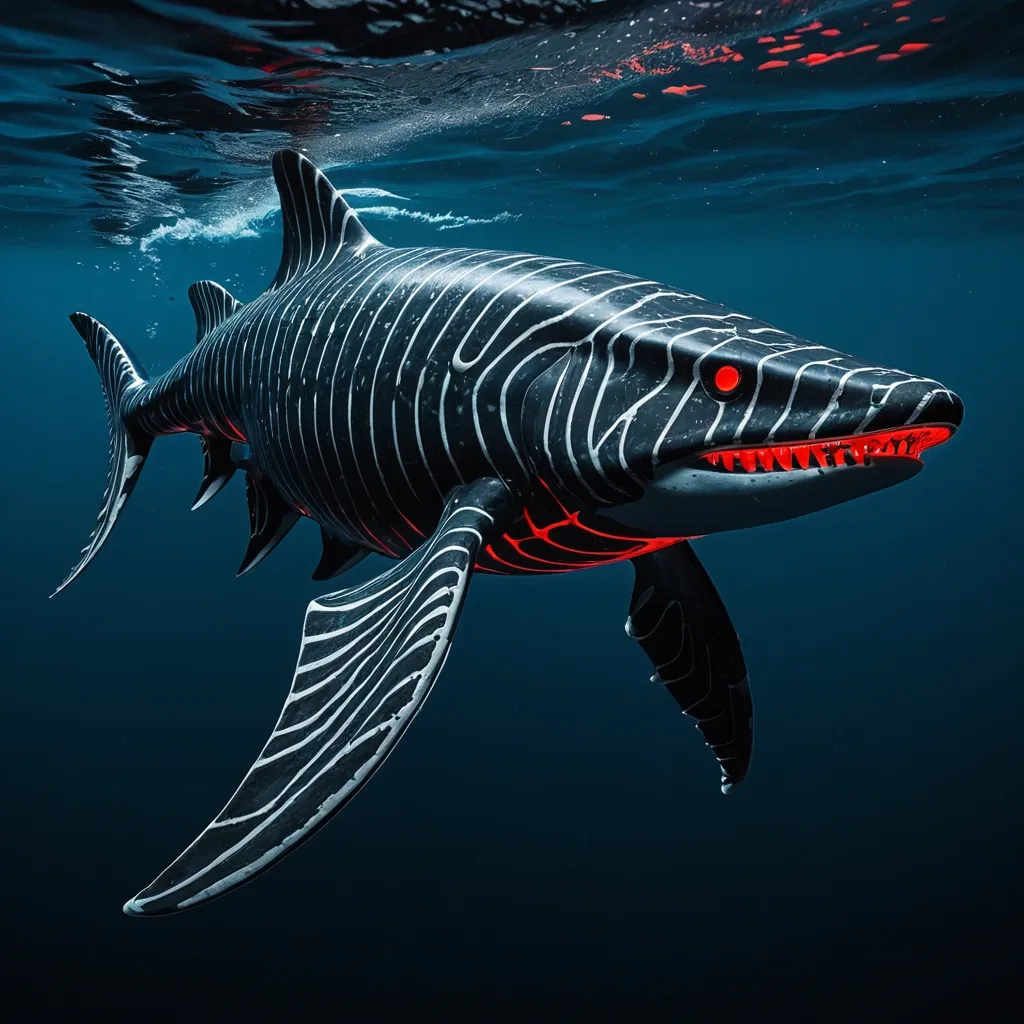
The Megalosaurus Orca is a colossal marine hybrid dinosaur , measuring between 40 to 60 feet in length and weighing an astonishing 50 to 75 tons. Its body combines the robust , thick musculature and mighty jaw strength of Predator X and Megalodon with the sleek hydrodynamics and agility of the Mosasaurus Hoffmannii and transient killer whale. The creature’s skin is armored with large , overlapping bony scales inspired by the Arapaima , offering both flexibility and formidable protection against predators and environmental hazards. Its coloration is sexually dimorphic: males boast a deep black base coat adorned with light gray tiger stripes , while females display a gray base with stark white tiger stripes. Both sexes feature vivid red bioluminescent photophores arranged in tiger stripe patterns along their flanks and dorsal fins , used for communication , intimidation , mating displays , and luring prey in the abyssal darkness. The Megalosaurus Orca’s rigid pectoral fins can tilt back to reduce drag during high-speed pursuits , enabling bursts of speed up to 82 mph , rivaling the Black Marlin and shortfin mako shark. Powerful flippers , inspired by the leopard seal , allow it to scoot or slide short distances on land , useful for navigating beaches and shallow coasts. Its head features powerful jaws lined with dozens of large , long canine teeth capable of delivering over 40 , 000 PSI bite force , capable of crushing almost anything in its path. The skull is flexible , allowing it to swallow large prey whole. Crown-of-Thorns starfish-like venomous spines stud its dorsal ridge , serving as a defensive mechanism against attackers , and it can regenerate lost spines and limbs rapidly , a gift from its axolotl heritage. Abilities: Dual Respiratory System: Equipped with both functional lungs and gills , it can breathe underwater and survive brief excursions on land , as well as thrive at depths from 500 to 9 , 800 feet. Mucus Defense: Inspired by the Atlantic hagfish , it secretes a thick mucus layer that deters parasites and predators while retaining moisture during surface rests or land visits. Blubber Insulation: A thick layer of blubber provides thermal insulation , antimicrobial protection , and aids in rapid healing of wounds. The blubber’s varying stiffness across the body creates a springlike swimming motion , enhancing speed and agility. Stealth Hunting: Utilizing the transient killer whale’s passive listening abilities and silent movement , it stalks marine mammals and large prey with deadly precision , avoiding echolocation to remain undetected. Bioluminescent Communication: Red photophores allow complex signaling in the dark ocean depths for social interaction , mating , and intimidation. Salinity Tolerance: Can thrive in a wide range of salinity levels , from freshwater estuaries to the deep ocean , thanks to genetic traits from Mexican molly and saltwater crocodile. Reproductive Strategy: Live births occur in crushing-pressure depths up to 9 , 800 feet. Offspring are born adapted to extreme cold and pressure. The social group consists of a male and two females , balancing speed/power and endurance/nurturing roles. Behavior and Social Structure: Megalosaurus Orca travel in small , tight-knit family units of three , mirroring the transient killer whale’s social structure. The male leads high-speed hunts , using brute force and stealth , while females provide endurance and care for offspring. They communicate through low growls , barks , and the flashing of their bioluminescent stripes. Backstory: Created by the Ceno Evail Crossgen Corporation , the Megalosaurus Orca was engineered as the ultimate marine apex predator and survivor , blending the most fearsome traits of prehistoric and modern oceanic hunters. Designed to dominate both shallow and abyssal waters , it represents a pinnacle of genetic engineering with a lifespan reaching up to 135 years. Its creation was part of a secret project to explore deep-sea resource harvesting and marine ecosystem control , but its intelligence and adaptability have made it a subject of fascination and caution among researchers. ,
The Megalosaurus Orca is a colossal marine hybrid dinosaur , measuring between 40 to 60 feet in length and weighing an astonishing 50 to 75 tons. Its body combines the robust , thick musculature and mighty jaw strength of Predator X and Megalodon with the sleek hydrodynamics and agility of the Mosasaurus Hoffmannii and transient killer whale. The creature’s skin is armored with large , overlapping bony scales inspired by the Arapaima , offering both flexibility and formidable protection against predators and environmental hazards. Its coloration is sexually dimorphic: males boast a deep black base coat adorned with light gray tiger stripes , while females display a gray base with stark white tiger stripes. Both sexes feature vivid red bioluminescent photophores arranged in tiger stripe patterns along their flanks and dorsal fins , used for communication , intimidation , mating displays , and luring prey in the abyssal darkness. The Megalosaurus Orca’s rigid pectoral fins can tilt back to reduce drag during high-speed pursuits , enabling bursts of speed up to 82 mph , rivaling the Black Marlin and shortfin mako shark. Powerful flippers , inspired by the leopard seal , allow it to scoot or slide short distances on land , useful for navigating beaches and shallow coasts. Its head features powerful jaws lined with dozens of large , long canine teeth capable of delivering over 40 , 000 PSI bite force , capable of crushing almost anything in its path. The skull is flexible , allowing it to swallow large prey whole. Crown-of-Thorns starfish-like venomous spines stud its dorsal ridge , serving as a defensive mechanism against attackers , and it can regenerate lost spines and limbs rapidly , a gift from its axolotl heritage. Abilities: Dual Respiratory System: Equipped with both functional lungs and gills , it can breathe underwater and survive brief excursions on land , as well as thrive at depths from 500 to 9 , 800 feet. Mucus Defense: Inspired by the Atlantic hagfish , it secretes a thick mucus layer that deters parasites and predators while retaining moisture during surface rests or land visits. Blubber Insulation: A thick layer of blubber provides thermal insulation , antimicrobial protection , and aids in rapid healing of wounds. The blubber’s varying stiffness across the body creates a springlike swimming motion , enhancing speed and agility. Stealth Hunting: Utilizing the transient killer whale’s passive listening abilities and silent movement , it stalks marine mammals and large prey with deadly precision , avoiding echolocation to remain undetected. Bioluminescent Communication: Red photophores allow complex signaling in the dark ocean depths for social interaction , mating , and intimidation. Salinity Tolerance: Can thrive in a wide range of salinity levels , from freshwater estuaries to the deep ocean , thanks to genetic traits from Mexican molly and saltwater crocodile. Reproductive Strategy: Live births occur in crushing-pressure depths up to 9 , 800 feet. Offspring are born adapted to extreme cold and pressure. The social group consists of a male and two females , balancing speed/power and endurance/nurturing roles. Behavior and Social Structure: Megalosaurus Orca travel in small , tight-knit family units of three , mirroring the transient killer whale’s social structure. The male leads high-speed hunts , using brute force and stealth , while females provide endurance and care for offspring. They communicate through low growls , barks , and the flashing of their bioluminescent stripes. Backstory: Created by the Ceno Evail Crossgen Corporation , the Megalosaurus Orca was engineered as the ultimate marine apex predator and survivor , blending the most fearsome traits of prehistoric and modern oceanic hunters. Designed to dominate both shallow and abyssal waters , it represents a pinnacle of genetic engineering with a lifespan reaching up to 135 years. Its creation was part of a secret project to explore deep-sea resource harvesting and marine ecosystem control , but its intelligence and adaptability have made it a subject of fascination and caution among researchers. ,
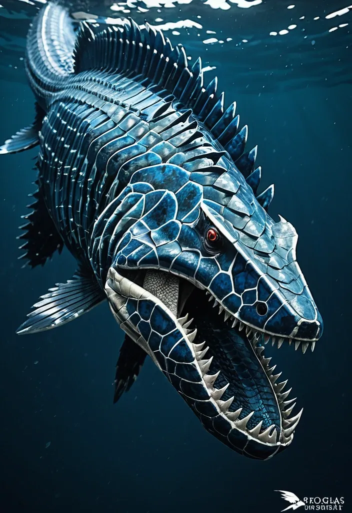
Orcinus Megalsaurus is a colossal marine hybrid stretching between 40 to 60 feet in length , weighing an imposing 50 to 75 tons. Its body is a streamlined fusion of powerful marine predators and ancient reptiles , designed for both speed and durability. Head & Jaws: Massive and robust jaws reminiscent of Mosasaurus Hoffmannii , lined with dozens of large , serrated teeth capable of slicing through the toughest prey. The jaw muscles are reinforced for crushing power , with an agile , flexible skull allowing it to swallow large creatures whole. Body: Covered in overlapping , bony , and tough Arapaima-inspired scales that provide formidable protection while maintaining flexibility for swift movement. The coloration is a gradient of deep oceanic blues and dark greys , with subtle mottled patterns for camouflage in deep waters. Spines & Armor: Sprouting venomous , long , sharp spines along its dorsal ridge , inspired by the Crown-of-Thorns starfish , these spines serve as both defense and offense , delivering painful , venomous wounds to predators or prey. Flippers & Tail: Enormous paddle-like front flippers derived from Archelon Ischyros , granting powerful swimming strokes. Its tail is flattened and ends in a strong fluke like the Mosasaurus , enabling bursts of speed up to 82 mph , matching the fastest sea animals. The tail's blubber and flexible musculature provide a springlike propulsion effect. Skin & Blubber: Beneath the scales lies a thick layer of dolphin-like blubber , providing insulation , buoyancy , and rapid healing properties. This blubber contains antimicrobial compounds that prevent infection from wounds and smooth the skin for hydrodynamic efficiency. Sensory & Communication: Equipped with the acute echolocation and vocalization abilities of Bigg’s Killer Whales , Orcinus Megalsaurus uses short-range , stealthy communication to coordinate ambush attacks. Its hearing and sonar are highly advanced , allowing it to detect prey at great distances. Mucus Secretion: When threatened , it can release a thick mucus cloud inspired by the Atlantic hagfish , confusing predators and protecting its skin from abrasion and parasites. Locomotion on Land: Although primarily aquatic , it can scoot or slide on land for short distances , using its powerful flippers akin to a leopard seal , allowing it to traverse beaches or shallow coasts. Regeneration: Thanks to the axolotl gene integration , Orcinus Megalsaurus can regenerate lost limbs , spines , and even parts of its internal organs , making it extraordinarily resilient. Abilities: Speed & Agility: Capable of reaching speeds of 45 to 82 mph in short bursts , making it one of the fastest marine predators ever. Its rigid pectoral fins can be tilted back like a black marlin to reduce drag during high-speed chases. Venomous Defense: Venomous spines deter attackers and can incapacitate prey or enemies with painful wounds. Stealth & Teamwork: Utilizes orca-like stealth and coordinated hunting tactics , ambushing prey with precision and communication that avoids detection. Healing & Immunity: Blubber layer accelerates wound healing and provides antimicrobial defense , ensuring survival from injuries sustained during hunts or fights. Mucus Defense: Can deploy mucus clouds to escape or confuse predators and parasites. Environmental Adaptability: Tolerates a wide range of salinity , from freshwater estuaries to deep oceanic waters , allowing it to exploit diverse hunting grounds. ,
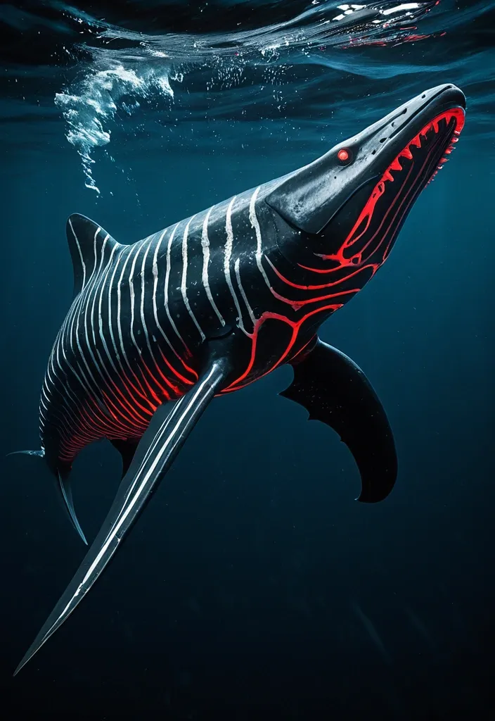
Physical Characteristics: Size & Weight: Between 40 to 60 feet in length , weighing 50 to 75 tons. Coloration: Males: Sleek black base with dark gray tiger stripes accented by subtle red bioluminescent highlights along the stripes , glowing faintly in deep ocean darkness. Females: Larger and more robust with black base and light gray tiger stripes , also featuring red bioluminescent patterns that pulse rhythmically. Body Structure: Hydrodynamic , muscular body combining the streamlined agility of the Shortfin Mako and Black Marlin with the robust power of Predator X and Megalodon. Rigid pectoral fins adapted from Black Marlin , capable of tilting back to reduce drag at high speeds. The tailend is a powerful fluke for propulsion , inspired by Mosasaurus Hoffmannii and Orca anatomy. Thick , overlapping bony scales similar to Arapaima , providing a durable armor that flexes with movement. Limbs: Powerful large flippers adapted for scooting or sliding on land , coated with mucus inspired by the Atlantic hagfish for moisture retention and defense. Capable of limited terrestrial movement , allowing brief excursions out of water. Head & Jaw: Massive jaws with over 40 , 000 PSI bite force , blending Predator X’s mighty jaw strength with the long canine teeth and powerful bite of the Leopard Seal. Flexible skull allowing swallowing of large prey whole. Respiration: Dual respiratory system with both functional lungs and gills , enabling survival from surface to abyssal depths (500 to 9 , 800 feet). Bioluminescence: Red bioluminescent photophores patterned in tiger stripes , used for communication , intimidation , mating displays , and luring prey in the dark ocean depths. Abilities & Traits: Speed & Agility: Capable of bursts up to 82 mph , rivaling the fastest sea creatures like the Black Marlin. Agile hunter using stealth and passive listening , mimicking Transient Killer Whale hunting strategies. Social Structure: Small family groups of three (one male , two females) designed for efficient reproduction and hunting. Males are more streamlined and shorter , optimized for speed and power; females are larger , robust , and agile for endurance and nurturing. Regeneration: Remarkable limb regeneration inspired by axolotl and Crown-of-Thorns starfish , able to regrow lost fins , limbs , and even parts of internal organs. Defense: Venomous spines derived from Crown-of-Thorns starfish line its dorsal ridge , delivering painful venomous wounds to attackers. Mucus coating for defense and moisture retention , also making it slippery and difficult to grasp. Healing: A blubber-like layer similar to dolphins provides insulation , buoyancy , and antimicrobial properties that accelerate healing of wounds. Communication: Uses low-frequency growls , barks , and hisses inspired by saltwater crocodile sounds , combined with bioluminescent signals and stealth vocalizations for hunting. Reproduction: Live births occur at extreme depths (up to 9 , 800 feet) , with offspring adapted to survive in crushing pressures and cold temperatures. Backstory: Created by the Ceno Evail Crossgen Corporation , the Megalosaurus Orca was engineered to dominate marine ecosystems and serve as a living testament to the pinnacle of hybrid dinosaur biotechnology. Designed to combine the raw power of ancient sea predators like Predator X and Megalodon with the intelligence , social hunting , and adaptability of modern marine mammals and fish , this hybrid thrives in the dark , cold depths of the ocean where few predators dare to venture. Their unique physiology allows them to traverse both deep ocean trenches and brief terrestrial environments , making them versatile apex predators. The three known individuals—one male and two females—form a tight-knit family unit , hunting elusive marine mammals and large fish with stealth and precision. Their bioluminescent stripes not only intimidate rivals but also help coordinate complex hunting maneuvers in pitch-black waters. With a lifespan of 100 to 135 years , they are long-lived titans of the sea , their legacy intertwined with the future of marine genetic engineering and the mysteries of oceanic evolution. ,
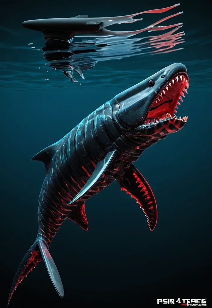
Physical Characteristics: Size & Weight: Between 40 to 60 feet in length , weighing 50 to 75 tons. Coloration: Males has a sleek black base with dark gray tiger stripes accented by subtle red bioluminescent highlights along the stripes , glowing faintly in deep ocean darkness. Body Structure: Hydrodynamic , muscular body combining the streamlined agility of the Shortfin Mako and Black Marlin with the robust power of Predator X and Megalodon. Rigid pectoral fins adapted from Black Marlin , capable of tilting back to reduce drag at high speeds. The tail end is a powerful fluke for propulsion , inspired by Mosasaurus Hoffmannii and Orca anatomy. Thick , overlapping bony scales similar to Arapaima , providing a durable armor that flexes with movement. Limbs: Powerful large flippers adapted for scooting or sliding on land , coated with mucus inspired by the Atlantic hagfish for moisture retention and defense. Capable of limited terrestrial movement , allowing brief excursions out of water. Head & Jaw: Massive jaws with over 40 , 000 PSI bite force , blending Predator X’s mighty jaw strength with the long canine teeth and powerful bite of the Leopard Seal. Flexible skull allowing swallowing of large prey whole. Respiration: Dual respiratory system with both functional lungs and gills , enabling survival from surface to abyssal depths (500 to 9 , 800 feet). Bioluminescence: Red bioluminescent photophores patterned in tiger stripes , used for communication , mating displays , and luring prey in the dark ocean depths. ,
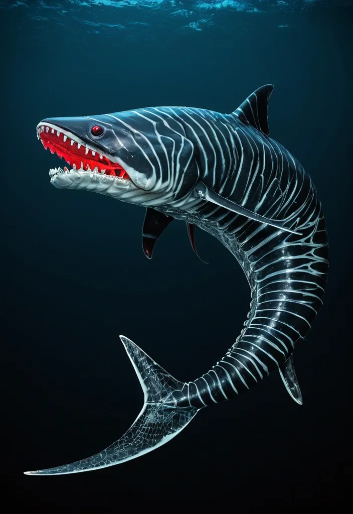
Physical Characteristics: Size & Weight: Between 40 to 60 feet in length , weighing 50 to 75 tons. Coloration: Males has a sleek black base with dark gray tiger stripes accented by subtle red bioluminescent highlights along the stripes , glowing faintly in deep ocean darkness. Body Structure: Hydrodynamic , muscular body combining the streamlined agility of the Shortfin Mako and Black Marlin with the robust power of Predator X and Megalodon. Rigid pectoral fins adapted from Black Marlin , capable of tilting back to reduce drag at high speeds. The tail end is a powerful fluke for propulsion , inspired by Mosasaurus Hoffmannii and Orca anatomy. Thick , overlapping bony scales similar to Arapaima , providing a durable armor that flexes with movement. Limbs: Powerful large flippers adapted for scooting or sliding on land , coated with mucus inspired by the Atlantic hagfish for moisture retention and defense. Capable of limited terrestrial movement , allowing brief excursions out of water. Head & Jaw: Massive jaws with over 40 , 000 PSI bite force , blending Predator X’s mighty jaw strength with the long canine teeth and powerful bite of the Leopard Seal. Flexible skull allowing swallowing of large prey whole. Respiration: Dual respiratory system with both functional lungs and gills , enabling survival from surface to abyssal depths (500 to 9 , 800 feet). Bioluminescence: Red bioluminescent photophores patterned in tiger stripes , used for communication , mating displays , and luring prey in the dark ocean depths. ,