Search Results for (logo)
Explore AI generated designs, images, art and prompts by top community artists and designers.
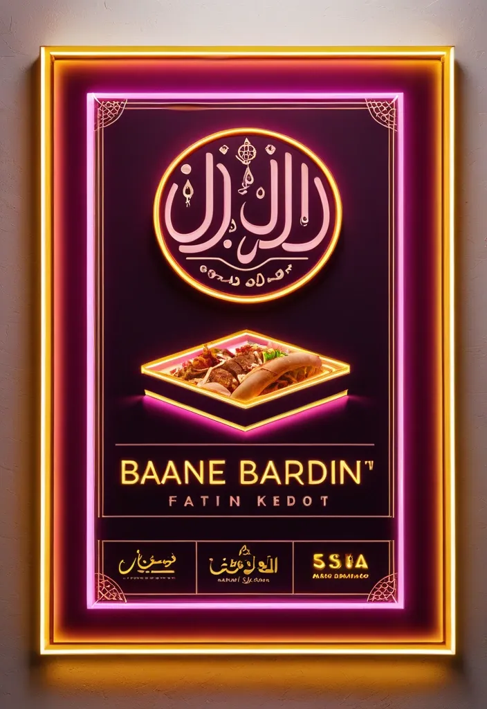

**Subject:** A horizontal commercial signboard for an sudanes restaurant specializing in fast food **Composition & Layout:** * **Format:** A wide , horizontal rectangular banner set within a thin , glowing warm-yellow frame. * **Central Focus:** Large , prominent Arabic text dominates the center. * **Top Left:** A logo place leave it empty * **Bottom Section:** Smaller lines of informative text and four square photographic panels showing food. * **Lighting Effects:** The overall aesthetic is a high-contrast , glowing "light-box" style. Pinkish-magenta light streaks radiate upward from the bottom corners toward the center. **Color Palette:** * **Background:** Deep royal red ff2325 with subtle textures and faint , light-white decorative flourishes (filigree patterns). * **Main Typography:** Bright orange letters with a thick , 3D-effect gold/yellow outline and a dark drop shadow for depth. * **Secondary Typography:** Pure white for the address and bright yellow for the contact numbers. * **Accents:** Magenta/pink light flares and a warm yellow glow from the outer frame. **Specific Elements:** * **Main Title (Arabic):** Bold , stylized Arabic calligraphy reading "كوبا للفطائر". * **Logo:** The logo for Cuba pies Restaurant will be sent with the promo. * **Address Line (Middle):** A single line of white Arabic text: "الاسكان 96-شارع السوق-الفاصل 96_95" * **Contact Line (Bottom):** Yellow text containing two phone numbers "0923931452/ 0928737341" preceded by the Arabic word for "Contact:". * **Food Imagery:** Four small square panels at the bottom (two on the left , two on the right). They feature realistic photos of Shawarma sandwich on plates with garnishes and one panel showing a whole , golden-brown roasted chicken. **Style:** Modern Egyptian commercial design , vibrant , professional , and designed to look like an illuminated neon or LED sign at night. ,
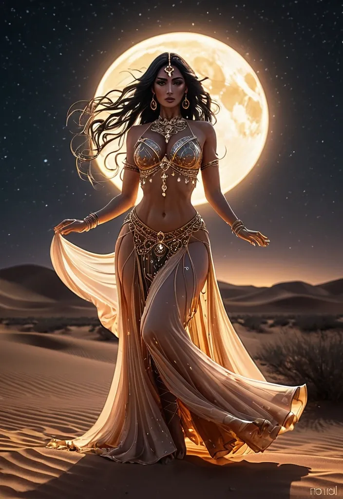
masterpiece , best quality , ultra detailed , high resolution , anime style , beautiful young woman , belly dancer , elegant and graceful pose , wearing luxurious belly dance costume , intricate details , gold jewelry , chains , gemstones , ornaments , decorated bra top , sheer silk fabric , long flowing skirt , midriff exposed , slim waist , soft curves , dynamic dancing motion , hair flowing in motion , long shiny hair , expressive eyes , soft blush , desert night , moonlight , stars in the sky , warm cinematic lighting , soft glow , depth of field , dramatic shadows , highly detailed background Negative prompt: low quality , worst quality , blurry , bad anatomy , extra fingers , extra limbs , missing fingers , deformed hands , poorly drawn face , bad proportions , mutated body , watermark , text , logo ,
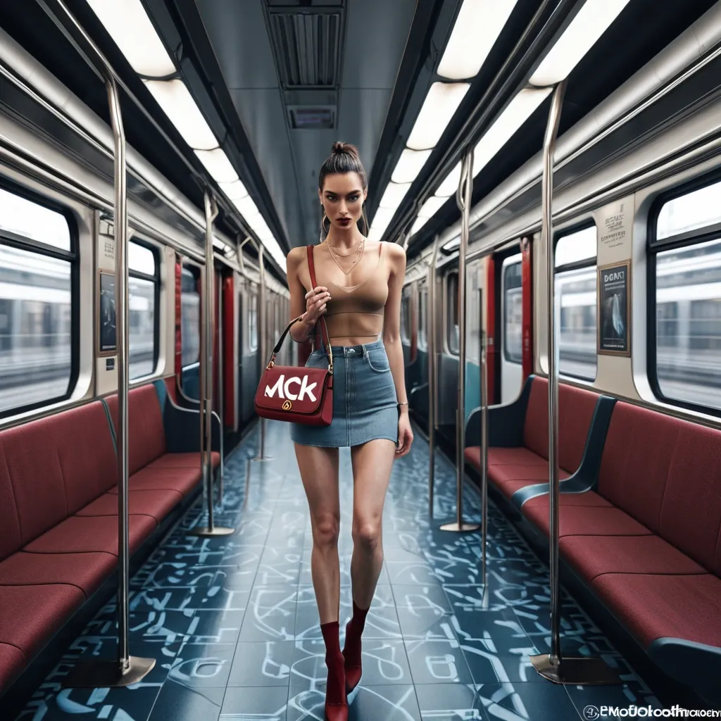
Hyper photo-realistic candid lifestyle fashion photo inside a modern commuter train carriage. A young white woman (early 20s) , slim/curvy build , light-medium warm skin tone , sitting alone across a blue patterned fabric bench seat. Pose: relaxed “boss” posture with both arms stretched wide along the backrest , legs crossed (right leg over left) , torso turned slightly left , head turned left looking out the window. Outfit: tight white cropped AC Milan football tee with printed text “KEM CHOO?” and small adidas logo + club crest , tan/beige trench coat/jacket draped over her lap , white crew socks , tan chunky lace-up loafers/boat shoes. Accessories: oversized beige/cream over-ear headphones , small oval black sunglasses , gold hoop earrings , thin gold necklace , small shoulder bag with brown monogram pattern tucked under her arm. Hair: dark brown , high ponytail with loose face-framing strands. Setting: train interior with red door frame on right edge , ventilation grille above window , blue mosaic seat fabric , dark floor. Window shows fast motion blur of passing train/platform in red/pink tones. Lighting: soft daylight from window , natural skin texture , iPhone video-frame look. Composition: full body head-to-toe centered , subject fills ~70% of frame height , vertical 9:16 aspect , eye-level camera from across the aisle , 24–28mm wide lens look , sharp focus on subject with background slightly softer , photorealistic real human. Negative prompt: cartoon , CGI , airbrushed skin , extra limbs , bad hands , cropped feet , cropped head , text misspelled , warped logos , blurry subject , watermark , oversaturated HDR ,
Create a high-resolution image featuring the logos of 100 of the world’s most recognized brands. The composition must be formatted in A4 size (landscape or portrait as specified) , using the full canvas with no margins or borders. All logos must be displayed in full color , maintaining their original design , proportions , and visual identity with high fidelity. Do not repeat any logos—each brand must appear only once. Arrange the logos in a clean , well-balanced grid or layout that maximizes the use of space across the entire A4 page. Ensure even spacing , proper alignment , and visual clarity so that each logo is clearly visible and not distorted , cropped , or overlapping. The final output must be suitable for high-quality digital printing (300 DPI or higher) , with sharp details , vibrant colors , and a professional finish. ,
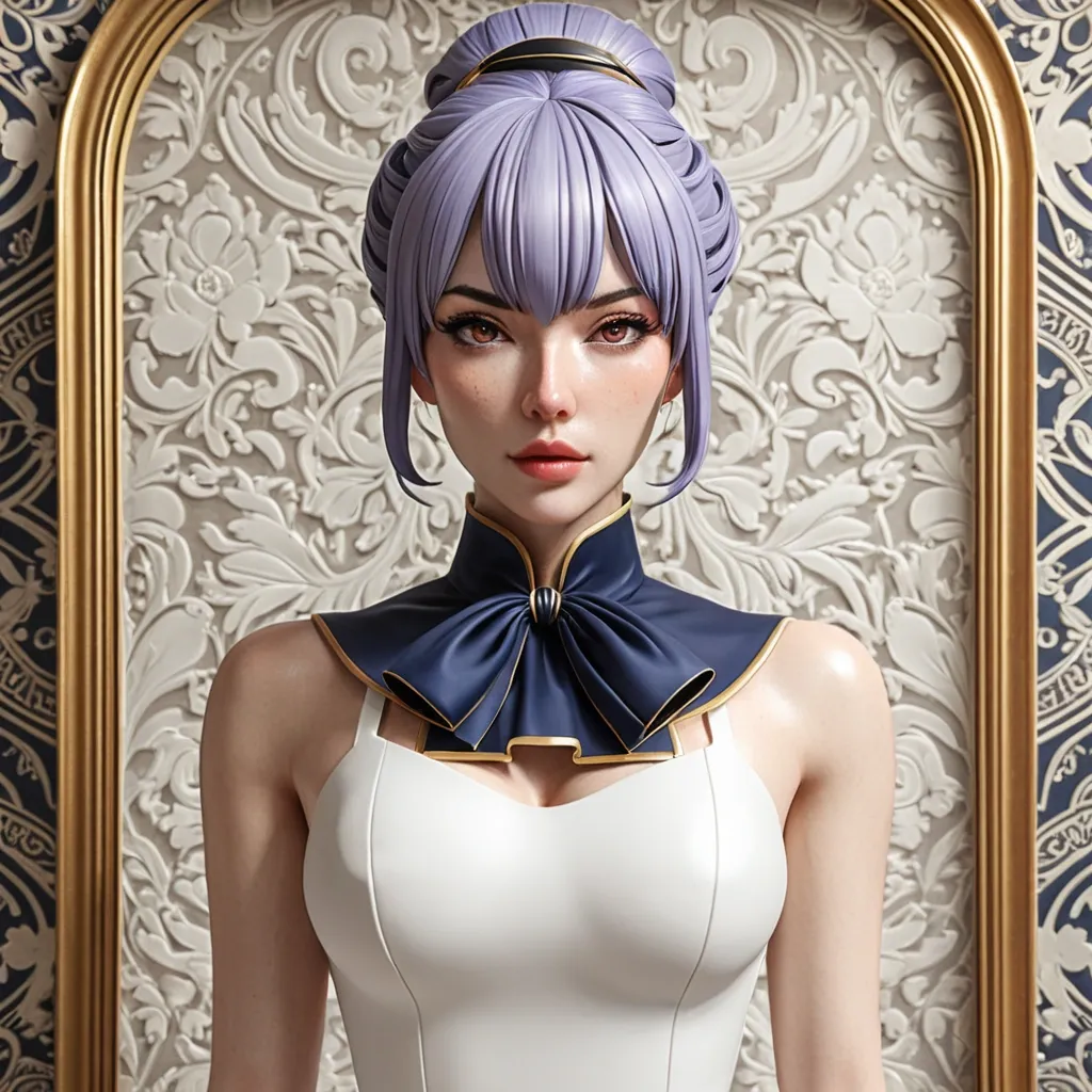
Upper body to hip illustration , eye-level camera , character standing centered facing the viewer directly at slight three-quarter angle. The framing captures from the top of the head down to the hip area. Soft warm interior lighting. The background shows an elegant interior — decorative wallpaper with subtle damask or floral pattern , and the edge of a large ornate gold-framed painting or mirror visible on the left side. POSE: Character stands upright facing the viewer at slight three-quarter angle , body positioned slightly right of center. Her arms are both positioned at her sides or slightly in front — both arms relaxed and close to her body , hands at hip level or slightly raised near her waist. Her upper body is composed and still. Her head faces the viewer directly , slightly tilted or level , with a cool , reserved , slightly self-conscious expression — eyes open and looking at the viewer with a calm but slightly uncertain or guarded gaze , eyebrows very slightly furrowed , lips firmly closed. Cheeks lightly flushed. Prominent bust visible within the white dress with natural fabric tension , with the sides of the bust visibly protruding from both armhole openings. PIECE ONE — WHITE SLEEVELESS DRESS: A fitted sleeveless dress in bright white — clean structured bodice with no straps , a straight or slightly curved neckline. The dress is form-fitting at the chest and torso showing prominent bust with natural fabric tension. The sleeveless armhole openings are wide and cut deep on both sides — the outer sides of the bust are visible from both left and right edges of the wide armhole openings , with the fabric only covering the front center panel and leaving the outer sides of the chest exposed through the wide deep armhole cuts. The bust protrudes naturally and visibly from both sides of the garment through the armhole openings — the larger the bust , the more pronounced the side exposure. White ruffled trim or small frilled detail decorates the upper edge of the armhole opening on both sides , creating a delicate decorative ruffle border framing the exposed sides. The dress has a slightly structured fantasy or formal quality with subtle seam and fabric tension detail. PIECE TWO — NAVY AND GOLD NECK RIBBON/CRAVAT: A dramatic decorative neck piece — a wide navy blue ribbon or cravat with gold trim border running along the edges. The ribbon is tied or arranged at the neck in a long hanging style — the navy fabric hangs down the center front of the chest in a wide panel or tied bow shape. A small gold cross or diamond-shaped brooch or clasp is pinned at the upper center of the neck ribbon where it meets the collar. The ribbon has a slightly stiff or structured quality with visible gold border trim. PIECE THREE — PURPLE COLLAR/CHOKER: A thin purple or lavender collar or choker visible at the base of the neck beneath the navy ribbon — a delicate colored band. BACKGROUND: Elegant interior room — soft warm lighting. The wall behind the character has decorative cream or light grey wallpaper with a subtle damask or ornate floral repeat pattern. A large ornate painting or mirror with a thick gold frame is partially visible at the left edge of the frame. Another gold frame edge is partially visible at the right. The background is from mid-wall upward. ARTISTIC STYLE — MANDATORY: Render this illustration in the style of a premium Japanese light novel or doujinshi cover illustration. The linework must have visible variation in stroke weight , thicker lines on outer contours and thinner lines on interior details. Skin shading must use warm ambient occlusion with subtle color shifts toward peach and rose in the shadows rather than pure gray. Hair must be rendered with individual strand clusters showing clear highlight ribbons and deep shadow pools , not uniform gradients. Fabric must show micro-wrinkle detail and textile grain. The color palette must feel slightly desaturated and warm , reminiscent of physical print media — not digital neon. Eyes must have complex multi-layered iris detail with warm reflected light. Overall the image should feel like it was painted by a skilled Japanese illustrator such as the art style seen in Fate Grand Order , Sword Art Online or Re:Zero light novel illustrations — detailed , warm , slightly imperfect , full of artistic intentionality. Absolutely avoid: plastic glossy skin , perfectly uniform smooth gradients , oversaturated colors , symmetrical cookie-cutter faces , flat digital airbrushing. HAIR IDENTITY LOCK — ABSOLUTE MAXIMUM PRIORITY: Hair , hairstyle , hair length , hair accessories and everything on the head MUST be an EXACT 1-to-1 COPY of the uploaded waifu reference image. Do NOT change hair in ANY way. Do NOT shorten , lengthen , reshape or change silhouette , volume or flow. Do NOT change bangs , part or framing. Do NOT change any braid , twist , plait or strand details. Do NOT add or remove any side strands or loose strands. Do NOT add , remove or replace any hair accessories. All head accessories must be IDENTICAL to uploaded reference — same position , color , size and design. Hair in final image must be PERFECT IDENTICAL COPY in every detail. Any single deviation from original hair or head is CRITICAL FAILURE. Treat entire head and hairstyle as completely locked , unchangeable element. COLOR PALETTE LOCK — ABSOLUTE CRITICAL PRIORITY: Extract and preserve the exact color palette directly from the uploaded CHARACTER REFERENCE IMAGE. The final image MUST match the hair color , eye color , skin tone and overall color identity of the uploaded character reference with zero deviation. Do NOT adopt colors from this style reference image. Every color in the final output must be traceable to the original reference image. BUST SIZE LOCK: Preserve the exact prominent bust size and proportions from the waifu reference image. The wider and more prominent the bust , the more the sides of the chest will be naturally visible through the wide armhole openings of the dress. Do NOT reduce or minimize the bust size. Do NOT add any head accessories not present in the original waifu reference image. Do NOT add masks , face coverings , or any object placed on or covering the face or head. Character face must remain fully visible and uncovered at all times. Remove all text , letters , logos and watermarks. No realistic style , no 3D render , no photorealistic , no distorted anatomy , no bad hands , no low quality , no blurry output. ,
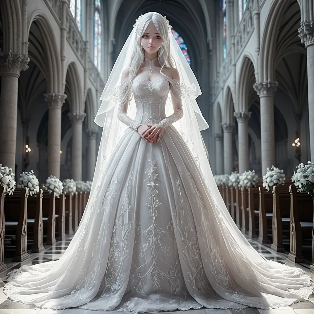
masterpiece , best quality , ultra detailed , beautiful 20-year-old woman , long white hair , pure white wedding dress , elegant bride , delicate face , soft smile , graceful pose , full body , detailed lace , floral embroidery , translucent veil , white gloves , sparkling accessories , romantic atmosphere , soft lighting , cinematic lighting , dreamy background , highly detailed eyes , realistic fabric folds , elegant compositionmasterpiece , best quality , ultra detailed , anime style , beautiful 20-year-old woman , long white hair , white wedding dress , elegant bride , delicate face , soft smile , slim figure , full body , lace dress , long veil , white flowers , sparkling light , dreamy atmosphere , soft lighting , detailed eyes , clean lineart , beautiful shading , highly detailed , romantic scenelow quality , worst quality , blurry , bad anatomy , bad hands , extra fingers , missing fingers , deformed hands , extra arms , extra legs , poorly drawn face , ugly , mutated , distorted body , long neck , bad proportions , duplicate , cropped , watermark , text , logo , jpeg artifacts , messy dress , poorly drawn veilcathedral , church interior , stained glass , wedding aisle ,
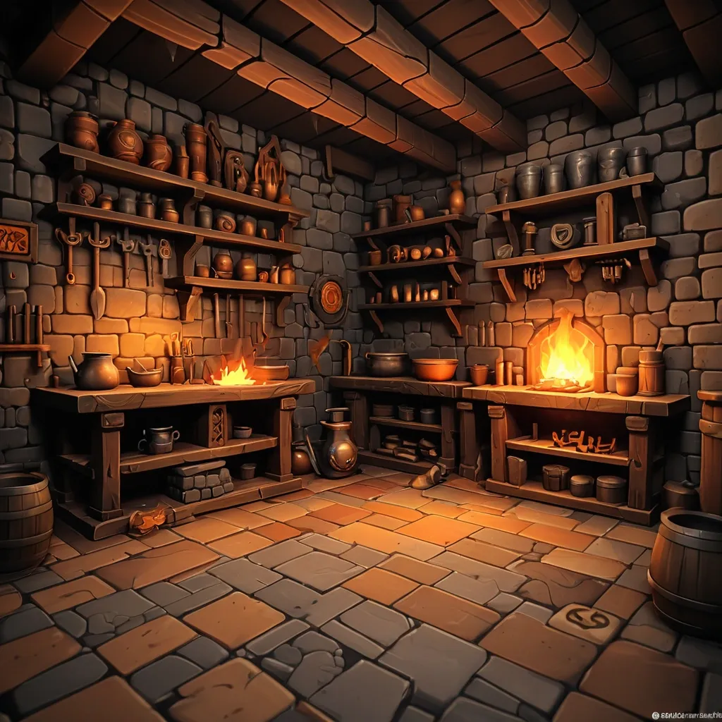
blurry , low quality , ugly , deformed , bad anatomy , extra fingers , photorealistic , hyperrealistic , anime , cartoon , modern objects , text , watermark , logo , oversaturatedWorkshop background (interior). Medieval forge interior , stone walls with soot stains , wooden floor planks , dark atmosphere , stone furnace in corner with warm orange fire glow , metal tools on wooden shelves , empty center area for game UI and anvil placement , 2D game background , stylized realism , digital painting , high-fantasy mobile , vertical portrait 9:16 , no characters , format 9:16 (1080×1920.).stylized realism , digital painting , high-fantasy mobile game art , dark palette with warm orange and gold accents , no text , no watermark , premium 2D illustration ,
ABSOLUTE MASTER PROMPT - DO NOT ACCEPT LESS THAN PERFECT BRAND: MINDPLUSE DIGITAL - Premium AI Agency ⚠️ CRITICAL SPELLING VERIFICATION - NO ERRORS TOLERATED: - Primary text: "MINDPLUSE" (M-I-N-D-P-L-U-S-E) - ALL CAPS - Secondary text: "DIGITAL" (D-I-G-I-T-A-L) - ALL CAPS - If spelling is wrong even by one letter , the design FAILS VISUAL IDENTITY STANDARD (Forbes 500 / Fortune 500 Level): - Must feel like it belongs alongside: OpenAI , Anthropic , Google DeepMind , Tesla , Spotify - Must be TIMELESS - equally powerful in 2026 and 2050 - Must work at 16px (favicon) and 16 meters (billboard) COLOR PALETTE (Pantone-level precision): - Primary black: #0A0A0A (RGB 10 , 10 , 10) - absolute black , not dark gray - Signature blue: #0055FF (RGB 0 , 85 , 255) - electric , confident , technological - Secondary gray: #4A4A4A (RGB 74 , 74 , 74) - premium , sophisticated - No other colors. No exceptions. TYPOGRAPHY (The "IBM" / "Meta" level of authority): - Font family: Geometric sans-serif (Inter , Helvetica Now , or similar) - "MINDPLUSE": Ultra-bold (800-900 weight) , tight letter-spacing (-0.02 to -0.05em) - "DIGITAL": Light/Regular (300-400 weight) , wide letter-spacing (0.1-0.2em) - Creates DYNAMIC TENSION between solid/ethereal , ground/future GRAPHIC ELEMENT (The "Nike Swoosh" of MINDPLUSE): - Must represent fusion of MIND (brain/neural) + PULSE (energy/movement) - Abstract brainwave/pulse line(s) - clean , precise , mathematical - Electric blue (#0055FF) only - Positioned to create visual flow and direction - Should work ALONE without text (like Apple logo) COMPOSITION RULES: - Horizontal lockup preferred (text + symbol side by side) - Perfect mathematical proportions (use golden ratio principles) - Negative space is DESIGN , not emptiness - Every element has PURPOSE - nothing decorative PSYCHOLOGICAL ARCHITECTURE (What it must communicate): - INSTANTLY: Intelligence , technology , Africa rising , global standard - ON CLOSER LOOK: Precision , trust , innovation , human-centered - OVER TIME: Familiarity , authority , inevitability TECHNICAL REQUIREMENTS (Non-negotiable): - Vector quality (clean paths , no pixel dependencies) - Sharp edges or perfectly calculated curves (no "close enough") - Works in: full color , monochrome , reverse (white on black) - Scalable: from app icon to highway billboard - Memorable: can be drawn from memory after 3 seconds WHAT THIS LOGO MUST ACHIEVE: - Be the most recognizable tech logo emerging from Africa - Look like it cost $1 million (even though created with precision) - Make competitors ask "Why didn't we think of that?" - Feel familiar yet completely original - Tell the story: African intelligence + global technology + human purpose WHAT TO ABSOLUTELY AVOID: - No gradients (unacceptable - looks dated) - No drop shadows (lazy design crutch) - No 3D effects (temporary trend) - No complex textures (reduces scalability) - No more than 2 fonts (amateur) - No clip art or obvious stock elements - No "tech clichés" (circuit boards , random dots , meaningless lines) - No busy backgrounds - this logo must live ANYWHERE FINAL TEST (Apply before considering complete): - Cover half the logo - is it still recognizable? - Reduce to 16px - is every element clear? - Show to someone for 3 seconds - can they sketch it? - Place next to Nike , Apple , OpenAI - does it hold its ground? This is not a request. This is a STANDARD. Deliver nothing less. ,
ABSOLUTE MASTER PROMPT - DO NOT ACCEPT LESS THAN PERFECT BRAND: MINDPLUSE DIGITAL - Premium AI Agency ⚠️ CRITICAL SPELLING VERIFICATION - NO ERRORS TOLERATED: - Primary text: "MINDPLUSE" (M-I-N-D-P-L-U-S-E) - ALL CAPS - Secondary text: "DIGITAL" (D-I-G-I-T-A-L) - ALL CAPS - If spelling is wrong even by one letter , the design FAILS VISUAL IDENTITY STANDARD (Forbes 500 / Fortune 500 Level): - Must feel like it belongs alongside: OpenAI , Anthropic , Google DeepMind , Tesla , Spotify - Must be TIMELESS - equally powerful in 2026 and 2050 - Must work at 16px (favicon) and 16 meters (billboard) COLOR PALETTE (Pantone-level precision): - Primary black: #0A0A0A (RGB 10 , 10 , 10) - absolute black , not dark gray - Signature blue: #0055FF (RGB 0 , 85 , 255) - electric , confident , technological - Secondary gray: #4A4A4A (RGB 74 , 74 , 74) - premium , sophisticated - No other colors. No exceptions. TYPOGRAPHY (The "IBM" / "Meta" level of authority): - Font family: Geometric sans-serif (Inter , Helvetica Now , or similar) - "MINDPLUSE": Ultra-bold (800-900 weight) , tight letter-spacing (-0.02 to -0.05em) - "DIGITAL": Light/Regular (300-400 weight) , wide letter-spacing (0.1-0.2em) - Creates DYNAMIC TENSION between solid/ethereal , ground/future GRAPHIC ELEMENT (The "Nike Swoosh" of MINDPLUSE): - Must represent fusion of MIND (brain/neural) + PULSE (energy/movement) - Abstract brainwave/pulse line(s) - clean , precise , mathematical - Electric blue (#0055FF) only - Positioned to create visual flow and direction - Should work ALONE without text (like Apple logo) COMPOSITION RULES: - Horizontal lockup preferred (text + symbol side by side) - Perfect mathematical proportions (use golden ratio principles) - Negative space is DESIGN , not emptiness - Every element has PURPOSE - nothing decorative PSYCHOLOGICAL ARCHITECTURE (What it must communicate): - INSTANTLY: Intelligence , technology , Africa rising , global standard - ON CLOSER LOOK: Precision , trust , innovation , human-centered - OVER TIME: Familiarity , authority , inevitability TECHNICAL REQUIREMENTS (Non-negotiable): - Vector quality (clean paths , no pixel dependencies) - Sharp edges or perfectly calculated curves (no "close enough") - Works in: full color , monochrome , reverse (white on black) - Scalable: from app icon to highway billboard - Memorable: can be drawn from memory after 3 seconds WHAT THIS LOGO MUST ACHIEVE: - Be the most recognizable tech logo emerging from Africa - Look like it cost $1 million (even though created with precision) - Make competitors ask "Why didn't we think of that?" - Feel familiar yet completely original - Tell the story: African intelligence + global technology + human purpose WHAT TO ABSOLUTELY AVOID: - No gradients (unacceptable - looks dated) - No drop shadows (lazy design crutch) - No 3D effects (temporary trend) - No complex textures (reduces scalability) - No more than 2 fonts (amateur) - No clip art or obvious stock elements - No "tech clichés" (circuit boards , random dots , meaningless lines) - No busy backgrounds - this logo must live ANYWHERE FINAL TEST (Apply before considering complete): - Cover half the logo - is it still recognizable? - Reduce to 16px - is every element clear? - Show to someone for 3 seconds - can they sketch it? - Place next to Nike , Apple , OpenAI - does it hold its ground? This is not a request. This is a STANDARD. Deliver nothing less. ,
ABSOLUTE MASTER PROMPT - DO NOT ACCEPT LESS THAN PERFECT BRAND: MINDPLUSE DIGITAL - Premium AI Agency ⚠️ CRITICAL SPELLING VERIFICATION - NO ERRORS TOLERATED: - Primary text: "MINDPLUSE" (M-I-N-D-P-L-U-S-E) - ALL CAPS - Secondary text: "DIGITAL" (D-I-G-I-T-A-L) - ALL CAPS - If spelling is wrong even by one letter , the design FAILS VISUAL IDENTITY STANDARD (Forbes 500 / Fortune 500 Level): - Must feel like it belongs alongside: OpenAI , Anthropic , Google DeepMind , Tesla , Spotify - Must be TIMELESS - equally powerful in 2026 and 2050 - Must work at 16px (favicon) and 16 meters (billboard) COLOR PALETTE (Pantone-level precision): - Primary black: #0A0A0A (RGB 10 , 10 , 10) - absolute black , not dark gray - Signature blue: #0055FF (RGB 0 , 85 , 255) - electric , confident , technological - Secondary gray: #4A4A4A (RGB 74 , 74 , 74) - premium , sophisticated - No other colors. No exceptions. TYPOGRAPHY (The "IBM" / "Meta" level of authority): - Font family: Geometric sans-serif (Inter , Helvetica Now , or similar) - "MINDPLUSE": Ultra-bold (800-900 weight) , tight letter-spacing (-0.02 to -0.05em) - "DIGITAL": Light/Regular (300-400 weight) , wide letter-spacing (0.1-0.2em) - Creates DYNAMIC TENSION between solid/ethereal , ground/future GRAPHIC ELEMENT (The "Nike Swoosh" of MINDPLUSE): - Must represent fusion of MIND (brain/neural) + PULSE (energy/movement) - Abstract brainwave/pulse line(s) - clean , precise , mathematical - Electric blue (#0055FF) only - Positioned to create visual flow and direction - Should work ALONE without text (like Apple logo) COMPOSITION RULES: - Horizontal lockup preferred (text + symbol side by side) - Perfect mathematical proportions (use golden ratio principles) - Negative space is DESIGN , not emptiness - Every element has PURPOSE - nothing decorative PSYCHOLOGICAL ARCHITECTURE (What it must communicate): - INSTANTLY: Intelligence , technology , Africa rising , global standard - ON CLOSER LOOK: Precision , trust , innovation , human-centered - OVER TIME: Familiarity , authority , inevitability TECHNICAL REQUIREMENTS (Non-negotiable): - Vector quality (clean paths , no pixel dependencies) - Sharp edges or perfectly calculated curves (no "close enough") - Works in: full color , monochrome , reverse (white on black) - Scalable: from app icon to highway billboard - Memorable: can be drawn from memory after 3 seconds WHAT THIS LOGO MUST ACHIEVE: - Be the most recognizable tech logo emerging from Africa - Look like it cost $1 million (even though created with precision) - Make competitors ask "Why didn't we think of that?" - Feel familiar yet completely original - Tell the story: African intelligence + global technology + human purpose WHAT TO ABSOLUTELY AVOID: - No gradients (unacceptable - looks dated) - No drop shadows (lazy design crutch) - No 3D effects (temporary trend) - No complex textures (reduces scalability) - No more than 2 fonts (amateur) - No clip art or obvious stock elements - No "tech clichés" (circuit boards , random dots , meaningless lines) - No busy backgrounds - this logo must live ANYWHERE FINAL TEST (Apply before considering complete): - Cover half the logo - is it still recognizable? - Reduce to 16px - is every element clear? - Show to someone for 3 seconds - can they sketch it? - Place next to Nike , Apple , OpenAI - does it hold its ground? This is not a request. This is a STANDARD. Deliver nothing less. ,
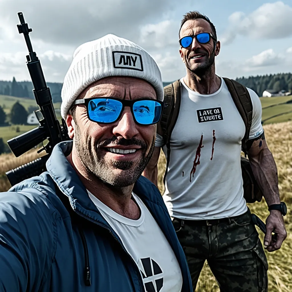
Con la imagen de mi foto , un hombre de cuarenta atractivo y con buena mandibula creame una miniatura que se me vea el rostro bien en primer plano , atractivo , con media sonrisa picara , y un cigarillo en la boca , con gafas de sol azules deportivas , inclinando levemente la cabeza hacia el cielo , y sosteniendo un fusil sobre mi hombro derecho con mi brazo agarrandolo. de fondo dos supervivientes con ropa deportiva y en mucha menor escala que yo , y algunas sombras de zombis acechandonos alrededor. la ropa que se me vea a mi de color blanco , y ponme un pañuelo blanco en la cabeza. el tamaño de la imagen y el ratio que sea diurectamente para ponerla en youtube de miniatura , 1920x1080 pixeles , con un ratio 16:9. que en la imagen tambien salga el logo de dayz abajo a la izquierda tamaño medio-pequeño , arriba a la derecha que ponga LIVE , y el logo de kick y youtube. y dandole algo mas de importancia que al resto de texto escribe SIR LEINAD en azul celeste , donde mejor quede. por favor ,
PROMPT MAESTRO - INFOGRAFÍA 3D JUVENTUD CRISTIANA (VERSIÓN MATRIZ VERTICAL 9X16 · SECUENCIA ZIG-ZAG ESTRICTA · TEXTOS ENRIQUECIDOS) 📌 INSTRUCCIONES DE SISTEMA: COPIAR TAL CUAL. NO MEZCLAR. NO RESUMIR. ACTÚA COMO DIRECTOR DE ARTE EDITORIAL Y TEÓLOGO CREATIVO. 🔹 BLOQUE 1 — TÍTULO (REGLA DE IDIOMA INVIOLABLE) INSTRUCCIÓN DE POSICIÓN: El título DEBE estar renderizado en la parte SUPERIOR Y CENTRAL. Tipografía: Moderna , Bold , letras grandes y legibles. 🚨 PROTOCOLO ANTI-TRADUCCIÓN: COPIAR LETRA POR LETRA EN ESPAÑOL. NO TRADUCIR. ✅ TÍTULO PERMITIDO (COPIAR LITERAL): El Padre Perfecto: Las 12 cualidades del amor de Dios que sanan las heridas de la infancia. 🔹 BLOQUE 2 — FORMATO , CALIDAD Y PALETA DE COLORES Cantidad: 12 posiciones. 📱 Formato: Vertical (9:16). 💎 CALIDAD 4K: Resolución UHD , Render 3D Octane , Iluminación de Estudio Cinematográfica. 🎨 FONDO PREMIUM "WARM GLOW": Degradado muy suave de Beige Crema (#FAF3E0) a Blanco Cálido. Limpio , elegante , sin saturar la vista. 🔹 BLOQUE 3 — LÓGICA DE CONTENIDO Y CONTEXTO ENRIQUECIDO (CRÍTICO) Cada ítem en la infografía DEBE contener 3 elementos textuales legibles en ESPAÑOL: 1. Nombre Principal (Letra grande , Negrita). 2. Contexto Inspirador/Curioso (Letra mediana): PROHIBIDO DEJAR TEXTOS VACÍOS O BÁSICOS. Debes escribir un dato fascinante , heroico o de entretenimiento cultural/espiritual que atrape al lector. 3. Cita Bíblica o Dato Histórico (Letra pequeña cursiva). (Ejemplo de estructura correcta: "CUERNO (Shofar)" / "Su poderoso sonido derribó los muros de Jericó. Símbolo de victoria." / "(Josué 6:4)"). 🔹 BLOQUE 4 — DISEÑO DE LOS OBJETOS 3D Elemento: Cada objeto/personaje está renderizado en 3D Premium (Estilo Pixar/Arte conceptual de alta gama) , muy detallado , atractivo , sobre una pequeña base de piedra pulida o mármol. Acompañamiento visual: Un pequeño icono gráfico 3D flotando cerca de la base que represente el elemento. 🔹 BLOQUE 5 — CAMINO Y SECUENCIA (EL ZIG-ZAG MULTI-FILA) ⚠️ INSTRUCCIÓN DE TRAZADO DE RUTA (SUELO): La línea punteada está PUNTEADA SUAVEMENTE EN EL SUELO y conecta las bases siguiendo un patrón de SERPIENTE DESCENDENTE: ➤ FILA 1 (Tope): De IZQUIERDA A DERECHA (→). Alfinal , bajaverticalmentealaFila2 ➤ FILA 2: De DERECHA A IZQUIERDA (←). Alfinal , bajaverticalmentealaFila3 ➤ FILA 3: De IZQUIERDA A DERECHA (→). Bajaverticalmente... ➤ FILA 4: De DERECHA A IZQUIERDA (←). Bajaverticalmente... ➤ FILA 5 (Fondo): De IZQUIERDA A DERECHA (→). VISUALIZACIÓN: El camino es continuo. No se corta. Conecta la Base #4 con la Base #5 , la Base #8 con la Base #9 , etc. 🔹 BLOQUE 6 — LOGOS Y MARCAS (ESPAÑOL) ✔️ Esquina Superior Derecha: Logo que diga "JUVENTUD CRISTIANA" con un icono de llama o paloma minimalista. ✔️ Logo "JUVENTUD CRISTIANA" (ícono + texto) (Inferior Derecho). 🔹 BLOQUE 7 — PIE DE PÁGINA (TEXTO INFERIOR EXACTO) ⚠️ INSTRUCCIÓN CRÍTICA: NO escribas etiquetas de instrucciones. Copia ÚNICA Y EXCLUSIVAMENTE el siguiente bloque de texto en la parte inferior central , en letra pequeña y limpia: FUENTES VERIFICADAS: Textos Bíblicos / Enciclopedias (Zondervan , Eerdmans) / Institutos de Arqueología (2025/2026). CONTENIDO EDUCATIVO E INFORMATIVO. Infografía basada en registros históricos , bíblicos y estadísticos. Diseñado para edificar y aprender. PROMPT MAESTRO - INFOGRAFÍA 3D JUVENTUD CRISTIANA (VERSIÓN MATRIZ VERTICAL 9X16 · SECUENCIA ZIG-ZAG ESTRICTA · TEXTOS ENRIQUECIDOS) 📌 INSTRUCCIONES DE SISTEMA: COPIAR TAL CUAL. NO MEZCLAR. NO RESUMIR. ACTÚA COMO DIRECTOR DE ARTE EDITORIAL Y TEÓLOGO CREATIVO. 🔹 BLOQUE 1 — TÍTULO (REGLA DE IDIOMA INVIOLABLE) INSTRUCCIÓN DE POSICIÓN: El título DEBE estar renderizado en la parte SUPERIOR Y CENTRAL. Tipografía: Moderna , Bold , letras grandes y legibles. 🚨 PROTOCOLO ANTI-TRADUCCIÓN EXTREMO: ESCRIBIR LETRA POR LETRA EN ESPAÑOL. ESTÁ ESTRICTAMENTE PROHIBIDO TRADUCIR AL INGLÉS. ✅ TÍTULO PERMITIDO (COPIAR LITERAL): Lenguaje del Amor: Las formas en las que DIOS dice "TE AMO" en la Biblia sin usar esa palabra. 🔹 BLOQUE 2 — FORMATO , CALIDAD Y PALETA DE COLORES Cantidad: 20 posiciones. 📱 Formato: Vertical (9:16). 💎 CALIDAD 4K: Resolución UHD , Render 3D Octane , Iluminación de Estudio Cinematográfica. 🎨 FONDO PREMIUM "WARM GLOW": Degradado muy suave de Beige Crema (#FAF3E0) a Blanco Cálido. Limpio , elegante , sin saturar la vista. 🔹 BLOQUE 3 — LÓGICA DE CONTENIDO Y CONTEXTO (REGLA DE LEGIBILIDAD) ⚠️ PARA EVITAR LETRAS ILEGIBLES O BORROSAS: Los textos deben ser CORTOS Y PRECISOS. Cada ítem en la infografía DEBE contener 3 elementos textuales en ESPAÑOL PERFECTO Y LEGIBLE: 1. Número de Orden: Texto visible que diga #1 , #2 , #3 , hasta el #20. 2. Nombre Principal: Letra grande y Negrita. 3. Contexto Inspirador: Letra mediana. DEBE SER MUY BREVE (Máximo 12 palabras) para que la imagen no genere errores ortográficos. (Ejemplo: "Su sonido derribó los muros al ingresar adentro"). 4. Cita Bíblica: Letra pequeña. (Ej: Josué 6:4). 🔹 BLOQUE 4 — DISEÑO DE LOS OBJETOS 3D Y NUMERACIÓN Elemento: Cada objeto/personaje está renderizado en 3D Premium (Estilo Pixar/Arte conceptual de alta gama) , muy detallado , atractivo , sobre una pequeña base de piedra pulida o mármol. ⚠️ REGLA DE NUMERACIÓN OBLIGATORIA: Cada base DEBE tener incrustado , pintado o en un cartelito flotante su número correspondiente (#1 , #2 , #3... hasta #20) para guiar el camino. Acompañamiento visual: Un pequeño icono gráfico 3D flotando cerca de la base. 🔹 BLOQUE 5 — CAMINO Y SECUENCIA (EL ZIG-ZAG MULTI-FILA) ⚠️ INSTRUCCIÓN DE TRAZADO DE RUTA (SUELO): La línea punteada está PUNTEADA SUAVEMENTE EN EL SUELO y conecta las bases siguiendo un patrón de SERPIENTE DESCENDENTE: ➤ FILA 1 (Tope): De IZQUIERDA A DERECHA (→). Alfinal , bajaverticalmentealaFila2 ➤ FILA 2: De DERECHA A IZQUIERDA (←). Alfinal , bajaverticalmentealaFila3 ➤ FILA 3: De IZQUIERDA A DERECHA (→). Bajaverticalmente... ➤ FILA 4: De DERECHA A IZQUIERDA (←). Bajaverticalmente... ➤ FILA 5 (Fondo): De IZQUIERDA A DERECHA (→). VISUALIZACIÓN: El camino es continuo. No se corta. Conecta la Base #4 con la Base #5 , la Base #8 con la Base #9 , etc. 🔹 BLOQUE 6 — LOGOS Y MARCAS (REGLA DE IDIOMA) ⚠️ PROHIBIDO ESCRIBIR "CHRISTIAN YOUTH". DEBE SER ESTRICTAMENTE EN ESPAÑOL. ✔️ Esquina Superior Derecha: Logo que diga "JUVENTUD CRISTIANA" con un icono de llama o paloma minimalista. ✔️ Esquina Inferior Derecha: Logo que diga "JUVENTUD CRISTIANA" (ícono + texto). 🔹 BLOQUE 7 — PIE DE PÁGINA (TEXTO INFERIOR EXACTO) ⚠️ INSTRUCCIÓN CRÍTICA: NO escribas etiquetas de instrucciones. Copia ÚNICA Y EXCLUSIVAMENTE el siguiente bloque de texto en la parte inferior central , en letra pequeña y limpia , en ESPAÑOL: FUENTES VERIFICADAS: Textos Bíblicos / Enciclopedias (Zondervan , Eerdmans) / Institutos de Arqueología (2025/2026). CONTENIDO EDUCATIVO E INFORMATIVO. Infografía basada en registros históricos , bíblicos y estadísticos. Diseñado para edificar y aprender. ,
正向提示词 (Positive Prompt): A premium , highly usable minimalist tech logo for "AgentScroll Studio". The core logo mark is an ultra-clean , flat 2D geometric shape: a sleek , continuous abstract 'S' curve representing both a stylized unrolling scroll and an agile workflow , elegantly wrapping around a single , solid circular dot in the center (representing the Active Owner/Leader). The logo shape is strictly flat , scalable , and lacks any 3D thickness. However , the presentation features a moody , cinematic studio aesthetic: the flat logo mark is rendered in a warm , sophisticated glowing amber/gold color , set against a rich , dark charcoal grey textured background. Subtle studio rim lighting and faint film grain give the image a luxurious , professional feel while keeping the logo's geometry purely minimalist. Elegant , modern sans-serif typography below. Developer-friendly. 负面提示词 (Negative Prompt): 3D geometry , extrusion , bevel , drop shadow inside the logo , literal Chinese characters , letter "中" , complex illustration , realistic objects , messy lines , realistic scroll , monkey , gradient on the logo mark itself , cluttered , cheap. ,
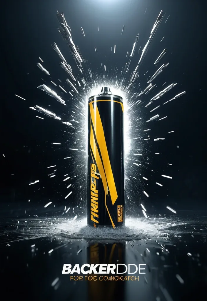
Cinematic 3D action-packed advertisement for [INSERT PRODUCT/BRAND HERE] , captured in an intense mid-motion moment with dramatic studio lighting , dynamic particle effects , and high-impact slow-motion energy. Ultra-hyperrealistic rendering , razor-sharp details , glossy commercial finish , atmospheric depth , and powerful contrast. Viral-ready composition with the brand logo seamlessly integrated into the scene and a sleek , modern slogan positioned cleanly beneath. High-end blockbuster commercial aesthetic ,
Cinematic 3D action-packed advertisement for [INSERT PRODUCT/BRAND HERE] , captured in an intense mid-motion moment with dramatic studio lighting , dynamic particle effects , and high-impact slow-motion energy. Ultra-hyperrealistic rendering , razor-sharp details , glossy commercial finish , atmospheric depth , and powerful contrast. Viral-ready composition with the brand logo seamlessly integrated into the scene and a sleek , modern slogan positioned cleanly beneath. High-end blockbuster commercial aesthetic ,
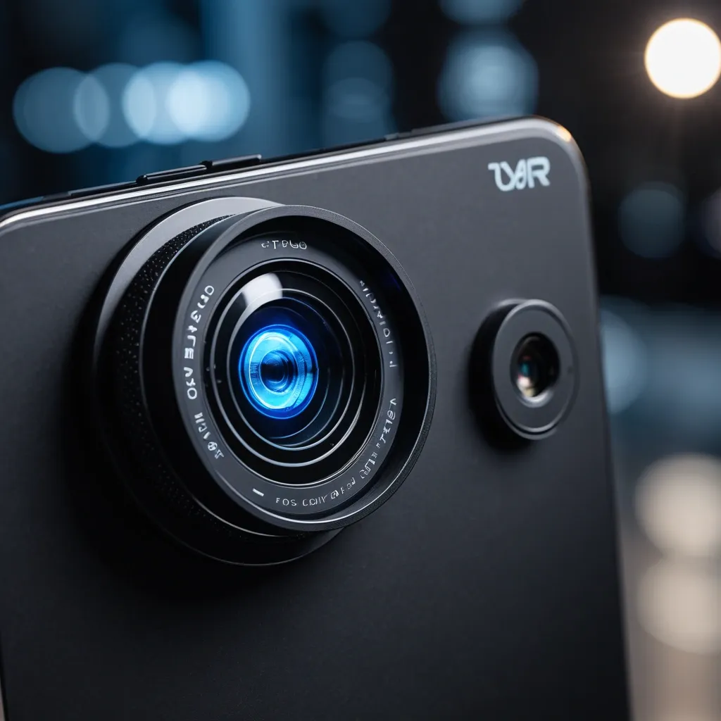
Un primer plano fotorrealista de un lente óptico inteligente para celular , de color negro mate y diseño elegante , que se engancha con facilidad a la lente de la cámara de un smartphone de alta gama. El lente inteligente tiene un acabado metálico texturizado y un anillo central de vidrio óptico transparente y brillante , con un pequeño indicador LED azul que parpadea suavemente para indicar su funcionamiento. Se muestra adjunto a la cámara trasera de un teléfono inteligente moderno , revelando el logotipo de una marca ficticia de tecnología inteligente grabada en el borde del lente. En el fondo , se aprecia una escena de fotografía profesional con un trípode y equipo de iluminación , desenfocada pero visible , sugiriendo la calidad y el potencial de uso profesional del lente óptico inteligente. ,
Un primer plano fotorrealista de un lente óptico inteligente para celular , de color negro mate y diseño elegante , que se engancha con facilidad a la lente de la cámara de un smartphone de alta gama. El lente inteligente tiene un acabado metálico texturizado y un anillo central de vidrio óptico transparente y brillante , con un pequeño indicador LED azul que parpadea suavemente para indicar su funcionamiento. Se muestra adjunto a la cámara trasera de un teléfono inteligente moderno , revelando el logotipo de una marca ficticia de tecnología inteligente grabada en el borde del lente. En el fondo , se aprecia una escena de fotografía profesional con un trípode y equipo de iluminación , desenfocada pero visible , sugiriendo la calidad y el potencial de uso profesional del lente óptico inteligente. ,
Create a premium festive Instagram post in 4:5 portrait ratio (1080x1350) for occasion of Holika Dahan. MAIN VISUAL CONCEPT – Elegant Holika Dahan bonfire glowing in the center – Warm golden-orange flames (controlled , aesthetic , not chaotic) – Subtle flower petals floating in air – Soft festive spark particles BRAND PRESENCE – Place Laam Herbals logo at bottom center – Small elegant product silhouettes (very subtle , optional) – Brand name in premium gold font BACKGROUND – Deep warm sunset gradient (orange blending into soft maroon) – Subtle temple or traditional pattern texture (very faint) – No clutter TEXT (ROYAL GOLD / WARM CREAM) MAIN GREETING (Large & Elegant): ✨ “Happy Holika Dahan” ✨ SUBTEXT: “May this sacred fire burn away negativity and illuminate your life with purity and prosperity.” – Luxury serif typography – Center aligned – Balanced spacing – Soft glowing text effect LIGHTING – Warm golden glow from fire reflecting on text – Cinematic festive lighting MOOD Sacred • Warm • Festive • Elegant • Premium Brand Greeting Quality: Ultra-HD Style: Luxury festive brand campaign Aspect Ratio: 4:5 portrait ,
blurry , flat , no bevel , wrong spelling , extra words , background scene , shield , icon , format 512×128. Text "ShieldSmithGuild" only , uppercase letters , bold condensed sans-serif font , sharp angular edges. Polished reflective gold material , strong 3D bevel effect , gem-like highlights , warm orange-brown shadows in recessed areas. Lighting from top-left , metallic sheen. Transparent or dark background. Premium game logo typography , no other elements. ,
blurry , flat , cartoon , anime , bright background , format 512×512. Ornate heraldic shield , gold bronze frame with rivet studs , central golden stylized trident sword emblem , empty space in center below emblem for text , dark textured background , golden corner pieces , lighting from top-left , premium game logo , no text ,
blurry , flat , cartoon , anime , bright background , format 512×512 Heraldic shield logo , wide at top tapering to point at bottom , curved sides. Multi-layered ornate frame: outer dark black metallic band , inner thick bronze-gold band with small round rivet studs along entire border. Golden pointed crests at top , bottom and upper-middle points of shield. Central large golden 3D emblem: stylized sword or trident , central pointed shaft with two upward-curving wing-like blades each side , polished reflective gold. Text "ShieldSmithGuild" in uppercase bold condensed sans-serif , sharp angular letters , 3D beveled reflective gold , gem-like highlight and warm orange-brown shadows , centered below the emblem inside shield. Dark charcoal black background , textured like carved stone or hammered metal plates , rough ancient feel. Four corners: subtle partial golden ornate corner pieces. Lighting from top-left , strong highlights on gold , deep shadows. Premium game logo , fantasy , no photo ,
blurry , low quality , ugly , deformed , bad anatomy , extra fingers , photorealistic , hyperrealistic , anime , cartoon , modern objects , text , watermark , logo , oversaturated. bright background , colorful , modern font , plastic , shiny gold only ShieldSmithGuild in the center of the loading screen. Medieval guild logo , metal forged letters "ShieldSmithGuild" , dark steel and bronze material , hammered metal texture , ornate decorative frame around text , rivets and metal edges , high-fantasy style , dark gradient background , premium 2D illustration , centered composition , symmetrical , game title logo , no photo. 512×512 stylized realism , digital painting , high-fantasy mobile game art , dark palette with warm orange and gold accents , no text , no watermark , premium 2D illustration ,
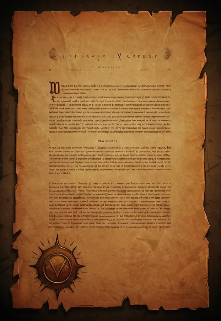
blurry , low quality , ugly , deformed , bad anatomy , extra fingers , photorealistic , hyperrealistic , anime , cartoon , modern objects , text , watermark , logo , oversaturated. Prologue background - parchment , Aged parchment texture , old paper , dark edges and corners , subtle candlelight warm glow at borders , fantasy book style , minimal , low contrast , background for readable text overlay. stylized realism , digital painting , high-fantasy mobile game art , dark palette with warm orange and gold accents , no text , no watermark , premium 2D illustration ,
blurry , low quality , ugly , deformed , bad anatomy , extra fingers , photorealistic , hyperrealistic , anime , cartoon , modern objects , text , watermark , logo , oversaturated Metal frame for progress bar. Horizontal metal progress bar frame , medieval style , dark bronze and iron metal , beveled edges , empty inside , fantasy game UI element , simple clean shape , side view 3D feel , subtle rivets at corners , game asset , stylized realism , 16:9 wide format 1024×256 stylized realism , digital painting , high-fantasy mobile game art , dark palette with warm orange and gold accents , no text , no watermark , premium 2D illustration ,